Create a Corn Cob in Adobe Illustrator
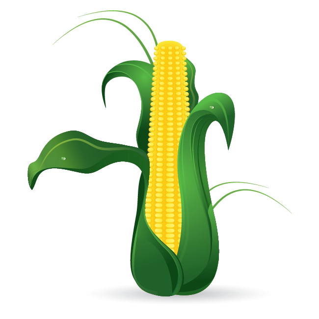
In this very interesting tutorial we will have the opportunity to create something unusual. We will create a Corn Cob by using Adobe Illustrator. We will use some great tools such as Blend Tool, Envelope Distort and of course the Pen Tool. Blend Tool will help us to create the grains, Envelope Distort will help us to form the cob and we will practice the usage of Pen Tool by creating beautiful green leaves.
Let's get down to business!
 For the start grab the Rounded Rectangle Tool from the Tool Panel and create the shape as it shown on the picture below.
 Apply radial gradient.
 Let's make a small reflection on the top. Under the Object select Path > Offset Path. Set the value for Offset to
  Apply a nice linear gradient and using the up arrow key on the keyboard nudge the new shape for the few pixels upwards. Group (
 Now we have to create the smaller grain for the top of the cob. Duplicate (
 Select both grains and under the Object select Blend > Make.
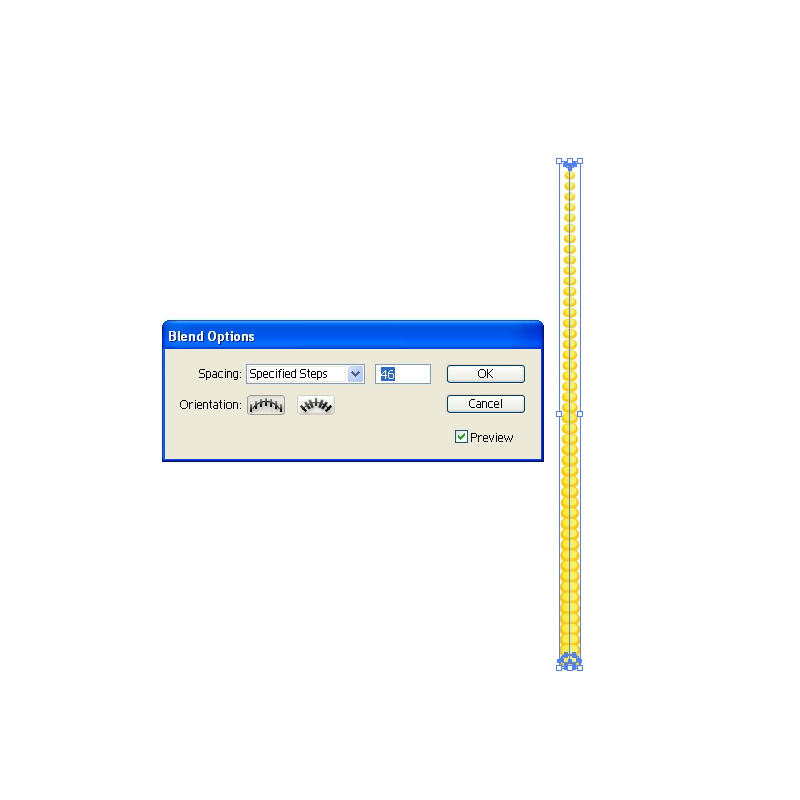
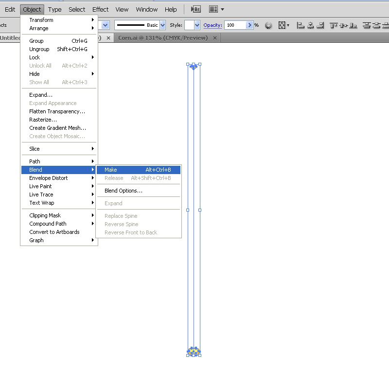 This will create the row of grains. Select Object > Blend > Blend Options. For the Spacing set the Specified Steps. In this case we will set the value for the Specified Steps to
  Expand the row of the grains (Object > Expand) and duplicate it (C
 Let's distort our rows a little bit. Select the left row of the grains and under the Object select Envelope Distort > Make with Warp. Under the Style select Bulge (
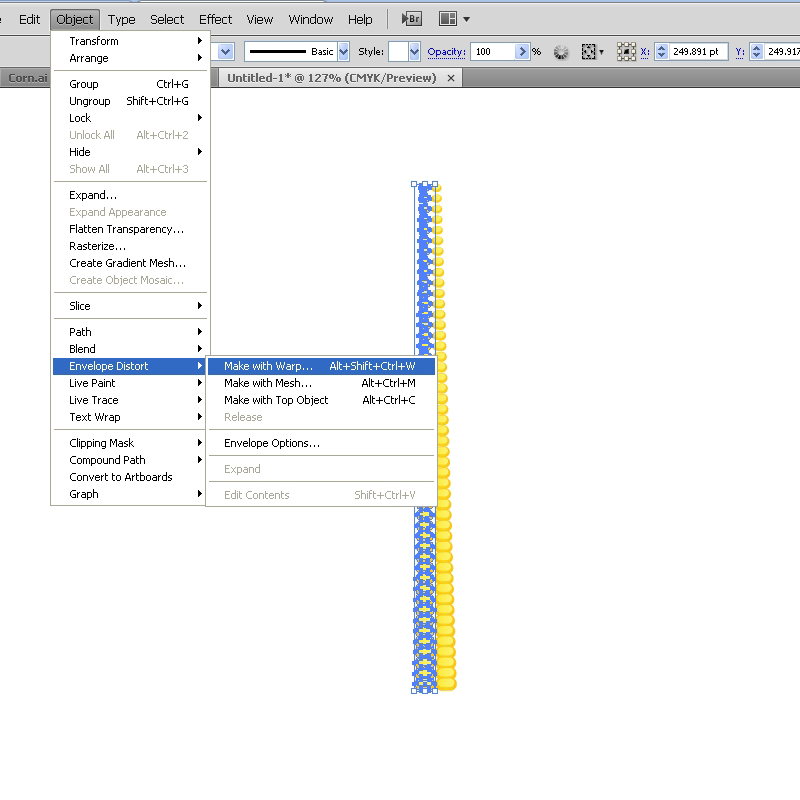
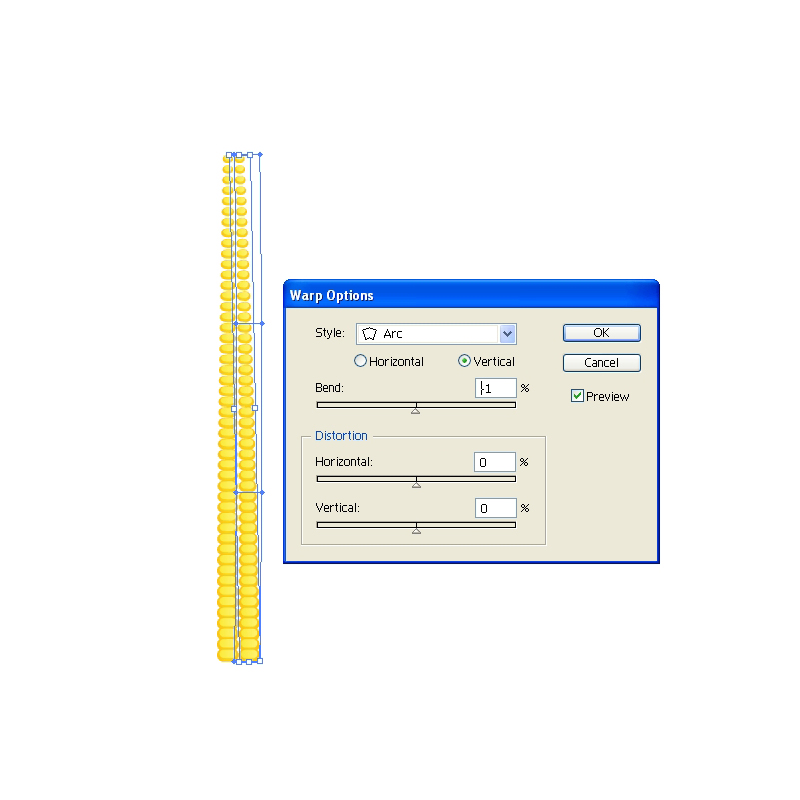
 We have to distort the right row of grains as well. Select it and under the Object select Envelope Distort > Make with Warp. This time set the Style to Arc (
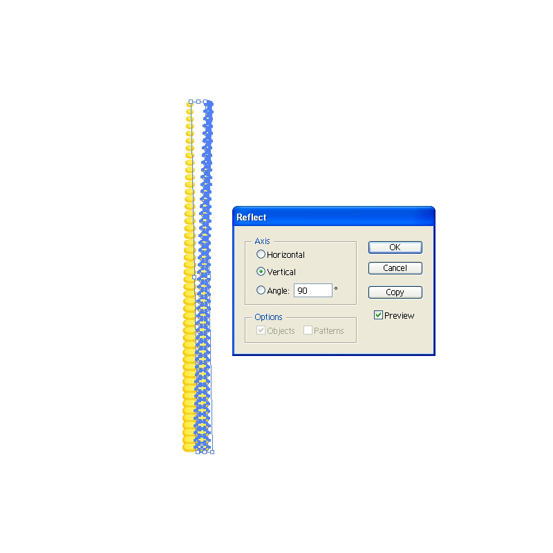
 Reflection will help us to create more grains . Under Object select Transform > Reflect. Set the Axis to Vertical and hit the Copy button. This will create a mirror image. Place the reflected copy on the left side.
 Create a copy (
  Group (
 Under the Object select Path > Offset Path. Set the value for Offset to
  Take a good look at the shape we have just created. You will notice it contains more anchor points then the larger shape. Grab the Delete Anchor Point Tool (
 Set the Fill color of the smaller shape to
  Send the blanded object behind the grains (
 Blend Tool is amazing Illustrator feature. You can create a color transition for the objects with irregular shape. There is just one thing you should keep on mind. Make sure to create two objects or paths with the
 Apply a nice green radial gradient.
 Duplicate (
 Ungroup (
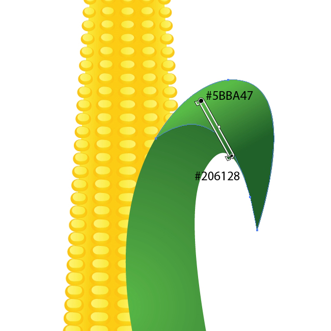 Hereafter we will try our best to create nice details which will make our leaves more interesting.
With the Pen Tool (
 Duplicate (
 Grab the Ellipse Tool (
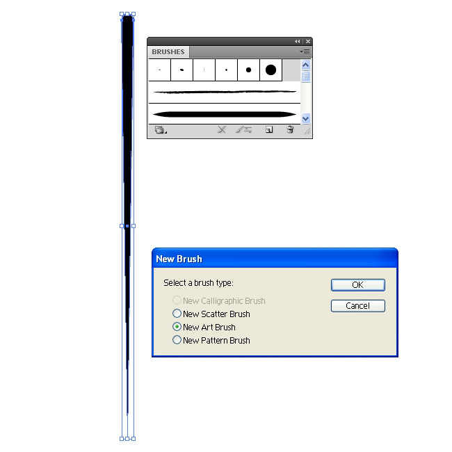
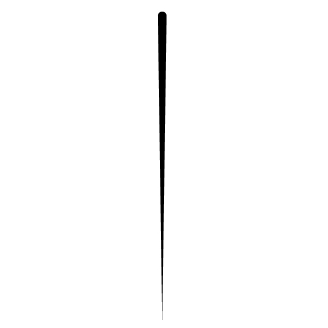 Grab the new shape and drag it to the Brush Panel. In the New Brush Panel check the New Art Brush and hit OK button.
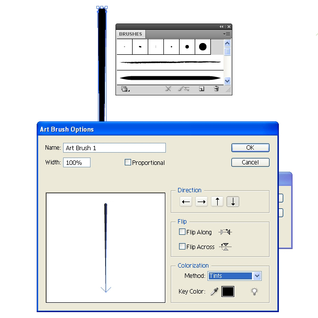
 Make sure to set the Colorization Method to Tint in the Art Brush Option Panel. This way you'll be able to set the Fill color of the brush to any color you like.
 Now when we have the brush let's create some interesting paths for our leaf. Grab the Pen Tool (
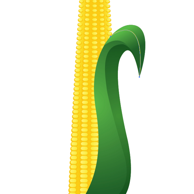 Apply the brush we have created few steps earlier.
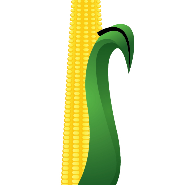 You will notice that the black shape we have just created overlap the upper part of the leaf . To fix this we will have to expand the brush (Object > Expand Appearance). Create the copy of the upper part of the leaf, select both objects and under the Pathfinder Panel hit the Intersect button.
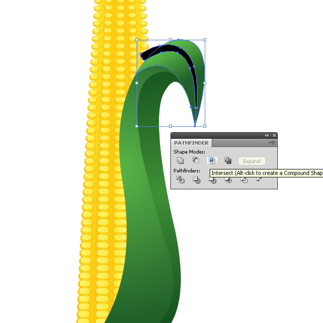 Apply a nice linear green gradient.
 Use the same technique try to improve the illustration by creating interesting details. Just make nice curves and apply the brush. After expanding, apply nice green colors and gradients. You should end up with something similar like this.
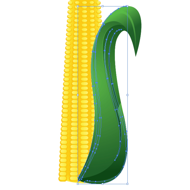 Grab the Pen Tool (
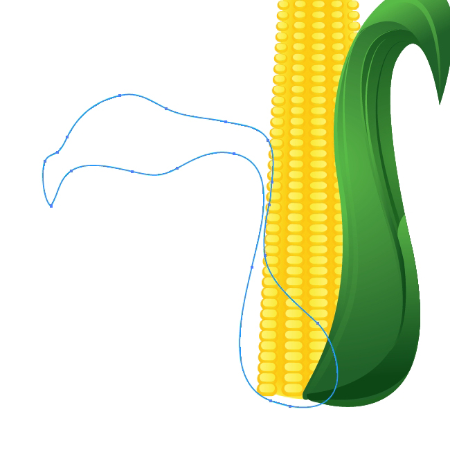 Apply a green radial gradient.
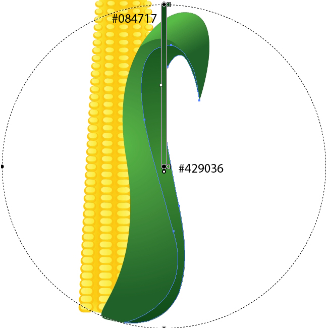
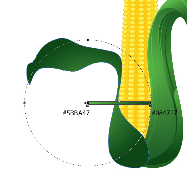 Duplicate (
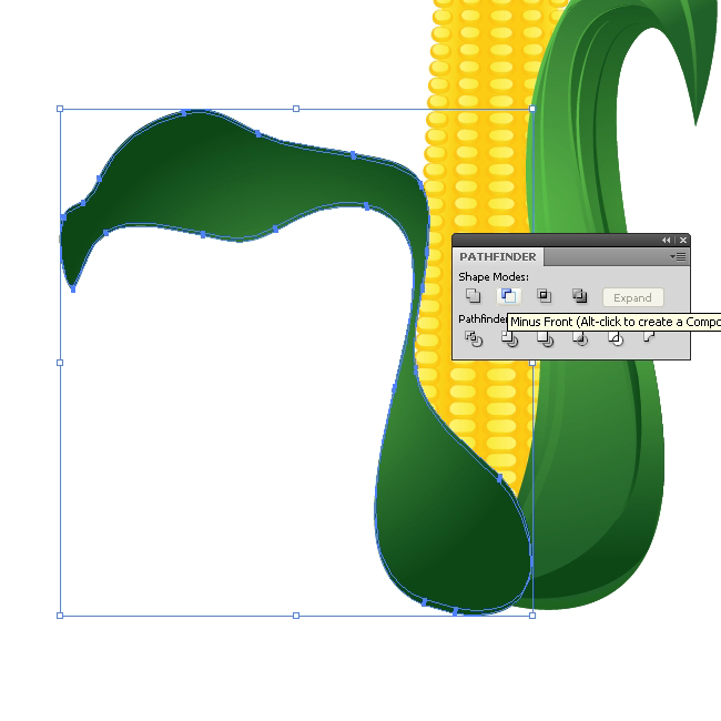 Set the Fill color of the new shape to dark green (
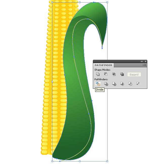
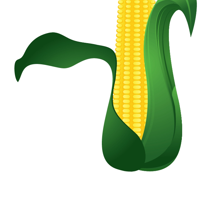 Create another copy of the leaf (
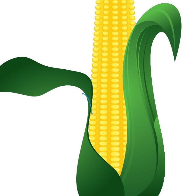 Select the copy of the leaf and the blue path and under the Pathfinder Panel hit Divide button. It will divide the leaf to half. Ungroup (
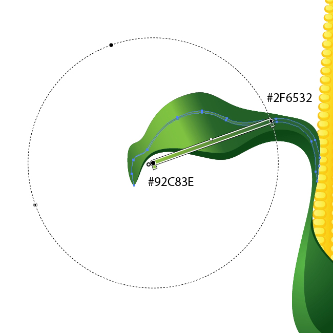
 Few more details and the leaf is ready. Duplicate (
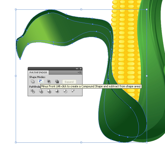
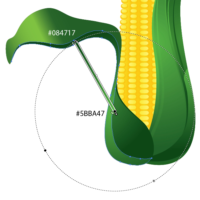 With the Pen Tool (
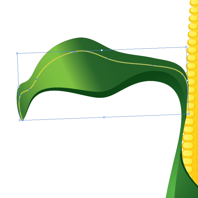 Apply the brush we've created earlier.
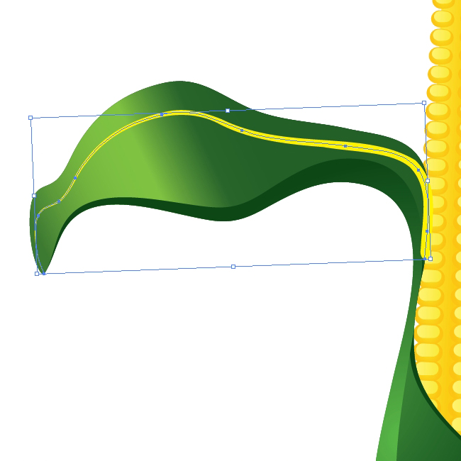 Let's turn the path into editable shape. Under the Object select Expand Appearance. You will notice that the shape we have just created overlap the leaf. To fix that we will have to create a copy of the upper part of the leaf. Hit the well known shortcut to do that (
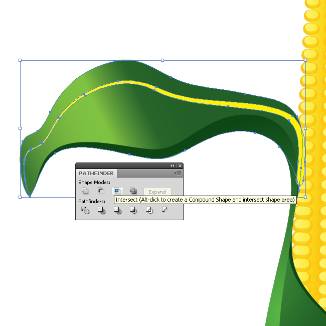 Apply nice radial green gradient
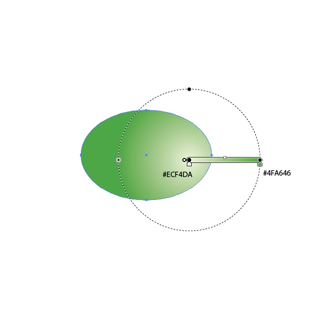 With the Ellipse Tool (
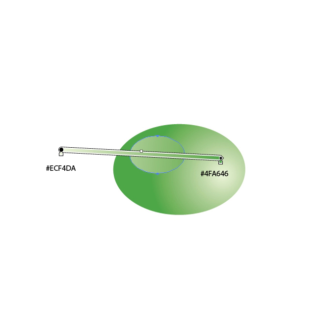 Select the larger ellipse and duplicate it (
 Select all the three ellipses and Group them (
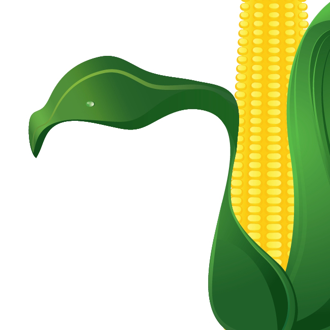 Use the same technique and create few more leaves with nice details.
And voila!
Grains
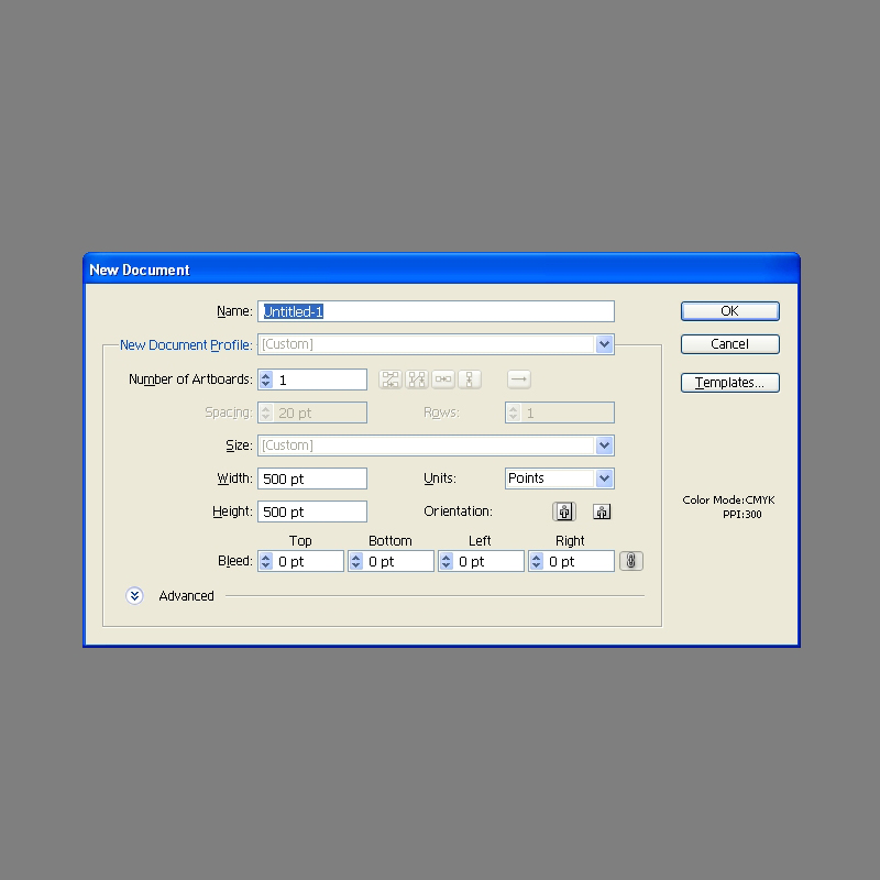
Create new illustrator document with500 x 500 pixels in size.
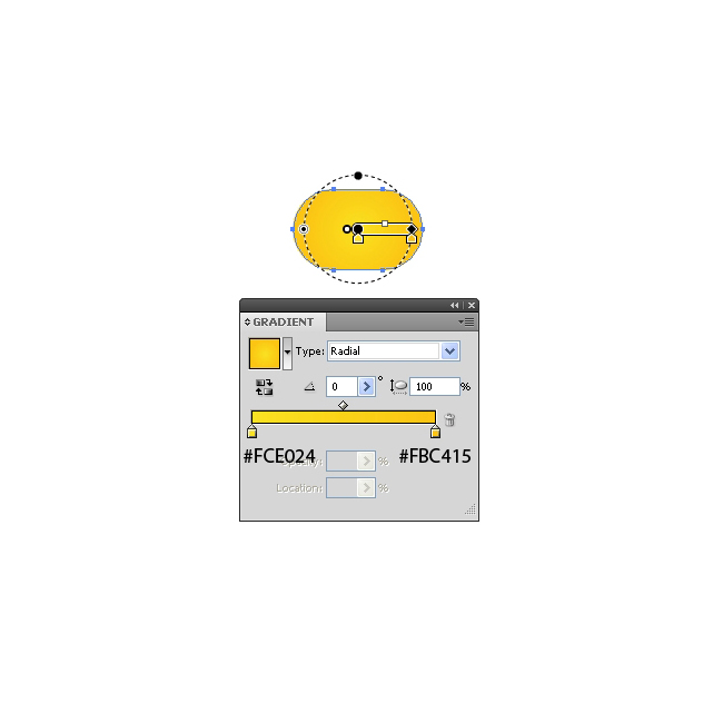
 For the start grab the Rounded Rectangle Tool from the Tool Panel and create the shape as it shown on the picture below.
 Apply radial gradient.
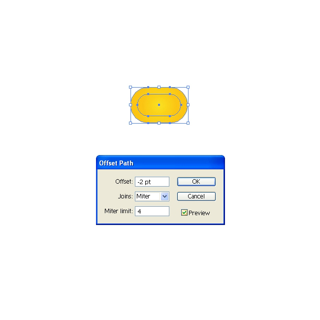
 Let's make a small reflection on the top. Under the Object select Path > Offset Path. Set the value for Offset to
 -2.
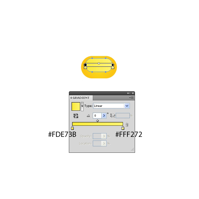
 Apply a nice linear gradient and using the up arrow key on the keyboard nudge the new shape for the few pixels upwards. Group (
Ctrl / Cmd + G) the grain.
 Now we have to create the smaller grain for the top of the cob. Duplicate (
Ctrl / Cmd + C, Ctrl / Cmd + F) the grain we already have, scale it down and holding the Shift key keyboard (for straight dragging) drag the scaled copy upwards.
 Select both grains and under the Object select Blend > Make.
 This will create the row of grains. Select Object > Blend > Blend Options. For the Spacing set the Specified Steps. In this case we will set the value for the Specified Steps to
 46.
 Expand the row of the grains (Object > Expand) and duplicate it (C
trl / Cmd + C, Ctrl / Cmd + F). Move the copy to the right and rotate it a bit, as it shown on the picture below.
 Let's distort our rows a little bit. Select the left row of the grains and under the Object select Envelope Distort > Make with Warp. Under the Style select Bulge (
Vertical) and set the value for the Bend to 1%.

 We have to distort the right row of grains as well. Select it and under the Object select Envelope Distort > Make with Warp. This time set the Style to Arc (
Vertical). Set the value for Bend to -1%. This will bend the row to the left side. Under the Object select Expand.
 Reflection will help us to create more grains . Under Object select Transform > Reflect. Set the Axis to Vertical and hit the Copy button. This will create a mirror image. Place the reflected copy on the left side.
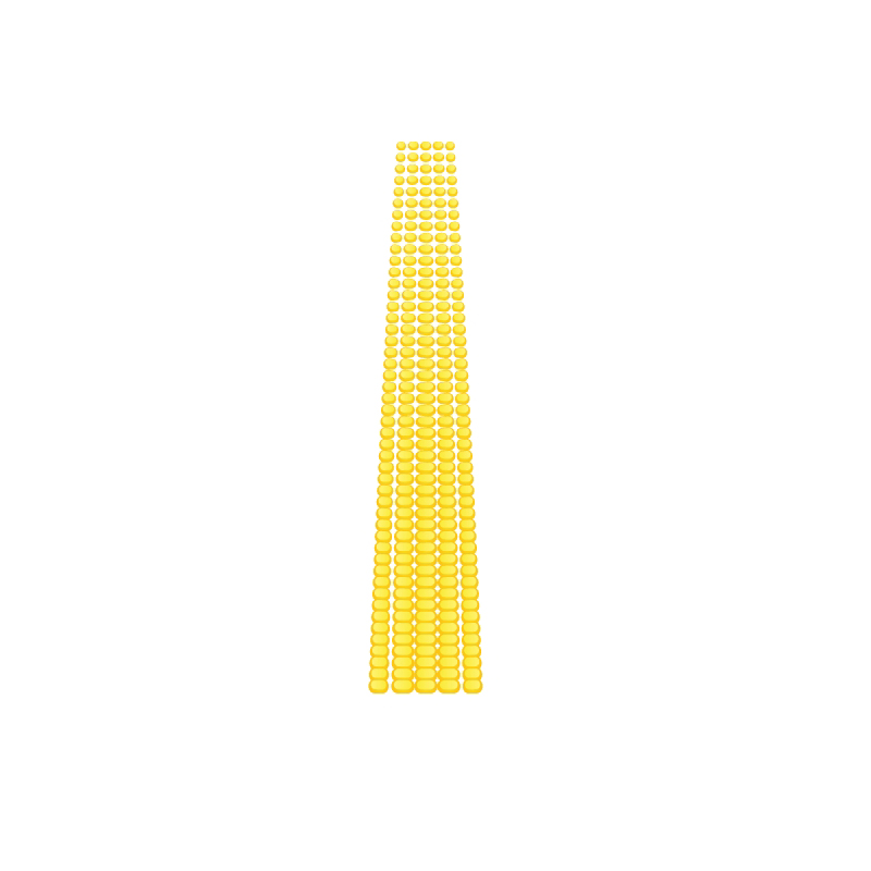
 Create a copy (
 Ctrl / Cmd + C, Ctrl / Cmd + F) of the left and the right row and place them as it shown on the picture below. Feel free to scale down the end rows by using non-uniforme scale.
 Group (
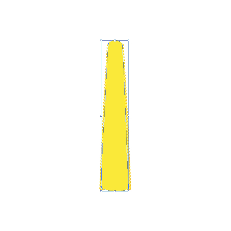
Ctrl / Cmd + G) the grains. Grab the Pen Tool (P) from the Tool Panel and draw the shape as it shown on the picture below. Set the Fill color to #FFE73B.
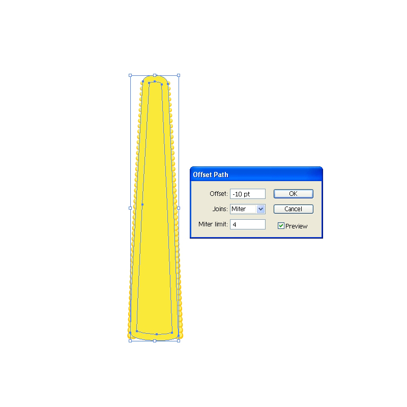
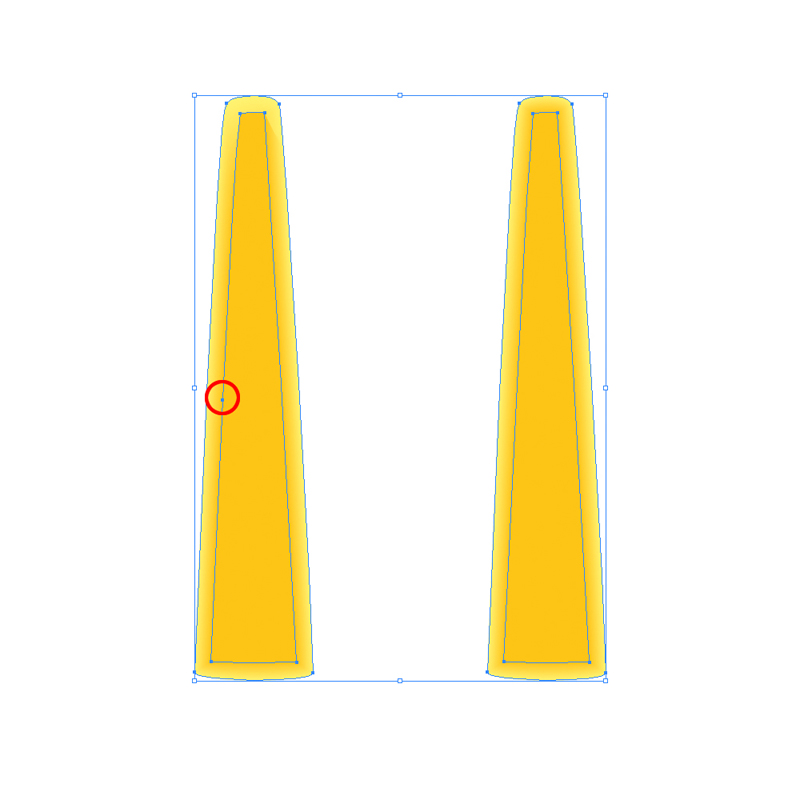
 Under the Object select Path > Offset Path. Set the value for Offset to
 -10.
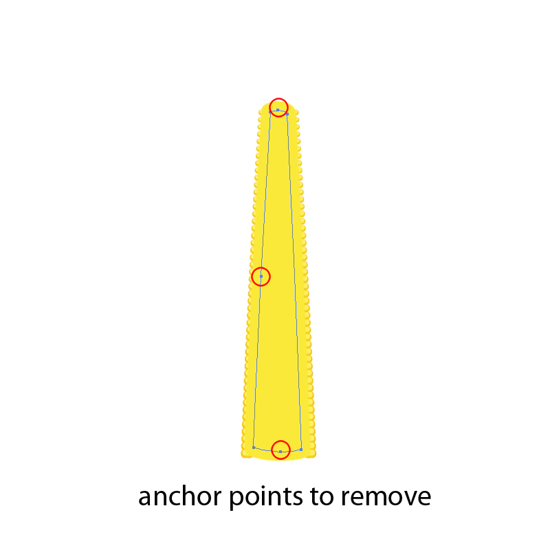
 Take a good look at the shape we have just created. You will notice it contains more anchor points then the larger shape. Grab the Delete Anchor Point Tool (
-) and remove some of the anchor points. Feel free to adjust the handlers of the anchor points in order to create nice and round corners.
 Set the Fill color of the smaller shape to
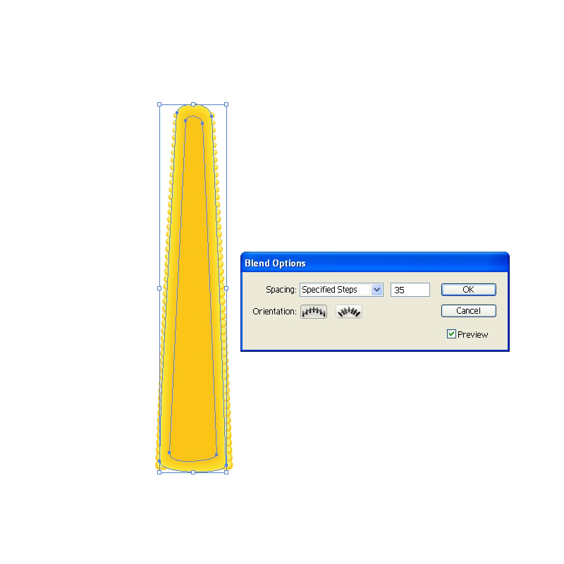
 #FBC415. Select both shapes and under the Object hit Blend > Make. Bring up the Blend Option box and under Specified Steps set the number to 35. This will create a nice color transition.
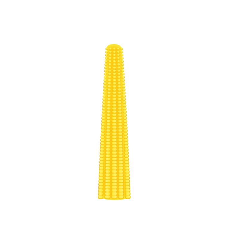
 Send the blanded object behind the grains (
Shift + Ctrl / Cmd + [).
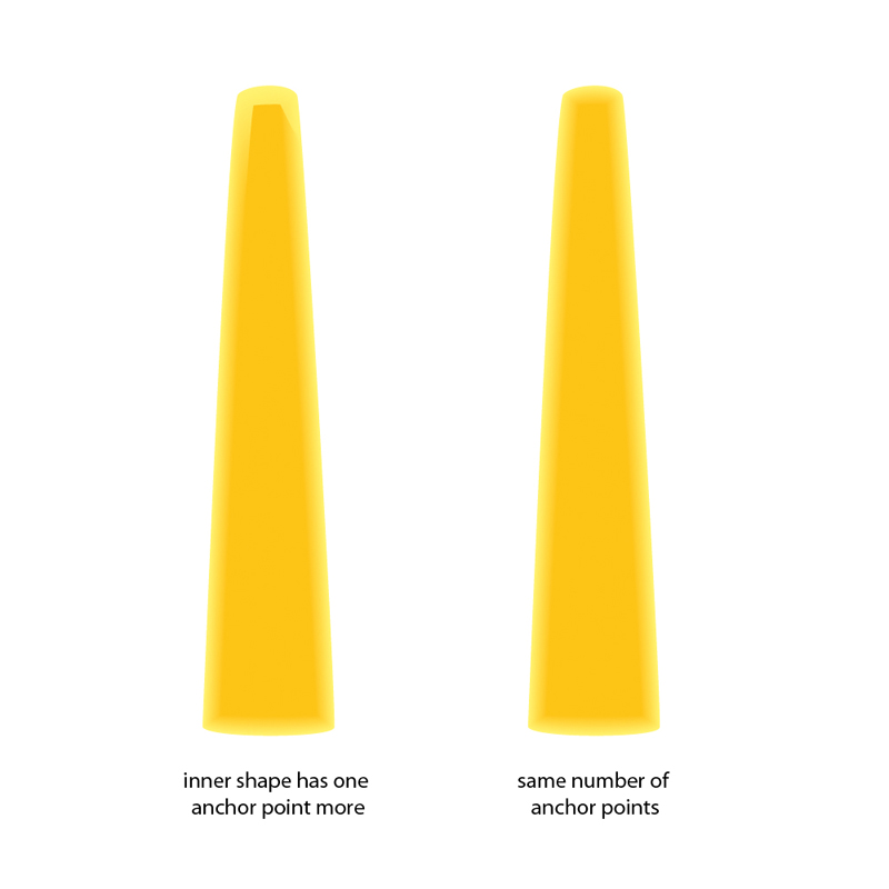
 Blend Tool is amazing Illustrator feature. You can create a color transition for the objects with irregular shape. There is just one thing you should keep on mind. Make sure to create two objects or paths with the
 exact same number of anchor points. That way you will ensure that each anchor point of one object (path) has the correspondent anchor point on the other object (path).


Leaves
In this part we will exercise drawing with Pen Tool (P). Get ready for creating nice curved paths and combining some shapes inside Pathfinder Panel.
Let's start!
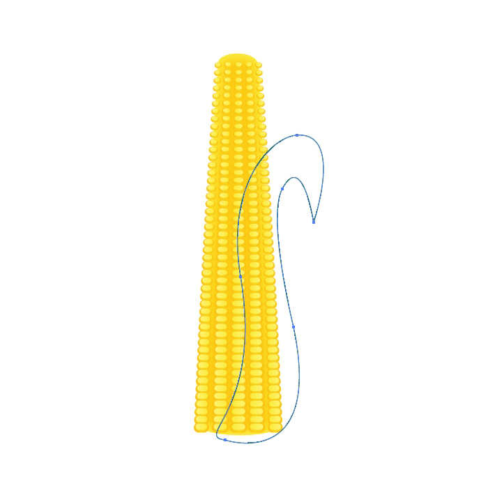
Grab the Pen Tool (P) from the Tool Panel and draw the shape as it shown on the picture below.
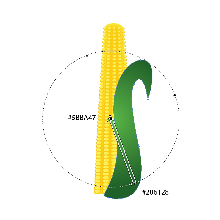
 Apply a nice green radial gradient.
 Duplicate (
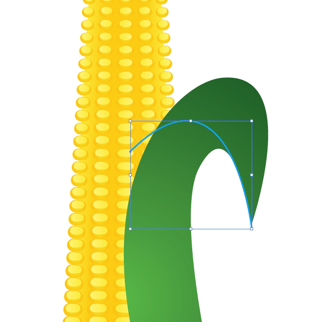
Ctrl / Cmd + C, Ctrl / Cmd + F) the leaf and create a small curved path. Select the copy of the leaf and the path and under the Pathfinder Panel hit Divide button
 Ungroup (
Shift + Ctrl / Cmd + G) the new shape and remove the lower part of divided leaf. Apply linear gradient as it shown on the picture below.
 Hereafter we will try our best to create nice details which will make our leaves more interesting.
With the Pen Tool (
Hereafter we will try our best to create nice details which will make our leaves more interesting.
With the Pen Tool (P) create the path as it shown on the picture below.
 Duplicate (
Ctrl / Cmd + C, Ctrl /Cmd +F) the shape of the leaf. Select the copy of the leaf and the path from the previous step and under the Pathfinder Panel hit Divide button. Ungroup (Shift + Ctrl / Cmd + G) the new shape, remove the larger part of the shape and apply green radial gradient.

 Grab the Ellipse Tool (
L) from the Tool Panel and create a small black circle. With Direct Selection Tool (A) select the lower anchor point and drag it downwards (don't forget to hold a Shift key on the keyboard for straight dragging). With Convert Anchor Point Tool (Shift + C) turn that anchor point into the sharp corner. This way we've created a brush that will help us to improve our leaf.
 Grab the new shape and drag it to the Brush Panel. In the New Brush Panel check the New Art Brush and hit OK button.
 Make sure to set the Colorization Method to Tint in the Art Brush Option Panel. This way you'll be able to set the Fill color of the brush to any color you like.
 Now when we have the brush let's create some interesting paths for our leaf. Grab the Pen Tool (
P) from the Tool Panel and create a small arc.
 Apply the brush we have created few steps earlier.
 You will notice that the black shape we have just created overlap the upper part of the leaf . To fix this we will have to expand the brush (Object > Expand Appearance). Create the copy of the upper part of the leaf, select both objects and under the Pathfinder Panel hit the Intersect button.
 Apply a nice linear green gradient.
 Use the same technique try to improve the illustration by creating interesting details. Just make nice curves and apply the brush. After expanding, apply nice green colors and gradients. You should end up with something similar like this.
 Grab the Pen Tool (
P) again and create the shape as it shown on the picture below.
 Apply a green radial gradient.
 Duplicate (
Ctrl / Cmd + C, Ctrl / Cmd + F) the new leaf twice. Nudge one of the copies downwards for 1 pixel and select them both. Under the Pathfinder Panel hit the Minus Front button.
 Set the Fill color of the new shape to dark green (
#0F4C1A). This way we've created a thickness for the leaf.
 Create another copy of the leaf (
Ctrl / Cmd + C, Ctrl / Cmd + F). We have to divide this shape to half. Grab the Pen Tool (P) and create a path as it shown on the picture below.
 Select the copy of the leaf and the blue path and under the Pathfinder Panel hit Divide button. It will divide the leaf to half. Ungroup (
Shift + Ctrl / Cmd + G) the leaf, delete the lower part and apply the linear green gradient to the upper part.
 Few more details and the leaf is ready. Duplicate (
Ctrl / Cmd + C, Ctrl / Cmd + F) the large shape of the leaf twice. Rotate one of the copies (you can scale it up as well). Select both of the copies and under the Pathfinder Panel hit the Minus Front button. Apply radial green gradient.

 With the Pen Tool (
P) create the path as it shown on the picture below.
 Apply the brush we've created earlier.
 Let's turn the path into editable shape. Under the Object select Expand Appearance. You will notice that the shape we have just created overlap the leaf. To fix that we will have to create a copy of the upper part of the leaf. Hit the well known shortcut to do that (
Ctrl / Cmd + C, Ctrl / Cmd + F). Select the copy of the leaf and the yellow shape and under the Pathfinder Panel hit the Intersect button.
 Apply nice radial green gradient

Creating a Water Drop
Select the Ellipse Tool (L) from a Tool Panel and create an ellipse. Apply nice radial white-green gradient. We are using a combination with green color because the water drop is semi-transparent and green color is reflecting from the leaf.
 With the Ellipse Tool (
L) create another, smaller ellipse and place it as you see on the picture below. For this ellipse we will use linear white-green gradient.
 Select the larger ellipse and duplicate it (
Ctrl/Cmd+C, Ctrl/Cmd+F). Set the Fill color to #206128 and nudge it for 3 pixels to the right. This will be the shadow that the water drop creates on the leaf.
 Select all the three ellipses and Group them (
Ctrl / Cmd + G). Place it on the leaf.
 Use the same technique and create few more leaves with nice details.
And voila!


Another impressive tut! Thanks!
the leaves turned out awesome!
however the single corns looks a bit weird… I think there is just too much space between them.
maybe a way to avoid this is to make lines of same sized corns by applying a blend and apply the warp filter later. that way they get smaller to the top as well :)
and when did the noupe layout change? lol I feel like I’m very late now
Thanks for the suggestion. Always appreciate feedback for improving the end product.
Noupe Editorial Team
Color combination and curves are perfect work..
I really like your tutorial. Easy to understand and apply and with a great outcome. You really know how to realize good ideas with the right technics.
Eagerly waiting now for what might come next.
very nice tutorial. easy to understand! will be waiting for more adobe illustrator tutorials. :)
Easy to follow as always. Great tutorial.
I am really glad you like it.
@pica-ae: Thank you for the suggestion. There is always room for improvement.
Wow, apart from the leaves, this looks very much real, like not an illustration.
Great work. thanks for sharing this kind of awesome stuff with us.
keep it up…
this tutorial is amazing and i really very impressed to workout this tutorial same … nice to posted this effect
Great tutorial Tnx!!
Gracias, aprendo mucho con tus tutoriales