
45+ Free Lessons In Graphic Design Theory
Considering how many designers are self-taught, either in whole or in part, the importance of a solid foundation in graphic design theory is often overlooked. New designers often want to jump right into creating websites, rather than learning the basics of why some designs work and some don't. But they're putting themselves at a disadvantage to designers who do have formal training or have taken the time to learn the principles behind good design.
Below are more than 45 recent lessons in graphic design theory. Included are general theories, theories about user experience and usability, typographic theory, layout and grid theory, and color theory.
 Principles of Good Design: Balance
Discusses how important balance is to creating an effective design. It covers symmetrical and asymmetrical balance, as well as off-balance designs.
Principles of Good Design: Balance
Discusses how important balance is to creating an effective design. It covers symmetrical and asymmetrical balance, as well as off-balance designs.
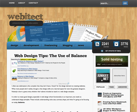
 Web Design Tips: The Use of Balance
This covers how to create balance in your website designs. It's a simple overview article, with a lot of practical advice in addition to theoretical discussion.
Web Design Tips: The Use of Balance
This covers how to create balance in your website designs. It's a simple overview article, with a lot of practical advice in addition to theoretical discussion.
 The 5 Primary Principles of Potent Web Design, Part 5: Balance
This article from The Pro Designer covers the principle of balance and how to apply it to your designs. It's short and to the point. Be sure to check out the links at the end for the other principles in the series.
The 5 Primary Principles of Potent Web Design, Part 5: Balance
This article from The Pro Designer covers the principle of balance and how to apply it to your designs. It's short and to the point. Be sure to check out the links at the end for the other principles in the series.
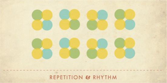
 3 Graphic Design Principles for Instructional Design Success
While dealing specifically with instructional design, this article covers three important principles that can be applied regardless of the purpose of your design: using layouts to convey meaning and relationship, using pattern and repetition to organize content, and using just the right images and no more.
3 Graphic Design Principles for Instructional Design Success
While dealing specifically with instructional design, this article covers three important principles that can be applied regardless of the purpose of your design: using layouts to convey meaning and relationship, using pattern and repetition to organize content, and using just the right images and no more.
 In Search of Ethics in Graphic Design
Ethical considerations are all too often overlooked in the world of graphic design. This article aims to change that by discussing a designer's responsibility to their users.
In Search of Ethics in Graphic Design
Ethical considerations are all too often overlooked in the world of graphic design. This article aims to change that by discussing a designer's responsibility to their users.
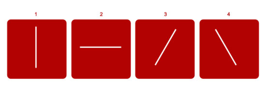
 Want to Know How to Design? Learn the Basics
This article provides a great overview of basic graphic design principles, including color, line, shape, space and more. Additional resources are provided for each concept.
Want to Know How to Design? Learn the Basics
This article provides a great overview of basic graphic design principles, including color, line, shape, space and more. Additional resources are provided for each concept.
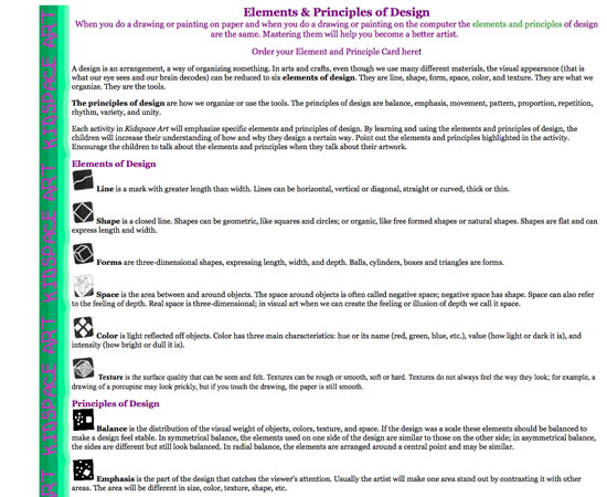
 Elements and Principles of Design
This page offers a basic but useful overview of the elements and principles of design, with basic illustrations of each concept. It's a great starting point and incredibly easy to understand, because it's aimed at young students.
Elements and Principles of Design
This page offers a basic but useful overview of the elements and principles of design, with basic illustrations of each concept. It's a great starting point and incredibly easy to understand, because it's aimed at young students.
 The Modern, No-Nonsense Guide to the Principles of Design
This covers all of the basics: balance, emphasis, movement, pattern, repetition and more, as well as six “new” principles of eBook design that are just as relevant to website and graphic design.
The Modern, No-Nonsense Guide to the Principles of Design
This covers all of the basics: balance, emphasis, movement, pattern, repetition and more, as well as six “new” principles of eBook design that are just as relevant to website and graphic design.
 Grids in Modern Web Design
A slideshow that explains the theory behind using a grid for a layout. It's a quick introduction to grid theory, with a few practical examples.
Grids in Modern Web Design
A slideshow that explains the theory behind using a grid for a layout. It's a quick introduction to grid theory, with a few practical examples.
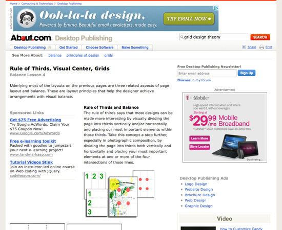
 Rule of Thirds, Visual Center, Grids
Another About.com article that discusses the theories of balance in page layout. The principles could be applied to either web or print design, but the article focuses on print design.
Rule of Thirds, Visual Center, Grids
Another About.com article that discusses the theories of balance in page layout. The principles could be applied to either web or print design, but the article focuses on print design.
 Gestalt Principles Applied in Design
This Six Revisions post covers the six basic principles of Gestalt theory?—?proximity, similarity, figure-ground, symmetry, “common fate” and closure?—?and how to apply them to your designs.
Gestalt Principles Applied in Design
This Six Revisions post covers the six basic principles of Gestalt theory?—?proximity, similarity, figure-ground, symmetry, “common fate” and closure?—?and how to apply them to your designs.
 Understanding Visual Hierarchy in Web Design
This Webdesign Tuts+ post covers the basics of visual hierarchy from a very practical standpoint. By the time you finish the article, you'll have a grasp of not only what hierarchy is and why it's important, but also how to effectively incorporate it in your designs.
Understanding Visual Hierarchy in Web Design
This Webdesign Tuts+ post covers the basics of visual hierarchy from a very practical standpoint. By the time you finish the article, you'll have a grasp of not only what hierarchy is and why it's important, but also how to effectively incorporate it in your designs.
 How to Use Visual Hierarchy in Web Design
This article from Design Shack covers the principles of visual hierarchy and how to achieve it, accounting for size, color, position and visual complexity.
How to Use Visual Hierarchy in Web Design
This article from Design Shack covers the principles of visual hierarchy and how to achieve it, accounting for size, color, position and visual complexity.
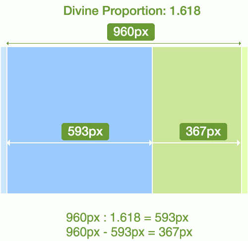
 Grid Theory
This article covers grid theory in relation to Phi, the Rule of Thirds, and the 960 Grid system. It's excerpted from Jason Beaird's The Principles of Beautiful Web Design book.
Grid Theory
This article covers grid theory in relation to Phi, the Rule of Thirds, and the 960 Grid system. It's excerpted from Jason Beaird's The Principles of Beautiful Web Design book.
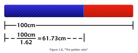 Applying Divine Proportion to Your Web Designs
Discusses how to apply Phi (a ratio of roughly 1:1.618) in order to achieve more attractive and visually balanced designs. It also discusses the Rule of Thirds and has some practical advice for implementing each theory.
Applying Divine Proportion to Your Web Designs
Discusses how to apply Phi (a ratio of roughly 1:1.618) in order to achieve more attractive and visually balanced designs. It also discusses the Rule of Thirds and has some practical advice for implementing each theory.
 How Cognitive Biases Shape User Experience
This slightly more advanced article covers the psychology behind why users react to design elements the way they do. It also covers the cognitive biases of those involved in crafting the user experience and how they can negatively affect the result.
How Cognitive Biases Shape User Experience
This slightly more advanced article covers the psychology behind why users react to design elements the way they do. It also covers the cognitive biases of those involved in crafting the user experience and how they can negatively affect the result.
 Principles for Usable Design
A quick overview of some important usability principles, including consistency, simplicity and communication. It offers a handful of tips for effectively implementing each principle.
Principles for Usable Design
A quick overview of some important usability principles, including consistency, simplicity and communication. It offers a handful of tips for effectively implementing each principle.
 8 Design and Usability Principles You Can Apply to Your Website
This article offers some great tips that, if followed, could really improve the usability and user experience of your designs. Included are topics like designing to demographics and writing for a Web audience.
8 Design and Usability Principles You Can Apply to Your Website
This article offers some great tips that, if followed, could really improve the usability and user experience of your designs. Included are topics like designing to demographics and writing for a Web audience.
 11 Quick Tips for More Usable Content
This UX Booth article has some excellent ideas on how to make your website's content more user-friendly. Some are directly related to design, while others are more related to the content itself (which should always be considered in context of the design).
11 Quick Tips for More Usable Content
This UX Booth article has some excellent ideas on how to make your website's content more user-friendly. Some are directly related to design, while others are more related to the content itself (which should always be considered in context of the design).
 8 Simple Ways to Improve Typography in Your Designs
This not only teaches you the theories behind the tips, but gives you practical examples and code to get you started using the theories.
8 Simple Ways to Improve Typography in Your Designs
This not only teaches you the theories behind the tips, but gives you practical examples and code to get you started using the theories.
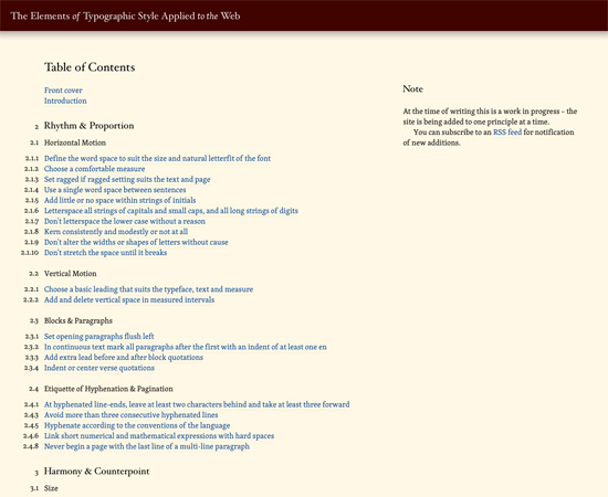
 The Elements of Typographic Style Applied to the Web
One of the most thorough guides to Web typography theory out there. It covers horizontal motion, vertical motion, blocks and paragraphs, the etiquette of hyphenation and pagination, and harmony and counterpoint, all in detail.
The Elements of Typographic Style Applied to the Web
One of the most thorough guides to Web typography theory out there. It covers horizontal motion, vertical motion, blocks and paragraphs, the etiquette of hyphenation and pagination, and harmony and counterpoint, all in detail.
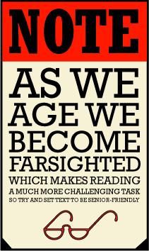
 Designing for Seniors
If you ever have to create designs for older demographics, then this is a must read. It explains numerous ways to make type more seniors-friendly, including guidelines for typographic style and size, text length, white space and more.
Designing for Seniors
If you ever have to create designs for older demographics, then this is a must read. It explains numerous ways to make type more seniors-friendly, including guidelines for typographic style and size, text length, white space and more.
 Typography for Children
There are also guidelines for designing typography for children. This article covers things like legibility, readability and more, all related to how children perceive and respond to designs.
Typography for Children
There are also guidelines for designing typography for children. This article covers things like legibility, readability and more, all related to how children perceive and respond to designs.
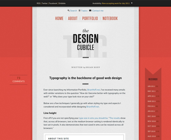
 Typography Is the Backbone of Good Web Design
Brian Hoff covers the techniques that he uses in his own Web typography, discussing both why they work well and how to get good results.
Typography Is the Backbone of Good Web Design
Brian Hoff covers the techniques that he uses in his own Web typography, discussing both why they work well and how to get good results.
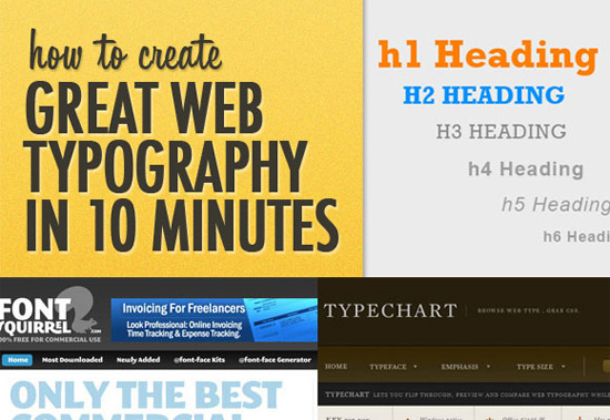
 How to Create Great Web Typography in 10 Minutes
This article is a mix of theory and practical advice, and it covers vertical rhythm, font families, visual hierarchy and font colors, all of which are important in typography, regardless of medium.
How to Create Great Web Typography in 10 Minutes
This article is a mix of theory and practical advice, and it covers vertical rhythm, font families, visual hierarchy and font colors, all of which are important in typography, regardless of medium.
 “What Font Should I Use?”: Five Principles for Choosing and Using Typefaces
Includes some excellent guidelines for choosing fonts for your designs, including contrast, font families and appropriateness.
“What Font Should I Use?”: Five Principles for Choosing and Using Typefaces
Includes some excellent guidelines for choosing fonts for your designs, including contrast, font families and appropriateness.
 Eight Tips for Type on the Web
A short article from Fonts.com that covers basic guidelines for creating good Web typography. Included are things like avoiding justified text, using smart punctuation and creating a typographic hierarchy.
Eight Tips for Type on the Web
A short article from Fonts.com that covers basic guidelines for creating good Web typography. Included are things like avoiding justified text, using smart punctuation and creating a typographic hierarchy.
 Type and Color
Explains how to choose the proper colors for your typography, and the rationale behind using different colors when designing type.
Type and Color
Explains how to choose the proper colors for your typography, and the rationale behind using different colors when designing type.
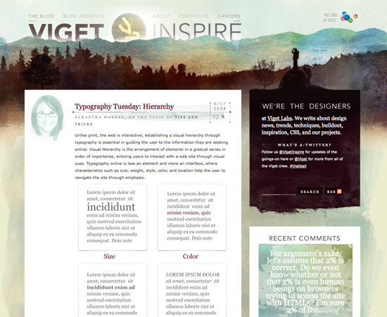
 Typography Tuesday: Hierarchy
Hierarchy is one of the most important concepts in typographic design, because it reinforces the priority of elements. Creating a sense of hierarchy is as simple as differentiating between such elements as headlines, body copy, headings and so on. This article covers a variety of ways to do that.
Typography Tuesday: Hierarchy
Hierarchy is one of the most important concepts in typographic design, because it reinforces the priority of elements. Creating a sense of hierarchy is as simple as differentiating between such elements as headlines, body copy, headings and so on. This article covers a variety of ways to do that.
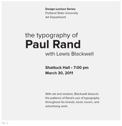
 Type Study: Typographic Hierarchy
Here is a great lesson in typographic theory, walking you through the principles, with a fantastic example that evolves throughout the article.
Type Study: Typographic Hierarchy
Here is a great lesson in typographic theory, walking you through the principles, with a fantastic example that evolves throughout the article.
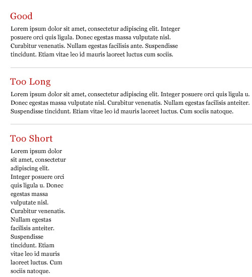
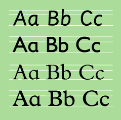
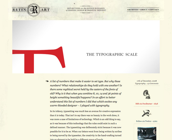
 The Typographic Scale
This covers another vital part of typography design: sizing your typography based on a pre-defined scale. This gives the text more order and reinforces relationships between the various typographic elements.
The Typographic Scale
This covers another vital part of typography design: sizing your typography based on a pre-defined scale. This gives the text more order and reinforces relationships between the various typographic elements.
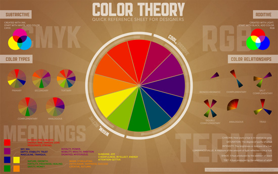
 Color Theory Quick Reference Poster
While not strictly a theory lesson, this poster includes all of the basics you need to know about color theory, in an easy-to-reference format. It's available as a print-ready PDF or as desktop wallpaper.
Color Theory Quick Reference Poster
While not strictly a theory lesson, this poster includes all of the basics you need to know about color theory, in an easy-to-reference format. It's available as a print-ready PDF or as desktop wallpaper.
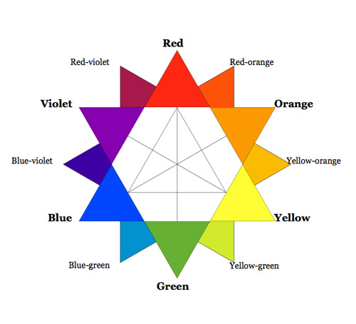
 A Look Into Color Theory in Web Design
This Six Revisions article offers a great overview of color theory, including the color wheel, terminologies, relationships between colors, types of color in design, and color meanings.
A Look Into Color Theory in Web Design
This Six Revisions article offers a great overview of color theory, including the color wheel, terminologies, relationships between colors, types of color in design, and color meanings.
 How to Get a Professional Look With Color
This post from Webdesigner Depot covers all of the basics of using color to achieve a professional design. It goes into more advanced techniques for creating color schemes.
How to Get a Professional Look With Color
This post from Webdesigner Depot covers all of the basics of using color to achieve a professional design. It goes into more advanced techniques for creating color schemes.
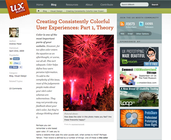
 Creating Consistently Colorful User Experiences: Part 1, Theory
This article on UX Booth discusses color theory in terms of user experience design. It talks about how color helps define how users perceive information in a design, as well as the subconscious impact of color on user experience.
Creating Consistently Colorful User Experiences: Part 1, Theory
This article on UX Booth discusses color theory in terms of user experience design. It talks about how color helps define how users perceive information in a design, as well as the subconscious impact of color on user experience.
 (al)(rb)
Featured Image by Jeroen den Otter on Unsplash
(al)(rb)
Featured Image by Jeroen den Otter on Unsplash
General Design Theory
The Lost Principles of Design Covers a number of basic graphic design principles, including balance, contrast, emphasis and subordination, directional forces, proportion, scale, repetition and rhythm, and unity, all with illustrations.
Principles of Good Design: Balance
Discusses how important balance is to creating an effective design. It covers symmetrical and asymmetrical balance, as well as off-balance designs.
Web Design Tips: The Use of Balance
This covers how to create balance in your website designs. It's a simple overview article, with a lot of practical advice in addition to theoretical discussion.
The 5 Primary Principles of Potent Web Design, Part 5: Balance
This article from The Pro Designer covers the principle of balance and how to apply it to your designs. It's short and to the point. Be sure to check out the links at the end for the other principles in the series.
3 Graphic Design Principles for Instructional Design Success
While dealing specifically with instructional design, this article covers three important principles that can be applied regardless of the purpose of your design: using layouts to convey meaning and relationship, using pattern and repetition to organize content, and using just the right images and no more.
In Search of Ethics in Graphic Design
Ethical considerations are all too often overlooked in the world of graphic design. This article aims to change that by discussing a designer's responsibility to their users.
Want to Know How to Design? Learn the Basics
This article provides a great overview of basic graphic design principles, including color, line, shape, space and more. Additional resources are provided for each concept.
Elements and Principles of Design
This page offers a basic but useful overview of the elements and principles of design, with basic illustrations of each concept. It's a great starting point and incredibly easy to understand, because it's aimed at young students.
The Modern, No-Nonsense Guide to the Principles of Design
This covers all of the basics: balance, emphasis, movement, pattern, repetition and more, as well as six “new” principles of eBook design that are just as relevant to website and graphic design.
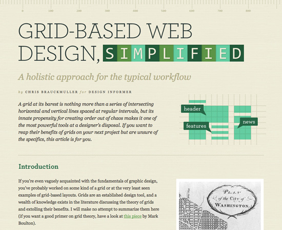
Grid and Layout Theory
Grid-Based Web Design, Simplified This covers the theory of grid-based design and gives practical advice on how to create your own grids, without over-complicating things.
Grids in Modern Web Design
A slideshow that explains the theory behind using a grid for a layout. It's a quick introduction to grid theory, with a few practical examples.
Rule of Thirds, Visual Center, Grids
Another About.com article that discusses the theories of balance in page layout. The principles could be applied to either web or print design, but the article focuses on print design.
Gestalt Principles Applied in Design
This Six Revisions post covers the six basic principles of Gestalt theory?—?proximity, similarity, figure-ground, symmetry, “common fate” and closure?—?and how to apply them to your designs.
Understanding Visual Hierarchy in Web Design
This Webdesign Tuts+ post covers the basics of visual hierarchy from a very practical standpoint. By the time you finish the article, you'll have a grasp of not only what hierarchy is and why it's important, but also how to effectively incorporate it in your designs.
How to Use Visual Hierarchy in Web Design
This article from Design Shack covers the principles of visual hierarchy and how to achieve it, accounting for size, color, position and visual complexity.
Grid Theory
This article covers grid theory in relation to Phi, the Rule of Thirds, and the 960 Grid system. It's excerpted from Jason Beaird's The Principles of Beautiful Web Design book.
Applying Divine Proportion to Your Web Designs
Discusses how to apply Phi (a ratio of roughly 1:1.618) in order to achieve more attractive and visually balanced designs. It also discusses the Rule of Thirds and has some practical advice for implementing each theory.
Usability and User Experience
10 Usability Principles to Guide You Through the Web Design Maze A quick overview of 10 usability principles. It's short and to the point and a great place to start learning about usability.
How Cognitive Biases Shape User Experience
This slightly more advanced article covers the psychology behind why users react to design elements the way they do. It also covers the cognitive biases of those involved in crafting the user experience and how they can negatively affect the result.
Principles for Usable Design
A quick overview of some important usability principles, including consistency, simplicity and communication. It offers a handful of tips for effectively implementing each principle.
8 Design and Usability Principles You Can Apply to Your Website
This article offers some great tips that, if followed, could really improve the usability and user experience of your designs. Included are topics like designing to demographics and writing for a Web audience.
11 Quick Tips for More Usable Content
This UX Booth article has some excellent ideas on how to make your website's content more user-friendly. Some are directly related to design, while others are more related to the content itself (which should always be considered in context of the design).
Typography
A 20 Minute Intro to Typography Basics A quick, simple guide to good typography. This is a high-level overview that covers things like typeface classifications, the anatomy of type, kerning and tracking, alignment, and ligatures, among other topics.
8 Simple Ways to Improve Typography in Your Designs
This not only teaches you the theories behind the tips, but gives you practical examples and code to get you started using the theories.
The Elements of Typographic Style Applied to the Web
One of the most thorough guides to Web typography theory out there. It covers horizontal motion, vertical motion, blocks and paragraphs, the etiquette of hyphenation and pagination, and harmony and counterpoint, all in detail.
Designing for Seniors
If you ever have to create designs for older demographics, then this is a must read. It explains numerous ways to make type more seniors-friendly, including guidelines for typographic style and size, text length, white space and more.
Typography for Children
There are also guidelines for designing typography for children. This article covers things like legibility, readability and more, all related to how children perceive and respond to designs.
Typography Is the Backbone of Good Web Design
Brian Hoff covers the techniques that he uses in his own Web typography, discussing both why they work well and how to get good results.
How to Create Great Web Typography in 10 Minutes
This article is a mix of theory and practical advice, and it covers vertical rhythm, font families, visual hierarchy and font colors, all of which are important in typography, regardless of medium.
“What Font Should I Use?”: Five Principles for Choosing and Using Typefaces
Includes some excellent guidelines for choosing fonts for your designs, including contrast, font families and appropriateness.
Eight Tips for Type on the Web
A short article from Fonts.com that covers basic guidelines for creating good Web typography. Included are things like avoiding justified text, using smart punctuation and creating a typographic hierarchy.
Type and Color
Explains how to choose the proper colors for your typography, and the rationale behind using different colors when designing type.
Typography Tuesday: Hierarchy
Hierarchy is one of the most important concepts in typographic design, because it reinforces the priority of elements. Creating a sense of hierarchy is as simple as differentiating between such elements as headlines, body copy, headings and so on. This article covers a variety of ways to do that.
Type Study: Typographic Hierarchy
Here is a great lesson in typographic theory, walking you through the principles, with a fantastic example that evolves throughout the article.
The Typographic Scale
This covers another vital part of typography design: sizing your typography based on a pre-defined scale. This gives the text more order and reinforces relationships between the various typographic elements.
Color Theory
Color Theory for Designers, Part 1: The Meaning of Color The first part in my own three-part series on color theory for designers. This article covers the meanings of different colors, including cultural differences in color meaning. Parts two and three go deeper into the concepts and terminology of color theory and into creating your own color schemes.
Color Theory Quick Reference Poster
While not strictly a theory lesson, this poster includes all of the basics you need to know about color theory, in an easy-to-reference format. It's available as a print-ready PDF or as desktop wallpaper.
A Look Into Color Theory in Web Design
This Six Revisions article offers a great overview of color theory, including the color wheel, terminologies, relationships between colors, types of color in design, and color meanings.
How to Get a Professional Look With Color
This post from Webdesigner Depot covers all of the basics of using color to achieve a professional design. It goes into more advanced techniques for creating color schemes.
Creating Consistently Colorful User Experiences: Part 1, Theory
This article on UX Booth discusses color theory in terms of user experience design. It talks about how color helps define how users perceive information in a design, as well as the subconscious impact of color on user experience.
(al)(rb)
Featured Image by Jeroen den Otter on Unsplash
nice collection, tnx!
Great list of sites. I’ve got so many added to my ‘Reading List’ I don’t know where to start. Cheers.
You have an excellent list, but I was hoping that you might consider my site, Creative Beacon, as well. There are a lot of in depth articles, and there are a lot of articles that talk about helpful things such as resume tips, ethics in the business of design, and so forth. I try my best to make it a helpful source for other designers.
Im seriously going to go by these rules next time im working on one of our design projects. Good subject btw.
Great reference! Thanks!!
wow!! i pray i read all these. I feel so left behind :(
Great collection of resources, sure to be helpful– thanks, Cameron.
Thanks for the compilation!!
Nice collection! Thx
DEFINITELY a great bunch of resources! Will come in handy. Thanks for sharing:)
Nice
Impressive round-up. Thanks!
Thanks from all of you for gathering these useful information.
It was really useful.
This was just what I needed! Super Upgrade Mode!
Brilliant selection!! Thank you for sharing this to the community
Good source of some great info.
Also gotta’ give a serious nod for the wrapper and graphics for your site layout. Outstanding!
Oh my! SO much wonderful stuff. I’m gonna be back daily now :)
Very neat ideas going around for these colors…
Design information express!! Love it! Thanks for the links!
This list is about two years worth of classroom fundamentals and advanced work. Fantastic THANKS dm
like this,
People take the time to read half of these at a minimum.
Then create something which uses them and then doesn’t.
Thats how its done.
You have an excellent list, but I was hoping that you might consider my site, Creative Beacon, as well. There are a lot of in depth articles, and there are a lot of articles that talk about helpful things such as resume tips, ethics in the business of design, and so forth.