
7 Rich & Creative User Interfaces and How to Create Your Own
There are plenty of perfectly acceptable and functional websites out there that don't use dynamic content. But what if you want to give your site that little something extra that makes your visitors say "Wow"? What then?
Maybe you'll find your answer below. There are tons of great, creative user interface options featured below, from modal windows to live search to hover effects. But they aren't just for looks; each one also adds valuable functionality and improves the user experience of your site. And to help you try out each of these techniques, we've also included tutorials and plugins to get you on your way to creating your own dynamic user interface.

Modal Windows
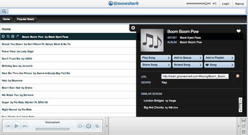
Modal windows, the descendent of annoying popups, are being put to great use all over the Internet. Examples range from using them for simple functions like replacing a dedicated login screen to creating a single-page website that uses modal windows to provide additional content. And there are plenty of usages that fall somewhere in between. Below are some examples of great modal windows that showcase some excellent uses. In addition are some tutorials and plugins to help you create your own. The Typographic Desk Reference uses a simple modal window to view interior pages of the book. It's another simple but effective example, and allows the site to be a single page while still providing plenty of information to potential buyers.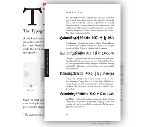


How To Create Modal Windows »
- Modal Windows in Modern Web Design from Smashing Magazine
- Simple jQuery Modal Window Tutorial from Queness
- Lightbox Gone Wild from Particletree
- fumodal for jQuery from fudini.net
- 20+ Ways to Create Javascript Modal Windows and Dialog Boxes from Design Label
- GreyBox from Orangoo Labs
Sliding Layouts
Sliding layouts are most commonly used to create sites that exist on a single page, where navigation causes the page in one direction or another to a new section (rather than linking to a new page). Effectively, this means that an entire website can be built on a single page, speeding up a user's experience. They're also implemented to show additional information under a topic heading or other subject. This type most often pushes content on the page out of the way when they're expanded, but don't actually move to a new section. Below are some examples of great sliders that showcase some excellent uses. In addition are some tutorials and plugins to help you create your own. Viget Labs is another site that uses sliders to keep all of their content on a single page. But this time the entire page slides left or right to show new content. They also use a number of other, smaller sliders within in the site to provide even more information. Overall, it's a very slick interface.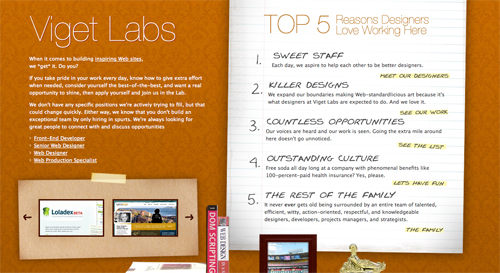
How To Create Sliding Layouts »
- Sliding JavaScript Menu Highlight 1kb from Leigeber.com
- Sexy Sliding JavaScript Side Bar Menu Using Mootools from Andrew Sellick
- Scroll Your Internal Links Smoothly from mad4milk
- Animated Collapsible DIV v2.2 from Dynamic Drive
- Accordian from Mootools
- Fx.Slide from Mootools
Hover
Hover effects are often used to provide additional, useful information without cluttering up a page. Some uses include showing additional information about a file download, a preview of a project or another page, or simply to highlight an element. Below are some examples of great hover effects that showcase some excellent uses. In addition are some tutorials and plugins to help you create your own. Legwork Studio uses hover in their portfolio to give a preview of their work. When you hover over a project name, not only does it highlight the name, it also displays a modal window with an image of part of the project. It's a great way to give a brief overview of their work without requiring users to click through to each separate project page.

How To Create Hover Effect»
- How to Create a Block Hover Effect for a List of Links from Smiley Cat Web Design
- CSS Link Hover Effects (aka Rollovers) from IfYouCodeItTheyWIll.com
- Animate a Hover with jQuery from Timothy van Sas
Slideshows
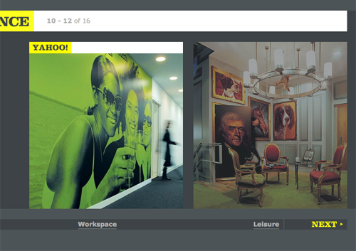
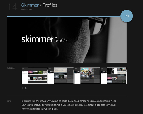
Slideshows are most often used to display portfolios or similar content, though there are other uses. The key to an effective slideshow is to make it relevant to what your visitors are looking for, whether that's your portfolio or something else entirely. Below are some examples of slideshows windows that showcase some excellent uses. In addition are some tutorials and plugins to help you create your own. FreeAgent uses a slideshow to show visitors the different kinds of people using their app. It's a simple but effective use, with obvious "next" and "previous" controls, along with a tabbed navigation for checking out each image.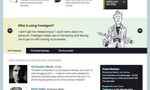


How To Create Slideshows»
- 30 Scripts for Galleries, Slideshows and Lightboxes from Smashing Magazine
- Ajax Slideshow Gallery Plugin
- XML Based Ajax Slideshow from Greepit!
- 35 Scripts for Galleries, Slidshows, and Lightboxes from I Love You WP
- Smooth Gallery from JonDesign
Embedded Audio and Podcasts
Podcasts and other audio content are becoming incredibly common place online. So many designers miss the opportunity these kinds of content provide for creating unique user interfaces. Whether it's simply offering up more than your standard MP3 or iTunes download or creating a completely custom UI for listening, there are plenty of ways to make the audio content on your site stand out. Below are a few examples of great embedded audio and podcasts that showcase some excellent uses. In addition are some tutorials and plugins to help you create your own. Shaun Inman embeds audio into his site between earbuds, allowing the content to be immediately identifiable without any obvious labels.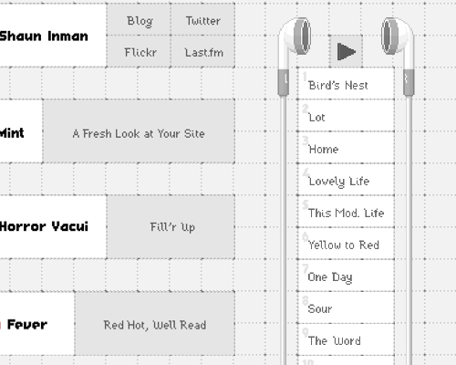


- Beatbox - Slick jQuery Animated Audio Portfolio from ThemeForest.net
- Making a Podcast from iTunes
- Podcast Suite for Joomla!
- Streampad Audio Player for WordPress
- podPress for WordPress
Search
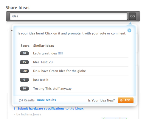
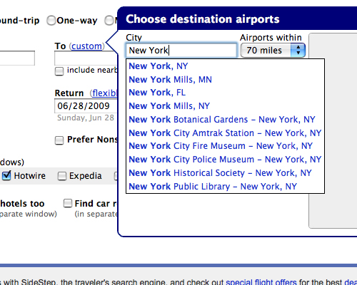
Most sites have a basic search box somewhere. But search is another one of those areas that's often overlooked by designers. There are tons of different ways to make search more useful and more user-friendly if you'll only take the time to do so. Below are a few examples of great search features that showcase some excellent uses. In addition are some tutorials and plugins to help you create your own. Footnote uses modal windows for offering more information when performing a search. Again, using modal windows for providing additional content without new page loads is a popular theme.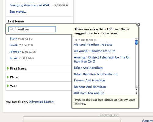


- HOWTO: Animated Live Search from OrderedList.com
- CakePHP Livesearch from Justkez.com
- Sikbox: Add Live Search Box on Your Website from Jowki
- Live Search Explained from JustAddWater.dk
- Live Search Popup plugin for WordPress
Tabbed Navigation
Tabbed navigation is more intuitive than most other types of site navigation. A tab suggests moving from one page to another, as you would if you used a tab within a notebook. But tabs don't need to be limited to the regular horizontal variety (though those are still very effective). There are tons of other options for using tabs, including outside of your main navigation. Below are a few examples of great sites with tabbed navigation that showcase some excellent uses. In addition are some tutorials and plugins to help you create your own. Outlaw Design Blog uses oversized tabs for their primary navigation. It's immediately apparent to new visitors and extremely effective.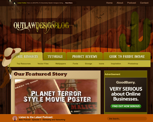


- 50+ Nice Clean CSS Tab-Based Navigation Scripts from Hong Kiat
- Sliding Doors of CSS from A List Apart
- Tabbed Navigation Case Study from JakeO.com
- 56 CSS Tabs and Navigation Menu Scripts and Examples from TechFlaps
- Tabbed Navigation, and What Makes it Useful from UX Booth
Author: Cameron Chapman
Cameron Chapman is a writer, blogger, copyeditor, and social media addict. She's been designing for more than six years and writing her whole life. If you’d like to connect with her, you can follow her on Twitter or at her Personal Website.Write for Us! We are looking for exciting and creative articles, if you want to contribute, just send us an email.
I’ve been looking for some tips on how to produce really effective user interfaces – there’s some excellent advice here, thanks!
looking for good design for video sharing site for learning purpose with personalization feature.
Some of those are really cool. Most of those effects I have seen as I have browsed the web but it’s nice to have them all in a quantifiable list. Thanks for taking the time to put this together. It must have taken you a while. Great work.
Thanks for this collection! I specially liked the fact that you combined different examples with links to the sites AND links to tutorials.
Just one small thing: these aren’t 7 “user interfaces”, but 7 ui patterns. A ui is the complete set of controls and displays of the whole application, a pattern a solution to a specific problem.
But don’t get me wrong – you helped me a lot with this post! Thx!
fantastic inspirational information..
thanks cameron
Thx,nice collection, I love Volll design.
These are some nice ideas. And that you didn’t split this feature up over 21 different pages is to be commended (thanks).
Numero Uno post on creative UIs! Kudos girl, wonderful coverage of nex-gen UIs. Only if I can get some design sense ( I am a developer!) , I can put them into practice in various applications. Thanks again!
Some inspirational sites there. Thanks
great collection and tuts, awesome! i more like volll creative interface design. great job girl, thanks.
great post
it’s really nice explanations, examples and resources
thanks for share them
adeux!
Gr8 article…loved it
this is an awesome collections. thanks!
I was into developing a web application and i had little time to spare for these user interfaces . I initially used some free css template but now i would like to design my own interfaces .
Thanks !
Loads of good stuff, thanks for the sum up.
One question. Would somebody have a nice tutorial to recreate BART’s nav cross browsers ? I’ve been trying to find some clean stuff but in vain so far.
Thanks
greg
Good collection, one of the design I especially like is the Squared Eye site, really good typography and choice of colors.
MPC
Really a wonderful collection. Worth a stumble from me.
Very Interesting and inspirational and needs to be bookmarked, in modal windows i liked Nasi Briyani Lounge. It not only less annoys the visitors but also doesnt takes much place, hope visitors sees the websites in background am i right? I do have seen some of them.
Excellent tips. Really like the Modal Window concept, it is the least intrusive for users and provides a rich experience.
Simply loved this post. Great info. The examples tht you shared were awesome
Impressive. Cheers to Cameron. Nice example of the latest web trends.
Really a wonderful collection. Worth a stumble from me.
thnxx for dis awesome info ive been searching them from weeks thnxxxx…..
nice,very good thanks alot
You never miss the noupe till the blog.. err.. maybe I should have given that a little more thought
thanks a lot bro.
can try these things n my new theme :)
i know some of them. but now u mentioned a lot more of similar sites.
great job there.
thx for sharing.
Wow! Thank you for this! First visit here and I love it!
Great resources and creativity. Thanks a great deal for sharing!
Thanks for these, of them all im most likely to look further into tabbed navigation.
Great collection. Found it through a tweet…I particularly like what Danny Blackman has done with his portfolio!
Nice collection. This is one of the nice posts I have seen till date.
Really inspiring, thanks for sharing.
I only wish I had the money to pay for a custom design like these…
good thanks
Wowsome! Great to see some innovative designs :)
I was into developing a web application and i had little time to spare for these user interfaces . I initially used some free css template but now i would like to design my own interfaces . Thanks !
nice job cameron.
amazing user interface. Thanks for sharing Dax Hamman. Specially viget labs i like this very much.