
A Collection of Inspiring Blog Designs
The Blogs
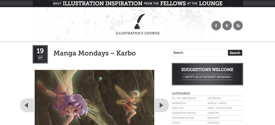
Illustrators Lounge
Illustrators Lounge uses a great monotone color-scheme that puts an emphasis on content. The charcoal covered layout is simple and clean, yet includes subtle touches of grunge, such as the watercolor splatters in the header background. The site utilizes @font-face in order to integrate some visually appealing typography in the post titles and date areas. Despite the limited color-scheme the site uses light and shadow to direct the readers eye - dark solid areas draw the eye, whilst white space is used for padding and balance.
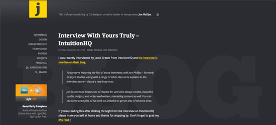
Jon Phillips
A perfect example of a wonderfully simple, elegant blog. This site proves that simple doesn't mean boring. The design itself seems effortlessly simple and clean, but is full of subtle designer touches to make it stand out. Notable examples of this include the watermarked background reading 'blog', the faint pattern/light effect in the top left corner of the page, the @font-face integration, and the underline/drop shadow css effect on the active menu state. In short, this website makes content king through a simplistic layout, yet provides plenty of 'visual dazzle' through the small touches.
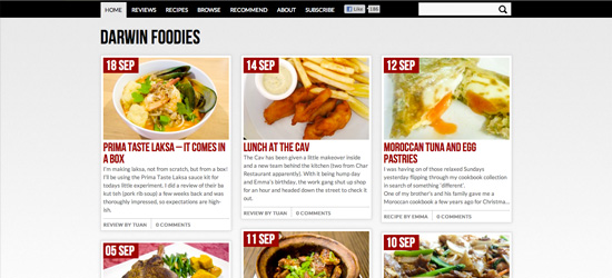
Darwin Foodies
This blog displays it's posts in a really creative way. The thumbnail style post previews fit perfectly with the site's theme, as they are easy to scan, similar to a menu. This food blog utilizes enticing pictures to draw in the reader, as well as some great hover effects (the bold rollover 'read this review' really catches the eye). The menu is simple and effective, with a classic active menu state clearly depicting the current page.
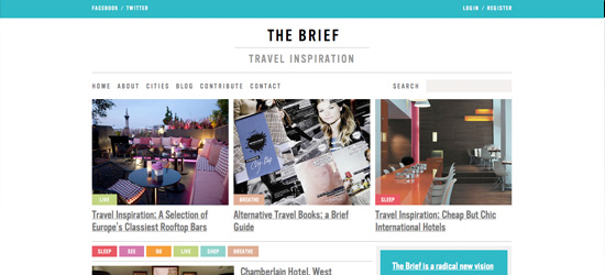
The Brief
The Brief is a great travel blog with a highly unique design. The site's content is split into clear categories, which are then organized via a series of colorful tags (e.g.: 'sleep', 'see' 'do'). These categories names are more intriguing than most blogs and really help draw in the reader, through the emotive connotations. The typography is clean and elegant, using plenty of kerning for a classic look. The multicolored layout is held together well by the most prominent blue/gray combination.
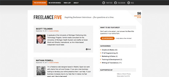
Freelance Five
FreelanceFive is bold, clean and simple. The combination of very dark gray, orange and white is classic and effective. The content is well padded and feels very well balanced, avoiding the cramped feeling a lot of blogs have. As the brightest color, orange is used to draw attention, particularly on calls to action (e.g.: 'be interviewed)'. The site has stuck to the basics, removing any clutter and focusing on key content only. This makes it a pleasure to browse, and you never feel lost. The tagline 'Inspiring freelancer interviews - five questions at a time' is succinct and informative, and provides a great welcome for new readers.
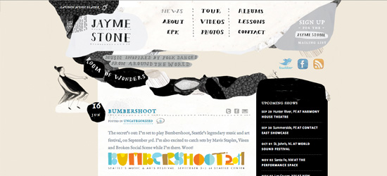
Jayme Stone
A highly creative blog, the header design of this site is incredibly eye catching. The handdrawn style instantly sets a homey, artistic feel for the blog, and the sketchy typographic menu just begs to be explored. The post content is somewhat cleaner in it's presentation, yet still includes subtle artistic touches such as the typography and faint watercolor smudges behind the post dates. The black on white design provides plenty of contrast, which is used to help distinguish content areas.
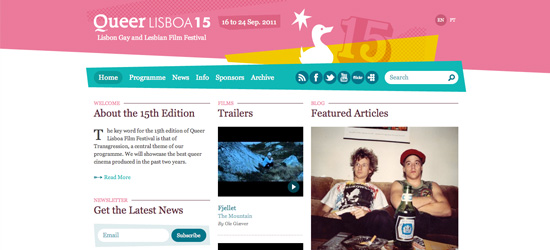
Queer Lisboa
This film festival site uses a reasonably standard layout, but is made much more interesting through it's vibrant color-scheme and abstract diagonal lines. The header has a somewhat retro feel to it, using simplistic illustrations and patterns to add a creative touch. The content is expertly laid out, giving the site a really airy, well padded feel, whilst still dealing with quite a high volume of content. The visual hierarchy is very effective, drawing the eye down the page, from the logo, to the menu, to the post/section headings.
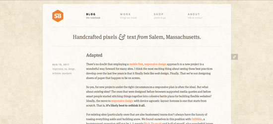
Simple Bits
SimpleBits has been a forerunner in the web design scene for years now, and they've always inspired simple, clean designs. Their latest iteration is no different, and is simplicity encapsulated. The design is largely based on great typography and visual spacing, yet this is beautifully framed by a subtle grungy background. The limited use of color is used to highlight links, whilst the menu consists of just four basic items. A wonderfully balanced website consisting of earthy hues and elegant fonts.
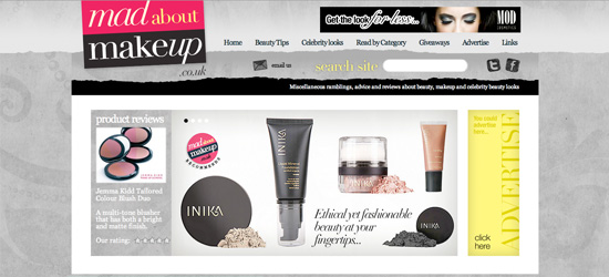
Mad About Makeup
Made About Makeup have used a really creative design for their blog. Everything about the design screams style and fashion. The charcoal background design is full of subtle marks and shapes, and provides a great frame for the central layout. The prominent product reviews area uses an animated jquery content slider, and is evocative of high-end fashion ads. The design uses plenty of subtle design touches such as ripped paper edges, wrap around heading areas and text drop shadows. Overall the pink, black and gray design works really well, with a large amount of content being displayed in a restrained, professional fashion.
Pelican Fly
One of those sites where it pays to delve into the subpages. Each page of this blog is like a work of art. The elegant typography and experimental HTML5/CSS3 features make it a joy to browse. The art is really in the details, and once you begin to notice the hover effects, indentations of content and text presentation you'll really be inspired by this design. Not to be justified by a simple screenshot, click through and explore!
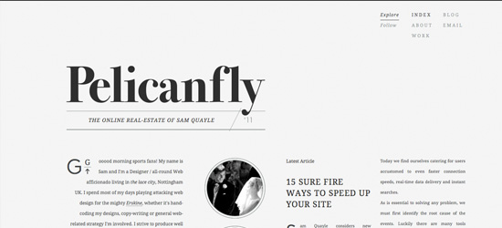
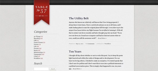
Table 37
Another clean and simple blog design with a lot to offer. The light gray backgrounds of this site mean that the darker typography and bright logo area really pop. The use of subtle shadows helps distinguish content areas and adds depth - particularly in the header area. Content is well padded and presented, and the stripped down approach makes the site highly usable. The content is the most prominent feature of this site, and as such you can't help but explore the blog posts on offer.
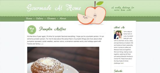
Gourmade at Home
A really light design that fits well with the foody theme. The simple illustration in the header instantly established a theme for the site, and the green color-scheme feels cohesive and relevant. As with a lot of food blogs this one is quite image heavy (after all - we apparently eat with our eyes). The post titles, sidebar headings and date areas utilize @font-face to integrate some awesome typography, and the bold orange hover effect is really eye catching.
Rogue-Dolls
Rogue-Dolls uses a really creative header as the key to their design. The charming illustration featuring multi-colored rain, combined with the umbrella logo sets the mood for a creative, unique blogger. The post layout itself is fairly basic, yet utilizes a nice heading area wrap around effective to add depth. The blue/green color-scheme fits well with the concept of rain depicted in the header, and is surprisingly impactful upon the mood of the posts and the reader.

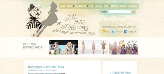
Little Miss Heirlooms
A lovely blog design, featuring some of the nicest watercolor background effects seen around. The muted, watercolor color palette feels very homemade and artistic, and fits well with the vintage, creative theme. The featured posts area is engaging and breaks up the header/post area well. This site is yet another great example of @font-face integration, and the post titles and sidebar headings look beautiful.
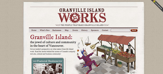
Granville Island Works
Granville Island Works uses a very retro design, featuring western style typography, and an attractive fabric style page background. The welcome area creatively overlaps a two column layout, and the hand-drawn illustration fits perfectly with the site. The color palette is limited, and constrained to earthy tones (reds, browns, creams etc...).
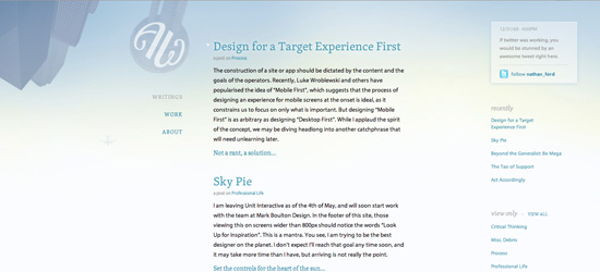
Art Equals Work
A very atmospheric, dreamy blog design. The light blue color scheme gives the impression of a skyline backdrop for the content, and the lack of harsh colors or strong contrast makes the site very easy on the eyes. Despite having multiple columns the central column containing the blog posts is clearly the most prominent, and the post titles help establish a clear visual hierarchy for the website. The subtle lighting and illustrations in the background are the key to what makes this layout so visually interesting, and the content seems to revolve around this foundation.
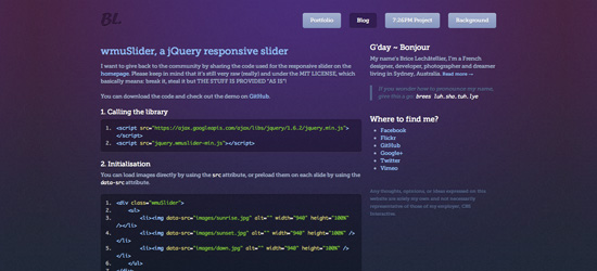
Brice Lechatellier
One of the most richly colored blog designs we've come across, this site is simply beautiful. The subtle transitions in background colors create a really engaging lighting effect, whilst the colorful content typography adds to this multi-colored treat. The navigation is simple and clear, and the indented active state makes browsing the site extremely easy. The logo is very faint, a mere indent in the top left corner of the page, yet it serves to represent an elegant, understated brand.
Riyuu
A soft, girlish website that captures the personality of the blogger perfectly. The fun illustrations add a lot of creativity to the page, and the various colors comprising the design are cohesive and well selected. A clear visual hierarchy is established as the eye is drawn down the page from the logo to the various blog post titles.
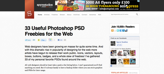
Spyre Studios
Spyre Studios is a really clean, well designed blog that makes excellent use of padding and a limited color palette. The limited colors of the site ensure that the content is the focus, something which is further emphasized through the use of large typography (see the blog post titles). They also have a great area in their footer which conveniently displays their latest freebies and community news.
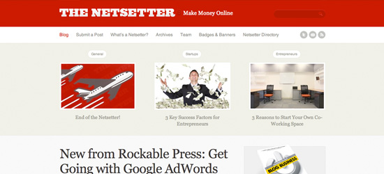
The Netsetter
The Netsetter is now obsolete (although it's moved to a blog column at Work Awesome), yet in it's day was a well loved blog with an awesome design. The clean, bold, red design helps establish the site as a brand, whilst some very large typography makes the posts engaging and eye catching. The site is incredibly pleasant to browse, and it's very easy to find the content that you're after. The top featured post area is particularly eye catching and really helps draw you into the inner content pages of the site.
The CP Diary
A very emotional blog, as Jesse writes about her experiences living with cerebral palsy. The blog itself is beautiful, and the welcome area is not only emotionally engaging, but visually engaging. The artful typography used for the headings and subtle lighting effects throughout the site really set this blog apart and make it something truly special.

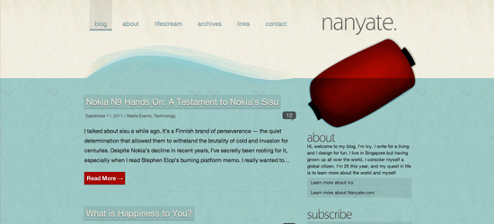
Nanyate
Nanyate is a wonderfully creative blog, with a great illustrative background design. The vector background sets the mood for the rest of the site, wherein the blog posts appear to be underwater. The colors are bold, but limited, and work well together. The menu is very simple and makes the site easy to browse. Each blog post uses a bright red call to action button ('Read More'), which helps draw readers in.
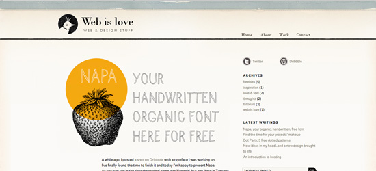
Web is Love
A very understated, charming design. The paper textures that comprise the background add a nice artistic feel to this blog, as does the earthy color-scheme. The content has plenty of padding and is pleasant to browse through. I recommend that while you explore the site you check out their free font 'Napa' as it's awesome!
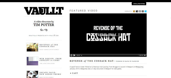
Vaullt
A great monochrome blog design with a strong logo and featured area. The typography is the crowning achievement of this blog, and it's applied with expert precision. Every letter spacing, line spacing, color and word placement seems to have been well thought out. The video area also has a great 'overlay FX' option, with some snazzy coding going on!
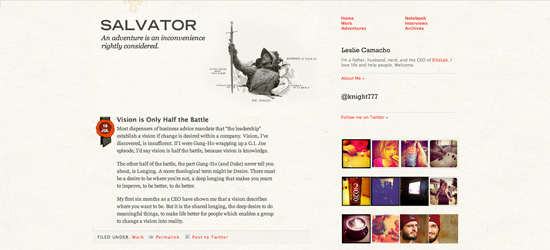
Salvator
Salvator is simply background design done right. The background is so subtle that you hardly notice it, and it doesn't get in the way of the content. However, it adds a huge amount to the site, providing texture, depth and detail, and is much more effective than a plain background would be. The sketchy photo manipulation in the blog header adds another touch of creativity, and the splashes of red throughout the site help tie everything together nicely. The content feels balanced and well presented, and the typography is really inspiring.
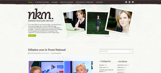
NKM Blog
Another great example of subtle background design, NKM utilizes subtle watercolor background details and a faint texture. The header area includes several photos of the blogger, positioned in polaroid fashion, to add a personal touch. The color palette for the site is limited, yet it uses touches of green to draw the eye to important areas (links and calls to action).
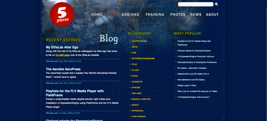
5 Pieces
5 Pieces is a bit of a classic blog, but still has some great design features to inspire us. The high contrast white/yellow on dark blue is really striking and the header graphic blends really well with the main background. The site uses several colors, yet doesn't feel overwhelming.
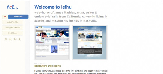
Leihu
A deceptively simple blog, this site should really be explored to see what it has to offer. There are tons of great touches to the design, such as a multi-colored menu hover effect, awesome menu active state, really nice image hover effects, and a cool 'top of page' slider effect. Overall the design is clean and beautifully designed. The font choices and colors all feel 'soft', making the site a really pleasant browsing experience.
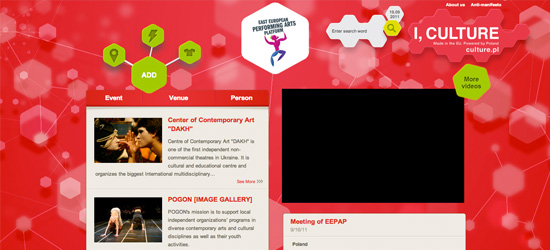
EEPAP
A really bold and bright blog design, with a vibrant red background. The site has utilized abstract shapes to create a more unique experience for visitors. The green menu feels very interactive, as you're encouraged to explore the creative icons. The bokeh background effect is a little busy for some, yet does create additional depth for the design.
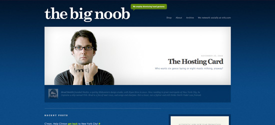
The Big Noob
The Big Noob is a well known and respected blog, in large part due to it's innovative design. The site uses some great typography which is laid over a rich blue gradient background. Splashes of lime green are used to accentuate calls to action, whilst white is used for a second accent color. The large welcome area includes a rotating intriguing image aimed to draw people further into the blog.
Nice roundup! I’m really digging the Granville Island Works design. Great use of texture. And the Mad About Makeup design is sweet!
I’m really loving the designs of The Brief and Art Equals Work. Thanks for the post, and thanks for featuring my blog as one of the designs! :D
Thanks a lot for the mention Tom, much appreciated ;)
Thanks for putting these beautiful designs. I love designs that are simple, clutter free, and these are the best inspiration for such design, Also the illustration at some are well put.
I really like this kind of post. Putting the reasoning behind the selection instead just putting the selection. Good work. Thanks for this.
Not quite convinced by the picks here… To each his own I guess but I see a lot of emphasis on minimalist design and most blogs don’t make me go “wow”.
Not a fan of the Jayme Stone site, but otherwise a good list
really inspirational..keep doing the good work…thanks
Hi Tom,
Thanks for the feature and your very kind words. Please feel free to pay us a visit anytime.
Kindest regards,
The Illustrator’s Lounge.
Some inspirational designs here! My fav are Pelican Fly and Art Equals Work. Thanks for featuring my blog as well. I’ve recently changed my theme though.
this is very helpful thanks
Too light, well most of them, I like alot of color, darker ones in my blogs!
Those are nice blogs, i like you website too, thanks Tom !
Great list Tom and thanks for featuring Freelance Five! Your write up captures exactly what we were aiming at with the design.
Thanks for the mention, we are so happy that others like our blog as much as we do!
:) We’ve just tweeted about your article and are truly grateful!
Great group of blogs! Love your blog design as well :)
Very nice
These are really clever blog designs. Thanks for the showcase. It’s really lovely.
thank you.. i like your posting..