
A Graphic Design Primer, Part 3: Basics of Composition
In the first two sections of this primer, we covered the basic elements of design, and the basic principles of design. In this section, we'll cover the basic principles of composition.
There are a variety of different composition theories you should familiarize yourself with. Since this is just a primer, there's a brief overview of the most common and important theories. You'll want to study each in more depth before putting them to use, so we've included some additional resources for each.
 Jamie Brown's website has a similar single visual design:
 If you're interested in designing websites according to the Golden Ratio, you may want to check out The Golden Grid, which was built with the ratio in mind.
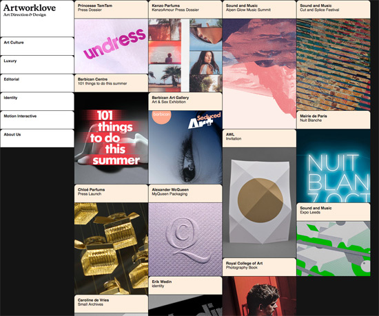
 Artworklove is another example of a grid-based design, with very specific vertical alignment:
 Effective use of closure leaves the viewer feeling more involved with the design, as they become an active participant, rather than just an observer.
 There are a few visual cues that help indicate similarity between items: size, shape, and color are the three most common.
 Proximity can either reinforce or counteract similarity among items.
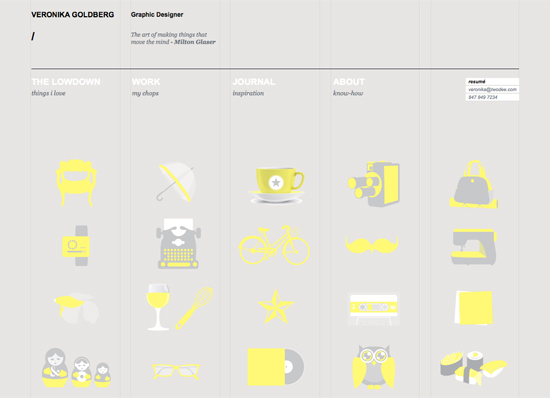
 Veronika Goldberg's site offers a great example of centered alignment:
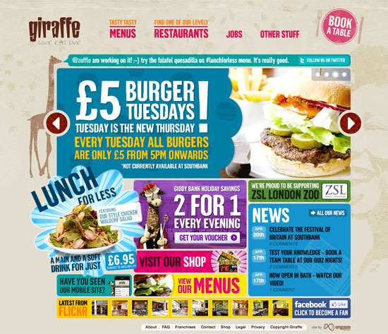
 The Giraffe website has overlapping elements in their grid-based design:
 Another example of a Z-shape:
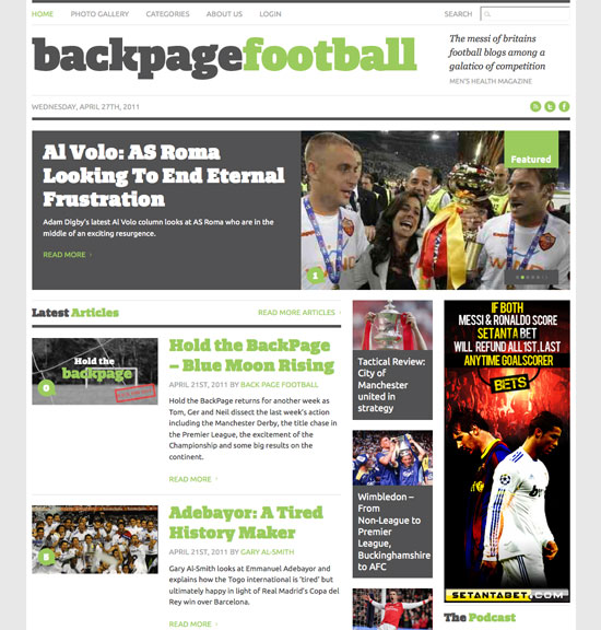
 The Backpage Football site is a good example of an F-shaped design pattern:
Single Visual
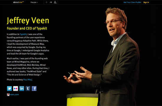
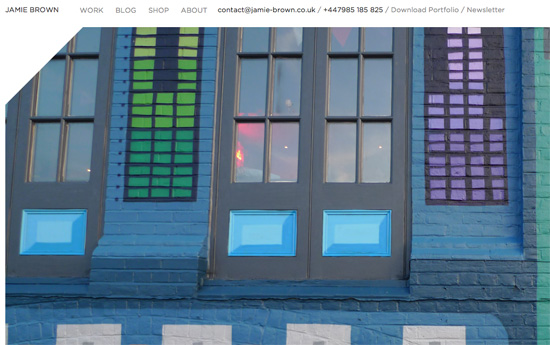
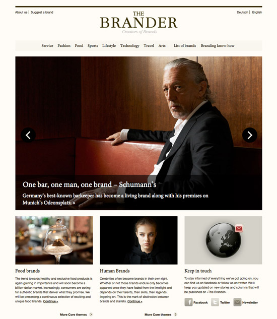
The single visual method of composition is where a single, generally striking, visual image is used as the basis of the design. This is sometimes seen on single-page websites, or more commonly in print design. The single visual pattern is the easiest composition to successfully achieve. Pick a strong image and let it do the bulk of the work for you. The key here is to make sure that other elements of your design (in most cases, the typography is the other major element of the design) support and reinforce the main visual, and don't try to compete with it. Sites like those created on About.me are a great example of the single-visual composition pattern.
Jamie Brown's website has a similar single visual design:
The Divine Proportion
The Divine Proportion (also known as the Golden Ratio, Golden Spiral, Fibonacci Spiral, Golden Rectangle, or Phi) is approximately 1:1.618. It's a ratio that is found throughout the natural world in the proportion of various things to one another. Placing elements along the lines created by the Divine Proportion If you're interested in designing websites according to the Golden Ratio, you may want to check out The Golden Grid, which was built with the ratio in mind.
The Rule of Thirds
The Rule of Thirds is sometimes confused with the Divine Proportion, but they are not the same. The ratio present in the Rule of Thirds is 1:1.667. In effect, though, it can serve as a sort of "lazy man's" Divine Proportion. Most commonly, the Rule of Thirds is seen in photography (many cameras have built-in composition grids that follow this rule) and fine art, though it's also regularly seen in graphic and web design.Resources:
- Divine Composition With Fibonacci's Ratio (The Rule of Thirds on Steroids) - from Digital Photography School
- The Rule of Thirds and the Golden Ratio Are Not the Same Thing - from 3.7 Designs
- The Lazy Rule of Thirds - from JakeGarn.com
Focal Point
A focal point gives viewers of a design something to look at. It adds a sense of direction to the design, and can act as a grounding point for visitors. Every design should have a focal point of some kind. This could be an image, a bit of typography, a button, or something else entirely. Think carefully about what your focal point will be. It should directly relate to the purpose of your design. If your site's goal is to sell something, then you may want to make sure your call to action is the design's focal point. If the goal of the site is something else, think about what makes sense as the focal point in relation to that goal. The large typography is the obvious focal point here:
Grid Theory
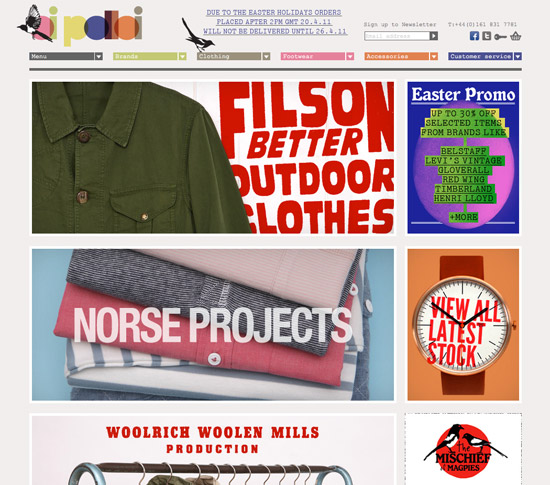
Grid design is probably one of the most familiar design patterns for many graphic and web designers. Grids add structure and order to designs, and can be a useful method for achieving good proportion among elements in your work. There are a huge number of grid frameworks out there (including both fixed and fluid grids). Some sites designed within a grid framework are obviously grid-based, while others are more subtle. In either case, though, a pre-defined grid can add a sense of pre-meditation to your designs that makes them cleaner and more refined. The Oi Polloi site is a great example of an obvious grid design:
Artworklove is another example of a grid-based design, with very specific vertical alignment:
Resources
- Grid-Based Design: Six Creative Column Techniques
- Designing With Grid-Based Approach
- Beyond the Grid: With Grid Based Web Design - from OneXtraPixel
- 24 High Quality Free CSS Frameworks - from Webification
Gestalt Principles
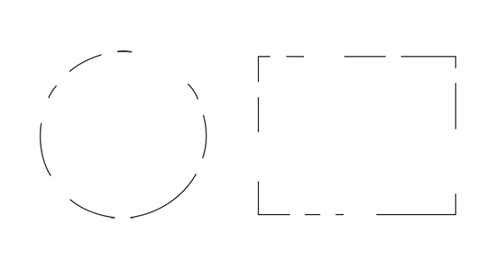
Gestalt is a German word meaning "whole". In relation to design, it's a study of the behavioral and psychological processes of people, and their visual perceptions of things. In other words, it's a set of scientific principles for how the visual design of something has a direct psychological impact on the viewer. Gestalt can be broken down into five distinct principles: closure, similarity, proximity, continuance, and alignment. Understanding and using these principles can help you more effectively control the emtional and intellectual reactions people have to your design.Closure
Closure is the idea that your brain will fill in missing pieces in an image. For example, with a dotted line forming a circle, your brain recognizes it's a circle, even with big chunks of the line missing. Simple shapes and images are the most easily recognized, but more complex images can also benefit from closure if they're familiar (faces are one such example). Effective use of closure leaves the viewer feeling more involved with the design, as they become an active participant, rather than just an observer.
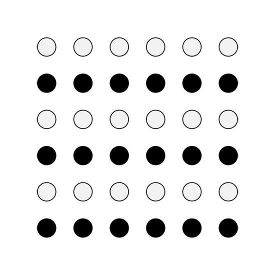
Similarity
When too much visual information is presented, the brain naturally tries to group that information to make sense of it. Similarity is the idea that these groupings are often done based on what something looks like, regardless of any similarity beyond superficial appearance. There are a few visual cues that help indicate similarity between items: size, shape, and color are the three most common.
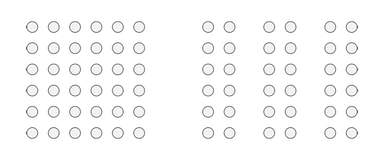
Proximity
The proximity of items—how close they are to one another—is an important psychological indicator of relationships. Items in close proximity are going to be perceived as related more closely than items that are further apart. Proximity can either reinforce or counteract similarity among items.
Continuance
Continuance is the principle that once you start looking in a direction, you'll continue to look in that direction until something significant catches your eye. There are a few different ways to achieve continuance. First, if a person in an image in your design is looking in a particular direction, visitors to your site will be drawn to look in the same direction. Paths in an image can also direct the eye in a particular direction. Things like roads, lines of trees, or other similar paths all direct the eye. Perspective does a similar thing, directing your eye toward a focal point. Continuance can be used to direct a visitor's attention to a specific element on your website.Alignment
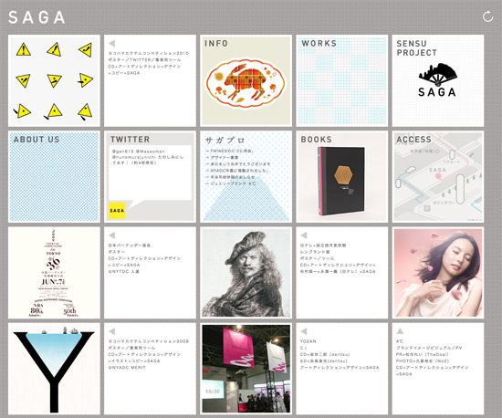
Alignment is such an obvious composition principle that it's often overlooked. But there are different types of alignment, and each can be used for different effects. Edge alignment is when shapes or elements are aligned based on their edges. Edge alignment is most commonly seen among simple geometric shapes like rectangles or triangles. Center alignment is when elements are lined up based on their centerlines. This type of alignment works better with irregular shapes, though it can be used with simple geometric shapes, too. Overlapping or inserted elements are another method of alignment, and are often seen in design (think of photo layouts where the images overlap one another for the most obvious example). The Saga website is a great exmaple of edge alignment:
Veronika Goldberg's site offers a great example of centered alignment:
The Giraffe website has overlapping elements in their grid-based design:
Resources
- Gestalt Principles Applied in Design - from Six Revisions
- The Gestalt Principle: Design Theory for Web Designers - from Webdesigntuts+
- Using Power Structure and Gestalt for Visual Hierarchy - from Six Revisions
Z Layout
The "Z" Layout is based on common eye movement patterns. Eye-tracking studies have shown that people generally look at a website or other design in a roughly Z-shaped pattern (starting at the upper left, moving across the screen, scanning to the bottom left, and then reading across to the right again). Since this is a natural pattern, it makes sense to align important elements of your design along these lines. A similar pattern is the F-shaped layout. It's a similar concept, that people read the top line first, and then work their way down the page, scanning less of the content to the right as they go. A great example of a Z-shaped layout:
Another example of a Z-shape:
The Backpage Football site is a good example of an F-shaped design pattern:
Resources
- Understanding the Z-Layout in Web Design - from Webdesigntuts+
- 3 Design Layouts: Gutenberg Diagram, Z-Patter, and F-Patter - from Van SEO Design
- Understanding the F-Layout in Web Design - from Webdesigntuts+
Nicely organized and written primer. Oh, and it feels good to leave the 1st comment. Usually, I get to articles 2 weeks later :)
Great Article, just one thing does this apply to designing for print as well or for web designing only.
Where do I get the other 2 Articles Part 1 & Part 2 is it still available
still learning
thanks
Good stuff, and it’s always good to be reminded. Thought you might have put something about space in there?
Great article as all the series, gives a very clear look at one place.
nice article thank you. i’ve not heard of the term f-shaped before.
The “single visual” layout would be AWESOME for presentations! My head is spinning with ideas!
For F patterning and eye-tracking studies, there is some very interesting info on the useit site by Jacob Nielson’s web usability group:
http://www.useit.com/alertbox/reading_pattern.html
I love this series. So many designers – and developers that may need some help with design – could use this.
I never realised how many psychological elements were involved with design. Its definitely given me a lot to think about for the next web project I carry out. I’d only ever heard of the Z-shaped path of visual focus before. Hopefully it will reduce bounce rates by applying some of the bits you’ve spoken about!
This is a very very basic “primer” that really glosses over a lot of key components. I would recommend people research these individually.