
Color Theory and Typography: The 10 Commandments (Infographics)
Life as a designer is far from simple. Although the word "designer" in itself is fairly short and people do have a decent assumption of what such a designer actually does, reality is much more complex. I know we all got cupboards full of literature and other than others we don't just need to learn in perpetuity, but indeed permanently, continuously. Thus, it is much appreciated to be served small pieces of information in a visual and comprehensive way, without the need for digging up that 1,000 pager again. The following two tables of 10 commandments (each) by DesignMantic are of this kind. I actually printed them out and put them under my desk pad...
 (Source: DesignMantic)
 (Source: DesignMantic)
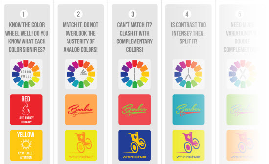
The 10 Commandments of Color Theory
Color theory is one of these topics. Rarely anyone actually learns or even cares about it. Your client is totally unscrupulous anyway and will demand color mixes, you'd reject even without any professional knowledge. It's difficult. The 10 commandments of color theory might be able to cool down one or another heated discussion about the attractiveness of combining green with pink and red stripes in the customer's brand logo. The list of commandments starts with the emotional impact of the color choice and moves through all the important topics down to the explanation of the different color spaces. I expect the list to be very helpful in a lot of customer briefings. It is comprehensive and attractive. Customers will like it. Following I show you only a massively down-sized version of the 10 commandments. Click on it and we'll take you over to DesignMantic, where they have a much larger version in place: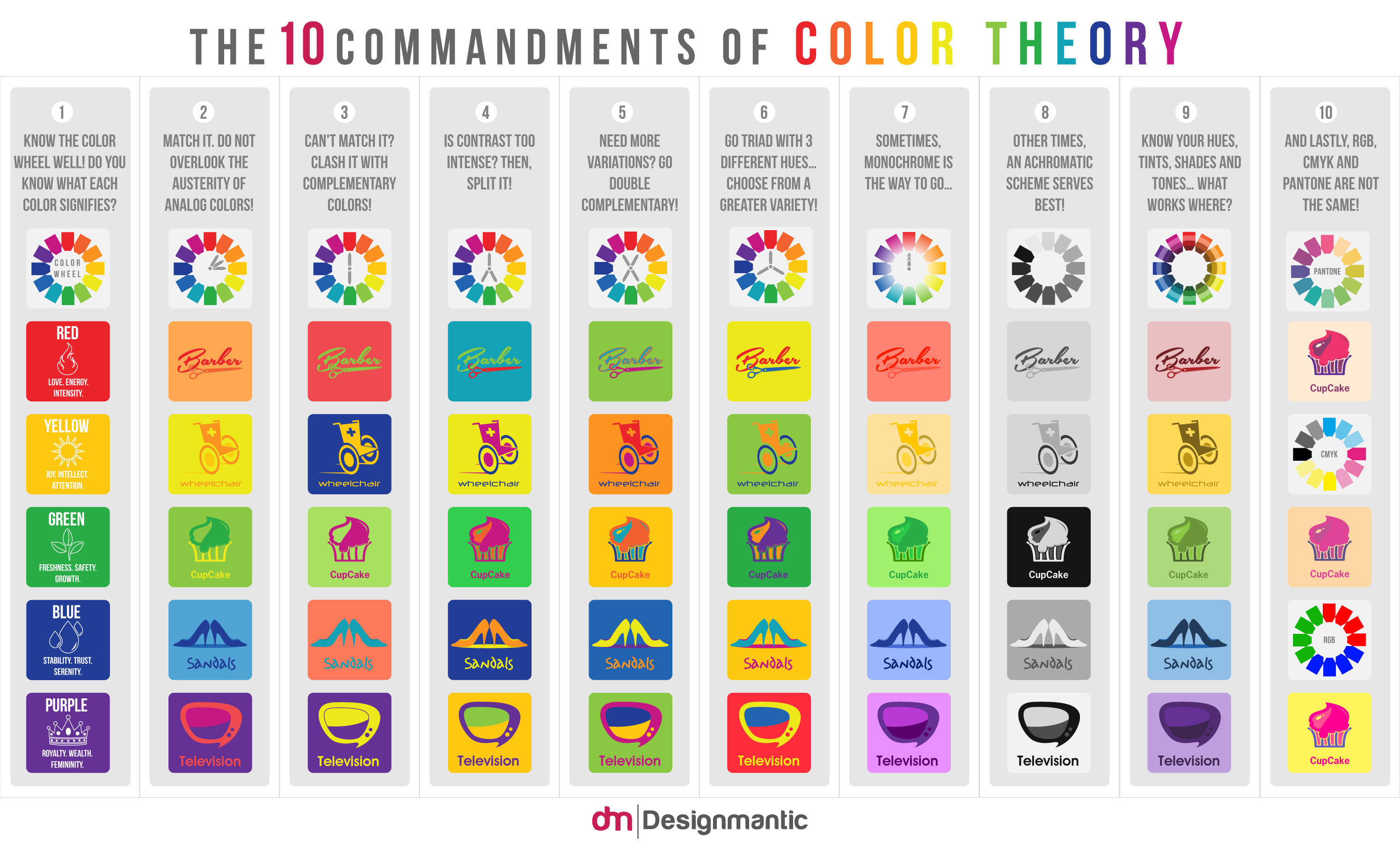 (Source: DesignMantic)
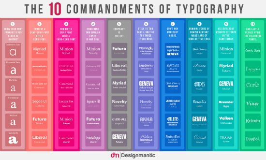
The 10 Commandments of Typography
Typography, another one of these topics. If you've ever seen a Powerpoint presentation, regardless of who put it together, you are exactly aware of what I'm talking about. Even high-profile top managers are not invulnerable to bad taste. Do you know any of these people? Print out the 10 commandments of typography and they'll immediately improve, as it is no rocket science to avoid at least the biggest mistakes. The 10 commandments start with the different font families to distinguish, show serif and sans-serif, advise you to not mix different too heavily resembling fonts and go as far as to rightfully ask you to never use the good old Comic Sans or Papyrus or Kristen... Following I show you only a massively down-sized version of the 10 commandments. Click on it and we'll take you over to DesignMantic, where they have a much larger version in place: (Source: DesignMantic)
Nice collection, thx for sharing.