
Design Trend Hero Images: The Bold Way of Using Images
Currently there are two seemingly contrary trends in web design. On the one hand, websites become more minimalistic - less colors, clear fonts and simple shapes. On the other hand, large-sized, full page images - so called hero images - are becoming more and more popular. Sounds strange, but in the end only appears to be contradictory. At second glance, both trends complement each other very well. Of course, this only applies when they are used both in a sensible way and even more importantly with an expressive image.
 Source: ErikaWittlieb on Pixabay
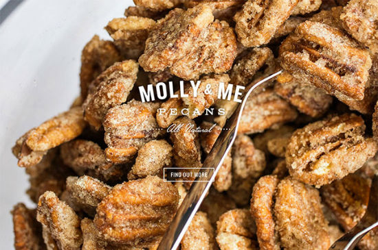 Website of „Molly & Me“ from South Carolina
The website of "Molly & Me", who sell products made from pecans, uses a hero image to impressively present its product. Logos, writing and link buttons are kept completely white. You can also see another new trend here, as a ghost button is employed.
Instead of putting the products front and center, you may also use the employees - or the team - of the company for the hero image.
Website of „Molly & Me“ from South Carolina
The website of "Molly & Me", who sell products made from pecans, uses a hero image to impressively present its product. Logos, writing and link buttons are kept completely white. You can also see another new trend here, as a ghost button is employed.
Instead of putting the products front and center, you may also use the employees - or the team - of the company for the hero image.
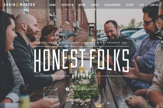 Agency „Grain & Mortar“
The design agency "Grain & Mortar" from Nebraska presents themselves via hero image as down-to-earth and likable team - including rustic wooden table, table decorations and beer.
In contrast to many other websites, the agency from Nebraska impresses with individuality and forgoes classic desk motives, which are quite frequent in the design sector. For that, they accept that it is not immediately apparent what can be expected from this website. Grain & Mortar could just as likely be a construction company.
Agency „Grain & Mortar“
The design agency "Grain & Mortar" from Nebraska presents themselves via hero image as down-to-earth and likable team - including rustic wooden table, table decorations and beer.
In contrast to many other websites, the agency from Nebraska impresses with individuality and forgoes classic desk motives, which are quite frequent in the design sector. For that, they accept that it is not immediately apparent what can be expected from this website. Grain & Mortar could just as likely be a construction company.
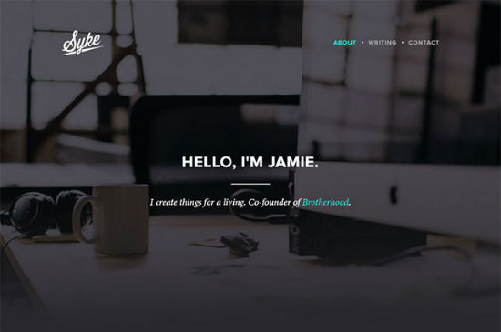 Website of the designer Jamie Syke
Although the website of the designer Jamie Syke shows the classic desk motive, it appears much more individual due to its perspective and features. The color scheme and low-contrast of the picture make it less in-your-face than the previous examples.
Website of the designer Jamie Syke
Although the website of the designer Jamie Syke shows the classic desk motive, it appears much more individual due to its perspective and features. The color scheme and low-contrast of the picture make it less in-your-face than the previous examples.
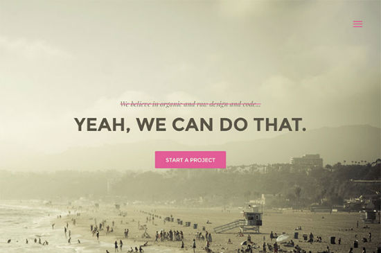 Agency „Alto Labs“
The company "Alto Labs" relies on a more restrained hero image. The background with its muted sepia colors is brought to life especially due to the pink graphic elements of the foreground. The image statement of this design is questionable, however. What is the meaning of "Yeah, we can do that"? Yes, we can go to the beach?!
Agency „Alto Labs“
The company "Alto Labs" relies on a more restrained hero image. The background with its muted sepia colors is brought to life especially due to the pink graphic elements of the foreground. The image statement of this design is questionable, however. What is the meaning of "Yeah, we can do that"? Yes, we can go to the beach?!
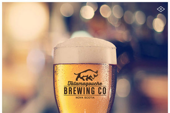 „Tatamagouche Brewing Company“
Here, the hero image, together with a small navigational icon, is the only thing the visitor gets to see. If the picture wouldn't work, the whole thing, hero trend or not, would be for nothing.
These examples show how varied hero images can be implemented and how differently the navigation may be integrated into the website. Some websites rely on an off-canvas navigation, others set the navigation into the hero image or below it. In the last case, you have to scroll down to see the navigation.
„Tatamagouche Brewing Company“
Here, the hero image, together with a small navigational icon, is the only thing the visitor gets to see. If the picture wouldn't work, the whole thing, hero trend or not, would be for nothing.
These examples show how varied hero images can be implemented and how differently the navigation may be integrated into the website. Some websites rely on an off-canvas navigation, others set the navigation into the hero image or below it. In the last case, you have to scroll down to see the navigation.
Source: ErikaWittlieb on Pixabay
Usage of Hero Images with CSS3
Technically speaking, using large-sized pictures causes hardly any problem by now. For one thing, the speed of mobile Internet is high enough to transmit even big images easily (by and large, at least). Moreover, the CSS3 feature "background-size" ensures that the background graphic always fills the whole "<div>" container or the whole viewport of the page.
div.hero {
  width: 100%;
  height: 400px;
  background-image: url("hero.img");
  background-size: cover;
}
The value "cover", for once, makes certain that the background image is not repeated and instead covers the full height and length of the "<div>" element. If necessary, the graphic is cut to size at the right and lower edges.
If you center the background image via "background-position", the cuts are made on two sides respectively, so that the center of the background image is always in the center of the element.
div.hero {
  …
  background-position: center;
}
Due to this technique, such background images can be realized without huge CSS obstacles or the usage of JavaScript.
Good Heros - Only Possible With Expressive Images
Whoever wants to adopt a hero image for his or her website should put emphasis on expressiveness and technical quality when picking out the picture. At the moment, stylish desks, preferably with Apple devices on them, are popular. Even though a lot of these images are aesthetically pleasing, they are equally random and nondescript. Unusual and individual motives are far better suited to give the hero trend an original touch. For this reason, a good mixture of memorable background image and foreground has to be created. For that, a restrained design is necessary. Oftentimes, the front - usually the logo and at times some text and the navigation - is kept as a monochrome layer over the background image. All in all, the hero image is not supposed to be cluttered or concealed by too much foreground. At the same time, logo and text still have to be legible in spite of the background image.
Website of „Molly & Me“ from South Carolina
The website of "Molly & Me", who sell products made from pecans, uses a hero image to impressively present its product. Logos, writing and link buttons are kept completely white. You can also see another new trend here, as a ghost button is employed.
Instead of putting the products front and center, you may also use the employees - or the team - of the company for the hero image.
Agency „Grain & Mortar“
The design agency "Grain & Mortar" from Nebraska presents themselves via hero image as down-to-earth and likable team - including rustic wooden table, table decorations and beer.
In contrast to many other websites, the agency from Nebraska impresses with individuality and forgoes classic desk motives, which are quite frequent in the design sector. For that, they accept that it is not immediately apparent what can be expected from this website. Grain & Mortar could just as likely be a construction company.
Subtle Heros
If you prefer a more understated approach, you can use hero images in a less intensive way. It is entirely possible to design impressive websites with low-contrast pictures or ones that are not too colorful.
Website of the designer Jamie Syke
Although the website of the designer Jamie Syke shows the classic desk motive, it appears much more individual due to its perspective and features. The color scheme and low-contrast of the picture make it less in-your-face than the previous examples.
Agency „Alto Labs“
The company "Alto Labs" relies on a more restrained hero image. The background with its muted sepia colors is brought to life especially due to the pink graphic elements of the foreground. The image statement of this design is questionable, however. What is the meaning of "Yeah, we can do that"? Yes, we can go to the beach?!
The More Conspicuous the Image, the Better It Has to Be
How conspicuous an image on a website should be also depends on the quality of the picture. Exposure, acuity, perspective and quality all have to be just right and very precise. Whoever relies almost exclusively on a hero image, like the Canadian "Tatamagouche Brewing Company", needs a brilliant picture for that.
„Tatamagouche Brewing Company“
Here, the hero image, together with a small navigational icon, is the only thing the visitor gets to see. If the picture wouldn't work, the whole thing, hero trend or not, would be for nothing.
These examples show how varied hero images can be implemented and how differently the navigation may be integrated into the website. Some websites rely on an off-canvas navigation, others set the navigation into the hero image or below it. In the last case, you have to scroll down to see the navigation.
Nice article about hero section. It would become better if there was some point about the height of hero area. Nowadays it is very common to have a full screen hero section. But there was some other that has fixed height.
Are there supposed to be links to websites in this article? Because there aren’t any.