
Design Trends in Responsive Navigation: Best Practices 2015
Responsive websites have become standard. More and more people switch from their desktop devices to mobile clients like smartphones and tablets to consume websites. If you don't want to fall behind and lose valuable visitors, it's about time to optimize your website for mobile view. Such a website provides a good and accessible navigation on mobile devices. Practically speaking, mobile navigation is one of the most important elements in responsive design, so be sure to invest adequate time.
 Mobile portrait (320x480)
 A fantastic solution for websites with few navigation items. The tabs are large enough to be operated even with gloves on.
Demo and download
A fantastic solution for websites with few navigation items. The tabs are large enough to be operated even with gloves on.
Demo and download
 Mobile portrait (320x480)
 A very unusual solution for blogs and websites with few navigation elements. By using icon fonts instead of pure graphical icons this solution becomes retina ready. What should be mentioned is that tablets show a different menu than smartphones. On tablets it's a list of layered menu items (either side-by-side or on top of each other) whereas on smartphones it extends by a click.
Demo and download
A very unusual solution for blogs and websites with few navigation elements. By using icon fonts instead of pure graphical icons this solution becomes retina ready. What should be mentioned is that tablets show a different menu than smartphones. On tablets it's a list of layered menu items (either side-by-side or on top of each other) whereas on smartphones it extends by a click.
Demo and download
 The Responsive Multi-Level Menu picks up an old idea refined with many interesting effects. Unfortunately, they can't be captured on screenshots. Therefore, I would recommend you to visit the site. You can choose between 5 different effects.
Demos and download
The Responsive Multi-Level Menu picks up an old idea refined with many interesting effects. Unfortunately, they can't be captured on screenshots. Therefore, I would recommend you to visit the site. You can choose between 5 different effects.
Demos and download
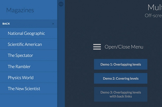 The same here. They picked up an old idea and refined it. The implementation, however, follows a well-conceived approach as the overlapping levels are designed extremely user friendly. The menu items are also large enough to be accessed with gloves on.
Demos and download
The same here. They picked up an old idea and refined it. The implementation, however, follows a well-conceived approach as the overlapping levels are designed extremely user friendly. The menu items are also large enough to be accessed with gloves on.
Demos and download
 Mobile portrait (320x480)
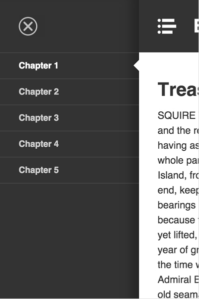 The Slideout Menu is a tutorial by our big sister SmashingMagazine.com and suits perfectly for websites that have a lot of menu items.
Demo and download/tutorial
The Slideout Menu is a tutorial by our big sister SmashingMagazine.com and suits perfectly for websites that have a lot of menu items.
Demo and download/tutorial
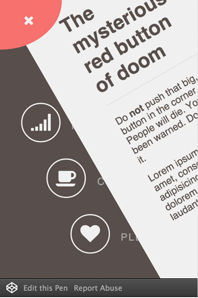
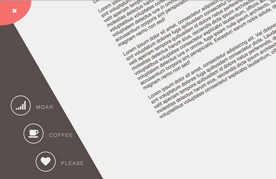 This is the most appealing solution I have come across so far. It's suitable for the desktop as well as mobile view. Unfortunately, the mobile view only shows the icon buttons whereas the writing is hidden.
Mobile portrait (320x480)
This is the most appealing solution I have come across so far. It's suitable for the desktop as well as mobile view. Unfortunately, the mobile view only shows the icon buttons whereas the writing is hidden.
Mobile portrait (320x480)
 Demo and download
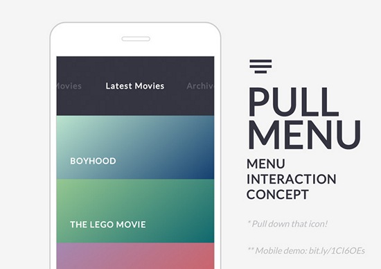
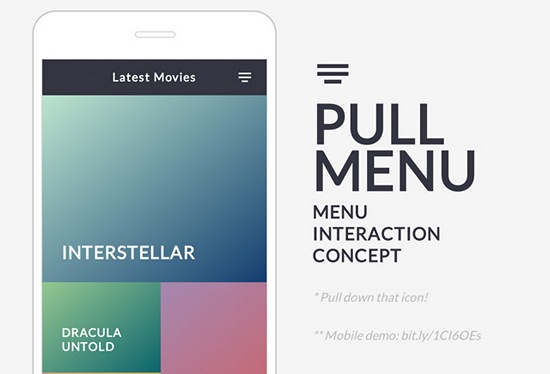 The Pull Menu offers a very interesting and innovative concept which is well implemented. Menu items can be chosen by pulling down the menu icon as far as necessary. By releasing the icon the item will be loaded.
The menu pulled down
The Pull Menu offers a very interesting and innovative concept which is well implemented. Menu items can be chosen by pulling down the menu icon as far as necessary. By releasing the icon the item will be loaded.
The menu pulled down
 Demo and download
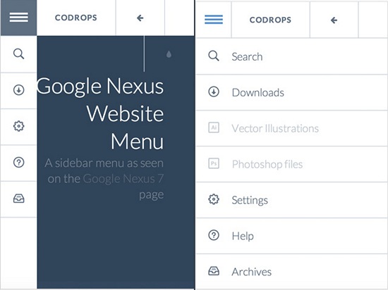
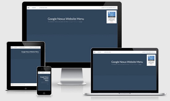 The Google Nexus Website Menu is not only a menu for smartphones and tablets but works for all screen resolutions. What makes it interesting is that you only have to add one navigation during the project's development process. By tapping on the menu item in the upper left corner, the menu slides out a bit. The full list opens when you hover over one of the items.
Mobile portrait (320x480)
The Google Nexus Website Menu is not only a menu for smartphones and tablets but works for all screen resolutions. What makes it interesting is that you only have to add one navigation during the project's development process. By tapping on the menu item in the upper left corner, the menu slides out a bit. The full list opens when you hover over one of the items.
Mobile portrait (320x480)
 Demo and download
 The active menu
 This is also based on an old idea, however, with a completely new approach. It's well made and definitely worth a closer examination.
Demo and download
This is also based on an old idea, however, with a completely new approach. It's well made and definitely worth a closer examination.
Demo and download
 Mobile portrait (320x480)
 Demo and download
 Mobile portrait (320x480)
 This plugin stands out from the crowd because it offers completely new approaches with an integrated search and appealing submenus.In addition, it's not only a mobile menu but suitable for all website resolutions.
Demo and download
This plugin stands out from the crowd because it offers completely new approaches with an integrated search and appealing submenus.In addition, it's not only a mobile menu but suitable for all website resolutions.
Demo and download
 Mobile portrait (320x480)
 Trunk.js is one of the most frequently used solutions when it comes to responsive navigation. It works smooth as silk, is pretty fast and suitable for websites with lots of navigation items.
Demo and download
Trunk.js is one of the most frequently used solutions when it comes to responsive navigation. It works smooth as silk, is pretty fast and suitable for websites with lots of navigation items.
Demo and download
 Mobile portrait (320x480)
 SlickNav is a well-working plugin which can, however, only display the responsive, mobile version of a navigation menu. This makes it work well and fast, so SlickNav is always an option in the development process.
Demo and download
SlickNav is a well-working plugin which can, however, only display the responsive, mobile version of a navigation menu. This makes it work well and fast, so SlickNav is always an option in the development process.
Demo and download
 Mobile portrait (320x480)
 This solution is becoming more and more popular for websites with few menu items. The menu items are simply put on top of each other using CSS and can be accessed quite easily.
Link to the website
This solution is becoming more and more popular for websites with few menu items. The menu items are simply put on top of each other using CSS and can be accessed quite easily.
Link to the website
 Mobile portrait (320x480)
 Ableton relies on a pull-down menu with an integrated search function and links to the cart and one's profile. A good example for user friendliness.
Link to the website
Ableton relies on a pull-down menu with an integrated search function and links to the cart and one's profile. A good example for user friendliness.
Link to the website
 Mobile portrait (320x480)
 Digital Atelier has a pretty outlandish and unique mobile navigation. It can be operated with gloves on but resolutions of 800x600 and below don't show writings of the mobile navigation.
Link to the website
Digital Atelier has a pretty outlandish and unique mobile navigation. It can be operated with gloves on but resolutions of 800x600 and below don't show writings of the mobile navigation.
Link to the website
 Mobile portrait (320x480)
 The grand master of CSS, Chris Coyier, takes the easy way out with having only few menu items. Using CSS, he lets the navigation items flow either on top of each other or side-by-side. The result is nice as the menu items are of decent size guaranteeing operation with gloves on.
Link to the website
The grand master of CSS, Chris Coyier, takes the easy way out with having only few menu items. Using CSS, he lets the navigation items flow either on top of each other or side-by-side. The result is nice as the menu items are of decent size guaranteeing operation with gloves on.
Link to the website
 Mobile portrait (320x480)
 A well-tried idea newly interpreted. The mobile navigation along with an animation is put over the actual website.
Link to the website
A well-tried idea newly interpreted. The mobile navigation along with an animation is put over the actual website.
Link to the website
Latest Trends in Mobile Navigation
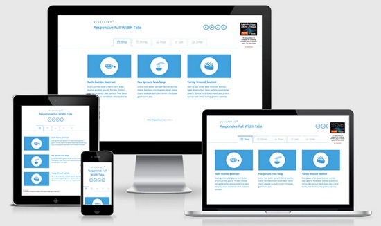
Responsive navigation menus are continuously being developed further with new solutions coming up. Some of them may only be niche solutions but they're still interesting. So, let's have a look at them. I'll show you how the desktop and mobile view of each menu looks like because that's what this article is all about. If possible, I'll provide a download link below the presented menu.Responsive Full Width Tabs
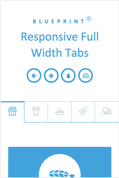
Mobile portrait (320x480)
A fantastic solution for websites with few navigation items. The tabs are large enough to be operated even with gloves on.
Demo and download
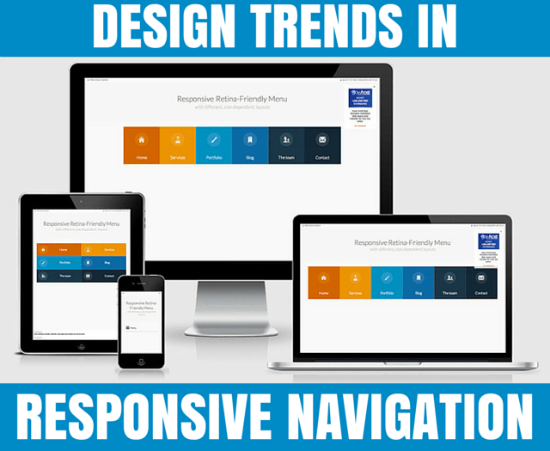
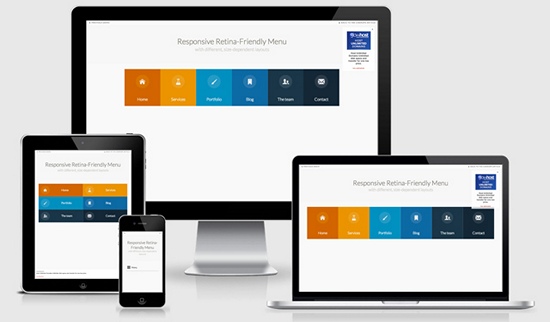
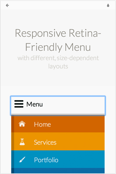
Responsive Retina-Friendly Menu
Mobile portrait (320x480)
A very unusual solution for blogs and websites with few navigation elements. By using icon fonts instead of pure graphical icons this solution becomes retina ready. What should be mentioned is that tablets show a different menu than smartphones. On tablets it's a list of layered menu items (either side-by-side or on top of each other) whereas on smartphones it extends by a click.
Demo and download
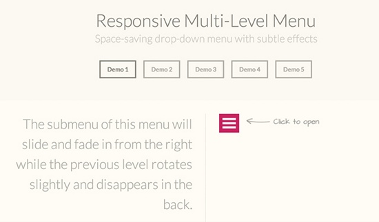
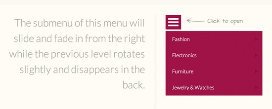
Responsive Multi-Level Menu
The Responsive Multi-Level Menu picks up an old idea refined with many interesting effects. Unfortunately, they can't be captured on screenshots. Therefore, I would recommend you to visit the site. You can choose between 5 different effects.
Demos and download
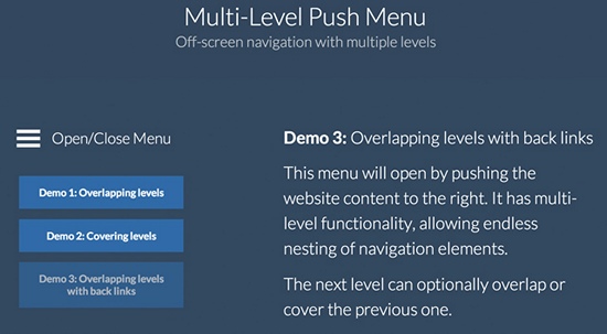
MULTI-LEVEL PUSH MENU
The same here. They picked up an old idea and refined it. The implementation, however, follows a well-conceived approach as the overlapping levels are designed extremely user friendly. The menu items are also large enough to be accessed with gloves on.
Demos and download
Slideout Menu
Mobile portrait (320x480)
The Slideout Menu is a tutorial by our big sister SmashingMagazine.com and suits perfectly for websites that have a lot of menu items.
Demo and download/tutorial
Off-Canvas Menu with a Twist
This is the most appealing solution I have come across so far. It's suitable for the desktop as well as mobile view. Unfortunately, the mobile view only shows the icon buttons whereas the writing is hidden.
Mobile portrait (320x480)
Demo and download
Pull Down Menu Interaction
The Pull Menu offers a very interesting and innovative concept which is well implemented. Menu items can be chosen by pulling down the menu icon as far as necessary. By releasing the icon the item will be loaded.
The menu pulled down
Demo and download
Google Nexus Website Menu
The Google Nexus Website Menu is not only a menu for smartphones and tablets but works for all screen resolutions. What makes it interesting is that you only have to add one navigation during the project's development process. By tapping on the menu item in the upper left corner, the menu slides out a bit. The full list opens when you hover over one of the items.
Mobile portrait (320x480)
Demo and download
Social App Menu
The active menu
This is also based on an old idea, however, with a completely new approach. It's well made and definitely worth a closer examination.
Demo and download
jQuery Plugins for Responsive Navigation Menus
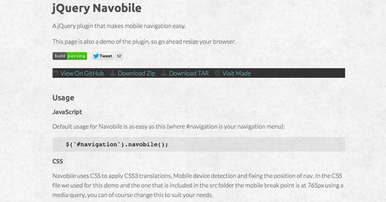
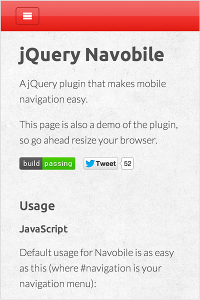
The most important jQuery plugins are, of course, a must in an article about mobile navigation. Here you can find well-tried as well as new products with one giving a new experience from an approach which has always been the same.jQuery Navobile
Mobile portrait (320x480)
Demo and download
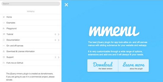
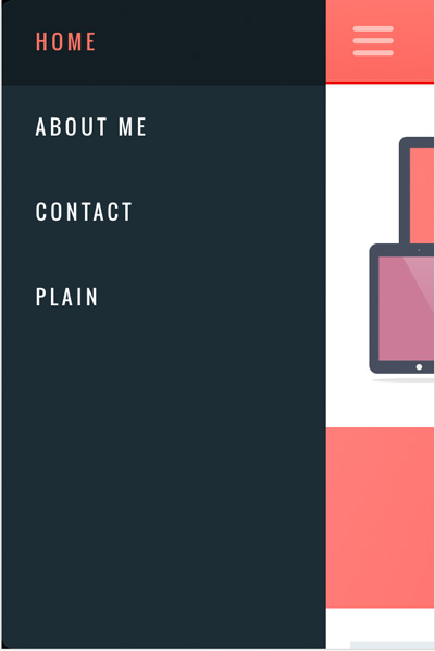
jQuery.mmenu
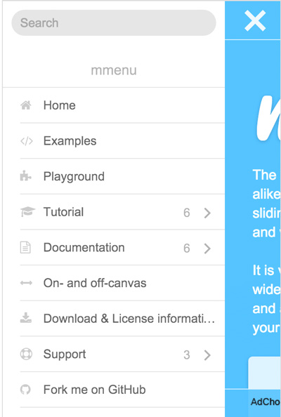
Mobile portrait (320x480)
This plugin stands out from the crowd because it offers completely new approaches with an integrated search and appealing submenus.In addition, it's not only a mobile menu but suitable for all website resolutions.
Demo and download
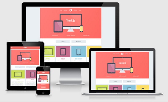
Trunk.js - A Responsive Web Solution
Mobile portrait (320x480)
Trunk.js is one of the most frequently used solutions when it comes to responsive navigation. It works smooth as silk, is pretty fast and suitable for websites with lots of navigation items.
Demo and download
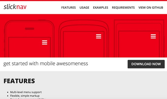
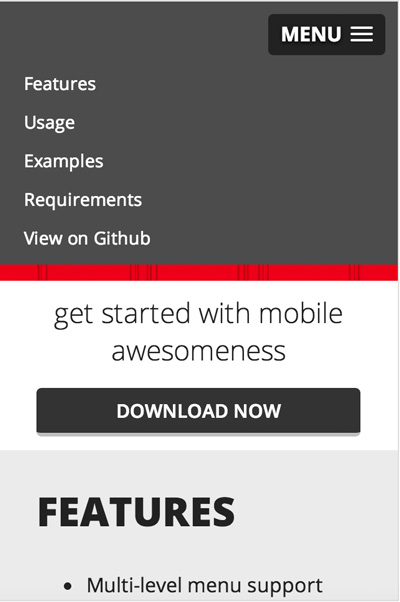
SlickNav - Responsive Mobile Menu
Mobile portrait (320x480)
SlickNav is a well-working plugin which can, however, only display the responsive, mobile version of a navigation menu. This makes it work well and fast, so SlickNav is always an option in the development process.
Demo and download
Examples for Well-Implemented Responsive Menus (Non-Downloadable)
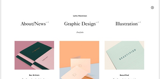
The following examples show how responsive mobile navigation can be optimally implemented. The websites have extraordinarily designed navigations and can be a real inspirational source for your own website.Lotta Nieminen - Graphic Designer
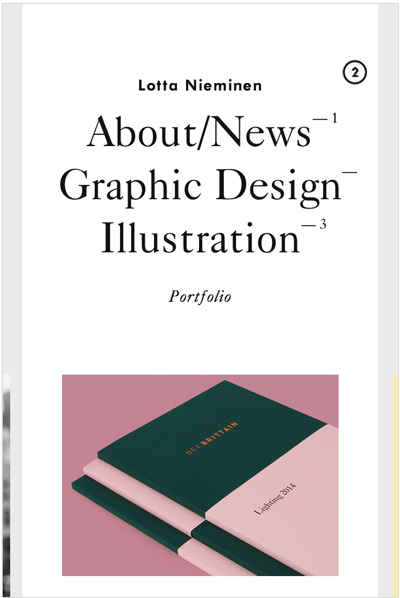
Mobile portrait (320x480)
This solution is becoming more and more popular for websites with few menu items. The menu items are simply put on top of each other using CSS and can be accessed quite easily.
Link to the website
Ableton
Mobile portrait (320x480)
Ableton relies on a pull-down menu with an integrated search function and links to the cart and one's profile. A good example for user friendliness.
Link to the website
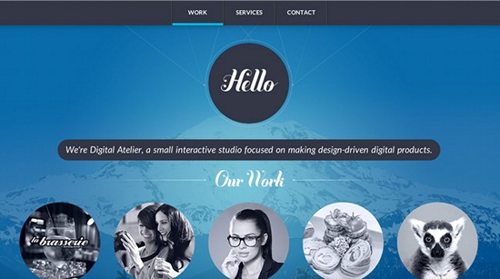
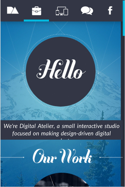
Digital Atelier
Mobile portrait (320x480)
Digital Atelier has a pretty outlandish and unique mobile navigation. It can be operated with gloves on but resolutions of 800x600 and below don't show writings of the mobile navigation.
Link to the website
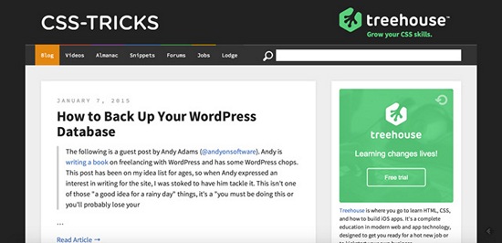
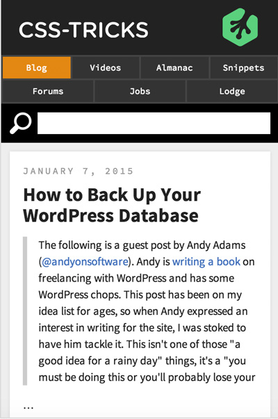
CSS Tricks by Chris Coyier
Mobile portrait (320x480)
The grand master of CSS, Chris Coyier, takes the easy way out with having only few menu items. Using CSS, he lets the navigation items flow either on top of each other or side-by-side. The result is nice as the menu items are of decent size guaranteeing operation with gloves on.
Link to the website
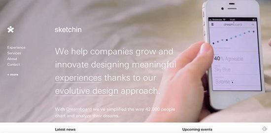
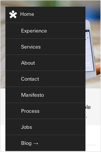
sketchin - evolutive experience design
Mobile portrait (320x480)
A well-tried idea newly interpreted. The mobile navigation along with an animation is put over the actual website.
Link to the website
Great info! Big thanks mate
Thanks for this share! April 21st is coming up fast, everyone better be responsive then! Thanks for these cool trends, very inspirational for my next design.
April 21st has passed. Hopefully more websites will be responsive now; nothing kills a great article like a non-responsive site.
Responsiveness used to be a selling point and something we would use as a value added service almost. Now it’s a standard best practise that we insist on adding to all of our digital solutions. With the number of mobile browsers rising daily, it’s a must for each every digital touch point.
It still amazes me the amount of websites that still haven’t put the time, investment or urgency into making their sites responsive. Back onto the navigation trends though. I think it’s one of the more interesting aspects of responsive design, as it’s one of the most difficult to fit in!
Awesome stuff. Thanks for the information. This is what I was looking for!!! Awesome designes you put here for responsive navigation, I love it. Thanks for the informative and useful post.
We’re now at the stage of offering our clients HTML 5 lite Apps for deployment as well as the responsive site. The HTML 5 apps are based on the responsive mobile code and are a nice add on to sell to clients.
Great post!
Very good survival guide for mobileggedon!
Hope everyone have responsive websites ready..
Thats a very good article. I am a drupal developer myself & just recently switched my site to a responsive design. Mine is current;y a simple mobile portrait menu which looks just fine. But surely the options above are great to look into.
Any feelings on how both global navigation, and user navigation, should be presented on the same page?
Great post, its interesting to see the changes in design over time, especially with new mobile platforms coming into play.