
HTML5 Brings Tables Back: Contemporary Grid Layouts with CSS Grids
Back in the days where CSS was a rumour and content and design were not divided, building a website using tables was perfectly common. With the rise of the semantic web tables were redefined to be used only for their original purpose, structuring data, that was meant to be shown in the form of tables. Furthermore, CSS didn't bring forward an easy way to structure layouts in rows and columns. Now, with the new CSS Grids rasterized layouts return and they resemble the way of table-based designs quite closely.
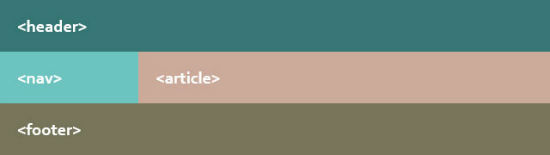 Simple Grid with Content-sensitive Heights
A classic in table layouts was the possibility to add a footer that would always be visible above the lower end of the browser window. CSS Grids can do this, too, with „calc()“.
Simple Grid with Content-sensitive Heights
A classic in table layouts was the possibility to add a footer that would always be visible above the lower end of the browser window. CSS Grids can do this, too, with „calc()“.
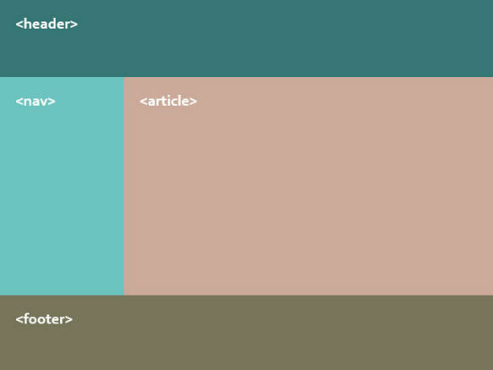 Grid Covering 100 Percent of the Height
An alternatiove to „calc()“ is the new unit „fr“ („fraction unit“). This unit will always take up the rest of the available space.
Grid Covering 100 Percent of the Height
An alternatiove to „calc()“ is the new unit „fr“ („fraction unit“). This unit will always take up the rest of the available space.
 All the „…-align“ properties with the values „start“, „center“ and „end“ lead to elements that will always be sized according to their contents, as long as „width“ and „height“ have not been used to fix sizes. The default value for „grid-column-align“ and „grid-row-align“ is „stretch“.
Preparing the Grid
For starters we have to define the section of our HTML document that is supposed to carry the grid. If you want to have the grid fill up your entire page, the „<body>“ element would be a great starting point. Using the „display“ property this element and its children are prepared for the usage of grids.body {
display: grid;
display: -ms-grid;
}
As CSS Grids only work in Internet Explorer we need to care for proper prefixing. So besides „grid“ don't forget to use „-ms-grid“. From there on let all child elements be positioned via CSS Grids.
Before we start defining rows and columns we should tell the „<body>“ element their default width and height. We do this using the properties „grid-columns“ and „grid-rows“. Add one space-delimited value for each row and columnd using absolute or relative values. If you wat to leave that to the browser, simply use the keyword „auto“.
body {
  width: 100%;
  display: grid;
  display: -ms-grid;
  grid-columns: 25% 75%;
  -ms-grid-columns: 25% 75%;
  grid-rows: auto auto auto;
  -ms-grid-rows: auto auto auto;
}
In this example we define a layout consisting two columns and three rows. The first column is 25 percent wide, the second takes up 75 percent. The height of all three rows is set to „auto“, which means that the height will adjust to the content. Using the „width“ and „height“ properties you could as well define all the values individually.
Simple Grid with Content-sensitive Heights
A classic in table layouts was the possibility to add a footer that would always be visible above the lower end of the browser window. CSS Grids can do this, too, with „calc()“.
body {
  width: 100%;
  height: 100%;
  display: grid;
  display: -ms-grid;
  grid-columns: 25% 75%;
  -ms-grid-columns: 25% 75%;
  grid-rows: 100px calc(100% - 200px) 100px;
  -ms-grid-rows: 100px calc(100% - 200px) 100px;
}
In this example the height of the middle row gets calculated by subtracting the heights of the first and the third row from the total page height (100 percent). To have that function correctly, make sure to add a height of 100 percent to the „<body>“ as well as to the „<html>“ element.
Grid Covering 100 Percent of the Height
An alternatiove to „calc()“ is the new unit „fr“ („fraction unit“). This unit will always take up the rest of the available space.
body {
  …
  grid-rows: 100px 1fr 100px;
  -ms-grid-rows: 100px 1fr 100px;
}
In this example we define the middle row with a height of „1fr“. This leads to the column taking up all the rest of the available height. While values in percent are always relative to to the page's total height or width, „fr“ takes absolute values on other elements inside the grid into account and handles these correctly.
And we have a third way of defining the width and height of any grid element. Using „minmax()“ we can fix a minimum and maximum value for either width or height respectively.
body {
  …
  grid-rows: 100px minmax(100px, 1fr) 100px;
  -ms-grid-rows: 100px minmax(100px, 1fr) 100px;
}
In this example we use „grid-rows“ to the define the height of the middle row to make sure its height will be minimum 100 pixels and maximum the rest of all available space in the browser window.
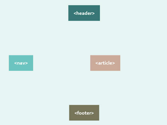
Defining Rows and Columns
In the next step we position rows and columns. This is achieved using the properties „grid-column“ and „grid-row“. They contain the position of the element inside the grid. Just like in the ancient table layouts rows can span more than one column.header {
grid-column: 1;
-ms-grid-column: 1;
grid-row: 1;
-ms-grid-row: 1;
grid-column-span: 2;
-ms-grid-column-span: 2;
}
In our example we create the header section. It sits in the first column and row of the grid and is supposed to span both columns. We set the respective value uwing the property „grid-column-span“.
nav {
  grid-column: 1;
  -ms-grid-column: 1;
  grid-row: 2;
  -ms-grid-row: 2;
}

article {
  grid-column: 2;
  -ms-grid-column: 2;
  grid-row: 2;
  -ms-grid-row: 2;
}
The second row is supposed to show the navigation („<nav>“) and content („<article>“) side by side. Inside the grid we add these elements to the first and second column of the second row. The third row will carry the footer („<footer>“) across all columns.
footer {
  grid-column: 1;
  -ms-grid-column: 1;
  grid-row: 3;
  -ms-grid-row: 3;
  grid-column-span: 2;
  -ms-grid-column-span: 2;
}
As width and height of our grid elements has already been defined inside the „<body>“ element, we can omit to add any values here.
Aligning the Elements Inside the Grid
The properties „grid-column-align“ and „grid-row-align“ are made to help you align the content of each grid element horizontally or vertically. Using these properties gives you the common formatting options such as left, center, right, etc.header {
…
grid-column-align: center;
-ms-grid-column-align: center;
grid-row-align: end;
-ms-grid-align: end;
}
In this example our header will show its contents centered and to the bottom of the grid element. While the value „center“ speaks for itself, „start“ defines an alignment to the left and to the top respectively. And „end“ aligns the content to the right or to the bottom.
All the „…-align“ properties with the values „start“, „center“ and „end“ lead to elements that will always be sized according to their contents, as long as „width“ and „height“ have not been used to fix sizes. The default value for „grid-column-align“ and „grid-row-align“ is „stretch“.
Thanks for this one. It is possible to usw the breakpoint with tables for responsive view?
Back to reality. Reading this article I have only one question and that is “Why bothering about a technique that only works in IE?”. Does webdesigners do not hate IE as they do not like webdesigners. Reading it over a second time, I have a second question “What about responsive or addapted web?”. Do not like percentages in my responsive web and this grid technique absolutely makes addaptive web almost impossible to handle.
So guess that this technique will die a slow death.
I am a big fan of the contemporary style grids, well contemporary/modern design in general. These grids are great and helpful, and will be a good start to any responsive layout. Very basic but will work for what I am trying to do for a mockup, so thanks!
F Microsoft and everything related to it. Legacy IE versions are a developers nightmare, and should not be supported like the plague.