
Multi-Layered Design: Guidelines and Examples
There have been tons of posts about minimalist and simple web design. It's something every designer should consider and study, as minimalist and simple design principles are important in a lot of website designs. But there's been such a focus on clean and minimalist design in recent years that many designers shy away from more visually-complex designs.
That's a mistake. Just as there's a time and place for minimalist designs, there's a time and place for more complicated designs, too. Below are some guidelines to help you create more multi-layered website designs. They tend to require more graphics-savvy than minimalist sites, as well as a bit more advance planning. But they're really no more difficult to create than a minimalist site (and in many cases are more forgiving).
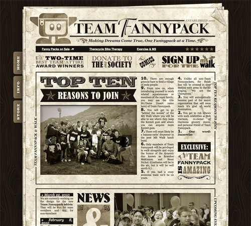 A site with a very obvious grunge/antique theme throughout.
In either case, a common theme or element helps tie everything in the site's design together and make it visually cohesive. If you just start throwing all sorts of stuff into the design, you'll probably just end up with a mess.
A site with a very obvious grunge/antique theme throughout.
In either case, a common theme or element helps tie everything in the site's design together and make it visually cohesive. If you just start throwing all sorts of stuff into the design, you'll probably just end up with a mess.
 A great example of a site with lots of visual interest that doesn't feel cluttered at all.
The same idea can be applied to your website designs. When you think you've finished this kind of design, see if there's something you can take away. There almost always will be, and your design will likely be stronger because of it. This is related to the minimalist principle of perfecting a site when nothing else can be taken away (just in a much less extreme version).
Remember, the goal here is to create a design that has a lot of visual interest, not to create a design that's cluttered and messy.
A great example of a site with lots of visual interest that doesn't feel cluttered at all.
The same idea can be applied to your website designs. When you think you've finished this kind of design, see if there's something you can take away. There almost always will be, and your design will likely be stronger because of it. This is related to the minimalist principle of perfecting a site when nothing else can be taken away (just in a much less extreme version).
Remember, the goal here is to create a design that has a lot of visual interest, not to create a design that's cluttered and messy.
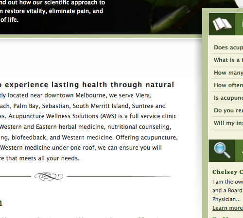 A great example of how small details add a lot of interest and a much more polished and put-together look.
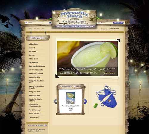
 Margarita Shack
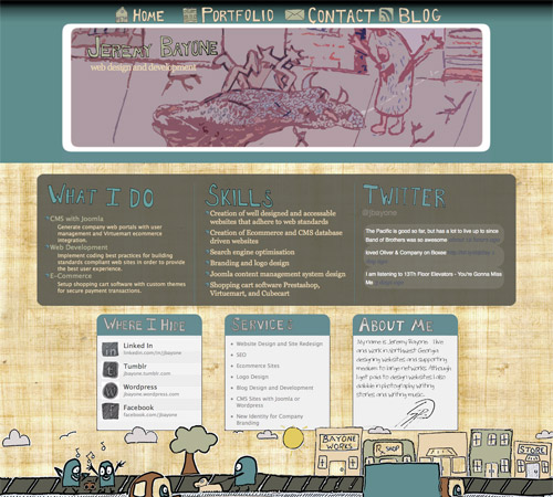
 Jeremy Bayone
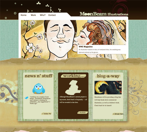
 MoonBeam Illustrations
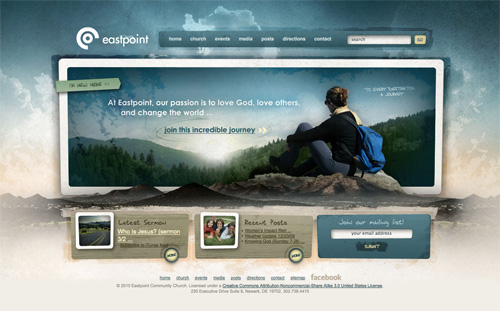
 Eastpoint
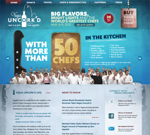
 Vegas Uncork'd
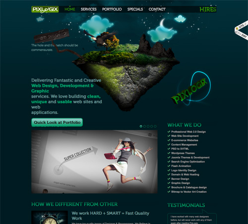
 Pixlogix
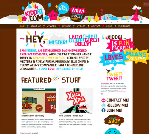
 Kidd81.com
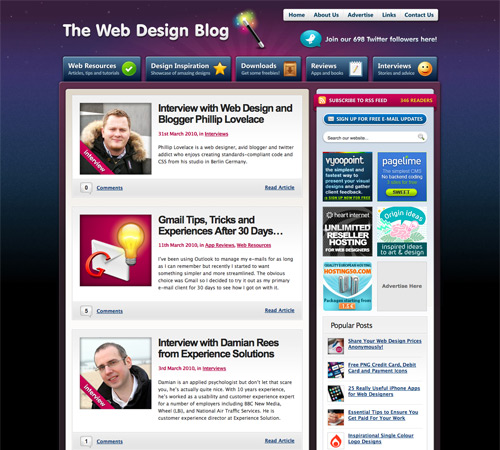
 The Web Design Blog
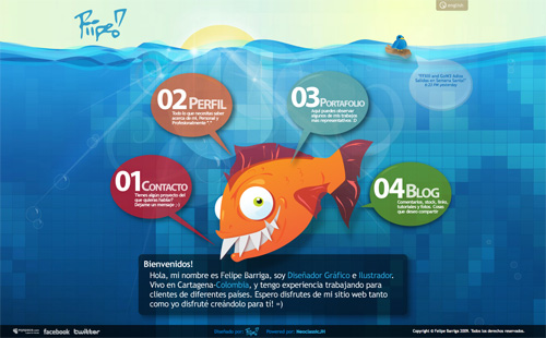
 Piipe
Piipe
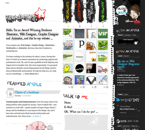
 KevAdamson.com
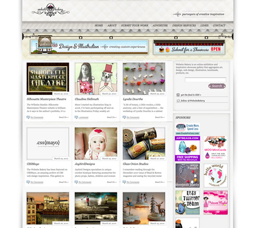
 Website Bakery
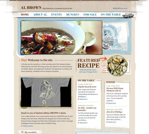
 Al Brown
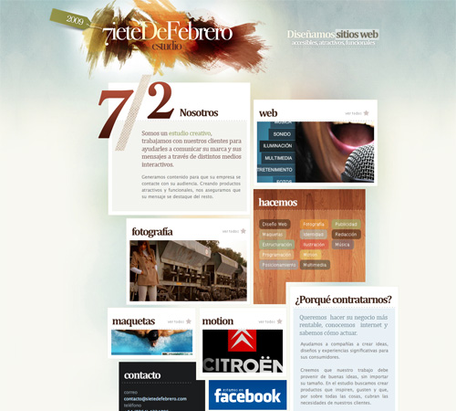
 SieteDeFebrero
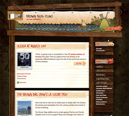
 Brown Blog Films
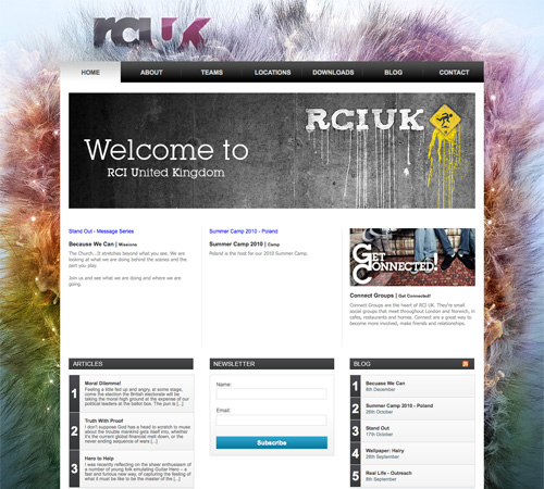
 RCIUK
RCIUK
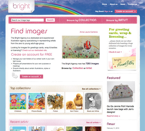
 The Bright Agency
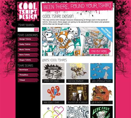
 Cool Tshirt Design
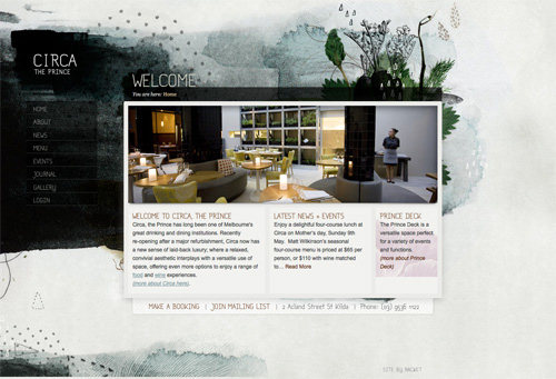
 Circa The Prince
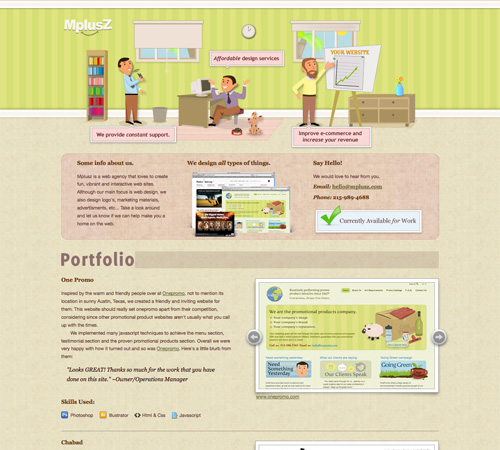
 Mplusz
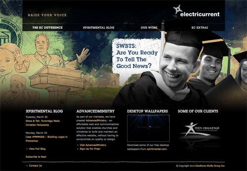
 Electricurrent
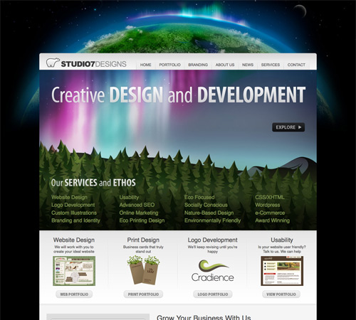
 Studio7Designs
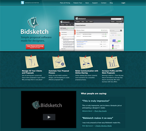
 Bidsketch
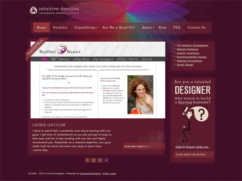
 Intuitive Designs
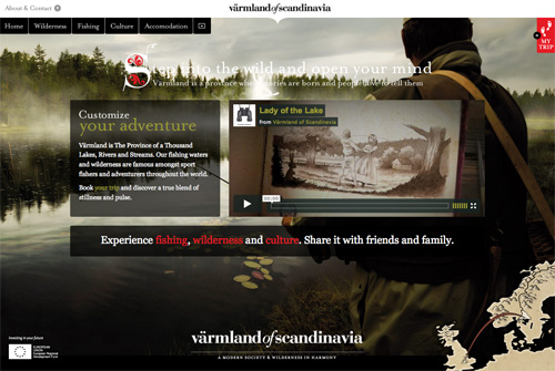
 Varmland of Scandinavia
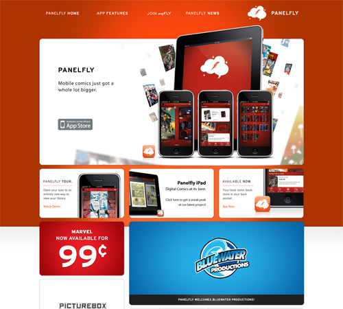
 Panelfly
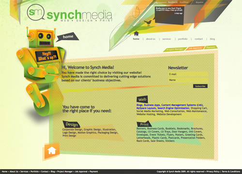
 Synch Media
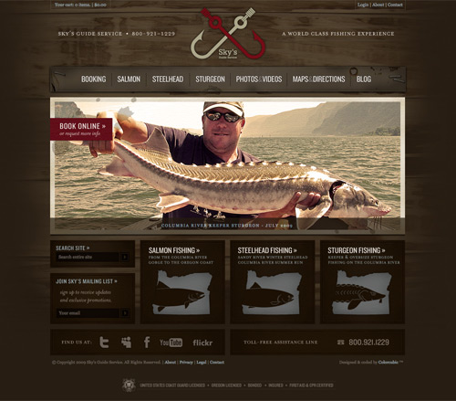
 Sky's Guide Service
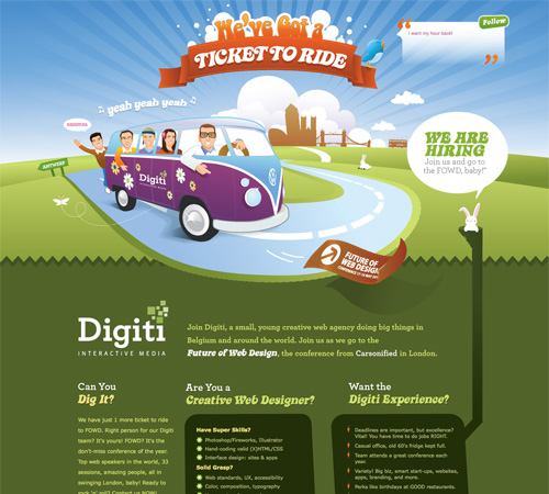
 Digiti
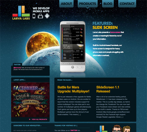
 Larva Labs
Guidelines for Creating Multi-Layered Designs
We've already established that multi-layered designs are more visually-complex than minimalist sites. But that doesn't tell us a whole lot about how to create them. They can be intimidating to many designers, especially those who started out with minimalist designs. After all, there seem to be so many places you can go wrong with this kind of design.Use Some Kind of Theme
The best designs like this have an overall theme or aesthetic they follow. They're not just throwing together random elements. Sometimes this is something obvious like a particular type of image. Other times it's a bit more subtle, such as grunge elements throughout.
A site with a very obvious grunge/antique theme throughout.
In either case, a common theme or element helps tie everything in the site's design together and make it visually cohesive. If you just start throwing all sorts of stuff into the design, you'll probably just end up with a mess.
Take Something Away
Coco Chanel recommended that when a woman got dressed in the morning that she remove one accessory before leaving the house. The idea behind this is that we often tend of overdo things and by removing something we give more importance to the things that remain.
A great example of a site with lots of visual interest that doesn't feel cluttered at all.
The same idea can be applied to your website designs. When you think you've finished this kind of design, see if there's something you can take away. There almost always will be, and your design will likely be stronger because of it. This is related to the minimalist principle of perfecting a site when nothing else can be taken away (just in a much less extreme version).
Remember, the goal here is to create a design that has a lot of visual interest, not to create a design that's cluttered and messy.
Don't Overlook the Details
Details are what generally set excellent versions of this design aesthetic apart from the less-than-stellar examples. Pay attention to areas where an extra detail can really make your design stand out. Things like typography, narrow borders, etc. are all areas where small details can make a big impact.
A great example of how small details add a lot of interest and a much more polished and put-together look.
Examples
Here are thirty great examples of sites that are much more visually-complex than the current surge of minimalist sites that are flooding the Internet. Harmony Republic
Margarita Shack
Jeremy Bayone
MoonBeam Illustrations
Eastpoint
Vegas Uncork'd
Pixlogix
Kidd81.com
The Web Design Blog
Piipe
KevAdamson.com
Website Bakery
Al Brown
SieteDeFebrero
Brown Blog Films
RCIUK
The Bright Agency
Cool Tshirt Design
Circa The Prince
Mplusz
Electricurrent
Studio7Designs
Bidsketch
Intuitive Designs
Varmland of Scandinavia
Panelfly
Synch Media
Sky's Guide Service
Digiti
Larva Labs
I really like the multi layered design, adds some pizazz!
Appreciate your efforts in putting this together. What a great talent you have presented here.
Nice article and examples… but next time maybe a bit more tips and a few less examples ;)
Thanks for the kind mention!
Huge list of inspiration for multi layered design and nicely written article much appreciated.
Great list! Thanks
These layered designs are really cool .. thanks for sharing this
thanks for this share. lastly have a look out on grid on other blog and now multi-layered design, you guys make my day.
interesting read, thanks for this!
That was a fantastic read,You discover new things every day.
I actually went FROM a minimal design TO a more image rich, layered design when I redesigned my personal website in 2009. I really think this style is too often over looked! If done correctly, it can be very beautiful, as are many of your example sites!
Love the http://digiti.be/ design, only because I’ve got VW bus myself :-)
Wow! I am very lucky to be included in this list of designs! Thanks for the mention.
Very Useful and Interesting Post !
Great collection and tips!
I was curious though. How long do you guys take when designing a site, on average. Because my boss gives me about an hour or two and it has made me feel like I am slow/stupid or something.
An hour or two? Your boss clearly has no understanding of design itself, nevermind web design. Good designs can take days. Great designs can take weeks. Your boss (or his/her clients) fall into the category of people who “just want a web site”, not in the category of “need a web site for a reason”. Web sites designed for the sake of having a web site and without purpose simply can’t evolve to become great “web” designs.
Thank you! I was starting to think I was crazy as this is my first salary position in graphic design. Started to think I took too long.
Thought, it fits in with the whole agencies view “quantity over quality” to quote my 90 day review in which I was told I need to spend less time designing. “Just do exactly what the client wants”.
I have become a pixel pusher :(
The best was yesterday when I finished an email design and my boss asks why I used so much space between sections (40px or 50px). I told him. Then 15 min later he comes to me and asks me to look at his changes. He pushed everything right next to each other, added random lines for separation and made the logo take up the whole header. And sent it to the client.
Thanks for the mention. Nice list.
Another Fish recipe, for you, for those who like curry. So then can have fish with curry. Try this great recipe at home and you will like it very much
Nice list :) I especially like Vegas Uncork’d.
Here’s annother one: http://www.plentywish.com
a subtile wish list/gift ideas site with loads of details if one looks carefully.
This is a great set of tips and resources. Thanks for sharing.
Attention-grabbing learn! I also found one thing related you could wish to take a look, its a site all about the most effective pagerage facebook layouts on the web!
Test it out on the link here and let me know what you think!
– All the very best
Awesome links, and Love your website design its amazing.