
Responsive Web Design: How to Find the Right Photos
The Web - open space for any web designer out there. Today's and even more so tomorrow's web is one big challenge for our industry. Web sites are supposed to adapt seamlessly to any screen size with any aspect ratio on any device. Desktop computers, tablets, and smartphones are only the beginning. No one knows what kind of device will be popular next year. On the other end of the spectrum, high definition displays are growing in popularity. What results from this is a balancing act in many ways. One of the more prominent challenges is the choice of adequate images. Images that work fine on a smartphone as well as on a UHD display. Today's article will focus this problem to help you choose the right photos for responsive web design.
 Search Result Limited to Photos in Landscape Mode (Screenshot: Bigstock)
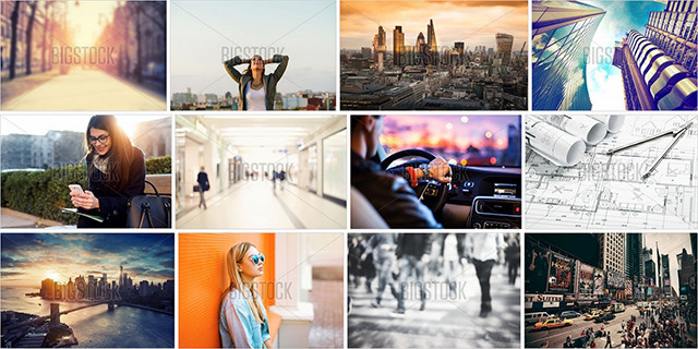
As soon as you are looking for a full-screen background you should generally go for landscape orientation. It simply is the most used device orientation besides that of the smartphone. Consider that landscape photos will be cut and thus not be showing all of the image content.
Search Result Limited to Photos in Landscape Mode (Screenshot: Bigstock)
As soon as you are looking for a full-screen background you should generally go for landscape orientation. It simply is the most used device orientation besides that of the smartphone. Consider that landscape photos will be cut and thus not be showing all of the image content.
 Well-suited Photos for Backgrounds
Our example shows two photos that are very well suited as they don't carry much detail and don't have a clear focal point. Any part of the image will work as well as another.
Well-suited Photos for Backgrounds
Our example shows two photos that are very well suited as they don't carry much detail and don't have a clear focal point. Any part of the image will work as well as another.
 Backgrounds in Portrait Mode
Even if more than half the image should get lost in portrait mode, this will not have any influence on the image message.
Backgrounds in Portrait Mode
Even if more than half the image should get lost in portrait mode, this will not have any influence on the image message.
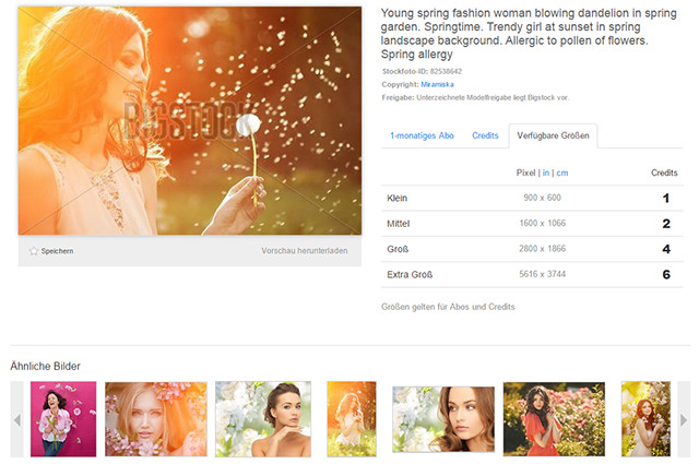 Availability of Photos in Different Resolutions (Screenshot: Bigstock)
Photos not prepared for razor-sharp presentation will look blurred on these displays. That's why we should care to offer images in appropriate resolutions. Already on smartphones we should not provide images smaller than 640 pixels wide to let them display correctly in landscape mode. Thanks to HTML5 and the powers of the <picture> element and the srcset attribute we can factor in all possible resolutions and pixel densities.
Check out Bigstock today, and claim your free trial, where you get up to 35 free images over a 7-day period.
Availability of Photos in Different Resolutions (Screenshot: Bigstock)
Photos not prepared for razor-sharp presentation will look blurred on these displays. That's why we should care to offer images in appropriate resolutions. Already on smartphones we should not provide images smaller than 640 pixels wide to let them display correctly in landscape mode. Thanks to HTML5 and the powers of the <picture> element and the srcset attribute we can factor in all possible resolutions and pixel densities.
Check out Bigstock today, and claim your free trial, where you get up to 35 free images over a 7-day period.
Details – When Less is More
Conventional devices such as desktops or notebooks allow for a regular display of pictures in any resolution. Even the most detailed images are readily perceptible to the visitor's eye. On tablets and more so smartphones, this is an entirely different story. The larger the image, the more significant the difference when this picture has to be scaled down to smartphone dimensions. It goes without saying that image details can be hard to get or even be rendered invisible. This is not a problem as long as these lost features are not what defines the image as a whole. As soon as they are vital to the picture we need to find ways to keep these details perceptible even on smaller resolutions and screens. An established width for smartphone images is 320 pixels. As soon as your maximum image width is defined to fit the width of the whole viewport, you can securely use 320 pixel images as a guideline and simply check whether the vital image information will still be preserved. To give you a good example of how this should be done, we will use a typical business photo of a team meeting. The following photos, taken from stock media provider Bigstock show such a situation. While both photos will work correctly on large screens and resolutions, there are limitations on smaller displays. The picture with the eight team members is no longer optimal. People are too small, their faces barely perceptible. You should make sure that photos showing people always stay large enough to keep the facial expressions of the depicted visible. People and especially their faces should always make up the greater part of any image depicting people as the main image information.Choosing the Right Photos From a Series
Often we will try to convey as much information and content as possible through a single image. Regarding responsive designs, however, we should question that approach. Think about what is necessary and what can be omitted. To achieve this, it might be helpful to evaluate a row of similar photos. Bigstock offers a variety of images for a single topic, and often these images stem from a series. Series are especially helpful as the scenery stays the same while only the arrangement changes. Our image shows two pictures of a presentation. While the first image leaves no doubt that we are looking at a presentation meeting, the second demands only a small thought more to get that same information. Think of smaller displays and you will agree that the second image is much better suited for that use case. Details are waived, but the central information stays. You will of course always have to evaluate individually which details can be omitted. This will vary wildly. In our above example, we couldn't leave out the listeners should the listeners contribute to the site's content and not the presenter.Photos with a Strong Focal Point
There will be situations where searching for pictures from a series and then using one with less detail, or a different focus will not work. In these cases try to find photos that come with one clear and strong focal point. The following examples depict four situations with people on the telephone. The surroundings of the people are completely irrelevant to the message of the image and can be omitted without losing the slightest part of the message. Photos With a Clear Focal Point A conventional desktop-oriented design would have space enough for showing these images complete with their surroundings. Smaller devices would benefit from a presentation we have prepared for you in the following example. JavaScript frameworks such as "Focal Point" allow us to define a - well - focal point. Does the resolution fall under a pre-defined size, the JavaScript cuts the image according to the preset focal point. Of course we need to make sure that our chosen focal point still leaves the picture message intact. Should we want to convey a typical office feeling, we should not cut the fourth image down as shown in the example. Let us take a short look at how "Focal Point" works, shall we?How to Use the JavaScript "Focal Point" on an Image
As I mentioned earlier, with Focal Point you can define an area that represents the parts you do not want to miss out on smaller resolutions. Parts covered by Focal Point stay visible no matter how far down you scale. How To Define The Focal Point The principle of Focal Point is simple: a grid is put upon each picture. The grid consists of 12 by 12 units. Using CSS we now define one unit of the grid as the Focal point, the area that will always stay visible. Imagine that picture of Uncle Hugo. Define his head as Focal Point. Even though Uncle Hugo's face resides on the right side of the photo, it will stay in focus when being scaled down to smaller resolutions. I don't think Uncle Hugo would have accepted any other solution on his own website... To define the Focal Point, we assign two classes to the image. These classes position the Focal Point inside the grid horizontally and vertically. We start counting from the center of the grid. That way we have six classes altogether, counting up, down, left and right.<div class="focal-point left-3 up-2">
<div>
<img src="img.jpg" width="400" height="300" alt="" />
</div>
</div>
In this example, the Focal Point is defined to be three grid units from the center to the left and then two units up. The class focal-point is as mandatory as the surrounding div around the image.
By default, the framework cuts down the image as soon as the browser window gets resized to sizes smaller than 767 pixels. You can easily adjust this value in the accompanying style sheet.
How Focal Point Works
Focal Point's mode of operation is easily understandable: Different CSS classes cut the image using negative margin values. The unit for the value is em. Use images with a 4:3 proportion for best results, add the additional class portrait for 3:4 proportions.
Focal Point follows an interesting approach to optimize the presentation of images at smaller resolutions. With only one single file to embed and customize, there is no tedious learning curve to work along. If you need to refocus images while being scaled, give Focal Point a go...
Portrait or Landscape: Important for Full-width Images
Another important consideration in choosing suitable images for responsive design is whether to work with images in portrait or landscape orientation. There is no easy answer to that question. Desktop displays, as well as notebooks and mostly tablets, are used in landscape mode. Smartphones are typically used in portrait mode. Some users prefer to use their tablets in portrait mode, too. And others hold their smartphones in landscape position. This is not easy to predict. Using images in portrait resolution will lead to a full-screen presentation on a smartphone while the same image will be too large for a landscape device. If your layout is image-centric, this is a problem, as you will always lose parts of the picture message to the area below the fold. You will need to weigh the pros and cons individually. Bigstock lets you limit the search to either portrait or landscape photos. That makes it easier to find the right imagery once you made up your decision.
Search Result Limited to Photos in Landscape Mode (Screenshot: Bigstock)
As soon as you are looking for a full-screen background you should generally go for landscape orientation. It simply is the most used device orientation besides that of the smartphone. Consider that landscape photos will be cut and thus not be showing all of the image content.
Well-suited Photos for Backgrounds
Our example shows two photos that are very well suited as they don't carry much detail and don't have a clear focal point. Any part of the image will work as well as another.
Backgrounds in Portrait Mode
Even if more than half the image should get lost in portrait mode, this will not have any influence on the image message.
Care for Visitors on UHD Displays
The last vital thing to consider when choosing photos for responsive design is the growing popularity of high-definition displays. We have screens of 32 inches showing more than eight million pixels available these days. Stock providers such as Bigstock offer photos in different resolutions. Usually, the smallest resolutions will suffice for web design. But then there are these pixel monsters allowing to show images twice as detailed as conventional displays.
Availability of Photos in Different Resolutions (Screenshot: Bigstock)
Photos not prepared for razor-sharp presentation will look blurred on these displays. That's why we should care to offer images in appropriate resolutions. Already on smartphones we should not provide images smaller than 640 pixels wide to let them display correctly in landscape mode. Thanks to HTML5 and the powers of the <picture> element and the srcset attribute we can factor in all possible resolutions and pixel densities.
Check out Bigstock today, and claim your free trial, where you get up to 35 free images over a 7-day period.
Disclaimer: This article is sponsored by Bigstock. Bigstock did not influence the content in any way besides delivering the images used. Visit BigStock!
I enjoyed this article, thanks.
Educative post. Very well explained with great examples. However, I would prefer putting on my on images on the site instead of picking it from elsewhere. Enjoyed your post.
Every time i read any web development articles, mostly it is about various technologies or shortcuts which help you to simplify your job, but it is the first time that i am reading some thing about images, it really very useful article. Thanks for this post.
Thanks for the great info.
I like the method you are recommending which will work for majority of the cases and this will distinguish a normal web design from a hard work or professional web design. We are a web design London based company and I noticed that different web designers in London use different techniques to overcome this problem. I do face this problem for some of the websites that we design. Sometimes we come across a situation where there are multiple important points in an image that exist in different corners of the image and we have to show all the image because we can’t show only one part of the image by cropping the image to a smaller size because all the parts of the image are important. What do I do in these circumstances when I am designing a website; I load a different image via media property in css to overcome the image issue in responsive websites.
very informative post. we have to take case of mobile and table visitor and developed the site in such a way that i will open in all device. but i upload my images on my server and make all the possible size which my theme req.
thanks again for wonderful post.
Very useful article! I used to use images for web design mostly intuitively, but the last years everything has changed. With responsive design the images have become a complex part of it, and we have to care how its content is displayed, more than just dimensions.