Websites With Seamless Social Media Integration
Well, its official: social media is here to stay. While it can be difficult to keep up with the ever-changing social landscape, a basic understanding and implementation of the different platforms available can get big results. Companies of all sizes are taking advantage of the free publicity and word-of-mouth that social media can offer them.
One of the most logical ways for companies to capitalize on this trend is to integrate their social media campaigns with their websites. Unfortunately, some websites treat their social media links as an after-thought, and it shows. These sites will often use stock icons supplied by the social media outlets that do little to coordinate with the look and feel of the website itself. In other cases, the links might just be shoved into any blank space that was previously unoccupied. Either way, this is no way to treat such a potentially valuable marketing tool.
The following collection of websites, on the other hand, do a fantastic job of integrating their social media campaigns into the design itself. Through custom designed icons and typography, these social media elements fit into the page stylistically, and are easily accessible without overwhelming the user.
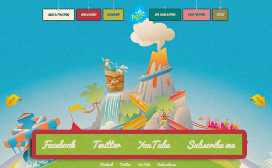
 Adventure World is a theme park in Australia with a fun, retro website. Rather than use icons that might clash with the site's design, they opt for the typographic treatment. They chose a quirky script font that coordinates perfectly with the images as well as the other typography on the site.
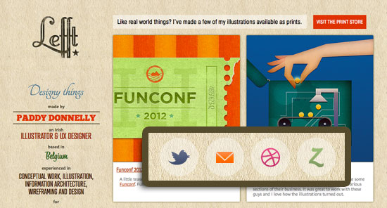
 Lefft is the portfolio site for Irish Illustrator and UX designer, Paddy Donnelly. The site as a whole has a very colorful, tactile feel to it, and the social icons complement this beautifully. A subtle hover effect darkens the icons as you mouse over them.
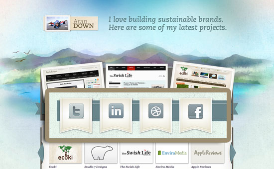
 Brand designer Aran Down's portfolio site has recurring ribbon embellishments used throughout. This treatment works very well with the custom-colored social icons used.
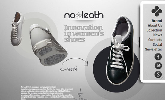
 No Leath is a women's shoe company with a pretty slick parallax scrolling site. Not wanting their social links to be left behind as their customers scroll, they are in a fixed position, right underneath the main navigation. They have been subtly customized in black, with a slight bevel to match the black leather shoes of course. Gotta match the shoes.
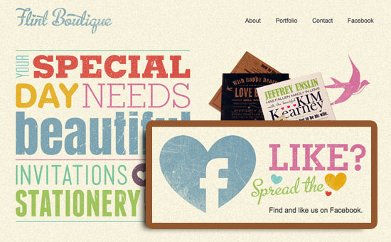
 Flint Boutique specializes in wedding invitation design, and that is translated very nicely into their website. Their oversized Facebook button includes a variation on the traditional Facebook "f" inserted into a heart. That combined with coordinating typefaces and a faux-stamped texture makes it feel as handmade as their invitations.
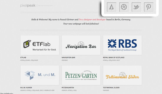
 The portfolio site for Pixel Peak design is a study in simplicity. It follows a very grid-like structure and the attention to detail is spot-on. The social icons blend in with the header seamlessly, and the hover effect on each slides up to reveal a pop of color.
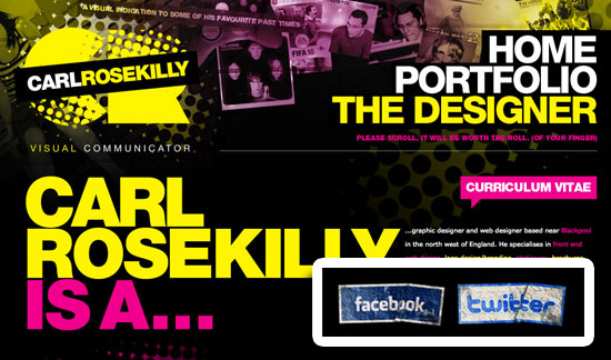
 Carl Rosekilly's design portfolio site is layered, dark and bright all at once. His links to Facebook, Twitter and Flickr are meant to look like little discarded bits of paper, which may not work on other sites, but it fits this grungy, layered site very well.
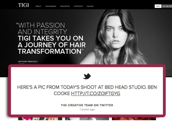
 Tigi Hair Products uses an ultra elegant black bird icon positioned above an equally eye-pleasing Twitter feed. It cycles through their most recent tweets, one at a time. It is just large enough and centered on the page for maximum impact.
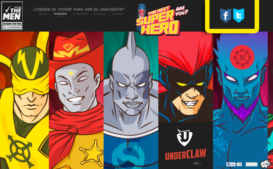
 The Rexona For Men site wants to know what makes you a superhero? Styled like a comic book, the social icons take on the shape of shields.
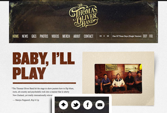
 The Thomas Oliver Band doesn't want you to forget to follow them, tweet them, or email them. That's why they practically nailed their social buttons to the floor. As you scroll up and down their site, the simply styled buttons remain anchored to the bottom of the window.
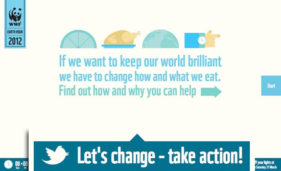
 The World Wildlife Fund's Earth Hour 2012 site is simple, using cool colors, simple shapes and plenty of white space. They chose to use an oversized footer with a large Twitter call-to-action. It matches the aesthetic established for the rest of the site, while calling due attention to itself.
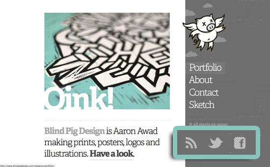
 Blind Pig Design is the portfolio site for designer Aaron Awad. It has a hip, illustrated vibe with subtly distressed elements for character. He uses a halftone pattern for his social media icons, which lets them fit right into their surroundings nicely.
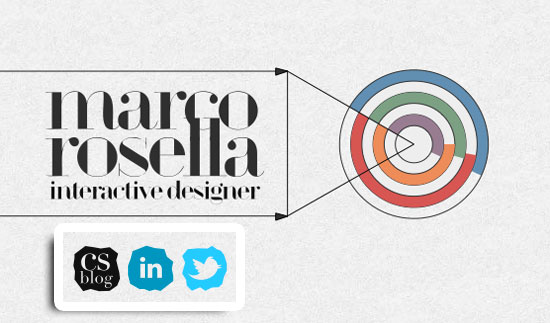
 The portfolio site for Marco Rosella has one of the most interesting navigation concepts I've ever seen. Rather than scrolling up, down, or side-to-side, you zoom into the content on the z axis. When you zoom in far enough to get to the contact info, that's where you will find links to his Linkedin, Twitter and Facebook, cut into interesting, organic shapes.
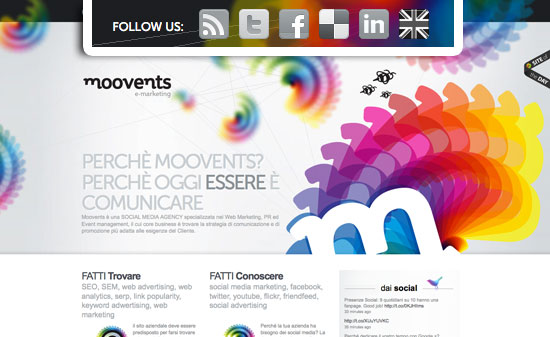
 Moovents is a social media agency, so one would expect great social media integration in their website. Keeping it simple, but sophisticated and noticeable, their social icons are greyscale versions of the famous logos, presented front and center in the header bar.
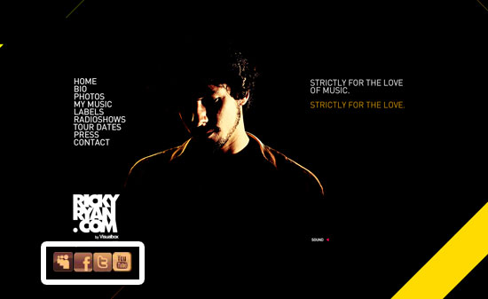
 House musician Ricky Ryan's website features small but mighty social links colored in shades of copper. Placed right under the musician's logo, (which stays in place no matter where you are within the site's horizontal navigation) they are not likely to be missed.
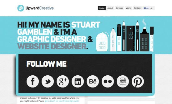
 The site for Upward Creative has a very mod 1960s look, and the simple row of circular icons certainly lends itself to that era as well.
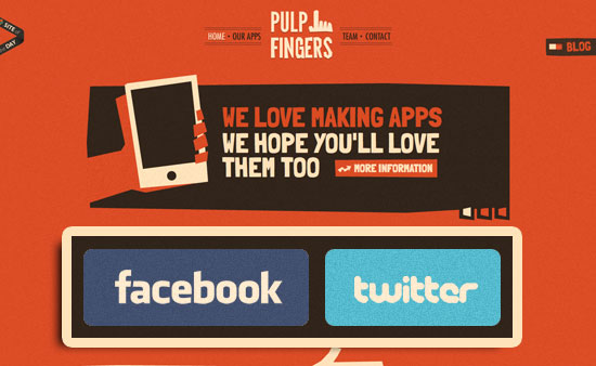
 Pulp Fingers is a team of designers and developers that specialize in making apps. The overall look of the site is very retro and playful, with typography and images seemingly cut out of construction paper. The Facebook and Twitter icons have a similar look, with a slight paper texture.
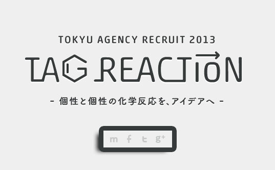
 The minimalist site for Tokyu Agency deserves minimalist icons as well. Breaking free of their usual enclosing shapes, these icons use only the familiar initials as links. Only a slightly darker color than that of the background, they are barely there, yet always there, as they are in a fixed position at the top of the window. A mouseover reveals a colorful circle background for each icon.
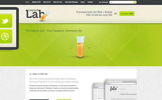
 Layout Lab's website is light and breezy with lots of negative space and a healthy dose of lime green for flavor. The links to their Twitter and Dribble accounts look right at home in fixed tabs on the upper left side of the window.
 The site for Fancy Rhino uses triangles as a recurring design element. Team member photos, and portfolio work all appear in triangular shapes, so why not their social links? A simple row of triangles on their contact section communicates the different ways you can follow their work.
 Friendly Gents is a Cincinnati web design studio with a vintage barbershop-inspired site. They use a lot of distressed fabric textures, and their social media links look like they are literally embossed into the fabric.
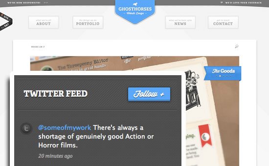
 Ghosthorses' website is another with a quirky retro style. It uses a lot of mid-century typography, and textured ribbon embellishments. Their custom styled Twitter feed and follow button fit the rest of the page's style like a glove.
 Fringe Web Development goes even further back in time, with a turn of the century look and feel. The main navigation is in a left sidebar with a row of simple, elegantly styled social buttons right beneath it.
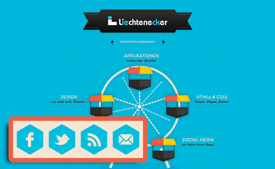
 Liechtenecker is a "superfresh" web agency in Germany. Their site is fun, colorful, and textured, and the honeycomb-shaped social links are no different. They stand out in contrast to the neutral beige background, yet they complement the visuals on the rest of the site perfectly.
Websites With Seamless Social Media Integration
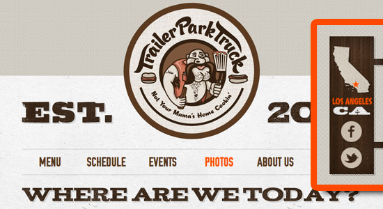
Trailer Park Truck is food truck based in Los Angeles, and they want to make sure their fans can always find their current location. They placed their twitter and Facebook links in the left margin of the site in what looks like an attached wooden sign. Adventure World is a theme park in Australia with a fun, retro website. Rather than use icons that might clash with the site's design, they opt for the typographic treatment. They chose a quirky script font that coordinates perfectly with the images as well as the other typography on the site.
 Lefft is the portfolio site for Irish Illustrator and UX designer, Paddy Donnelly. The site as a whole has a very colorful, tactile feel to it, and the social icons complement this beautifully. A subtle hover effect darkens the icons as you mouse over them.
 Brand designer Aran Down's portfolio site has recurring ribbon embellishments used throughout. This treatment works very well with the custom-colored social icons used.
 No Leath is a women's shoe company with a pretty slick parallax scrolling site. Not wanting their social links to be left behind as their customers scroll, they are in a fixed position, right underneath the main navigation. They have been subtly customized in black, with a slight bevel to match the black leather shoes of course. Gotta match the shoes.
 Flint Boutique specializes in wedding invitation design, and that is translated very nicely into their website. Their oversized Facebook button includes a variation on the traditional Facebook "f" inserted into a heart. That combined with coordinating typefaces and a faux-stamped texture makes it feel as handmade as their invitations.
 The portfolio site for Pixel Peak design is a study in simplicity. It follows a very grid-like structure and the attention to detail is spot-on. The social icons blend in with the header seamlessly, and the hover effect on each slides up to reveal a pop of color.
 Tigi Hair Products uses an ultra elegant black bird icon positioned above an equally eye-pleasing Twitter feed. It cycles through their most recent tweets, one at a time. It is just large enough and centered on the page for maximum impact.
 The Rexona For Men site wants to know what makes you a superhero? Styled like a comic book, the social icons take on the shape of shields.
 The Thomas Oliver Band doesn't want you to forget to follow them, tweet them, or email them. That's why they practically nailed their social buttons to the floor. As you scroll up and down their site, the simply styled buttons remain anchored to the bottom of the window.
 The World Wildlife Fund's Earth Hour 2012 site is simple, using cool colors, simple shapes and plenty of white space. They chose to use an oversized footer with a large Twitter call-to-action. It matches the aesthetic established for the rest of the site, while calling due attention to itself.
 Blind Pig Design is the portfolio site for designer Aaron Awad. It has a hip, illustrated vibe with subtly distressed elements for character. He uses a halftone pattern for his social media icons, which lets them fit right into their surroundings nicely.
 The portfolio site for Marco Rosella has one of the most interesting navigation concepts I've ever seen. Rather than scrolling up, down, or side-to-side, you zoom into the content on the z axis. When you zoom in far enough to get to the contact info, that's where you will find links to his Linkedin, Twitter and Facebook, cut into interesting, organic shapes.
 Moovents is a social media agency, so one would expect great social media integration in their website. Keeping it simple, but sophisticated and noticeable, their social icons are greyscale versions of the famous logos, presented front and center in the header bar.
 House musician Ricky Ryan's website features small but mighty social links colored in shades of copper. Placed right under the musician's logo, (which stays in place no matter where you are within the site's horizontal navigation) they are not likely to be missed.
 The site for Upward Creative has a very mod 1960s look, and the simple row of circular icons certainly lends itself to that era as well.
 Pulp Fingers is a team of designers and developers that specialize in making apps. The overall look of the site is very retro and playful, with typography and images seemingly cut out of construction paper. The Facebook and Twitter icons have a similar look, with a slight paper texture.
 The minimalist site for Tokyu Agency deserves minimalist icons as well. Breaking free of their usual enclosing shapes, these icons use only the familiar initials as links. Only a slightly darker color than that of the background, they are barely there, yet always there, as they are in a fixed position at the top of the window. A mouseover reveals a colorful circle background for each icon.
 Layout Lab's website is light and breezy with lots of negative space and a healthy dose of lime green for flavor. The links to their Twitter and Dribble accounts look right at home in fixed tabs on the upper left side of the window.
 The site for Fancy Rhino uses triangles as a recurring design element. Team member photos, and portfolio work all appear in triangular shapes, so why not their social links? A simple row of triangles on their contact section communicates the different ways you can follow their work.
 Friendly Gents is a Cincinnati web design studio with a vintage barbershop-inspired site. They use a lot of distressed fabric textures, and their social media links look like they are literally embossed into the fabric.
 Ghosthorses' website is another with a quirky retro style. It uses a lot of mid-century typography, and textured ribbon embellishments. Their custom styled Twitter feed and follow button fit the rest of the page's style like a glove.
 Fringe Web Development goes even further back in time, with a turn of the century look and feel. The main navigation is in a left sidebar with a row of simple, elegantly styled social buttons right beneath it.
 Liechtenecker is a "superfresh" web agency in Germany. Their site is fun, colorful, and textured, and the honeycomb-shaped social links are no different. They stand out in contrast to the neutral beige background, yet they complement the visuals on the rest of the site perfectly.


Excellent social media integration examples… and nice overall designs too.
Hi,
again really nice post…keep it up.
Thanks
Misleading.
More like “Websites With Seamless Social Media Icons”.
Agreed—I was hoping to see some websites with embedded sharing functionality, multi-step Facebook and Twitter competitions, that sort of thing… certainly not a list of “websites with cute custom social media icons”.
^yes^
I agree totally. Social Media Integration is not just about how pretty your links and likes are? Actually it’s often more about the calls to actions coming inwards from the social media platforms you use. Did you ever find a source to some examples like you state here?
Hi Wes,
Great article and thanks for the mention
Pretty good! I really like the Friendly Gents site.
I definitely think social media integration should be seamless. Something about bulky icons that don’t fit the design is just tacky to me.
Sure, the social media icons fit the themes of the sites, but they stick them in your face. When I saw Seamless in the title, I was hoping to see some snazzy ways to integrate social media features, not just ways to make icons look like they belong on the site.
Nice post. I totally agree, for many sites social media integration is an after-thought and they just seem to be thrown in whenever there is a new platform. I have seen this a few times recently with the increase in popularity of Pinterest.
You have posted some good examples of good integration within the design. I do however think it is a fine balance between well thought out integration and making the icons stand out.
Like the post and the ideas from the sites but it would have been nice to see more sites with integrations rather than just icons – sites which pull feeds from the various sites and the posts made on them.
Lovely post, full of nice examples! We also tried to integrate our social media icons in our website footer at http://www.antaviana.cat
Hope you like this sample too!
I don’t have a favorite which means that all the designs look great !!!
All have logos matching their website layout, Aran Down’s my favorite. With 3-4 social platforms it’s still good, soon they’ll have to integrate pinterest, instagram and all others skyrocketing in popularity; then it might be a problem..
Liechteneckers comes from Austria, not Germany!!!
Hey, I’m the developer of the Flint Boutique website. Thanks for the plug, kind comments and – of course – the referral traffic!
Simple designs like the one on Mashable work really well too. One of the main reasons is that the different interaction options are grouped together well and placed prominently above the fold.
Nice post. I am looking for a social media integration tips for our website