
A Crash Course in Typography: Principles for Combining Typefaces
When combining typefaces, there are a couple of important principles you'll need to keep in mind, namely contrast and mood. Effectively combining typefaces is a skill best learned through practice, and trial-and-error. Once you've mastered the principles covered here, you'll have the tools you need to try out combinations while making educated guesses about what will and won't work together.
[fblike]
Here, we're mostly covering combining two typefaces, as you would for body copy and headlines. In the next part, we'll cover combining more than two typefaces for things like navigation, image captions, and more.
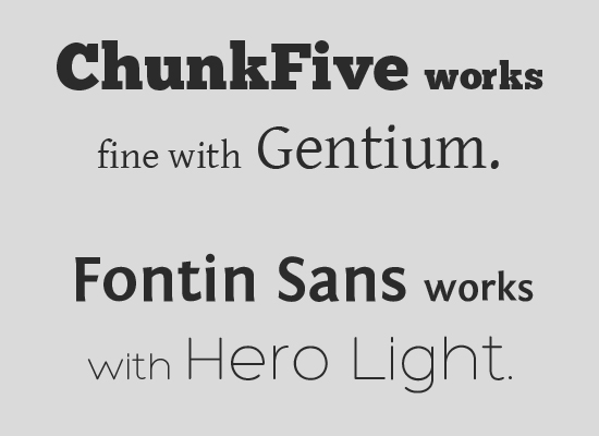
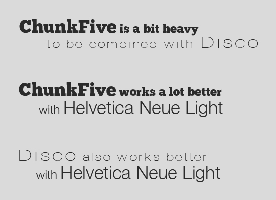 You'll want to look for typefaces that have noticeable difference in weight, without being too extreme. Very extreme differences in weight need to be made up for with similarities in other respects, particularly structure and style.
 Style and decoration can also be used to create contrast within a type family or typeface. Combine regular and italic fonts, varying weights, and things like shadows or outlines to create variation within a font family and sufficient typographic contrast.
 As a general rule, your hierarchy should start with your
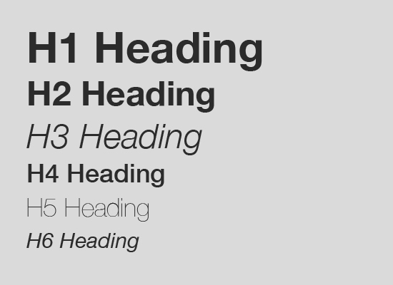
 Combining typefaces within the same classification is sometimes possible, but there are some extra considerations. For one, you want to find typefaces that are different enough that they're immediately recognizable as different typefaces, while also using typefaces that have similar moods, structures, and other factors that tie them together. To some extent, trial and error is your best bet for finding typefaces within the same classification that can work together.
 One trick is to choose typefaces that are in the same general classification, but fall under different sub-classes (such as a slab serif and a modern serif, or a geometric sans serif with a grotesk). This provides more contrast right from the start.
 Look at the letterforms side-by-side and see if they share a similar shape or other factor (such as x-height). It's better to go with wildly different structures than structure that's almost the same but not quite.
 Alternatively, if you have wildly different typefaces, color and texture and unify those typefaces, creating a harmonious look. The principles of color theory still apply to typography, so be sure you don't go overboard combining colors.
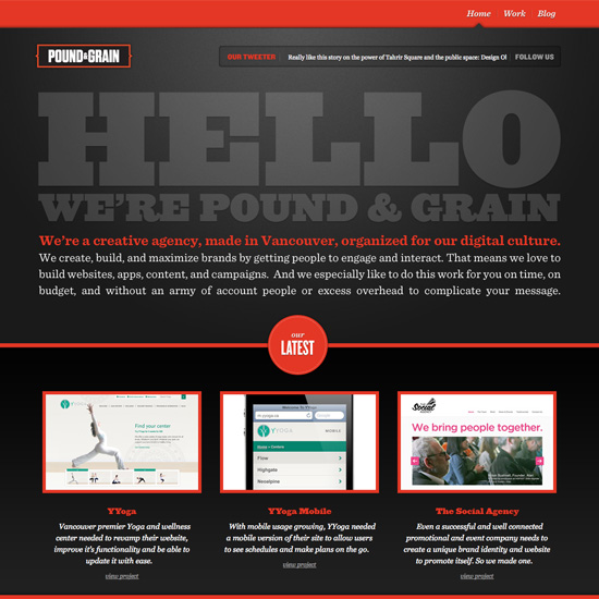
 Pound & Grain
 combines two serif typefaces, as well as a sans serif on their home page. The two serifs work well together because they belong to different sub-classes.
Pound & Grain
Pound & Grain combines two serif typefaces, as well as a sans serif on their home page. The two serifs work well together because they belong to different sub-classes.
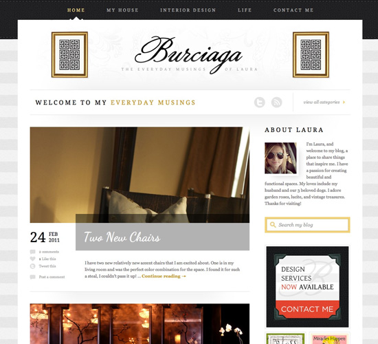
 Burciaga
 combines three distinct typefaces: Droid Serif, Georgia, and Dancing Script. Droid Serif and Georgia work surprisingly well together, and Dancing Script adds extra elegance.
Burciaga
Burciaga combines three distinct typefaces: Droid Serif, Georgia, and Dancing Script. Droid Serif and Georgia work surprisingly well together, and Dancing Script adds extra elegance.
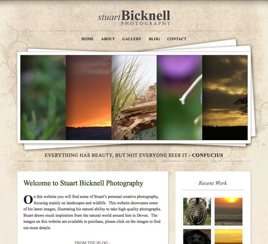
 Stuart Bicknell Photography
 uses font size and style to create contrast on the site, depsite the fact that virtually all of the typography is Times New Roman (there are a few small touches of Arial).
Stuart Bicknell Photography
Stuart Bicknell Photography uses font size and style to create contrast on the site, depsite the fact that virtually all of the typography is Times New Roman (there are a few small touches of Arial).
 Foundation Six
 uses a mix of Clarendon and Helvetica Neue, which creates a modern but still conservative look.
Foundation Six
Foundation Six uses a mix of Clarendon and Helvetica Neue, which creates a modern but still conservative look.
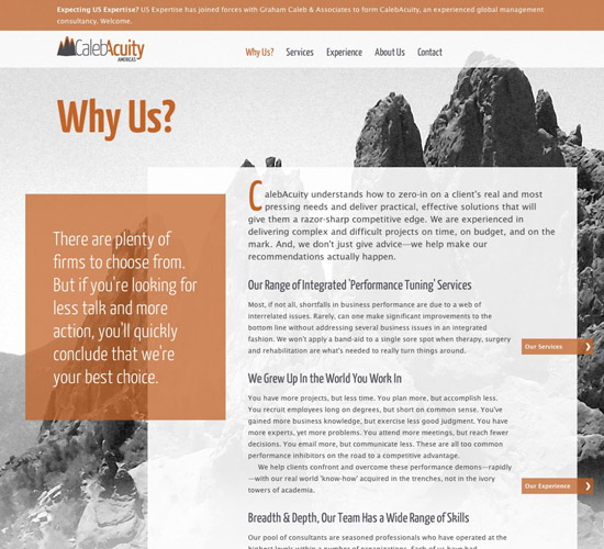
 CalebAcuity Americas
 uses a combination of YanoneKaffeesatzBold and Lucida Sans. It's a very modern look, and a great example of how to successfully combine sans serif typefaces.
CalebAcuity Americas
CalebAcuity Americas uses a combination of YanoneKaffeesatzBold and Lucida Sans. It's a very modern look, and a great example of how to successfully combine sans serif typefaces.
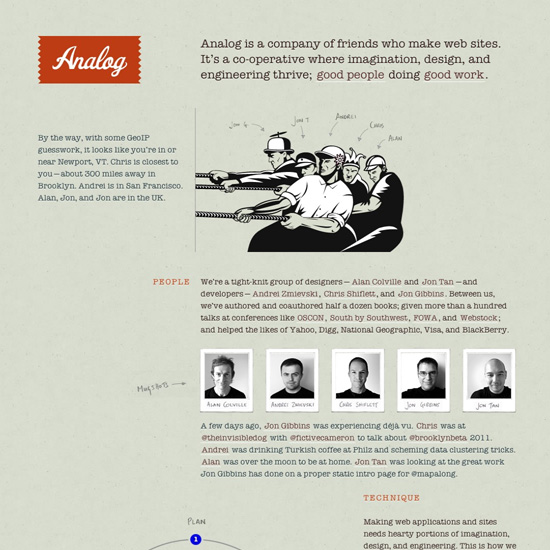
 Analog
 is a great example of a site that uses a single typeface, but uses styles, colors, and scale to create contrast.
Analog
Analog is a great example of a site that uses a single typeface, but uses styles, colors, and scale to create contrast.
 Thor Datacenter
 combines a few typefaces, including AllerDisplay, JournalRegular, and Arial. The addition of a script font like JournalRegular to the otherwise sans serif typography palette results in a much more casual and inviting feeling to the site.
Thor Datacenter
Thor Datacenter combines a few typefaces, including AllerDisplay, JournalRegular, and Arial. The addition of a script font like JournalRegular to the otherwise sans serif typography palette results in a much more casual and inviting feeling to the site.
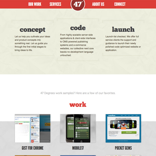
 47 Degrees
 combines LeagueGothic with ChunkFive and Helvetica for a very modern, casual style. They also use Museo300 sparsely on their site, which adds more visual interest.
47 Degrees
47 Degrees combines LeagueGothic with ChunkFive and Helvetica for a very modern, casual style. They also use Museo300 sparsely on their site, which adds more visual interest.
 Logo Nest
 combines a huge number of typefaces on their site to create a vintage look. They keep everything unified, though, through color (virtually all the type on the site is either black or white).
Logo Nest
Logo Nest combines a huge number of typefaces on their site to create a vintage look. They keep everything unified, though, through color (virtually all the type on the site is either black or white).

Contrast
Contrast is one of the most important concepts to understand when it comes to combining typefaces. Without proper contrast, typefaces tend to clash, creating a random, scattered look to your designs (and not in a good way). Creating proper contrast relies on a few principles, all of which are discussed below. But first, what exactly is contrast? Contrast is the amount of difference between two typefaces. Typefaces that are too similar tend to clash. Your mind doesn't instantly recognize that they're different typefaces, and when it finally does, it's jarring. Typefaces that are too dissimilar can appear haphazard and accidental, which can be just as jarring.Weight
The weight of a typeface plays a huge role in its appearance. We often think of weight in terms of "light", "regular", "medium", "bold", etc. But different typefaces have varying weights to begin with. Combining typefaces based largely on weight is a fairly straight-forward way of creating typographic contrast.
You'll want to look for typefaces that have noticeable difference in weight, without being too extreme. Very extreme differences in weight need to be made up for with similarities in other respects, particularly structure and style.
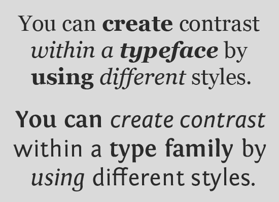
Style and Decoration
The style of a typeface has a huge impact on how it's received. Generally, when working with styles, you're going to be either using regular or italic styles. Underlines are also used, but in web design, they should only be used for links (otherwise, they're confusing). Other decorations include things like outlines or drop shadows, both of which can be used to unify varying typefaces.
Style and decoration can also be used to create contrast within a type family or typeface. Combine regular and italic fonts, varying weights, and things like shadows or outlines to create variation within a font family and sufficient typographic contrast.
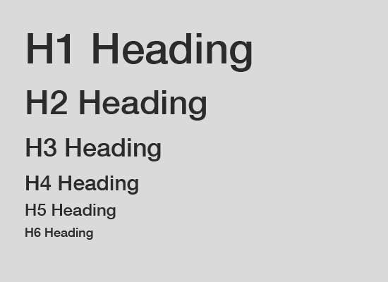
Scale and Hierarchy
The scale of typefaces, or their size relative to one another, is another important factor in combining typefaces. The hierarchy of different elements within the design is greatly influenced by the scale of the typefaces used. For example, your headings should obviously be larger than your paragraph copy. To the same end, yourH1 headings should be larger than your H2 headings, and so forth.
As a general rule, your hierarchy should start with your H1 heading being the largest, and your meta information or captions should be the smallest. You need to balance the differences in scale with differences in weight and style, too, so that you don't have too much variation in size between your largest and smallest fonts.
Classificiation
In general, when combining typefaces, you'll want to choose ones that aren't from the same classification. Combine a serif and a sans-serif, or a serif and a script, etc., and you'll have a much easier time coming up with a combination that has proper contrast and doesn't clash.
Combining typefaces within the same classification is sometimes possible, but there are some extra considerations. For one, you want to find typefaces that are different enough that they're immediately recognizable as different typefaces, while also using typefaces that have similar moods, structures, and other factors that tie them together. To some extent, trial and error is your best bet for finding typefaces within the same classification that can work together.
One trick is to choose typefaces that are in the same general classification, but fall under different sub-classes (such as a slab serif and a modern serif, or a geometric sans serif with a grotesk). This provides more contrast right from the start.
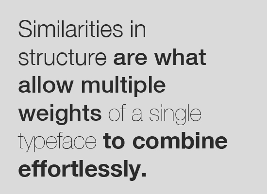
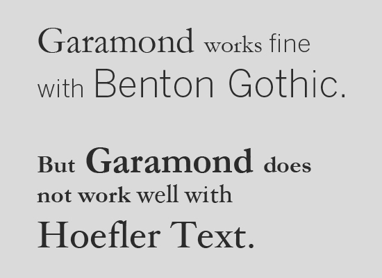
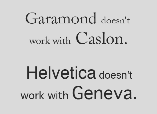
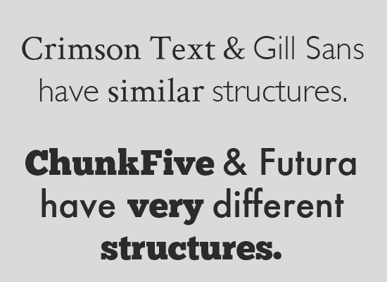
Structure
The structure of a typeface plays a huge role in how it works with other typefaces. You either need to choose typefaces that have very, very similar structures, or very different structures. Letterforms that are only a bit similar are going to clash. Typefaces that are very different in other ways can be unified by their similar structures, though the reverse rarely works as well.
Look at the letterforms side-by-side and see if they share a similar shape or other factor (such as x-height). It's better to go with wildly different structures than structure that's almost the same but not quite.
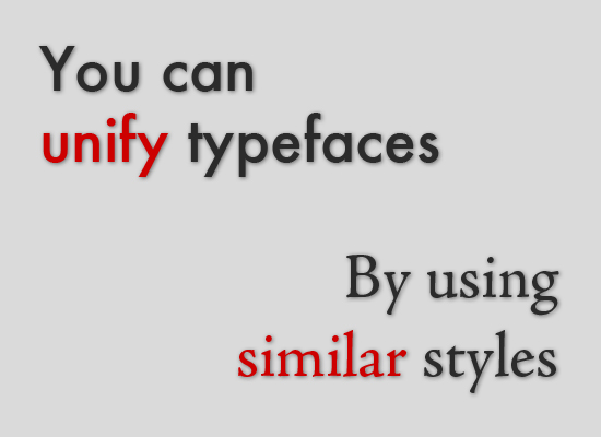
Color and Texture
When you need to add visual contrast or unify disparate typefaces, the use of color and texture can do wonders. For example, when you need to add contrast among typefaces that are nearly identical (or within a single type family), changing the color of some elements instantly adds interest. Adding texture has the same effect.
Alternatively, if you have wildly different typefaces, color and texture and unify those typefaces, creating a harmonious look. The principles of color theory still apply to typography, so be sure you don't go overboard combining colors.
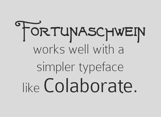
Extreme Contrast
Extreme contrast can be a great option if you're working with display or script typefaces. In these instances, it can be difficult to find typefaces with good contrast that aren't too dissimilar. So rather than trying to do that, go for completely different typefaces. Try combining a rather simple typeface with something more elaborate for the best results, rather than two elaborate typefaces.
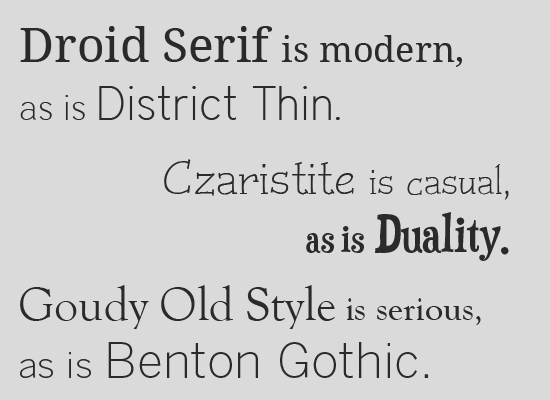
Mood
The mood of the typefaces you select is vital to the way they work together. Mood can be anything from formal to casual, fun to serious, modern to classic, or anything in between. This is where a lot of people run into trouble with combining typefaces. Selecting typefaces that not only have similar (or complementary) moods, but also have moods to match the project you're designing is crucial.
Examples
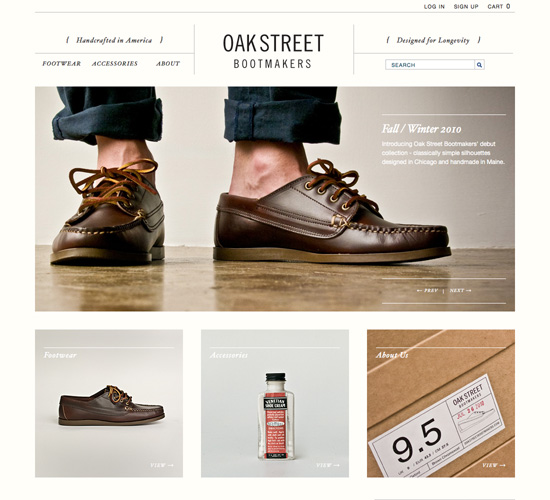
Oak Street Bootmakers Oak Street Bootmakers Uses a combination of Hoefler Text and Franklin Gothic, both of which are very classic typefaces. It creates an image that is steeped in tradition.
Pound & Grain
Pound & Grain combines two serif typefaces, as well as a sans serif on their home page. The two serifs work well together because they belong to different sub-classes.
Burciaga
Burciaga combines three distinct typefaces: Droid Serif, Georgia, and Dancing Script. Droid Serif and Georgia work surprisingly well together, and Dancing Script adds extra elegance.
Stuart Bicknell Photography
Stuart Bicknell Photography uses font size and style to create contrast on the site, depsite the fact that virtually all of the typography is Times New Roman (there are a few small touches of Arial).
Foundation Six
Foundation Six uses a mix of Clarendon and Helvetica Neue, which creates a modern but still conservative look.
CalebAcuity Americas
CalebAcuity Americas uses a combination of YanoneKaffeesatzBold and Lucida Sans. It's a very modern look, and a great example of how to successfully combine sans serif typefaces.
Analog
Analog is a great example of a site that uses a single typeface, but uses styles, colors, and scale to create contrast.
Thor Datacenter
Thor Datacenter combines a few typefaces, including AllerDisplay, JournalRegular, and Arial. The addition of a script font like JournalRegular to the otherwise sans serif typography palette results in a much more casual and inviting feeling to the site.
47 Degrees
47 Degrees combines LeagueGothic with ChunkFive and Helvetica for a very modern, casual style. They also use Museo300 sparsely on their site, which adds more visual interest.
Logo Nest
Logo Nest combines a huge number of typefaces on their site to create a vintage look. They keep everything unified, though, through color (virtually all the type on the site is either black or white).
More Resources:
- Typographic Contrast and Flow From WebDesignerWall. Covers the basics of contrast in typography.
- Typographic Contrast and the Web A very comprehensive aritcle that covers the basics of typographic contrast as it pertains to web design.
- Focus on Typography, Part 1: Contrast From SitePoint, this article covers all the basics of contrast, fully illustrated.
- A Guide to Web Typography A fantastic, comprehensive article covering web typography from I Love Typography.
- 29 Principles for Making Great Font Combinations A list-style post that covers some excellent rules for combining typefaces.
very informative. I consider typography an integral part of design
Well written, but articles like this pops up every week. I wish there were more articles about typographic rules and principles, rather than just guides for choosing and combining typefaces followed by a collection of screenshots (and pictures of heavily photoshopped 3D letters with flowers, lightning effects spelling out “typography” in Helvetica or the latest free fonts).
I want to read more about the rules and why they are important, when to use the right punctuation marks, columns, spacing, etc. Something that recognizes typography as a part of the structure and organization of written language. Going into the details, and not just the basic visual properties of different typefaces.
I agree, although I find it an nice article. Especially the examples made it a lot more clear. But I’m not sure what is meant with structures? What exactly is the structure of a font?
articles like this do not pop up every week, i think the author has took great effort in giving step by step typography guide especially for beginners .
Great article, really loved the examples. Typography is something that is sometimes put to the side, but it’s really a crucial part of a great web design.
Thanks for taking some of the mystery out of typefaces. I’m looking forward to using the principles your laid out as a staring point for some projects I working on. Thanks for a great article, I particularity like how you presented your examples.
Nice reading. Thanks for the basics in this matter.
Thanks so much for this. I seriously have been looking for a reference like this forever! I always feel like my typefaces are going to clash, so I just end up using the same one which turns out to be quite boring. Definitely bookmarking this!
Wow! The perfect article on Typography!
Very useful article!
Example of a well done (and quite relevant) design article. Kudos!
EXCELLENT article, and very helpful. Thanks!
Summary:
Don’t combine things that look similar.
Your thoughts and reflections about the “Principles for Combining Typafaces” are helpful for me to improve my own Webdesign.
Does anyone know the name of the bottom font in the fourth example—the jpeg is labelled “3-style”—just above the heading ‘Scale and Hierarchy’?
DC: I believe the font you ask for is “Fontin”.
Very useful article. Great little reference post. And thanks for listing the Stuart Bicknell site! :D
Excellent article,Great insight. Thanks for sharing.