
A Crash Course in Typography: Pulling It All Together
In the first three parts of this series, we covered a lot of information about the anatomy of a typeface, and what kinds of things to look for when actually combining two fonts. Here, we'll tie it all together.
[fblike]
Below are guidelines for combining fonts for paragraphs and headlines, as well as for other common type elements, like pull quotes and by-lines.
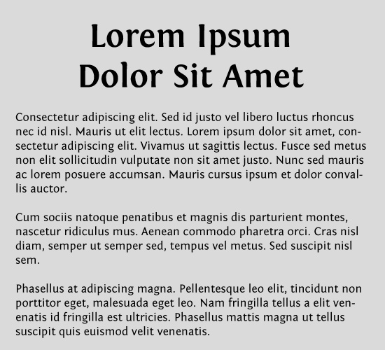
 The absolute simplest way to create a headline/paragraph combination is to use the same typeface for both, but with different weights and sizes. Here, we've combined Adobe Caslon: Regular for the paragraph copy and Bold for the headline. It's simple and formal, but can be a bit boring.
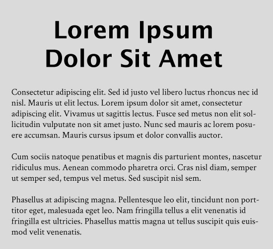
 The next easiest is to select fonts from the same family. Here we have Fontin Bold for the headline and Fontin Sans for the paragraph copy. Again, change around the weight and size to get better contrast. There are a lot of typeface families that include both serif and sans serif typefaces, including Droid Sans and Droid Serif, and Museo and Museo Sans.
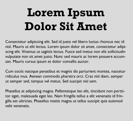
 Probably the most common method of combining typefaces is to pair a serif with a sans-serif. In print design, serifs are generally used for the body copy, while sans-serifs are used as headlines. The opposite is more generally true online, though both can work in either setting. Here, we've combined Lucida Sans for the headline with Crimson Text for the paragraph copy.
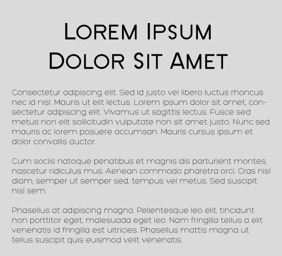
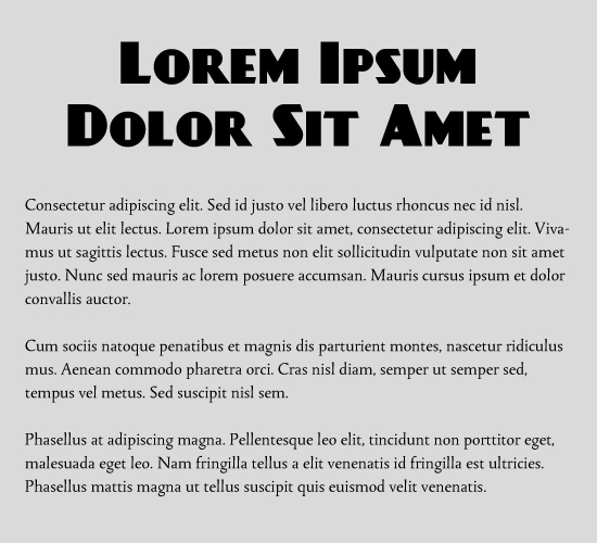
 Here we've combined Rockwell Bold for the headline and Gill Sans for the paragraph type. Both of these typefaces have a basis in geometric shapes, and therefore they work well together. If you look at the letter "o" especially, you'll see that in both typefaces, it's almost a perfect circle (the same is true for the bowls of the letters in both).
 Both the typefaces here are clean and modern. The headline is SF New Republic SC and the paragraph is Hero Light.
 Here's another set with a similar mood and style, this time old-fashioned or antique. The headline is Tagettes and the paragraph copy is Goudy Bookletter 1911.
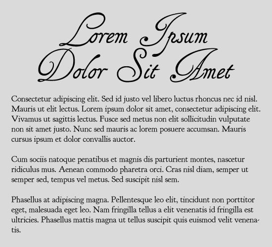
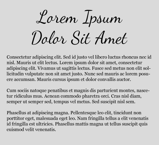 Mixing a strong typeface with a more neutral one can also be a great technique, especially on the web. Here, we have Dancing Script for the headline and Georgia for the paragraph copy.
 The trickiest typeface combination technique is probably creating a combination from two radically different typefaces. It's tricky because it's so easy to go wrong. Just because two typefaces are radically different doesn't mean they'll automatically work together. And when one of those typefaces also needs to be legible as paragraph text, it makes things that much more difficult.
The example above combines Tallys for the paragraph copy with DayPosterBlack for the headline. Tallys is a decidedly traditional-looking typeface, with a fairly light stroke weight. DayPosterBlack, by contrast, is a strong, modern, almost sci-fi-looking typeface.
This is one of those techniques that's best achieved through simple trial-and-error. Try out a bunch of different combinations and see which ones look good together. You may have to try out a dozen or more combinations before you find one that works well because of it's contrast.
The trickiest typeface combination technique is probably creating a combination from two radically different typefaces. It's tricky because it's so easy to go wrong. Just because two typefaces are radically different doesn't mean they'll automatically work together. And when one of those typefaces also needs to be legible as paragraph text, it makes things that much more difficult.
The example above combines Tallys for the paragraph copy with DayPosterBlack for the headline. Tallys is a decidedly traditional-looking typeface, with a fairly light stroke weight. DayPosterBlack, by contrast, is a strong, modern, almost sci-fi-looking typeface.
This is one of those techniques that's best achieved through simple trial-and-error. Try out a bunch of different combinations and see which ones look good together. You may have to try out a dozen or more combinations before you find one that works well because of it's contrast.
 It doesn't look bad, but it's also kind of boring having both the paragraph and pull quote in Times.
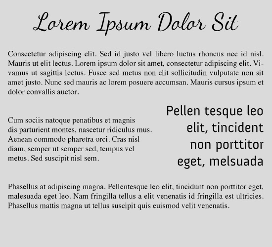
 Another option is to use the headline typeface, in this case Dancing Script, for your pull quote. This is more interesting, and definitely draws more attention to the pull quote, but it's not going to work in every situation. As a general rule, the more decorative your headline font, the worse it will work for pull quotes. You can get away with a script, but anything more decorative than that isn't going to look right.
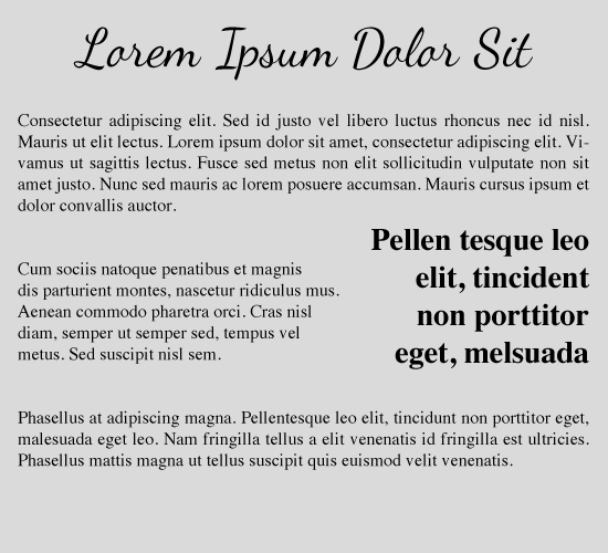
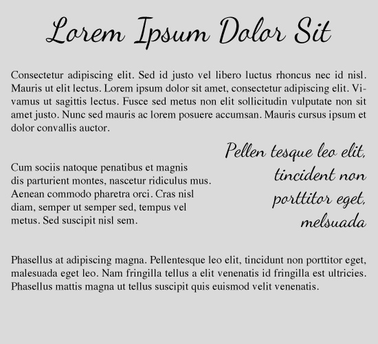
 The other options with pull quotes is to use a typeface completely different from your headline and paragraph choices. In this case, we've used Anivers for the pull quote, Times for the paragraph, and Dancing Script for the headline. Consider the guidelines for combining paragraph and headline typefaces, and use the same general guidelines. In this case, since the paragraph text is a serif and the headline is a script, it made sense to use a sans-serif for the pull quote. Using a weight for the pull quote that's roughly the same as the weight for the headline helps tie everything together.
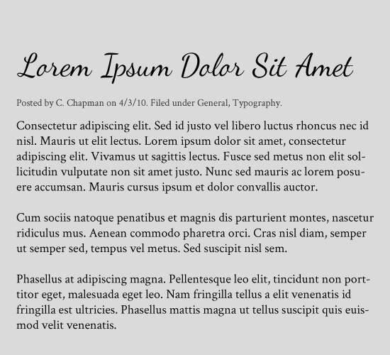 The first option is to use the same typeface you've used for your body copy, but in a slightly smaller size and/or a lighter color. Here, both the body copy and the meta information are Crimson.
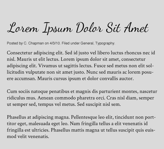 Another option is to use a very neutral typeface, like Helvetica, for your meta copy. This choice is especially good if your body text isn't highly legible at small sizes.
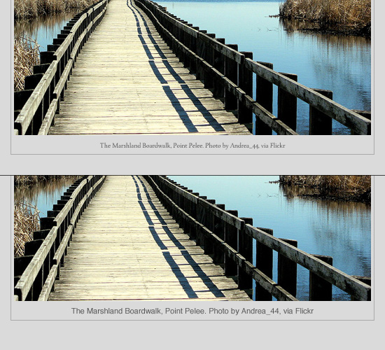 Boardwalk by Andrea_44 shared under Creative Commons Attribution 2.0 Generic (CC BY 2.0) licence
For example, look at the captions on the images above. Both are in 11pt, regular weight fonts. The top caption is in Tallys, a common typeface for body copy, which isn't particularly legible in this instance unless you squint. The bottom caption, by contrast, is in Helvetica, and is significantly more legible.
Boardwalk by Andrea_44 shared under Creative Commons Attribution 2.0 Generic (CC BY 2.0) licence
For example, look at the captions on the images above. Both are in 11pt, regular weight fonts. The top caption is in Tallys, a common typeface for body copy, which isn't particularly legible in this instance unless you squint. The bottom caption, by contrast, is in Helvetica, and is significantly more legible.
Headlines and Paragraphs
The headline and paragraph are two of the most basic building blocks of the typography of a design. In some cases, a heading and paragraph may be the only kinds of typographic information present in a design. Because of this, they're often given great precedence in the design process. So let's start with these two elements, and we'll expand from there. Here are some examples of effective typeface combinations, starting with the least difficult.
The absolute simplest way to create a headline/paragraph combination is to use the same typeface for both, but with different weights and sizes. Here, we've combined Adobe Caslon: Regular for the paragraph copy and Bold for the headline. It's simple and formal, but can be a bit boring.
The next easiest is to select fonts from the same family. Here we have Fontin Bold for the headline and Fontin Sans for the paragraph copy. Again, change around the weight and size to get better contrast. There are a lot of typeface families that include both serif and sans serif typefaces, including Droid Sans and Droid Serif, and Museo and Museo Sans.
Probably the most common method of combining typefaces is to pair a serif with a sans-serif. In print design, serifs are generally used for the body copy, while sans-serifs are used as headlines. The opposite is more generally true online, though both can work in either setting. Here, we've combined Lucida Sans for the headline with Crimson Text for the paragraph copy.
Here we've combined Rockwell Bold for the headline and Gill Sans for the paragraph type. Both of these typefaces have a basis in geometric shapes, and therefore they work well together. If you look at the letter "o" especially, you'll see that in both typefaces, it's almost a perfect circle (the same is true for the bowls of the letters in both).
Both the typefaces here are clean and modern. The headline is SF New Republic SC and the paragraph is Hero Light.
Here's another set with a similar mood and style, this time old-fashioned or antique. The headline is Tagettes and the paragraph copy is Goudy Bookletter 1911.
Mixing a strong typeface with a more neutral one can also be a great technique, especially on the web. Here, we have Dancing Script for the headline and Georgia for the paragraph copy.
The trickiest typeface combination technique is probably creating a combination from two radically different typefaces. It's tricky because it's so easy to go wrong. Just because two typefaces are radically different doesn't mean they'll automatically work together. And when one of those typefaces also needs to be legible as paragraph text, it makes things that much more difficult.
The example above combines Tallys for the paragraph copy with DayPosterBlack for the headline. Tallys is a decidedly traditional-looking typeface, with a fairly light stroke weight. DayPosterBlack, by contrast, is a strong, modern, almost sci-fi-looking typeface.
This is one of those techniques that's best achieved through simple trial-and-error. Try out a bunch of different combinations and see which ones look good together. You may have to try out a dozen or more combinations before you find one that works well because of it's contrast.
Beyond Headlines and Paragraphs
Headlines and paragraphs, while important, are only one small part of a lot of designs, especially blogs and news sites. Below are a few more types of typographic elements you may find yourself using.Pull-Quotes
With pull quotes, there are a couple of different options. First, you can simply use the body copy typeface for your pull quotes, but in a larger size, and possibly a different weight:
It doesn't look bad, but it's also kind of boring having both the paragraph and pull quote in Times.
Another option is to use the headline typeface, in this case Dancing Script, for your pull quote. This is more interesting, and definitely draws more attention to the pull quote, but it's not going to work in every situation. As a general rule, the more decorative your headline font, the worse it will work for pull quotes. You can get away with a script, but anything more decorative than that isn't going to look right.
The other options with pull quotes is to use a typeface completely different from your headline and paragraph choices. In this case, we've used Anivers for the pull quote, Times for the paragraph, and Dancing Script for the headline. Consider the guidelines for combining paragraph and headline typefaces, and use the same general guidelines. In this case, since the paragraph text is a serif and the headline is a script, it made sense to use a sans-serif for the pull quote. Using a weight for the pull quote that's roughly the same as the weight for the headline helps tie everything together.
Meta Information
Meta information is going to be found on virtually every blog or news site out there. This includes things like the category or tag information, the time the article was posted, and other similar information. Sometimes, it also includes the by-line of the author. Again, there are a couple of different ways to approach the typography for this kind of information. The first thing you need to remember, though, is that meta information is usually displayed quite small, and sometimes in a lighter color. This rules out a large number of potential typeface choices, as you need something that's legible at an 8 or 10 point size.
The first option is to use the same typeface you've used for your body copy, but in a slightly smaller size and/or a lighter color. Here, both the body copy and the meta information are Crimson.
Another option is to use a very neutral typeface, like Helvetica, for your meta copy. This choice is especially good if your body text isn't highly legible at small sizes.
Captions
Photo captions should be treated much like meta information. Generally, the type used to caption images is small and sometimes in a lighter color than the body text. In a lot of cases, it's included within the image border. Again, you basically have two options for photo captions: you can use the same typeface as your body copy, or you can use a different face. If your captions are going to be very small, legibility may make the decision for you.Boardwalk by Andrea_44 shared under Creative Commons Attribution 2.0 Generic (CC BY 2.0) licence
For example, look at the captions on the images above. Both are in 11pt, regular weight fonts. The top caption is in Tallys, a common typeface for body copy, which isn't particularly legible in this instance unless you squint. The bottom caption, by contrast, is in Helvetica, and is significantly more legible.
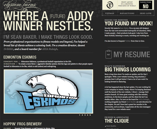
Examples
Whether you're combining two typefaces or eight, the same principles apply. You need to find typefaces with some kind of shared characteristics (except when using radical contrast) so that they work well together. Here are some examples of websites that have done just that.Elysium Burns
Elysium Burns uses a combination of serif and sans serif typefaces, as well as a variety of styles (including all caps).
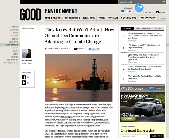
Good Magazine
Good Magazine also uses a combination of serif and sans serif typefaces, including Georgia for the body text and Arial for navigation and meta information.
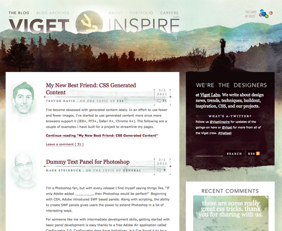
Viget Inspire
The Viget Inspire blog uses a combination of sans serif and serif typefaces. Constantina (with Georgia as the primary alternate) is used for headings, while Georgia and Verdana are used for meta information. Body copy on the blog is Verdana.
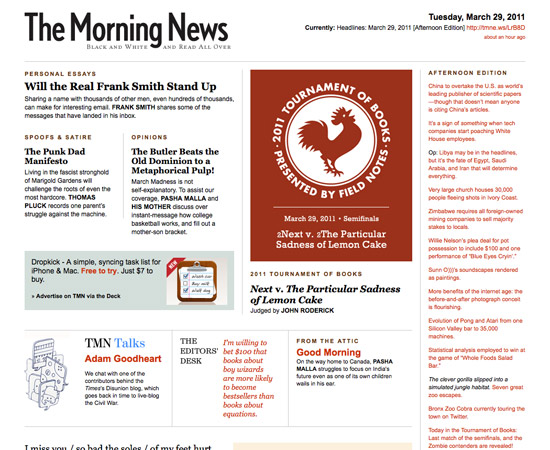
The Morning News
The Morning News uses Georgia for their headlines and Arial for body copy. They use a variety of weights and styles (including italics and all caps) to set apart different kinds of copy.
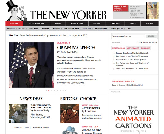
The New Yorker
The New Yorker uses their own typeface for article headlines, and Times New Roman for body copy. Meta information and some navigation is set in Arial.
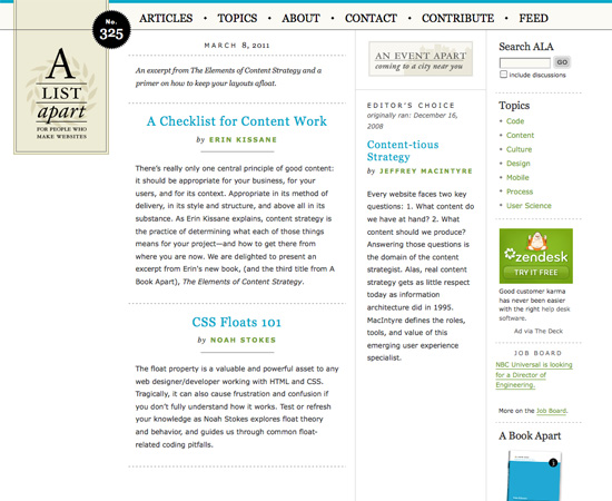
A List Apart
A List Apart uses Georgia for their headlines and navigation, and Verdana for body copy. For by-lines and meta information, they use a combination of Verdana and Times.
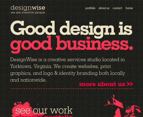
Design Wise
Design Wise uses various weights of a slab serif typeface for all of their typography.
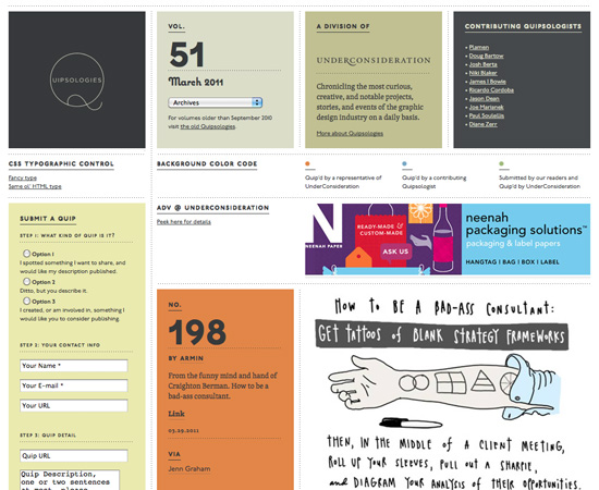
Quipsologies
Quipsologies uses a variety of custom fonts for their headlines (p22-underground-pc-1 and coquette-1 most prominently). They also use custom fonts for body text (mostly p22-underground-1 and skolar-1). It's a bold choice, made possible by web fonts.
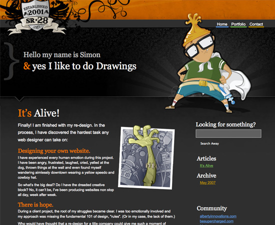
sr28
sr28 uses Georgia for headlines and Arial for body text.
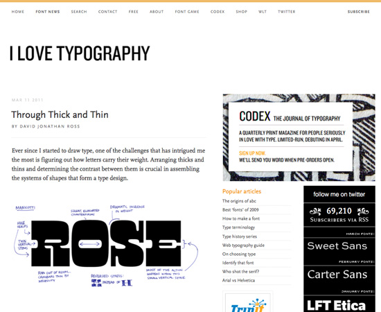
I Love Typography
I Love Typography uses web fonts from the same family for their typography, including ff-scala-sans-web-1 for their headlines and meta information, and ff-scala-web-1 for their body copy.
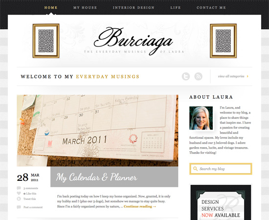
Burciaga
Laura Burciaga's blog uses a combination of three primary typefaces: Dancing Script (for headlines), Droid Serif (for meta information), and Georgia (for most of the body copy). Combining two serifs is tricky, but it's done really well here.
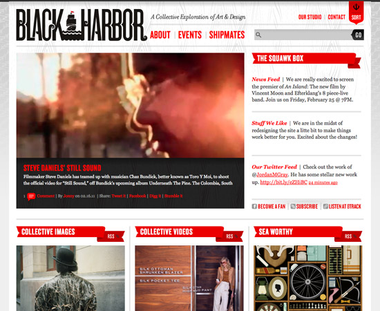
Black Harbor
Black Harbor uses Georgia for body copy and KnockoutHTF48-Featherweight for the headlines and navigation.
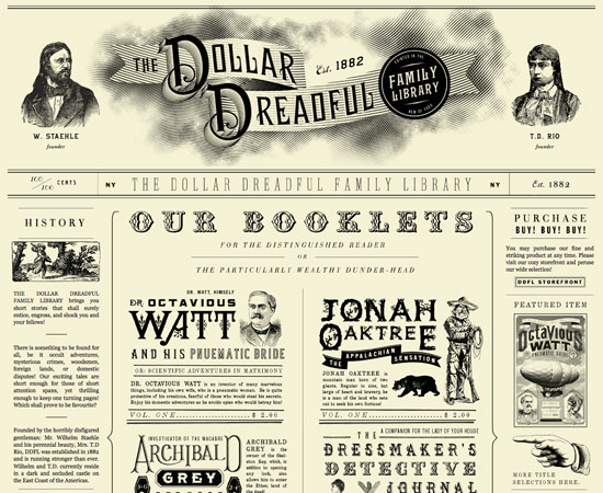
The Dollar Dreadful
The Dollar Dreadful uses a huge number of retro-styled typefaces for their headlines. Their body font is Georgia.
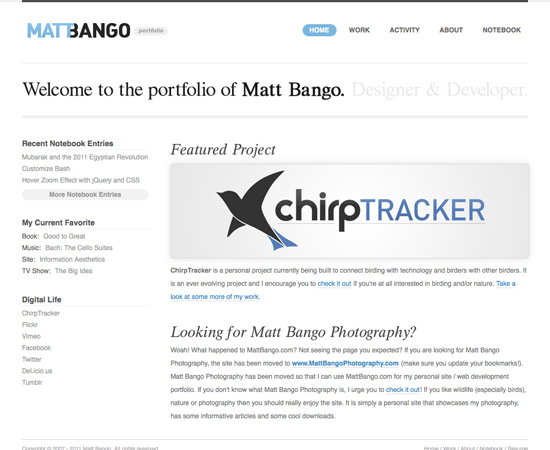
Matt Bango
Matt Bango uses a mix of Georgia and Helvetica, as well as another serif typeface (with Flash replacement).
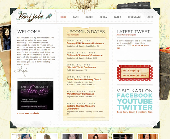
Kari Jobe
Kari Jobe's site uses a variety of typefaces, including Courier New for the body copy. Most of the typography on the site is done with images rather than web fonts.
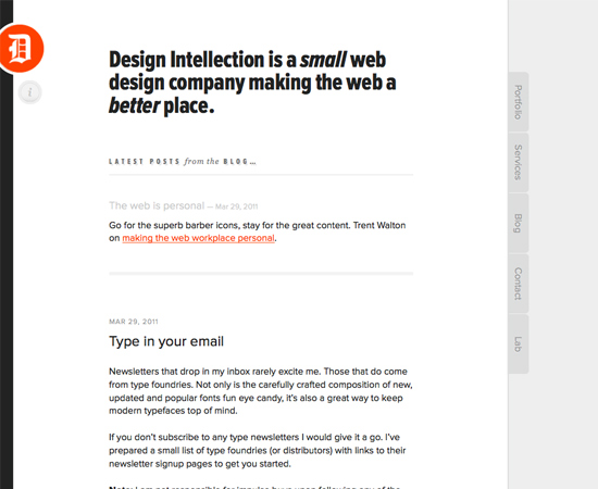
Design Intellection
Design Intellection uses a variety of weights and styles of Proxima Nova, as well as a bit of Georgia (for block quotes).
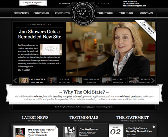
The Old State
The bulk of the typography on The Old State is Georgia, though there's a thin slab serif also used for the navigation and logo.
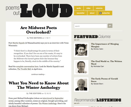
Poems Out Loud
Poems Out Loud uses Baskerville as their primary typeface for both headings and body copy (with Times as the secondary font). There's also limited use of Helvetica Neue for navigation.
A Word on Web vs. Print
There's a lot of conflict surrounding the best practices for typography on the Web when compared to print. In print, longstanding wisdom has pointed toward using serif typefaces for body copy and sans-serifs for headlines. On the web, the opposite is often touted as gospel: sans-serif body copy and serif headlines. The truth of the matter is that both serif and sans serif typefaces can be perfectly readable both onscreen and in print. It's all dependant on proper contrast and sizing. Some typefaces are designed to work well at small sizes (mostly by "hinting"), while others are not. One general rule of thumb for optimal readability, though, is that slightly larger type works better onscreen. This is partly to do with resolution: printed materials are generally printed at 300 dots per inch and up. Screen resolution, though, is generally around 96 points per inch. Because fewer pixels/dots are used to make up the letterforms, they're slightly less crisp onscreen than they are when printed. By making a type slightly larger, you're using more pixels to represent the same forms, making the form sharper. The more detailed the letterforms (such as with serif typefaces), the more stark this difference becomes. This is why sans-serif typefaces are often preferred online, as their simpler shapes are better reproduced at smaller sizes.Conclusion
Much of good typographic design has to do with being unafraid of trying new things and experimenting. Sometimes unlikely combinations work beautifully together, while at other times two typefaces that should look great together just don't quite look right. The only way to learn what works and what doesn't is to try new things. Here are some very general guidelines for using typefaces for various parts of a typical design. Remember, these are just guidelines, and there will be exceptions to all of them.- Small fonts are more readable if they're less detailed to begin with. This is compounded when they're being used online.
- Captions and meta information are generally a few points smaller than body copy, and should either be in the same typeface or a neutral alternative like Helvetica.
- Your typography should match the feel of your content. Formal documents should use formal type. Informal documents should use informal type. (In other words, don't use something like Comic Sans for a corporate report, and likewise don't use Times New Roman for a child's birthday party invitation.)
- When in doubt, use Caslon.
More Resources
- Four Techniques for Combining Fonts A useful breakdown from Hoefler & Frere-Jones
- Mastering Font Combinations A short, basic article on combining typefaces.
- 19 Top Fonts in 19 Top Combinations A look at combining some of the most popular fonts used by designers.
- 10 Great Google Font Combinations You Can Copy Not only gives the ten combinations, but also the reasons behind combining them.
- Choosing Type Combinations An in-depth article from Layers Magazine.
- Best Practices of Combining Typefaces An article from our archives on basic rules for combining typefaces.
Interesting article, I can see the websites in the future featuring a far more varied use of fonts now that @fontface and others have evolved. I don’t think that the web will mirror print as its fluid and font sizes will always vary but I can see designers having many more design options in the future, quite exciting to see how sites will develop in the future.
A lot of impressive examples, but not much real explanation actually. I don’t know anything at all about typography and while these samples all look good, I still wouldn’t know how to choose between a set of fonts. For example: ” In this case, since the paragraph text is a serif and the headline is a script, it made sense to use a sans-serif for the pull quote. “… Why does it make sense to use sans-serif for a pull quote? I read the entire article again when I came across that line, and I didn’t find a satisfactory answer. Sorry for ranting, but lately, I have been having this sentiment about most design blog posts and writeups.
Hey Munim
Thanks for the feedback. This article is the continuation of a series, so if you scan back and check out last week’s post which covered the Principles for Combining Typefaces it might shed a little more light on the subject than this weeks installment for you. I hope it helps answer your questions.
Nice post! Will definitely be checking up the rest in the series.
I always seem to end up using the same fonts for body text: verdana, arial, georgia etc. Are there many more web safe fonts that look nice for body text?
I’ve been checking out @fontface and it looks like a very interesting wat to expand my web font horizons! :o)
I was always fascinated how typography works in web, but thanks to this awesome article, I did clear my doubts. Thank You.
Good typography is a key element to almost all print and web design work. Traditionally print design has always had more freedom when it comes to experimenting with typography and exploring different possibilities but I think web design is fast catching up. With techniques such as font replacement, and the introduction of CSS3 the possibilities of typography within web design is constantly expanding. However no matter how much technology evolves I think good typography is always down to the understanding and implementation of key design principles. Some of my favourites here are the Viget Inspire site, I particularly like how they’ve combined the background image with the main heading, and the Dollar Dreadful site as I’ve always liked this type of retro typography.
The other articles in this series should be linked at the start of the article, would make things more streamlined.
still confused :(