
Album Covers with Eye-Catching Typography
It is hard to imagine the design world without typography since it has undoubtedly influenced the major development and establishment of design trends today. This post includes thirty inspirational examples of famous CD album covers that will surely inspire you with their excellent typography.
[fblike]
It's interesting to see how different typefaces are used for different music tastes. Of course it's not only the typography of your favourite CD that can boost your inspiration but also listening to your favourite songs as well. What's your favourite CD album cover? What makes a CD album cover eye-catching? Share your thoughts with us below!
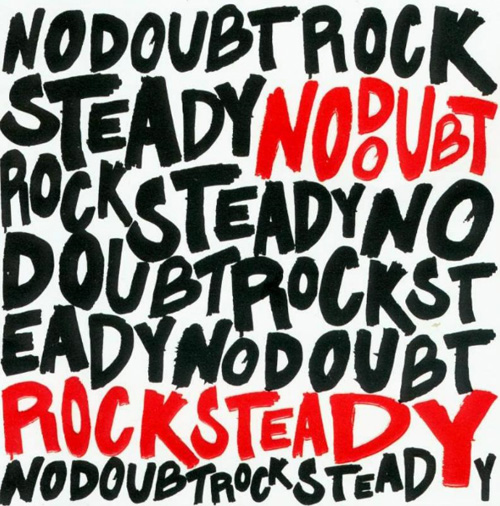
No Doubt - Rock Steady
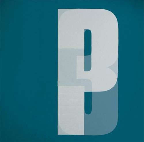
 Portishead - Third
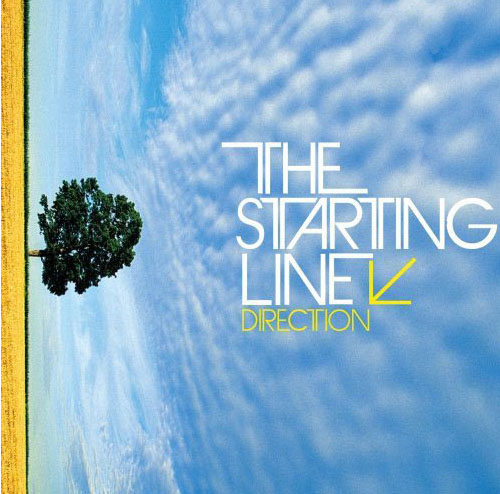
 The Starting Line - Direction
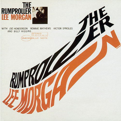
 Lee Morgan – The Rumproller
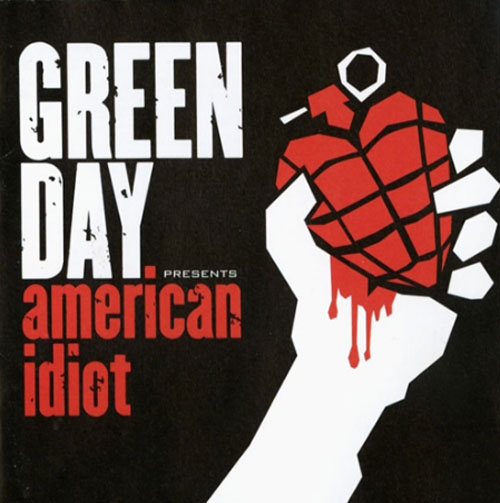
 Green Day – American Idiot
 TV on the Radio - Dear Science
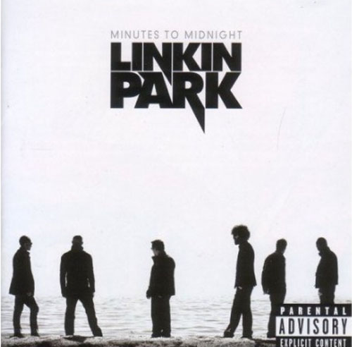
 Linkin Park – Minutes To Midnight
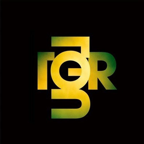
 Tiger Lou – Partial Print
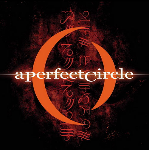
 A Perfect Circle - Mer de Noms
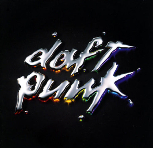
 Daft Punk - Discovery
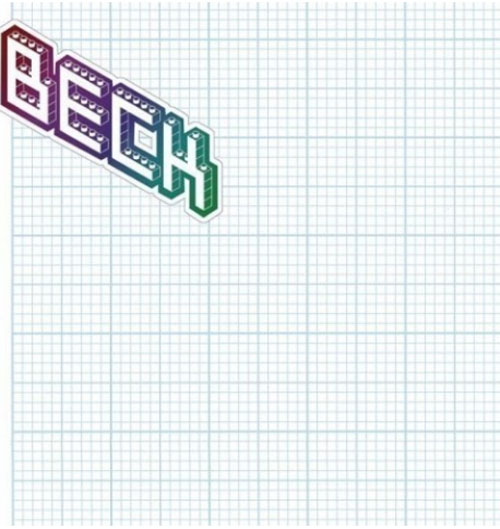
 Beck - The Information
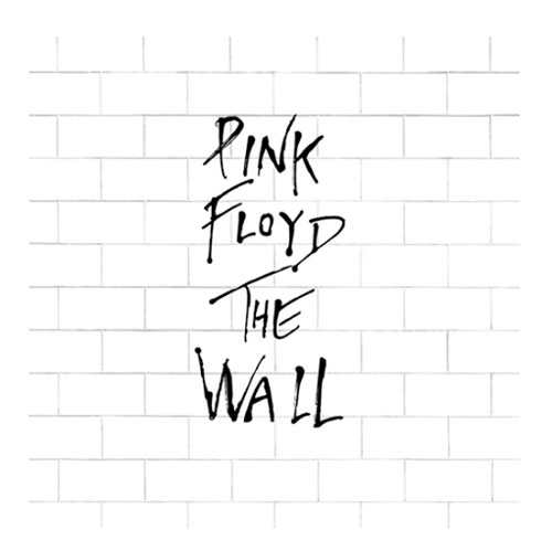
 Pink Floyd - The Wall
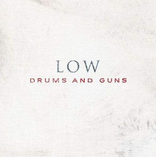
 Low - Drums and Guns
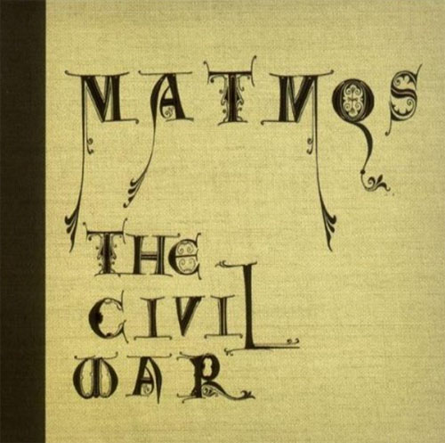
 Matmos - The Civil War
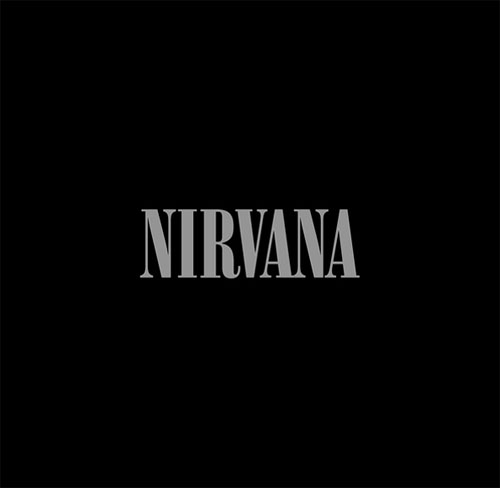
 Nirvana - Nirvana
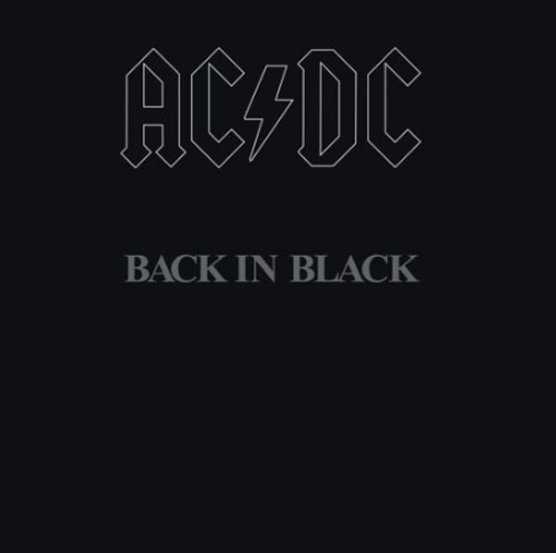
 AC DC - Back in Black
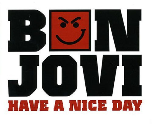
 Bon Jovi - Have a Nice Day
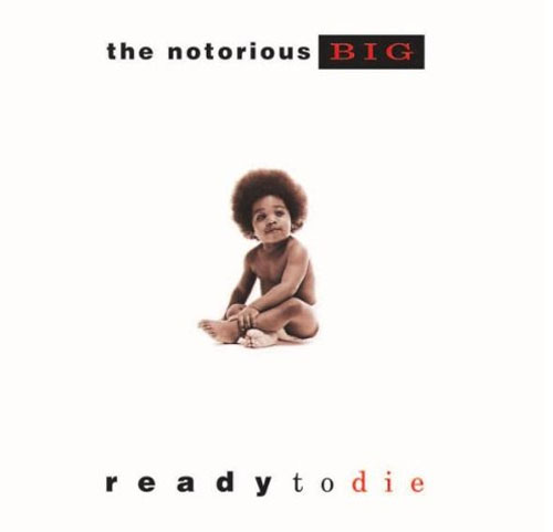
 Notorious B.I.G. – Ready To Die
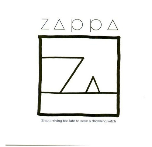
 Frank Zappa – Ship Arriving Too Late to Save a Drowning Witch
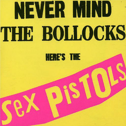
 The Sex Pistols - Never Mind The Bollocks
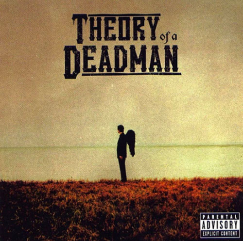
 Theory Of A Deadman – Self-Titled
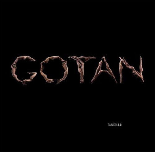
 Gotan Project - Tango 3.0
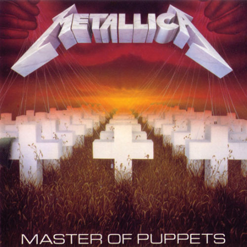
 Metallica – Master Of Puppets
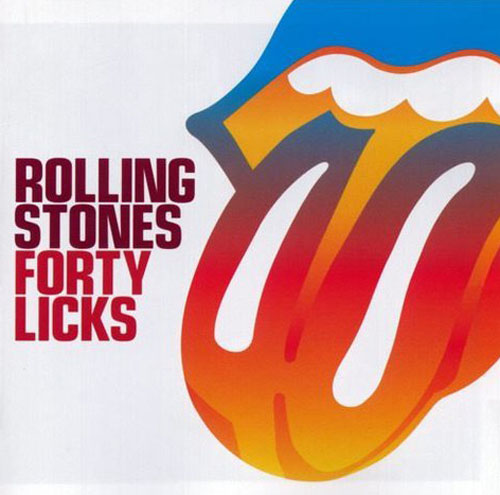
 Rolling Stones - Forty Lick
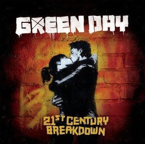
 Green Day – 21st Century Breakdown
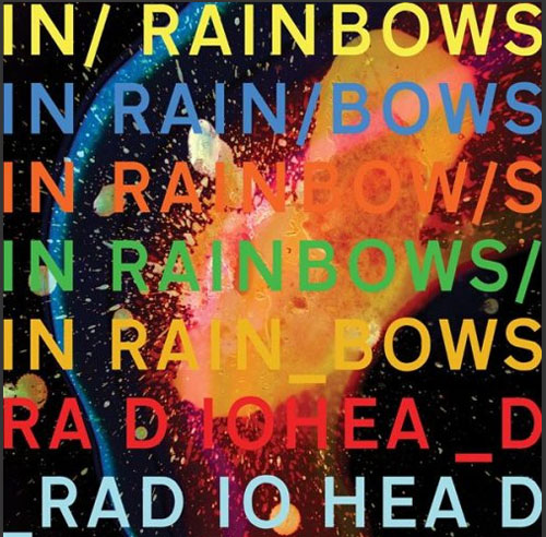
 Radiohead - In Rainbows
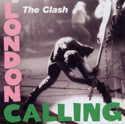
 The Clash - London Calling
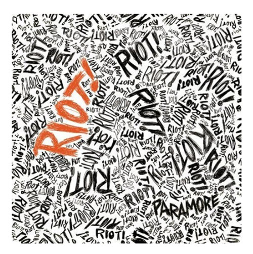
 Paramore RIOT
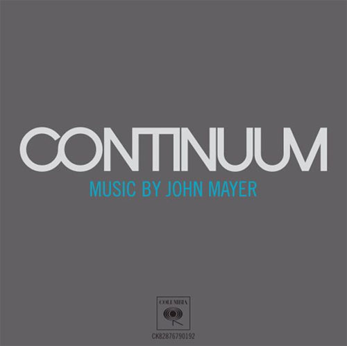
 John Mayer - Continuum
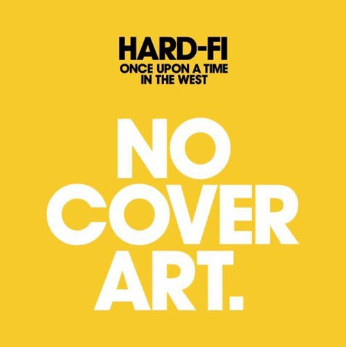
 Hard-Fi – Once Upon a Time in the West
 More Inspirational Sources:
Portishead - Third
The Starting Line - Direction
Lee Morgan – The Rumproller
Green Day – American Idiot
TV on the Radio - Dear Science
Linkin Park – Minutes To Midnight
Tiger Lou – Partial Print
A Perfect Circle - Mer de Noms
Daft Punk - Discovery
Beck - The Information
Pink Floyd - The Wall
Low - Drums and Guns
Matmos - The Civil War
Nirvana - Nirvana
AC DC - Back in Black
Bon Jovi - Have a Nice Day
Notorious B.I.G. – Ready To Die
Frank Zappa – Ship Arriving Too Late to Save a Drowning Witch
The Sex Pistols - Never Mind The Bollocks
Theory Of A Deadman – Self-Titled
Gotan Project - Tango 3.0
Metallica – Master Of Puppets
Rolling Stones - Forty Lick
Green Day – 21st Century Breakdown
Radiohead - In Rainbows
The Clash - London Calling
Paramore RIOT
John Mayer - Continuum
Hard-Fi – Once Upon a Time in the West
More Inspirational Sources:
- 35 Beautiful Music Album Covers - Album cover art is often considered to be one of the “extincted” fields in modern graphics design. In times when digital copies are cheaper and quicker to get, album covers have somehow lost their importance as less and less customers actually buy CDs and LPs in the stores. [...]
- 100 Obscure and Remarkable CD Covers - While recording artists and bands are busy recording their albums, a separate effort is usually being made behind the scenes to plan for the launch, promotion and circulation of the new tracks. The creation of CD cover art is an intergral part of this process.
A GIGANTIC dose of inspiration..
Thanks!!
Awesome collection. I’ve always loved that Sex Pistols cover!
to #1:
Yeah, quite inspiring. But what’s so inspiring? :)
To me — fonts on the web today look more like an average of these:
No Doubt – Rock Steady
Portishead – Third
Lee Morgan – The Rumproller
Linkin Park – Minutes To Midnight
Nirvana – Nirvana (minimalism)
AC DC – Back in Black (minimalism)
Notorious B.I.G. – Ready To Die (m)
Paramore RIOT (m)
But when someone would use something like of
Radiohead – In Rainbows —
then the professionalism of an artist would be immediately questioned. Sure, Radiohead with it’s popularity and style, could afford just not to care about the global opinion, and do something against the rules?…
It’s interesting to see how the different styles of typography not only represent the music but how some styles are now so recognisable they instantly represent a whole genre of music and everything that music represents. The most obvious example is the Sex Pistols album cover. I believe the uneven, anarchic typography now represents the entire punk movement. Another personal favourite of mine is the Pink Floyd album cover for the wall. Gerald Scarfes typography again is a great example of how typography can represent a period in music. The variety of styles is also apparent from the heavy metal style typeface of the Metallica cover to the clean and simple font used on the Hard-Fi cover. Each one I think successfully portrays the music and has became an integral part of it.
Always thought that the Paramore cover was a takeoff of the No Doubt cover…
As a rule, the brands suiting is not affected by imitation garments, however it’s casual and accessories selection is