
The Ultimate Ugly Showcase of Current Government Websites
Something a little different today: a showcase of government websites. The biggest difference between this showcase and others you see here at Noupe is obvious; the majority of the web 'designs' (if you can call them that) in this showcase are tremendously awful and poorly coded. And, well, let's be honest here: butt ugly!
So, what is it all of these governments don't quite understand? Someone is going to have to help me out here! Some of them say they are 'Optimized for Internet Explorer 6 and Firefox 1.0'. Firefox 1.0?! How many years ago was that?
Having very out-dated websites representing an entire country can't be a good thing - at all. They are difficult to use, the text is usually difficult to read, they have ridiculously slow loading speeds (depending on the country, of course), some of them are so bad they hurt your eyes.
To top the above points off, if you happen to be looking for one small piece of information (which you most probably are), it could take you hours on end of waiting, clicking, more waiting, napping, more clicking... until you're finally presented with a 'Server not found' error message! If I was looking at moving to a country and I got a server not found message, I think I would be put right off on the spot!
Bangladesh, Costa Rica and Papua New Guinea are just a few of the culprits of the dreaded non-loading pages, Russia is one of the many (far too many!) design offenders that use horrific drop-shadows. Also, the body copy font size is usually way too small for comfortable reading (Belarus).
However there are a couple that stand out from the rest - how many of you can tell me which ones they are?
Asia
Afghanistan
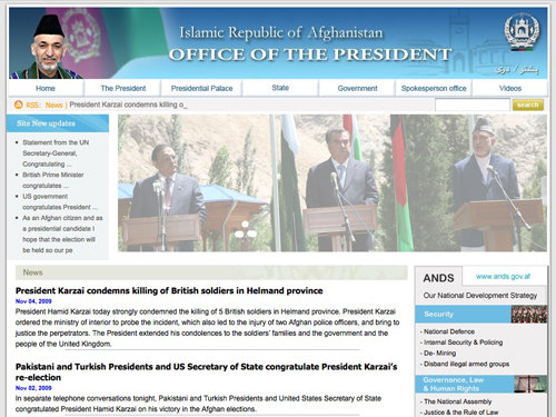
Afghanistans website manages to incorporate a workin RSS Feed but not much else. What's with the lowered opacity image?!
Bangladesh

Well, this site was loading for 10 minutes and, as you can see, didn't get very far!
Cambodia
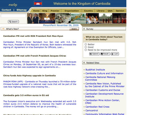
Cambodias government website has a great selection of Related Sites, but its 90s style color scheme and poorly coded structure makes it yet another terrible looking website.
China
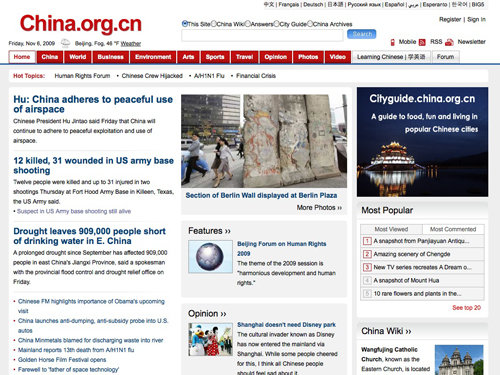
China has half managed a decent website for their government, a suitable and easy to read color scheme, a nice bold heading and an RSS Feed!
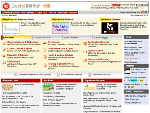
Hong Kong has a better idea then a lot of other sites here.
India
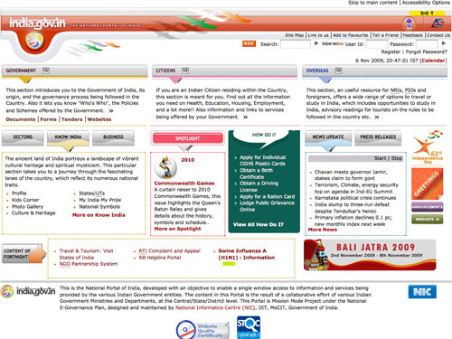
India has incorporated some nifty Web 2.0 highlight effects in with their 90's style layout. The spotlight section doesn't quite hit the spot though!
Indonesia
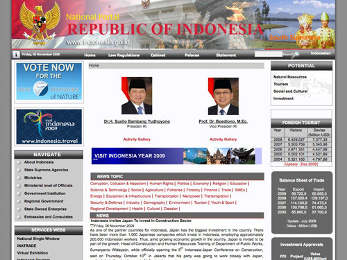
Indonesias government website looks a little like several different images merged together to create a banner style header with almost impossible to read text.
Iran
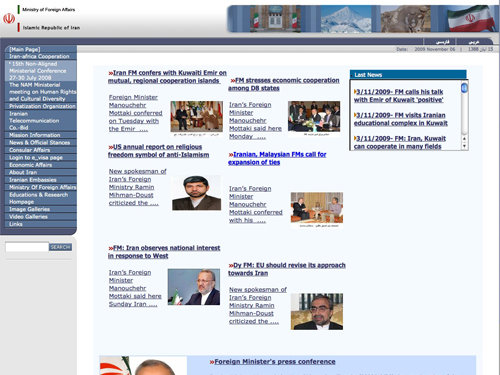
Iran makes great use of an iFrame style text box to display the 'Last News' in a scrollbox even though they have plenty of space left directly beneath it.
Iraq
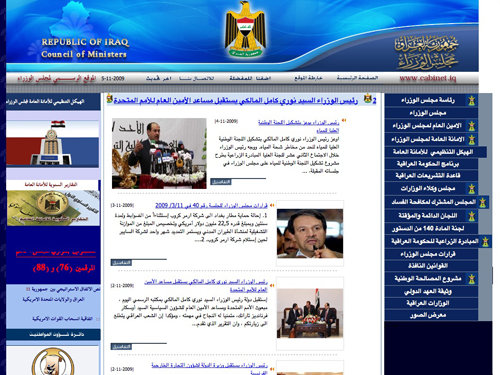
Iraq uses some terrible gradients and drop shadows on their aligned header type. For some unknown reason, the links on the right aren't doing what they're told either - but on second thought I highly doubt they were told in the first place.
Israel

Israels government has done their website pretty well compared to others, don't quite understand what the two dots off the 'v' in their logo are for though!
Japan
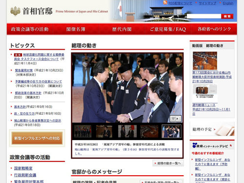
Japan has a very calm, simple and informative design.
Kazakhstan
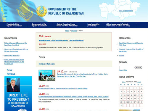
Kazakhstan has a better knowledge of color schemes and has come up with a half decent advertisment in the bottom left. Something still isn't quite right though... and the calendar obviously serves a great purpose for those who were about to ask!
Korea
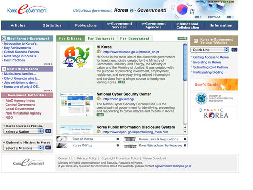
Korea has managed to pick up some great internet talk when creating their government website and decided to call it an e-Goverment... that explains it all.
Malaysia
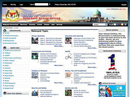
Malaysia has incorporated the option to change text size and color with their website. The designers should sort out the spacing between the thumnbail images and bullet points.
Maldives
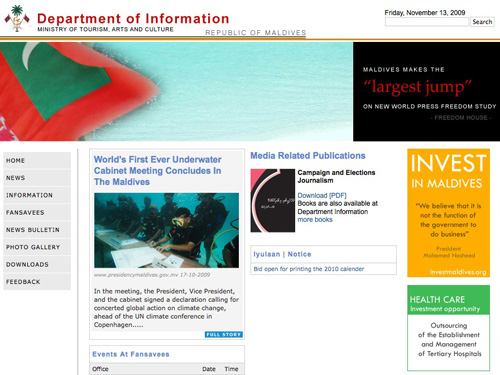
The Maldive's government website seems to have the content randomly placed on the page. And off the record: guys, letter-spacing isn't just used for fun!
Pakistan
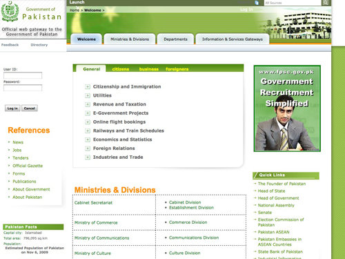
Pakistans 'official web gateway to the Government' uses lots of Photoshop feathering, gradients and drop shadows with some groovy dotted tables!
Saudi Arabia
You can't get much worse than Saudi Arabia's government website, it's overcrowded and uses bevel and emboss; a user's nightmare!
Singapore
Singapore hasn't done too badly with their government website, they've incorporated a pretty stylish photo of the city center in both daylight and nightlight; we are not too sure about the blending it into the rest of the page via feathering, though.
Thailand
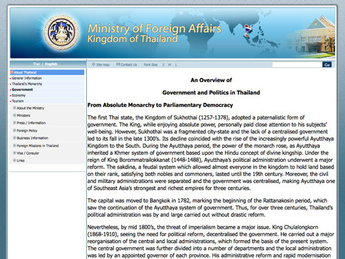
Thailand's government website can't get much simpler, it has various gradients and feather objects with outer glows to produce an attractive design – someone, please remove these terrible HTML borders!
Uzbekistan
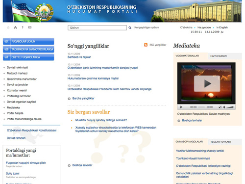
A very clean and well-commented (see the source code) design from Uzbekistan. The site uses many icons and a very light color scheme that makes it easy to read the text. However, on some pages there are certainly too much whitespace. Nice surprise: that's certainly not what we expected from Uzbekistan.
Vietnam
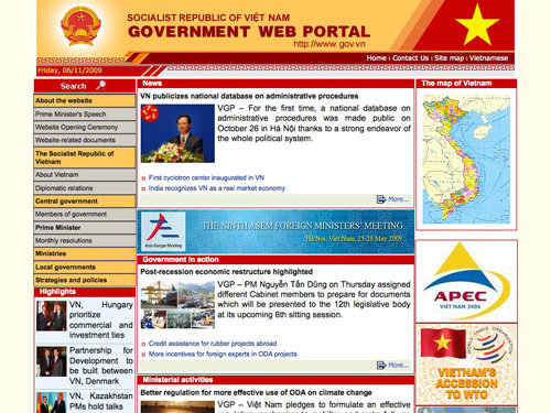
Vietnam has combined various warm colors to make a slightly over-the-top color scheme to use on their government website. The alignments are all wrong and you can see the table borders... should they even be using tables?!
Europe
Austria
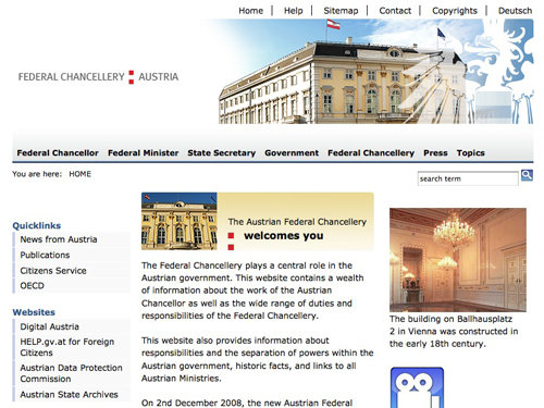
Austria, compared to other websites, is on the right track. There are no visible HTML tables and the navigation menu down the left side of the page is half decent.
Belgium
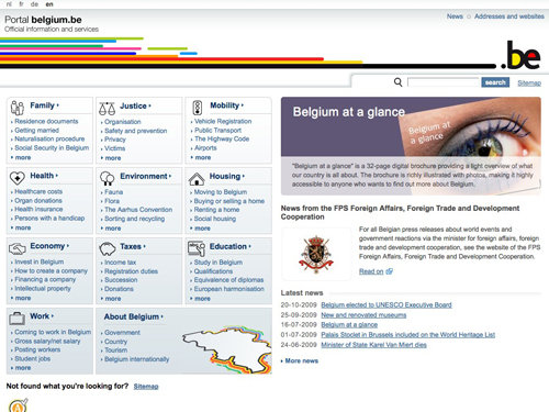
Well done, Belgium! I actually quite like this government website - they've combined a sleek color scheme with plenty of important information and stylish icons.
Belarus
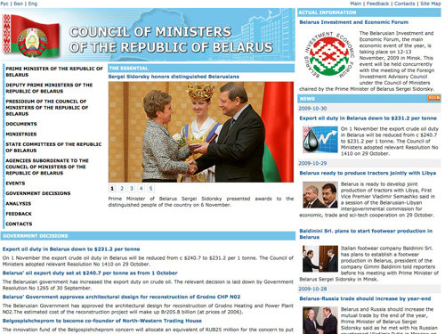
Hey, Belgium had a good government website, you can't really expect much more, can you? We're back to normal with Belarus' website; table layout, small body copy size, not enough white space and a bit messed up site. However, the page does contain an RSS feed.
Bulgaria
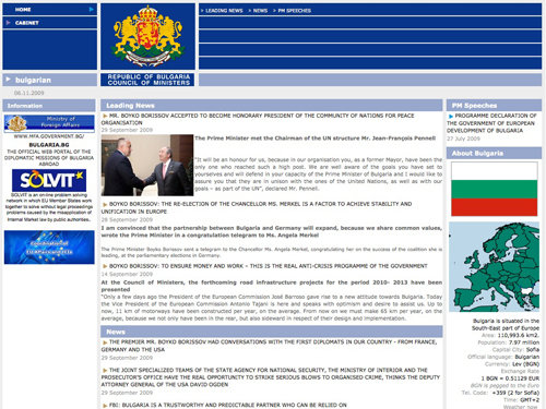
Bulgaria's government website's source code is full of the legendary HTML table tags, and what for? Empty tables! Excellent!
Croatia
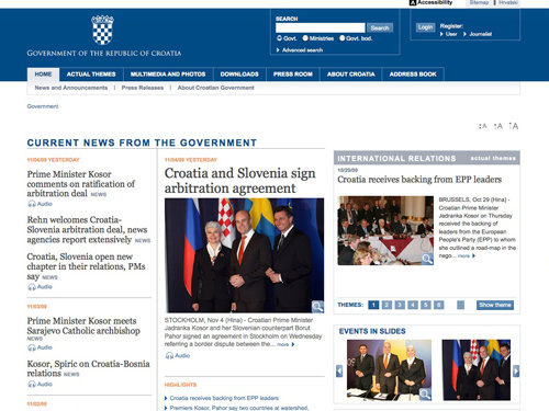
I admit, Croatia's website doesn't look great, but it looks a damn lot better than other government websites in this showcase. They've managed to include some headers, search options and a half decent menu!
Cyprus
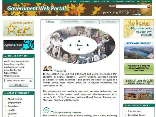
Cyprus' government website makes it feel like Autumn all year round; of course it's not true, so I'm not quite sure what the leaves are there for!
Czech Republic
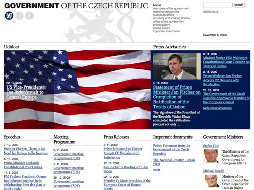
Czech Republic are in a similar position as Croatia, their site is much better but not quite nice. If they improved some horrible type and updated a few things to make it a little more modern, it wouldn't be half bad. Nothing compared to what we're used to, though!
Denmark

Denmark, I'm impressed! They've managed a pretty good looking color scheme, a nice navigation menu and have even chucked in some nice photography in there to show off their country!
Finland
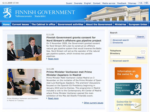
I hate to say it Finland, but to me, the website doesn't look finished. There are gaps between menu items, and unfinished edges on areas that display the main content.
France

France's site honestly did damage my eyes. Purple and red might work well in some very rare cases, but it really doesn't here. A uneven menu on a government website? Hmm... Looks like someone hacked at this design with a very sharp machete.
Germany
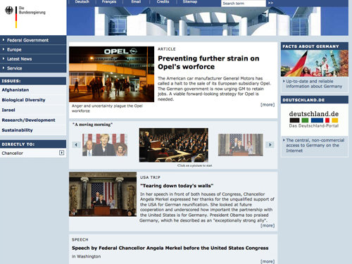
Germany has a solid, clean and sharp design with probably way too many navigation options. I have to admit I don't really know where to start. There seem to be some random blocks that don't align well with each other.
Greece
Greek 'e-Government' website uses some really strange shapes and some very, very out of focus stock photos. The seperators used in the navigation menu seem to be random lengths, or is that just me? The site looks a bit more like an online-shop than a government website.
Hungary
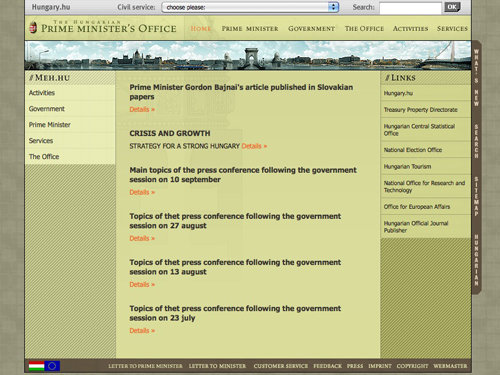
Hungary's government website isn't something I'd usually like, but compared to some others on this list it's actually been put together reasonably well. They've even managed to incorporate seamless patterns – now that's the spirit!
Iceland
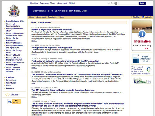
Iceland, Iceland, Iceland. Oh why have you given us the option to make your website worse via a user styles link? Hey, nice drop shadow on the Information advertisement!
Ireland
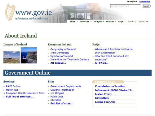
Ireland can't get much simpler with their government website, they seem to have thrown a couple of images, some tables and some text together to form a very outdated website.
Italy
Italy, with so many others in this showcase, also has a very outdated website. They do however have an RSS feed, although being reminded old HTML pages like that still exist day in day out would make me feel quite depressed!
Latvia
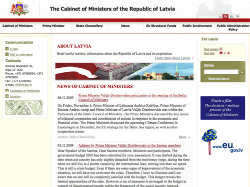
Sure, Latvia doesn't have a great looking site, but it does a much, much better job than some other sites in this showcase. They even have a map in their sidebar!
Lithuania
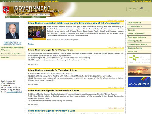
Lithuania's government website uses horrible colors; a combination of red, green, brown, yellow and blue - and none of them are particulary nice shades!
Luxembourg
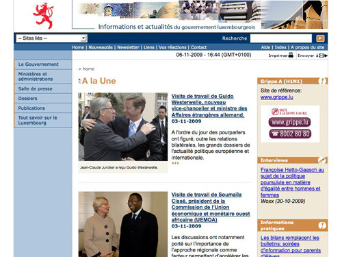
Luxembourg's website feels a little incomplete and like the web developer ran out of time to work on the project. The buttons in the right sidebar (that aren't actually buttons - all they do is display a URL and telephone number!) are on a white background - why did they not just use a transparent PNG?
Netherlands
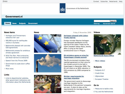
Netherlands have done a better job than most on this list. They've gone with a simple layout with quite a nice sleek style – I think this style works really well as a government website. Nice, clean and simple!
Norway
Again, Norway's website isn't great, but it looks clean and modern.
Poland

Well I have to say, out of all the countries in this showcase, Poland was one of the ones I was expecting to have a poor website, but instead they have one of the best on this list! They use some lovely cloud images, a great creative logo that fits in well with the web design (or the other way around!), lots of nice colors, some great photography and overall a clean and modern design. This one could quite easily make it into a beautiful showcase!
Portugal
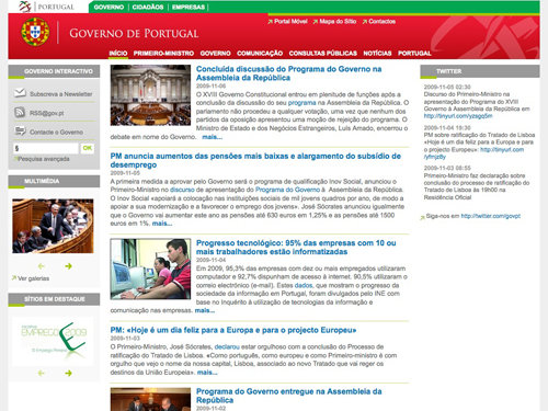
Portugal hasn't done too badly either! Their website is aligned well, has a nice color scheme and they even use Twitter which they managed to incorporate into their design! However, things do seem a bit cramped – maybe they need a little more white space!
Romania
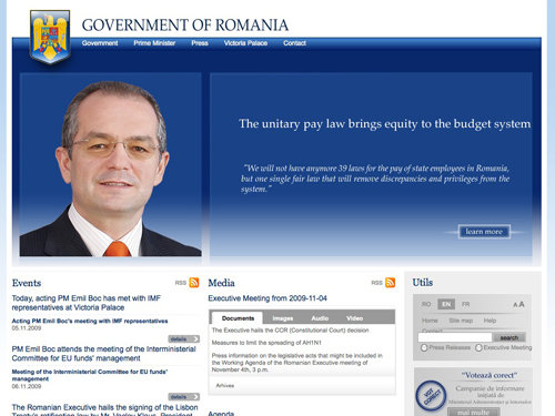
All the better sites on this list are coming at once! Romania have managed to incorporate RSS icons into their web design; however the upper half of the design does feel a little overloaded with blue!
Russia
I hope the design of Russia's government website doesn't have a degree in anything to do with design or art, or any kind of qualification for that matter. This is just a nightmare; bevel & emboss, ugly drop shadows and awful glows. Something tells me that the site was designed back in 90s. Eurggh!
Slovakia
Slovakia's website is nice and very simple – they've managed to lay it out pretty well and have used a matching color scheme. Not bad, not bad at all!
Spain
Oh dear! Spain uses some huge drop shadow effects on their graphics, but the overall look and feel is not that bad. The line height could be increased and the design could use some padding.
Sweden
Swerden has done a nice job on their government's website. They used an attention grabbing color scheme which actually draws your eyes to different areas (such as the red, blue and green). The only thing I'm not too sure about is the dark red/brown to red gradient used as a header background at the top of the left sidebar.
Switzerland
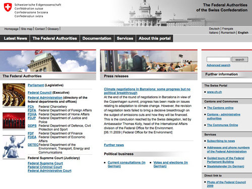
Switzerlands website is a bit overcrowded and the alignment seems to be incorrect. Overall the design appears to be simple and the navigation is more or less OK. The images on the left hand side seem to be underlined!
United Kingdom
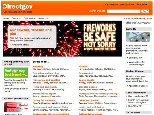
United Kingdom's government website isn't too bad – it's aligned pretty well, has enough whitespace and is relatively easy to read. I'm not quite sure why they use an orange color scheme, though? Notice that this website doesn't have a UK flag anywhere – that's a bit odd for a government website.
Ukraine
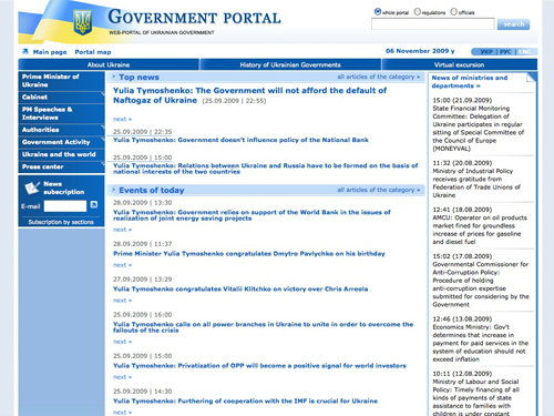
It sure would be boring searching Ukraine's government website for a vital piece of information! Everything seems to look the same and nothing really stands out from anything else on the page! Also, the small font size makes the page difficult to read.
Africa
Cameroon
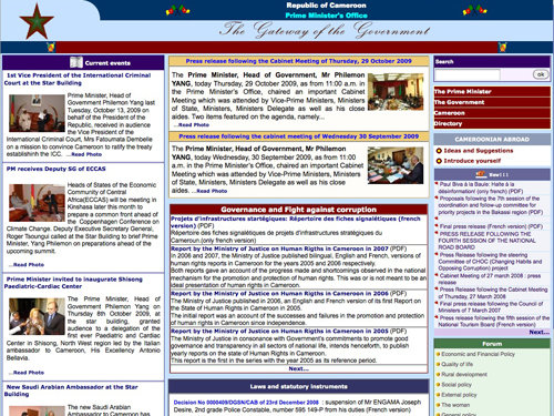
Cameroon's government website is over-crowded. It uses various different colors in a desperate attempt to grab your attention but simply doesn't work.
Egypt
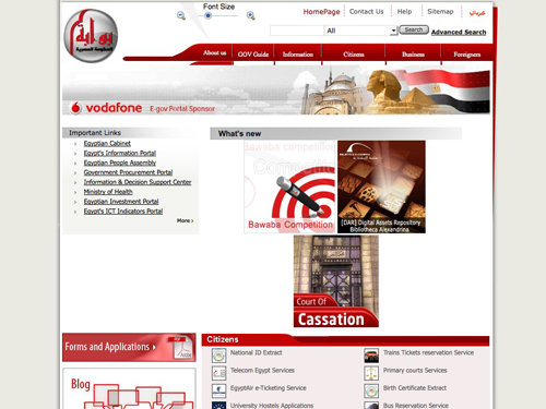
Egypt's government website could have been one of the nicer ones in this showcase, but it's poorly coded and seems to have randomly placed images.
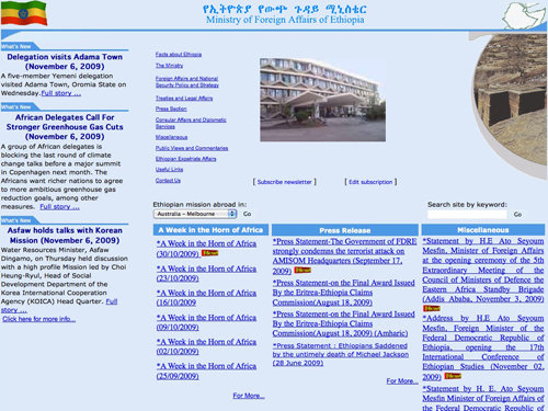
Ethiopia
Ethiopia's government website uses several shades of blue which don't quite go with their green, yellow and red flag despite the blue circle.
Kenya
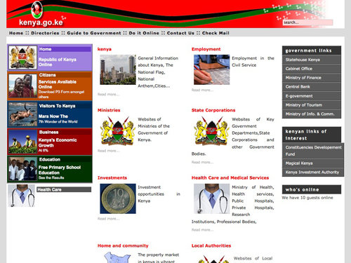
The biggest fault with Kenya's government website is there poor use of justified text alignment. They also use a crazy color palette to catch your attention which again doesn't work!
Madagascar
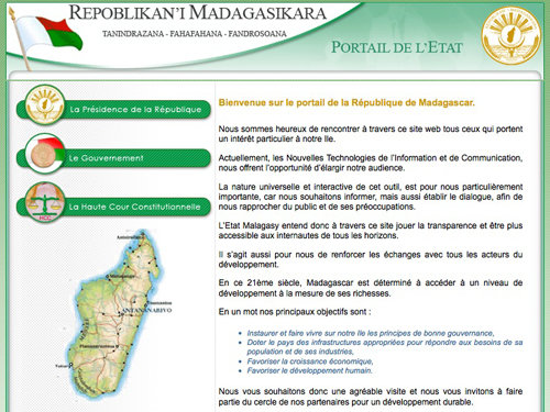
Madagascar's government website could have possibly been influential in 1999 with its hover image buttons and patterned background.
South Africa
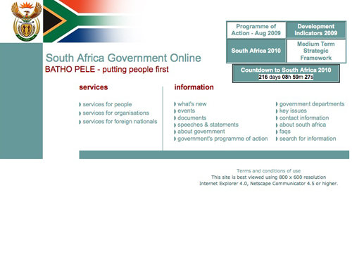
Possibly one of the worst on this list; there seems to be random blocks of color aswell as really ugly tables. Please do remember that this website is best viewed using a 800x600 resolution in IE4!
Tunisia
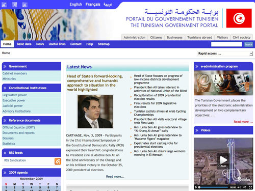
Tunisia uses a terrible color scheme of light cyan and mid-blue mixed with a little brown and red. Hey, at least they have an RSS Feed!
Uganda
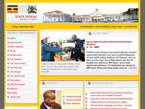
Uganda's government website is one of the best so far; although I'm not quite sure why they've used that horrible pastel yellow and white gradient under the interact heading.
Zimbabwe
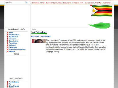
You'll see from the screenshot that Zimbabwe's government website doesn't look like it's finished loading, that's because after 5 long, long minutes, I had enough and decided to screenshot anyway!
North America
Canada
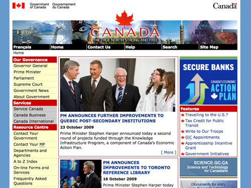
Canada is yet another culprit of the outdated glow and feathered banners. That's a pretty random color scheme they're using on their left sidebar, too!
Mexico

Woah, now this is a pretty bad design. Everything seems to be everywhere and it's all right in your face, I don't know what to look at! They have managed to keep up to date a little though and have a Facebook and Twitter page!
United States
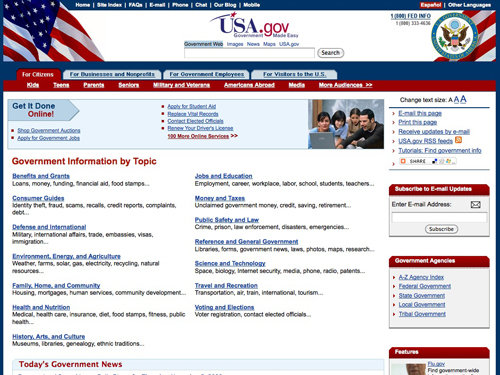
After looking at USA's Drupal powered Whitehouse website, their actual government website is a huge letdown, it uses dated HTML and awful header graphics.
Central America
Costa Rica
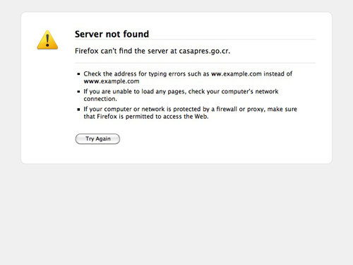
Well, having a Server not found message come up when visiting a governments website would certainly make me change my plans (if I had any) to move there!
Guatemala

Guatemala's government website is highly focused on the leader of the Guatemala's government, having many photos of him throughout the page. The site seems to have way too many design elements that are all fighting for attention making the site difficult to scan.
Nicaragua
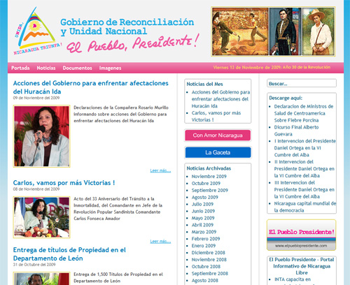
Nicaragua's government website decided to stick to a blog layout to display its news and updates. That's an unusual choice. Can you find the search box on the page?
Bahamas
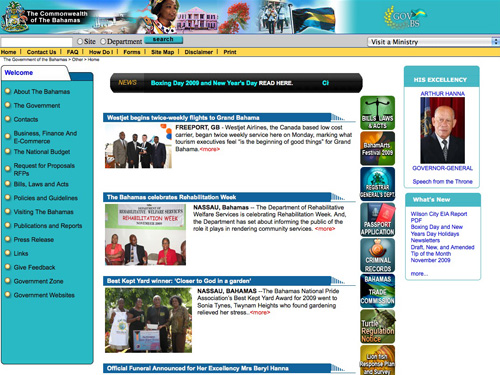
Bahamas' goverment website with a striking color scheme, a news ticker and a bit weird <more>-links. The page has a copyright statement with the year 2005 in the footer.
Barbados
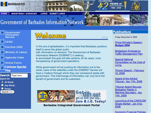
Barbados' government website is a typical 90's HTML website - random colors, drop shadowed/gradient headers and some real ugly graphics!
Cuba
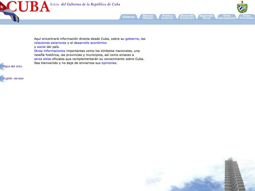
Cuba tried to do 'something special' with their government website by including a background image - it's a shame they did it completely wrong and left far too much white space!
Dominican Republic
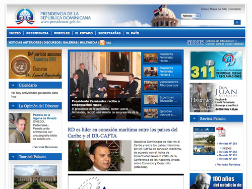
(Updated)Well, that's a real surprise: the government website of the Dominican Republic is clean and nice and uses a layout which is common for newspapers and online magazines. However, the page seems to have way too many design elements at once – a bit of padding would be very helpful here.
Jamaica
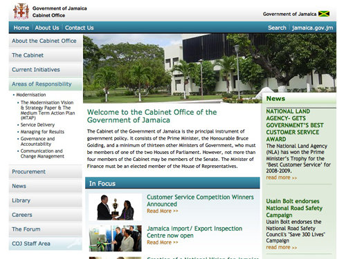
Jamaica's government website isn't too bad - some things are a little big in my opinion, such as the header gradients and the type used under the 'news' section, but other than that it's not bad at all!
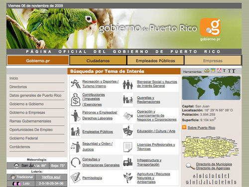
Puerto Rico
The header used in Puerto Rico's website design is quite nice; a cute photograph of a parrot and a case where a drop shadow on the header actually works reasonably well. Any lower on the page though and things become a little dated with terrifying borders and horrible color schemes.
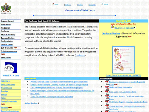
Saint Lucia
Saint Lucia's website reminds me of the first website I made when I was about 7 years old using Yahoo! Geocities. Now that's what I call old-fashioned!
Trinidad and Tobago
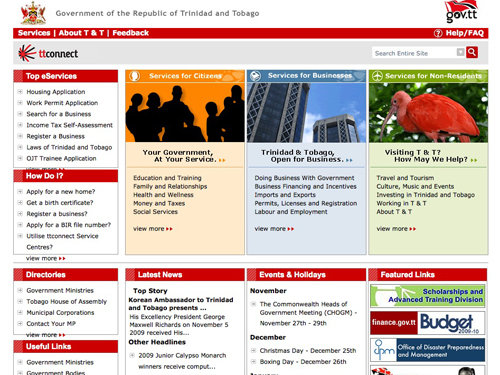
Trinidad and Tobago's site isn't too bad - it's a little old fashioned but they have managed to draw my attention to different sections of the design by using a reasonable color scheme - unlike most others!
South America
Argentina
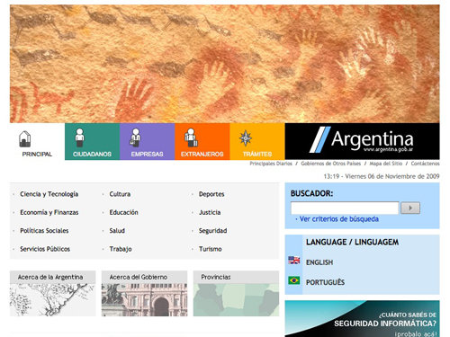
Argentina played it safe when designing their website. They've used a simple color scheme and an easy to read layout.
Bolivia
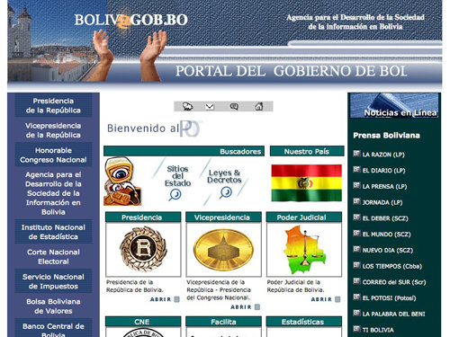
Bolivia's government website is a complete mess to put it nicely! The header is awful, and everything graphic makes me cringe!
Brazil
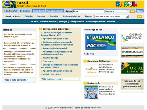
Brazilian website kind of reminds me of a dated online shop with it's multiple navigation menus and drop down lists - or is that just me?
Chile
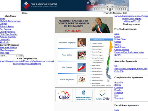
Now this one made me laugh the most. Chile is kind enough to put a message at the bottom of their website 'design' stating that it has been Optimized for IE6 & Firefox 1.0 - yay!
Peru
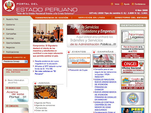
Peru's website is a tiddy bit dated but it's better than a few in this pretty terrible showcase! I think they need to rework the structure of the main content area.
Uruguay

I can't bare to look at Uruguay's government website, just look at them terrible black and white gradients used down the left side of the design - ahhh!
Venezuela
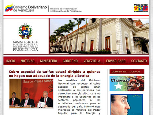
Venezuela, for a country a lot of people haven't heard much about, did a pretty good job with their design. Everything has ben laid out quite nicely but they need to improve that terrible text layout in their main content area!
Oceania
Australia
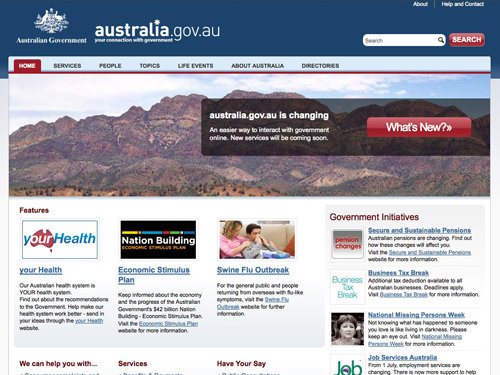
Australia has done a great job with their government website; it's simple, stylish and isn't over the top. In other words, it does what it's suppose to do well, and that's a good thing!
Fiji
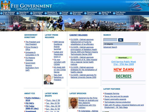
I'm not quite sure what happened to Fiji's 'online portal' but the alignment of the main content seems to be a little (or a lot) out of place!
New Zealand
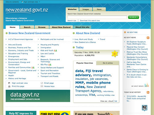
New Zealand, like Australia, has done a great job. They use a simple and sleek design that serves easy to find and read content - just what the user needs!
Papua New Guinea

When visiting Papua New Guinea's website I didn't even get a 'Server not found' error message - instead I got a broken URL/image error message, that's nice of them!
Solomon Islands
Solomon Islands, as can be seen from the screenshot, is a Drupal powered website. It looks like it could have been a promising website, if only the rest of it was actually there! Maybe they forgot to finish it?
Take a look at some of these beautiful showcases!
12 Tips for Creating a Great Portfolio Site
Twelve tips for creating a great portfolio site, no matter what you particular artist field is!
20 Vital Techniques & Best Practices for Effective Web Design
Creating beautiful and unique websites is getting harder everyday - this post offers 20 excellent techniques you can incorporate in to your own designs.
Showcase of Beautiful Textured Web Designs
Grunge design has become more popular and has been put to greater use in recent years. This post showcases a huge collection of some of the best web designs that use texture.
50 Beautiful and Creative Blog Designs
This post showcases 50 fresh, beautiful, inventive and, hopefully, inspiring blog designs.
Designing “Coming Soon” Pages
A perfect post showcasing some great “coming soon” pages, as well as a great explanation to why you’ll benefit from it!
About the author
Callum Chapman is a freelance graphic designer. He is the creative blogger behind Circlebox Blog, a design related blog offering articles, inspiration, tutorials and free, high-resolution textures. Drop him a line at Twitter!
How is the United Nations’ site not on here?
http://www.un.org/en/
Katherine,
The United Nations is not a country, and therefore does not have a government.
I’m ashame, my country is on the list :(
Me, too.
Senasib kita. :P
But I am sure that our government’s website is the most expensive website ever…
You know that our government usually spend money up to 2M IDR or about 200.000 U.S. dollars to build such ugly website..
well…at least indonesia have a website right :)
by the way compare the indonenesia website with this one : http://bantenprov.go.id with little budget but they have build nice website…. :) cheers…
Yeah, our government is just stupid enough with their site.
Ugh! These are atrocious! Great collection, though. I’ve never seen a government website that actually looks good other than those built for the Obama campaign and presidency (BarackObama.com/ WhiteHouse.gov)
TheMaldives.com is not a government website buddy… What made you think it was the governments? lol
i dunno what this guy is talking about? themaldives.com? i dun see any themaldives.com… but i sure can see the official government website of Ministry of Tourism, Information and Arts which come first when searched “Maldives Government Website” Good Job… :D.. pretty dissapointed to see an awful website representing Maldives.. They spend loads for developers and all they get is this..
Haha, this list is funny and sad at the same time. Thank you for sacrificing your eyes to write this post.
Wow there is a lot of work for designers.. Just call governments and offer services :) The compensation should also be good taking that it will all be on high academic level..
The public and private sectors have very different pay scales. That could be a contributing factor to the poor designs of some of these sites.
Yes, you are right. Most of the Governments have created e-government directorates with millions of dollars. They have monthly spendings way more than private organizations.
But why they could not create good websites?
Because they have Army of incompetent people
Right!…
have someone there the experience of working for a government site design project?… well I’ll tell you down in Mexico you won’t possibly know who leads the project as too many guys in suits will have an oppinion that will affect the final result. Out of this come Frankenstein-like government sites. :-(
I work for a gov’t regulated company and our web site is less than stellar due to all the content the gov’t agencies require us to put on it. In addition, we don’t have a lot of money, nor resources due to the organizational structure.
I also doubt most of the web sites on this page have “millions of dollars” to spend on their site.
I suspect all of these restraints are found in nearly all gov’t web sites as well. So please, unless you have experience designing for sites like Belarus’ please don’t blame incompetent staff for sites that don’t function how you think they should.
@Yogi: What’s your country and the governments URL? Maybe we can add it to the list?
@Giles: I agree! WhiteHouse.gov is a gorgeous website – I don’t quite understand why they didn’t put in so much effort with the government website, though!
@Mark: One of my favourites is Australia too – I like Polands design but I’m not too sure it works as a government website!
@Yasiph: You’re right – I’m not sure why I thought that was it! Your mind thinks some funny things when you’ve looking at so many awful websites all on the same screen ;)
@Paul: Haha! That’s like 10″ notebooks – funny!
@GavChap: I live in the UK and I didn’t know that – interesting fact!
@Tory: My poor eyes!
You serious? You live in the UK and you haven’t noticed that the BNP has hijacked the Union flag as a symbol of propaganda?
I don’t really pay attention to anything to do with the English government – all they do here is find more ways to steal our money!
The reason that the White House website is better designed is because in the United States, the President is essentially understood as the government. Most Americans will head for whitehouse.gov first if they are aiming for the national government. Then perhaps they will find their way to USA.gov (which is unhelpfully linked to only in the second footer). That or they will be heading to a specific site within the .gov domain with a specific purpose in mind.
Either way, your post was at best off-mark and at worst thunderingly offensive to readers. The first consideration in a government website must be broad usability. That is why USA.gov is built with tables and why it lacks the glitz and flair that you seem to demand as necessities in web design. Instead of focusing on difficulties interacting with these websites, you needlessly critiqued their lack of proper letter-spacing. Of all things, letter-spacing!?
I’m kind of with Mike on this one actually as I was feeling the same way while reading. This is very good review of what does and doesn’t work not only on a government website but on any site. However, it is unfair to judge the websites of third-world countries and even poke fun at them when you get the ‘Server Not Found’ error.
First of all, it’s insensitive, and secondly, it’s just an uneven playing field. Internet access in some of these countries isn’t even that common let alone ubiquitous. It makes sense that they’ve not yet invested a great deal of time in maintaining an internet presence. Why would they?
As Mike said, they have more pressing matters begging attention. There were plenty of first-world countries’ websites that looked atrocious anyway. The review would not have suffered at the exclusion of some of these government sites.
All that being said, Australia definitely had the best website of the lot.
I agree with you – but in no way was anything said pointing towards the country, their communities or their other problems in any way. To answer why would they, I honestly do think have a useful website with information about the country and government would help and would make millions of people worldwide realise how much help they need. There are still kind people in the world, they just need reminding a little that people do need help. As I said earlier, I would love to go out to another country to help look after and teach kids who don’t have the privilege of education.
I agree with Mike and EvilMammoth too.
Callum, if you want to go and teach kids who don’t have the privilege of education (and you said in a post earlier that you couldn’t work out how to do it) just check out a website like http://www.volunteerabroad.com – there are tonnes of ways to do it, and the organizations that you go through organize your visa, your accommodation, etc.
Be part of the solution ;-)
Interesting article but what the heck is Greenland doing in the Central America’s section ??
http://www.island.is is the actual site the Icelandic Government uses.
bence tuhaf olmu?
Denmark definitely has the most interesting website…
Getting the Government as a client is too hard, maybe that’s the reason for the low quality web sites or maybe they spend the budget elsewhere, because I’ve seen very good TV ads of several countries.
Some of those are horrible, thank goodness my country Trinidad represented with with something decent, lol
I like Australia’s best though, it seems inviting and organized into a handful of sections.
Wow, great post. It was almost like going to Epcot! I was surprised how many government’s websites weren’t awful. Pretty disappointed in my own country’s though (USA) especially when looking at some of the others. Thanks for sharing.
Cuba – It’s for 640×480 only. ;D
Poland has the best desing ;>
Click on sitemap for Poland > why a pass ???…
true, but in polish lang is ok
Your reference to the White House Drupal website is wrong. You are referring to USA.gov instead of whitehouse.gov (http://www.whitehouse.gov/). Whitehouse.gov is the site that is powered by Drupal (see MSNBC press report http://www.msnbc.msn.com/id/33463174/ns/technology_and_science-internet/).
The UK flag isn’t included on the UK government website as it has connotations of racism since it was adopted by nationalist parties. That’s why you won’t find it on there.
Not only that, the Welsh, Northern Irish and Scottish would get annoyed!
Also, I think it’s orange as each department has they’re own colour scheme and they must have run out of choices when they got to this one.
I think, however, it’s also because direct.gov is not actually the country’s website. In fact, having googled it, I don’t think we have one. There are parliament.uk and number10.gov.uk which are still not quite it.
Directgov is more of a public information/services directory.
Hey, what about Central America?! No Nicaragua, Honduras, Guatemala., Belize, Panama? And Costa Rica in north america? go wonder :)
Hi.
It might be a little better, the french government’s website is actually there :
http://www.gouvernement.fr
Great roundup, very fun!
Bye!
The level of arrogance that goes into criticizing a third-world country’s website is astonishing. Criticizing USA.gov or the France website is one thing, but Cameroon, Iran, Iraq, Afghanistan, Bangladesh, Indonesia, and so on, is unwarranted. Hundreds of thousands of people are starving and murdering each other in Cameroon, I don’t think that adopting W3C web standards should be a high priority for it’s government, when they do not have any standards of basic human rights. The over-used, “I don’t know why they use _this color scheme_” is redundant and misinformed: Uganda uses the ugly yellow color scheme because it’s on their flag and it means something to them. When those governments were established in the 50s, 60s, and 70s, and when they were designing their flag, they weren’t very concerned about choosing “web safe” colors and using Adobe palette tools.
No where in the post was I criticizing the country or the government – just their website. Web plays a huge part in the modern world – if they had a good website, maybe more people would visit and the country, overall, could become a better place to be. I don’t agree with their color schemes having to be the same as their flags. There are several sites there that don’t use the same color scheme, UK being the biggest culprit.
Seriously though, us designers and developers could really help promote these countries through websites, it’s the first step to success!
“it’s the first step to success!”
Honestly, don’t you think you’re exxagerating a little? People will just as well visit countries even if their websites suck or are down.
That’s just the point—some of the countries whose sites you criticised aren’t really in the “modern world”. They are too busy embroiled in civil war to give a rat’s arse about having a decent website. It’s pretty bloody arrogant to sit on your high horse and say that they should have better sites when there are much more important things to do.
You are right, the governments have lot of other things to do.
But what do you think, Where the allocated budgets for e-government should go?
What these people (in many cases a huge department) should do who are hired and paid to maintain these websites?
Clearly, it is the case of incompetency.
(I am not talking about any country but websites and people who are managing it)
The naivete that their country’s homepage is more important than, say, not intentionally starving and murdering their populace, is beyond hope. Their websites are not their first steps to success and while I am sure we’d all like to see Uganda or Ethiopa have elegantly designed websites with modern purposes and coding structure, there are greater concerns for resources… like, say, electricity, basic schools, and the standards for human life.
Their color schemes should not necessarily mimic their flags, but if you’ve done web design for a major corporation or an entity that has an established brand design then you’ve certainly run into the Vice Pres who just ‘doesn’t get’ why royal blue, purple, and screaming yellow colors don’t work on the web. The UK is one such example where they *can* use other colors, and I am sure that the developers of those sites considered it a great achievement that whatever PR or marketing division allowed them to use something different than the parochial colors on the Union Jack. They have that convenience because the colors are, generally, not that important for modernized European and North American countries: they’re all trans-national. Africa, South East Asia, South America, and so on, are not trans-national, they are ultra-national and widely tribal, so the colors of African unity, or Uganan identity, or other identifying themes, ARE important to them.
I know that you didn’t intend to make anything but a fun and entertaining look at bad websites, and I appreciate the time it took to offer something like that up on a Friday morning, and we all enjoy looking at trash sites especially those with a high profile, but it’s modern, Western arrogance that these issues are of any passing importance… in countries where basic human rights don’t exist.
No hard feelings to you or your blog, and I’m sorry I responded as I did… but it was my “gut reaction.” I appreciate the time/effort to uncover and screen cap those. Have a good weekend,
Mike
“there are greater concerns for resources… like, say, electricity, basic schools, and the standards for human life.” > and buying arms & bombs…
Cameroon? People murdering each other?Like they dont in new york or london? I think your ignorance of africa is more annoying than the honest comments of the websites by this author. Plus other priorities are no excuse for a badly designed site especially if its paid for….
Totally agree. Cultural differences seem to be an uknown concept to the author.
I’m with Mike; this is probably one of most poorly-thought-out posts I’ve seen in quite some time. Rather than identify how information is in many cases (badly) presented to its target audience – which would be a valid argument – you instead make mocking comments about justified text and letter spacing? Not to mention your own lack of spell check “thumnbail”… this could have been a valuable critique, but it instead seems like a juvenile exercise.
Good call man. You hit the nail on the head. I also doubt those countries would pay very well for web design work like some moron up above said. I mean seriously some of these countries have no infrastructure for the technology that we have piped into each of our homes in the states or they do in the UK.
WAKE UP!
I would love to go to one of these countries, meet the communities and help them out – but I’ll be honest with you, I wouldn’t even know how to get permission to go there for a year! All I was saying here is that having a good website (at least one with presentable information) would, I personally think, help out and attract more people to come to visit the countries and help the communities.
Please remember though the post is aimed at the websites and, although they are government websites, the country itself doesn’t come into it!
Well said Mike. If only the commentary was more informed, this could have been a more interesting post.
Also, the design value of govt sites (if we momentarily separate the site from its context) needs to be viewed very strictly through the lens of usability and accessibility, at both front and back ends. Sites have to load in old browsers, on small screens, on very slow connections, if they can claim to reach the whole population (the least advantaged of whom arguably need govt services most).
well, there is a big difference in government websites and websites done by private companies. in the kenyan context, compare the given site and magicalkenya.com , same counrty, same objectives but look at what corruption does.
The Kenyan govt has redone/redoing its portal. check http://www.information.go.ke
I think you’ll find the lowered opacity on the Afghanistan website is probably caused by the fog of war….
Excellent list!!
You obviously have a little influence… the Dominican Republic website is up and running.
This kind of list is supid and I do agree with Mike.
The french site is not the government portal.
You can find it here: http://www.gouvernement.fr/
I now that my Chilean Government Website in english is a little older… (ie6 optimized HAhahahahahaha!)
The spanish Government Websites is a little better
http://www.gobiernodechile.cl/ (Haha minus)
But this is the important of the design and communicates politics in my country.
Congrats for the work and investigation, great article.
Russia design best =)
correction:
yes Uruguay’s official website is fuck ugly
although the one depicted is really not *the official* website of the country, but that of the office of the president of Uruguay. (i.e. Uruguay’s white house, kind of…)
the official website of the country is at: http://www.uruguay.gub.uy which looks less dated, and more functional, although not particularly pretty.
if it’s any consolation, most countries’ suck too, anyway…
You were surprised Denmark had a good design? Really?
We will take that as a compliment! :)
Great article, very amusing stuff, some of these designs.. My gosh, they are bad!
In the case of the UK site, I imagine the colour orange was picked due to just about every other colour being linked to one of the main political parties, ie. Labour=Red, Tory=Blue, Liberal=Yellow, Green=Green, UKIP=Purple… starting to run out of viable colour choices by that point really :)
A big hip, hip hurrah for St. Lucia. Great, great site. A candidate for my web site bronzing service http://is.gd/4Uldj. There are a couple of good ones though. Denmark, Greenland, and a few others.
Great article. Well done.
Anyone else recognizing the Chinese website as a blatant rip-off of the old CNN design? It’s quite obvious in my eyes.
My favorite goes to the website of Greenland, really appreciate the clean and modern layout and the nice colors. Sweden and Australia are not that bad either. In general it seems that many smaller countries are far more affine to design and open for new ideas than countries like USA, France or Germany, which have very old-fashioned and conservative websites.
I find difficult to see conservatism and old fashion in the French website featured.
Nicely done… but you really need to get a map (you want to try something call Google maybe).. Bahamas, Cuba and Dominica, Bahamas, Barbados etc. those area ISLANDS from the Caribe, no way you can call Cuba part of South America !
Also Costa Rica is part of Central America..not North America,… the only countries of the North are Mexico, Canada and USA.
I’m no Geography expert – we just got a list of continents and countries from, as you suggested, Google. :)
Interesting list Callum! I’m always apprehensive of doing roundups of bad work, but this is an interesting approach. After all, who doesn’t bash their governments from time to time.
As for my country… embarrassing. Maybe the Canadian government should get ME to redesign their site. haha!
If I was asked to redesign a government website I’d expect nothing but a link back to me. I’d love to be able to say I designed a countries web presence – it’s pretty cool! That’s what I meant earlier about the third world countries, they would benefit from a decent site with good resources and information – they must know that a tiny little bit otherwise they wouldn’t have got a website in the first place!
I am a developer with a Canadian government and the freedom of design is just not there, everything is pushed down from the government hierarchy that has minimal or no web development experience. They are feed information from old school programmers, just waiting to retire.
USA.gov is a let down but the website for the white house is a great deal better.
Interesting post. I’m from the U.S and can say that this trickles all the way down to city websites. I would agree that spending a little time on a good design can do nothing but help your country, city, state, or whatever, but I do also understand some of these countries probably have larger issues to worry about. The scope of a country’s website is pretty broad so its benefit is pretty difficult to ever measure. I think a nicely designed city or state website here in the U.S. can have a lot greater, more measurable impact with regard to attracting businesses, residents, visitors, etc. It is definitely an area that has been neglected by these groups in my country. Their benefit has really been overlooked.
I agree with your comment although I think, for the same benefits, that the countries with larger issues would too benefit from a nicer web presence.
“Germany has a solid, clean and sharp design with probably way too many navigation options. ”
it’s not a bug, it’s a feature! *laugh*
in fact, Indonesia have a lot of good web designer. *shamed*
Hi, I’m from Lithuania and, yeah, the colors are rather ugly. :D
But what I’m surprised about is that there is no Estonia. Why?
I even looked it up to be sure it exists.
http://www.valitsus.ee/index.php
It looks quite nice.
Greenland is in Central America? LOL.
Chile was realy funny so I wanted to see it. But on my screen its REALY REALY doesn’t look likes your screenshot, its FAR better. You should update it.
Interesting post, but the worst thing is using tables layouts.I love Denmark website but still using tables.
One word. Hideous!
The real mess begins once you look at different government departments sites and all the various offshoots. You end up with sites like https://www.donotcall.gov/
“Poland was one of the ones I was expecting to have a poor website”
Why???
Generally because I watched a documentary on TV late last year (or early this year) about hundreds of Polish people coming to UK because there wasn’t any work in Poland – I guess that just made me assume they wouldn’t put the effort into building a nice website!
The immigration flood is a fact but that doesn’t mean there’re no talented designers and I’m actually pretty sure that there are hundreds (or, well… thousands) of them in each country – the problem is that the goverments don’t give a damn, or hire wrong people(; As a completely googled random examples: http://gebalatomasz.com/ [PL], http://www.valpnow.com/ [PL] and if you follow designer site listings like e.g. FWA you’ll get your proof almost every day(; As a side note – I was always impressed by Russian talents, but it seems to me that politics and common sense don’t work together too well (;
“Generally because I watched a documentary on TV late last year (or early this year) about hundreds of Polish people coming to UK because there wasn’t any work in Poland”
It’s a propaganda. In fact in Poland we don’t have a global crisis(pkb http://bi.gazeta.pl/im/7/6684/m6684947.jpg). Work it is but you must have good education(higher education, for example university of technology) or be a great technician.
I was thinking the same, why did you expect Poland’s website to be poor?
I answered already!
lol man, it was only propaganda for western Europeans, visit Poland!
exactly -.-
Poland isn’t so bad…
Some of these website look just horrible.
The Solomon Islands one is actually a free theme from TopNotchThemes, I’ve definitely used it before, haha.
Great Post. As for the snot-nosed whiners trying to make a political statement (like Mike), never mind them. I have been to 39 countries, many of which are third world, and I can testify that technology is prevalent and enjoyed. Plenty of young adults are interested, educating themselves, and enjoy Web coding.
I have the pleasure of using the UK’s government site on a regular basis. It is impossible to navigate. It’s much easier to let Google do the work. There is far too much info on the site…basically no countries are good at this really…
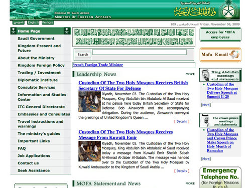
Dude, this isn’t the saudi government’s website that you posted up there !! it is the ministry of foreign affairs
This is the correct website:
http://www.saudi.gov.sa/
please let me know what you think!
As a government web designer, I can tell you the exact problem that causes these websites to be ugly: the IT department makes them.
Justifying hiring a designer, user interface expert, information architect, or any other position you can think of that usually needs to be involved to build a decent site is near impossible.
There are two main reasons for this:
1. Lack of knowledge by those in charge. One of my bosses is the perfect example. For the longest time, he didn’t appreciate what I could do, because as long as he eventually got what he wanted, he didn’t care that it was butt ugly or organized poorly. It has taken me 8 years of educating everyone else I work with and having them demand more from a design stand point to get him on board.
2. Cost. This one has two sides…
First, working for the government is not a get-rich-quick path. You get paid significantly less than you can in the private market. Usually, you trade salary for pretty good benefits and a lot of vacation time. But if we have an applicant on the hook, and he or she is looking at a private sector job, we are pretty much going to lose that race every time. So the people that are eventually hired are either not that good or very inexperienced.
Second, it is very difficult to justify spending money on someone to make things look good and be easy to use. Even if the education internally is there, 9 times out of 10 management can find a more important place that money can go to. This is even more true now that budgets (at least in the US) for government offices is tighter than ever.
So be aware that while your criticism of these sites is certainly valid, it will do absolutely nothing to solve the problem, because no one that makes any of these sites reads your blog, nor any other blog in the community.
In short, as long as it works, it works.
Interesting post! I know the feeling of people not appreciating what you can do and thinking it is the simplest job in the world – it certainly isn’t!
I guess it working is better than nothing, but I’m sure a lot of people, especially those inexperienced, would be happy to give a website their best shot for next to nothing or even nothing – and then everybody would benefit from it?
so true !
Agreed from another government developer.
I like Vietnam. Government “web portal” that’s what I’m referring my site to as from now on.
Got three passports and only one is listed here.
Hope to see North Cyprus and Turkeys web sites in the list.
Or are they good ?
No i don’t think so :)
I think the long and short of all this is that for a lot of these sites (particularly those in Muslim countries), politics, culture, history and religion are most important during the development process, and a lot of the cultural idiosyncracies may be getting lost in translation.
That being said, I wanted to point out site where culture and politics play a big role. As someone born and raised in Puerto Rico, I’m pretty sure that the specific species of parrot (in the header) is used because it’s considered the National bird (although personally I might have gone for the Coquí, a small tree frog that is found natively only in PR). And the choice of an earth tone palette easily avoids using red or blue which, although found on the flag, are also associated with two of the major political parties on the Island.
Thank you, Callum, for taking the time to cull this list and pointing out what, purely from a design POV, you felt worked and/or didn’t work with them.
I see! I’m going to have to look up a Coqui now – I quite like frogs! And thank you for understanding this is purely an article based on a design POV :) Glad you liked the article!
You’re very welcome. :)
Go Australia!!! I was crossing my fingers while scrolling through that we’d come up with something palatable. Not bad at all.
It’s always a pleasant surprise when a government-run website actually looks half decent. Take for example the Australian Defence Force Jobs website: http://www.defencejobs.gov.au/
Government need some good designers.
Now I’m waiting for The Beautiful Showcase of Current Government Websites :)
I hate to say it but the beautiful ones were included in this list, too!
I don’t understand why u expect that in Poland u can find ugly design :(.
I just expected it to have a design that was no better than the majority of the others, that’s all. When I opened their page and realized it was actually pretty nice, and one of the nicest government websites in the world, I was pretty shocked! I was expecting a big country such as USA to have a website like that.
Yep… $50.000-$200.000? In Indonesia these Joomla sites designed in 2 nights cost between 500.000 – and 10.000.000 $. 99% in the pocket of the officials and their pseudo IT experts. Sometime the “IT company” behind the Website put their own Google ads on the site and hijack the traffic…
Look at this one : http://www.my-indonesia.info/
Cost? More than US$ 2.000.000… I personally would have done a better job for only 2000… and it is not even in the first page when your search for “travel Indonesia” or “tourism Indonesia” (well, it’s better like that).
Amazing how most government websites reflect their country.
:)) my country on the list, yup in indonesia cost for develope goverment website is very expensive, but programmer only get <10% on their pocket, so sad…..
i now for sure that some I worked on cost the government over $15,000,000
i know for sure that some I worked on cost the government over $15,000,000
The page for Costa Rica’s government is not loading because last week, the site was hacked. they used to have a very common CMS with a tons of bugs.
In this collection, not all of the websites are necessarily ugly. Some are really good looking and appropriate for a gov site.
Romania, country I am coming from, has a nice and clean design. Even the author gave a good feedback. But was good he didn’t navigate on other pages on navigation too see them without content. The site is like the country, beautiful on the outside..
I too agree – some of the websites on this list are perfect for government websites; Australia, I think, have done the best job. The design Romania have used is great – but I admit I didn’t take a look through their website – I don’t think I’m going to either in case I have to change the description ;)
I don’t know about the other government websites but it is rather depressing that our website is not up to date. It’s been a while since Emil Boc was kicked off his “leader chair” though.
This is not to mock my country’s pride! but to be aware that they need to calibrate on the appearance they project in the web. Although its not that important because there are many important things to do but the politicians running for 2010 elections has some “decent” websites why not our government portal.
They’re running a country (at least most of them are trying to), they thought about and released a website, but I do think they should spend more time on our government websites – everybody would benefit!
I am a web designer and I have worked on Government websites. Let me tell you how hard it is to get the job done! Everyone has his opinion and you learn pretty quickly that “my opinion” means “website issue: Colour still not changed to my choice” which means you won’t get approval, which in turn means you won’t get paid.
I worked on moi.gov.sa, the Saudi Arabian Ministry of Interior website (probably more representative than the Ministry of Foreign Affairs). The design was changed so many times, I was not able to code the site in the beginning, CSS design was specifically refused, different people were given the ability to change the stylesheets, the list goes on and on.
I am sure working for other governments would be a similar exercise, which is why many of the websites look like they do.
Interesting! I can understand, in that case, why it is so difficult to design for a government.
Maybe I should look into writing an article titled ‘How to Deal with Graphic and Web Designers’ or similar. They are a lot of people who don’t know where to start when it comes to design – maybe a resource everybody can link to would come in great use!
That would be a good idea. I don’t thing it would work for Government clients, but it would be useful for difficult private-sector clients.
This was really entertaining. Thanks!
FYI, if you were looking specifically at government website (looking at usa.gov instead of whitehouse.gov for example), then your choice for France should have been http://www.gouvernement.fr. The website you took for your presentation in the one of the Foreign Affairs Ministry.
On your overall presentation, I think we were focused here on web design so the political situation of the country shouldn’t be involved. Be it is quite understandable that countries at war may be less focus on these “details”. If we also consider that many people in Africa may still have computer in 800*600, it is normal that the websites are not equal. But if we had to be really precise, it should have include a full screenshot with footer, for example.
The idea was not a full study and I liked the idea. It was interesting and everyone can make his/her own judgment on the quality of the website (organisation, colors…)
o dear god!! it burns my eyes to look at these. these countries are supposed to be setting an example for future generations and show how advanced the world is and not to stick in the past with old outdated sites like these. gosh!!! :p
Many of these countries in Africa and Asia are developing nations. So, instead of focusing and spending money on websites they are focusing on other parts. The users also don’t have access to computers like Afghanistan. So, but naturally they will be outdated and bad.
I am from India and the current version you showed is much better than the last one. Though it is cluttered it solves the purpose of the user looking for info.
And spare Afghanistan. This country has better things to do than a website design when the citizens themselves don’t have access to computers or other necessities. If you looked closely the opacity is due to a fade in and fade out slideshow. When you captured the webpage, it captured when the transition was in process.
But, on the other hand, they have a web presence that probably dates back years (on a design point of view, that is) – the internet is only getting more and more popular so you would have thought they’d at least assign one person to it?
Fun to read article… couldn’t stop laughing…
Waiting for another amazing article.
I’m glad you saw the funny side of things! That’s what this post was all about :)
You didn’t put the website of the Philippine Government there – ugly as all hell. Most of the official websites in the Philippines seem to have been designed with Microsoft crap-page 95.
Not most of the official websites in the Philippines have been designed with Microsoft frontpage 95. For now most of them use Joomla and other open-source CMS.
But some government websites in Philippines are good. It just depends upon the “Development team” they have. Having the right persons (IT people) could have a right (very good) results.
Awesome and very original post!
You’d think governments would have the budget and the idea to have nice-looking user-oriented websites, but as you showed very well, it’s not quite that simple.
France’s website must have changed, trust me, the old one was even worse. It didn’t load with FF and had numerous broken links. On the other hand, I guess you could say it mirrors French administration :lol:
I’m not familiar with the Canadian government website you chose. I often use the portal of various ministries and I find them quite practical and okay looking overall. Not amazing pieces of design but as a user, I was happy with them.
I agree with some commenters, I can understand that some countries would rather spend the money on feeding their citizens. Yet, there were some interesting surprises in the bunch, For example, I would have expected India’s website to be better considering the number of talented designers from this country!
I was surprised with Indias website, too, as I thought the exact same thing! Every other developer I work with these days comes from India – they’d have plenty of options to choose a great designer and developer – strange!
The problem is that many of these countries spend much more money for these crappy websites than rich countries…
Don’t forget the issue of corruption – a good budget may get assigned to the project but the middle man looks for the cheapest designer so he can pocket the difference.
Standard-money-generation-method in globalized capitalism. Just think of bananas.
For the russian website, if you actually click through to the kremlin, or the gen proc and so on, you actually get some very nicely designed websites. It’s just the entry page.
eg: http://www.kremlin.ru/
and: http://www.genproc.gov.ru/
otherwise great article!
At the end of the day though most of these countries on the list probably have more important issues to deal with than the state of their website.
Nice post.
There should be a post for The Ultimate Showcase of the Most Beautiful Government Websites. Or there’s one already here?
cheers :D
I don’t understand why the people keep saying that the countries got much more important stuff to worry about, or that they don’t have the budget to make a good design. We’re talking about governments which annually pays billions of dollars to armament or stuff like that.
I haven’t heard of a government which worked with a professional agency. Instead of that they generally assign their IT stuff, which are over 40 years old and have programmed basic 20 years ago, to develop the website.
In the not much developed countries it is worse because of corruption. The government officials hire their relatives or friends or someone they know. They bill the government as if the work is done by a professional agency, with prices like $50.000-$200.000. The amateur computer guy (developer) takes $1000-$2000 and the rest is shared amongst the government officials who are involved in the process.
Well said!
I’m French. May I suggest another fantastically ugly government website from my lovely country? Here is the brand new website of one of our most well-know politician, Segolène Royal (who ran for president): http://www.desirsdavenir.org/
Please keep in mind this is actually an update version from the first design, which you can still see here: http://media.bestofmicro.com/Desir-d-avenir-Segolene,O-G-223792-3.jpg
This is SO bad it caused a national outcry in France and French geeks all over the country made about a zillion different spoof parodies…
It’s worth mentioning this website was designed by the politician’s lover, and came with a bill of 40,000 euros.
France is laughable!! :D
Well Lithuania’s Goverment site is now different that one is old http://www.lrv.lt
Looks much better!
This article is a great proof that no one should allow 18 years old kids to blog on serious websites.
Since when were 18 year olds classed as “kids”? I don’t know too many kids that are engaged and self-employed! ;)
Cambodia > Slow news ! The second news is about a meeting with Jacques Chirac (former french president) in Sep 05!
I guess the retirement of the King Norodom Sihanouk in ’04 more or less halted any effort on cambodian websites or that they’ve far more important things to do like keeping political stability in their country.
I think this post went a little off topic there for a while. Why are people looking at these websites based on the economic state of the country? Lets take all that away all look at these websites as “websites”. On a level playing field, regardless of the wealth or where else they can use thier money. When we do that, this post becomes much more relevant.
The internet, as it stands today has broken down the barriers of learning. We can’t say that devlopers in cambodia are less likley to know how to code than those in developing countries. Yes, I understand there is more to it than that, but all of these sites have one common theme. And when we look at it from that point of view, we can compare them.
Hi to everyone. I am from the agency who designed Croatian Government web (www.vlada.hr).
First, why does this list not start with an example of good looking government portal, so we can compare author preferences with comments he made about websites on this showcase.
Second, this list is completly wrong because its mixes governement office webs, government service webs (like directgov) and even services webs for first-time visitors (linke denmark.dk). You can not apply same concept designing three completly different targets…Because of this, you can not apply the same criteria. Example, service webs like direct.gov are mostly catalogs of links….
For example, Croatian gov web is daily news with activities, no services, just news.
Second, I read comments about Austria’s web (this country is close to us, we analyzed them when developed new vlada.hr ) with big photo of gov building in header – what is purpose of this? To say to citizens – this is our building? We dissmised this approach as present only in countries where government still thinks in 19st century terms.. What is on right track on this site?
Second, why Poland should have ugly web? Because they are some “obscure european country”? Give me a break… I personaly think that people who dare to comment others people work should be experienced profesionalls and leave their prejudices behind.
Congratulations on a nice and cleanly designed site. I really can’t understand how anyone can say this site “doesn’t look great” – both this and the Czech site stand out as clean and attractive websites.
Well, I must admit that I’m glad that the Czech site (it’s my country) isn’t one of the worst, but it could really use more modern design.
And about the Poland site, despite how bad I thuink about some Polish people (we have our own opinion on the border), if you browse the deviantArt, many of the best web designs are contributed by Poles so… carefully wit that prejudice…
China’s website is http://www.gov.cn, not http://www.china.org.cn.
Great idea for a post – hopefully this will make them take a different approach to their sites now
re Nicaragua. If you’re looking at a spanish website you might start searching for “search” by knowing the spanish word used would be “buscar” and then magically the search box is a the top on the right, where one could easily find it.
Costa Rica website is down because the site got hacked not too long ago, they are generating a new website right now, that’s why is down..
Hi everyone. I am a designer from the US. and I recently joined a small agency that is involved with designing government related websites. I can definitely say that it’s an entirely different beast.
Good design in Government is a new thing. It wasn’t until Barack Obama started running for Presidency that design took a front seat. But it’s still new and it’s slowly trickling down to other areas of government. We won’t see change overnight due to all the red tape and politics involved. But other leaders and parties are taking notice.
The clients (Congressional Leaders, Senators, Governors, etc.) I work with have a huge team. I deal with one point of contact from their office. The individual might be an assistant, a communications director or anyone else in between. The design has to go through the contact first and then to their superior before it reaches the Congressman or Senator for the approval or changes. And during this process, I deal with each individual’s personal preferences and/or ego.
The offices that have a more older and conservative team are usually not focused on design. They just want a website that works and maybe something similar to their peers. The offices with a younger team are fairly open to embracing new ideas. And are pleasant to work with. They understand the web and know how design portrays their overall image.
There are a million more reasons why some government sites have poor designs, but i just wanted to fill you guys in on what I’ve recently experienced with this new job.
where is USA?
This is the Icelandic website, not the one shown above.
http://en.island.is/
The Chile site is missing the stylesheet. Reload it, it’s not half bad :-)
Within the next 50 years the humanity will overcome the idea of nations and the nationalism coming with it.
Long lives the global solidarity!
Being new at the website design game I found this article informative and entertaining. Who really cares about the origin of the work (who paid for it) it’s the site design and style that are of interest. In the final analysis it’s really all subjective and feed for the future website style gurus.
Thanks for an entertaining article
Why there isn’t Estonia’s government’s website?
Instead of comparing government sites, you should do better design for your own.
“Well I have to say, out of all the countries in this showcase, Poland was one of the ones I was expecting to have a poor website, but instead they have one of the best on this list!”
Another British ignorant. I’ve spent a few years in the UK doing my studies and I have to say that the level of ignorance in Britain is unbelievable. Well Poland is 6th largest economy in Europe and the level and quality of living in large cities, and Warsaw especially, is higher than for example in Scotland where I was studying. Quite a lot of people came to UK, but mostly from villages and those who coudnt find a job, due to low qualifications. With minimal 5,5 an hour it is a reasonable approach. And yet you write like it was a third world country. But its not your fault, its british lower-level educational system which is one of the worst in Europe and produces uneducated people that think they are living in such a great country.
+1
epic win
Headshot!
Sad but true.
In that case, why did you come to UK to study?
Donzul said “its british lower-level educational system which is one of the worst in Europe” but he/she didn’t say anything about higher education. And I presume that donzul came to study in University.
I’m glad to know I went to a higher education school, then! :)
To all cretins who complain about the difference between poor asian countries, europe and whatnot:
STFU. This is not a political debate, just a comparison of government websites. Which is NOT so unimportant as you may think.
Thank you! The complete opposite of a political debate – purely a design point of view! :)
A list of sites of the nation’s governments all over the world which aims to show how ugly those sites are is automatically political. Here’s why: Those sites, which are ugly indeed, are only ugly because of the lack of technological progress in those countries, which comes with the unequal economic system, mostly dominated by the usa.
Can’t call that unpolitical!
Well, you’ve already explained why you’d expected so little from Polish website and I’m not going to get back to that. But WHY did you expect anything special from USA’s website, when, for me, their typical webdesign is poor and outdated. Just because they’re a powerful and a big country? Please… :) I’d say that the greatest letdown was the British website, because I think UK has the most talented graphic designers in the world.
You must be a British citizen. I think nobody can tell which country has the most talented graphic designers in the world. Brazil, Canada, USA, France, UK, Korea, Japan.. so many countries have excellent designers…
On the other hand I think it is very easy to tell which countries have not the most talented designers…
I personally think it’s impossible to tell who has the best designers in the world. I often hear London, Paris and New York being called ‘design capitals of the world’ though – surely there should only be one capital? ;)
And also, you entitled your article “the Ultimate Ugly Showcase”. On the other hand you write that some websites are good. Isnt that a contradiction? Lack of logical thinking, Im afraid.
Just following orders :)
Great post – I had to laugh at Papua New Guinea and Costa Rica. Denmark and Australia had great designs. Thanks for posting!
I checked other government websites not listed here, to see who coded without tables. Found only these pages!!!
Armenia: http://www.gov.am/en/
Togo: http://www.republicoftogo.com/
Liberia: http://www.emansion.gov.lr/
Senegal: http://www.gouv.sn/
New-Caledonia: http://www.gouv.nc/portal/page/portal/gouv
Do you remember Liberia –> Charles Taylor –> civil war?
Not to debate about politics, but I would think a government’s site is more or less the (e)face of a country.
Come on, it’s not -that- hard to do a better design so why don’t you? People may think that your government webdesign department (if any) is full of incompetent guys who can’t even tell the differences between table and css layout, and yes I would tend to agree with them.
HEI HEI HEI
Why did the *OLD* Lithuanian site is reviewed?
New one – http://www.lrv.lt/ – is quite impressing, it even has links to twitter facebook and youtube. Yes We, have profiles there too ;)
WOW WOW WOW ! you have a great article but I’m little bit disagree with your article. Because you didn’t specified that what type of colorscheme, layout and graphics should be used for government website? What standard should they follow? you must give them suggestions….
Of all the great designers, programmers and resources South Africa DO have – HOW embarrassing with a website like that!!
Actually, the one for Thailand is one of the ministries website. If you are looking for something comparable to that of the White House, go to the Government website at http://www.pm.go.th
No! no! but web: Prime Minister of Thailand.
Thai gov website is not the right one!
try (English) http://www.thaigov.go.th/eng/
or (Thai) http://www.thaigov.go.th/index.aspx
So many replies, perhaps I missed this already but…
The problem is, with government web sites often that they are are a totally internally focused group feeling the need to say so much. They never consider their users nor try to understand and work toward their needs, goals and requirements. Most web sites like this end up a hodge-podge of snippits of unrelated things that get plomped on a set of pages that are structured according to the internal infrastructure of the business, and it’s been done by the head-of-committe’s brother-in-law because he did web sites at a uni-media-course last year. Even better (or worse) is local government web sites (at least in Aus, I expect US would be the same) less money applied, less idea and process considered.
Before criticizing web design, you should start doing something yourself. You’re talking about web of the 90’s. But in the 90’s, you were playing with plastic toys while people were already creating websites.
I actually created my first website in the 90’s :)
I don’t know how old Callum is, nor do I know him – but I feel the need to defend “young” web designers! I am 27, and while maybe not considered “young” haha…I started creating websites when I was 12 years old, circa 1994. That was back when NO ONE my age even heard of HTML! Nowadays, its so common, and I have to say that I’m very impressed with what even teenagers turn out.
So – don’t knock the youngens. The children are our future, man.
Callum … I apologize You for some stupid comments from polish side on this page. As already posted earlier, every country has a lot of very good designers, but the political reality is a totally diffrent world (at last polish politicians did something good for this country ;-) ) I felt on the floor laughing from my chair after reading that polish economy is in top 6 of EU’s economies – If it was true there would be no “work emigration” from this country – sad but true. I must admit, this article is a piece of very good work – don’t stop it.
Thank you very much for the great comment! It is a great thing that Poland have design a good website for their country, and I’ll be honest it makes me want to visit – the picture on the front page looks so happy!
In reviewing Korea’s, you would rather review the native language version (http://www.korea.go.kr/), not the english version you reviewed (http://www.korea.go.kr/eng/index_eng.jsp).
polish site is the best ;D
I don’t quiet understand. The danish website isn’t the danish government website. The website showcased is a part of the Ministry of Foreign Affairs of Denmark. To match the concept of showcasing government websites, the danish is this one: http://www.stm.dk/ – a little less fancy than the one posted :)
wykop kurwa
Seems like you missed it big time buddy. I mean if you call these sites ugly, wait till you see the government owned websites of my Country. NEPAL… they go by CCTLD “.gov.np” try looking for them n u’ll realize that the sites you talked about are actually very good. ;) . Sad but true… Oh ya and did I mention that almost all the government sites have been hacked once…. Beat that.
Well, on the lighter side, I had a blast chkng out all the sites. And as an SEO Analyst, and my country’s website ranking no.5 in here, m glad that its PR 10. Lol. Google Loves it, if not the people. LMAO.
China’s goverment website address is: http://www.gov.cn/
Please correct it!Please correct it!
so, where on earth my Turkey?
thnx, good job!
Looks Chile’s site is linking to the wrong CSS!
I guess they don’t know their own URL.
Hey, why for Lithuania post old website? (even in link there is word OLD),
Here is the normal website:
http://www.lrv.lt/
” Well I have to say, out of all the countries in this showcase, Poland was one of the ones I was expecting to have a poor website ”
Becouse? Have you ever been here? No, for sure. Funny…
i come from Malaysia and oh, i feel ashamed! at least our site is better than the ones that didn’t load up :x
plenty of malaysian government sites are pretty outdated and well, as you said, BUTT UGLY too. it makes me cringe whenever the government requires us to login to their site to submit income tax forms or check our summons or do other government tasks. damn its hard as hell!
A very important point that this post misses is that Government sites aren’t always designed by Government – directgov is an example of this. It’s also very easy to point fingers without having any understanding of the challenges behind the scenes, such as under resourced teams and competing priorities. Designing in Government is completely different to designing in the private sector and for the record I could easily put together a similar post of ugly well-known commercial websites.
Go Venezuela Go!
I was hoping a good review from our site, is not great but at least has a nice look…
And please, let politics out, this is only a review from design POV
Please, what of Nigeria … I’ll take it that she has a beautiful website then!
What about http://www.kremlin.ru/ it is official site Russian president? (And now official site Russia)
This is not the french government website. When you do and publish a study, try to be more accurate.
I admit that most of governmet sites are ugly and poorly coded for all the reasons that were mentioned before, but i think that you can’t write a post and criticise when you did not took the time to search if the sites in your list are the official government sites or even categorise them properly. I think that your job writing this post is not much different from those ugly websites.
I am from india, and i like this articles, plenty of information, and i hope my government website is better than many.
It’s funny that Spain’s website is so crappy while Barcelona’s (http://www.bcn.cat/en/ihome.htm) is actually pretty good (despite being way over cluttered. Seriously why do they need that right hand column? Why not expand the text column out there? Or the emergency telephone numbers?).
I didn’t read all the comments so I don’t know if this has been said or not, but is anyone taking into account connection speeds of the Internet in 3rd world countries? When in Africa this year, I could only get dial-up and sites loaded slower than hell! Some of the 90s designs with little CSS and old browser programming may be because the Internet is still not broadband there! Think about what life was like back in the early 90s when you had to Dial into the Internet every time you wanted to connect to something. If I remember correctly, floppy disks were still prominently used everywhere, 3 MB downloads were considered insane, and you might as well forget about youtube and streaming music, because that’s just not gunna happen. So until they start seeing an increase in web speeds in these countries, chances are they won’t care too much about whether their govt. site uses drupal, javascript, css or anything else!
Well, I don’t agree with you guys on that one. Different countries have different styles. I mean what did you expect? Cartoonized presidents, floral patterns, jquery light-boxes, facebook, twitter and what not invites? Those aren’t design contest websites, they are made with tax payers money and I’d rather not pay more so some designer is pleased with the appearance of it. They are mostly functional and logical. In fact other countries think of American design as strange. Don’t get me wrong, I’m not offended but I think I’m seeing the bigger picture here.
Well, when it comes to UK, I’d much rather our tax money be going towards a decent website instead of the MP’s spending them on duck-houses and ‘hobnob’ biscuits, that’s for sure!
l like this pst and very interesting because some of them looks very cheap and horrible, well done
Wrong website for Iran, that’s the foreign ministry, this’s the government website: http://www.president.ir/en/
@Mike: exclude Iran from your list, we exactly know what’s the W3C, but well not so easy to push for them, also Yahoo isn’t W3C valid so start from states ;)
I think this is great post from cameroon. His post can make this country maybe think twice to create nice website.
Hey…I’m from Indonesia and my country it’s in there, I realize that first when read this post it will be my website country there and it’s true. It’s sucks but that the fact.
Create more attractive web maybe can improve visitors to their country. My country have many talented web designer and developer they can use them if they want.
Great post cameroon…really..this is great…!!!
Great post! Seems like a lot of government sites that need a web designer! :D
wonderful collections !!!
“Looks like someone hacked at this design with a very sharp machete.” AJAJAJJAJAJA!!!!!!!
The website of my country (chile) really SUCKS!!. The Best is the Belgium goverment website.
I Thinks this represent the interest of each country to make things right in all aspect..
Denmark and Norway the bests!!!!!!!!!
This post is a good idea, now we know what to not do. ;)
India’s website is going to redesign next year(heard on news)
hope it happens!
Costa Rica…maybe you should have check the correct goverment site. You went to the wrong site.
Look at this, not the best but it is online.
http://www.gobiernofacil.go.cr
England is made up of many parties such as http://www.labour.org.uk/ which is probally why the british gov is rubbish :P
The BBC also represent Britain which have a decent website http://www.bbc.co.uk
A really odd topic but is no excuse for making really ugly websites representing nations. If they hire a single professional non government employee (designer) , their country wouldn’t be on this list.
I think Australia’s website is very bad actually. And the internal pages are really really terrible.
It was interesting looking at all of the poorly designed government sites out there, but the writing of this article was like reading my 13 year old niece’s FB postings. I expect more from a quality site like Noupe.
hi,
french gov website is not the right one!
try
http://www.gouvernement.fr/
The author of this post is a hypocritical idiot.
Someone with so many design flaws on his own site should think twice before posting an article making fun of badly designed websites, especially from countries with so many problems.
lol, my goverment site is there and i am fro a long time have sayed my goverment web site is so ugly glad that some one else think that too.
lol, my goverment site is there and i am from a long time have sayed my goverment web site is so ugly glad that some one else share that with me.
Guess I should be happy for not finding my country’s government website in this “Ultimate Ugly Showcase”.
Check out the website of the government of Moldova – http://www.gov.md
You’ll definitely like it :)
Hi,
Some of the website in your list is good and not supposed to come in your list, also you just understand one thing. Governemnt websites are information oriented and not design oriented.
I couldn’t agree more! I was actually going to post nearly the same message, until I saw yours… now I can just concur.
This kid clearly knows NOTHING about the web design process.
example: He cites “bad code” occasionally and never expounds on what exactly is bad about it… also, never actually provides any details explaining why we should agree with him.
very nice Poland site
Wow, nobody told you…, you have not Polish Government Site only site in Polish Language which is made for promoting Poland abroad and its main goal is to inform Poles living abroad whats up in Poland. Proper link is :
http://www.sejm.gov.pl/english.html – for english language translation.
This is because the word government in Polish language is :
Sejm and of course we, Poles have Polish government site without the word Poland, happy thinking!!!
i really like DENMARK & POLAND site….
and http://www.cubagob.cu/ cube site has an liquid layout.. adjust by screen resolution..
The Solomon Islands website is definitely a freebie theme from TopNotchTheme, however, it was used primarily for its dropdown menu which is sadly not widely supported in Drupal. The launched version will be significantly different to this and of course, finished. Nobody forgot to complete (as a matter of fact it is under active development), things are pretty slow here abouts and thats not just the internet speed. But I take the comments in a positive light and its great to know that someone actually sees the potential even before the site is done. Hopefully, we should launch by the end of the month or early 2010. Visit us then!
I am sorry, the website you got of China is not official. The official one is here: http://english.gov.cn/
Just wanted to say I enjoyed this post. I am from Uruguay, I agree with everything posted about my government´s site, and also, I would like to add that with very honourable exceptions, politicians in my country (no matter the party) care too much about their relatives and friends and their commercial relations, and too little about their people… if you know what I mean. This is as sad, as my country´s site.
Great post! Thanks! :p
Designers, there’s work to be done.
I don’t believe. It is a negative publicity against Bangladesh. People enjoy it in many different ways. I just tried with a person who forwarded the link to me. I clicked http://www.bangladesh.gov.bd/ and it was quite okay. Are you trying from any remote location?
I’m very depressing that by country website look very suck.(thailand) It look like ten years ago design.
Design is not very important.
Lots of times Russian Hackers Hack White House Site and Others US government sites.(check in google)
so first secure your site.
all sites are looking good.
Noupe.com? who is design this site? lots of bold fonts…etc…
first you need to improve your site…
it nice to see some of the government websites, in that lineup I gotta show a website of Sri Lanka governments site (one of worst) http://www.priu.gov.lk/
Brilliant article, made me laugh! Gotta love czech republic
In Canada’s defense, it offers instructions right on there website on how to configure your own client-side CSS file to make their website look differently. hehehe
http://canada.gc.ca/ahlp-aacc-eng.html#accfsc
Czech Republic – http://www.czech.cz/en, not vlada.cz
I have been thinking so many times about the awful area of government websites but I never thought that somebody, someday will collect them all and talk about the good & bad. Exceptional article, congrats! :)
I have always been thinking about it…Thanks for this brilliant showacse! Fortunately, my home country’s government website is not listed :)
The writer didnt appreciate and get to understand that for color schemes many sites use their national colors.
There exists very many flags that have very ugly color schemes and it is those same colors that are used when designing the sites.
You should have taken time to do more background research on the countries to understand actually what significance the colors and images used have to those countries.
The colors may not be pretty but the country men identify with and love those colors
LOL! Our site most cool! \m/ :) \m/
Dude, this was hilarious! I loved it. Interesting that all kinds of hate-spewing liberal freak comments had to end up on here though. I thought the article was amusing and gave me a good chuckle. Making fun of people who don’t know what they’re doing is always funny, without question!
You should add the Canada Government…
BAD = canada.gc.ca
So is India’s official website. I guess they choose the worst of the worst web designers to get it done.
I agree about the Canada website. It’s outdated and messy. And the first photo, of two guys shaking hands, is comical because of the female “Mountie” who’s watching them.
Has anyone noticed that the coolest countries have photos of men AND WOMEN on their home pages, but the suckiest ones have just guys? I suppose it’s appropriate that the patriarchal cultures warn us of their problems right up front.
Interesting website. Nice to see that others notice good design on the rare occasion when it’s presented. Thanks!
For the Netherlands, alle goverment websites are build in the same style, foreign affairs Ministry of finance. They all have the same clean style.
It’s very clean and simple but the coding is good and functional. Much better done then other countries! The one of the netherlands is one of my favorites.
the guy who wrote the ugly web sites thing is an idiot
he points out things that are really obvious and he still doesn’t get them
he’s bitching about a calendar being on a site and it’s obvious that it’s not just a regular calendar but that it’s for a news archive
it says it right above it
AND the dots above the “v” in the Gov logo is to make it look like a checkmark and he’s acting like they’re just there and confusing
maybe these things should be more obvious to people b/c we’re clearly simple minded and can’t figure things out
i hope this was for a school project b/c otherwise, he makes really annoyingly simple points and doesn’t have much of a case. I could note some things wrong with sites that have much more value than the things he’s saying
anyway
and he doesn’t point out that the search icon w/ the magnifying glass is completely off kilter with the search field bar for australia.
it’s ugly as sin
and no. i did not use caps in this comment… b/c it isn’t a web site.
i could have written a better article.
and before anyone has anything to say due to possibly being pissed off at my opinion, i’d like to point out that i am simply giving it and that is healthy. just like this guy gave his.
This is a stupid reaction! These all are personal observations, ever heard of the term ‘personal’?? That means ‘your own opninion’ and the writer’s opinion is his own, personal opinion. Your stupid reaction isn’t ‘healthy’ al all, whatever that means!
Looks like Bekkie there got up on the wrong side of bed this morning. When you start by calling someone you disagree with an “idiot”, it doesn’t do much for your credibility.
I think that a lot of judgments on web design are subjective, or reflect cultural differences. What looks “crowded” to you might look sparse to someone else.
Hey Becci poo. You’re so lame. Why bother?! The article is obviously making a light-hearted observation about gov. sites that look shit, which they all do!
So go ahead, write that ‘better article’. Can’t wait to hear your in-depth review of whatever it is makes your happy and see you beautifully designed site.
Hey guys, what about this one?!
http://education.qld.gov.au/learningplace/
hahahaha
Yes, it’s a stupid article.
Simply because a “professional” in any area cannot load an article with a bunch of crap and wrong observations (40% of article)
Com’mon, self employed designer?? Emo?? Something is wrong..
I completely agree with you. This ‘article’ was a huge waste of time.
Its not…
I’m really impress with this article.
Nice analysis. My country is one listed here and my opinion is lke yours.
I totally agree with rebecca on this one.
I don’t; she’s stupid in her reaction and so are you!
Agreed! Rebeccas observation is very narrow minded.
Right, totally. Because calling someone “stupid” completely makes YOUR opinion that much more credible.
You pointed out earlier that this article was a “personal observation”. Well, isn’t that comment a personal observation on the article? Or are you and merely those who agree with the author allowed to express their personal observations?
So let me get this straight…you were defending the author of this article for stating his/her opinion by bashing someone ELSE who stated a dissenting opinion.
Is it just me, or do I smell a hypocrite?
It works both ways,
on the whole, the showcase was a great idea. however I can see that there are some websites listed that are not government sites but promotion websites of a country in question.
Honestly, it’s unforgivable that you don’t have the North Korean government website
korea-dpr.com/
kremlin.ru/ – oficial Russian goverment page
This is alright, but this is quite unfair for the govements. They arn’t all as concerened as you are about a website.
Yeah let’s take the piss out of third world countries for have a crap website!
Honestly, half the countries in this list have a lot more important things to worry about than whether Mr Chapman likes their choice of colour scheme.
If they had better websites it would encourage people to visit their countries and/or make it easier for people to visit their countries, as you need to apply for visas etc for a lot of them – not an easy task on a hard to navigate website. More tourists = more money, more money = coming up in the world? Correct?
Callum, um, how old ARE you? Judging by the writing I’d say pre-college. And then there’s the photo. Why would I be any more likely to visit a country if they have a pretty web site? or any less likely to visit if it’s crappy? I doubt I’m even going to visit a country’s site before embarking on the trip. As has been mentioned before, some of these places have far more important things to worry about than proper use of fonts and whitespace. Like, staying alive. I’m amazed some of these places even HAVE websites.
All that said, I am impressed with your initiative to do this article. It is relatively harmless.
Saying that some country actually has a good website, despite what you had expected from a country ‘xyz’, just shows how limited and stereotypical your mind is.
And is a sign you should pull your head out of your ass.
I know you live on a island after all. So do I, but that’s never stopped me from learning about what’s outside.
Following your logic: UK government’s website is actually good, despite what one could’ve thought (look at all those drunk lads and chavettes on the streets of London in the evenings).
Swerden LOL
ha..ha..ha, my gov site (ID) is one of ugly..hmmm I hope it will be fix for next time, it’s correction for my gov web dev team. thanx ;-)
I found this list rather entertaining. I find it hard to believe that so many nations of the world have still failed to grasp the importance of a web presence. As a South African, I agree completely that our government site is awful (and hang my head in shame). Perhaps I should contact them and offer a redesign…
If you are a South African you will know that that page is not the official SA website
It is the official _government_ website
Most government websites are owned and maintained by GCIS the government communications department, you reckon you’ll be able to wrangle that site from their clutches? Good luck :P
Very interesting post!
New website of Lithuania is here: http://www.lrvk.lt/.
Just noticing to uptate the link.
Cheers!
I am wondering what browser was used to test this because it doesn’t seem to be one of major two. When I visited it on a PC in Firefox 3.5 and IE 8 they both displayed correctly.
It was pretty obvious to me that the authors comments were incorrect about the Egypt website having “randomly placed images” – its margins were being interpreted incorrectly and forcing the design to pop.
Its a bit unfair to use a niche browser to compare the sites unless that was the specific focus of the list.
It was Firefox. :)
Totally Agree with you mate! lol
>I hope the design of Russia’s government website doesn’t have a degree […] Something tells me that the site was designed back in 90s. Eurggh!
You’re absolutely right, this website was created in 1998.
The reason there’s no Union Jack on the British gov website is probably because it would be deemed as offensive to the human rights of radical muslims…
I was just scanning through the comments to find one that answered that question lol…
we cant put a union jack on our government site because it would be deemed racist to those that live here but do not consider themselves British…
What a pathetic country we live in
I was about to say something along those lines, it is crazy how our government is so scared to put something that represents our country on our own country’s website
Welcome to our world (US).
Oh dear, poor old Pete J, theexo51 and Craig. Some people see conspiracy theories everywhere. I suspect the UK DirectGov web site is like it is because it is not there to promote the UK internationally, but to provide a gateway to UK government services for people in the country (how well it does that is another matter). I think Callum’s initiative to do this is excellent. But one of the problems with the original article is that is comparing chalk and cheese, or apples and pears if you prefer. The various sites he lists have a whole range of different purposes.
All of which doesn’t change a bit about the fact that your country (I happen to live in) is so politically correct that it’s no longer a country, but a product designed to tip-toe around and comfort ethnic minorities, so as to not make them even think for a second something is racist, discriminatory or even considered hate-speech (what a dumb term) by the modern crooked PC standards.
And all this at the cost of the Brits and other civilised people.
This is what I call racism. Allowing your guests to tread on your values but when it’s done the other way it’s called ‘racism’.
This is how your country looks from day to day.
good work……
Brazil’s website design has recently remade. More than 500 pages of services was totally redone from scratch at once. See more here:
http://translate.google.com.br/translate?u=http://www.brasil.gov.br/noticias/0-brasil-lanca-novo-portal-com-mais-de-500-servicos-disponiveis-para-os-cidadaos&hl=pt-BR&langpair=auto|en&tbb=1&ie=UTF-8
Typo:
Should be “than”
Hong Kong has a better idea then a lot of other sites here.
Don’t forget this one.
NEPAL
http://i44.tinypic.com/i3vrsh.jpg
surely the chart topper lol
suck the butter from my ass!!!
Haha! I can’t believe the author actually took the time to visit ALL the websites of these countries! I am from Singapore and agree the Singapore government’s website could be better (based on the version shown in the picture here); it looks too cluttered.
How about Government of Kosova website? http://www.rks-gov.net
Here is a screenshot which I think it looks great compared to others listed in here
http://i43.tinypic.com/35mp382.jpg
http://www.georgia.gov.ge/
This is Georgia’s Government Site please review and add it in the list
+1 – Joining the request!
I saw this website a while back, just needed to post it. Talk about a mess… http://www.rgisc.org. PLEASE REVIEW!
Pretty intense, let me grab a cup of coffee
I’m a government web designer, and I would really like to see a well-researched post about GOOD government web design. Governments have limited resources and often don’t have centralized decision-making when it comes to technology. We will be redesigning our site this year, and having a list of success stories from city, state, and national governments would be a great help!
Brasil’s official site was redone. Here’s the new one: http://www.brasil.gov.br/
We have YouTube AND Twitter AND RSS! SO HA :D About a million times better than the old one.
surprised to see croatia’s is the best one.
Excellent compilation!
About Venezuela, I think the proper web site to show should be http://www.gobiernoenlinea.ve/ It’s ugly, but the content suits best to this article purpose.
The one you’re showing here it’s from the President’s Office.
Again, great article :)
the screenshot of the The site of Chiliean gov is was tooken while the site was under contruction.
hmmm…..I agree these are bad. This post involves more emotional reaction rather than a true designer point of view.
He’s young.
im surprized Philippines is not included! haha
haha.. Interesting, Philippines is not included! haha
oe pagina culia, esa no es la pagina del gobierno de chile
terrible aweonao gringos qls chupen la q cuelga
great idea for making a blogpost, but I think all the descriptions lack of a real analysis, this is just a compilation of poor opinions and no real arguments in any subject: comunication, information design, graphic design, really I expected much more from the title/subject of the post
that isn’t the actual Chilean government website.
http://www.gobiernodechile.cl/
We are aware about the actual poor quality of the design of the website (and the logo) but is much better than the snapshot you post here.
Great post btw
I think this is number one
174.142.8.50/pages1list.aspx?page_site=1&x_Page_site=1&z_Page_site=%3d%2c%2c&x_page_cat=2&z_page_cat=%3d%2c%2c&pages1_psearchtype=&pages1_psearch=
“they even are not have DNS name ”
All your “analysis” don’t need to end in exclamation points, its veryhard to take you seriously. This was not a well executed post. Many of you web sites listed are not official websites of the respective countries either.
i was really surprised by the polish website, they even have a different b&w Layout because of the … current events, i would say that would be worth an extra mention!
Great showcase, with some obvious link/source errors, and I don’t agree with many of the design comments, but it’s still great to have a general overview on different ideas of information presentation around the globe. Most are fungly for sure, but that’s governmenty goodness for ya.
Hello Callum
I had to applaud u for you’re perspective of GOV websites and their poor designs, very funny !
You have a nack for being critical of others poor choices.
I wish there were more writers on the web like you !!
The website for India seems so cluttered to me. I wish they’d space everything and add a better navigation, because that’s just too much text all at once.
Let’s not even get started on the Canadian one.
Damn, people blowing themselves up all around the third world and you want to sit back in your Aeron and pass judgment about the quality of their web designers.
por favor ingresar en suramerica, http://www.presidencia.gov.co y http://www.colombiaespasion.com
Hello,
I’m just here to inform you that the Hong Kong government website recently got a redesign @ http://www.gov.hk/en/residents/, and I think it looks pretty neat. :)
Nice collection, but you forgot this one: http://www.korea-dpr.com/. I am considering to settle down there as a web designer instead of Germany
I’m from Indonesia and I’m ashamed for my country website. That’s what happened when the friend of friend, family of the family of the minister or his/her friends got the contract for the site development.
Dude, what browser did you use? Bangladesh came out perfectly, in under ten seconds. Somebody’s just obviously racist.
That was 10 minutes of my life that I’ll never get back. It would have been more productive for me to sit here and smoke 20 cigarettes.
I completely agree with Rebecca’s observations. If you’re going to write an article with this degree of content it’s quite an undertaking if you’re going to offer an informed, in-depth and educated critique of each site. A list of screen shots with a few sarcastic remarks does not make a good article. This was an exercise in stating the obvious, incorrectly.
shocked to see that the Philippines did not made it. lol check our government site. http://www.gov.ph/
Yep they sure are ugly and outdated.
I worked on a recent government website in China and it’s amazing how much bureaucracy goes into the designs… not fun to design.
Its shameful for our government to see our Govt Website (Pakistan)there, but wait, our government has no shame as far as our current government is concerned.
My country has some good designers and developers but no one will get to design governmental websites just because those contracts goes to official’s nephews, or the one who will pay commission up front.
I dont know, why we have make habbit to always blame government for evreything.
Where’ Slovenia? Check this out http://www.vlada.si/
The 2 favorites in my opinion are Denmark and Australia
There’s quite a few layouts which should be banned altogether for being a government portal.
was it just me but did others notice that Iran copied the header from Germany. ha ha ha ha ha real creative guy!
Actually, the Polish site here is not the one of the government, but a promotional one.
The Prime Minister website: http://www.premier.gov.pl/en/
The President Website: http://www.president.pl/en/
And the Sejm website: http://sejm.gov.pl/english.html
It surprises me that you expected the Polish website to be so bad. Poland has a massive collection of extrememly talented designers so this comment was probably down to your ignorance rather than any education.
Poland also has the team that developed “The Witcher” video game. It’s definitely one of the best from the past 5 years!
Heh, what about offical web-site of Russian President http://www.kremlin.ru (eng.kremlin.ru) or official goverment site goverment.gov.ru
gov.ru is just domain name right now
After some investigation, Paupa New Guinnea’s broken image should point to this beautiful GIF: http://www.pngonline.gov.pg/image/construction.gif
;)
Hi,
This is such a great resource that you are providing and you give it away for free. I enjoy seeing websites that understand the value of providing a prime resource for free. I truly loved reading your post.
Thanks!
Mamunur Rasid
oDesk Outsourcing Provider.
Be Your OwnCoder
You’re right about some of these websites, but it’s only a matter of taste, buddy!
You think the French website is ugly, huh? Come On!
What is the uggliest of your selection ? The competition is hard ! Iceland, Ethopia or Bulgaria…
nice website for egypt
i think you miss one of the ugliest gov websites. it’s St.Vincent and The Grenadines. check it out
of coz i love indonesian portal
Nice collection of government website.Thanks for sharing
I want to understand from the author Mr. Callum Chapman what are the specific issues with the India Portal. It would help us to take it up with the authorities to fix those.
I think for a information seeker the Portal is really good.
Israel:
Perhaps the two dots over the “V” are there to complete a check mark symbol.
It would be interesting to see if any were any cultural factors that led to some of the design/content decisions. ‘ugly’ is being applied from a western culture and values model then ‘designer’ aesthetic (in that culture model) perhaps. For example, Would some local citizens expect a text heavy institutional look for that sense of authority,trust, credibility or other values that may not be apparent without cultural considerations e.g. power distance relationships, cultural values etc. Hopefully a local or culturally sensitive ux practitioner and designer will tackle some of these for their audiences.
Reminds me of the club websites at my university-always so ugly.
Many countries are together in above. It should be happened in reality also. So, we can make a peaceful world. anyway i like ASIA.
You forgot Serbia. We have a rule according to which a government web designer must finish a totally unrelated faculty and that’s why some of our government’s websites, especially ministry of foreign affairs’ website are a pure nightmare.
You’d really, really think this is a joke: http://www.mfa.gov.rs/
“When visiting Papua New Guinea’s website I didn’t even get a ‘Server not found’ error message – instead I got a broken URL/image error message, that’s nice of them!”
ha, ha, ha!! this comment made me laughter!! :D
anyway, i am indonesian and yes, i agree your comment about indonesia website, especially this part “…to create a banner style header with almost impossible to read text”
well, that is because indonesian government asked to amateur web designer not profesional web designer (they did that because they are really super lack of design knowledge even didn’t know what is difference about profesional and amateur web designer…)
and thanks for share this awesome showcase (i bet the person who searched a lot of these website is very tired)
peace!! :)
Hong Kong updated their website (i’d say recently) – it looks really good!
Government websites are supposed to be super ugly!
If they are not than something is wrong!
And if we add the sluggishness for the governments to redisign or update things. There are competitions and they choose the most cheaper or just they hire some developers, but not designers.
I think it is normal to have such ugly websites!
Serious website always like that. They have too much info, that why most of it look so cluttered or too simple….itt normal…my country also included…hohoho
Well I’m also a web designer and I’m from India. I have seen all these sites and somehow I agree with you but not completely. These are government websites and not corporate or commercial websites. They should be informative about the country in all aspect as much as possible. Ya, design and color scheme wise you are somehow correct but you liked some courtiers’ websites just on the basis of design only, but they are not at all informative. I’m surprised that why government websites are not showing their national flag in their site. Well they have shown their national symbol that is good part. I would like to comment about India’s website. First thing India’s national flag is absent, site is really informative that is good part, in header orange color has been used and three flying birds have been shown which denotes our national flag, site name that is ‘india.gov.in’ is well defined, I’m not sure about what the logo is denoting, overall structure, design and color combination wise I would definitely recommend this site for resign.
Well I’m also a web designer and I’m from India. I have seen all these sites and somehow I agree with you but not completely. These are government websites and not corporate or commercial websites. They should be informative about the country in all aspect as much as possible. Ya, design and color scheme wise you are somehow correct but you liked some courtiers’ websites just on the basis of design only, but they are not at all informative. I’m surprised that why government websites are not showing their national flag in their site. Well they have shown their national symbol that is good part. I would like to comment about India’s website. First thing India’s national flag is absent, site is really informative that is good part, in header orange color has been used and three flying birds have been shown which denotes our national flag, site name that is ‘india.gov.in’ is well defined, I’m not sure about what the logo is denoting, overall structure, design and color combination wise I would definitely recommend this site for redesign.
i cant believe some of these countries have very nice sites
well… “Server not found” layout is awesome design ckakakakkaka
Stupid Author!
Official gov portal in russia gosuslugi.ru
he just want to say something!
Hello,
http://Www.usa.gov website is updated.
Please check the new version.
Thanks
Azhar
There is no need to Re-design India’s site.its a perfect informative site. If you wanna see colors of Indian Government site than Visit –
http://www.keralatourism.org/
http://www.cwgdelhi2010.org/
While the majority of comments on the designs of these sites are right on, there are some things people need to understand about international web design.
1. The language barrier is BIG when it comes to anything with computers. Programming languages were designed in english and there are not that many, if any, resources for web design in other languages.
2. Money, if you don’t have it, you can’t hire a decent web designer.
3. Culture: Many countries have different tastes in color schemes and layout. Some write right to left, which changes layout some.
That said, yes, most of these websites are horrible. Now that everyone knows, why not go to those countries and teach them proper web design. It’s rewarding and helps out some less fortunate countries.
US Gov site: http://www.whitehouse.gov/
That’s Author’s viewpoint but an interesting article. The professional looking of a website depends on how care the owners take I think.
Yeah Man u sure did burn them, take that Ethiopia. Maybe they should stop worrying about their starving citizens and learn some ef’ing code, that way Snwats like you would have to put them in their place. I mean fer reals, don’t the have Lynda.com in New-fail-istan?
Israel’s two dots, I guess, implying a “check” sign.
I would however be happy to see a critics on Turkish http://www.turkiye.gov.tr. As far as I see in your comments, that’s not a bad one either.
Great job btw.
Dinces is right. Do you know there is a country that named Turkiye!
Really good post! Government should be spending a little more to make their sites slightly more interesting and getting upto date with the social internet! they could benefit so much from it.
Great post though. thanks
Your post is very lame; it is all very subjective. I do agree that some of the web portals are sub par, your analysis is completely insignificant and I will tell you why. I resided in a community that was populated by religious freaks. However, those freaks are very tech savvy and computer literate. I moved back east to what is considered the “normal world” and no one really seems to care about any of this. Even successful companies that are in the computer business have outdated sites with little to no info on their respective business.
all these sites prove that governments pay peanuts to get their work done and the only ones willing to do the work are what they bargain for. wikileaks should expose how much they paid for the above sites :)
Totally agree with you….
i don’t think every country should focus on the design of their websites. They should/they do focus on how they can help people using the web. My first basis of a good government website is that it should be informative and i think most of them passed to that.
And where is my country which is Morocco in this list :( :( :( ? though, it’s very cool
I am confused, the title is inappropriate with the content. Some of the showcases are not that ugly. It’s very disappointing that the writer seems very subjective and emotional in judging a design.
It’s a big mistake to write subjectively in such public site like Noupe. You got to be more objective with your opinion!
HAPPY NEW YEAR ALL OVER WORLD’S SWEET AND COOL PEOPLE.
As money is often used in all government works, and we all know that how much our countries are honest to spend all money on right work. only 10% of alloted money is used and remaining goes to gov officers. In this 10% you can’t expect much better than that.
hahahahaha………
This really hit the spot for me. I laughed so hard I cried.
The majority of these sites look the way they do because they had a programmer “design” the site, when in fact they should have had a designer “design” it, then a programmer program it.
Clean, cause usually people visit there doesn’t care bout the design.. all they want is the info. (well what about other gov site that are cool?) Good for them the hire a design oriented coder. That’s totally super, mega, ultimate ugly if the site built for a web designer port.
Nice collection of government website.Thanks for sharing
Oh..no..my government website included on ugly website, but I agree with u. And some of website that u shared in here like newspaper design, not interesting, and not user friendly. Bored website design.
Israel: this is an innovative typographic approach. Since we’re in the high-tech world where everything is pixilized, the artist tried himself in recreating a ‘live’ and round pixels instead of the traditionally boring squares :)
Thailand: I checked – this website supports IE 3 and older browsers, respect!
Cuba: it’s not the official government website of course, but it belongs to my friend, a web developer and a beginner who tries to make his first steps with open source software. Also great.
Costa Rica: From a professional point of view, the website is the winner, not by the screenshot, but by the design. Although they could’ve improved their bandwidth..
The screen shot of Korean government website is the old one. (surely though it’s not important issue…)
oyeah. that’s right. aus and nz have it going on xD
hi, really inter-sting post :)
The Israel website looks like a Internet service provider website.. and not a GOV website.
Btw, Indian Website is changed, please update the THUMB. india.gov.in
Oh my government website also there, not bad enough I think, :lol:
I have always believed that training with a partner offers the best form of motivation. When u don’t feel like working, they do and they push u!
This is the most serious and funniest article I have ever read on the internet. Smart smart smart author. So thank you for this article Chapman. And keep up the goof work.
They’re all beautiful Government Websites that I’ve ever see, thank you.
Your article lives on, Callum. It’s almost end of Jan 2011 and we still are talking about it! Well done. I found it informative and entertaining. What’s more the two countries I am passionate about came on the top : Australia and Poland. All the best for 2011 by the way Mr Chapman :-)
you forgot to include this http://www.nigeria.gov.ng/ … it’s a mess.
They’re all beautiful Government Websites that I’ve ever see, thank you.
Thank you for your article is wonderful
At least now I know that ours isn’t the ugliest… ;)
finally indian government changed their site, but still it no fully perfect, the government need designers for their sites and good developers.
Canada didn’t even make the list! Wtf! But yeah Russia’s is pretty ug.
Not government (but is, really) – the equal of many a tin-pot dictatorship’s site…
http://www.scottish.parliament.uk/
Please add!
Most are not as ugly as this showcase site.
Well this is our actual Chilean web site:
http://www.gobierno.cl/
:D
This list is horribly wrong, many of the sites on this list have very nice layouts that look nothing like the screen shots. For example USA’s website looks great, and has a style that is nothing like what is shown here. It’s almost like you took archived screens of the 90s versions of these sites and decided to call them ‘up-to-date’
Jamaican government websites are terrible.
Lots of deadlinks. Poorly coded. Outdated information.
One government agency who I emailed said they do not “routinely” respond to their emails – so I’d have to call the office to let them know that I’d sent the email.
Top favourites!
Office of the Registrar of Companies: http://www.orcjamaica.com/ – ironic that an agency intending to promote commerce fails so disastrously
Jamaica’s Most Wanted: http://www.jamaicasmostwanted.com/ – I kid you not – the page has been suspended/taken down. How efficient,eh!
i really don’t know what to say ? but, most of government website on the list should update their current design.
China’s government website is http://www.gov.cn not http://www.china.org.cn, please check it again, thanks.
And I believe China’s government website’s network is best because they use whole-world CDN network :)
Despite the rather strong opinions of the other readers. I thought the collection was interesting and worth my time.
The color schemes though are a cultural thing and shouldn’t be called bad design. Blue gives a sense of warm and inviting to the users,in the USA. While other countries, the color blue represents sense of coldness.
Just something to think about!
true, that’s something to take into account.the symbolism behind colors in different cultures.He should’ve done an anthropological essay instead.Hey,that s a good idea.Instead of judging the sites from a pomo hipster pow.
What I’d like to know is when all these governments finally wake up and decide to overhaul their sites who’s going to get paid to do it..and how much? I’m assuming that because these are government sites they’ll just have internal staff do the work and that’s probably the problem in the 1st place – internal staff that are experts in database administration but not in branding or design and with no training on the horizon. That’s why all the cool branding government jobs get outsourced.
A nice collection by the way.. appreciate it. The article title is not appropriate to the contents…
The collection is very nice. However some of the websites as mentioned by many viewers should be modified.
Nice reading dude :)
I really enjoyed. I think Saudi dudes read this article and immediately changed their website to something better
Have a look
http://www.mofa.gov.sa/sites/mofaen
I thought the same thing.
This list is too long to be of any benefit to anyone. You started out with the ultimate ugly sites but then you began listing all possible government sites you could find. I personally think this article lacks a bit of focus. Better would be to come up with a top 10 list and that would also narrow down the field for discussion.
All the best.
Although this website is not a government one, personally,I feel that the color scheme reminds me of toilet paper.Like Cottonelle.or a tampon brand.light pink and pastel colors?And Noupe sounds like Soupe in french.It s got liquid connotations.And what s up with those weird slanted bars next to the menu items in the footer?
I like most Smashing related sites though..
Now Costa Rica has the Joomla-Icon as Favicon :)
@Amanda: The Chinese will pay for it and we will pay the debt service. And eventually, we will go out of business, all of us!
As for my country… embarrassing. Maybe the Canadian government should get ME to redesign their site. haha!
The USA.gov website is way better now. Much cleaner, though it could use a little more texture.
So… Every nearly single countries government on the planet Earth has an ugly website then?
I’ve been absent for a while, but now I remember why I used to love this site. Thanks , I will try and check back more often. How frequently you update your web site?