
Newsletter Signup: 7 Essential Tips for Higher Subscription Rates
Behind every successful mailing list, is a great newsletter signup form.
Having an engaged mailing list that will interact with your email campaigns is a must for a successful business that wants to develop an effective customer lifecycle marketing strategy.
However, to enjoy the benefits of your mailing list, you need to make sure that you get as many subscribers as possible.
For that, you should create an efficient newsletter signup form to capture their email addresses and make them part of your list.
While designing a form is simple, there are some things you need to consider to enhance your newsletter signup rate and promote your business development.
In this post, we are going to see how to optimize your newsletter signup rate and lead you one step close to success. Let’s dive in!
Why Do You Need An Effective Newsletter Signup Form?
Your newsletter signup form is only useful for capturing email addresses, right?
Well, no! A newsletter signup form can do a lot more than collecting your visitor’s address.
First of all, your forms will allow you to get started with segmenting your audience into groups with similar interests.
This means that you’ll be able to target your audience better with more relevant content that suits their needs.
Consequently, your email campaigns will be a lot more relevant and increase your email open rate and click-throughs.
An effective newsletter signup form along with an email marketing platform will help you nail your email marketing strategy without any effort.
Just make sure that you’ve already found a service that suits your needs. If not, you can always take advantage of the available free email marketing services, test them and select the one that suits you best.
Apart from segmenting your audience, a great newsletter signup form will help you drive more first-time sales and show your new potential customers the value of your business.
7 Best Tips to Enhance Your Newsletter Signup
1. Pay Attention to Your Form Design
As visual creatures, consumers tend to favor visual elements more than anything else.
So, creating an attractive design that has the right visual combinations will attract your visitors’ attention more effectively.
If you have already created a plain newsletter signup form that has the right incentive but doesn’t manage to give you the desired conversions, then you need to invest more time and effort into your form design.
This example from Meowingtons demonstrates that creative and unique popups can be interesting and fun to interact with.
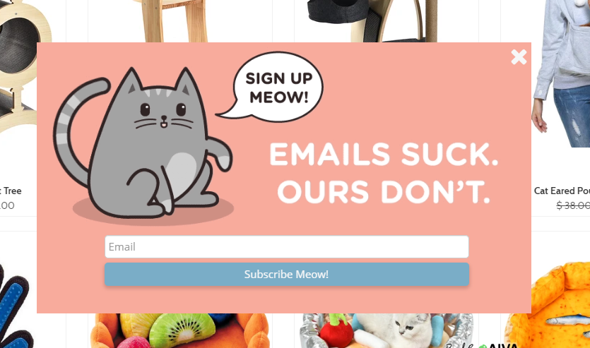
The brand uses balanced colors and an animated version of their mascot to capture their cat-loving audience and get them to take action.
At the same time, the brand removes any distraction from their form using only a headline that delivers a fun experience.
2. Send a Newsletter Signup Email
When your visitor joins your list there are a few things you can do to enhance their experience and prevent them from unsubscribing.
One of those things is your confirmation message, a short notification that you can display on your website after your visitor converts.
Here’s an example from Wendell August Forge:
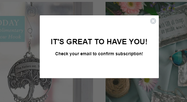
A simple confirmation message like this will show your new subscribers that they have successfully joined your list.
However, if you want something to verify that your new members are people with real email addresses, you should consider sending them a confirmation email.
Confirming your subscriber’s addresses is a must to maintain good email deliverability and ensure a good sender reputation score.
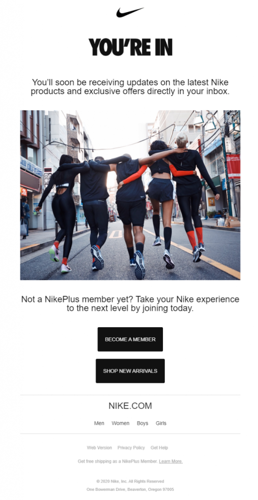
Apart from the simple confirmation email, though, you can also create a unique newsletter signup email that will be something between a confirmation and a welcome email.
Here’s Nike’s:
3. Segment Through Input Fields
Simplicity is an essential element to get your visitors to take action. Minimizing distractions by omitting unnecessary elements will also help you increase the efficiency of your form.
However, if you want to take your email marketing to the next level, you should take advantage of your input fields to get started with segmentation.
As we said, segmentation is the process of dividing your subscribers into similar groups based on demographics like their gender, age, and profession.
Leveraging the power of such data will help you deliver better content to your subscribers, engage them faster and, finally, turn them into your loyal customer.
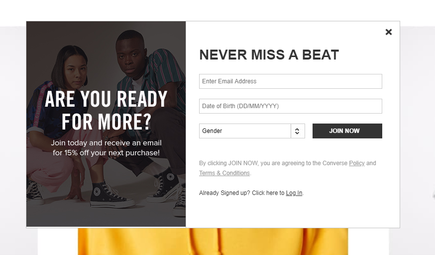
Here’s an amazing example from Converse:
A short form that doesn’t have unnecessary elements and is easy to complete will perform better than a lengthier one.
So, if you don’t want your popups to perform poorly, make sure that you minimize this effect by placing only the necessary fields.
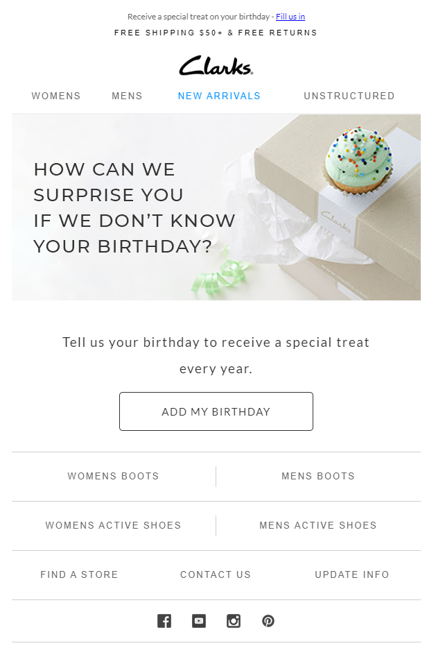
After all, you can always ask your subscribers for more information through specific campaigns like Clarks does:
4. Improve Your CTAs
Your CTAs are the most important elements of your forms. So, neglecting to pay extra attention to them will, undoubtedly, lead to a lower newsletter signup rate.
The easiest way to improve your underperforming CTAs is by changing their colors. Brightly colored buttons will stand out better on your form and attract more attention compared to soft-colored boxes.
Taking into consideration the colors of your form should be your guide to choosing the right color combinations.
Leveraging white space will also help you accomplish even more since your brightly colored will stand out and grab your visitors’ attention even more.
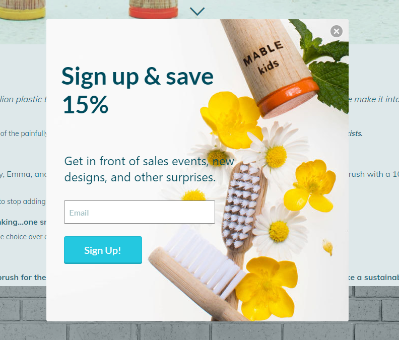
Here’s an example from Mable:
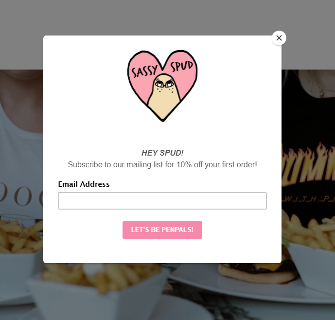
Of course, to enhance your CTAs you also have to choose the right copy. Words like “Submit,” and “Sign Up” can cause friction if used by themselves despite being some of the most popular CTAs.
To increase your efficiency, it’s better to choose a more personalized copy to show your new subscribers that they don’t have to give something up to enjoy the benefits of your list.
Here’s a personalized and unique CTA box by Sassyspud:
5. Reward Your New Subscribers
To convert, your subscribers need to see why they need to join your mailing list.
Telling them about the news and updates they will receive when they subscribe is great.
However, what’s better than telling them to give you their email address is to give them an irresistible first-time reward that will influence their opinion about your brand.
To leverage this tactic, make sure that you include the reward on your form as clearly as possible.
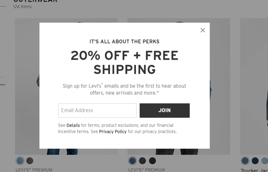
Here’s an example from Levi’s that uses both a discount and free shipping to show their new subscriber the perks of becoming part of their list
6. Tweak Your Newsletter Signup Timing
Timing your popup forms is essential to get more subscribers. If you think about it, when people land on a website, it only takes 10 seconds to form an opinion and take action.
Displaying your newsletter signup at the right moment is of paramount importance to contribute to your user’s experience.
However, if you hurry to display it, then you might interrupt your visitor’s experience and lead them away.
While it is understandable that the faster you show them your popup, the better chances you have at capturing their address, frustrating them and interrupting them will have the opposite effect.
For example, Swarovski used to have a full-page form that appeared the moment a new visitor landed on their page.
The full-page form not only appeared before the visitor interacted with the website but it also didn’t include a reward to ensure that the visitor would be compensated for the intrusion.
While there’s no rule of displaying your popups, you should let your visitors explore your content, see the value and then, when you think that they feel confident enough, target them with the right newsletter signup form.
7. A/B Test Your Forms
A/B Testing is part of every successful strategy, so it’s no wonder why you also need to implement it to increase your newsletter signup rate and lead generation.
Coming up with an effective design will help you capture your visitors. However, since the needs of your visitors change all the time, you constantly need to optimize your forms to find elements that will give you better results.
Leveraging the power of A/B Testing will allow you to create variations of your initial design, also known as control, and see which gives you a higher subscription rate.
To get started with A/B Testing you can target various elements like your copy, colors your CTA box, and even its placement on your website.
For instance, in an A/B test performed by Crazy Egg, one of their clients tested two different popup forms regarding the form’s headline:
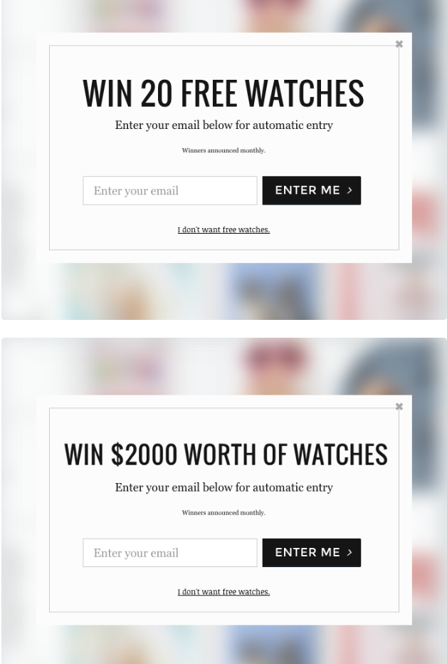
According to the results, the second version with the bolder offer ($2000 worth) performed a lot better, giving the client a subscription rate of 13.40% compared to the first form’s 6.70% rate.
Takeaway
Growing your mailing list is important to engage with your subscribers and nurture them into loyal customers of your business.
To expand your list, though, you need an effective newsletter signup form that will capture your visitors’ hearts and email addresses.
While increasing your newsletter signup rate isn’t rocket science, there are several things you should do to boost your subscription rate beyond imagination.
So, if you need to get there faster, follow these tips, test your forms and, in no time, you’ll have a powerful newsletter signup form to power up your digital marketing endeavors like a pro.