
Web Design: How to Guide Your Visitors Through Long Pages
Websites are becoming longer and longer: the average site in Google's top 10 of 2016 was about 3 A4 pages long. How can we navigate through these long pages?
The substance of a website URL is constantly increasing - regarding content and its length - and is always getting larger: according to the SEO tool provider Searchmetrics, a desktop site in Google's top 10 of 2016 had an average of 1,500 words, with mobile sites sitting at about 1,000 words. With about 500 words per A4 page in standard font size (12) in Word, this results in two to three A4 format sites.
This content is coined by the aspiration for relevance: "holistic content," like SEOs call it, is supposed to cover the topic for which we optimize a page (we don't optimize for single search terms or keywords anymore) as extensively as possible. So, holistic optimization means addressing as many questions and possibilities within an URL, providing relevant content this way. However, this also means that we have to provide a new form of navigation for our users, making it easier for them to find their way, right?
 Image Caption: Screenshot of Apple.com[/caption]
With (a lot) less popular brands, however, this would cause the bounce rate to become rather high, as users won't find the content they're looking for within their attention span, which, by the way, is an average of 8 seconds on the web. They are very likely just to leave the page undone.
Image Caption: Screenshot of Apple.com[/caption]
With (a lot) less popular brands, however, this would cause the bounce rate to become rather high, as users won't find the content they're looking for within their attention span, which, by the way, is an average of 8 seconds on the web. They are very likely just to leave the page undone.
 Image Caption: Screenshot of Wikipedia.org[/caption]
This anchor link navigation does not only make navigating between the single sections easier, but can also have a direct influence on the look of the so-called snippet - the website preview in the Google search results.
However, a table of contents is not always the optimal solution: it moves relevant information and (media) elements in the content area away from the viewing area of the users. Additionally, users that want to navigate between different topics always have to return to the beginning of the page.
Of course, we can say this again: brands or platforms like Wikipedia can afford to do this, but I also believe that the encyclopedia will have to change this with a redesign in the future, as otherwise, pages with better user reactions (so-called user signals), and more relevant information in the viewing area (“above the fold”) will contest the rank.
Image Caption: Screenshot of Wikipedia.org[/caption]
This anchor link navigation does not only make navigating between the single sections easier, but can also have a direct influence on the look of the so-called snippet - the website preview in the Google search results.
However, a table of contents is not always the optimal solution: it moves relevant information and (media) elements in the content area away from the viewing area of the users. Additionally, users that want to navigate between different topics always have to return to the beginning of the page.
Of course, we can say this again: brands or platforms like Wikipedia can afford to do this, but I also believe that the encyclopedia will have to change this with a redesign in the future, as otherwise, pages with better user reactions (so-called user signals), and more relevant information in the viewing area (“above the fold”) will contest the rank.
 The left (marginalia) column gets the anchor navigation. This creates the connection in a style similar to the current menu item. The reading direction from top left (logo) to bottom right (URL, navigation, then anchor navigation) makes the orientation easy as well (thus, no right-sided alignment of the anchor navigation).
I place the anchor links below each other (horizontal alignment) to create the connection to the actual content. Ideally, the anchor link menu items get highlighted while scrolling, or are animated similarly to the active URL link in the main menu, underlining the connection between menu and content.
There's still enough room to place the most important call to action button (for the conversion optimization), and the second most important one (sharing button) in the header. Breadcrumbs (navigation paths), language selection, and search, as well as an optional back or scroll-up button, can be implemented too.
This navigation is well-suited for conservative pages with users that are still used to controls via an upper, and left-sided menu. However, things get more difficult when the navigation is realized responsively: then, the anchor links have to be integrated into the URL navigation.
The left (marginalia) column gets the anchor navigation. This creates the connection in a style similar to the current menu item. The reading direction from top left (logo) to bottom right (URL, navigation, then anchor navigation) makes the orientation easy as well (thus, no right-sided alignment of the anchor navigation).
I place the anchor links below each other (horizontal alignment) to create the connection to the actual content. Ideally, the anchor link menu items get highlighted while scrolling, or are animated similarly to the active URL link in the main menu, underlining the connection between menu and content.
There's still enough room to place the most important call to action button (for the conversion optimization), and the second most important one (sharing button) in the header. Breadcrumbs (navigation paths), language selection, and search, as well as an optional back or scroll-up button, can be implemented too.
This navigation is well-suited for conservative pages with users that are still used to controls via an upper, and left-sided menu. However, things get more difficult when the navigation is realized responsively: then, the anchor links have to be integrated into the URL navigation.
 The advantage is that it only takes up little space, leaving more room for the actual content. Whether a sidebar or the entire space is used for contents remains fully open, granting high flexibility.
This is mainly useful for the display on tablet PCs, and small browser widths. For my definition, this mainly affects blogs and consumer-oriented pages that serve the purpose of research and surfing. Here, couch surfers with tablets or users that have multiple browser windows open next to each other are more common.
The disadvantage of this navigation is, that not only a separate display is needed for smartphones, but also that the number of menu items and anchor links is usually limited.
The advantage is that it only takes up little space, leaving more room for the actual content. Whether a sidebar or the entire space is used for contents remains fully open, granting high flexibility.
This is mainly useful for the display on tablet PCs, and small browser widths. For my definition, this mainly affects blogs and consumer-oriented pages that serve the purpose of research and surfing. Here, couch surfers with tablets or users that have multiple browser windows open next to each other are more common.
The disadvantage of this navigation is, that not only a separate display is needed for smartphones, but also that the number of menu items and anchor links is usually limited.
 While it does require the content to be displayed in an appealing way even with smaller browser width, this comes with a bunch of advantages:
For starters, we can pursue a "mobile first" approach due to menu items aligned above each other: the navigation can be displayed in the same way on both desktop and mobile resolutions (ideally hidden under a hamburger icon for mobile users).
Furthermore, there is no limit on the number of URL and anchor links. Marketers and editors get to develop content that's as long as they desire with many subheadings. The navigation follows the content's storytelling and then leads to a URL-specific call to action button.
Disadvantage: even here, at one point, we are restricted in the number of links. To fight this, we only let the anchor links lock while scrolling.
While it does require the content to be displayed in an appealing way even with smaller browser width, this comes with a bunch of advantages:
For starters, we can pursue a "mobile first" approach due to menu items aligned above each other: the navigation can be displayed in the same way on both desktop and mobile resolutions (ideally hidden under a hamburger icon for mobile users).
Furthermore, there is no limit on the number of URL and anchor links. Marketers and editors get to develop content that's as long as they desire with many subheadings. The navigation follows the content's storytelling and then leads to a URL-specific call to action button.
Disadvantage: even here, at one point, we are restricted in the number of links. To fight this, we only let the anchor links lock while scrolling.
Holistic Content Without Navigation
Of all things, the easiest reaction to extensive, holistic content is provided by THE design benchmark: Apple. On the about 1,700 word long page on the iPad Pro, for example, there is no option to navigate faster between the sections and paragraphs, outside of scrolling. Certainly, this was done on purpose, keeping users on the page longer by making them surf more carefully, and making them find important content parts on their own. Apple can afford to do this because most of the customers are loyal fans, or at least willing to look through the page's content. [caption id="attachment_80777" align="alignnone" width="483"] Image Caption: Screenshot of Apple.com[/caption]
With (a lot) less popular brands, however, this would cause the bounce rate to become rather high, as users won't find the content they're looking for within their attention span, which, by the way, is an average of 8 seconds on the web. They are very likely just to leave the page undone.
The Solution: The Anchor Link
Let's take a look at how the web's strongest site approaches the topic: Wikipedia. The encyclopedia is the pioneer when it comes to holistic optimization. For years now, it has been showing us how to rank perfectly with one's content. Today, it is entirely normal for their users to reach the individual sections using a table of contents. In the case of Wikipedia, this is generated automatically, and gets users to single subheadings (h2 and h3) via anchor links: [caption id="attachment_80779" align="alignnone" width="640"] Image Caption: Screenshot of Wikipedia.org[/caption]
This anchor link navigation does not only make navigating between the single sections easier, but can also have a direct influence on the look of the so-called snippet - the website preview in the Google search results.
However, a table of contents is not always the optimal solution: it moves relevant information and (media) elements in the content area away from the viewing area of the users. Additionally, users that want to navigate between different topics always have to return to the beginning of the page.
Of course, we can say this again: brands or platforms like Wikipedia can afford to do this, but I also believe that the encyclopedia will have to change this with a redesign in the future, as otherwise, pages with better user reactions (so-called user signals), and more relevant information in the viewing area (“above the fold”) will contest the rank.
Navigation Transformation
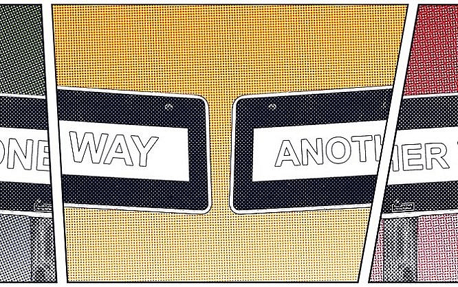
In my opinion, due to the holistic contents and the demand for an optimal user experience, the menu of websites should not be limited to URLs anymore. Instead, it also has to offer a navigation within the respective URL via anchor links. Because I, as an SEO consultant, don't have a design-related function, I often give three examples on how to solve that:1. Separate Navigation
The easiest solution is the one above with the menu items aligned next to each other. I call this type of menu vertical array, as the arrangement also describes the so-called verticals. In marketing, verticals are application areas or branches. Each vertical represents an URL which is the optimized for the application or branch solution (the topic or the keyword).
The left (marginalia) column gets the anchor navigation. This creates the connection in a style similar to the current menu item. The reading direction from top left (logo) to bottom right (URL, navigation, then anchor navigation) makes the orientation easy as well (thus, no right-sided alignment of the anchor navigation).
I place the anchor links below each other (horizontal alignment) to create the connection to the actual content. Ideally, the anchor link menu items get highlighted while scrolling, or are animated similarly to the active URL link in the main menu, underlining the connection between menu and content.
There's still enough room to place the most important call to action button (for the conversion optimization), and the second most important one (sharing button) in the header. Breadcrumbs (navigation paths), language selection, and search, as well as an optional back or scroll-up button, can be implemented too.
This navigation is well-suited for conservative pages with users that are still used to controls via an upper, and left-sided menu. However, things get more difficult when the navigation is realized responsively: then, the anchor links have to be integrated into the URL navigation.
2. Combined Vertical Navigation
A different way to combine URL and anchor links is to align everything vertically in the header:
The advantage is that it only takes up little space, leaving more room for the actual content. Whether a sidebar or the entire space is used for contents remains fully open, granting high flexibility.
This is mainly useful for the display on tablet PCs, and small browser widths. For my definition, this mainly affects blogs and consumer-oriented pages that serve the purpose of research and surfing. Here, couch surfers with tablets or users that have multiple browser windows open next to each other are more common.
The disadvantage of this navigation is, that not only a separate display is needed for smartphones, but also that the number of menu items and anchor links is usually limited.
Combined Horizontal Navigation
The last and, to me, most interesting solution is the combination of menu items and anchor links in the left column.
While it does require the content to be displayed in an appealing way even with smaller browser width, this comes with a bunch of advantages:
For starters, we can pursue a "mobile first" approach due to menu items aligned above each other: the navigation can be displayed in the same way on both desktop and mobile resolutions (ideally hidden under a hamburger icon for mobile users).
Furthermore, there is no limit on the number of URL and anchor links. Marketers and editors get to develop content that's as long as they desire with many subheadings. The navigation follows the content's storytelling and then leads to a URL-specific call to action button.
Disadvantage: even here, at one point, we are restricted in the number of links. To fight this, we only let the anchor links lock while scrolling.
Thank you for your detailed explanations of formulas for creating a page with sequential content.
I was thinking of creating a web page of a single page with high graphic content and divided into four blocks at most to speed it up.
I think I have the clearest idea.