
5 Competitive Real Estate Website Designs
If a real estate agency wants to stay ahead of the competition, it is no longer enough to simply have great agents and outstanding service. Today every aspect of how an agency is run can have an impact on its bottom line – including real estate website design.
Think of it the way you would think of curb appeal: A home can be beautiful inside but if the first impression a potential buyer has is unkempt landscaping and a dirty exterior, it will be much harder to get them in the door. It is the same way with a website – a potential client’s first impression. Check out five of the most competitive real estate website designs and what makes them unique.
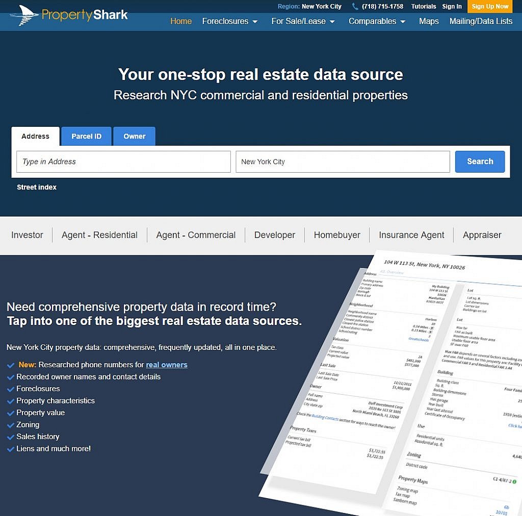
1. PropertyShark
One of the most challenging aspects of creating a competitive real estate website design is striking a balance between providing enough information and not providing enough. You do want visitors to instantly know what the website is for and what they can do there, but you do not want to overwhelm them with search boxes, graphics, illustrations, and links.
PropertyShark’s modern website manages strikes this balance by carefully selecting and limiting the color and types of fonts and pictures in such a way that it is able to offer a wide range of search options, subscription choices, and drop-down menus without overwhelming the reader. A quick scroll down the page offers access to interesting blogs with well-chosen titles and quotes that give the reader an immediate sense of the subjects covered and relevance.
For a website with so much valuable information available to its readers, PropertyShark manages to do an exceptional job of presenting the information in a fun and manageable way.
2. Homes.com
From the moment a visitor arrives at Homes.com they understand their three main options: buying, renting, and checking home values. With a dynamic, expansive picture to great viewers, followed by specific property listings in the area from which the viewer is visiting the website, there are several sections that immediately grab attention.
For the visitor who is committed to seeing everything the site has to offer, a short scroll down takes them to a section that then dominates the screen: an ad for the company’s Snap & Search program. The main picture is bright, bold, and instantly draws the eye, and the out of focus home in the background allows a visitor to substitute their perfect home for this rough outline.
By using contrasting information, photos, and data, Homes.com excites the visitor, forcing them to choose their own perspective. This gets them involved in the viewing process and increases the chance they will take the time to click around.

3. Century 21
Like PropertyShark, Century 21 focuses on just a few colors to help their website feel less cluttered. In fact, the overall aesthetic is one of minimalism. Compared to the other pages discussed this far, this website has fewer links, pictures, and information on its home page. The one picture they chose to showcase their entire brand brings one thing immediately to mind: luxury.
When a real estate company is making design decisions, one of the first choices they must make is whether to focus on a market niche or the market as a whole. While the previous websites have taken a more macro approach, Century 21 has clearly decided to focus on luxury and commercial clients. With clean lines, little clutter, and soft colors, their website instantly makes their focus clear.
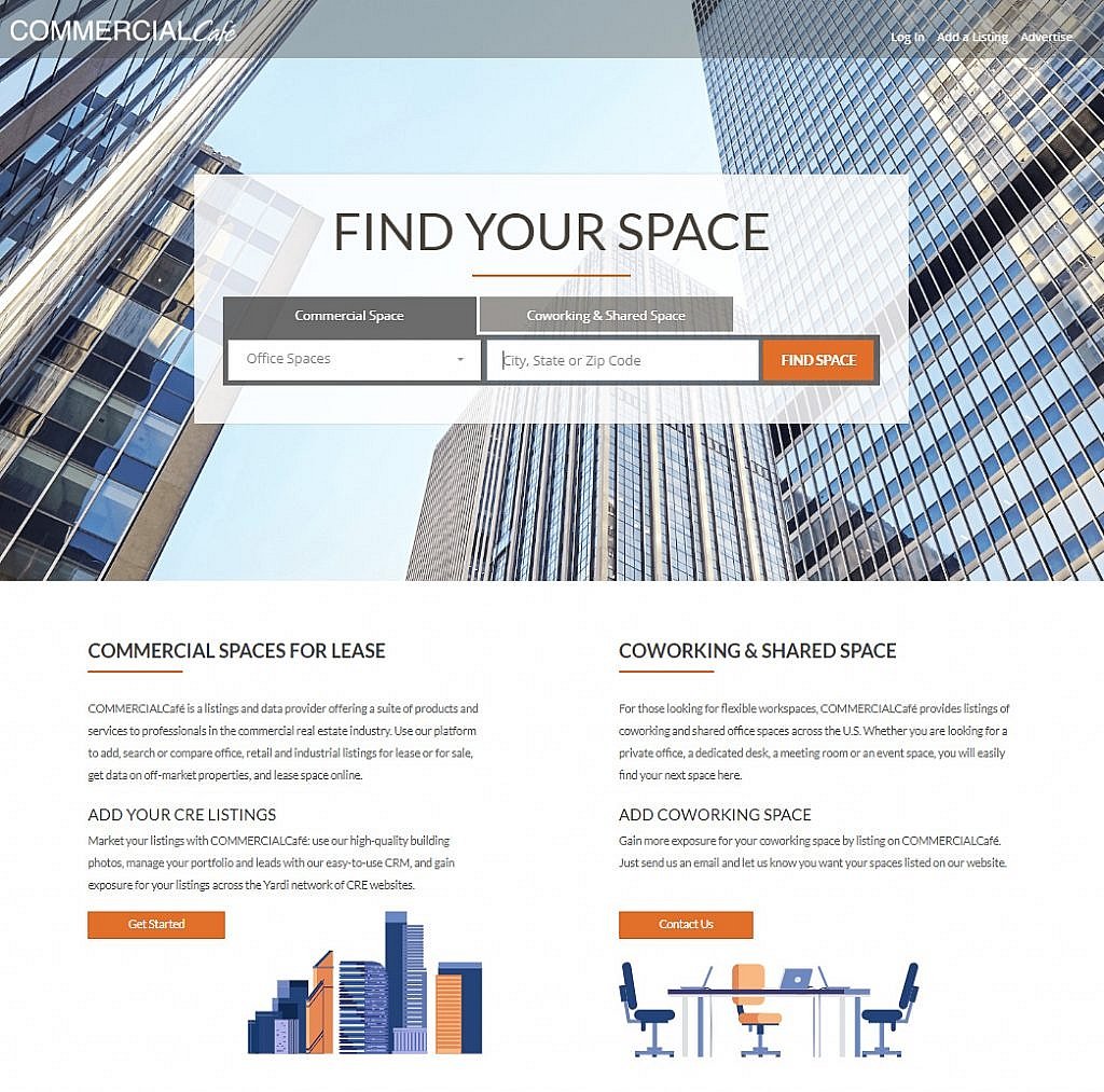
4. CommercialCafe
The name and the website make it clear that CommercialCafe is all about commercial real estate. From the choice of the main image – a towering skyscraper – to center justifying the font, this is another example of focusing on a niche market. The website keeps words to a minimum while offering over a dozen active links. In short, it is all about getting down to business – just like a commercial property owner would be.
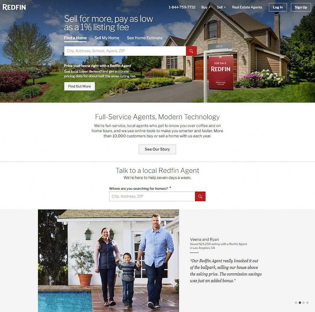
5. Redfin
With a style that is opposite of the cool, calm, collected design of CommercialCafe, Redfin focuses on the personal, warm relationships between people and the properties they occupy. The main image is a welcoming home with blue skies behind it. Below it, a slider showcases smiling families and individuals who are telling a
Nice tips and Tricks, for a beginner like me looking to enter into the real estate market, these suggestions really matters. Will help me in understanding the things better
Awesome blog. Very useful information, it clarified a lot of things to us. Thanks for sharing your view. – dentist in bloomington il
Really helpful information provided by you. I was searching for website design for my real state business. Thanks for providing this info.
Wow, great website designs. I will definitely use them for my real state business. Thanks a lot for sharing these designs.