A Graphic Design Primer, Part 1: The Elements of a Design
There are many elements that make up any visual design, whether it's good or not. Becoming familiar with the parts of a design is necessary before you can start to apply the principles of good design to your own work, in the same way that a doctor needs to have an understanding of anatomy before he can learn to heal a patient.
There are seven basic elements of any design. Some are easier to grasp than others, but all are important. Once you can identify the elements of a design, whether it's your own or someone else's, you can learn how the principles of good design are best applied.
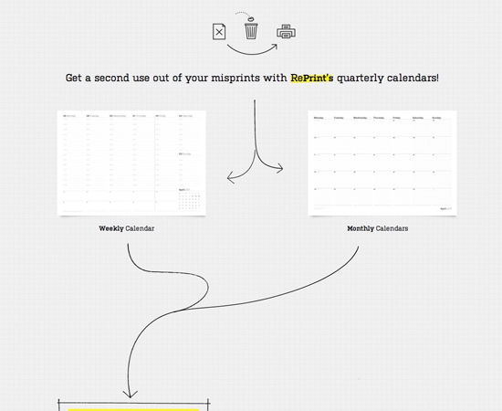
 RePrint
 uses a number of curved lines to direct the eye of the visitor.
RePrint
RePrint uses a number of curved lines to direct the eye of the visitor.
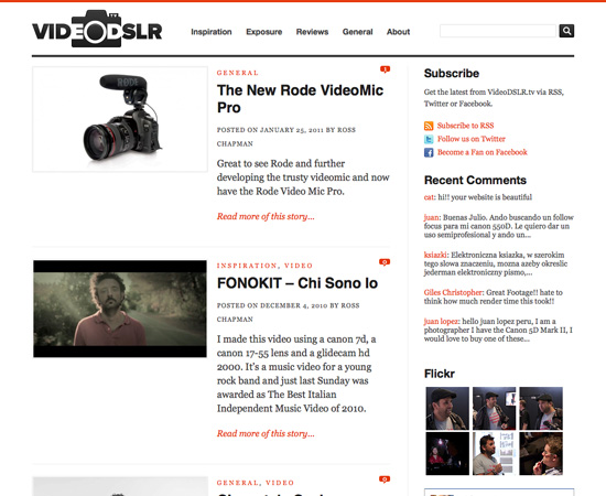
 VideoDSLR
 uses straight lines of varying widths to delineate content sections.
VideoDSLR
VideoDSLR uses straight lines of varying widths to delineate content sections.
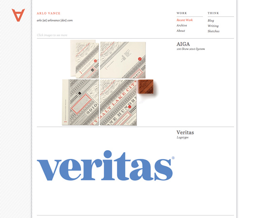
 Arlo Vance
Another example of a 3D effect in website design.
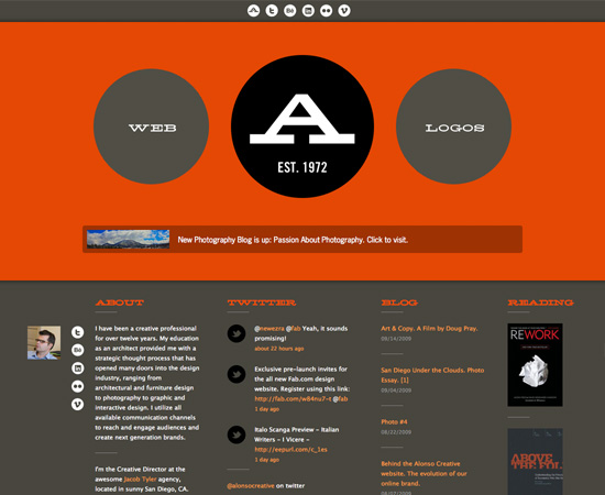
 Passion About Design
Circles are used throughout the design.
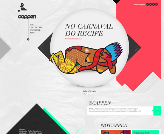
 Cappen
The Cappen site uses triangles throughout their site.
 Doublenaut
 uses a more pronounced texture in their background.
Doublenaut
Doublenaut uses a more pronounced texture in their background.
 Cuban Council
The Cuban Council website uses textures on virtually every element of their design.
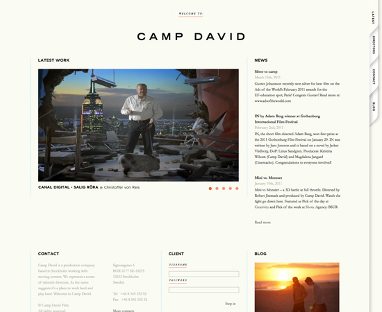
 Camp David
The more muted colors here give a completely different feeling than the site above.
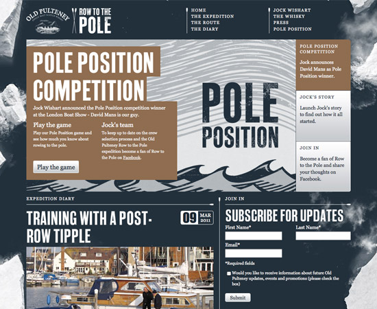
 Old Putney Row to the Pole
The Old Putney Row to the Pole site uses darker but still muted colors, which gives yet another impression.
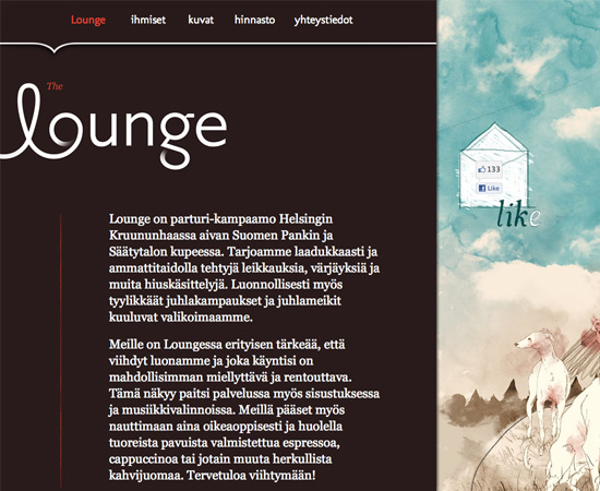
 The Lounge
 has a relatively dark value.
The Lounge
The Lounge has a relatively dark value.
 Dazed Digital
, on the other hand, has very little white space in their design.
Dazed Digital
Dazed Digital, on the other hand, has very little white space in their design.
 Poster Roast
Another example of a site without a whole lot of negative space.
Line
Lines are generally present throughout a design. They can be thick or thin, straight or curved, solid or dashed or dotted. Lines can be any color and any style. Straight lines are often used as delineations between sections of a design, or they may be used to direct a viewer's vision in one direction or another. The width of a line has a direct effect on its visual impact. Thick lines are bold and strong; they draw attention to themselves. Thin lines tend to do the opposite. Color also effects the impact of a line, with brighter and darker colors drawing more attention than lighter and paler colors. The style of a line also has an effect: dotted or dashed lines are less imposing than solid lines. Curved lines often give a more dynamic or fluid look to a design. They indicate movement and energy. They're also more common in designs with an organic nature, as they're more likely to be seen in nature. Straight lines are more formal and structured, and indicative of "civilized" culture.Examples
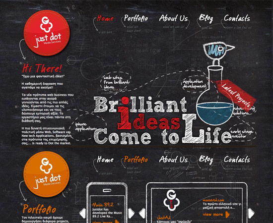
Justdot Justdot is another example of a site that uses a lot of curved and dashed lines to indicate movement and energy. RePrint
 uses a number of curved lines to direct the eye of the visitor.
RePrint
RePrint uses a number of curved lines to direct the eye of the visitor.
 VideoDSLR
 uses straight lines of varying widths to delineate content sections.
VideoDSLR
VideoDSLR uses straight lines of varying widths to delineate content sections.

Form
Forms are three-dimensional objects within a design, like a sphere or cube. You can have forms that are actually three-dimensional in your designs (like with product packaging), or forms that are actually two-dimensional but are displayed in a way as to imply that they're three-dimensional (like a line-drawing of a cube). Forms are common in actual three-dimensional graphic design, of course, but are also seen in web and print design. Website designs that use 3D techniques are making use of forms. Another common place to see forms is in logo designs where a sphere or cube is present.Examples
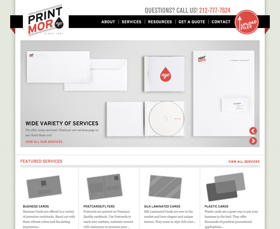
Print Mor NYC Print Mor NYC uses a 3D effect behind their main content. Arlo Vance
Another example of a 3D effect in website design.

Shape
Shapes are two-dimensional. Circles, squares, rectangles, triangles, and any other kind of polygon or abstract shape are included. Most designs include a variety of shapes, though deliberate use of specific shapes can give a design a certain mood or feeling. For example, circles are often associated with movement, and also with organic and natural things. Squares are more often seen with orderly, structured designs. The color, style, and texture of a shape can make a huge difference in how it is perceived.Examples
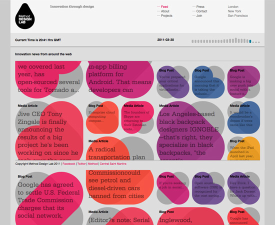
Method Design Lab Method Design Lab uses ovals and other rounded shapes throughout their design. Passion About Design
Circles are used throughout the design.
 Cappen
The Cappen site uses triangles throughout their site.

Texture
Textures are an important part of just about any design. Even designs that, on the surface, don't seem to use textures actually are ("smooth" and "flat" are textures, too). Textures can add to the feeling and mood of a design, or they can take away. The most commonly seen textures, apart from flat or smooth, are things like paper, stone, concrete, brick, fabric, and natural elements. Textures can be subtle or pronounced, used liberally or sparingly, depending on the individual design. But texture is an important aspect of design, that can have a surprising effect on how a design comes across.Examples
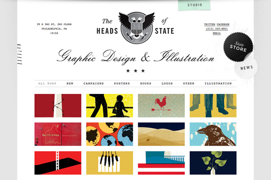
The Heads of State The Heads of State site uses a few subtle textures. Doublenaut
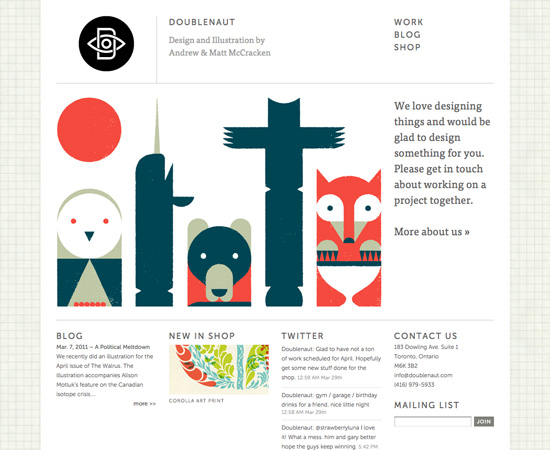
 uses a more pronounced texture in their background.
Doublenaut
Doublenaut uses a more pronounced texture in their background.
 Cuban Council
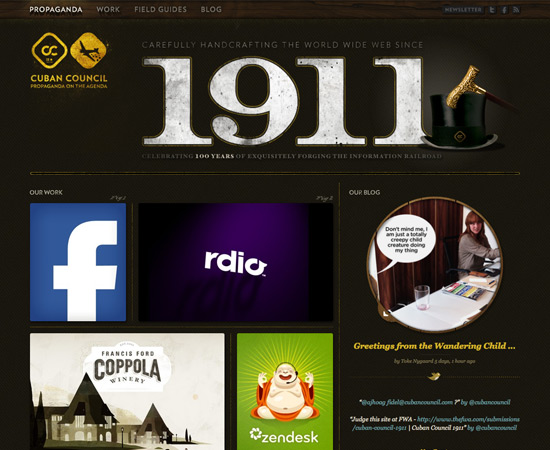
The Cuban Council website uses textures on virtually every element of their design.

Color
Color is often the most obvious thing about a design. We're taught colors from an early age, and even go so far as to identify some things with color descriptors ("my green jacket" or "my red shoes"). Color is also capable of creating strong reactions among people, who consciously and subconsciously apply certain meanings or emotions to different colors (this is also influenced by culture, as many colors mean different things in different cultures). Color theory is an important aspect of design, and something designers should at least have casual knowledge of. You should know the difference between a shade (when black is added to a pure color), tint (when white is added to a pure color) and tone (when gray is added to a pure color). You should also know terms like chroma, value, and hue. But more importantly, you should know how all these things work together to create a mood or feel in a design. For a more complete overview of color theory, check out our archived series, Color Theory for Designers.Examples
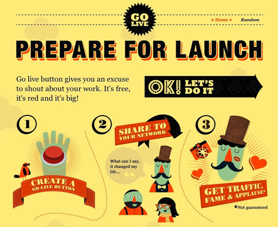
Go Live Button The very bright colors used on the Go Live Button website have a definite impact on the perception of the visitor. Camp David
The more muted colors here give a completely different feeling than the site above.
 Old Putney Row to the Pole
The Old Putney Row to the Pole site uses darker but still muted colors, which gives yet another impression.

Value
Value is closely related to color, but it's more general. It's how light or dark a specific design is. Again, this relates directly to the mood a piece gives. Darker designs convey a different feeling than lighter designs, even with all other design elements being equal. This is one reason you'll often see designers releasing both light and dark versions of their themes. Not every piece has a clear-cut value. With very colorful pieces, you might not really be able to tell how high or low the value is. One trick is to convert the design to grayscale, to get a better sense of how light or dark it is. You can also look at the histogram of an image to get an idea of where the value is more heavily concentrated.Examples
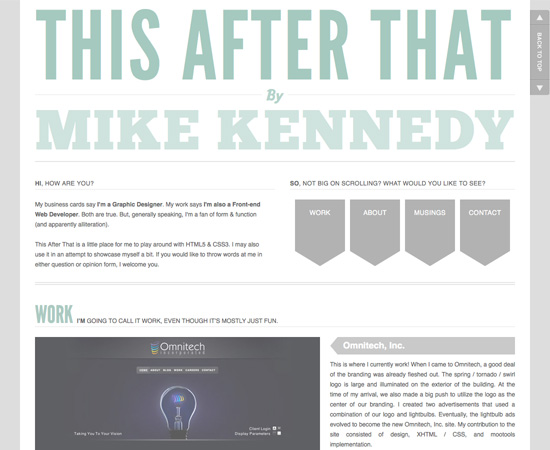
This After That This After That is an example of a site with a relatively light value. The Lounge
 has a relatively dark value.
The Lounge
The Lounge has a relatively dark value.

Space
There are two kinds of space in design: positive space and negative space. Positive space is that which is occupied by design elements. Negative space (also called "white space") is the area that's left over. The relationship between positive and negative space has a strong influence on how the design is perceived. Lots of negative space can give a piece a light, open feeling. A lack of negative space can leave a design feeling cluttered and too busy, especially if the designer is careless. Negative space can create its own shapes and forms, which impact the design. Understanding the effect of negative space and how to use it to your advantage in a design is one of the most important techniques a designer can learn, and can make the difference between a good design and a great design.Examples
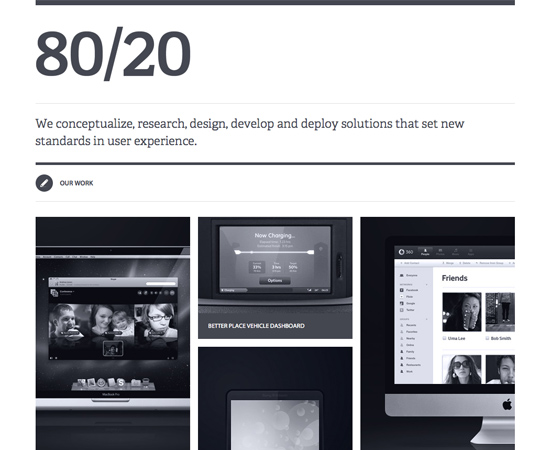
80/20 Studio 80/20 Studio has a lot of negative space in their design. Dazed Digital
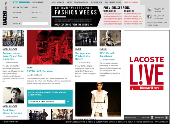
, on the other hand, has very little white space in their design.
Dazed Digital
Dazed Digital, on the other hand, has very little white space in their design.
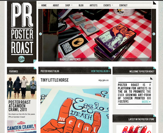
 Poster Roast
Another example of a site without a whole lot of negative space.

Up Next...
In the next installment, I'll be covering the principles that make up a good design, and how to apply them to the elements we covered here.Further Resources
- Shape - Basic Elements of Design This article from About.com offers a brief rundown of how shapes are used in design, as well as links to more specific resources.
- Textures in Modern Web Design An article from our archives on using textures effectively in website designs.
- The Elements of Design An overview from Digital Web Magazine.
- Learn the Basic Elements of Visual Design, Go For the Right Composition Another overview of the basic elements, this time from DesignModo.

Not too groundbreaking I have to admit.
Sorry to disappoint, Dick, but this is a primer. It is for beginners, or to act as a refresher for those looking to brush up on the basics. I think Cameron did a fine job explaining the various elements in a clear, digestible way. Not sure what you would have expected out of a primer, but we felt it was done well. Maybe next time… :)
Noupe Editorial Team
I agree with u Robert
I’m still in the early stages of becoming a pro
and this article has taught me staff I didn’t learn at school– super Noupe
thank you Cameron
Thanks for the good article, great as a primer. Designers (myself included) often forget about what the basic elements they have at their disposal are. An old (printed!) book I have that I also like is called “Visual thinking”. I find myself going back to it sometimes as some of its principles still apply (and relate to the article).
Cameron! Thank you TONS and TONS for this!
I’m a self taught web designer, and I’m often frustrated at not knowing how to do sometimes even the most basic of things. Articles like these are super valuable to me for that reason, and also because then I can better explain designs to the people who I work with.
I really love the reasoning behind the art and design. Not that understanding all the reasons makes you into a great designer, but it at least helps to better understand great design!
A very nice read! Now I remember stuff like value.
It’s always useful to turn back to basics from time to time, it is really a good primer!
what about type? or do you consider that a principal of design??
Thanks. Nice read. Can’t wait for the next one.
A good read.
I was expecting a bit more hardcore ‘design theory’ but interesting none the less.
Great post. As someone who struggles with graphic design (who doesn’t), nice to see resources such as this. Doesn’t hurt that it comes from someone else named Cameron. :-)
Please keep them coming.
Cameron
Awesome!! Thanks for the post!
Thanks for the mention Cameron! Great article :)
Great examples and composite of websites. Wish my website made the list, but I guess that just means I have to work harder to get noticed for my designs on the web…Challenge here I come. :)
thanks Cameron.. a very helpful notes for the beginners.. :) good examples and well put across..
Thanks for the awesome graphic design primer! I’m still new to the design world, and after spending more than a decade in development, it’s concepts like these that help make me a better Interactive Designer. I look forward to using these techniques on my next website build.
Very nice websites. Thanks!