
A Guide To Seamless Website Redesign
An inherent problem with owning a web site is that styles come and go on the internet fast as (or faster than) the real world. A web site can look out-of-date very fast if it is not being constantly maintained. Do you need to refine your online presence? A web site redesign may be just what the doctor ordered.
[fblike]
While it is possible to salvage your old web site, it may be better to keep what worked in the past and start from scratch. You can end up spending more time realigning content or revising old graphics without adding much more value to your web site.
 This article will cover the different stages of a web site redesign including analysis, research, structure, interaction and atmosphere. While there are other bits a pieces of a redesign that may be left out, we've covered the most significant parts. If you take your time while building a web site, you can create something that will last a long time and reduce future costs for you and your clients. You can easily navigate this article using the table of contents found below:
One benefit of the World Wide Web is that almost anyone can take on the role of a Web designer with the wide variety of tools available. One thing to keep in mind is that Web design is a skilled craft and the most important thing is to create a beautiful user-friendly site that will display all of your content. Not every skilled developer is just as skilled at design. Even if you do not have design talent, there is a good amount of planning you can do for your redesign. If you feel more comfortable leaving this to the experts, there are many Web design services available.
This article will cover the different stages of a web site redesign including analysis, research, structure, interaction and atmosphere. While there are other bits a pieces of a redesign that may be left out, we've covered the most significant parts. If you take your time while building a web site, you can create something that will last a long time and reduce future costs for you and your clients. You can easily navigate this article using the table of contents found below:
One benefit of the World Wide Web is that almost anyone can take on the role of a Web designer with the wide variety of tools available. One thing to keep in mind is that Web design is a skilled craft and the most important thing is to create a beautiful user-friendly site that will display all of your content. Not every skilled developer is just as skilled at design. Even if you do not have design talent, there is a good amount of planning you can do for your redesign. If you feel more comfortable leaving this to the experts, there are many Web design services available.
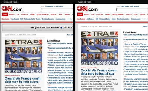 Web sites display differently depending on the operating system and web browser. The example above shows Firefox 3.0 OS X (left) and Safari 3.0 OS X (right) in Adobe Browserlabs.
Remove Content Clutter. Take a look at your web site and search for unnecessary details that could bore the client. Very often we see the description of some products that may seem appealing at first sight but in the end they lack important information that may persuade us to buy it.
Redesigning your web site is something that you should do quite often in order to make it effective for a long period of time. Updating, always bringing something new to audience, using the latest technology instead of hard-coding, brings you the company you’ve always dreamt of. As Leonardo da Vinci said best "Simplicity is the ultimate sophistication".
Outdated. If you have had a web site for a few years with minimal content changes and it has not done much for your online presence, you may require a content refresh, some simple search engine optimization (SEO) or a complete redesign. It would be best to start by evaluating your company objectives and how you hope to use your web site to accomplish them. Once you have figured that out you can determine the best route.
User Friendly Interface. When people visit your web site will they be able to find what they're looking for in less than three clicks? If you answered no to this question your site may not be very user friendly. The purpose of a web site is to find the content your are looking for as fast as possible. The more roadblocks you remove, the better the user experience will be.
Professional Look. While content is king in the web world, majority of modern web users put their trust in your company based on your web sites look. If you can connect to your demographic and display strong branding you are steps ahead of many companies online today.
Web sites display differently depending on the operating system and web browser. The example above shows Firefox 3.0 OS X (left) and Safari 3.0 OS X (right) in Adobe Browserlabs.
Remove Content Clutter. Take a look at your web site and search for unnecessary details that could bore the client. Very often we see the description of some products that may seem appealing at first sight but in the end they lack important information that may persuade us to buy it.
Redesigning your web site is something that you should do quite often in order to make it effective for a long period of time. Updating, always bringing something new to audience, using the latest technology instead of hard-coding, brings you the company you’ve always dreamt of. As Leonardo da Vinci said best "Simplicity is the ultimate sophistication".
Outdated. If you have had a web site for a few years with minimal content changes and it has not done much for your online presence, you may require a content refresh, some simple search engine optimization (SEO) or a complete redesign. It would be best to start by evaluating your company objectives and how you hope to use your web site to accomplish them. Once you have figured that out you can determine the best route.
User Friendly Interface. When people visit your web site will they be able to find what they're looking for in less than three clicks? If you answered no to this question your site may not be very user friendly. The purpose of a web site is to find the content your are looking for as fast as possible. The more roadblocks you remove, the better the user experience will be.
Professional Look. While content is king in the web world, majority of modern web users put their trust in your company based on your web sites look. If you can connect to your demographic and display strong branding you are steps ahead of many companies online today.
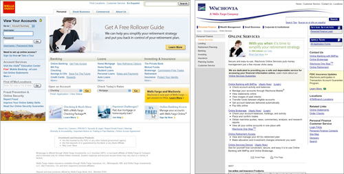 Based on looks alone, who would you trust your money with? When it comes to key business decisions especially those revolving around money, a professional look can instill trust.
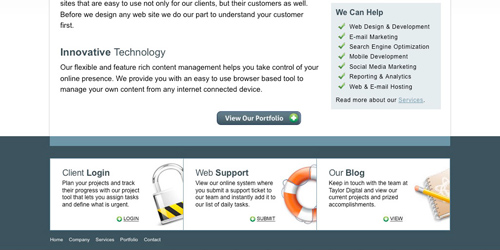 The redesign of TaylorDigital.com was focused on their current clients. They brought the client login, support and blog to the spotlight.
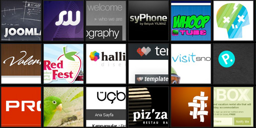 With hundreds of web sites to choose from organized by industry and popularity you will have an unlimited supply of references at your finger tips.
 It doesn't matter if you sketch a sitemap by hand or create one on a computer, it is always a good idea to create when coming up with your web site structure. The sitemap above was created in WriteMaps and then brought into Adobe Photoshop for final touch-ups.
One thing to keep in mind is that people who surf the web are ruthless when it comes to finding content. If they can find what they need fast they will stay, if they cannot they go back where they came from and find a comparable web site. A sitemap is very important because if it is well structured, your users can find what they need quickly.
It doesn't matter if you sketch a sitemap by hand or create one on a computer, it is always a good idea to create when coming up with your web site structure. The sitemap above was created in WriteMaps and then brought into Adobe Photoshop for final touch-ups.
One thing to keep in mind is that people who surf the web are ruthless when it comes to finding content. If they can find what they need fast they will stay, if they cannot they go back where they came from and find a comparable web site. A sitemap is very important because if it is well structured, your users can find what they need quickly.
 There are many ways to make a wireframe to help plan your web site. You can sketch them by hand or use Adobe Illustrator as shown in the image above. The darkened black elements are located on every page while the lighter elements change depending on the page.
Designing your new web site based on a grid system can be very helpful. The main idea behind grid systems is to maintain a visual and structural balance. The 960 Grid System is an effort to streamline web development workflow by providing commonly used dimensions, based on a width of 960 pixels. There are two variants: 12 and 16 columns, which can be used separately or in tandem.
There are many ways to make a wireframe to help plan your web site. You can sketch them by hand or use Adobe Illustrator as shown in the image above. The darkened black elements are located on every page while the lighter elements change depending on the page.
Designing your new web site based on a grid system can be very helpful. The main idea behind grid systems is to maintain a visual and structural balance. The 960 Grid System is an effort to streamline web development workflow by providing commonly used dimensions, based on a width of 960 pixels. There are two variants: 12 and 16 columns, which can be used separately or in tandem.
 Apple organizes it's navigation leading with it's store then following with product information and support.
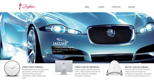 RedFenix has a very simple menu and includes added direction with a secondary navigation highlighted with images.
Secondary navigation is may not always be present on every page of a web site. These pages should be supplement the top level navigation (i.e. features, gallery, how to, tech specs, buy). While these pages contain important information that you would like to have on every page, they do not need they same visual significance.
RedFenix has a very simple menu and includes added direction with a secondary navigation highlighted with images.
Secondary navigation is may not always be present on every page of a web site. These pages should be supplement the top level navigation (i.e. features, gallery, how to, tech specs, buy). While these pages contain important information that you would like to have on every page, they do not need they same visual significance.
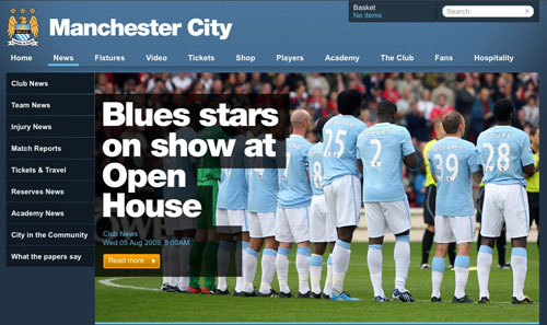 Manchester City has a lot of club information that they need to present and put the secondary navigation on the sidebar.
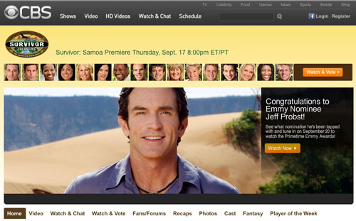 CBS uses many visual elements of navigation but clearly displays their secondary navigation below their feature photo.
Local navigation is important when you have a lot of lot of content within a particular page making it long (massive amounts of page scrolling require). It can be extremely helpful when a user wants to jump to a particular part of the page.
CBS uses many visual elements of navigation but clearly displays their secondary navigation below their feature photo.
Local navigation is important when you have a lot of lot of content within a particular page making it long (massive amounts of page scrolling require). It can be extremely helpful when a user wants to jump to a particular part of the page.
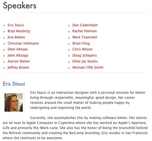 The webdirections event had a series of speakers on a single page listing bio and class information. This caused the page to be very long, requiring local navigation.
Breadcrumb navigation is used to show your path from the homepage to your current destination. This is helpful because even if you landed directly on your destination page, you can easily take one step back by using the breadcrumb. This is commonly used for resources and eCommerce web sites that have multiple items spread across many different categories.
The webdirections event had a series of speakers on a single page listing bio and class information. This caused the page to be very long, requiring local navigation.
Breadcrumb navigation is used to show your path from the homepage to your current destination. This is helpful because even if you landed directly on your destination page, you can easily take one step back by using the breadcrumb. This is commonly used for resources and eCommerce web sites that have multiple items spread across many different categories.
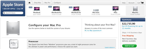 Apple shows the steps that were taken to get to this page. It spotlights the user has went to the shop, chosen the Mac Pro and started configuration for purchase.
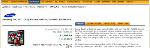 Newegg spotlights which department and manufacturer sections this product is located at.
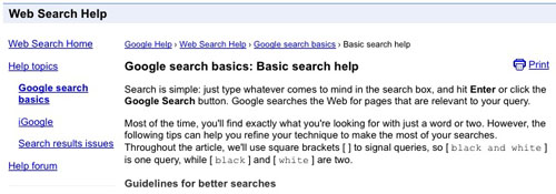 Google lets you know what category and subcategories the article the user is reading are located.
Navigation Styles
There are many different navigation styles available to help you achieve a branded look without compromises. While some styles can break the rules a bit, elements are expected to behave in certain ways with no exceptions. Including mouse over and hover effects will increase your user interaction and satisfaction greatly if done correctly.
Top navigation is by far the most common type of web site navigation. Placing your navigation in the most exposed part of your web site helps keep it easily identifiable and removed from heavy content. Giving your navigation it's own special place near the top means you will have a wide area of space available for optional large text.
Google lets you know what category and subcategories the article the user is reading are located.
Navigation Styles
There are many different navigation styles available to help you achieve a branded look without compromises. While some styles can break the rules a bit, elements are expected to behave in certain ways with no exceptions. Including mouse over and hover effects will increase your user interaction and satisfaction greatly if done correctly.
Top navigation is by far the most common type of web site navigation. Placing your navigation in the most exposed part of your web site helps keep it easily identifiable and removed from heavy content. Giving your navigation it's own special place near the top means you will have a wide area of space available for optional large text.
 A Word From His Word has large text with a red mouse over effect accompanied by a flame icon.
 Housing Works uses a utilizes transparency over a large homepage image and white capitalized text for high contrast and exposure.
 Soh incorporates the use of a high contrast light blue effect to help identify the page you are on as well as which item you mouse over
List navigation provides a large amount of flexibility for content. Once the primary and secondary are visually separated you can have a large amount of navigation items listed. With certain styles you can expose the secondary navigation on click as like the GoMedia web site (below), making your initial view very clean and tidy.
Soh incorporates the use of a high contrast light blue effect to help identify the page you are on as well as which item you mouse over
List navigation provides a large amount of flexibility for content. Once the primary and secondary are visually separated you can have a large amount of navigation items listed. With certain styles you can expose the secondary navigation on click as like the GoMedia web site (below), making your initial view very clean and tidy.
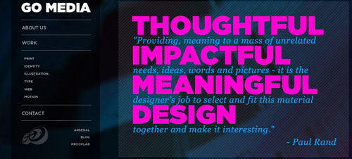 GoMedia only shows their primary navigation on load (i.e. about us, work, contact) and the secondary navigation on click. They include less significant items just below their menu without spotlighting them (i.e. arsenal, blog, prooflab)
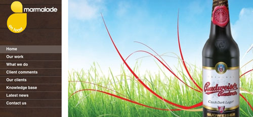 Marmalade has a left navigation highlights the selected item and will highlight any item you mouse over.
Drop-down menus help you keep your layout clean and easy to navigate but grouping all of your primary and secondary navigation elements together. Drop down menus are a great way of showing content without cluttering up a page with choices. Choices are hidden until you need to see them, by hovering or clicking on a link. Read this article on drop-down menus best practices for more information.
Marmalade has a left navigation highlights the selected item and will highlight any item you mouse over.
Drop-down menus help you keep your layout clean and easy to navigate but grouping all of your primary and secondary navigation elements together. Drop down menus are a great way of showing content without cluttering up a page with choices. Choices are hidden until you need to see them, by hovering or clicking on a link. Read this article on drop-down menus best practices for more information.
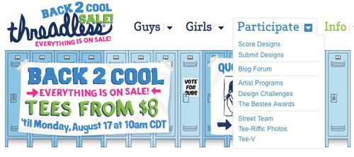 Threadless has a a clean drop down menu style that incorporates an arrow and color changes to identify elements and actions.
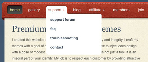 Elegant Themes uses a pure white drop down over their heavily colored site to provide more contrast for their menu items.
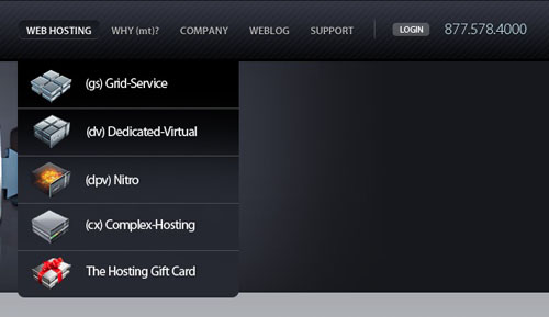 Media Temple has added the use of icons into their drop down menu to help identify between their various product choices.
Tab navigation is more of a stylistic choice, and many act just like any other top navigation. The benefit here is in the psychological effect tabs have on users (because they're more reminiscent of navigation in the real world). If done correctly, well designed tab navigation will help create a clean look.
Media Temple has added the use of icons into their drop down menu to help identify between their various product choices.
Tab navigation is more of a stylistic choice, and many act just like any other top navigation. The benefit here is in the psychological effect tabs have on users (because they're more reminiscent of navigation in the real world). If done correctly, well designed tab navigation will help create a clean look.
 Icon Bakery seems to do slight loading when you lick each tab but their web site looks very clean and you are able to switch pages easily.
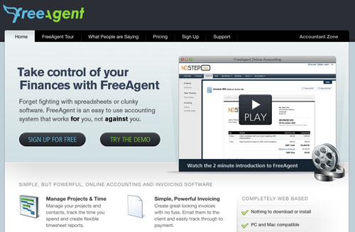 Free Agent has nearly seamless transitions when loading between tabs making their user experience excellent. Matching high contrast colors with the content body helps make it very obvious which tab is selected.
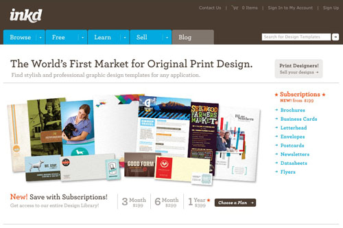 Inkd has a very friendly user interface with fast loading pages. This web site has a very pleasing color scheme, presenting a soft, clean feeling.
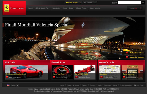 The Ferrari web site places their search box in the top-right corner of their site and the location never changes no matter which page is being viewed.
Search Wording
What do you put inside the search box? What does the button say? These are very common questions to ask, because not everyone does the same thing when it comes to search box wording. More technical users can navigate easily with an input field and an icon for a button. To develop for the average web user, we recommend that your button text says either "Search" or "Go" instead of just an icon button. You can either leave the search input field blank or add some friendly text that says "enter keyword","search articles", "search site" or even "custom search" and it will be made clear what users are doing with your search box.
The Ferrari web site places their search box in the top-right corner of their site and the location never changes no matter which page is being viewed.
Search Wording
What do you put inside the search box? What does the button say? These are very common questions to ask, because not everyone does the same thing when it comes to search box wording. More technical users can navigate easily with an input field and an icon for a button. To develop for the average web user, we recommend that your button text says either "Search" or "Go" instead of just an icon button. You can either leave the search input field blank or add some friendly text that says "enter keyword","search articles", "search site" or even "custom search" and it will be made clear what users are doing with your search box.
 InCase has a typical search box in the top-right corner of their web site with text within the input field and a button that says "go".
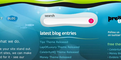 Design Disease has a non-typical search box located a little further down the page from the top-right corner and an icon for a button although they do a good job of helping the search box stand out with a graphic container that matches their theme.
Search Behavior
You may have noticed that Google recently released a nice feature that helps users formulate queries when they are not sure what to look for. If you have ever been at a loss for words you realize how valuable these auto suggestions can be to users. This is one of many ways you can improve search form behavior.
Design Disease has a non-typical search box located a little further down the page from the top-right corner and an icon for a button although they do a good job of helping the search box stand out with a graphic container that matches their theme.
Search Behavior
You may have noticed that Google recently released a nice feature that helps users formulate queries when they are not sure what to look for. If you have ever been at a loss for words you realize how valuable these auto suggestions can be to users. This is one of many ways you can improve search form behavior.
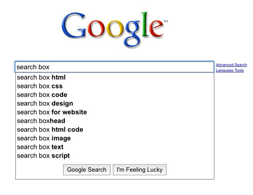 Google Suggests is a feature recently implemented by Google to help users be more specific when searching phrases and even give additional ideas on what to search for.
Layout
Once you understand your sites visitors you can make sure your search acts how they would expect it to. If you are starting from scratch there are a few basic items that users expect with search. The searched words should pull up a new page with query results. This page should contain a headline with the words being searched and the results returned. This makes sure that the user knows exactly what they searched for and how many options they need to consider.
Google Suggests is a feature recently implemented by Google to help users be more specific when searching phrases and even give additional ideas on what to search for.
Layout
Once you understand your sites visitors you can make sure your search acts how they would expect it to. If you are starting from scratch there are a few basic items that users expect with search. The searched words should pull up a new page with query results. This page should contain a headline with the words being searched and the results returned. This makes sure that the user knows exactly what they searched for and how many options they need to consider.
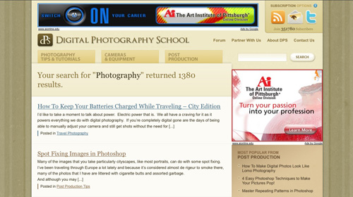 Digital Photography School does a great job with their search layout. There is no confusion on what has been searched, how many results are available.
Function
The search feature should be smart enough to recognize common misspellings and let the user know what it thinks they meant to type. This helps the user identify a mistake and quickly search for the correct word. The search feature should also display exact matches for the phrase being searched first, followed by anything else that comes close. Other useful functions include highlighting the phrase searched within the results and supplying options when zero results are found.
Digital Photography School does a great job with their search layout. There is no confusion on what has been searched, how many results are available.
Function
The search feature should be smart enough to recognize common misspellings and let the user know what it thinks they meant to type. This helps the user identify a mistake and quickly search for the correct word. The search feature should also display exact matches for the phrase being searched first, followed by anything else that comes close. Other useful functions include highlighting the phrase searched within the results and supplying options when zero results are found.
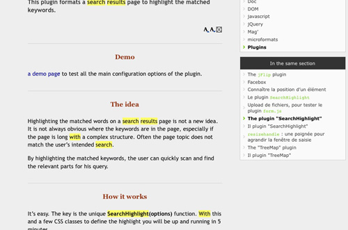 JQuery.info shows how you can use JQuery to highlight text on a search results page. This is also common practice for Google when your search result is a PDF.
 This blog uses well balanced asymmetry in the header graphic design.
Most designers stick to symmetry keeping with matching elements and use such methods as the three buckets method or rule of thirds by maintaining a golden ratio. The three buckets method is that magical combination of threes that pull together as a single element visually yet keep enough separation to evenly distribute content across the page. Using the rule of thirds you can fill two-thirds of your layout and fill the last third with white space. By balancing the page into thirds you can create more energy and interest in the site composition.
This blog uses well balanced asymmetry in the header graphic design.
Most designers stick to symmetry keeping with matching elements and use such methods as the three buckets method or rule of thirds by maintaining a golden ratio. The three buckets method is that magical combination of threes that pull together as a single element visually yet keep enough separation to evenly distribute content across the page. Using the rule of thirds you can fill two-thirds of your layout and fill the last third with white space. By balancing the page into thirds you can create more energy and interest in the site composition.
 This uses the three bucket method in it's feature rotator with the spotlighted numbers and again in the lower sub feature elements on it's homepage.
Be Aware of the Viewport
Because web site visitors vary in many ways including their display resolution, we have to take that into account with every site design. You don't want just design for the smallest screen size but the average web user instead. As of January 2009 the most common display resolution is higher than 1024x768 with 57% of users and 1024x768 coming in a sure second with 36% users. Keeping that information in mind and subtracting the space taken up by the browser interface you have varying 1000x650 viewport where the site will be displayed. You can take control of the viewport flexibility with fixed, fluid or elastic layouts. With these different types of layouts you can make sure the average user sees your site how you intended without leaving anyone else out and possibly giving them more than they bargained for.
Fixed layouts have predetermined dimensions (usually pixels) that define the width of the site. If the fixed layout width is 960 pixels, then no matter how wide the users browser is the site will always be that width and no larger for the sites visitors. With this kind of layout you can insure that the main content area remains the same size and will maintain image positioning within a text area.
This uses the three bucket method in it's feature rotator with the spotlighted numbers and again in the lower sub feature elements on it's homepage.
Be Aware of the Viewport
Because web site visitors vary in many ways including their display resolution, we have to take that into account with every site design. You don't want just design for the smallest screen size but the average web user instead. As of January 2009 the most common display resolution is higher than 1024x768 with 57% of users and 1024x768 coming in a sure second with 36% users. Keeping that information in mind and subtracting the space taken up by the browser interface you have varying 1000x650 viewport where the site will be displayed. You can take control of the viewport flexibility with fixed, fluid or elastic layouts. With these different types of layouts you can make sure the average user sees your site how you intended without leaving anyone else out and possibly giving them more than they bargained for.
Fixed layouts have predetermined dimensions (usually pixels) that define the width of the site. If the fixed layout width is 960 pixels, then no matter how wide the users browser is the site will always be that width and no larger for the sites visitors. With this kind of layout you can insure that the main content area remains the same size and will maintain image positioning within a text area.
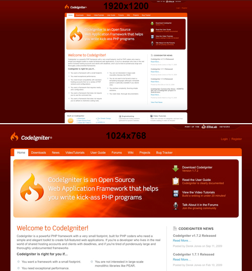 The CodeIgniter web site uses a fixed width layout of 927 pixels and will not change no matter the users display resolution. The site uses a background tile gradient image to accommodate larger viewport's.
Fluid or liquid layouts have dimensions that are relative to the size of the users viewport as defined by preset percentages. If the fluid percentage is 90%, then no matter how wide the users browser is the site will always be 90% of the total width and no larger for the sites visitors. With this kind of layout you can insure that the main content area will grow to fill the available area.
The CodeIgniter web site uses a fixed width layout of 927 pixels and will not change no matter the users display resolution. The site uses a background tile gradient image to accommodate larger viewport's.
Fluid or liquid layouts have dimensions that are relative to the size of the users viewport as defined by preset percentages. If the fluid percentage is 90%, then no matter how wide the users browser is the site will always be 90% of the total width and no larger for the sites visitors. With this kind of layout you can insure that the main content area will grow to fill the available area.
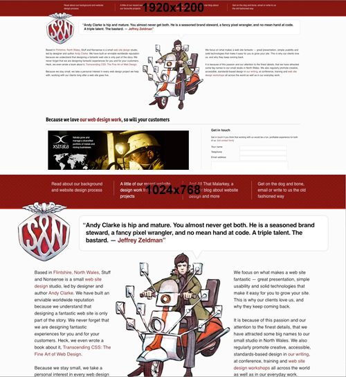 The Stuff and Nonsense web site uses a fluid layout that makes room for the content below when using viewed by a larger display resolution.
Elastic layouts are a marriage between fixed and fluid layouts. When this is implemented a sites content will shrink or grow depending on the users preference. The entire layout stays proportional to the text size as it is increased.
The Stuff and Nonsense web site uses a fluid layout that makes room for the content below when using viewed by a larger display resolution.
Elastic layouts are a marriage between fixed and fluid layouts. When this is implemented a sites content will shrink or grow depending on the users preference. The entire layout stays proportional to the text size as it is increased.
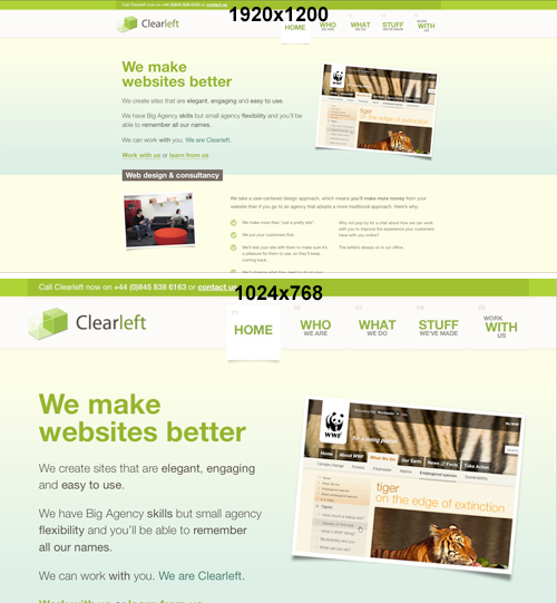 The Clearleft web site uses an elastic layout adjusts the text size for smaller display resolutions. You can really tell by the increased distance between the logo and navigation as well as the different line breaks in the opening paragraphs.
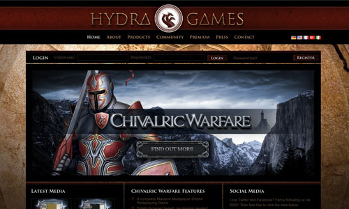 The Hydra Games web site has a mythological, medieval atmosphere in line with the companies logo and games they create. This is due to the black and red color use mixed with the textured background image and other graphics on the site.
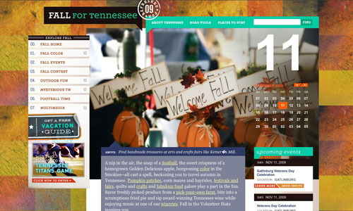 In contrast, the Fall for Tennessee web site still maintains an atmosphere but in a different way. Using nature textures mixed with specific colors and images that evoke the feeling of fall.


 Use the examples above to find your inspiration in photography, design, product, Web and advertising.
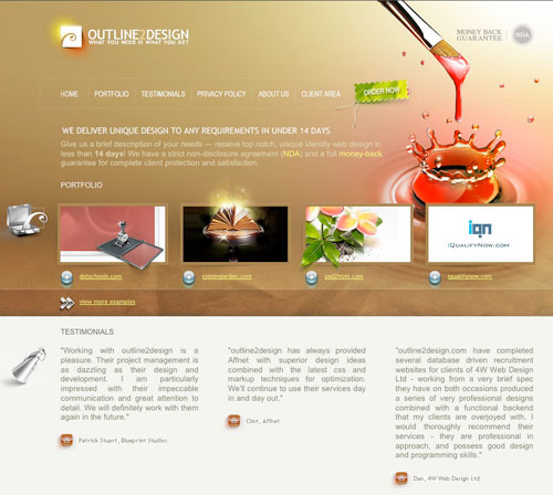 Outline2Design uses a combination between photography, icons and graphics. You can see the great use of visual imagery balanced with warm colors and soft tones.
Artwork
A great web site is not required to have a strong message. In fact, you can have a fairly minimal site design and do just fine. That's not to say that adding art cannot help. You may not be an illustrator or photographer, but that doesn't mean you can't find stock resources to help you add expression to your web site. By adding the right combination of art and content that is right for your site, you can capture your visitors to help sell services, products or even convert depending on your sites goals.
Photography
I know that it's cliche but they say "a picture is worth a thousand words", just make sure it's a thousand words you want your site visitors to see. Better yet, make sure those thousand words will help your users become aware of the sites goals. Photography can be used to establish a connection between the web site and its visitors. Personal connections are important, especially when your sites main goal involves offline activities.
Outline2Design uses a combination between photography, icons and graphics. You can see the great use of visual imagery balanced with warm colors and soft tones.
Artwork
A great web site is not required to have a strong message. In fact, you can have a fairly minimal site design and do just fine. That's not to say that adding art cannot help. You may not be an illustrator or photographer, but that doesn't mean you can't find stock resources to help you add expression to your web site. By adding the right combination of art and content that is right for your site, you can capture your visitors to help sell services, products or even convert depending on your sites goals.
Photography
I know that it's cliche but they say "a picture is worth a thousand words", just make sure it's a thousand words you want your site visitors to see. Better yet, make sure those thousand words will help your users become aware of the sites goals. Photography can be used to establish a connection between the web site and its visitors. Personal connections are important, especially when your sites main goal involves offline activities.
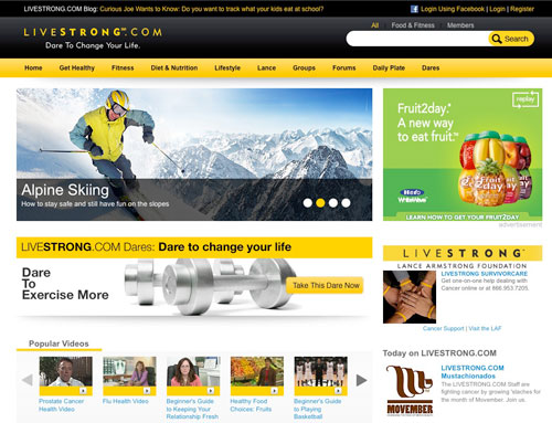 Livestrong does an exceptional job of using photography to depict a happy, healthy lifestyle while challenging you to change the way you live with graphic reinforcement. Skiing anyone?
When using photography on your web site you can use stock photography agencies, free stock photography or take your own. In any case, make sure that the photo quality is high. You may have to tweak the levels & curves or crop creatively. Remember that adding a photo with poor quality to your web site can give a bad first impression to visitors. No one would visit your business if you left your trash at the front door right?
Illustration
Many companies have embraced the use of illustration on their web sites. This includes anything from line sketches to detailed cities. Adding illustrations can guarantee a certain uniqueness that can set you apart from other web sites. Illustration can be used in the background, header, footer, menu and anywhere else you see fit. However you decide to use illustration remember to maintain your site's mood.
Livestrong does an exceptional job of using photography to depict a happy, healthy lifestyle while challenging you to change the way you live with graphic reinforcement. Skiing anyone?
When using photography on your web site you can use stock photography agencies, free stock photography or take your own. In any case, make sure that the photo quality is high. You may have to tweak the levels & curves or crop creatively. Remember that adding a photo with poor quality to your web site can give a bad first impression to visitors. No one would visit your business if you left your trash at the front door right?
Illustration
Many companies have embraced the use of illustration on their web sites. This includes anything from line sketches to detailed cities. Adding illustrations can guarantee a certain uniqueness that can set you apart from other web sites. Illustration can be used in the background, header, footer, menu and anywhere else you see fit. However you decide to use illustration remember to maintain your site's mood.
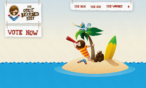 The Great Bearded Reef uses basic illustration for the base of its site. The imagery is very playful and uses bright colors for a happy mood.
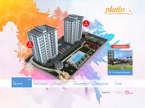 Platin uses detailed illustration (3D) in combination with motion to get the attention of its visitors.
Iconography
Icons can be a gift and a curse with helping to guide your visitors. I well designed and well placed icon will work as a visual shorthand for visitors that can help understand content without reading it. Think of street signs and how they are used in society. We have become accustomed to associating certain pictures with things and activities. When visiting a foreign country you can do a decent job of guiding yourself with signs along because symbols and icons have become a universal language. A good icon should be understood immediately. If you plan to use icons you can create your own or you can use a stock icons.
Platin uses detailed illustration (3D) in combination with motion to get the attention of its visitors.
Iconography
Icons can be a gift and a curse with helping to guide your visitors. I well designed and well placed icon will work as a visual shorthand for visitors that can help understand content without reading it. Think of street signs and how they are used in society. We have become accustomed to associating certain pictures with things and activities. When visiting a foreign country you can do a decent job of guiding yourself with signs along because symbols and icons have become a universal language. A good icon should be understood immediately. If you plan to use icons you can create your own or you can use a stock icons.
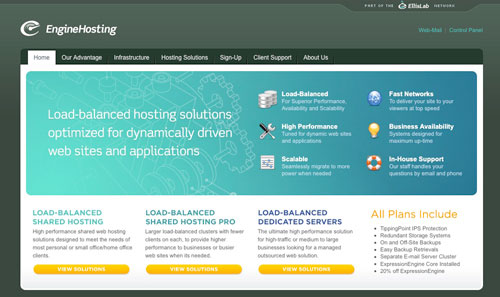 EngineHosting makes use of icons in the home page feature to help guide users to other pages of their site while leaving room for the different plans below.
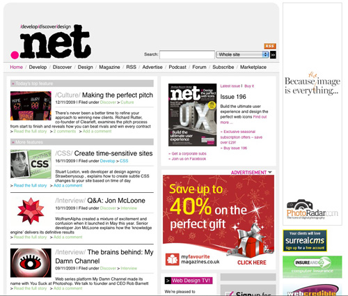 .Net magazine uses Helvetica and Arial sans-serif fonts to give their web site a smooth flowing feel.
Today on the web typography is easier to accomplish than years past from a technical perspective. From a design perspective, designing for computer users brings it's own unique set of challenges. The art of type is a very delicate subject because so much is involved such as web safe fonts, replacement techniques, font embedding and CSS3 advances. We will focus on typography basics because typography is such a deep subject. If you would like to lean more you can use the resources below.
Web Safe Fonts
There are a number of fonts that are considered safe to use on the web. These web safe fonts are common across many different browsers and operating systems. an example of some fonts would be Georgia, Times New Roman, Arial, Verdana and Impact. There are 20+ web safe fonts available out of the many fonts available to designers today. Fonts render differently depending on the browser and operating system. You can see examples of how fonts render to help you choose the right font for your visitors.
Taking these restrictions into account, you can still find many ways to be creative when creating a web site. When you specify which fonts you want to display in your cascading styles sheet by using font stacks. This will allow you to add your preferred set of font names, in order to determine how your text will display. We are able to utilize fonts that are pre-packaged with common software so the users that have them available will have an enhanced typography experience. There three great websites Better CSS Font Stacks, AwayBack, and Guide to Font Stacks that will show you how to utilize stacks for optimal impact.
.Net magazine uses Helvetica and Arial sans-serif fonts to give their web site a smooth flowing feel.
Today on the web typography is easier to accomplish than years past from a technical perspective. From a design perspective, designing for computer users brings it's own unique set of challenges. The art of type is a very delicate subject because so much is involved such as web safe fonts, replacement techniques, font embedding and CSS3 advances. We will focus on typography basics because typography is such a deep subject. If you would like to lean more you can use the resources below.
Web Safe Fonts
There are a number of fonts that are considered safe to use on the web. These web safe fonts are common across many different browsers and operating systems. an example of some fonts would be Georgia, Times New Roman, Arial, Verdana and Impact. There are 20+ web safe fonts available out of the many fonts available to designers today. Fonts render differently depending on the browser and operating system. You can see examples of how fonts render to help you choose the right font for your visitors.
Taking these restrictions into account, you can still find many ways to be creative when creating a web site. When you specify which fonts you want to display in your cascading styles sheet by using font stacks. This will allow you to add your preferred set of font names, in order to determine how your text will display. We are able to utilize fonts that are pre-packaged with common software so the users that have them available will have an enhanced typography experience. There three great websites Better CSS Font Stacks, AwayBack, and Guide to Font Stacks that will show you how to utilize stacks for optimal impact.
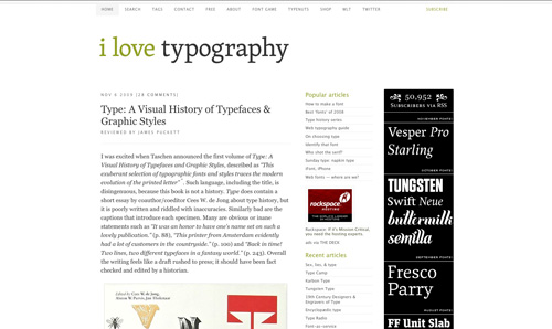 I love typography uses a font stack of Lucida Grande”, Geneva, Helvetica, sans-serif (used for some of the headings and meta information).
Replacement Techniques
A popular way to render fonts on a web site even if the visitor doesn't have it on their computer is to embed the text into an image. A common way to do this is with Revised Image Replacement where the text still remains in the HTML even when replaced with an image. This is done to keep the web page access able to screen readers and text only modern web browsers. You are able to keep the SEO benefit of having an H1 tag with this technique and you can save time by writing your markup and then styling items instead of having to wedge items into your design. View the CSS tricks test page from their article Nine Techniques for CSS Image Replacement.
Another approach to image replacement is using Scalable Inman Flash Replacement (sIFR) where text is substituted with a flash file containing a font that the viewer may not have. This method is less accessible to screen readers and text only modern web browsers. You can use this for any font type, it is cross-browser compatible and you don't run into any SEO issues because the original XHTML document remains unchanged. Learn more about sIFR 2.0 and how it can be used effectively.
Font Embedding
Being able to embed fonts is an alternative to replacement techniques. You can embed font files on your site and host them online so that even is a user does not have a particular font installed they can still view text as you intended. Browsers such as Safari 3.1+, Opera 10+, Firefox 3.5+, Chrome 3+, Netscape 4+ and Internet Explorer 4+ support this method. Font embedding comes with its own challenges, especially in Internet Explorer because that browser type uses a proprietary file format Embedded Open Type (EOT). Creating an EOT is not complicated, but rather requires a few extra steps. You can embed fonts using the @font-face rule as shown in the example below:
I love typography uses a font stack of Lucida Grande”, Geneva, Helvetica, sans-serif (used for some of the headings and meta information).
Replacement Techniques
A popular way to render fonts on a web site even if the visitor doesn't have it on their computer is to embed the text into an image. A common way to do this is with Revised Image Replacement where the text still remains in the HTML even when replaced with an image. This is done to keep the web page access able to screen readers and text only modern web browsers. You are able to keep the SEO benefit of having an H1 tag with this technique and you can save time by writing your markup and then styling items instead of having to wedge items into your design. View the CSS tricks test page from their article Nine Techniques for CSS Image Replacement.
Another approach to image replacement is using Scalable Inman Flash Replacement (sIFR) where text is substituted with a flash file containing a font that the viewer may not have. This method is less accessible to screen readers and text only modern web browsers. You can use this for any font type, it is cross-browser compatible and you don't run into any SEO issues because the original XHTML document remains unchanged. Learn more about sIFR 2.0 and how it can be used effectively.
Font Embedding
Being able to embed fonts is an alternative to replacement techniques. You can embed font files on your site and host them online so that even is a user does not have a particular font installed they can still view text as you intended. Browsers such as Safari 3.1+, Opera 10+, Firefox 3.5+, Chrome 3+, Netscape 4+ and Internet Explorer 4+ support this method. Font embedding comes with its own challenges, especially in Internet Explorer because that browser type uses a proprietary file format Embedded Open Type (EOT). Creating an EOT is not complicated, but rather requires a few extra steps. You can embed fonts using the @font-face rule as shown in the example below:
 Simurai uses a text shadow and blur radius to create a wonderful tilt-shift effect with CSS3
This article will cover the different stages of a web site redesign including analysis, research, structure, interaction and atmosphere. While there are other bits a pieces of a redesign that may be left out, we've covered the most significant parts. If you take your time while building a web site, you can create something that will last a long time and reduce future costs for you and your clients. You can easily navigate this article using the table of contents found below:
One benefit of the World Wide Web is that almost anyone can take on the role of a Web designer with the wide variety of tools available. One thing to keep in mind is that Web design is a skilled craft and the most important thing is to create a beautiful user-friendly site that will display all of your content. Not every skilled developer is just as skilled at design. Even if you do not have design talent, there is a good amount of planning you can do for your redesign. If you feel more comfortable leaving this to the experts, there are many Web design services available.
"If you only do what you know you can do, you never do very much." - Tom Krause
1. Analysis
When building a house you must always first make sure you have a good foundation. In order to determine the current faults in your web sites foundation you have to do a full analysis to make sure nothing is overlooked. Afterall, you wouldn't want to overlook something twice, right? Once you have covered all of the items listed below you should have a better handle on what needs to be changed to reinforce the focus and goals of your web site. Leads/Sales. If you are experiencing trouble with your web site such as lack of improvement in your leads/sales, it may be your that site needs an improvement or even a redesign. Firstly, your web site always needs to be fresh, that means you must frequently update your site with content, images or animation so that the viewer does not have a routine impression. If your main web site has no need to be updated, you may consider adding a blog or news ticket to add fresh variety. Visit web sites that offer the similar services and find out if there are any flaws and missing aspects that you could fill, related to your personal site. Online Expansion. If your web site is growing and expanding, you need to make sure that it still satisfies your objective. By adding new programs and services to your web site you should consider organizing your information. Adding some audio and video information will bring more authenticity to the site and your business will expand even more without a major redesign. In addition, if you're changing the focus of your site or the products or services you sell, you'll want to redesign. Browser Compatibility. It is advisable to check if your web site is compatible with all modern web browsers. If you happen to browse the web, you can see a lot of web sites that are not compatible to different browsers as each browser reads the web in it's own way. This is a very important matter because you risk losing a good amount of clients. There are many bells and whistles that can be added to a web site but you have to make sure you are not narrowing your audience by creating something they cannot properly view. Adobe Browserlabs provides Web designers exact renderings of their web pages in multiple browsers and operating systems, on demand. When using that service you must keep in mind that any interactive testing will still have to be completed manually.
Web sites display differently depending on the operating system and web browser. The example above shows Firefox 3.0 OS X (left) and Safari 3.0 OS X (right) in Adobe Browserlabs.
Remove Content Clutter. Take a look at your web site and search for unnecessary details that could bore the client. Very often we see the description of some products that may seem appealing at first sight but in the end they lack important information that may persuade us to buy it.
Redesigning your web site is something that you should do quite often in order to make it effective for a long period of time. Updating, always bringing something new to audience, using the latest technology instead of hard-coding, brings you the company you’ve always dreamt of. As Leonardo da Vinci said best "Simplicity is the ultimate sophistication".
Outdated. If you have had a web site for a few years with minimal content changes and it has not done much for your online presence, you may require a content refresh, some simple search engine optimization (SEO) or a complete redesign. It would be best to start by evaluating your company objectives and how you hope to use your web site to accomplish them. Once you have figured that out you can determine the best route.
User Friendly Interface. When people visit your web site will they be able to find what they're looking for in less than three clicks? If you answered no to this question your site may not be very user friendly. The purpose of a web site is to find the content your are looking for as fast as possible. The more roadblocks you remove, the better the user experience will be.
Professional Look. While content is king in the web world, majority of modern web users put their trust in your company based on your web sites look. If you can connect to your demographic and display strong branding you are steps ahead of many companies online today.
Based on looks alone, who would you trust your money with? When it comes to key business decisions especially those revolving around money, a professional look can instill trust.
Redesign
After reading the above information if you feel that any of the issues that currently plague your web site are holding you back, a redesign or realignment may help your company move forward. This is your chance to start over! Take this opportunity to update your look, improve your layout, update your navigation and polish your user experience. If you are ready to try something different you can increase brand recognition, traffic and leads. I will warn you, it is up to you to determine your business needs and apply them based on the recommended instructions below. There are two great articles titled Good Designers Redesign, Great Designers Realign and Redesigning Your Own Site that will give you more in-depth information if you are going to redesign your personal site or choose to realign. This is not a step-by-step guarantee to make your company or clients millions through a redesign. This is however, a great article to help keep you focused and on track with your redesign.2. Research
Think of this part from the user standpoint. How do you want your visitors to feel when they see your web site? It is good to consider your web site goals so you can prepare for your visitors reaction to the usability of your design. Do you want them to be amazed, informed or curious? Visitor reactions are very important to the success of your web site. It does not matter if your budget is high or low, the fact still remains that research is a key part of building a web site. It is never good to build your car while you drive it. Once you know your likes and dislikes you will have a better handle on the direction of your project. Some ways to understand interaction would be usering a service such as crazyegg that will help you see heatmaps and where users have clicked. This will help you identify if they are looking at and clicking everything you want them to.- Successful Web Site Goals Before you begin planning out your web site, make sure you have a good idea of what success will look like. Your goals for your web site can lead to very different planning, design, and promotion strategies.
- CSS Gallery List This is a great resources to find all of the web galleries out there. You can browse through the thousands of listings or submit your own web site for free.
- 25 Incredibly Useful Usability Cheat Sheets & Checklists You can find cheat sheets and checklists for forms, blogs and more below, all listed in alphabetical order.
Web Site Goals
The online world is a never ending competition for traffic, conversion and ROI. If you don't know what your goals are, you cannot create a successful and engaging web site design. What is your call to action? What do you want your visitors to do? While there is no single answer because every business is different, it is good to have an idea of your needs before anything is built. It would be a good first step to write all of your goals down and then begin to prioritize intro three groups: primary, secondary and support. Primary goals are essential tothe success of your business and they should receive the most attention during the redesign process. Secondary goals may not make or break your business but they are still important to growing your business. They can be considered during this process or taken care of as a second phase of the redesign. Support goals are usually an after though and have never been a priority. You should consider leaving these goals out of the process to help you focus on the more important issues. Too many goals will cloud and confuse the process while dragging out your timelines.
The redesign of TaylorDigital.com was focused on their current clients. They brought the client login, support and blog to the spotlight.
Visitor Reaction
The more attractive your web site is, the better off you will be. In past reports it was said the average attention span for a web user 8 seconds. A recent study conducted by Akamai Technologies reported that number has dropped to 4 seconds. Web users have a short attention span due to the sheer number of accessible content available. If you make your user think too hard to find what they are looking for, that user could potentially never return. You want to make sure you look around the web and find some new and interesting web sites with friendly interfaces (navigation, look and feel). One great way to find inspiration is to look at Creamy CSS, Best Web Gallery or other web galleries found in the resource section. If you create an appealing design there is a greater chance that users will be more receptive to your message or buy your product/service.
With hundreds of web sites to choose from organized by industry and popularity you will have an unlimited supply of references at your finger tips.
Usability
Avoid focusing on the abundance of people on the web as time would be best used focusing on your audience and their needs. There are many different types of people on the internet: children, young adults, adults, seniors, blind users, users with slow internet connections, web gurus, users who are not technically savvy etc. While catering to the needs of your audience can be partially achieved by exceptional markup, design plays a large part as well. There is a great article on the Usability Effect or that can help you find specific usability guidelines for nearly any need. Keep your demographic of users in mind as you move onto the interaction of your site when creation navigation, forms and adding media.3. Structure
After your research has been completed the next step is to start planning the layout of your web site. Since you are redesigning your web site you probably have an existing structure to work off of. It is always good to look over your information architecture to see what pages have been successful in the past and which have not. You will want to get rid of unnecessary pages, making your web site easier to navigate. No one wants to visit a web site that contains pages with unnecessary or repetitive content. When planning for your new web site structure it is best to start with a sitemap and then follow-up with a wireframe. A complicated or unnecessary structure is a key pitfall when creating web site.- Building a Web site Wireframe in Illustrator This tutorial reviews some techniques for setting up your document for the web, quickly building rounded boxes for layouts, creating a repository of usable web elements, using callouts, and more.
- The Importance Of Wireframes In Web Design And 9 Tools To Create Wireframes Web Prototyping saves costs of any marketing communication that may be necessary to undo brand damage resulting from poorly functioning web site and a frustrating user experience. Expensive site redesigns are often undertaken to correct those kinds of problems.
Sitemap
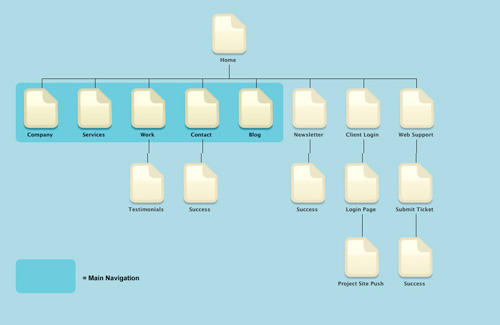
No to be confused with a sitemap page, a planning sitemap is important to keep organized. A web site's structure should come natural and flow in a way that the user does not have to guess where content should be. Don't focus too much on the technical part of the site and how it runs. Instead, focus more on what is best for your visitors. A sitemap is drawing out every page on your web site structure in map format. WriteMaps or OmniGraffle are great applications for putting together your sitemap. In this stage you should be sure to note all of the interaction and navigation between pages.
It doesn't matter if you sketch a sitemap by hand or create one on a computer, it is always a good idea to create when coming up with your web site structure. The sitemap above was created in WriteMaps and then brought into Adobe Photoshop for final touch-ups.
One thing to keep in mind is that people who surf the web are ruthless when it comes to finding content. If they can find what they need fast they will stay, if they cannot they go back where they came from and find a comparable web site. A sitemap is very important because if it is well structured, your users can find what they need quickly.
Wireframe
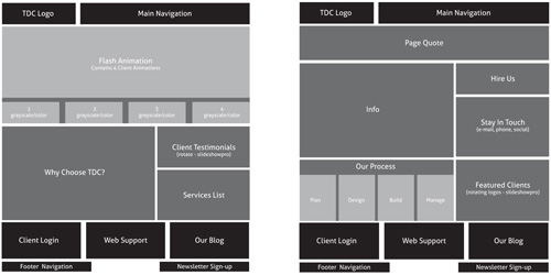
While sitemaps deal with the what pages are within your web site, wireframes dig deeper into the content for each page. Think of wireframes as a web page blueprint, you need to have a solid foundation before you start the construction of a house. With wireframes you can fine-tune where you want to place content. This is where you figure out which content is most important and how it will fit with other content. In most cases, companies are forced to complete a redesign because the previous layout (wireframe) no longer makes sense. In this stage you do not have to worry about specific design elements as much as you need to consider how prominent each piece of content will be. There are key elements that must be included in every web site design and without them you could create a negative brand impression. Make sure your layout has a consistent look and feel as to not confuse the user. Every page needs to be clearly labeled and identified in the navigation so visitors will always know where they are on your site. Once you have decided where elements will be placed you can then focus on how they will interact.
There are many ways to make a wireframe to help plan your web site. You can sketch them by hand or use Adobe Illustrator as shown in the image above. The darkened black elements are located on every page while the lighter elements change depending on the page.
Designing your new web site based on a grid system can be very helpful. The main idea behind grid systems is to maintain a visual and structural balance. The 960 Grid System is an effort to streamline web development workflow by providing commonly used dimensions, based on a width of 960 pixels. There are two variants: 12 and 16 columns, which can be used separately or in tandem.
4. Interaction
It can be said that every element on a web site interacts with another. A web site in itself is an interactive experience. It can be as slight as a link to another web page, pushing a button, submitting a form, or opening a modal window to enter login details. The most common forms of interaction are navigation, and forms. We will discuss the multiple ways these elements can interact with your visitors to better help you determine your web sites functionality.- 40+ Helpful Resources On User Interface Design Patterns In this article you see the best of the best, cream of the crop sites, galleries, online publications, and libraries devoted to sharing information and exploring concepts pertaining to User Interface design patterns. Use these recommended sources to gain knowledge about a particular UI problem or to gain inspiration and insight on best practices, techniques, and examples of exemplary UI designs.
- Navigation Menus: Trends and Examples This article presents recent trends, examples and innovative solutions for design of modern navigation menus. All images are clickable and lead to the sites from which they’ve been taken.
- Beautiful Form Design Forms needs a solid visual structure, a profound hierarchy of form elements (Fields and Labels), powerful techniques and Functionality (AJAX) to make the form look and work creatively. There is a great bunch of creative, outstanding and individually designed from scratch forms.
- Form Design is Good Form Forms facilitate users to make purchases, register into communities, exchange information with organizations, etc. These functions are the basic elements of a majority of web sites - money, participation, information.
- Web Form Design: Modern Solutions and Creative Ideas In this article you will find over 40 examples of web forms as well as modern solutions and creative ideas related to web form design. Some of the examples are Flash-based; however, in most cases you can easily create similar designs with pure CSS and (X)HTML.
Navigation
It is important to keep to common guidelines when creation your navigation. You want to make sure you do not confuse your users with a complicated or confusing navigation. Keeping your navigation consistent and making sure it appears on every page will help your users navigate through your content easier. With the evolution of the internet and Web design in general, there are many navigation types & styles. When building your navigation, you should reply on you sitemap that we spoke of previously in this article. Common Navigation Guidelines When designing your navigation there are several very common elements that can be used as a base for your navigation design. When your navigation is easily found and digested by your users, the overall site experience benefits.- It is important that you keep your user in-mind when you are creating your navigation. You should make sure that the titles of your navigation links are short and descriptive. Users should understand very quickly where to find content they are looking for.
- To help prevent overcrowding keep your main navigation under 5 links. Keep your most important information in the primary navigation and place other content into your secondary navigation.
- Make your primary navigation recognizable and bold within your site design. If a user cannot easily spot the navigation you will leave them confused and disoriented.
- In the case of users having their graphics/javascript turned off or enabling the use of screen readers, a text alternative available. The use of a text menu at the bottom of your site and alt tags will help these visitors navigate.
- Users should always be able to tell what page they are currently on. This can be achieved through breadcrumb navigation or revers the contrast of a navigation element to help it stand out.
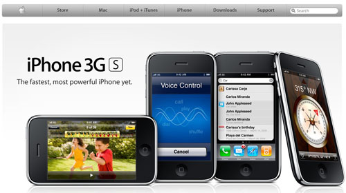
Apple organizes it's navigation leading with it's store then following with product information and support.
RedFenix has a very simple menu and includes added direction with a secondary navigation highlighted with images.
Secondary navigation is may not always be present on every page of a web site. These pages should be supplement the top level navigation (i.e. features, gallery, how to, tech specs, buy). While these pages contain important information that you would like to have on every page, they do not need they same visual significance.
Manchester City has a lot of club information that they need to present and put the secondary navigation on the sidebar.
CBS uses many visual elements of navigation but clearly displays their secondary navigation below their feature photo.
Local navigation is important when you have a lot of lot of content within a particular page making it long (massive amounts of page scrolling require). It can be extremely helpful when a user wants to jump to a particular part of the page.
The webdirections event had a series of speakers on a single page listing bio and class information. This caused the page to be very long, requiring local navigation.
Breadcrumb navigation is used to show your path from the homepage to your current destination. This is helpful because even if you landed directly on your destination page, you can easily take one step back by using the breadcrumb. This is commonly used for resources and eCommerce web sites that have multiple items spread across many different categories.
Apple shows the steps that were taken to get to this page. It spotlights the user has went to the shop, chosen the Mac Pro and started configuration for purchase.
Newegg spotlights which department and manufacturer sections this product is located at.
Google lets you know what category and subcategories the article the user is reading are located.
Navigation Styles
There are many different navigation styles available to help you achieve a branded look without compromises. While some styles can break the rules a bit, elements are expected to behave in certain ways with no exceptions. Including mouse over and hover effects will increase your user interaction and satisfaction greatly if done correctly.
Top navigation is by far the most common type of web site navigation. Placing your navigation in the most exposed part of your web site helps keep it easily identifiable and removed from heavy content. Giving your navigation it's own special place near the top means you will have a wide area of space available for optional large text.
A Word From His Word has large text with a red mouse over effect accompanied by a flame icon.
Housing Works uses a utilizes transparency over a large homepage image and white capitalized text for high contrast and exposure.
Soh incorporates the use of a high contrast light blue effect to help identify the page you are on as well as which item you mouse over
List navigation provides a large amount of flexibility for content. Once the primary and secondary are visually separated you can have a large amount of navigation items listed. With certain styles you can expose the secondary navigation on click as like the GoMedia web site (below), making your initial view very clean and tidy.
GoMedia only shows their primary navigation on load (i.e. about us, work, contact) and the secondary navigation on click. They include less significant items just below their menu without spotlighting them (i.e. arsenal, blog, prooflab)
Marmalade has a left navigation highlights the selected item and will highlight any item you mouse over.
Drop-down menus help you keep your layout clean and easy to navigate but grouping all of your primary and secondary navigation elements together. Drop down menus are a great way of showing content without cluttering up a page with choices. Choices are hidden until you need to see them, by hovering or clicking on a link. Read this article on drop-down menus best practices for more information.
Threadless has a a clean drop down menu style that incorporates an arrow and color changes to identify elements and actions.
Elegant Themes uses a pure white drop down over their heavily colored site to provide more contrast for their menu items.
Media Temple has added the use of icons into their drop down menu to help identify between their various product choices.
Tab navigation is more of a stylistic choice, and many act just like any other top navigation. The benefit here is in the psychological effect tabs have on users (because they're more reminiscent of navigation in the real world). If done correctly, well designed tab navigation will help create a clean look.
Icon Bakery seems to do slight loading when you lick each tab but their web site looks very clean and you are able to switch pages easily.
Free Agent has nearly seamless transitions when loading between tabs making their user experience excellent. Matching high contrast colors with the content body helps make it very obvious which tab is selected.
Inkd has a very friendly user interface with fast loading pages. This web site has a very pleasing color scheme, presenting a soft, clean feeling.
Forms
Forms are put in front of visitors in many different ways. A user may come across a search form, newsletter sign-up, contact form, login form or registration form. As you can imagine there are many different elements that must be considered to establish a memorable user experience. Web forms are often used to achieve goals such as collecting user information or accessing information you currently have. A successful form will be clear, concise and to-the-point. This will help your user send the information they need, without becoming confused or bored. Form usability is a very complex subject that is beyond the scope of this article. The articles below should give you more information on the subject.Search Box
If your web site doesn't currently have a search box and it's content heavy, add one. Not having this feature on a web site is a key user complaint. If a visitor needs quick access to information, you must meet their needs. On large content rich sites, the search box can be a key lifeline in stopping user frustration and maintaining return visitors. Three things that control all aspects of search are the position, wording and behavior. If you pay attention to those key aspects, you are closer to making your sites content available to new and repeat visitors. Search Position When putting together a web site design, some people consider where the search box will be located on the fly. Others pay attention to usability statistics and place their search box in the most common spot. By considering the F-Shaped Reading Pattern you understand why search boxes are commonly located in the top-left or top-right corner and users are trained to find it in this location. When the search box is moved it may take longer for users to find, especially when surrounded by graphics. Placing the search box on every page in a highly visible location and never moved it will insure that all users can fit easily.
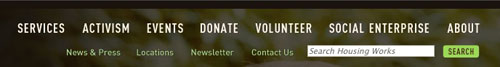
The Ferrari web site places their search box in the top-right corner of their site and the location never changes no matter which page is being viewed.
Search Wording
What do you put inside the search box? What does the button say? These are very common questions to ask, because not everyone does the same thing when it comes to search box wording. More technical users can navigate easily with an input field and an icon for a button. To develop for the average web user, we recommend that your button text says either "Search" or "Go" instead of just an icon button. You can either leave the search input field blank or add some friendly text that says "enter keyword","search articles", "search site" or even "custom search" and it will be made clear what users are doing with your search box.
InCase has a typical search box in the top-right corner of their web site with text within the input field and a button that says "go".
Design Disease has a non-typical search box located a little further down the page from the top-right corner and an icon for a button although they do a good job of helping the search box stand out with a graphic container that matches their theme.
Search Behavior
You may have noticed that Google recently released a nice feature that helps users formulate queries when they are not sure what to look for. If you have ever been at a loss for words you realize how valuable these auto suggestions can be to users. This is one of many ways you can improve search form behavior.
We find that by providing suggestions up front, we can help people search more efficiently and conveniently. - Google Blog
Google Suggests is a feature recently implemented by Google to help users be more specific when searching phrases and even give additional ideas on what to search for.
Layout
Once you understand your sites visitors you can make sure your search acts how they would expect it to. If you are starting from scratch there are a few basic items that users expect with search. The searched words should pull up a new page with query results. This page should contain a headline with the words being searched and the results returned. This makes sure that the user knows exactly what they searched for and how many options they need to consider.
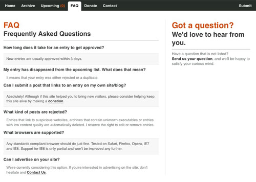
Digital Photography School does a great job with their search layout. There is no confusion on what has been searched, how many results are available.
Function
The search feature should be smart enough to recognize common misspellings and let the user know what it thinks they meant to type. This helps the user identify a mistake and quickly search for the correct word. The search feature should also display exact matches for the phrase being searched first, followed by anything else that comes close. Other useful functions include highlighting the phrase searched within the results and supplying options when zero results are found.
JQuery.info shows how you can use JQuery to highlight text on a search results page. This is also common practice for Google when your search result is a PDF.
5. Atmosphere
Now that all of the research and planning is done, you can get your fingers dirty with the site design. This is the part that will require a good amount of knowledge of color theory, design and composition. If you are not a designer it is strongly recommended you work with someone who can help turn all of your planning and hard work into a beautiful and attractive web site. The atmosphere of your web site will play a large role in how all of your hard work is perceived. It should reflect the main purpose and goals of your web site. Layout & composition, color, imagery, and typography are aesthetic elements that enhance your web sites look and feel. These elements with communicate ideas and feelings to you potential customers.- Grid-Based Design: Six Creative Column Techniques Grid systems bring visual structure and balance to site design. As a tool grids are useful for organizing and presenting information. Used properly, they can enhance the user experience by creating predictable patterns for users to follow. From designer’s point of view they allow for an organized methodology for planning systematic layouts.
- Designing With Grid-Based Approach Inspired by Khoi Vinn’s and Mark Boulton’s presentation Grids are Good, we’ve decided to take a deep look in the articles about grid-based designs. We’ve read through over 50 articles and selected some of the most important and interesting facts web-developers should know about the grid-based approach. Besides, we’ve listed the most useful references, tutorials and tools we found - with precise descriptions of what the articles are about.
- Color Theory Wiki A detailed and sometimes historical look at color theory with references for further reading.
- Brown University Introduction to Color Theory Although the site looks terrible and some references are outdated, this is an example of color theory from a credible university course.
- Liquidsoft's Color Theory Tutorial Color can be more complicated than it needs to be, if you need a brief guide to get your feet we, this article is a good start.
- Typography Wiki A detailed history and explanation of typography as a whole.
- Typography Essentials – A Getting Started Guide Learn more about typography and why it is so important to designers. Typography is part of everyday life, it is all around us.
- 50 Useful Design Tools For Beautiful Web Typography This article covers typographic tools, useful typographic references, font browsers, typographic CSS- and JavaScript-techniques, hyphenation techniques, sIFR tools and resources, grids and related tools, free and commercial fonts, a guide to Web typography, examples of great Web typography.
- A Lesson on Typography Video From the Vancouver Film School.An interesting look at typography in 1:47 minutes.
- Typographic Contrast and Flow As you have probably know, most online readers don’t read line by line, instead they scan (from one point to another). For this reason, designers create typographic contrast and flow by emphasizing certain text.
- Revised Font Stacks Serious efforts are being made to get more typeface choices on the web to enhance web typography. Still, most of us prefer web-safe fonts like: Verdana, Georgia, Times New Roman and Arial. Though choices are limited, yet the number can be increased by exploring other pre-installed fonts.
- Web Typography Demo Many web pages use images to display text in fonts that are not installed on every platform. However, you can apply a few CSS properties directly to the text elements in your web page to create stunning graphics, navigation menu items, buttons, and other user interface elements.
Layout & Composition
Instead of going into a tangent about Web design and color theory, everyone would be better served by focusing on the principles of layout and composition and then reading The Principles of Beautiful Web Design by Jason Beaird for a more in-depth sampling. It is key to maintain balance and prepare for multiple monitor sizes with fixed, fluid or elastic layouts depending on the need. You can design with grid-based frameworks or use your own methods. Visual Balance Maintaining balance whether you're using a symmetrical or asymmetrical design will create a more visually pleasing web site and increase the the opportunity to capture your visitors attention. The blog Subtraction shown below uses asymmetry or off-center/mismatched elements to achieve a balanced design. By counteracting the weight of the black dog with a gray "X" to the right using a keen eye, the site maintains balance.
This blog uses well balanced asymmetry in the header graphic design.
Most designers stick to symmetry keeping with matching elements and use such methods as the three buckets method or rule of thirds by maintaining a golden ratio. The three buckets method is that magical combination of threes that pull together as a single element visually yet keep enough separation to evenly distribute content across the page. Using the rule of thirds you can fill two-thirds of your layout and fill the last third with white space. By balancing the page into thirds you can create more energy and interest in the site composition.
This uses the three bucket method in it's feature rotator with the spotlighted numbers and again in the lower sub feature elements on it's homepage.
Be Aware of the Viewport
Because web site visitors vary in many ways including their display resolution, we have to take that into account with every site design. You don't want just design for the smallest screen size but the average web user instead. As of January 2009 the most common display resolution is higher than 1024x768 with 57% of users and 1024x768 coming in a sure second with 36% users. Keeping that information in mind and subtracting the space taken up by the browser interface you have varying 1000x650 viewport where the site will be displayed. You can take control of the viewport flexibility with fixed, fluid or elastic layouts. With these different types of layouts you can make sure the average user sees your site how you intended without leaving anyone else out and possibly giving them more than they bargained for.
Fixed layouts have predetermined dimensions (usually pixels) that define the width of the site. If the fixed layout width is 960 pixels, then no matter how wide the users browser is the site will always be that width and no larger for the sites visitors. With this kind of layout you can insure that the main content area remains the same size and will maintain image positioning within a text area.
The CodeIgniter web site uses a fixed width layout of 927 pixels and will not change no matter the users display resolution. The site uses a background tile gradient image to accommodate larger viewport's.
Fluid or liquid layouts have dimensions that are relative to the size of the users viewport as defined by preset percentages. If the fluid percentage is 90%, then no matter how wide the users browser is the site will always be 90% of the total width and no larger for the sites visitors. With this kind of layout you can insure that the main content area will grow to fill the available area.
The Stuff and Nonsense web site uses a fluid layout that makes room for the content below when using viewed by a larger display resolution.
Elastic layouts are a marriage between fixed and fluid layouts. When this is implemented a sites content will shrink or grow depending on the users preference. The entire layout stays proportional to the text size as it is increased.
The Clearleft web site uses an elastic layout adjusts the text size for smaller display resolutions. You can really tell by the increased distance between the logo and navigation as well as the different line breaks in the opening paragraphs.
Mood
Before any color, art, images typography can be added you have to first consider the mood that the web site will convey. The web site should give visitors a feel for the style, message, goals and content of the web site on a subconscious level. Mood is something that is felt when you see it, not through any specific combination of things.A mood board helps establish the branding, design components, typography, imagery, and color palettes that will be incorporated in the design. Much the way an interior designer will initially put together a swatch panel showing the fabrics and colors that will be used in designing a room, the mood board establishes the aesthetic direction of the site up front without negatively impacting the flow or structure of the site. - 404 Creative
The Hydra Games web site has a mythological, medieval atmosphere in line with the companies logo and games they create. This is due to the black and red color use mixed with the textured background image and other graphics on the site.
In contrast, the Fall for Tennessee web site still maintains an atmosphere but in a different way. Using nature textures mixed with specific colors and images that evoke the feeling of fall.
Color
Color use is a very strong influencer in the overall appearance of your web site. Color theory is used to convey many feelings and have many meanings. Choosing the right colors for your web site can be one of the most difficult tasks at hand. You can't just line up a list of colors on a dart board and use the first 4-6 you hit. Some colors play well with others and some do not. Multiple articles could be written about color theory alone, for that reason I recommend using the articles listed below. Get Inspired Color is used to bring out predetermined branding or create branding guidelines. Every company has a specific demographic they are trying to reach out and speak to. Everyone enjoys looking at something beautiful don't they? After all, beautiful is relative to a persons point of view. Choose your colors wisely by using a color schemer, keeping up with web site trends, creating your own trends and looking for offline inspiration.
Use the examples above to find your inspiration in photography, design, product, Web and advertising.
Imagery
Using imagery will add value to your site and help speak to your audience. It is important to use imagery that directly supports the message and goals of the site. You can use few graphics, or base your site around them, just be sure that whichever method you choose to utilize imagery that you do not cloud the sites focus or confuse users. Do your best to guide the users eye and be cautious of clutter!
Outline2Design uses a combination between photography, icons and graphics. You can see the great use of visual imagery balanced with warm colors and soft tones.
Artwork
A great web site is not required to have a strong message. In fact, you can have a fairly minimal site design and do just fine. That's not to say that adding art cannot help. You may not be an illustrator or photographer, but that doesn't mean you can't find stock resources to help you add expression to your web site. By adding the right combination of art and content that is right for your site, you can capture your visitors to help sell services, products or even convert depending on your sites goals.
Photography
I know that it's cliche but they say "a picture is worth a thousand words", just make sure it's a thousand words you want your site visitors to see. Better yet, make sure those thousand words will help your users become aware of the sites goals. Photography can be used to establish a connection between the web site and its visitors. Personal connections are important, especially when your sites main goal involves offline activities.
Livestrong does an exceptional job of using photography to depict a happy, healthy lifestyle while challenging you to change the way you live with graphic reinforcement. Skiing anyone?
When using photography on your web site you can use stock photography agencies, free stock photography or take your own. In any case, make sure that the photo quality is high. You may have to tweak the levels & curves or crop creatively. Remember that adding a photo with poor quality to your web site can give a bad first impression to visitors. No one would visit your business if you left your trash at the front door right?
Illustration
Many companies have embraced the use of illustration on their web sites. This includes anything from line sketches to detailed cities. Adding illustrations can guarantee a certain uniqueness that can set you apart from other web sites. Illustration can be used in the background, header, footer, menu and anywhere else you see fit. However you decide to use illustration remember to maintain your site's mood.
The Great Bearded Reef uses basic illustration for the base of its site. The imagery is very playful and uses bright colors for a happy mood.
Platin uses detailed illustration (3D) in combination with motion to get the attention of its visitors.
Iconography
Icons can be a gift and a curse with helping to guide your visitors. I well designed and well placed icon will work as a visual shorthand for visitors that can help understand content without reading it. Think of street signs and how they are used in society. We have become accustomed to associating certain pictures with things and activities. When visiting a foreign country you can do a decent job of guiding yourself with signs along because symbols and icons have become a universal language. A good icon should be understood immediately. If you plan to use icons you can create your own or you can use a stock icons.
EngineHosting makes use of icons in the home page feature to help guide users to other pages of their site while leaving room for the different plans below.
Typography
Text is synonymous with design, so it's no surprise that it plays a large role in Web design. When thinking about typography there are many things to be considered. No matter how typography is used, whether in print, television or on the web - designers are forced to adapt to each specific medium.Optimizing typography is optimizing readability, accessibility, usability, overall graphic balance. Organizing blocks of text and combining them with pictures, isn’t that what graphic designers, usability specialists, information architects do? - Information Architects
.Net magazine uses Helvetica and Arial sans-serif fonts to give their web site a smooth flowing feel.
Today on the web typography is easier to accomplish than years past from a technical perspective. From a design perspective, designing for computer users brings it's own unique set of challenges. The art of type is a very delicate subject because so much is involved such as web safe fonts, replacement techniques, font embedding and CSS3 advances. We will focus on typography basics because typography is such a deep subject. If you would like to lean more you can use the resources below.
Web Safe Fonts
There are a number of fonts that are considered safe to use on the web. These web safe fonts are common across many different browsers and operating systems. an example of some fonts would be Georgia, Times New Roman, Arial, Verdana and Impact. There are 20+ web safe fonts available out of the many fonts available to designers today. Fonts render differently depending on the browser and operating system. You can see examples of how fonts render to help you choose the right font for your visitors.
Taking these restrictions into account, you can still find many ways to be creative when creating a web site. When you specify which fonts you want to display in your cascading styles sheet by using font stacks. This will allow you to add your preferred set of font names, in order to determine how your text will display. We are able to utilize fonts that are pre-packaged with common software so the users that have them available will have an enhanced typography experience. There three great websites Better CSS Font Stacks, AwayBack, and Guide to Font Stacks that will show you how to utilize stacks for optimal impact.
Default font stacks:
- Arial, Helvetica, sans-serif
- Courier New, Courier, monospace
- Times New Roman, Times, serif
- Georgia, Times New Roman, Times, serif
- Verdana, Arial, Helvetica, sans-serif
- Geneva, Arial, Helvetica, sans-serif
I love typography uses a font stack of Lucida Grande”, Geneva, Helvetica, sans-serif (used for some of the headings and meta information).
Replacement Techniques
A popular way to render fonts on a web site even if the visitor doesn't have it on their computer is to embed the text into an image. A common way to do this is with Revised Image Replacement where the text still remains in the HTML even when replaced with an image. This is done to keep the web page access able to screen readers and text only modern web browsers. You are able to keep the SEO benefit of having an H1 tag with this technique and you can save time by writing your markup and then styling items instead of having to wedge items into your design. View the CSS tricks test page from their article Nine Techniques for CSS Image Replacement.
Another approach to image replacement is using Scalable Inman Flash Replacement (sIFR) where text is substituted with a flash file containing a font that the viewer may not have. This method is less accessible to screen readers and text only modern web browsers. You can use this for any font type, it is cross-browser compatible and you don't run into any SEO issues because the original XHTML document remains unchanged. Learn more about sIFR 2.0 and how it can be used effectively.
Font Embedding
Being able to embed fonts is an alternative to replacement techniques. You can embed font files on your site and host them online so that even is a user does not have a particular font installed they can still view text as you intended. Browsers such as Safari 3.1+, Opera 10+, Firefox 3.5+, Chrome 3+, Netscape 4+ and Internet Explorer 4+ support this method. Font embedding comes with its own challenges, especially in Internet Explorer because that browser type uses a proprietary file format Embedded Open Type (EOT). Creating an EOT is not complicated, but rather requires a few extra steps. You can embed fonts using the @font-face rule as shown in the example below:
@font-face { font-family: Futura; src: url('Futura.otf'); } @font-face { font-family: Futura; font-weight: bold; src: url('Futura-Bold.otf'); }Then call it using font-family:
h3 { font-family: Futura, sans-serif; }CSS3 Advances With the speed of technology advances increasing, the web was introduced to CSS3 with new features like drop shadows, font embedding and styling techniques. While not yet compatible with the entire web user base, these features can be utilized in newer browsers and degrade gracefully in older versions. The @font-face rule we previously discussed in itself has been made more powerful with the with CSS3 as seen in the Essential Guide to @font-face. Many web developers had begun to experiment with new fonts as soon as the ability was made widely available. Utilizing fonts instead of graphics is beneficial because fonts are dynamic in content and size whereas graphics only work well when made smaller and tend to create a heavier page load if overused.
Simurai uses a text shadow and blur radius to create a wonderful tilt-shift effect with CSS3
6. Conclusion
In conclusion, web styles on the internet come and go at a light speed and it pays to be innovative verses conventional. It is your responsibility to yourself and as a designer to deliver a product that accomplishes your clients goals and ill not need to be replaced every year. Think future-proof. Use this article as a guide but not a blueprint. There is no one way to create a beautiful aesthetically pleasing web site. Use the resources and examples from within this web site and your redesign process will go along much more smooth than trying to figure everything out on your own. In this article you read about the different stages of a web site redesign including analysis, research, structure, interaction and atmosphere. While there are other bits a pieces of a redesign that may be left out, we are only covering the most significant parts. If you take you time when building a web site, you can create something that will last a long time and reduce future costs for you and your clients."You might make a lot of money, but it's very hard to get out from under that rug. The more you can reinvent yourself, the better..." - Peter Berg
Prepare for the Future
Sometime in the near future you will look back on your site and decide that it is in need of a redesign or realignment yet again. Planning and preparing for future changes during your current redesign is essential. Lay a simple and clean path to follow by using valid XHTML 1.0 Strict (not transitional) and organizing your code semantically. These two very simple steps with make it easy to go into your site to make updates and help prevent redesigning from scratch in the future. By looking into new CSS3 and HTML5 techniques you can get ahead of the curve with experiments. If you are using a content management system (CMS) for your web site, you are already one step ahead of the game because your content is separated from your design. With the easy-to-use templating systems and content rollback features you can swap out designs and style sheets without ever affecting content structure on your site. This not only saves time, but keeps your code organized without any extra effort.7. Further Resources
Below you can find more detailed reading and resources not included in the above text.- Questions to Ask Yourself During a Redesign This web site redesign guide is really for anyone involved with web sites. It will help you get the deep meaning of the site as well as more practical issues. This guide will help you redesign a web site according to your audience's needs and changing perceptions
- Redesign vs. Realign Understanding the difference between redesigning and realigning can result in happier clients who are better reaching their website goals.There are times when redesigns are appropriate, and there are other times when realignments are appropriate. It all depends on how the client’s current site is working for them, and what their goals are.
- Redesigning Your Own Site Redesigning a freelance website is an exercise in masochism. There are no colleagues or an umbrella corporation to share the pain: It’s just you.
- Useful Glossaries For Web Designers and Developers These glossaries are also especially useful for those of you who are just getting started in the online business world. By understanding that basics of the core materials that make up whatever it is you are getting into, you will be able to have a better understanding of what’s going on in your industry, as well as be able to learn faster.
- Redesign: When To Relaunch The Site and Best Practices This article covers a brief overview on how to plan, execute and how to find the perfect timing for a redesign.
This is a huge round-up of to-do things for a perfect website redesign. I agree especially when you say that photos and images have to be high quality. The problem sometimes is to convince your client who absolutely wants some images of his own in the website ;)
Very well written and detailed article, great!
A very useful (and detailed!) article – thanks for posting.
This is great stuff! I am actualy looking forward to redesigning my website now! Before reading this article it was one big obstacle that had to be overcome first. Thanks!!
Well-done! You completed a web design degree course here. You are among the design followers disputing the fact that school is a rip off in web designing.
Your post is informative and educational.
This is really in depth, thanks for the research. I want to make this required reading for new clients! But they might pass out :)
Great article, heaps of really useful info. Nice work
It seems comments were accidentally turned off for quite sometime :(
Thank you all for the great feedback. The idea was to deliver enough information so that all of the information you needed would be at your fingertips and all you would have to do is plan your own strategy.
Really nice article about website Redesign….Thanks for Sharing..
Website design can make or break your site. A site needs to be eye pleasing, not too busy, and functional. There also needs to be pertinent information, but not too much as in today’s world, people are too busy to spend time reading information.
Great article. It never hurts to get new ideas on how to redesign an existing website ( as painful as it may be sometimes.. )
This is perfect man.
thanks
Great article about website redesign, very detailed I picked up quite a few techniques.
Thanks :-)
Nice post with some useful tips.. good job
Excellent article, comprehensive. Thanks for the share.