
A Look at Inspiring Website Designs of Musicians
A Look at Inspiring Website Designs of Musicians
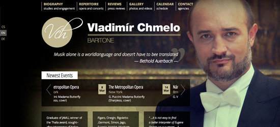
Vladimir Chmelo
Vladimir Chmelo has a fairly simple site structure, with muted tones and formal typography. The design is made all the more interesting by the large photographic background, which not only enhances the visuals of this website, but let's us see the man behind the name. The reserved color palette suits the classical, serious nature of his music.
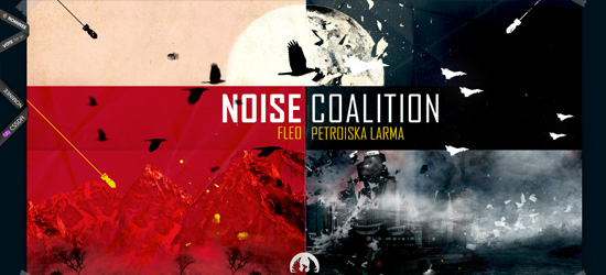
Noise Coalition
A very unusual looking site, but very visually striking. The site acts as almost a kind of cover artwork, with a huge quartered photo manipulation comprising most of the homepage space. The bold red/black combination mixed with the harsh imagery of falling bombs and shattering objects creates a mood of destruction and bleakness. The call to action text 'DOWNLOAD FOR FREE' is enhanced by using a bold, red font to encourage action on the users part.
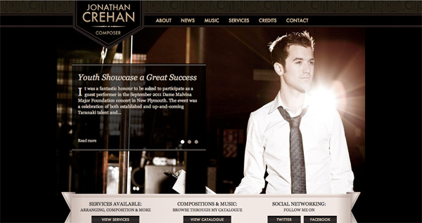
Jonathan Crehan
A great example of effective background design. Our eye is immediately drawn to the artist who is beautifully lit in this photo. The color scheme is very muted, using rich golds, browns and blacks. The typography is clear and legible, and recent news is promoted via a homepage slider area.
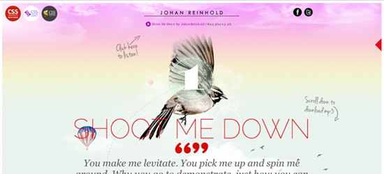
Johan Reinhold
A fantastic web design with a very interactive feel to it. You really need to click through and explore the site yourself to fully experience the details of this design. As you scroll down the page the birds in the background design rise up faster than the surrounding content, creating a sense of weightlessness. The dreamy, pastel colors and elegant imagery make this site very easy on the eyes.
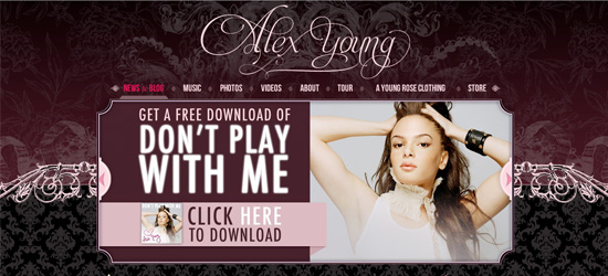
Alex Young
A very detailed, nicely designed website. The background is full of intricate details and patterns, and the logo text is incredibly elegant. The central content area is used to promote a free copy of Alex's latest single, and acts as a great call to action. Overall we get a feeling of sophistication using this website, with no detail overlooked.
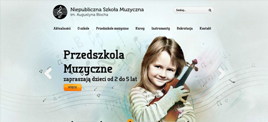
Bloch
This site is for a music school rather than a specific musician, but I had to include it in this list. It's a wonderful example of a visual design bringing music to life. The subtle watercolor background is infused with swirling notes, fractal lines and patterns all building around a central photo montage. The featured child appears to be expelling energy and music as the visuals surround them.
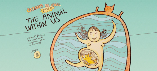
Caring is Cool
A really cute website design featuring a funny illustration as the center piece. The illustration lends a hand drawn feel to the site, and the waving lines in the background feel very abstract. The hand-drawn theme is continued through the site in the sketchy typography and UI.
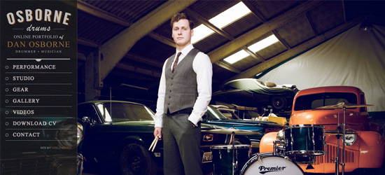
Daniel Osborne
Another design with an awesome photographic background. Daniel is the centerpiece in his own design, striking a very cool pose by some drums and vintage cars. The sidebar for the site is concise, but explains clearly what he does and gives easy to navigate menu links.
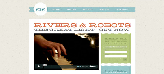
Rivers and Robots
A simple and clean website that's very easy on the eyes. Rivers and Robots uses a subtle pastel color scheme along with very faint texture application to add depth and detail. The typography used almost universally across the site has an almost western style feel to it. At any rate, the overwhelming impression of the website is slightly retro.
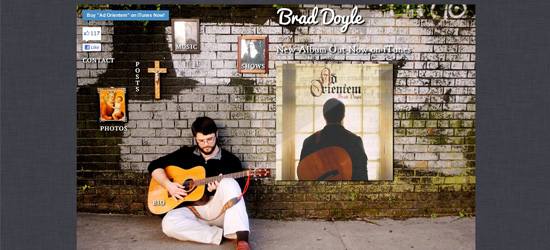
Brad Doyle
Brad Doyle uses a very simple site that is essentially an image map. However, it definitely feels quite interactive and gives a sense of the artist. The navigation is spread across the wall backdrop photo and you can click the various hanging images to browse through the site.
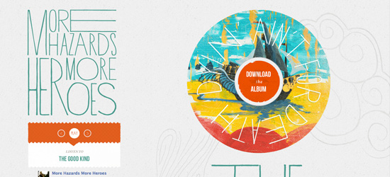
More Hazards More Heroes
One of the most creative designs in this post, More Hazards More Heroes use some really nicely designed elements in their website. Their logo text is hand-drawn and natural feeling. Their content areas often use creative, rough edges. The main background is comprised of a very faint line art, which helps bring the content together and add a sense of artistry.
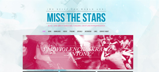
Miss the Stars
Lovely typography and awesome colors. The pink and blue color palette works great together and the central content slider is really eye catching. The background design is really well constructed and layers up multiple photos, textures and lightings to create a detailed, attractive backdrop for the site.
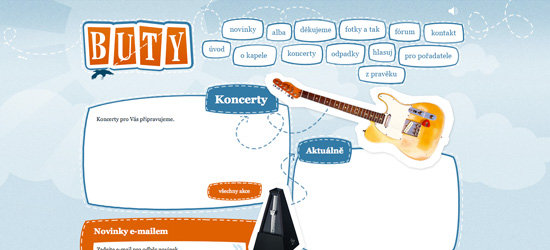
Buty
Another very creative web design with a sketchy feel to it. Buty's website uses abstract shapes to construct content areas, breaking, rather than adhering to any kind of content grid. Visuals are given a bold white border which makes them appear like a paper cut out. There are also some great animations happening, such as birds flying across the page constantly.
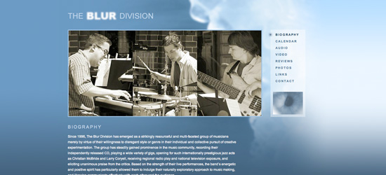
The Blur Division
The first thing that strikes you about this design is the deep blue background gradient. This is accented by the smoke in the top-right of the page, which adds some nice lighting. Overall the design is fairly minimal, but the colors and typography work beautifully together. The logo is also a great concept, with the word 'BLUR' being out of focus.
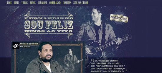
Fernandinho - Sou Feliz
Fernandinho Sou Feliz's website has a real grungy feel to it. The rough background textures and faded photo in the backdrop create a worn look. The menu and logo typography are also typically grungy, which is enhanced by grunge elements strewn across the page such as the top-right badge design.
Great websites, thank you for sharing. When you have more like these, please, keep me informed…
BTW the picture of Alex Young’s website leads to Johan Reinhold’s website. Cheers!
Very nice roundup! I have also created few roundups on inspirational sites on alldesignstuffs.com I hope you like them…
re Rivers and Robots: the site almost has the look of the Blue Note jazz records of the 60’s, very nice!
Very creative music website templates-Really inspiring
Great post, with some interesting examples however i do feel like some of these musicians websites are only nice because of a extremely huge background image of themselves and the rest of website is non existent. Personally i like Vladimir Chmelo because although this website has a huge background image i feel like there has been a huge amount of effort and work to make the website look perfect. I really like the colours used, and all round it is a great looking website.
Nice post.
I’ve just built a site for a musician, not as nice as these designs though :p
I don’t feel any of them really stand out as much as they should. Just my opinion anyways. I agree with @adam that some of the sites are only nice because of the background images. Nice inspiration though.
As a musician and web geek, I though this is a very nice collection. Thank you.
Interesting subject, thanks for the article. here’s my vision of a musician website:
http://www.marwanmusic.com
My favorite musician’s website is holdonphoton.com. It seems like in the near future the quality of a band or musician’s web presence will be the most important thing they can control beside their music. Thanks for the roundup!
Very creative collection.
Awesome collection, very inspiring! My vision of a musician website design that stands out: http://www.tylermichaud.com
Really nice roundup, all the sites are really nicely done and have great artistic vibes to them. But I have to say I love the Johan Reinhold site, I love that the music starts playing as soon as the site loads, the music fits nicely with the feel of the graphics as well! :)
Awesome compilation! Thanks for sharing!