
29 Best Airline Logos and Their Story
Billions of people use airlines to travel across the globe every year. Between local and global airlines, there are hundreds of airlines that compete with each other to provide the best travel experience. As a result, airline logos play a crucial part as branding is extremely important.
Airlines don’t hesitate to pay huge amounts to get their airline logos designed. Airplane body logos, tail logos, tv ads, billboards, etc. they utilize every possible option to influence people’s views on their brand.
The best 29 Airline Logos and their stories
1. Qatar Airways
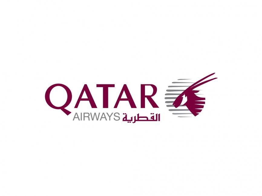
Qatar Airways has a unique logo. Unlike many other airline tail logos that, in some way, resemble a bird or a wing, Qatar’s logo is that of an Oryx which is the national symbol of the country. The burgundy and white colors used on the logo are taken from the country’s flag.
2. Singapore Airlines

Singapore Airlines has had the same logo since its split from Malaysian Airlines. The airline logo features a bird called the silver kris. It’s derived from a dagger named keris, which plays a prominent role in the region’s folklore. The ‘silver’ kris appears on the airplane’s tail as a golden bird and the theme is used in various different services offered by the airlines.
3. Qantas Airways
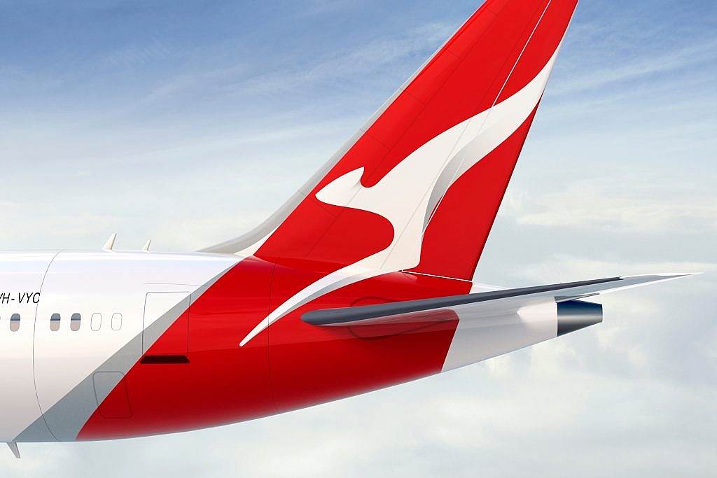
Qantas Airlines has a Kangaroo symbol in its logo as an Australian logo. The kangaroo symbol used in the airline logo was inspired by the Australian one-penny. The airplane tail logo used by Qantas is a little different than other airlines and warrants its spot on the list. The tail logo instead of covering only the tail-wing covers a much larger portion of the airplane’s tail and even if the colors are quite popular among other airlines, it makes it stand out.
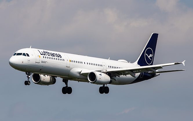
4. Lufthansa Airlines

The German airlines has gone through various name changes since it was first founded in 1919. However, the airline logo has remained almost the same. The logo features a crane in a circle and its color has changed from yellow to ultramarine. It was designed by Otto Firle in 1918.
5. Virgin Atlantic
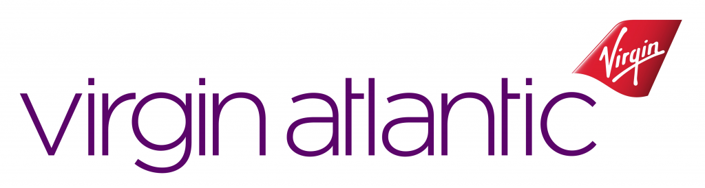
While the airline tail logo isn’t all that unique, Virgin Atlantic Airways was famous for it’s flying lady icon. In 2019, the airlines changed its logo to feature 5 different characters for more diversity.
6. Turkish Airlines

The logo of Turkish Airlines features a wild goose. The goose is white on a red background which is the same color as the Turkish flag. The airlines have picked the wild goose as it’s the worlds highest-flying bird that can go as high as 29 thousand feet.
7. Garuda Indonesia
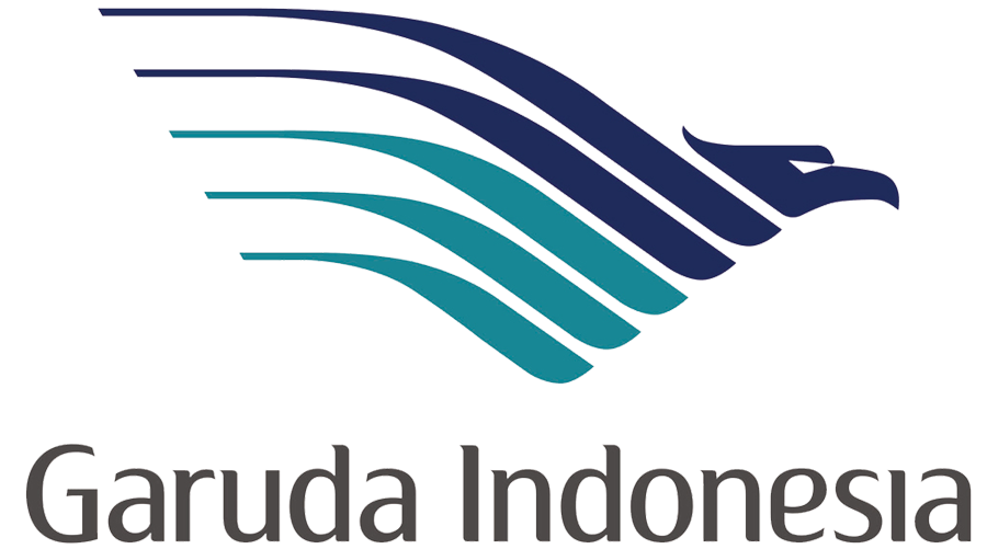
Garuda Indonesia hasn’t changed the logo too much. Only the fonts have been adjusted to make the logo look a bit more modern. Like many other airlines, Garuda Indonesia also features a bird, in this case, it has a bird that resembles an eagle.
8. Southern China Airlines
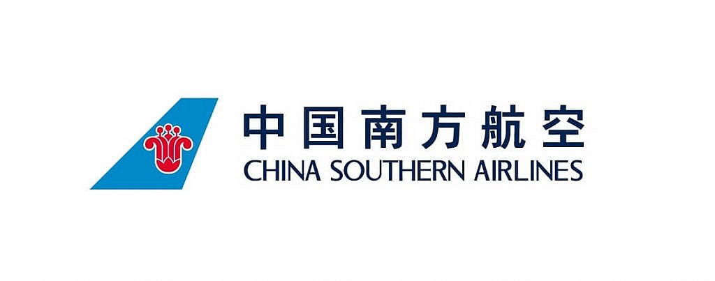
Going through numerous mergers and rebrandings, China Southern Airlines has a unique airline logo. It doesn’t look like the best logo but it changes some unpopular colors used by other airlines. The logo consists of a red Kapok Flower on a bright blue background. The Kapok flower is also the symbol of the airlines’ hometown Guangzhou.
9. Austrian Airlines
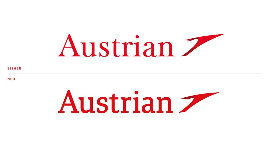
While its logo is a rather simple one. Austrian Airlines has recently ‘tweaked’ their airline logo. The change was made to make the logo fit with the modern trends. Its text is a bit bolder and the tail logo has become more 3d.
10. Air New Zealand

Air New Zealand has an extremely unique logo. The airline logo features the Maori symbol of Koru which symbolizes prosperity, growth, new life, and peace. It also resembles wind which fits perfectly as an airline symbol. The Koru symbol is also quite prominent in Maori culture.
11. Hawaiian Airlines
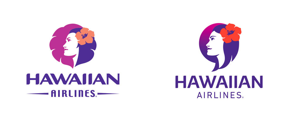
This airline logo definitely makes it into the list as it’s quite different from other airline logos. It is one of the few airlines that features a person on their logo rather than a type of bird or something associated with flying. It was recently updated too with a more modern font and the gradient used in the background added to that.
12. Korean Air

No, this airline logo wasn’t stolen from Pepsi. It’s actually, much older than the Pepsi Logo. Korean Air’s logo features the ‘Taegeuk’, the symbol of the ultimate reality. The Taegeuk is also featured on the Korean Flag.
13. Ryanair

Known for its cheap flights across Europe, Ryanair actually has an interesting tail logo. The Irish airline’s logo consists of a cross-over between an angel and a harp. Both items are somewhat significant in Irish culture, while they are much less known outside. The airlines is well-known due to its controversial advertisement strategies. The airline logo has fallen somewhat short as the company’s advertisement controversies spear-head its branding strategy.
14. AeroMexico
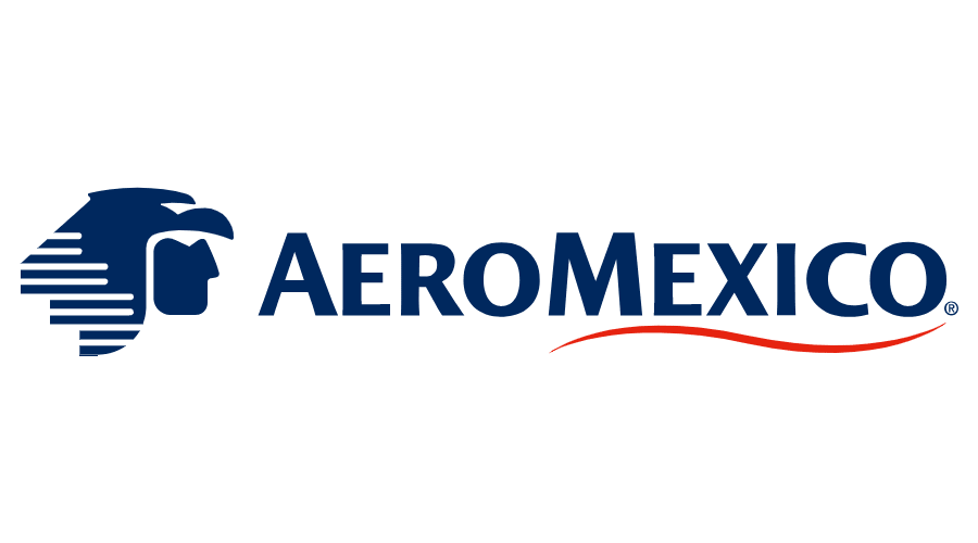
AeroMexico is another airline with an interesting logo. It’s one of the other few airline logos that cover a person. In this case, its logo has the symbol of an Aztec eagle warrior called ‘cu?uhtli’. The eagle warriors were the most feared class in the Aztec military and eagles symbolize the sun and the skies.
15. PNG Air
This airline logo is probably the most interesting and is praised by many people. Hailing from Papua-New Guinea, PNG Air has a rather detailed and unique looking airline tail logo. The airline is quite young and it has gained a lot of traction with its unique logo. The logo symbolizes the diversity of the culture of Papua-New Guinea, which is by far the most diverse country in the world.
16. EgyptAir
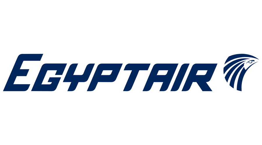
EgyptAir, has gone through numerous rebrandings and has changed its owner many times. When it finally settled on the name ‘EgyptAir’ in 1971 it adopted its current airline logo. The logo depicts the head of ‘Horus’ which is one of the sun gods in Egyptian mythology. Horus has the head of a falcon and is believed to be the creator of the universe. However, the sun god RA also has a falcon head and represents the same things as Horus. The controversy between which god is the real one has led to them to be merged as Ra-Horakthy. EgyptAir prefers to refer their logo as Horus though.
17. Aer Lingus
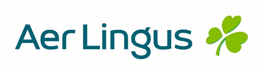
Unlike Ryan Air, the Irish airline Aer Lingus has adopted a more well-known Irish symbol for its airline logo. Aer Lingus features the ‘Shamrock’ in its logo. The Shamrock is a traditional Irish symbol of clover with 3 leaves. As the Shamrock is a little inverted in the logo, it’s referred to as the tipsy-shamrock, highlighting the Irish stereotype.
18. Japan Airlines

Japan Airlines makes it into the list because, unlike other airlines, they changed their logo and had to revert to their original logo as consumers didn’t like the re-branding. The airline logo has a red Japanese crane on a white background. As with many airlines, Japan Airlines has opted for a bird, but the crane is actually a good choice as they can gain immense heights and can fly long distances. Also, many think that the logo resembles the Rebel Alliance symbol from Star Wars.
19. SWISS

Referred to as SWISS, Swiss International Airlines, has a relatively simple airline tail logo. It contains the Swiss national flag in the shape of an airplane tail. It’s simple yet effective as it screams Swiss at you.
20. IranAir
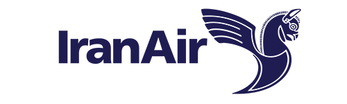
Previously called Iran National Airlines, IranAir started to search for its logo after it was rebranded. A competition was announced in Iran, and the logo that contained a Huma bird was the winner. The Huma bird plays a significant role in Iranian folklore. The bird is to bring good fortune and it never leaves the skies. It’s called by various names also including ‘bird of paradise’. The Huma bird in some interpretations resembles a phoenix and in some, it’s depicted like a griffin. IranAir has opted for the griffin version and the airline is referred to as Huma inside of Iran.
21. Sri Lankan Airlines
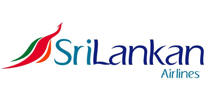
It’s vibrant, it’s big, and it’s unique. Sri Lankan Airlines has come up with a beautiful logo during its rebranding in 1999. It features a peacock in red, green, orange. The font of the logo also pushes it even further. According to local tales, a flying machine once existed in Sri Lanka and it resembled a peacock.
22. Ethiopian Airlines
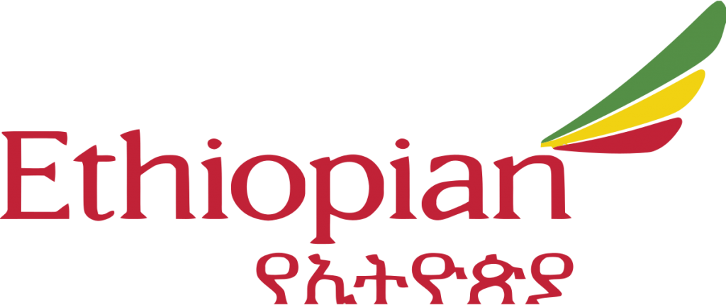
In 2010, Ethiopian Airlines was invited to join the Star Alliance under the mentorship of Lufthansa. This made Ethiopian Airlines the third airline from Africa to join the alliance. During its admission period to the alliance, the airline started a re-branding campaign and modernized its logo. It assumed the tail logo that contained the colors on the Ethiopian national flag. It also has Ethiopian in both English and Amharic text.
23. Delta Airlines

When listed based on revenue, Delta Airlines is the #1 airline in the world. It’s the second-largest based on the number of passengers it carries. The airline logo features a triangle that looks like it’s designed in 3D while in reality, it isn’t. The triangle is cut from its center and with clever coloring, it looks as if it was 3D. The triangle also resembles the Greek letter delta as in the name of the airlines itself.
24. AirFrance
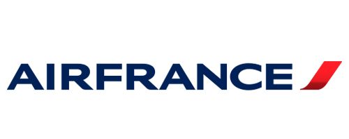
One of the two airlines that operated faster-than-sound flights, AirFrance is one of the top airlines in the world. It frequently flew Concorde jets between Europe and the US until 2003. Its original logo was that of a seahorse, but its more contemporary logo that consists of a single red stripe with the color scheme of the French national flag was adopted after its merger with KLM.
25. Aeroflot
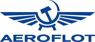
The Russian airlines is one of the oldest airlines in the world. It served during the Soviet period as the biggest airline in the world. After the dissolution of the USSR, the airline transformed into a semi-private company. The airline logo, however, kept using the sickle and hammer logo even after the dissolution of the union. Its main difference is that it avoids the color red in it.
26. Finnair
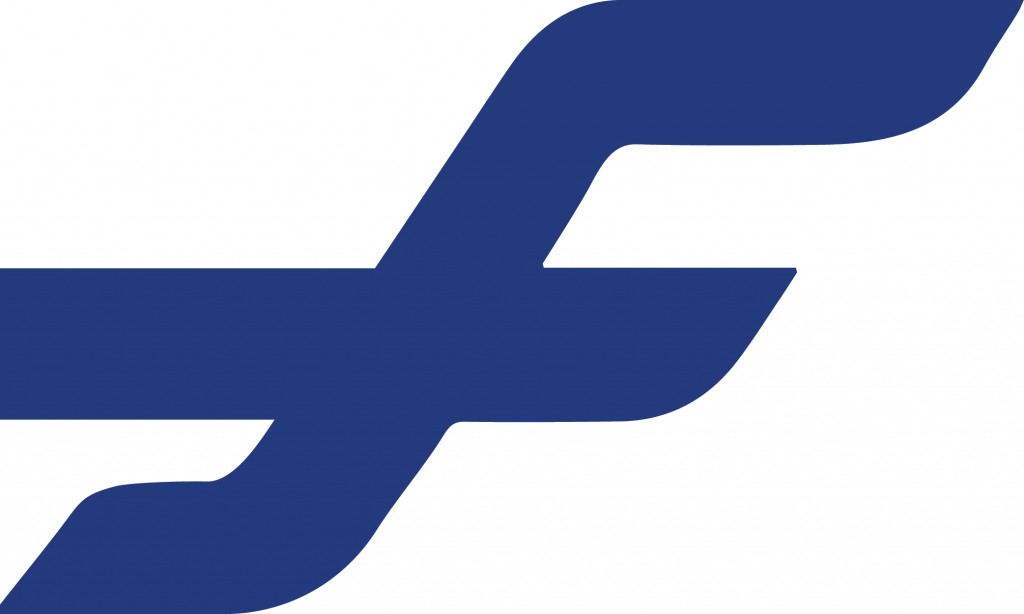
The Finnish Airlines is listed as the safest airline in the world with zero fatal accidents in the last 57 years. The logo of the airlines is quite simple yet really effective. The tail logo consists of an ultramarine ‘F’ letter that stretches out. The color scheme is that of the national flag and the F stands for Finland. The stretched F greatly resembles the cross on the national flag too.
27. Easyjet
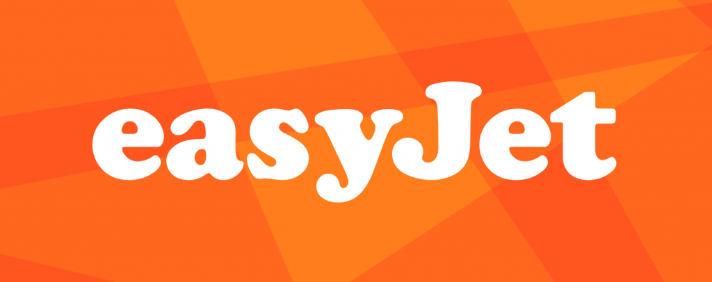
EasyJet makes it into the list not because its design stands out but because it’s such an unusual and simple logo. Simply, it’s just the brand logo in white on an orange background. That’s it. No cultural, national symbolism.
28. Aegean Airlines
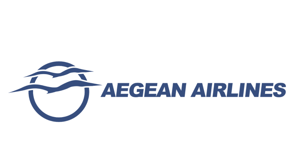
If you’ve read this far, you might have realized that there are two main trends in airline logos. One is dominated by red and white while the other is dominated by ultramarine and white. Aegean Airlines, is in the second camp. Its logo is quite simple but carries the Aegean vibes with the sunset and the birds flying over the Mediterranean.
29. Air Asia
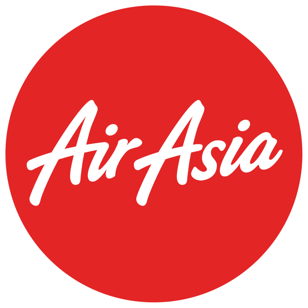
While the logo greatly resembles the logo of Virgin Airways, the airline logo is quite simple with the name on a red background. The airline faced some controversy when a runway accident caused a backlash. When the plane had the accident, the runway operators tried to cover the airline logo so that it wasn’t associated with Air Asia. Well, it didn’t work out too much.
Even though we’ve seen that there are two major trends in airline logos, a white icon on a red background and a white icon on an ultramarine background, there are also quite unique and well-designed icons. Our two favorites were the airline logo of Hawaiian Airlines and the airline logo of PNG air. Which ones were your favorite?
Did we miss any interesting airline logos? Let us know in the comment section below.
Featured Image by Kevin Hackert on Unsplash
I think you forget the most traditional Airlines, like KLM, Iberia or Avianca.
Actually, Garuda Indonesia’s logo is that of a… garuda…
nice
Varig Airlines logo one of most beautiful airline logo ever.