
Animating Design Elements: 7 Unique & Creative Practices
We saw different methods and techniques that truly speak to the designer’s capabilities and creativity. A great way to distinguish yourself from the crowd is to have a truly unique user interface. Although there are many possibilities, you should carefully plan each project on its own. Not all techniques provide a solution for everything. Some of them are very helpful and easy to implement, but some lack usability and simplicity.
There are 7 creative practices featured below, from animated menus to scrollable content to hover effects. But they aren't just for looks; each one also adds valuable functionality and improves the user experience of your site. These examples can be a starting point for what jQuery and other javascript libraries can do to animate any design element you want.
1. Animated Menus
- Koodoz
Koodoz has taken a truly unique approach to the top navigation menu. What they have created is an animated drop down menu when you hover on any item while showing a small description of what this item mean or lead to.
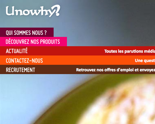
- Unowhy
The Unowhy has an impressive designed menu, when a visitor hovers over the menu item, additional information is displayed automatically in a very elegant way.
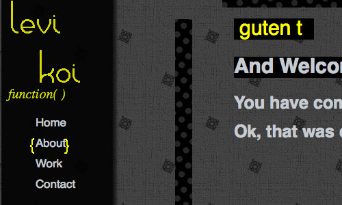
- LeviKoi
LeviKoi has a nice animated menu effect.
2. Scrollable Content
- Metalabdesign
Metalabdesign uses an interesting approach to scroll smoothly in a visually-appealing manner.
- Bulletpr
Another great example of smooth scrolling.
- SquaredEye
Over the last couple of years we have noticed a strong trend toward sliding horizontal panels or menus also known as Carousels. SquaredEye uses a similar effect, once one of the navigation options at the left and right is clicked, an of image slides in horizontally.It also uses a rollover effect on the trigger elements to let the users preview previous and next navigation item.
3. Form Validation
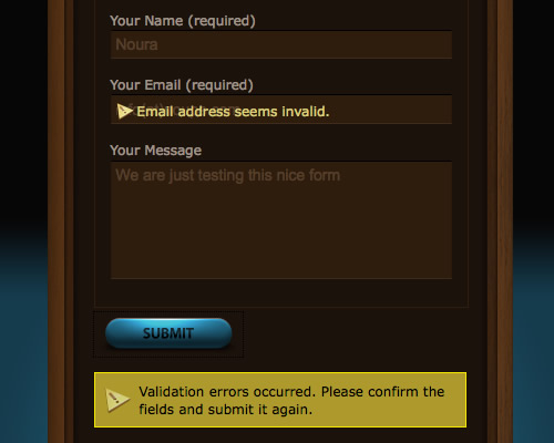
- WeLoveIcons
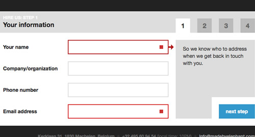
The goal of web form validation is to ensure that the user provided necessary and properly formatted information needed to successfully complete an operation. WeLoveIcons's contact form implements a unique form validation that gives the user feedback inside the field and below the form in a really stylish way.
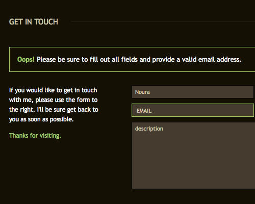
- Scottjehl
Another interesting example of validating form in a non traditional way is the contact form created by Scottjehl.
- MadeByElephant
Another impressive example of validating forms.
4. Tabs
- EA Video Games
This tab set is beautifully styled. It uses large buttons, and clean typography with icons.
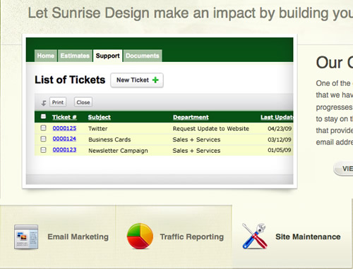
- SunriseDesign
Another tab set that has a good styling. It uses a bevel to seperate tabs, large buttons, and clean typography with icons.
- Vyniknite
One of my favorite tab sets. The use of rounded corners and a strong color difference to separate the tabs not in use.
5. Hover Effects
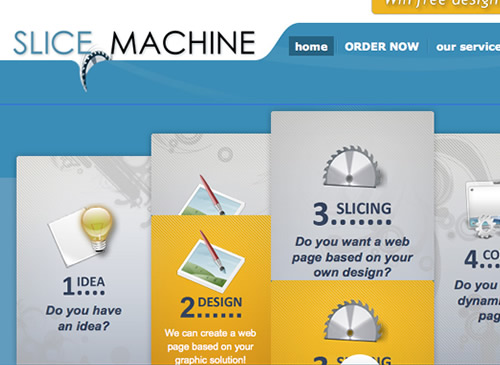
- SliceMachine
SliceMachine is a brilliant example showing a nice rollover effect that present additional information in a very beautifully styled and clean layout.
- Eyedraw
Eyedraw has an excellent example of applying the insatiably attractive Mootools effect (Kwicks) but in jQuery.
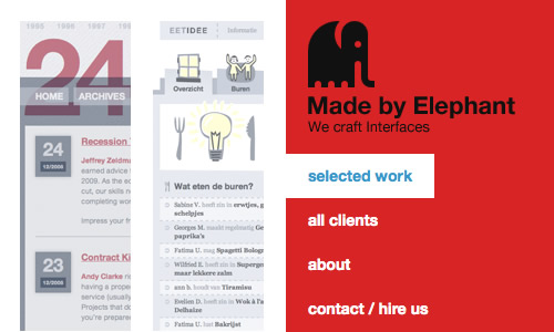
- MadeByElephant
Another interesting design approach is presented by MadeByElephant – the gallery uses rollover effect on the trigger elements to let the users preview more info about the selected item. In some situations this approach can be useful.
6. Image Showcase & Slideshows
- ScottJehl
This is a very well-thought-out image gallery with very smooth sliding and a clean layout.
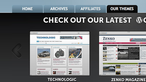
- WPZoom
WPZoom has a very very clever portfolio slider showcasing their latest themes with a nice layout.
- CrushLovely
An in-depth slideshow with a fully styled and usable horizontal slider.
7. Toggle Elements
- Atlantic bt
Toggling a panel can be an excellent way to tuck away an obstructive menu, which the user can click on to reveal.
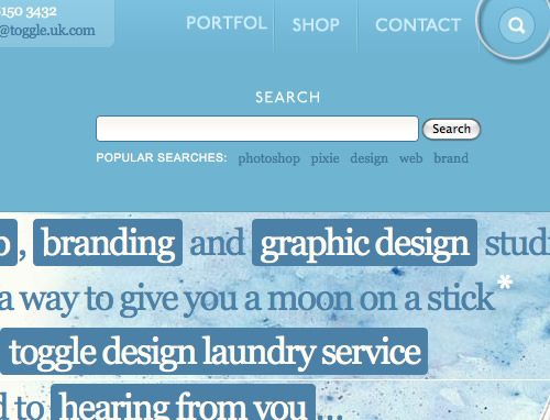
- Toggle
Another example of showing hidden content; the search box.
This is a fantastic collection of inspirada.
Can’t wait to try some of them in my next project…
wow, this is just brilliant.
thanks a ton.
Very useful information. Specially liked the Hover effect examples, pretty darn creative!
Thanks for featuring our site and our “truly unique” ;) navigation on your site!! Very cool :)
Pretty inspiring….
Great post & thanks for sharing..
Its great post and very informatics and inspiring
thanks
There are some really nifty effects and visuals listed here. But, a word of caution: many of the implementations of these effects aren’t accessible if you have JavaScript and/or CSS disabled.
Know your audience, then make a decision on how much animated bling you can add :)