
The Best Figma Fonts of 2024
Fonts are more than just text characters; they shape the user experience. From guiding users through your interface to conveying brand personality, fonts are vital to design. However, finding the perfect font that fits your website or app's tone can be challenging.
But fear not, we're here to help! Stay tuned as we explore the significance of fonts in a curated list of the best Figma fonts for 2024 and beyond.
How to Choose the Right Font?
When choosing the appropriate font for your digital content, considering these questions can aid in assessing the font's clearness and practicality:
- Does the font include all necessary characters and font styles?
- How many variations or weights does the font offer?
- Clearness of structure, for instance, can users differentiate between I, l, or 1 easily?
- How well-designed is the shape of kernings?
- How many alphabet combinations does the chosen font cater to?
You don’t need to search in detail for the most suitable Figma font type for your digital presence anymore, because here is our selection of the best Figma fonts:
Inter
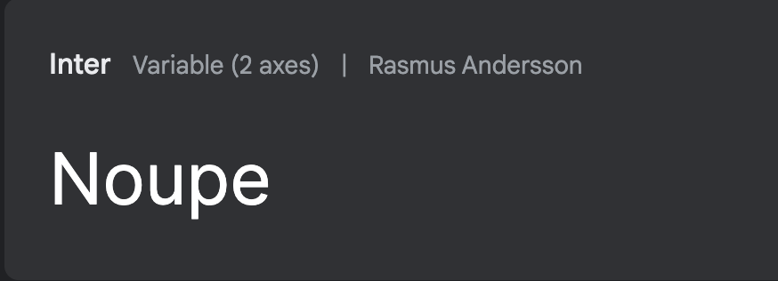
Being one of the famous web design fonts used by Mozilla and GitHub, Inter was created by Rasmus Andersson, a famous Figma designer. Rasmus and the designer team worked hard and spent 3 years creating a core set of glyphs that caters to web users' needs.
Thanks to its versatile font collection tailored for digital display, it boasts a tall x-height, enhancing legibility for both upper and lowercase text. It offers various OpenType features such as contextual alternates, which adapt punctuation based on neighboring glyphs' shapes, and a slashed zero option for distinguishing between "0" and "o". It also includes tabular numbers, among other features, catering to diverse typographic needs.
It works very similarly to Figma components. The main advantages of these design tools tailored to specific fonts include features such as components and support for kerning and the results show in the numbers. According to Google Fonts, Inter is featured on more than 1,300,000 websites with a usage of 4.7 billion times. This showcases Inter will continue to protect its position amongst fonts.
Quicksand
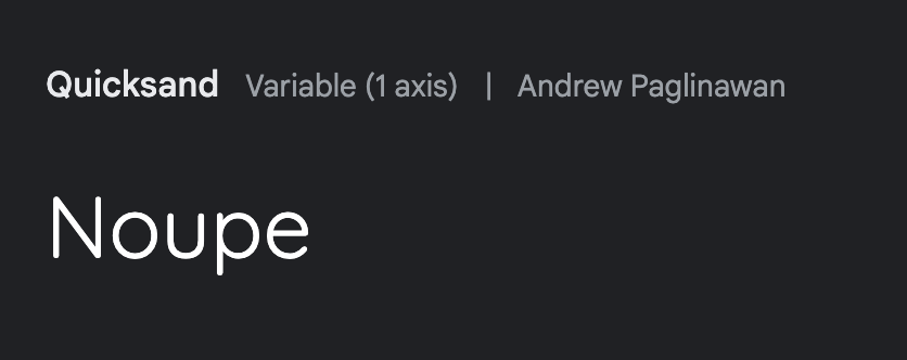
Quicksand is a versatile and user-friendly display sans serif font, ideal for educational materials and tech products. It is also a typeface that embeds both modern and merry flows. Created by Andrew Paglinawan in 2008 with geometric shapes as its foundation, it underwent significant revisions by Thomas Jockin in 2016 to enhance its quality. Later, in 2019, Mirko Velimirovic transformed the font family into a variable font, offering even greater flexibility in design and usage.
With its rounded terminals and legibility in both large and small sizes, Quicksand is a valuable asset for SEO-friendly design in Figma. However, Quicksand has no options for Cyrillic alphabets.
Poppins
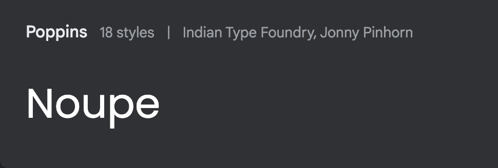
Poppins is a geometric sans serif font known for its modern twist on a classic style. It supports both Devanagari and Latin scripts. The font features diligently prepared glyphs with a rationalist design frame, also including a unique Devanagari typeface based on geometric shapes like circles. Poppins is created by Indian Type Foundry which offers multilingual fonts for digital purposes as many Indian and international alphabets are included.
Poppins' monolinear letterforms ensure consistent typographic balance, while its diverse character set supports 244 languages, making it suitable for various global contexts. It's often used in corporate, editorial, web, and mobile design, thanks to its modern yet friendly feel with a hint of sophistication. Described as approachable, balanced, and versatile, Poppins is an excellent choice for projects requiring a contemporary and professional look.
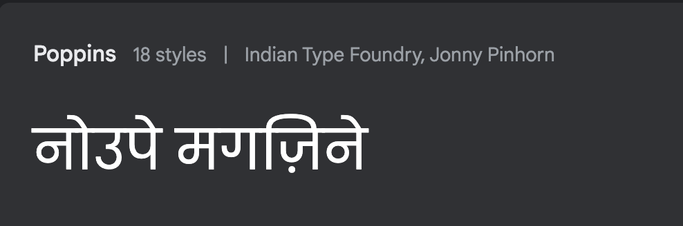
“Noupe Magazine” in Devanagari alphabet in the Poppins font.
Mulish
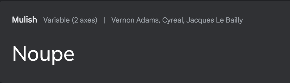
Formerly known as Muli, Mulish underwent a name change in 2020, marking a new chapter in its evolution, because it was initially created for display purposes. However, with collaborative efforts from other designers, Mulish has expanded its range with additional weights, making it a perfect fit for both web and mobile interfaces.
Designed by Vernon Adams in 2011 and refined over the years until 2014, Mulish exudes a modern and sophisticated vibe that's sure to impress. Whether you're crafting a sleek website or designing captivating mobile interfaces, Mulish has got you covered.
Originating from a design perspective created for display fonts with optimal spacing, Mulish is crafted not only in headline usage but also as body text. It offers a user-friendly font for both mobile and website applications.
Zilla Slab
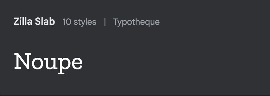
Zilla Slab serves as Mozilla's main font, prominently featured in its logo, headlines, and overall design. This contemporary slab serif font, created by Yuliya Gorlovetsky and based on Typotheque's Tesla, boasts smooth curves and true italics, lending text an unexpectedly sleek industrial look while maintaining a friendly and approachable feel across all weights.
In addition to its use in the Mozilla Foundation's branding, including its logo, Zilla Slab is also employed in various products and projects such as MDN Web Docs and Common Voice, alongside fonts like Inter and Metropolis. Ohio University also adopted Zilla Slab as their secondary font choice starting on February 21, 2018.
Zilla Slab is readily available on GitHub, Google Fonts, and through Mozilla's CDN. Additionally, its variant, Zilla Slab Highlight, can be found in the same GitHub repository and is also accessible via Google Fonts.
Plus Jakarta Sans
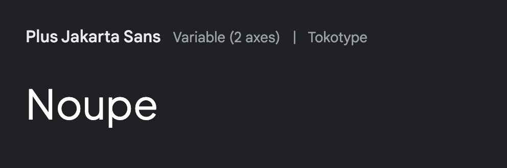
Plus Jakarta Sans is a modern take on geometric sans serif fonts, created by Gumpita Rahayu from Tokotype and originally developed for the Jakarta Provincial Government's and Jakarta City of Collaboration’s identity in 2020. These fonts bring a fresh perspective to the table. This typeface combines historical influences with a modern aesthetic, making it suitable for a wide range of design projects in Figma.
Inspired by classics like Neuzeit Grotesk, Futura, and 1930s grotesque sans serifs, Plus Jakarta Sans features clean-cut shapes with almost monolinear contrast and sharp curves. The x-height is slightly taller, creating distinct spacing between uppercase and lowercase letters. The font also includes open counters and balanced spaces to ensure readability across various sizes. It is available in 505 languages.
Nunito
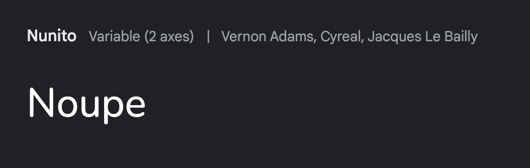
If you've been using Figma for a while, you've encountered Nunito. While it may seem like a straightforward sans-serif font, its simplicity is one of its strengths, making it a top choice for elegant designs. Many Figma designers pair Nunito with Lora and Roboto, as these combinations have proven highly effective.
Recently, Nunito expanded to include six weights, making it versatile for both headlines and paragraphs. If you need a thin sans-serif font that's easy to read, Nunito is a solid option.
Nunito is a comprehensive sans serif typeface family consisting of two versions. It all began with Nunito, designed by Vernon Adams to be a rounded terminal sans serif primarily for display purposes. Jacques Le Bailly expanded the project to encompass a full range of weights, as well as introduced a regular version without rounded terminals, known as Nunito Sans. It’s available in 612 different languages.
Lora
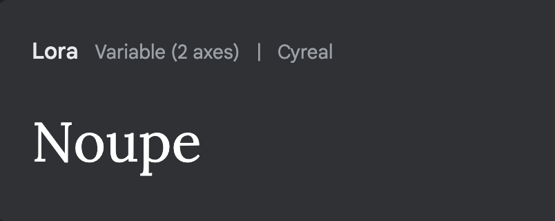
Lora is a sleek and sophisticated serif font that adds a modern touch to any text. While it's not the best for long passages because of its fancy details, it's perfect for attention-grabbing headlines. Newspaper headlines, logos, and menu topics could be some examples.
Like Roboto, Lora supports a whopping 311 languages, including Latin and Cyrillic scripts, and comes with all the punctuation and symbols a Figma designer needs.
Lora is a carefully balanced font with a contemporary feel, inspired by calligraphy. Its unique features like smooth curves and bold serifs make it stand out on design projects. This increases its functionality in creative fields. Whether you're telling a story or writing an essay, Lora sets the right tone effortlessly. Plus, it's optimized for both screens and print, making it usable for any design project.
Roboto
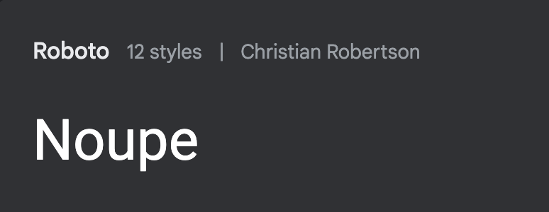
With its impressive presence on over 610 billion websites, Roboto is one to consider.
Roboto might not be new to the scene, but it's still got that trendy energy. It's a timeless classic that adds a touch of sophistication to any Figma project. Its structure with large geometric shapes and subtle quirks makes it versatile for everything from long paragraphs to catchy headlines, especially logos.
What distinguishes Roboto is its dual nature, characterized by its mechanical aspects with mostly geometric forms combined with friendly and open curves. Unlike some fonts that force a rigid rhythm by letterforms, Roboto keeps things natural, allowing letters to settle into their natural width. This creates a more fluid reading experience for humanist and serif fonts. Plus, with support for over 300 languages and a complete set of punctuation, currency symbols, and more, Roboto is one of the go-to choices for any Figma project you've got in mind.
Tilt
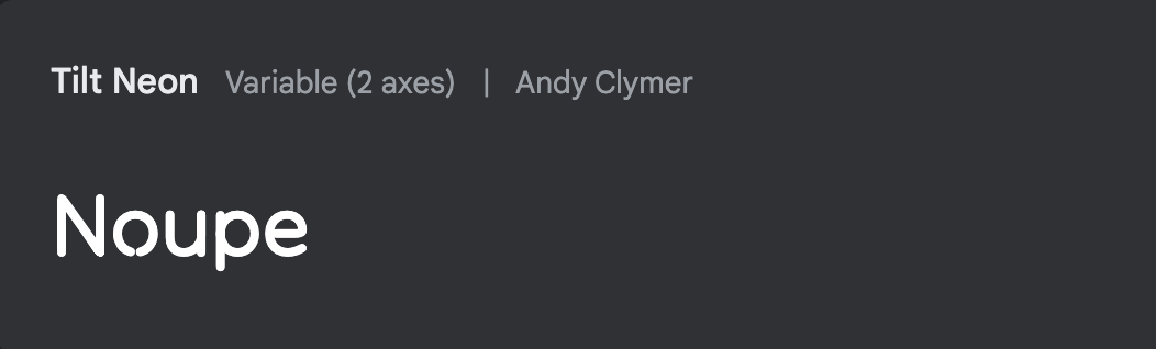
Let’s look at more energetic types. Tilt is a font family that's all about the visuals, drawing inspiration from city landscapes, especially the bold lettering seen on shop signs. It includes three variable fonts: Tilt Neon, Tilt Prism, and Tilt Warp. These fonts are based on a simple geometric structure, but each has its unique style and purpose. Tilt Prism is particularly eye-catching and works great for attention-grabbing marketing materials and landing pages.
These fonts are based on a geometric sans serif model used by sign painters but with added details. They are designed as variable fonts, allowing users to rotate glyphs along the X and Y axes by up to ±45° while maintaining readability. This unique feature makes Tilt a versatile choice for various design projects requiring dynamic typography of storefront signage.
Montserrat
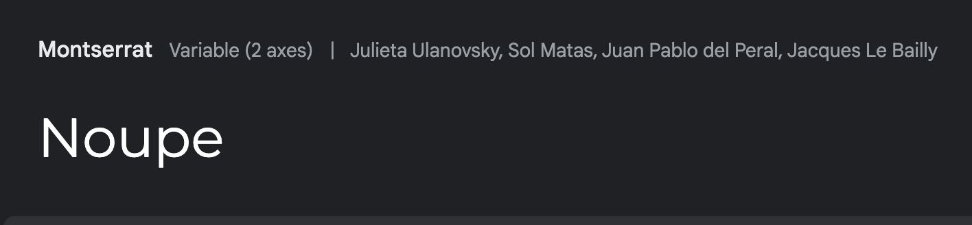
Julieta Ulanovsky was inspired by the vintage posters and signage of Buenos Aires' Montserrat neighborhood to create this typeface, aiming to preserve the essence of urban typography from the early 20th century. As the neighborhood changes, its original charm and unique designs are lost forever. The letters that influenced this project embody hard work, dedication, and the vibrant life of the city, both day and night in Buenos Aires. The Montserrat Project was initiated to capture Montserrat's essence and release it under a free license, named the SIL Open Font License.
The Montserrat font family includes three variations: the normal family, the Alternates, and the Subrayada sister families. The Alternates feature distinct letterforms, while the Subrayada variation incorporates a special style of underlining inspired by the Montserrat neighborhood. The creative design story of Montserrat results in its comprehensiveness and inclusivity as it offers 593 languages available all over the world.
Why is Choosing the Right Font Important?
- The right fonts make life easier
When you filter your overwhelming list of font selections and narrow it down to a few of the most commonly used and trendy ones, your job gets much easier. Selecting the right font for the appropriate design projects makes it easy to shape that visual structure when your users scroll through your website or app.
- Emotional connotations
Different fonts evoke different emotions and convey different meanings. For instance, a sleek and modern font may convey professionalism and sophistication, while a playful and whimsical font may suggest creativity and friendliness. Choosing a font that aligns with the tone and personality of your message can help reinforce your intended message and connect with your audience on a deeper level.
- Brand recognition
When it comes to providing brand value and uniqueness to things, fonts serve that purpose. Coca-Cola has a unique font customers can associate them with, whereas Amazon has a different font as their brand logo. Your font selection should reflect the brand and ensure the user can picture it in their mind.
- Communication codes
Choosing the right font is important because it directly impacts how your audience perceives your content. The font you select sets your message's tone, style, and overall impression. It contributes to your text's readability and visual appeal, influencing how effectively your message is communicated.
Conclusion
Selecting the right font in Figma designs is crucial for enhancing user experience and effectively communicating brand tone and message. From versatile options like Inter and Roboto to elegant choices like Poppins and Lora, there's a font for every design project. Fonts evoke emotions, convey brand recognition, and directly impact how your audience perceives your content. By choosing fonts that align with your brand's personality and message, you strengthen brand identity and connect with your audience on a deeper level. Ultimately, the right font enhances readability, visual appeal, and overall user engagement, contributing to successful design outcomes in Figma and beyond.