
Brutalism in Web Design: As Simple as Possible, or Even Simpler?
In general, the best design is always the one that is so simple it doesn't need an explanation. The best design has an intuitive interface and is understood without words. That said, is brutalism the best design?
When walking through your city and noticing a terribly ugly concrete block, you can either call it an ugly eyesore in the cityscape or an expression of the architecture trend of brutalism. It stays true to the motto "is this art or trash?"
Hold up! Stop! It's not that easy after all.
Advocates of the trend put the focus on the functionality of a building, leaving little to no room for the appearance. The culinary principle "You eat with your eyes first" doesn't apply here.
[caption id="attachment_104428" align="aligncenter" width="1024"]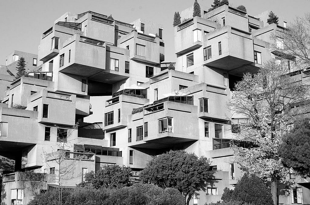 Habitat 67 photo by Matias Garabedian shared under Attribution-ShareAlike 2.0 Generic (CC BY-SA 2.0) licence[/caption]
Originally, brutalism was a more minimalistic, sober way to view the world, rather than art, and was more of an expression of the functionality-oriented past generation of architecture. At the same time, the design was also meant to be a political protest, like a concrete left-wing party.
Habitat 67 photo by Matias Garabedian shared under Attribution-ShareAlike 2.0 Generic (CC BY-SA 2.0) licence[/caption]
Originally, brutalism was a more minimalistic, sober way to view the world, rather than art, and was more of an expression of the functionality-oriented past generation of architecture. At the same time, the design was also meant to be a political protest, like a concrete left-wing party.
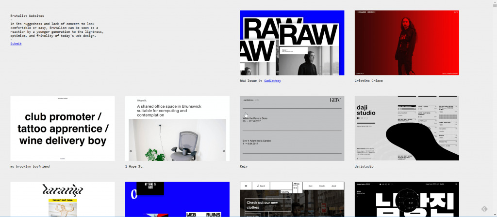 Brutalist Websites: Collection of Ugly Web Designs. (Screenshot: D. Petereit)[/caption]
Deville got this result via code analysis. Oftentimes, this showed the use of modern technology and optimized processes that still lead to terribly ugly layouts. There was no way these were not bad on purpose.
Brutalist Websites: Collection of Ugly Web Designs. (Screenshot: D. Petereit)[/caption]
Deville got this result via code analysis. Oftentimes, this showed the use of modern technology and optimized processes that still lead to terribly ugly layouts. There was no way these were not bad on purpose.
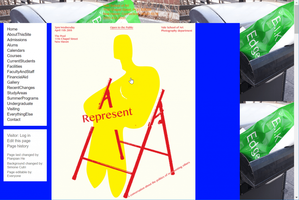 This is the actual website of the Yale School of Art. (Screenshot: D. Petereit)[/caption]
Overall, it is striking that brutalism is more common in the purely artistic corner than anywhere else on the web. So, if you're an artist, you might want to take a brutalist look at your public image.
This is the actual website of the Yale School of Art. (Screenshot: D. Petereit)[/caption]
Overall, it is striking that brutalism is more common in the purely artistic corner than anywhere else on the web. So, if you're an artist, you might want to take a brutalist look at your public image.
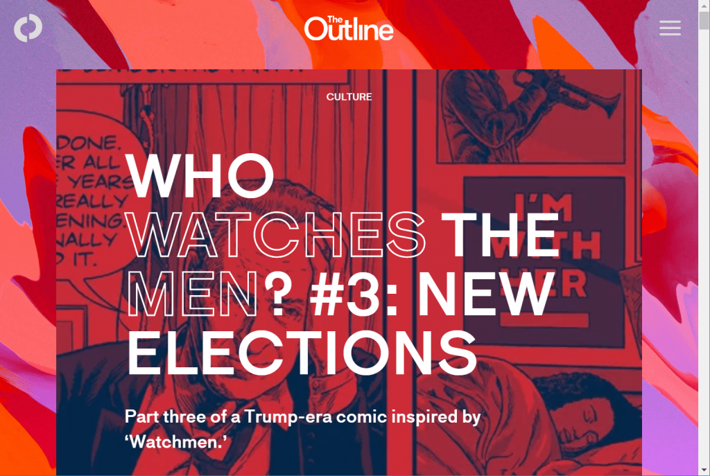 The brutalist online magazine The Outline. (Screenshot: D. Petereit)[/caption]
Ugly design elements harmonize with modern design consensus, shifting the focus towards the magazine's individual articles. Of course, this doesn't work for everyone, but the look suits the concept of The Outline. Just take a look at the underlinings. They are wave-shaped and move. Eerily beautiful.
The design agency AKU from Tallinn in Estonia offers an eerily beautiful brutalist look as well. As the agency specifically addresses artists, it makes sense for its presentation to be extraordinary. Average Joe will struggle with this, but potential clients will love it:
[caption id="attachment_104423" align="aligncenter" width="1024"]
The brutalist online magazine The Outline. (Screenshot: D. Petereit)[/caption]
Ugly design elements harmonize with modern design consensus, shifting the focus towards the magazine's individual articles. Of course, this doesn't work for everyone, but the look suits the concept of The Outline. Just take a look at the underlinings. They are wave-shaped and move. Eerily beautiful.
The design agency AKU from Tallinn in Estonia offers an eerily beautiful brutalist look as well. As the agency specifically addresses artists, it makes sense for its presentation to be extraordinary. Average Joe will struggle with this, but potential clients will love it:
[caption id="attachment_104423" align="aligncenter" width="1024"]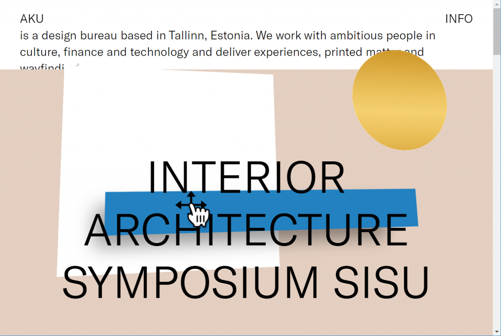 The presentation of the design agency AKU from Estonia is not any less astonishing. (Screenshot: D. Petereit)[/caption]
All it takes to make use of the options of brutalism is fantasy and courage. In today's design world, it is hard to make new paths aside from the existing ones and make your visitors follow them. If you succeed, however, you have a unique characteristic at your hands.
Designer Maria Grilo takes this as far as claiming that brutalism is just the kind of bad influence that we need to revive our designs. Is this true, though?
Picture credit: Post image by Ralf Roletschek / Roletschek.at also shows the Habitat 67.
The presentation of the design agency AKU from Estonia is not any less astonishing. (Screenshot: D. Petereit)[/caption]
All it takes to make use of the options of brutalism is fantasy and courage. In today's design world, it is hard to make new paths aside from the existing ones and make your visitors follow them. If you succeed, however, you have a unique characteristic at your hands.
Designer Maria Grilo takes this as far as claiming that brutalism is just the kind of bad influence that we need to revive our designs. Is this true, though?
Picture credit: Post image by Ralf Roletschek / Roletschek.at also shows the Habitat 67.
Habitat 67 photo by Matias Garabedian shared under Attribution-ShareAlike 2.0 Generic (CC BY-SA 2.0) licence[/caption]
Originally, brutalism was a more minimalistic, sober way to view the world, rather than art, and was more of an expression of the functionality-oriented past generation of architecture. At the same time, the design was also meant to be a political protest, like a concrete left-wing party.
Web Design of the Nineties = Brutalism?
Transferred over to web design, these aspects are only a subordinate factor. Nonetheless, artistic aspects, like the expression of a certain protest culture, are still in effect here. However, pretty much every website of the nineties was brutalistic frome a visual standpoint. There were very few options available to make a design visually appealing. For the most part, the designers where the people that have earned that reputation with their completely overloaded Powerpoint slides. We all remember Beepworld, Geocities, and pretty much all websites available back then. Since, "back in the days, we had nothing", web design was done using a sledgehammer. Some sites were so ugly that visiting them would make you go to your local oculist shortly after. Today, there are templates in every corner of the internet. With these templates, even the most infamous Geocities inhabitant can upload a visually appealing, easy to control website to the world wide web. With a CMS, like WordPress, things get even easier. HTML knowledge is not required, and neither is knowledge on CSS, PHP, or JavaScript. Homepage builders like Wix or Webydo, which operate fully graphically, take the last bit of ambition to look deeper into basic web technology off our hands.HTML or no HTML: Culture Battle of the Web
Terrible is what some say when they want to go back to the days where someone without a rather profound webmaster knowledge and HTML skills was a nobody. Perfect is what the others say because the web was not meant to be a playground for designers and coders. It is supposed to be a technology that allows content from all around the world to be published and viewed freely. Today, we're a lot closer to the publishing of content by anyone than we were in the nineties. So we can be certain that the web's basic concept is content, and not design. Early webmasters like Justin Jackson will agree without further ado. This look into the motivation of the web inventor Tim Berners will have a positive effect as well. Do the two approaches even contradict each other? Sure, modern tools move us further away from the web's technological foundation, especially the manual coding of HTML. On the other hand, this situation enables a large number of people to actively share content on the web in the first place. Of course, the impression of a uniform web design is valid. The only controversy is whether this is a good or a bad thing.Brutalism in Web Design
We can definitely connect the current brutalism trend to the protest regarding the situation. Here, people purposely use a style for their website design that is not even necessary anymore, as our technological options are way past the state of the nineties. Is nostalgia a factor here? Was everything better in the old days? Is a matter of ideology? Is it about web-purism following the initial statements of Berners-Lee? Is it like punk or gothic? A striking way of separating yourself from the norm, so that said norm notices? This is hard to judge. We can safely say what it isn't, though. Usually, the reason is not a lack of knowledge. Pascal Deville, partner of the Zurich-based creative agency "Freundliche Grüße", figured this out rather quickly, after he released his collection of brutalist websites titled "Brutalist Websites" in 2014. [caption id="attachment_104424" align="aligncenter" width="1024"] Brutalist Websites: Collection of Ugly Web Designs. (Screenshot: D. Petereit)[/caption]
Deville got this result via code analysis. Oftentimes, this showed the use of modern technology and optimized processes that still lead to terribly ugly layouts. There was no way these were not bad on purpose.
Pros of Brutalism in Web Design?
The creators of some of the listed websites have answered the question why the chose to run a brutalist site in brief interviews. The answers vary from "because it's fun" to "I come from a brutalist environment," all the way to "because it's trending right now. There doesn't seem to be a clear motivation behind this. If the designers themselves can't even give us good reasons, we have to resort to speculation. When looking at the topic from a marketing point of view, we have to admit that a brutalist website is very likely to gain more attention than a streamlined version of the latest template bestseller. If things are going well, the design can even go viral. However, we should definitely make up an answer in case we get asked why we launched a website that looks like a leftover from the nineties in 2018. Generally, minimalism is one of the megatrends of the recent past. And where's the difference between brutalism and minimalism? Well, it is a very ugly form of minimalism, but this is more of a detail question. If your brutalist design is done well, it is pretty much automatically accessible and responsive, without any other technological preparations. If it wasn't so ugly, it could easily pass as a best practice. Relentlessly executed brutalism can only have one plausible explanation aside from the protest aspect: art, as you can't argue about art. At least at the Yale University, this is the consensus. Take a brave look at the website of their School of Art: [caption id="attachment_104426" align="aligncenter" width="1024"] This is the actual website of the Yale School of Art. (Screenshot: D. Petereit)[/caption]
Overall, it is striking that brutalism is more common in the purely artistic corner than anywhere else on the web. So, if you're an artist, you might want to take a brutalist look at your public image.
This is How it Could Work: Brutalism in a Defused Form
Assuming we neither want to convey protest nor seem progressively artistic, what else could we use brutalism for? Not at all? Of course, this works as well. However, it is definitely possible to take advantage of the positive effects of modern brutalism without turning into a design dyslexic. Take a look at the online magazine The Outline for example: [caption id="attachment_104425" align="aligncenter" width="1024"] The brutalist online magazine The Outline. (Screenshot: D. Petereit)[/caption]
Ugly design elements harmonize with modern design consensus, shifting the focus towards the magazine's individual articles. Of course, this doesn't work for everyone, but the look suits the concept of The Outline. Just take a look at the underlinings. They are wave-shaped and move. Eerily beautiful.
The design agency AKU from Tallinn in Estonia offers an eerily beautiful brutalist look as well. As the agency specifically addresses artists, it makes sense for its presentation to be extraordinary. Average Joe will struggle with this, but potential clients will love it:
[caption id="attachment_104423" align="aligncenter" width="1024"] The presentation of the design agency AKU from Estonia is not any less astonishing. (Screenshot: D. Petereit)[/caption]
All it takes to make use of the options of brutalism is fantasy and courage. In today's design world, it is hard to make new paths aside from the existing ones and make your visitors follow them. If you succeed, however, you have a unique characteristic at your hands.
Designer Maria Grilo takes this as far as claiming that brutalism is just the kind of bad influence that we need to revive our designs. Is this true, though?
Picture credit: Post image by Ralf Roletschek / Roletschek.at also shows the Habitat 67.