
Chartist.js Creates Responsive, Animated Charts with SVG
Numbers and statistics are usually bone-dry and sometimes not really clarify but obscure even more. By visualizing data with charts, you can attract much more attention. The JavaScript library Chartist.js from Zurich turns as many numerical sequences as you like into easy to understand bar, line, pie, or other charts. They not only look good but are also responsive and can be jazzed up with animations.
 Pie chart[/caption]
Then a pie chart is created by
Pie chart[/caption]
Then a pie chart is created by 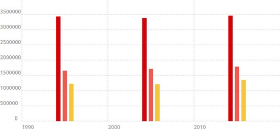 Bar chart[/caption]
If you want to turn a bar chart into a line chart, simply change the
Bar chart[/caption]
If you want to turn a bar chart into a line chart, simply change the 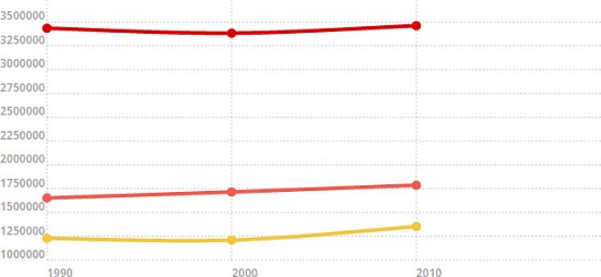 Line chart[/caption]
 Half Donut Chart[/caption]
Easily Generate Simple Charts
Chartist.js is a project by Swiss Gion Kunz available under a DWTFPL. I'm not going to write what this abbreviation stands for. What I can say is that you can use Chartist.js for whatever you want. Gion Kunz doesn’t care about it ;-) It doesn’t take much to get started: First implement the JavaScript and the stylesheet file of Chartist.js. The JavaScript file is necessary for the functionality and data entry. The stylesheet file contains the different chart types. Use HTML to add a container element to thebody which we will then fill with the chart. Attach the class ct-chart for the basic layout and a class that specifies the chart’s aspect ratio on the container.
Besides a quadratic ratio (ct-square) or the classic 16:9 (ct-minor-seventh) and 3:4 (ct-perfect-fourth) ratios, you can also choose the golden section (ct-golden-section). There are 17 different aspect ratios in total you can choose from.
<div class="ct-chart ct-perfect-fourth"></div>In the example above, we created a
<div> element with a 3:4 ratio. Then add the numerical sequences and chart labels to the container.
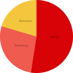
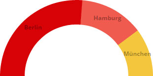
var data = {
  labels: ["Berlin", "Hamburg", "München"],
  series: [3460725, 1786448, 1353186]
};

new Chartist.Pie(".ct-chart", data);
The example illustrates the population of the three biggest German cities with a pie chart. We assigned the numeric values and labels as object literal to a variable (data). The label of each numeric value is defined in the label array; the numbers are defined in the series array.
[caption id="attachment_88473" align="alignnone" width="310"] Pie chart[/caption]
Then a pie chart is created by Chartist.Pie(). Chartist.js expects two parameters: the class of the <div> container for the chart and the object literal data with the chart values.
The chart is an SVG graphic with the width of the parent element. The height depends on the aspect ratio specified in the container.
Charts with Several Numerical Sequences
Besides pie charts, you can also create line and bar charts that can visualize several numerical sequences. It is important that each numerical sequence – even though it’s only one – is assigned as a separate array to theseries array. Otherwise, you would fail to display the chart.
var data = {
  labels: [1990, 2000, 2010],
  series: [
    [3433695, 3382169, 3460725],
    [1652363, 1715392, 1786448],
    [1229026, 1210223, 1353186]
  ]
};

new Chartist.Bar(".ct-chart", data);
The example illustrates the population of the three biggest cities in 1990, 2000, and 2010 with a bar chart. Chartist.js draws for each year three bars on the x-axis – one bar for each city. Unfortunately, it’s not possible to label each single bar, so the chart itself doesn't clearly say which bar stands for which city; however, the bars of each row are colored automatically with different colors.
[caption id="attachment_88470" align="alignnone" width="550"] Bar chart[/caption]
If you want to turn a bar chart into a line chart, simply change the Chartist.Bar() into Chartist.Line().
new Chartist.Line(".ct-chart", data);
The example then visualizes the data with a line chart.
[caption id="attachment_88472" align="alignnone" width="550"] Line chart[/caption]
Chart Options
Depending on the chart you chose, you'll have different setting options to adjust the look of it. If you prefer a chart with fixed dimensions, you can configure those. Assign all options and the chart data as object literal to a variable.var options = {
width: "640px",
height: "320px"
}
Then allocate the options as a third parameter to the Chartist object.
new Chartist.Line(".ct-chart", data, options);
The setting options depend on the chart type. You can, for example, define maximum y-axis values for line and bar charts, so that the chart will display a certain area.
var options = {
  low: 1000000,
  high: 4000000
}
In the example above, the displayed range of the y-axis is limited by low and high to values between 1 and 4 millions.
Pie charts can also be displayed in the form of a donut.
var options = {
  donut: true,
  donutWidth: 50
}
Just set the parameter donut to true. To define the width of the donut use donutWidth. You can also display only a part of the donut rather than the whole one. Half donuts are common when it comes to distribution of seats in a parliament e.g.
var options = {
  donut: true,
  donutWidth: 50,
  startAngle: 270,
  total: 13200718
}
For such charts, you will need to choose a start angle (startAngle) for the donut and the size (total) of the displayed data. If the total value is identical to the sum of the numerical sequence, the data will be displayed as a full donut. If the total value is double the size of the numerical sequence’s sum, the data will be displayed as a half donut.
[caption id="attachment_88471" align="alignnone" width="310"] Half Donut Chart[/caption]
Customize the Look
Chartist.js automatically colors each line, bar, and pie piece. You can, however, change the look and choose different colors by defining own classes for each segment.var data = {
label: ["Berlin", "Hamburg", "München"],
series: [
{data: 3460725, className: "city1"},
{data: 1786448, className: "city2"},
{data: 1353186, className: "city3"}
]
};
In the example above, each segment got its own class by allocating arrays with two values for each number to the series array – data for the number and className for the class.
Responsive Design
If you don't use a fixed width and height, you have a good basis for a responsive design as the chart always adjusts to the width of the parent element. At the same time, the chart won’t be statically scaled down. The line strength and the font size of line charts always stay the same. The amount of values displayed on the y-axis is reduced with smaller charts so that lines won’t be too thin, and fonts won’t be too small. But this is not always enough. Especially smaller visualizations of complex charts can lead to situations where it's hard to recognize any detail. Therefore, Chartist.js offers specific settings where you can add media queries to be called up depending on the size of the browser window/display or device orientation.var options_responsive = [
["screen and (max-width: 640px)", {
showLine: false,
showArea: true
}]
]
new Chartist.Line(".ct-chart", data, options, options_responsive);
In the example above, the lines of a line chart are masked out at a resolution of 640 pixels and less. Instead, you'll see the curve's surface. You can set as many media queries with the appropriate options as you want. This is how you can adjust the look for different resolutions and device orientations.
Animate Charts
Charts can be easily animated using theanimate() method. You can, for example, animate bars starting from zero to the top. To do so, call up a function through a draw event as soon as the chart is ready.
new Chartist.Bar(".ct-chart", data).on("draw", function(bars) {
  bars.element.animate({
    y2: {
      begin: 0,
      dur: 500,
      from: bars.y1,
      to: bars.y2
    }
  })
});
In the example above, we assigned each chart bar to a function using bars. These are defined by the SVG element <line>. We want to animate the height of the bars which is defined in the property y2 of the <line> element.
The option begin lets you define a time delay when the animation should start. The parameter dur defines the duration of the animation in milliseconds. The options from and to define the values for the beginning and the end of the navigation. At the beginning <line> should have a height of zero. This is achieved when the properties y1 and y2 have identical values.
As all SVG elements and attributes of a chart can be manipulated, you can create unique animations. Just take a look at the SVG source code of the chart.
This is a great read. Chartist.js is absolutely great to use, this was a great add on to the knowledge I already knew about it. Thanks!
Chartist looks like a useful tool that I’d never heard of before. I’ll be some more research into this now. Thanks for this…
One of the problems with numbers and statistics is that they can be very very dull and dry and turn people off before you’ve had the chance to explain the implication of them. This is quite a useful tool for countering this issue.