Elegant or Boring? Gray Color in Website Design
Did you know that the human eye is able to distinguish something around 500 shades of gray? The range of gray lies between two non-colors - black and white. The darker a gray is the more black-like it is, and the lighter tones of gray are growing into white. Depending on the intensity of the color, it has been loaded with various meanings. Light gray shades are very neutral, they are perfect for a background design. Usually, light gray doesn’t evoke negative emotions, and, to be honest, it feels emotionless in most cases. On the other side, dark gray symbolizes mourning, depression, grief - strong emotions. The wide range of gray shades and their associated effects allow us to claim this color to be one of the most versatile and unpredictable.
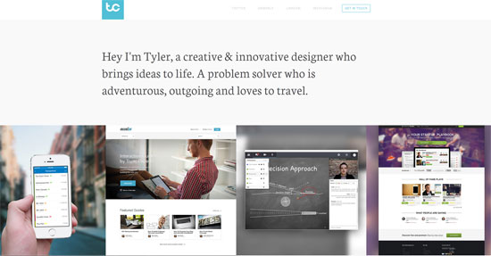
 Tyler Copeland One-page Site with Light Background and Charcoal Footer
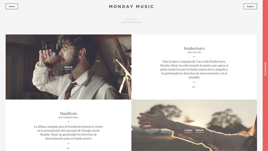
 Monday Music Gray Website Design
 Trust Reviews Web Design in Gray
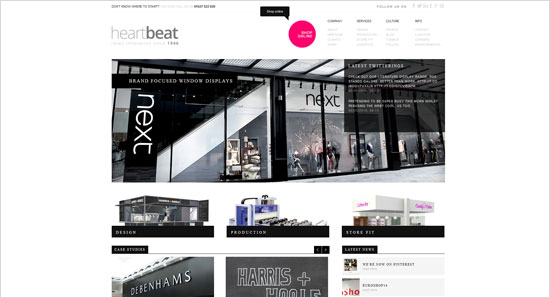
 Heartbeat Retail Store Website in Gray and Pink
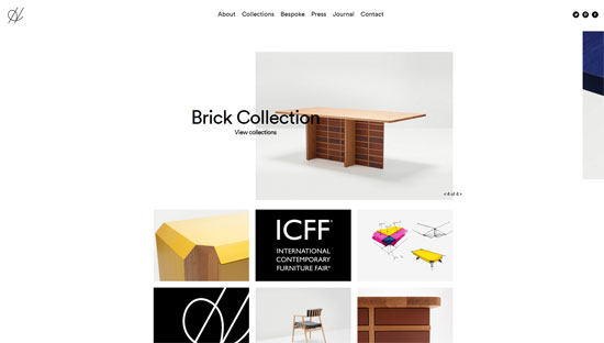
 H Furniture Website with Light Gray Background
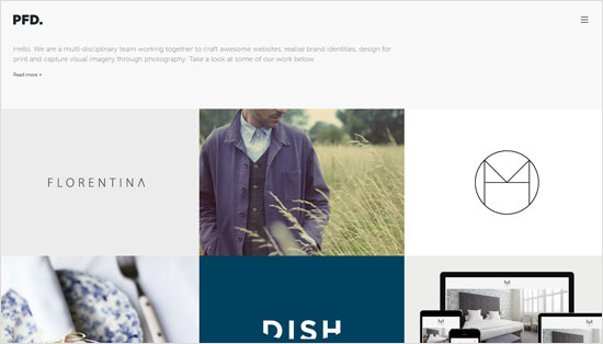
 PFD Design Agency Website
 Bird Boutique Website with Gray Homepage Image
 One Space Media Digital Agency Website with Dark Header and Footer
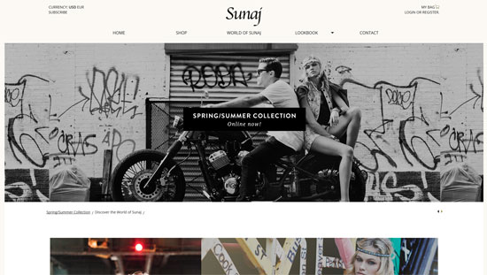
 Sunaj Official Store Website
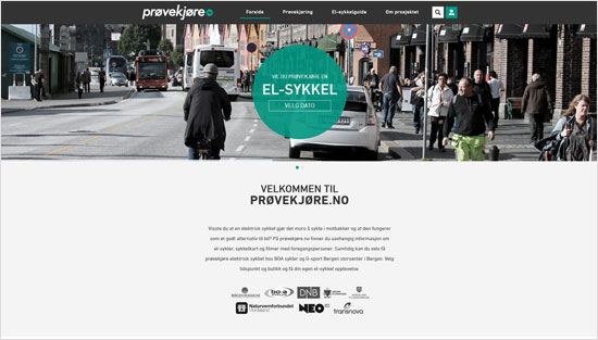
 Provekjore Website with Gray Image Banners
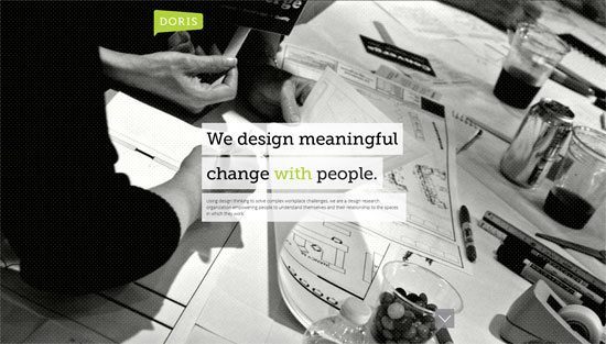
 Doris Research Website
 Tickera Ticketing System Website Done in Various Gray Shades
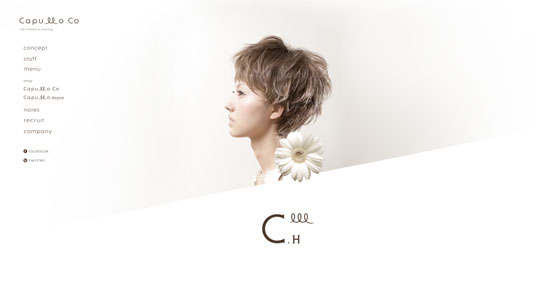
 Capullo Hairmake and Styling Portfolio Site
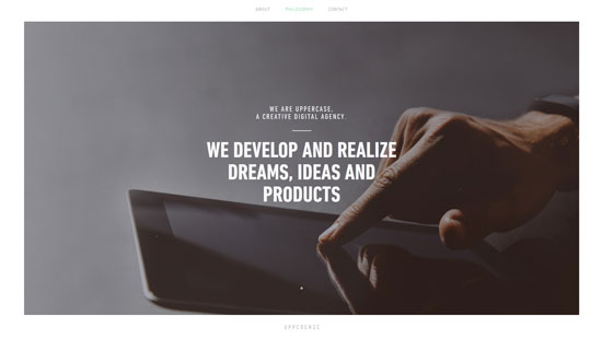
 Uppercase Website with Monochrome Gray Background
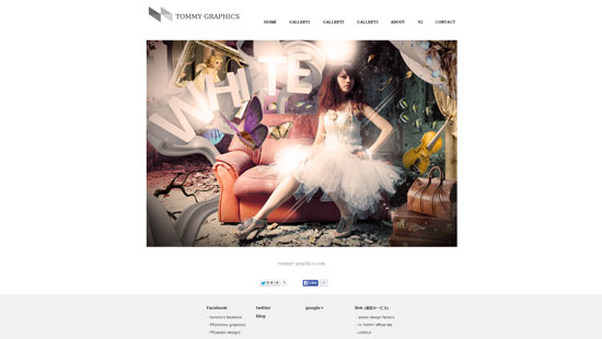
 Tommy Graphics Website
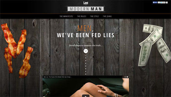
 Lee Jeans Web Design with a Few Background Textures
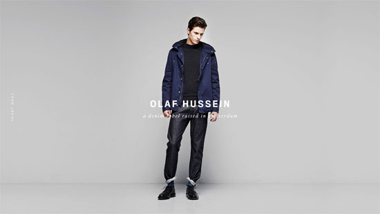
 Olaf Hussein Denim Label Site with Creative Use of Gray
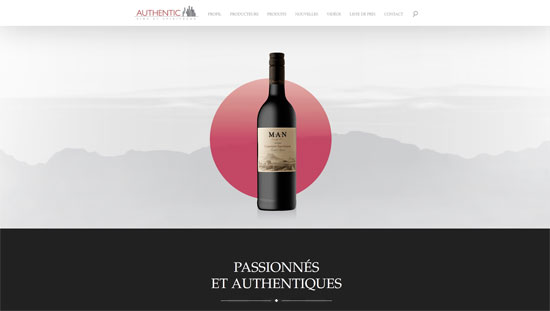
 Authentic Wine Sales and Marketing Agency Website
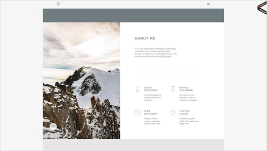
 Michele Mazzucco Branding Design Website
 Juicymo Website with Gray Dotted Texture
 Mike Seehagel Photography Website
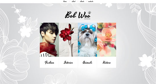
 Photo Portfolio Website Design with Floral Background Texture
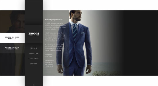
 Boggi Roeselare Website
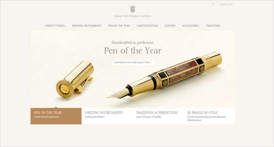
 Graf von Faber Castell Website with Gentle Shade of Gray in Design
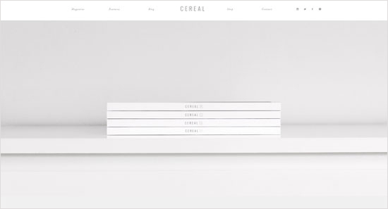
 Perfect Gray Website Design for Cereal Magazine
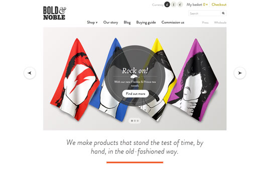
 Bold & Noble Website
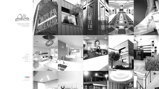
 Allure Architecture Website
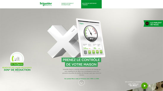
 Schneider Electric One-page Website Designed with Many Gray Tones
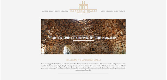
 Masseria Gialli Website
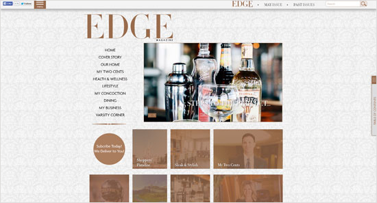
 Edge Magazine Website with Creative Background Texture
 The Pragmatic Lab Website
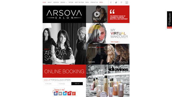
 Arsova Salon Website Design in Gray
 Gray Designer's Portfolio Wordpress Theme
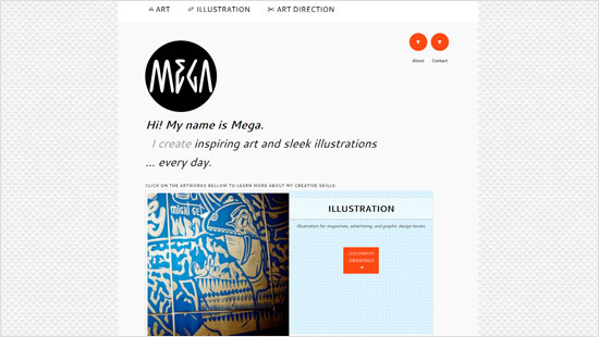
 Mega Illustrations Website with Original Background Texture
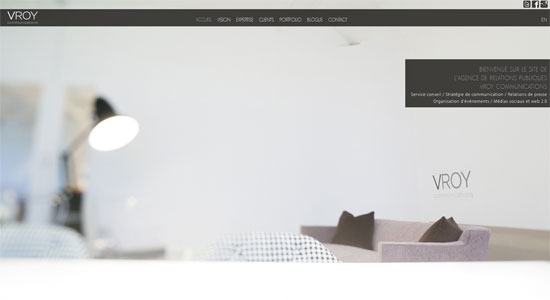
 VROY Communications Website Done in Gray
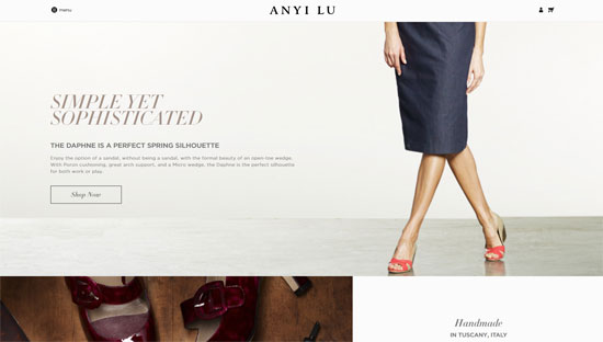
 Anyi Lu Shoes Brand Website with a Gray Touch
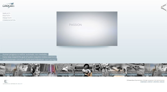
 Crocon Corporate Website
 Magnetic Zero Website Designed with Gray Background
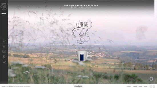
 The 2014 Lavazza Calendar Website
 Herbal Bises Website
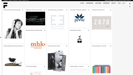
 Framelab Website
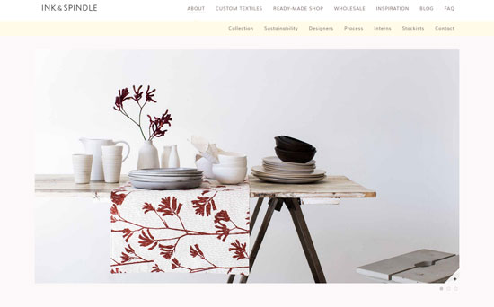
 Ink & Spindle Textile Studio Website
 That's the end of our little roundup. Did we miss the latest and graytest ;) ? Then help us out in the comments.
(dpe)
The Different Perceptions of Gray
First, let’s talk about a common stereotype of gray. It's the color of business, corporate uniformity. Together with blue suits, gray ones are very widespread in the business industry. That is why millions of people perceive gray as something formal, serious, and boring. While many who consider gray to be boring and emotionless, others conceive it as very elegant. Suits are established as elegant clothes for managers of big corporations. Still, colors are extremely significant and powerful in website design and development. If you use colors inappropriately, your next website project will have a horrible look. Colors convey moods; they set the tone for a website and form an impression of you via your project. Gray is used a lot in web design, and believe it or not, a gray website or any other color site with gray accents can have a classy appeal (but this requires some efforts from you). Here are the main applications of gray in web design:- Gray color as a background color is unobtrusive. A proper gray tone will point the content out and make the design complete. Still, a website will never look elegant, if you do it in one gray shade. You should make a composition of grays, and do it wisely, it will act in your favor then. In addition, tons of gray background textures can be used for websites of any category. Floral textured background is the one for design studios, wedding or fashion sites; metal textures are for industrial projects. This long list is written on by your own creativity.
- The second use for gray is navigation menus. You can base your design on images and then a left-sided menu panel in a neutral gray will be a peak of elegance. A search box with a gray field is a very common thing for many web projects too.
- Another application of gray is geometry, i.e. use of different shapes. The text content organized in geometrical figures (colored gray or done in a mix of colors) will have a nice look for any corporate website.
- Gray typography, what do you think about it? If you like to design a feminine site, use gray together with pink; in case you are going to develop a site for men, blend gray with deep green or blue hues. A play of colors can help you to build a strong color hierarchy on your site.
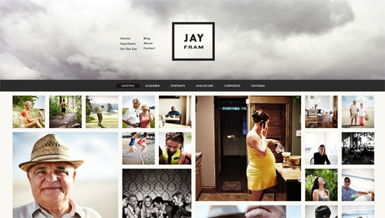
Jay Fram Website with Gray Cloud Header Image
 Tyler Copeland One-page Site with Light Background and Charcoal Footer
 Monday Music Gray Website Design
 Trust Reviews Web Design in Gray
 Heartbeat Retail Store Website in Gray and Pink
 H Furniture Website with Light Gray Background
 PFD Design Agency Website
 Bird Boutique Website with Gray Homepage Image
 One Space Media Digital Agency Website with Dark Header and Footer
 Sunaj Official Store Website
 Provekjore Website with Gray Image Banners
 Doris Research Website
 Tickera Ticketing System Website Done in Various Gray Shades
 Capullo Hairmake and Styling Portfolio Site
 Uppercase Website with Monochrome Gray Background
 Tommy Graphics Website
 Lee Jeans Web Design with a Few Background Textures
 Olaf Hussein Denim Label Site with Creative Use of Gray
 Authentic Wine Sales and Marketing Agency Website
 Michele Mazzucco Branding Design Website
 Juicymo Website with Gray Dotted Texture
 Mike Seehagel Photography Website
 Photo Portfolio Website Design with Floral Background Texture
 Boggi Roeselare Website
 Graf von Faber Castell Website with Gentle Shade of Gray in Design
 Perfect Gray Website Design for Cereal Magazine
 Bold & Noble Website
 Allure Architecture Website
 Schneider Electric One-page Website Designed with Many Gray Tones
 Masseria Gialli Website
 Edge Magazine Website with Creative Background Texture
 The Pragmatic Lab Website
 Arsova Salon Website Design in Gray
 Gray Designer's Portfolio Wordpress Theme
 Mega Illustrations Website with Original Background Texture
 VROY Communications Website Done in Gray
 Anyi Lu Shoes Brand Website with a Gray Touch
 Crocon Corporate Website
 Magnetic Zero Website Designed with Gray Background
 The 2014 Lavazza Calendar Website
 Herbal Bises Website
 Framelab Website
 Ink & Spindle Textile Studio Website
 That's the end of our little roundup. Did we miss the latest and graytest ;) ? Then help us out in the comments.
(dpe)
I miss Mac OS 9.
Look where you put it ;-)
Colors are extremely noteworthy and powerful in website design and development. Personally I also used this in my own site..
I love sites that take advantage of simple colors like grey and white, I think you can use all that white space too make your site look brilliant. I really love the Dorris Research one, the black & white photography is very strong on the eyes.
Have to be careful with greys though – it’s very easy to let asthetics get in the way of usability. Users of your site with mild vision imparements will be disproprotionately affected by a lack of contrast, and text that looks fine to a designer may be all but unreadable to a significant portion of readers.
Theres nothing worse than a site that looks beautiful but people can’t read. Check contrast ratios to be sure, and make adjustments as necessary.
From the W3C “Web Content Accessibility Guidelines 2.0”
1.4.3 Contrast (Minimum): The visual presentation of text and images of text has a contrast ratio of at least 4.5:1, except for the following: (Level AA)
Large Text: Large-scale text and images of large-scale text have a contrast ratio of at least 3:1;
Incidental: Text or images of text that are part of an inactive user interface component, that are pure decoration, that are not visible to anyone, or that are part of a picture that contains significant other visual content, have no contrast requirement.
Logotypes: Text that is part of a logo or brand name has no minimum contrast requirement.
Thanks for your advice, Stephanie! Yes, it is really hard create a balanced design, but impossible is nothing – hard work gives good results)
Thanks for really making me think about the importance of color in website design! This will come in handy!