
CSS3 Lifelike: A Slightly Different Box Model with {box-sizing:border-box}
The classical box model in CSS has never been the most intuitive. Thanks to CSS3, we now have an alternative to consider: The Classical Box Model:
Think real life: If you want to know the measurements of a box in the analog world, you will always refer to the outer dimensions of this box. You will not measure such dimensions without 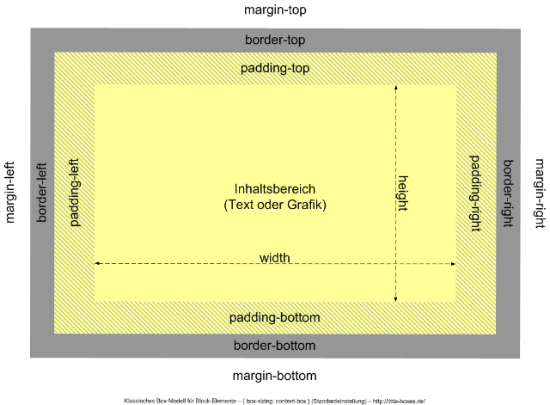 Fiddling and calculations are needed to fit everything into place. In layouts with fixed pixel widths this is annoying, but achievable.
Lifelike Boxes with CSS3:
Almost hidden from public sight, browsers took to supporting another, a second box model, with a slightly different mode of operation. In this model, 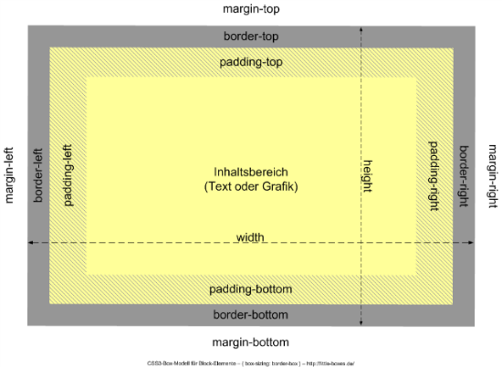 In a web designer's everyday life this mousy change in layouting comes in very handy. Looking back at our sidebar example we can easily save the double inner HTML element:
The
Once you've understood the whole practical value of 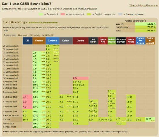 Hey hey, even IE8 understands that. Unbelievable. Mozilla does need a prefix, though, but he who is able to omit IE7, could start the stylesheet with the following:
{box-sizing:border-box}. This model has lots of advantages, especially when it comes to flexible layouts.
The Classical Box Model: {box-sizing: content-box}
Think real life: If you want to know the measurements of a box in the analog world, you will always refer to the outer dimensions of this box. You will not measure such dimensions without padding and border ;-)
In the digital world, especially concerning the classical box model, things are different. Here, width only defines the width of the content area, measures for padding or border have to be added. Visually this model looks like this (in case you forgot):
Fiddling and calculations are needed to fit everything into place. In layouts with fixed pixel widths this is annoying, but achievable.
HTML Squared as Stopgap
Difficulties, real problems arise, when the measures forwidth, padding, border or margin are defined using different units. If done this way, the outer width of our box is not reliably calculable:
- A layout column created with
<aside class="sidebar">is desired to receive awidthof 20% and apadding, both left and right of 10px each. - Question: How much space do we need to reserve for the sidebar in our layout?
- Answer: No idea. This is not reliably computable.
- Inside
asidewe put in an additionaldiv. asideis declaredwidth:20%.- The inner
divis equipped with optional values forpadding,borderormargin.
padding and other values. It will stay at a width of 20% no matter what and is calculable once again.
This doubling of HTML elements has become so common these days, that we almost forgot about the fact, that this is only a stopgap and intentionally thought out as that.
Lifelike Boxes with CSS3: {box-sizing: border-box}
Almost hidden from public sight, browsers took to supporting another, a second box model, with a slightly different mode of operation. In this model, padding and border are already included in the value given for width. It answers to the name of border-box, as its width gets calculated from border to border. This is how it looks:
In a web designer's everyday life this mousy change in layouting comes in very handy. Looking back at our sidebar example we can easily save the double inner HTML element:
- We start with defining
.sidebar { box-sizing:border-box}. - Then we e.g. add a
width:20%and some randompaddingorborderto the element.
border-box we need not care about how much padding or border an element gets, as these values are simply subtracted from the whole width and not added to it. This proves reasonable in almost all thinkable cases. Or sidebar is calculable without the need for the doubling of elements.
By the way: If you add an outer margin, this will still have to be added to the value, which makes no difference to lifelike boxes either.
The border-box in Daily Use
Once you've understood the whole practical value of border-box, you will anxiously ask the inevitable question of how browsers support it. This is the answer:
Hey hey, even IE8 understands that. Unbelievable. Mozilla does need a prefix, though, but he who is able to omit IE7, could start the stylesheet with the following:
* {
  -moz-box-sizing: border-box;
  box-sizing: border-box;
}
This is exactly what Paul Irish recommends in his blog post from February 2012.
Conclusion
border-box is more than just a welcome alternative to the classical box model, but before you change your coding tactics in one fell swoop to border-box, make sure to read the articles below. I predict that, for responsive layouts, border-box will become self-evident rather sooner than later.
Related Links:
As you can see, this topic is not exactly new, but has been discussed throughout the last few years. The following articles show the evolution from first attempts to a recommendation:- Paul Irish, * {border-box} FTW (February 2012)
- Roger Johannsson, Controlling width with CSS3 box-sizing (April 2011)
- Chris Coyier, Box-Sizing (September 2010)
- Dirk Jesse, CSS - Alles wird gut? (December 2006)
[photo credits wooden box: 16 Miles of String via photopin cc]
Article originally written by Peter Müller for our German Dr. Web Magazin
(dpe)
I like the Classical Box Model. Nice explanation.
Nice explanation of how border-box works. Have been using this on all projects for a while now and it makes life much easier!
When using the border-box property, I prefer the following code at the top of a normalize or reset stylesheet:
*,
*:after,
*:before {
-webkit-box-sizing: border-box;
-moz-box-sizing: border-box;
box-sizing: border-box;
}
Wow amazing tutorial…