
How to Tell if a Design is Good or Bad

Your own taste is a bad guide when it comes to the question whether your design is good or bad. Let's take a more objective approach.

 The problem you need to solve or the purpose you need to fulfill is not always as easy to see as it is with this mug. That's why it's even more important to talk to your client to figure out what they want your design to do. Is it for a website that is supposed to sell a product? Is it supposed to entertain? Does the client want a logo that is attractive to his target group? Who's that?
The more you know about the wish of your client, the more efficient your design can be.
The problem you need to solve or the purpose you need to fulfill is not always as easy to see as it is with this mug. That's why it's even more important to talk to your client to figure out what they want your design to do. Is it for a website that is supposed to sell a product? Is it supposed to entertain? Does the client want a logo that is attractive to his target group? Who's that?
The more you know about the wish of your client, the more efficient your design can be.
 Of course, a design has to look good as well. These good looks shouldn't be determined by your taste, but rather using data and facts. The psychology of colors is a good starting point for creating the color scheme, while typographic basics help you select and use appropriate fonts. For the division of your design, you can use the theory of the golden ratio for orientation.
This will result in a visually appealing design, fully independent of individual tastes.
Featured Image geralt on Pixabay
Of course, a design has to look good as well. These good looks shouldn't be determined by your taste, but rather using data and facts. The psychology of colors is a good starting point for creating the color scheme, while typographic basics help you select and use appropriate fonts. For the division of your design, you can use the theory of the golden ratio for orientation.
This will result in a visually appealing design, fully independent of individual tastes.
Featured Image geralt on Pixabay
Design is Not an Art Form
You might know the old saying that the bait has to be tasty for the fish, and not for the fisher. This is a step in the right direction when it comes to judging the bait, which is a design in our case, with you and the client joining forces as the fisher. The target group of your design is the fishes.
Photo by James Wheeler on Unsplash
Even among fishes, you won't find a unanimous opinion. Thus, we can't rely on the target group's subjective opinion just as little as we can rely on our, or our client's opinion. The taste question, asking if you like something or not, is definitely not suitable for judging if a design is good or bad anyway. Of course, taste is a factor in the further process, but not the main one. More on that later. Design is not an art, but a method of communication. A few designers that define themselves as artists won't like this, but that doesn't make it any less true. And as the products are not art, they are not subject to the same conditions. You can try greeting your potential client by throwing two pounds of butter into the corner of the conference room, expecting him to thank you for his new grease corner. I'm pretty sure you'll be disappointed. Design serves a purpose, which, in most cases, is selling a service or product. This is never the case for art. Art itself is the purpose. Oftentimes, it is supposed to sell, but it always sells itself. Design is much more ambitious. This point, the judgment of the purpose, is where we start with the objective criteria that show if a design is good or bad.Does the Design do Its Job?
Look at the following design. It doesn't fulfill its purpose. Some may find it pretty. But that doesn't change anything, as the mug is supposed to allow the user to consume a drink. It doesn't do that. Thus, the design is bad.
The problem you need to solve or the purpose you need to fulfill is not always as easy to see as it is with this mug. That's why it's even more important to talk to your client to figure out what they want your design to do. Is it for a website that is supposed to sell a product? Is it supposed to entertain? Does the client want a logo that is attractive to his target group? Who's that?
The more you know about the wish of your client, the more efficient your design can be.
Does the Design Suit the Brand?
When designing a great Away-Jersey for the German soccer club BVB 09, that is as comfortable as warm sun rays on your skin, as sturdy as titanium, and looks fantastic, but you end up coloring it blue and white, then that's not a good design. This wouldn't fit the brand at all. Ideally, the brand already has a loyal audience, customers - a target group. This target group will ave some core ideas of the design for the brand. Going back to the example, blue and white won't be a part of that. In the beginning, Red Bull heavily supported niche sports. Accordingly, the previous design was more extreme, closer to sports like surfing, motocross, and parkouring. The wider the target group, the tamer the design has to become. With a very limited group, you can focus on the characteristics of that audience, creating proximity and credibility. A more conventional approach is recommended for more widespread brands. So, the design has to fit the brand, and transport said brand to the target group. If you can tick off this sentence for your design, it's a good design.Is the Design Not Recognizable as Such?
Poor design will be noticed, but negatively. You'll notice bad design, for example, when the used font is way too small, or the website's layout doesn't adjust to the smartphone display correctly. Bad design creates a learning effort on its own. However, if the design feels seamless, and doesn't create an expense for the user, it's good.Does the Design Stick to Approved Best Practices and Fundamentals?
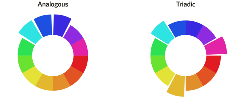
Of course, a design has to look good as well. These good looks shouldn't be determined by your taste, but rather using data and facts. The psychology of colors is a good starting point for creating the color scheme, while typographic basics help you select and use appropriate fonts. For the division of your design, you can use the theory of the golden ratio for orientation.
This will result in a visually appealing design, fully independent of individual tastes.
Featured Image geralt on Pixabay