
Design: Microinteractions Make the Difference

You think the big picture is what counts? You're right, but only as long as it differentiates itself sufficiently. Today, the small UI elements and features are far more important. Thus, microinteractions are what you should pay special attention to when designing your projects.
 Switch Animation | Eugene Cheporov[/caption]
Thus, for a few years now, interface elements with minimalistic design and integrated interactions have established themselves. Logically, skeuomorphism is limited by the limitations of the real role models, if they want to keep up the image.
More modern approaches don't underlie these conventions. Especially Google's material design leads the way. People also like to call this microexperiences, as a synonym for microinteractions.
Switch Animation | Eugene Cheporov[/caption]
Thus, for a few years now, interface elements with minimalistic design and integrated interactions have established themselves. Logically, skeuomorphism is limited by the limitations of the real role models, if they want to keep up the image.
More modern approaches don't underlie these conventions. Especially Google's material design leads the way. People also like to call this microexperiences, as a synonym for microinteractions.
 I told you. You have to look for the names to tell apart the products. (Screenshot: Noupe)[/caption]
This is not what we call innovation. From a superficial point of view, you'll be tempted to ask how I think the different providers should have made their todo apps recognizable. Sure, the answer isn't simple. But, it is no reason not to seek for it.
Differentiation can no longer happen on the level of the design basics, it seems. The microinteractions are what lets you as a designer set your product apart from others. Basically, the only way the user interacts with your product is via microinteractions.
The more convincing they are, the more fluid the usage feels, which increases the chance of the user enjoying using your product. A single well-done interaction is capable of deciding the battle between product A and product B, which is key to surviving amongst millions of rival apps, and a lot more competing websites.
[caption id="attachment_104171" align="aligncenter" width="800"]
I told you. You have to look for the names to tell apart the products. (Screenshot: Noupe)[/caption]
This is not what we call innovation. From a superficial point of view, you'll be tempted to ask how I think the different providers should have made their todo apps recognizable. Sure, the answer isn't simple. But, it is no reason not to seek for it.
Differentiation can no longer happen on the level of the design basics, it seems. The microinteractions are what lets you as a designer set your product apart from others. Basically, the only way the user interacts with your product is via microinteractions.
The more convincing they are, the more fluid the usage feels, which increases the chance of the user enjoying using your product. A single well-done interaction is capable of deciding the battle between product A and product B, which is key to surviving amongst millions of rival apps, and a lot more competing websites.
[caption id="attachment_104171" align="aligncenter" width="800"] Download Button | Alex Pronsky[/caption]
The perishing of old design patterns frees you, and lets you make use of the options of modern technologies. With microinteractions, it is always important to not just provide the user with a clear trigger, such as an obvious button or slider.
Instead, you have to make sure that the user receives a clear feedback. This has to reliably inform the user regarding success, failure, or the duration of the action.
[caption id="attachment_104170" align="aligncenter" width="800"]
Download Button | Alex Pronsky[/caption]
The perishing of old design patterns frees you, and lets you make use of the options of modern technologies. With microinteractions, it is always important to not just provide the user with a clear trigger, such as an obvious button or slider.
Instead, you have to make sure that the user receives a clear feedback. This has to reliably inform the user regarding success, failure, or the duration of the action.
[caption id="attachment_104170" align="aligncenter" width="800"] Progress Circle | Leo Zakour[/caption]
Here, usage of motion in the element, meaning the integration of small animations, has been proven to be successful. In the guidelines for Material Design, you'll find detailed tips on the topic. But, especially when using animations, it is important to be careful. Something that may be perceived as a nice surprise the first time can seem boring or even annoying when the users encounter it the tenth time.
[caption id="attachment_104169" align="aligncenter" width="800"]
Progress Circle | Leo Zakour[/caption]
Here, usage of motion in the element, meaning the integration of small animations, has been proven to be successful. In the guidelines for Material Design, you'll find detailed tips on the topic. But, especially when using animations, it is important to be careful. Something that may be perceived as a nice surprise the first time can seem boring or even annoying when the users encounter it the tenth time.
[caption id="attachment_104169" align="aligncenter" width="800"]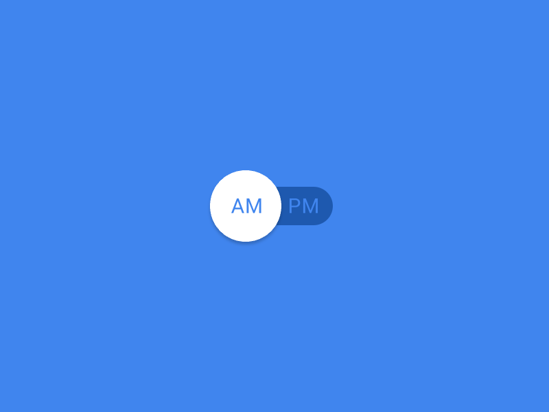 Fluid Switch | Leo Zakour[/caption]
When creating animations, it is important to make them as short as possible. Google recommends not exceeding 400 milliseconds. The animation mustn't cause a delay when using your interface. Delays in the seconds would be too long and make the product seem slow.
[caption id="attachment_104168" align="aligncenter" width="800"]
Fluid Switch | Leo Zakour[/caption]
When creating animations, it is important to make them as short as possible. Google recommends not exceeding 400 milliseconds. The animation mustn't cause a delay when using your interface. Delays in the seconds would be too long and make the product seem slow.
[caption id="attachment_104168" align="aligncenter" width="800"]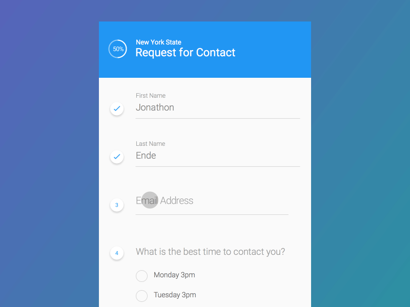 Form Flow | Leo Zakour[/caption]
Once you've made sure that the user gets a clear feedback after using a microinteraction, it is time for the next step. You have to judge whether the microinteraction will be one that the user will use repeatedly.
If yes, you need to consider whether the first usage makes it necessary to make changes for repeated usage. For instance, you could turn the button "buy" next to the purchased product into the button "buy again" after the purchase, handing out important information to the user on the go.
When developing the microinteraction, it is also important to only display what's really necessary to complete the task up next. Surely, you can add a bit of humor to your animations, if you use it very conservatively. However, I only recommend this for animations that the user doesn't see all the time. Don't put a funny play button into your music app.
Even if it's a good one, every joke is only funny once. With microinteractions, however, users are exposed to the same element hundreds or thousands of times. It's better not to annoy the users. The best microinteraction is so subtle that it is not even recognized as one, and just treated as a natural component.
Of course, you mustn't forget about the general principles, even when designing microinteractions. Which designer hasn't heard of Don't Make Me Think? All UI elements have to exist in context to each other, and, at least in this context, need to be self-explanatory.
The color scheme has to be homogenous, as well as the typography. Texts need to be worded in a comprehensible, simple language. But you know all of this already.
If you want to learn more about microinteractions, you should visit Dan Saffer's website Microinteractions - Designing with Details.
Featured image by RÜ?TÜ BOZKU? from Pixabay
(The article was initially written in the German language by our author Dieter Petereit for our sister magazine Dr. Web.)
Form Flow | Leo Zakour[/caption]
Once you've made sure that the user gets a clear feedback after using a microinteraction, it is time for the next step. You have to judge whether the microinteraction will be one that the user will use repeatedly.
If yes, you need to consider whether the first usage makes it necessary to make changes for repeated usage. For instance, you could turn the button "buy" next to the purchased product into the button "buy again" after the purchase, handing out important information to the user on the go.
When developing the microinteraction, it is also important to only display what's really necessary to complete the task up next. Surely, you can add a bit of humor to your animations, if you use it very conservatively. However, I only recommend this for animations that the user doesn't see all the time. Don't put a funny play button into your music app.
Even if it's a good one, every joke is only funny once. With microinteractions, however, users are exposed to the same element hundreds or thousands of times. It's better not to annoy the users. The best microinteraction is so subtle that it is not even recognized as one, and just treated as a natural component.
Of course, you mustn't forget about the general principles, even when designing microinteractions. Which designer hasn't heard of Don't Make Me Think? All UI elements have to exist in context to each other, and, at least in this context, need to be self-explanatory.
The color scheme has to be homogenous, as well as the typography. Texts need to be worded in a comprehensible, simple language. But you know all of this already.
If you want to learn more about microinteractions, you should visit Dan Saffer's website Microinteractions - Designing with Details.
Featured image by RÜ?TÜ BOZKU? from Pixabay
(The article was initially written in the German language by our author Dieter Petereit for our sister magazine Dr. Web.)
What Are Microinteractions?
Microinteractions define the actual human-machine interface. If you turn off your alarm or lock and unlock your car, flush the toilet, or turn the light off and on - all of these are microinteractions. With these examples, you can already see that all of them are short actions with major significance regarding the respective user experience (in one of the example cases even affecting the user experience of following users). Calling microinteractions the most important elements in product design is not an exaggeration. The main advantages of successful microinteractions are obvious. Microinteractions, especially when combined with small animations, can convey the impression that the digital product behaves very similarly to an analog product. This can be accomplished via immediate feedback, like the effect of clicking a button, pulling a slider, or showing a rotating spinner during a download, or a shopping cart filling after clicking on buy. Targeted use of immediate feedback avoids user mistakes since you have access to much better controls of the click paths via visual support. Psychologically speaking, the product reacting to the user has a positive effect. Who doesn't like recognition for his actions?Microinteractions 1.0: Skeuomorphism as a Design Principle
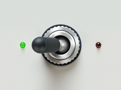
In the past, designers liked relying on skeuomorphism, which are very detailed recreations taken from the real life, when designing interactions. Some designers went ahead and even imitated a real example to make sure that the user won't struggle with using it. The problem with skeuomorphism is their high taste and culture dependency. Additionally, too exact copies get boring very fast. [caption id="attachment_104172" align="aligncenter" width="400"] Switch Animation | Eugene Cheporov[/caption]
Thus, for a few years now, interface elements with minimalistic design and integrated interactions have established themselves. Logically, skeuomorphism is limited by the limitations of the real role models, if they want to keep up the image.
More modern approaches don't underlie these conventions. Especially Google's material design leads the way. People also like to call this microexperiences, as a synonym for microinteractions.
Microinteractions 2.0: Use the Modern Options
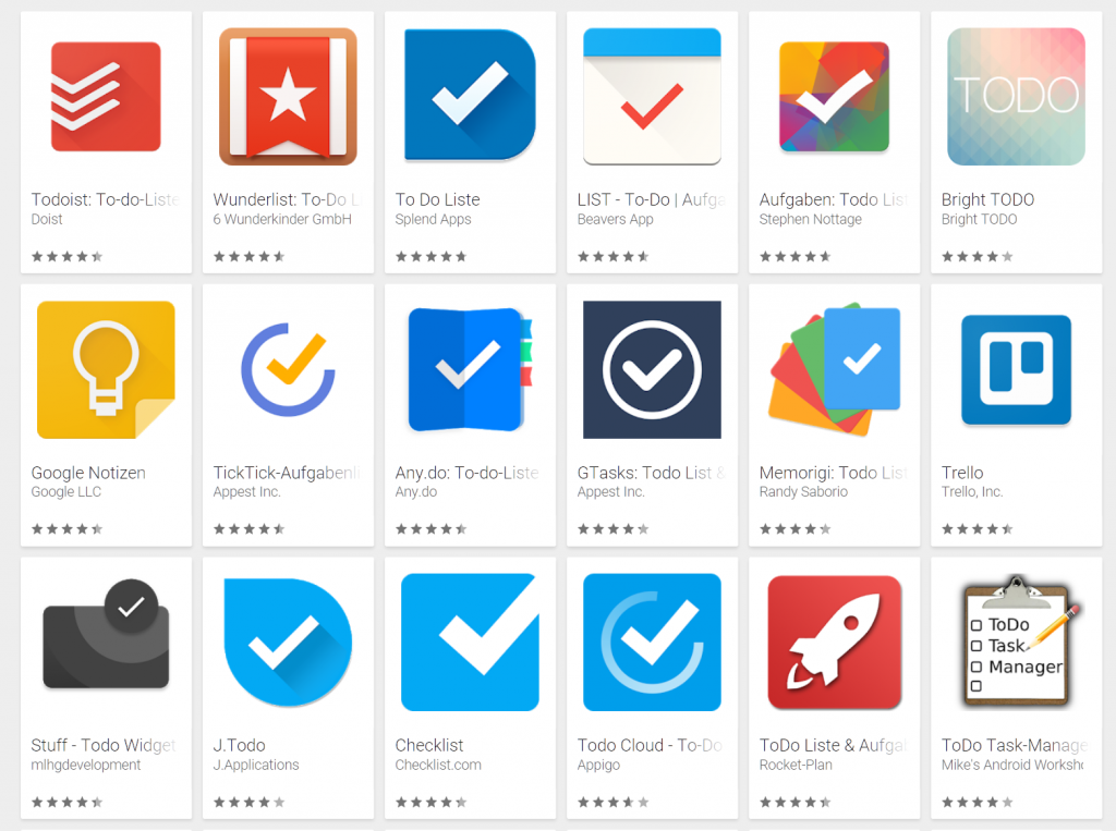
Nowadays, after ten+ smartphone years, designing elements that let the user relate to the analog world is not as relevant anymore. The digital aspect has been established in our everyday lives and does not need an explanation via wood hammer methods. Nonetheless, the significance of microinteractions is rising constantly. The reason is simple. Due to a consistent design language, digital products are getting more and more similar. Some products can only be told apart from each other if you specifically look for the name. Here's an excerpt from the search result when searching for the category "todo" in the Google Play Store: [caption id="attachment_104173" align="aligncenter" width="1024"] I told you. You have to look for the names to tell apart the products. (Screenshot: Noupe)[/caption]
This is not what we call innovation. From a superficial point of view, you'll be tempted to ask how I think the different providers should have made their todo apps recognizable. Sure, the answer isn't simple. But, it is no reason not to seek for it.
Differentiation can no longer happen on the level of the design basics, it seems. The microinteractions are what lets you as a designer set your product apart from others. Basically, the only way the user interacts with your product is via microinteractions.
The more convincing they are, the more fluid the usage feels, which increases the chance of the user enjoying using your product. A single well-done interaction is capable of deciding the battle between product A and product B, which is key to surviving amongst millions of rival apps, and a lot more competing websites.
[caption id="attachment_104171" align="aligncenter" width="800"] Download Button | Alex Pronsky[/caption]
The perishing of old design patterns frees you, and lets you make use of the options of modern technologies. With microinteractions, it is always important to not just provide the user with a clear trigger, such as an obvious button or slider.
Instead, you have to make sure that the user receives a clear feedback. This has to reliably inform the user regarding success, failure, or the duration of the action.
[caption id="attachment_104170" align="aligncenter" width="800"] Progress Circle | Leo Zakour[/caption]
Here, usage of motion in the element, meaning the integration of small animations, has been proven to be successful. In the guidelines for Material Design, you'll find detailed tips on the topic. But, especially when using animations, it is important to be careful. Something that may be perceived as a nice surprise the first time can seem boring or even annoying when the users encounter it the tenth time.
[caption id="attachment_104169" align="aligncenter" width="800"] Fluid Switch | Leo Zakour[/caption]
When creating animations, it is important to make them as short as possible. Google recommends not exceeding 400 milliseconds. The animation mustn't cause a delay when using your interface. Delays in the seconds would be too long and make the product seem slow.
[caption id="attachment_104168" align="aligncenter" width="800"] Form Flow | Leo Zakour[/caption]
Once you've made sure that the user gets a clear feedback after using a microinteraction, it is time for the next step. You have to judge whether the microinteraction will be one that the user will use repeatedly.
If yes, you need to consider whether the first usage makes it necessary to make changes for repeated usage. For instance, you could turn the button "buy" next to the purchased product into the button "buy again" after the purchase, handing out important information to the user on the go.
When developing the microinteraction, it is also important to only display what's really necessary to complete the task up next. Surely, you can add a bit of humor to your animations, if you use it very conservatively. However, I only recommend this for animations that the user doesn't see all the time. Don't put a funny play button into your music app.
Even if it's a good one, every joke is only funny once. With microinteractions, however, users are exposed to the same element hundreds or thousands of times. It's better not to annoy the users. The best microinteraction is so subtle that it is not even recognized as one, and just treated as a natural component.
Of course, you mustn't forget about the general principles, even when designing microinteractions. Which designer hasn't heard of Don't Make Me Think? All UI elements have to exist in context to each other, and, at least in this context, need to be self-explanatory.
The color scheme has to be homogenous, as well as the typography. Texts need to be worded in a comprehensible, simple language. But you know all of this already.
If you want to learn more about microinteractions, you should visit Dan Saffer's website Microinteractions - Designing with Details.
Featured image by RÜ?TÜ BOZKU? from Pixabay
(The article was initially written in the German language by our author Dieter Petereit for our sister magazine Dr. Web.)
Very interesting read. I think Google’s MDL is a great resource for this as well.