
Flexbox: How to Create a Responsive Comment Section with HTML5 and CSS3
Very often, when you surf the web, it is likely that you may have noticed how responsive comment sections are more and more becoming a common thing. These are mainly a lot more popular in blogs and some sites that belong to the social media bracket. Here, we shall take a look into how one can easily construct such a responsive comment section with the help of Flexbox, which is a new layout model in CSS3.
What is Flexbox?
Simply put, Flexbox is basically a new method for building powerful layouts, which can make many challenging areas of web development seem rather easy. Almost every browser that is largely used at present is known to support it, so it can be a good way to develop your front-end work.Now that we know what Flexbox is, let us also see a few important parts that it is comprised of. This will enable you to implement powerful features in a manner that serves your needs.
Flexbox CSS Properties We Shall Implement
There are quite a few CSS properties that we are going to be using in our quest to develop a responsive comment section.
display: flex
This is a feature that is responsible for the activation of the flex layout and also makes the element, with its categories, follow Flexbox rules.
justify-content
Just like text is aligned, this property ascertains the alignment of the elements under Flexbox’s rules.
order
This particular property allows one to position elements accordingly to where they need to be displayed. This is used for switching text and photo in the comment section.
flex-wrap
It helps in the wrapping of elements that are within the flex element. This feature has use in small screens where avatars are displayed below the comment text.
Layout of the Comment Section
The layout of the comment section shall have:
- a comment body, with name, time and the avatar.
- two types of comments – one for the author, which shall bear one particular color, and another for other comments.
- for both types of comments, the HTML markup needs to be as similar as possible. This will permit easy generation of comments via code.
- the entire section needs to be completely responsive.
Taking on the HTML Code
The HTML portion is pretty simple. It will have a list of comments, with the option to write new comments (a basic form) at the end.
Listing 1: HTML Code
<ul class="comment-section">
	<li class="comments user_comments">
 		<div class="information">
 		<a href="#">Anita Boston</a>
      	<span>7 hours ago</span>
       </div>
      	<a class="avatar" href="#">
      	<img src="images/avataruser_one.jpg" width="30" alt="Profile Avatar" title="Anita Boston" />
		</a>
     	<p>I think this shall work.</p>
  	</li>
  	<li class="comments author_comments">
       <div class="information">
      	<a href="#">Jackie Sharp</a>
      	<span>5 hours ago</span>
     	</div>
     	<a class="avatar" href="#">
      	<img src="images/avatarauthor.jpg" width="30" alt="Profile Avatar" title="Jackie Sharp" />
		</a>
      	<p>Sure enough! With a little bit of effort, everything is possible.</p>
    </li>
<!—Add more comments in this section-->
	<li class="write_new">
       <form action="#" method="post">
       <textarea placeholder="Please add your comment here" name="comments"></textarea>
		<div>
    	<img src="images/avataruser_two.jpg" width="30" alt="Profile Brad Jonas" title="Brad Jonas" />
		<button type="submit">Submit</button>
       </div>
       </form>
    </li>
</ul>
Now, if you have carefully looked into the HTML portion of the code, you will notice that both types of comments are basically the same, except that they have different class names. The stylistic aspect, as such, shall be applied with the help of CSS.
CSS Part of the Code
The first step here is to use display: flex, as that’ll bring all comments under it and allow us to implement Flexbox features.
.comments{
  display: flex;
}
After this, the next step is to have the elements in the container in the reverse order. Here, the message will come first, followed by the avatar and then the comment. We use the order property to apply this.
.comments.author_comments .information{
  order: 3;
  }

.comments.author_comments .avatar{
  order: 2;
  }

.comments.author_commentsp{
  order: 1;
}
Now that we have implemented the comment section, there is still one little task to do. This certainly is the readjustment to the comment section for narrow screens or small devices.
With the help of a media query, we shall expand the comments paragraph, so that it takes up the entire width of the container. The user information, along with the avatar moves to the next line, as comments have the flex-wrap property set up for wrap.
Listing 2:CSS for small devices
@media (max-width: 700px){
  /* Reversing order of elements in user comments,
  such that avatar and information appear after text. */

  .comments.user_comments .information{
    order: 3;
    }

  .comments.user_comments .avatar{
   order: 2;
   }

  .comments.user_commentsp{
   order: 1;
   }

  /* Making the paragraph in the comments utilize up the entire width,
  making avatar and user information wrap to next line*/

  .comments p{
    width: 100%;
    }

  /* Aligning towards the beginning of the container (i.e. towards the left)
  all elements inside author comments. */

  .comments.author_comments{
   justify-content: flex-start;
   }
   }
Following is the output of the application. It shows how the users can comment through the application built using Flexbox.
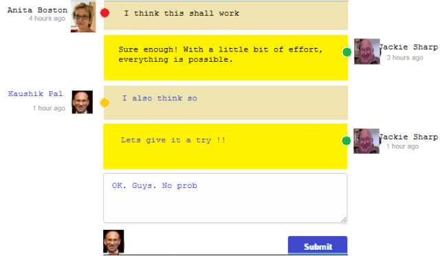
Output of the Comment Window
Conclusion
Our little tutorial explains how you can easily implement Flexbox for the development of responsive comments layout. The use of Flexbox makes its development easy, which otherwise can seem to be difficult.
This article is provided by VoucherBin.
wow