
Google Web Fundamentals: Free Handbook for Multi-Device Web Design in the Making
A few days ago, Google released a beta version of a stylish and comprehensive new online handbook for web designers and developers to the public. The project is a work in progress and will lead to a more polished version 1.0 in June. Yet, you shouldn't wait until then, as Web Fundamentals is a fine collection of best practices in multi-device, responsive design just now. Work on the handbook is coordinated via Github, while the product itself has its own shiny website - a best practice example in itself...
[caption id="attachment_82007" align="alignleft" width="550"]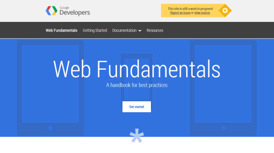 Google Web Fundamentals: Landing Page[/caption]
Web Fundamentals: From The Ground Up
Google's latest developer support project's name actually is an understatement. It goes beyond the fundamentals and his built with growth in mind. If you are fairly new to designing for mobile devices, the "Getting Started" guide is able to do wonders to your skill level. If you have already built mobile websites and are familiar to vocabulary such as viewport and breakpoint, probably that part of Google's online handbook won't help you evolve.
[caption id="attachment_82006" align="alignleft" width="550"]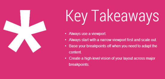 Google Web Fundamentals: Key Takeaways[/caption]
Anyway, let's not turn away from the very fundamentals too quickly. I like the way Google built the Getting Started section. It is very comprehensive, with good examples, clean code and helpers such as summaries, called the Key Takeaways or Notes with important information to recollect.
[caption id="attachment_82008" align="alignleft" width="550"]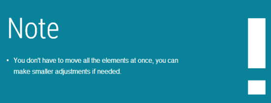 Google Web Fundamentals: Note[/caption]
Images of the work in process as well as of the finished product help you get a hold of what you are working on.
[caption id="attachment_82004" align="alignleft" width="550"]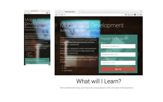 Google Web Fundamentals: Finished Example[/caption]
Having thoroughly worked through the initial two lessons, you are equipped with the most vital basics and ready to move on to the actual handbook itself.
Web Fundamentals Handbook: Four Topics, Ten Guides
The handbook itself consists of four main topics with ten guides altogether, at the time of this writing. The topic sections are designed to grow, so I guess, we will see more guides added in the near future.
[caption id="attachment_82005" align="alignleft" width="550"]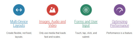 Google Web Fundamentals: Topics[/caption]
The first topic covers "Multi-Device Layouts" and offers guides on responsive web design and action patterns. The second topic named "Forms and User Input" explains the design of form elements and the addition of touch functionality. The very interesting "Images, Audio and Video" covers all aspects of adding media assets to responsive websites. And the last topic focuses on the optimization of "Performance".
A section with more resources, such as the Visual Style Guide used for the project page itself, helps you get to speed on real life examples quickly.
Over at Github, the discussion to improve the handbook have already started. Anyone can submit a pull request. Just as we know it from Google, this developer guide is a fine piece of work and will help designers and developers worldwide to improve on their mobile skills. Make sure to add that bookmark to your toolbox, too.
Related Links
- Google Web Fundamentals | The Handbook
- Google Web Fundamentals | Github Repository