
Gutenberg: Web Typography for Everyone
Gutenberg is a starter kit for better web typography. Its developer Matej Latin provides an easy way of creating prettier content that is easier to read. This is mainly achieved by a consequent orientation of all contents towards a baseline which is defined depending on the text size.
 Gutenberg was made based on Sass. This allows you to work with Mixins and thus create flexibility for your designs which wouldn't be possible without using variables.
Gutenberg is distributed under Creative Commons 3.0. That means you have to mention the originator if you use it. Additionally, altered or extended versions of the project have to be provided under the same conditions. Basically, you're not allowed to take Gutenberg and create a product that you want to sell on this base. You can still use Gutenberg in commercial, and customer websites, however.
Gutenberg was made based on Sass. This allows you to work with Mixins and thus create flexibility for your designs which wouldn't be possible without using variables.
Gutenberg is distributed under Creative Commons 3.0. That means you have to mention the originator if you use it. Additionally, altered or extended versions of the project have to be provided under the same conditions. Basically, you're not allowed to take Gutenberg and create a product that you want to sell on this base. You can still use Gutenberg in commercial, and customer websites, however.
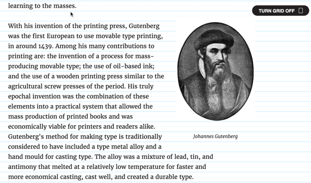 In the top right of the project site, but also in the two examples, you'll find a switch that makes the grid visible.
By the way: A while ago, we've presented a project called Baseline JS, which aims in a similar direction, but uses JavaScript instead. If you never dealt with this topic before, you'll surely be interested in our typography crash course.
(dpe)
In the top right of the project site, but also in the two examples, you'll find a switch that makes the grid visible.
By the way: A while ago, we've presented a project called Baseline JS, which aims in a similar direction, but uses JavaScript instead. If you never dealt with this topic before, you'll surely be interested in our typography crash course.
(dpe)
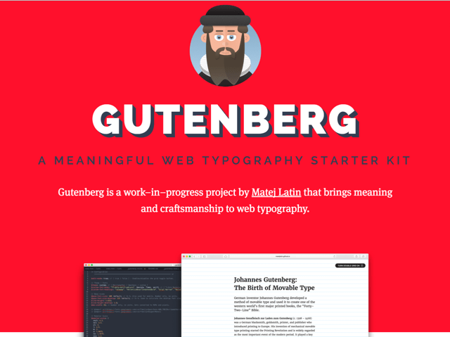
Gutenberg's Web Typography is Handsome
Good typography is a rare sight on the web. Of course, if you see an accordingly designed website, you'll be able to see the thought put into placement, equal gaps, overall the thought put into the entire project. But even websites that were not created considering the typographic aspect generally work. Thus, I can understand when a designer decides not to put in that extra work. The new typography starter kit Gutenberg by Matej Latin is designed to follow basic typographic rules without requiring additional effort. At the time, Gutenberg only offers the absolute basics for one-column layouts. However, Matej is working on extensions for a table layout and side comments already.
Gutenberg was made based on Sass. This allows you to work with Mixins and thus create flexibility for your designs which wouldn't be possible without using variables.
Gutenberg is distributed under Creative Commons 3.0. That means you have to mention the originator if you use it. Additionally, altered or extended versions of the project have to be provided under the same conditions. Basically, you're not allowed to take Gutenberg and create a product that you want to sell on this base. You can still use Gutenberg in commercial, and customer websites, however.
Gutenberg: How to
Gutenberg "calculates" how to set the page elements according to the two base values of text size and line gap. The multiplication of both values determines the so-called$leading which is the actual base for the grid in which the content is fitted.
$base-font-size: 100; // Converts to 16px
$line-height: 1.6;
$leading: $base-font-size * $line-height;
Thanks to Sass being used, you can further calculate with the value for $leading, and determine other automatically fitting values, for example for h2:
h2 {
  margin-top: #{2.5 * $leading + 'px'};
  line-height: #{1.5 * $leading + 'px'};
}
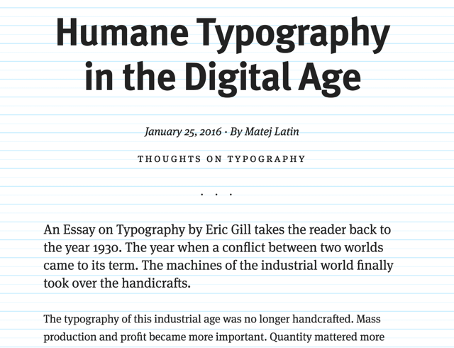
To get you going quickly, Matej gives out two "themes" that work on the base of the Google fonts Merriweather and Open Sans and thus lead to the right results. You can, however, also choose the option custom to realize your own ideas.
If you want to get an impression of the looks of the themes first, Matej has prepared two articles for that. Click on the respective image to access the according article:
In the top right of the project site, but also in the two examples, you'll find a switch that makes the grid visible.
By the way: A while ago, we've presented a project called Baseline JS, which aims in a similar direction, but uses JavaScript instead. If you never dealt with this topic before, you'll surely be interested in our typography crash course.
(dpe)