
Hixle: UI-Design Dissected
Design is not only about taste. Good design can be constructed, not just invented. The new service Hixle helps you do that.
 Hixle: Landing Page[/caption]
As of right now, Hixle is a small but neat project, based on a WordPress installation, and it is curated manually. Hixle's creator, the London-based product designer Balraj Chana, plans to make the project open to designers, allowing the portfolio to expand faster. Of course, Design is always a question of taste, too. In that aspect, not everyone will agree with Chana's selection.
Currently, Hixle offers different approaches to get the desired inspiration. Access displays of entire projects from the landing page. After clicking one of the thumbnails, a modal window with detailed information on the project pops up. The information includes the used fonts, and tools, as long as Chana can make it available. He mainly relies on source code analyses for that. The dominant colors, for example, are extracted from the CSS.
[caption id="attachment_103102" align="alignnone" width="1024"]
Hixle: Landing Page[/caption]
As of right now, Hixle is a small but neat project, based on a WordPress installation, and it is curated manually. Hixle's creator, the London-based product designer Balraj Chana, plans to make the project open to designers, allowing the portfolio to expand faster. Of course, Design is always a question of taste, too. In that aspect, not everyone will agree with Chana's selection.
Currently, Hixle offers different approaches to get the desired inspiration. Access displays of entire projects from the landing page. After clicking one of the thumbnails, a modal window with detailed information on the project pops up. The information includes the used fonts, and tools, as long as Chana can make it available. He mainly relies on source code analyses for that. The dominant colors, for example, are extracted from the CSS.
[caption id="attachment_103102" align="alignnone" width="1024"]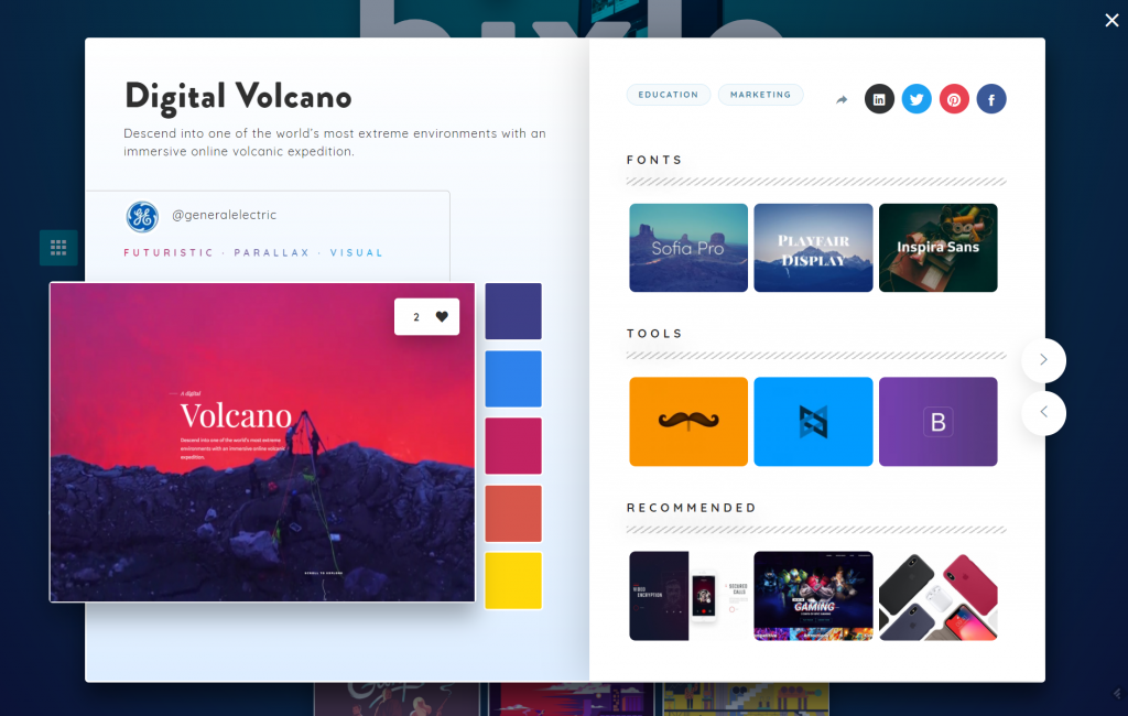 Hixle: Detailed Information[/caption]
 Hixle: Collection of Palettes, Gradients, and More.[/caption]
Every listed element can be shared via your social media channels, like Twitter, Facebook, LinkedIn, and Pinterest. An upvote system lets you make sure that your favorites get the attention you think they deserve. Participating is simple, but not for everyone. The only way to sign up is using Twitter or Facebook OAuth. The benefit: it's done super fast ;-)
Hixle: Collection of Palettes, Gradients, and More.[/caption]
Every listed element can be shared via your social media channels, like Twitter, Facebook, LinkedIn, and Pinterest. An upvote system lets you make sure that your favorites get the attention you think they deserve. Participating is simple, but not for everyone. The only way to sign up is using Twitter or Facebook OAuth. The benefit: it's done super fast ;-)
Inspiration is Not Cheap
Inspiration itself is a good thing. But, just seeing a pretty screenshot of an app or website won't actually do much for you. Inspiration wants to be fed more precisely. Which tools did the designer work with? Which fonts did he use? What kind of color gradient is this? Which dominant colors, which color palette is this design based on? Use this information to create a blueprint for you to use for your next project.Hixle Gives You Blueprints for Your Ideas
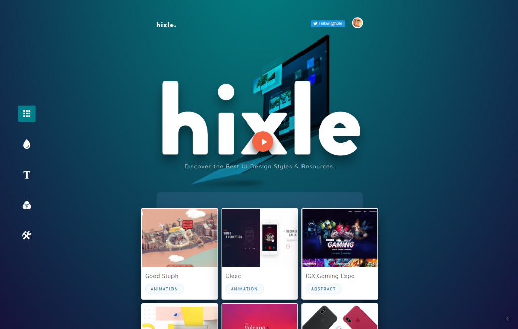
The new service Hixle provides you with help regarding just that. Thus, it's no surprise that Hixle's inventor has the goal to turn the service into some starter kit for new projects. Here, Hixle is even meant to consider cultural differences. For instance, a future search query could be: "Show me the colors most US-Americans associate with joy and satisfaction. There's no denying that this would be a great thing. [caption id="attachment_103103" align="alignnone" width="1024"] Hixle: Landing Page[/caption]
As of right now, Hixle is a small but neat project, based on a WordPress installation, and it is curated manually. Hixle's creator, the London-based product designer Balraj Chana, plans to make the project open to designers, allowing the portfolio to expand faster. Of course, Design is always a question of taste, too. In that aspect, not everyone will agree with Chana's selection.
Currently, Hixle offers different approaches to get the desired inspiration. Access displays of entire projects from the landing page. After clicking one of the thumbnails, a modal window with detailed information on the project pops up. The information includes the used fonts, and tools, as long as Chana can make it available. He mainly relies on source code analyses for that. The dominant colors, for example, are extracted from the CSS.
[caption id="attachment_103102" align="alignnone" width="1024"] Hixle: Detailed Information[/caption]
Palettes, Gradients, Fonts, and Tools for Your Next Project
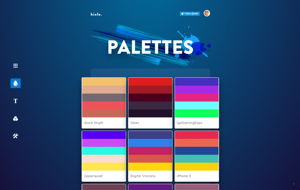
Aside from this rather global approach, Hixle also provides direct access to palettes, gradients, fonts, and tools. The way of accessing them is always the same. All elements are visualized as a grid. You hover over this grid and click one of the elements that you're interested in, opening a modal window with further details. Here, you'll find out the hex values of the color palettes and gradients, which you won't see in the project overview. Access the source of the respective tool, font, etc. from the modal. [caption id="attachment_103101" align="alignnone" width="1024"] Hixle: Collection of Palettes, Gradients, and More.[/caption]
Every listed element can be shared via your social media channels, like Twitter, Facebook, LinkedIn, and Pinterest. An upvote system lets you make sure that your favorites get the attention you think they deserve. Participating is simple, but not for everyone. The only way to sign up is using Twitter or Facebook OAuth. The benefit: it's done super fast ;-)