
How to Design a Stellar UX for Long-form Articles

After putting in multiple hours on researching, outlining, writing, and editing the first draft of your article, you’re eager to press the publish button. You want to share it with your audience, and earn some appreciation.
But guess what?
Your audience won’t bother reading your article unless they find its packaging appealing. You need to ensure a robust user experience (UX) on your website for your prospective visitors.
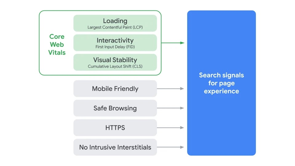
For one, Google is rolling out a page experience update factoring the metrics below in its algorithm starting May 2021.
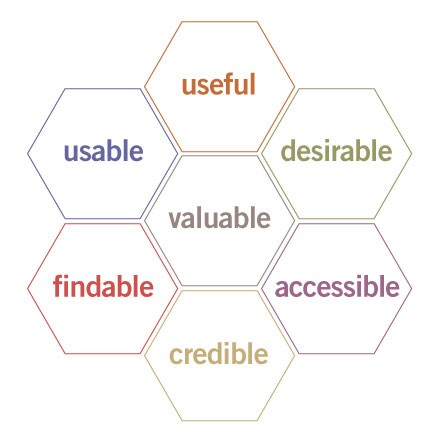
But page experience is merely a subset of overall UX. You can think of it in the form of the honeycomb by Semantic Studios below:
A sophisticated design establishes your brand’s credibility and makes it more likely for a user to return to your website. Called “preconscious judgments”, these aesthetical cues happen even “before any reading or other cognitive processes.” Here are some of the UX elements you need to take care of for your long form content pieces:
Keep your website technically robust
Let’s look at the basic technical operations where your website mustn’t falter.
No dead clicks and errors
Is the navigational menu at the top of your article responding properly on clicking? Is your email opt-in form free of errors? The mismatch of expectations results in a frustrating experience for users.
You can monitor some of these errors through Google Analytics but it helps to get some feedback from users every time you implement changes on your site.
Now, if you mess with the URLs while moving around your website’s pages, then you can end up creating a lot of 404 errors. Besides fixing these errors, you can also get creative and use a customized 404 page to re-engage a visitor.

Enough of those intrusive interstitials
When Interstitials obstruct content on a page, Google can penalize a site for making their content difficult to access.
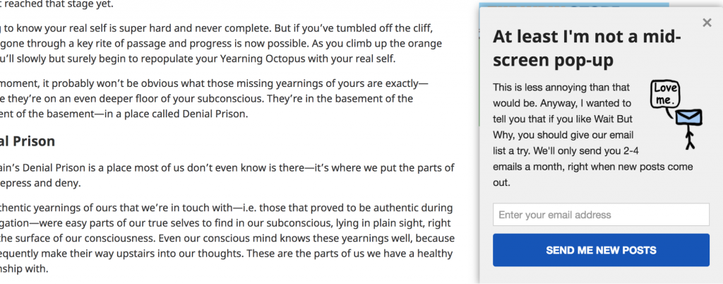
Go ahead, and minimize the usage of other aggressive tactics, such as those popup opt-in forms. Wait But Why is one of the internet’s favorite places for 10,000-word articles. They boast an email list of 615,000+ humans. But besides the sidebar opt-in form, they only use the following humorous “scroll bar” that appears after you engage with their articles for a bit:
You can also attempt other locations and less intrusive kinds of opt ins like a floating bar.
Keep it safe and mobile-friendly
Security and privacy have become increasingly important for consumers today. Google already uses HTTPS as a ranking signal. So ensure that your site uses secure, encrypted connections. Let’s Encrypt allows you to create a free SSL certificate for your site:
Given that mobile-traffic is approximately equivalent to half of the total web traffic, having a mobile-friendly website for your business is a no-brainer. If you’re using WordPress (or any other modern CMS), you typically have numerous responsive theme options to choose from.
Take the mobile-friendly test to identify pages that are not responsive. Then use the Noupe tutorials and mobile web design tips here to fix those pages.
Choose big and readable font combinations
Small font sizes and low contrast between the text and the background are among the most common legibility problems for web users.
What font sizes and combinations should you choose? Well, here are a few tips to help you:
- Each font has a character and impacts the viewer’s emotional state. You can get creative while choosing fonts aiming to show your brand personality, but readability comes first.
- Generally, bigger font sizes help speed and comprehension of text and improve your readability. With long-form articles containing a lot of text, it makes sense to test 12-point size for body copy and even bigger sizes for headlines.
- If you’re targeting 40+ men with visual impairments, your font selection and size needs more care. Older adults prefer 14-point fonts.
- As per psychographics of reading, an increase in line spacing to 1.5 can help the reading speed and comprehension.
- High contrast between your text and the background aids readability.
- Research and choose font pairings that seem to “belong to each other”, find the appropriate font size for your audience by running a test and noting the change in your performance.
- If your fonts don’t specifically draw any attention of the readers, they are likely doing a decent job.
Embrace whitespace
If you cram your blog with a colorful sidebar, five fancy fonts, and lousy color combinations, you set yourself up for failure. Instead, provide breathing space for your audience. Take inspiration from the good folks at Medium (where the optimal reading is around 7 minutes --- which can mean a long-form article of up to 2000 words).
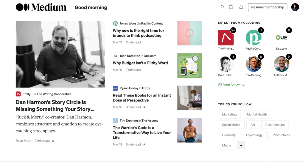
On Medium, you always get a slick and distraction-free reading experience. So use some more of that white space, will you?
Break down the article into easily scannable and readable chunks
Web users are habitual of scanning and skimming the content --- only 16% of users read word-for-word. So your long-form article faces an upheaval battle for attention. Here’s how you can aid the scanning behavior:
Use short sentences, paragraphs, and subheadings
Breaking your article down into easily digestible chunks of easily understandable sentences and paragraphs saves effort for the readers. Top it up with meaningful subheadings that coherently organize your ideas and make for a seamless reading experience.
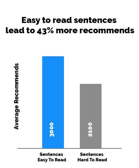
A Medium study found that easy-to-read sentences helped an article get more recommendations on the platform.
Indeed you can use an app like Hemingway to ensure an eighth grade (or below) reading level for your articles --- unless you work in a specialized industry where jargon is essential. It makes your article accessible to a wider audience and can lead to a higher engagement.

Leverage special elements
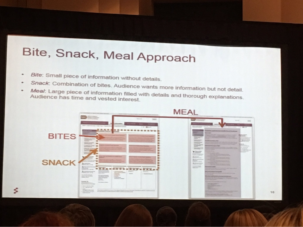
Can your article use a special summary box, a “pro and cons” table, a quote pull out, or the like? Generally, such elements provide the most important information from the article to the user. If they are interested, they can continue to read from there.
For example, in my article discussing top online course software at Elite Content Marketer, I’ve discussed fifteen of these platforms. But I’ve used a summary of the top three in a table as visible below:
These elements are to help you take the bite, snack, meal approach in your long-form article:
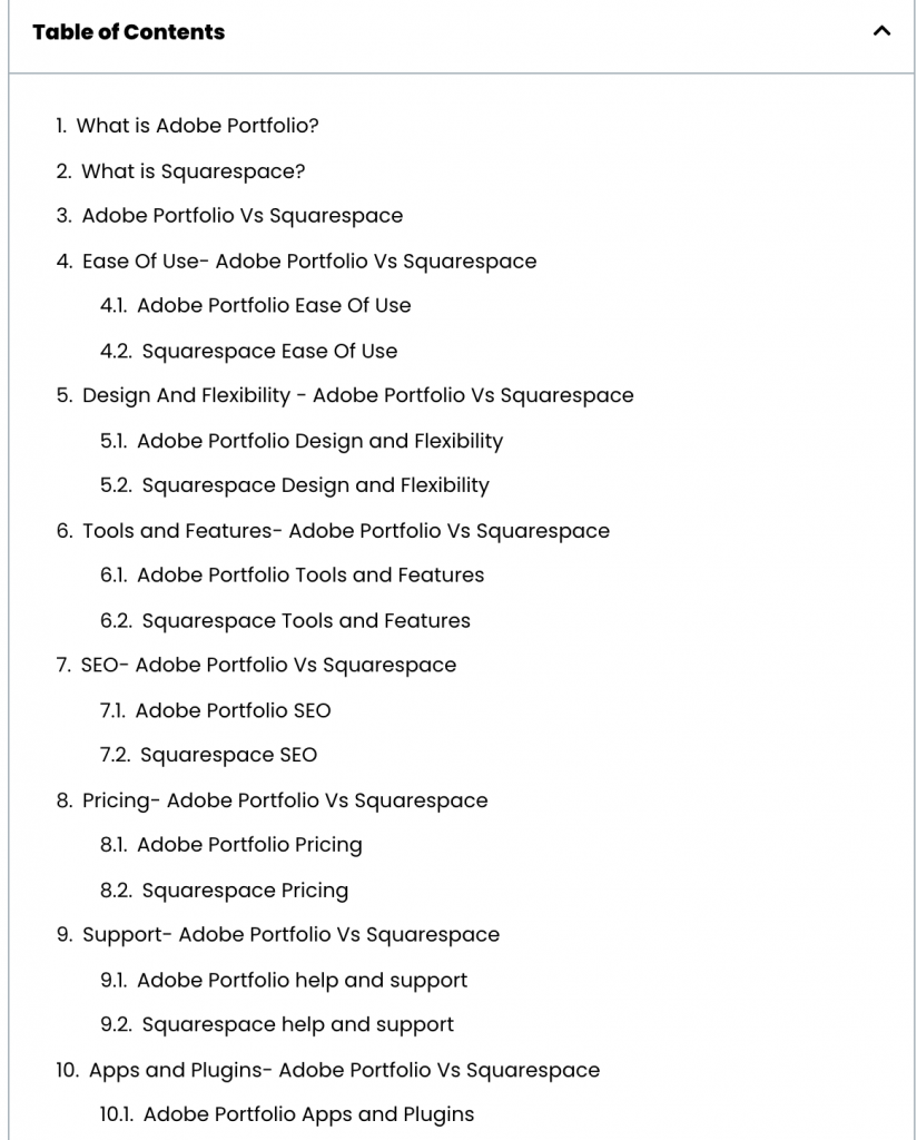
Help readers navigate through a table of contents
In longer articles, most readers would like to read a section relevant to them right now and walk away from your site. You should help users do that by using a table of contents (TOC) at the top of your article. Here’s an example from an article at The Creatives Hour:
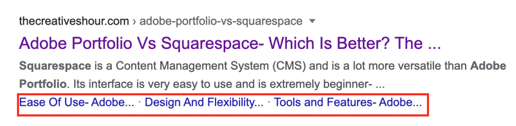
Indeed such a TOC can result in snagging additional sitelinks in SERPs for your article. It increases your CTR for the organic listing and makes your long-form article more accessible:
Integrate multimedia
Visuals can increase the retention of information from 10% to 65%. Further, adding images in your articles at regular intervals is considered an SEO best practice — given they are relevant to the subject matter of the article. Here’s a video discussing SEO for Google Images:
Similarly, videos relevant to your articles (like the one above) could engage readers for a longer time as they are easier to consume than text alone.
Include a progress bar
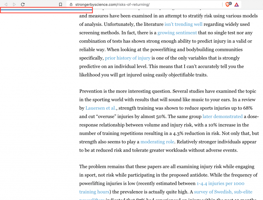
Using a progress bar is a handy feature that sets expectations on the amount of time required for reading an article. You can use a horizontal thin line indicator like Stronger by Science does below:
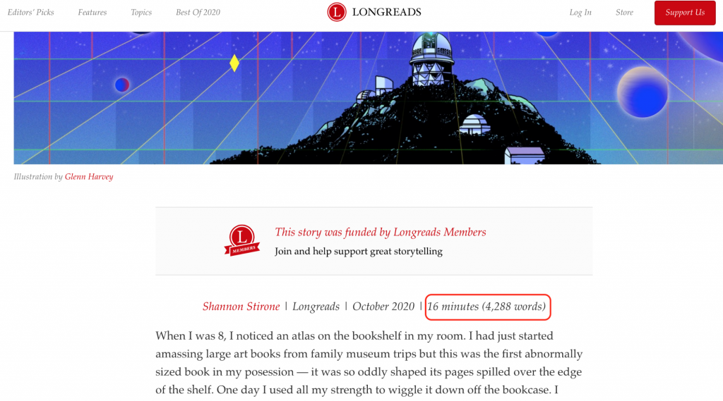
Or you could even mention an estimated reading time at the top of your articles like Longreads does at the top of their articles:
Cut unnecessary elements affecting the site’s performance
Your website loading speed is an important attribute that can directly affect your conversions. It’s also a ranking factor in search. Here’s how to improve your performance:
Compress your images
Sure having an image for every 100 to 150 words is great for visual engagement. But too many images can slow down a web page. The solution is to compress images without compromising quality.
My article on podcast hosting had 31 images leading to a drop in the page’s performance. On installing the ShortPixel Image Optimizer plugin and compressing these images. I noticed a considerable improvement in its loading speed — without any noticeable drop in quality. You can use a tool such as TinyPNG if you’re not using WordPress.
Watch those video and external embed scripts
Besides images, video and other embedded scripts from third-party websites also lead to a drop in performance. You can either directly link to the videos or elements you mention in your article or use their screenshots to point them.
You can also lazy load all the iframe videos. On WordPress, these settings could be managed by a plugin such as WP Rocket.
Shift to a high-performance hosting
Ultimately, improvement in your performance won’t happen on the top of the average infrastructure — because you get what you pay for. I use WPEngine to host my site as they offer top-notch performance. What’s more? Caching, speed optimization, daily backups, and security are also taken care of in their managed hosting services.
You can learn more about improving site speed here. If you’re on WordPress, this guide could be even more helpful.
Final Thoughts
Throughout the article, I talked about Google search rankings because the main use of long-form content is getting organic traffic. But the UX implications mentioned in the article not only optimize your performance on Google but also help your bottom line. After all, a satisfied user is the most likely to convert into a paying customer.
If you want to further understand the consumer sentiment and engagement with your long-form landing pages, consider putting them through a user experience test with a session replay software (such as Hotjar and Lucky Orange). It can reveal interesting insights about your prospects.
What other tips do you have for ensuring a stellar user experience in your long-form articles? Let me know in the comments below.
Featured Image by Glenn Carstens-Peters on Unsplash