
HTML5 and CSS3: Get Your Website Ready for High-Resolution Displays

When Apple introduced a new high-resolution display - the so-called Retina display - for its iPhones, iPads, and MacBooks a couple of years ago, they ushered in a new era of display quality. On such screens, the human eye can't discern individual pixels anymore. With high-res displays being the norm rather than the exception today, you'll find more and more middle-range high-res mobile devices. Many apps are already high-res compatible, and now you can also create high-res websites using HTML5, CSS3, and JavaScript - without additional JavaScript libraries.

Double as Sharp Thanks to Double Pixel Density
Mobile devices traditionally use a default width of 320 pixels, so many mobile websites are designed to this width. High-res displays, however, come with double the pixels or even more. To prevent a website from appearing half its size on a display of double density, it will be scaled up. This works just fine with fonts and vector graphics. Bitmap-based formats like JPEG and PNG files, however, become blurred and pixelated.
Because such displays become more and more popular, providing web projects in high-res quality is an important factor for web designers and developers.
HTML5 and the srcset Property
People had been struggling for a long time to provide images for high-res displays in HTML5. The srcset attribute has become the method of choice. It allows you to define multiple file sources for different pixel densities. The pixel density is defined separately with a space following the referenced image, for example, "2x" for double pixel density.
<img srcset="image.jpg, [email protected] 2x" src="image.jpg" width="320" height="160" alt="" />
In the example above, two files are defined via srcset. The first one is used for devices of standard pixel density. For standard pixel densities you can leave the value "1x" out. It is followed by a file for displays of double pixel density. The src attribute should be used as a fallback for older browsers. Also, reference the "normal" image here.
[caption id="attachment_90428" align="alignnone" width="550"]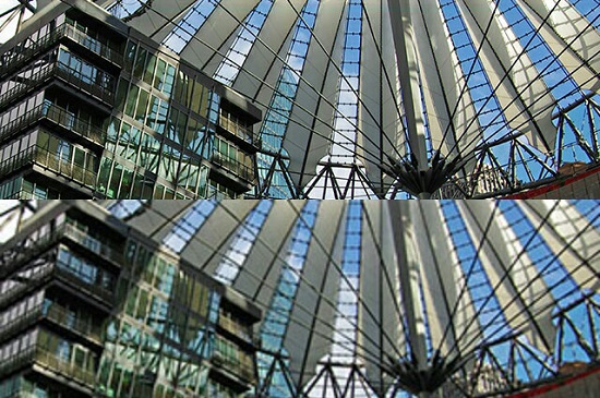 Comparison of two images on a high-res display: double pixel density (upper) and standard pixel density (lower)[/caption]
You can also add the physical width and height of an image to the appropriate file source within the srcset attribute rather than defining the pixel density.
<img srcset="image-320w.jpg 320w, image-640w.jpg 640w" src="image-640w.jpg" alt="" />
If you choose to go for the latter option, the image will be scaled to the browser's/window's width - if you don't use height or width attributes. The browser selects the appropriate file for the device. If your device has a screen width of up to 320 pixels, the browser will use the file image-320w.jpg. If the resolution is above 320 pixels, it will use the file image-640w.jpg.
By using the sizes attribute, you can adjust the displayed width of the image. You'll need to specify media information along with the preferred image width.
<img srcset="image-320w.jpg 320w, image-640w.jpg 640w" sizes="(min-width: 320px) 50vw, (max-width: 320px) 100vw" src="bild-640w.jpg" alt="" />
In the example above, the image will be scaled to 50% of the viewport width (50vw) for a viewport width of at least 320 pixels (min-width: 320px). If it's less than 320 pixels, the image will occupy the whole viewport width (100vw).
[caption id="attachment_90427" align="alignnone" width="550"]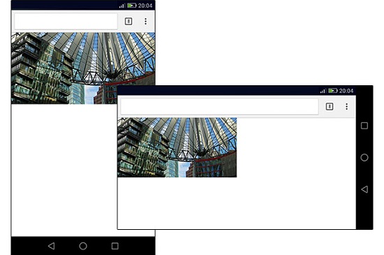 Different widths: 100% of the viewport in portrait mode and 50% in landscape mode[/caption]
You can only define the pixel density (for example, 2x) or the width and height (for example, 320w 160h) within a srcset file reference. It's not possible to combine them.
The srcset attribute also works with the new <picture> and the associated <source> element. The <picture> element allows you to define images for different display/window sizes. And you can also define sources for different pixel densities.
<picture>
  <source srcset="image-640w.jpg, [email protected] 2x" media="(min-width: 320px)" />
  <source srcset="image-320w.jpg, [email protected] 2x" media="(max-width: 320px)" />
  <img src="image-640w.jpg" width="320" height="160" alt="" />
</picture>
In the example above, four file sources are referenced via the two <source> elements. The files image-320w.jpg and [email protected] will be used for display/window widths less than 320 pixels (depending on the pixel density). The files image-640w.jpg and [email protected] will be used for widths of more than 320 pixels. Keep in mind that the <source> element doesn't know width and height attributes. If you want to define sizes, you'll need to use CSS.
And don't forget to provide a <img> fallback for older browsers.
The srcset and sizes attribute, as well as the <picture> element, are supported by Chrome 38+ and Firefox 38+. Internet Explorer currently does NOT support the attributes and element. Android Chrome does from version 40 and iOS Safari from version 8.1. Safari, however, supports sizes only partly.
If you want to use the srcset attribute for not supported browsers, you can get a polyfill, which imitates the functionality of older browsers.
CSS3 and image-set()
You can also define different image sources for different pixel densities using CSS3. This can be done with image-set(). Similarly to the HTML5 attribute srcset, you can reference multiple files via url(). image-set() can be used whenever an image source is defined via url().
body {
  background-image: url("hg.jpg");
  background-image: image-set(
    url("hg.jpg") 1x,
    url("[email protected]") 2x
  );
}
In the example above, a background image for two pixel densities is defined via image-set(). Currently, you should mark the notation with the appropriate vendor prefixes, for example, -webkit-image-set(). Again, it might be a good idea to get a fallback. It's important that the fallback precedes image-set(). Browsers that don't know image-set() will ignore the second background-image property. All other browsers will execute the second property and overwrite the first one.
[caption id="attachment_90425" align="alignnone" width="550"] High-resolution background (upper) and "normal" resolution background (lower)[/caption]
The image-set() notation is currently supported by Chrome 31+, iOS Safari 7.1+, and Android Chrome 40+. Firefox and Internet Explorer don't support it.
Besides the image-set() notation, which supports different pixel densities only for images, there are also the media queries min-resolution and max-resolution, which consider any CSS properties for different pixel densities.
@media screen and (min-resolution: 2dppx) {
  body {
    background: url("[email protected]");
  }
}
In the example above, a background graphic for displays of double pixel densities is defined via min-resolution. The unit dppx stands for dot per pixel and represents the pixel density. But there are also other units like dpi (dots per inch), which allows you to provide images in a printable resolution, or dpcm (dots per centimeter). You should use the unit dppx for screens.
The resolution feature is supported by Chrome 31+ and Firefox 35+. Internet Explorer supports the feature from version 9 and only with the dpi unit. Android Chrome supports it from version 40 and iOS Safari from version 7.1 - however, only with the old notation min-device-pixel-ratio or max-device-pixel-ratio.
Alternative: Provide Bitmaps Only in High-Resolution
The new HTML5 elements and attributes allow you to provide images for different resolutions and pixel densities; however, you'll usually have to generate different files for an image. Content management systems like TYPO3 do this automatically, but for handmade projects, which have to do without a server-side programming language, you'll need to manually generate file variants.
Those who want to spare the expense but still want to consider high pixel densities can take the middle way, which requires only one file for all pixel densities. Create an image file of double resolution - best in reduced quality - and embed it in half its resolution in an HTML document. For a 640x320 image it would look like this:
<img src="image-640w.jpg" width="320" height="160" alt="" />
While high-res screens display the full physical resolution, standard screens scale the image down to half its size. When using the standard pixel density, you won't notice any quality loss due to the down-scaling. The double pixel density still delivers a better quality than you would get with an image of normal resolution.
On the downside, displays of standard resolution will download an unnecessarily large file. It would therefore be advisable to use only highly compressed JPEG files.
[caption id="attachment_90426" align="alignnone" width="550"]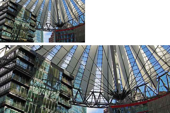 Highly compressed JPEG file of half its resolution (upper)[/caption]
Images can also be incorporated in double resolution using CSS. The property background-size allows you to scale down the image to half its resolution.
body {
  background-image: url("hg.jpg");
  background-size: 32px 16px;
If the background image in the example has a resolution of 64x32 pixels, it will be displayed in half its size. So, this is the same effect like in the HTML example.
Use SVGs and Iconfonts
All latest browsers now support the vector-based SVG format. Especially logos but also many other graphical elements are vector graphics and are embedded as GIF or PNG files in websites. Thanks to the SVG formats, they can also be displayed as vector graphics in a website, no matter if you use HTML via <img> element or CSS via url() element.
The advantage of the SVG should be clear: As it's vector-based, it will always be displayed in the best resolution and, in addition, it spares bandwidth and saves time because it doesn't need to be provided for different resolutions and pixel densities.
Icon fonts are a good alternative to SVGs for high-res displays. Fonts are also vector-based and therefore displayed in optimal resolution.
If you want to hedge your bets on SVGs and don't exclude older browsers without SVG support, you can incorporate fallback solutions with some tricks.
Determine Pixel Density Using JavaScript
Sometimes images are loaded via JavaScript, for example, in galleries. You can directly load the right image source with the appropriate pixel density rather than generating an <img> element with all srcset references via Javascript.
JavaScript knows the property devicePixelRatio, which shows the pixel density.
if (window.devicePixelRatio > 1) {
  document.getElementsByTagName("img")[0].src = "[email protected]";
}
In the example above, an image file will be loaded if the pixel density is higher than 1. Logically, the property can only be read.
There's one thing you should keep in mind when using devicePixelRatio: The value determined by this property depends on the actual zoom factor of the browser. If a document is displayed at a 150% browser zoom, devicePixelRatio delivers a value of 1.5 - with standard pixel density. A double pixel density would show a value of 3 at the same zoom factor.
Conclusion and Related Links
Getting web projects ready for high-res displays can be a quite challenging task. However, high pixel densities should always be considered, especially when working on new projects. All of the presented solutions can be easily equipped with fallbacks, so you won't run the risk of leaving older browsers out.
(dpe)
Thanks so much for this interesting article. I’m more clear about the power of imgsrc and image-set. And also why SVG is used a lot.
I can say this is one of the best article in your website.I loved it lot and thanks for sharing !!!
Following the link to ‘srcset-polyfill’ it says’ [Warning: not for production code]’, and considering a lot of the above techniques don’t work in all browsers, I’m a but confused as to what direction I should go in. Design for high resolution screens and ignore the older browser (although I would hardly call Firefox 27 an old browser) that won’t display the image property, or design for the lowest denominator and try and produce a site that works for everyone…
The snippets are encoded. Source set is really very helpful
Thanks for sharing the importance of high resolution images with us. It will help me a lot in building new designs for my new customers.
I have read a lot of articles about HTML5 and CSS3. However, this one seems to be the best one. Thanks for informative sharing! Images is one of important factors for all responsive web designers.