
Importance of Web Design in Boosting Your Business

First impressions on websites matter. Make them matter.
66% of individuals would rather view something wonderfully designed than something straightforward if they had only 15 minutes to view the information. Thus, the design of your site is an essential component. For your business website to be successful, you need to understand the importance of web design.
Your website is a gateway to business through which visitors connect with your business. That’s how visitors view the business as a whole. A poor website can seriously damage a business’s reputation, whereas a good website can increase its influence and generate leads. A study found that 38.5% of web designers believe that users leaving a website is primarily due to the outdated or non-appealing design.
Additionally, responsive web design is extremely important in this. There’s a strong possibility a visitor will simply leave your website if they have to pinch to zoom in and out. Making changes that alter how people view your website the first time they interact with it can make all the difference between these two results for you.
This shows why web design is a crucial aspect to boost your business. Now, let’s know what are the key components for a great web design.
Latest Trends To Keep In Check
Well, as we discussed above, how impactful can the design of your website be? Now, your website must adapt to the latest trends. But what are these trends?
Designing your website should take into consideration some current trends. Such as:
- Claymorphism
- Memphis Design
- Complex Gradients
- Behavioral design
- Visible Borders
- Glass Morphism
By keeping these trends in mind you can start designing your websites. Although there are some future web design statistics that you shouldn’t miss.
So, let’s check the stats now.
Web Design Statistics To Keep In Check
Your company website is more than simply a place where people can learn the bare minimum about you and your brand. It becomes a helpful marketing tool and valuable addition to your company.
Additionally, your website design should build trust and inform the target audience, in addition to meeting the fundamental needs of your business. For a successful manufacturing website overhaul or facelift, keep these things in mind.
Well, to make sure you design a proper website, you must be aware of the latest trends and statistics. Here, you will find some interesting and crucial stats on web design that will help you understand the various aspects of designing a website.
Now, let’s begin.
The web design of your site accounts for 94% of first impressions
“The first impression is the last impression”. Well, even in the world of web design, 94% of first impressions are design-related. Thus, it is one of the most important & crucial aspects to keep in check.
As per the research, users will form a judgment about a website in about 0.05 seconds. You want to make a positive first impression when someone discovers your company for the first time. This may affect how they view your company going forward. The bulk of first impressions made of your website is based on its design. Therefore, it’s important to make a good impression with your web design, create a stunning website, and engage your audience with your page.
To make a lasting first impression, design a visually striking website that attracts and draws in your viewers. 75% of people acknowledge evaluating a company’s credibility depending on the layout of its website. Build a website that represents your business, is aesthetically pleasing, and offers users a great first experience on your site, whether you do it yourself or employ a web design firm.
75% of website legitimacy comes from design
You want people who find your company online to recognize it as a legitimate operation. Because a poorly designed website may give the impression that you are spamming or unreliable. Unattractive layouts or content will turn 38% of users away.
Therefore, it is quite important to put time, money, and effort into creating a professionally designed site to ensure that you increase sales as well as credibility and trust with your audience. Because if your website isn’t beautifully designed, you run the danger of losing your audience’s trust and discouraging them from using it.
For your website, invest in top-notch design. To develop ideas on how to create a top-notch website, you can look for samples of excellent design to obtain a sense of how your site should appear. You may build a trustworthy website by picking the appropriate colors, aesthetic components, and layout.
Websites that are well-designed can have a visit-to-order conversion rate of 200% higher than those that are poorly designed.
You should also ensure that your website is safe. To guarantee that you’re giving your audience a secure browsing and buying experience, check to see if your website has HTTPS and an SSL certificate.
When consumers have a bad user experience, 89% switch to a competitor
You must be preoccupied not only with creating a positive first impression but also with maintaining that impression as visitors browse your website. Even the most nicely crafted website will be rendered useless if users are unable to navigate it and find the information they seek.
44 percent of consumers share negative online experiences with their friends. Users will leave if they are unable to quickly access the information available on your website. If you don't want to start losing leads to the competition, you must prioritize user experience on your website. You get a $100 return on each and every dollar you invest in enhancing the user experience on your website. The key to success is an advanced website that is simultaneously appealing and functional.
Focus on features that will improve the user experience for your audience while you construct your website. As per the research, 42% of visitors tend to leave a website due to inefficiency. Thus, pay attention to details like creating a well-organized navigation system, including visual elements to break up the text, and making sure your website runs quickly. The website design must be easy to navigate.
The viewer should constantly be aware of their location on the website and have quick access to any location they desire. If one is accessible, it would be a great idea to use it. Although it seems simple, most websites might be made better in this regard. Functionality should be the goal because there is a thin line between an interactive menu and one that is obtrusive.
85% of adults believe that a company’s mobile website must be at least as good as its desktop website. Thus, you may build a more user-friendly website with the aid of all these components.
On their homepage, 70% of small company websites lack a Call to Action (CTA)
Contrarily, whether you’re a Fortune 500 firm or a Small/Medium Business, implementing Calls to Action incorrectly can have a major impact on your turnover. In actuality, CTA errors are unaffected by the size, age, or reputation of the organization. Depending on the type of business you operate, the type of CTA you include on your homepage will vary, but users will leave if there isn’t one. Users would like to know what your website intends them to accomplish, whether they realize it or not.
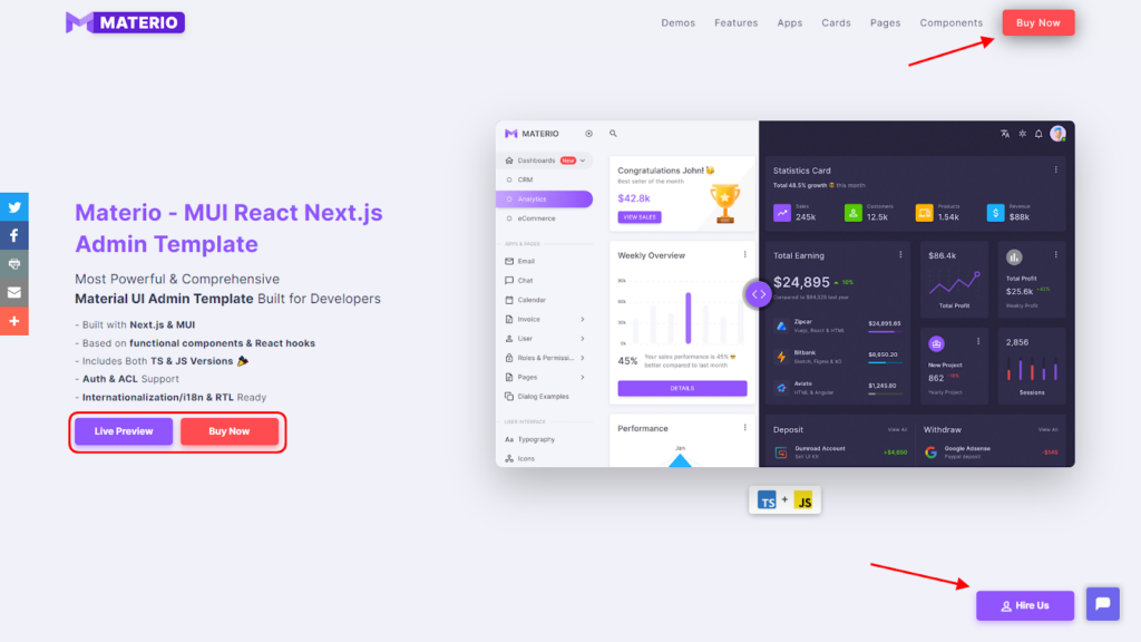
When creating a CTA, you need to comprehend the psychology of the customer. As you can see in the image above, ThemeSelection has placed CTA buttons very properly. As a visitor when you land on the product page you will definitely look for the demo or preview button to get an overview of the product. Thus, this is the exact area where you can use the CTA that navigates to where exactly the user wants to go.
According to research, most people base their decisions on whether their acts are reasonable and likely to be in their best interests. It’s surprising how frequently businesses lose out on opportunities to connect more deeply with potential customers. Almost 70% of small companies don’t have a proper Call To Action, which leads them to poor business.
Thus, You must pay attention to Call To Action design to prevent a serious loss. Through CTA, You may convince your visitors to read your emails or do particular actions, like making a purchase or joining the mailing list, by using a well-written CTA. You can create great CTAs by placing text on a button or just a link with the appropriate anchor text.
A website's layout and navigational links are viewed by 38% of consumers
Visitors to websites wander all over the place, therefore your website’s navigation must be logical, approachable, and simple to use. If customers have even a slight difficulty locating what they’re looking for on your website, they won’t hesitate to leave and find another. As per the research, 38% of users who visit a website for the first time examine the page’s design or navigational links.
When visiting a website using a mobile device, 83% of users expect a faultless experience. Even though it now seems obvious, using a responsive website will guarantee that it will appear beautiful on every device a website visitor may use. Thus, it is crucial to provide proper navigation. However, users might not always use it. But still, chances are high that they will be impressed by the easy and flawless navigation. In addition to informing visitors about your products or suite of services, your website also acts as your primary point of sale online.
74% of users are more likely to return to mobile-friendly websites
People spend 70% of their Internet time on mobile too. With more people acquiring access to mobile devices, such as smartphones and tablets, it's crucial to have a website that works well on them.
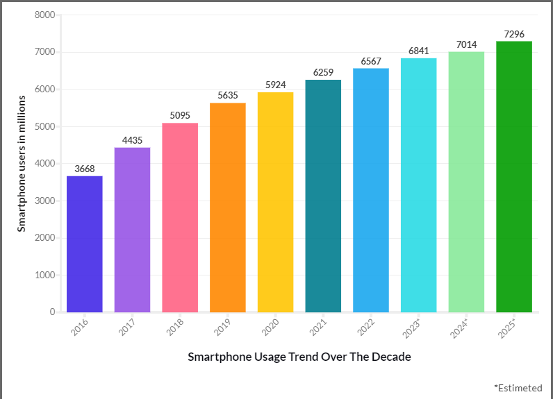
If businesses’ mobile websites or apps offer pertinent product recommendations, 63% of smartphone users are more inclined to purchase from them. Reactive design is one of the most important components of a mobile-friendly website. By using responsive design, you ensure that your website is compatible with any device a user may be using. As you can check the graph below, smartphone users are rapidly growing. Thus, you should not avoid these stats.
More than 54% of all web traffic worldwide is currently generated by mobile devices. Therefore, you risk losing up to 50% of your potential clients if your website isn't mobile-friendly. Consider a smartphone user accessing a desktop-friendly website. It’s nearly impossible for potential consumers to locate what they’re searching for if text, photos, and buttons don’t adjust to fit touchscreen controls and smaller screen sizes; after a few incorrect clicks, they’ll probably go somewhere else.
According to Google’s research, almost 75% of users say they prefer a mobile-friendly website, and 96% of users claim they have come across websites that were not made for mobile devices. For businesses looking to interact with mobile users, this is both a major issue and a major opportunity.
Google’s mobile-friendly checker tool can help you determine whether your site is mobile-friendly.
Each year, slow-loading websites lose $2.6 billion in revenue
Yes, you heard correctly. A slow load time can increase shopping cart abandonment by 29.8% because their websites don’t load quickly enough, websites lose out on over two billion dollars in revenue each year. People dislike having to wait as websites load information, which discourages them from completing a purchase. This website statistic is important because it demonstrates how urgently your audience needs to acquire content. Make sure you’re on the winning side of the fast-loading website vs. the slow-loading website battle.
It has been reported that websites that load in five seconds earn 70% longer user sessions. Without a quick website, your company will be left behind. Fast-loading websites from your rivals will bring in more visitors and money. Your conversions will rise by 7% simply by speeding up your website by one second.
Design statistics indicate that 47% of users anticipate a web page to load in 2 seconds. To determine how quickly your site loads and where improvements might be made, you can utilize tools like Google Pagespeed Insights. You may also spend money on page speed services to hire a third party to optimize your website so you can concentrate on managing the influx of new visitors.
Users spend 88% more time on pages with videos
In 2021, 9 out of 10 viewers indicated they wanted to see more videos from brands and companies, while 96% of consumers increased their online video consumption. In fact, by 2023, it's predicted that the average individual would watch 100 minutes of online streaming daily. Well, that’s why you shouldn’t neglect the importance of videos regardless of your business type. Automatically playing videos can significantly boost a page's intrigue. They can be utilized to tell a narrative and greatly minimize the quantity of additional text required to describe your company.
When optimizing your website, you should include visual areas of interest to draw viewers in and encourage interaction. Consequently, it is wise to include videos when designing and optimizing your website. It will capture the attention of your visitors right away and persuade them to get in touch with you. This is known as “conversion,” and it’s likely the ultimate objective of your website. As per the research, users spend 88% more time on your site if you have videos on it.
This will enhance the visual attractiveness and interactivity of your website. But there’s no need to go overboard. Your audience can benefit and the user experience will improve if you make videos for difficult ideas or lengthy material. The degree of interaction should never surpass the benefit because, as previously said, there is a thin line between “interaction” and “annoyance.”
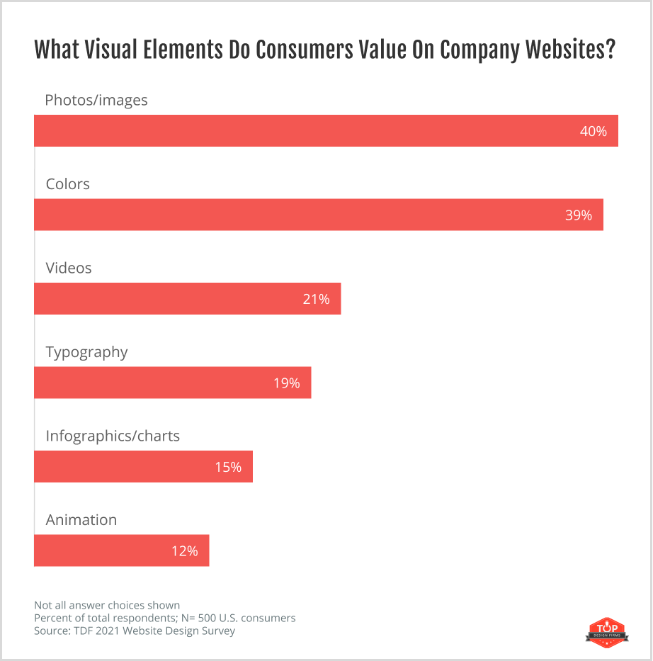
The most appreciated elements in website design are color (40%), and photos/images (39%)
According to survey data, companies looking for new clients can employ marketing color tactics to boost sales. Color preferences are ingrained instincts that may not be reasonable but have a significant impact on our decisions. Therefore, a person’s perception of a website’s color scheme may influence whether they decide to buy something or use a service.
When buying a product, According to a study, 84.7 percent of customers claim color as the main reason they choose a particular product to purchase, and 93 percent of consumers emphasize a product's visual appeal when making a purchase. Thus, color plays a really vital role to boost the business. 46% of individuals think blue is their favorite color to see on a website, while only 23% say yellow is their favorite color for website design. Businesses should consider color selection closely and customize color schemes to user preferences.
Photography engages users and captures their interest when it comes to site design. Websites with poor photos have a higher chance of having a higher bounce rate from uninterested visitors. Beautiful photos of your business’s facilities, staff, and products help you come off as professional. Nearly 39% of respondents mentioned photos/Images as the affecting elements while visiting a website. Photos engage users and capture their interest when it comes to site design. Do note that websites with poor photos have a higher chance of a higher bounce rate from uninterested visitors. While using photos of your business’s facilities, staff, and products help you come off as professional.
Thus, your company should start by adding photographs and choosing a color scheme for your website. Then, concentrate on incorporating not just the previously listed visual components, but also typography, infographics, and animation.
Visitors to the website first browse the top left corner.
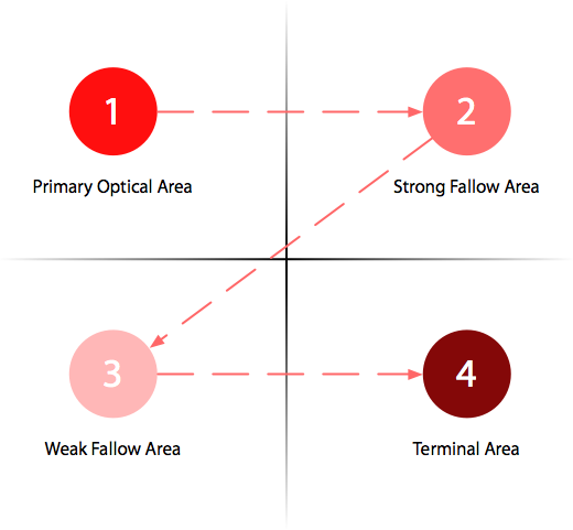
Users’ eyes naturally travel from the upper-left corner of your website down and to the right after they arrive. Similar conclusions were reached by a Yahoo study. Look at your website to see what is available in these zones. To the top-left corner, reposition the value proposition. When someone does choose to read a page, their eyes move horizontally from left to right, frequently focused on the upper-left corner of a webpage or the main content section of the webpage, which is generally triangular.
You can get a general description of the eye movement pattern when gazing at (often text-heavy) content as in the Gutenberg diagram. Except for the region at the bottom right, it generally fits this zoning conclusion. The top left is the major optical area, the top right is the strong fallow area, the bottom left is the weak fallow area, and the bottom right is the terminal area. The user’s eyes naturally start at the main optical area and move in sweeping motions across and down the display to the terminal area.
However, this pattern varies according to the design and function of a page. For instance, a person’s eyes will move differently over a page with a two- or three-column layout, a blog with a lot of text, or a slideshow with a lot of photos.
Thus, it is necessary to place things in the right area.
Conclusion:
As you can see, website design is constantly evolving and changing. Some aspects that were popular years ago (such as picture sliders) are falling out of favor, and it’s difficult to forecast what websites will look like in the future.
Whatever “best practices” you follow, keep in mind that a website isn’t “done” after the first design. People are more likely to trust websites that have recently been updated or evaluated.
Commit to researching web design statistics and keeping trends in mind. Use them to demonstrate your responsiveness when rebuilding your website.
Featured image by Igor Miske on Unsplash