
7 Deadly Sins Of Landing Page Design That Sabotaging Your Results
There is no surprise to know that 44% of B2B clicks are focusing on making a perfect landing page design which could attract their potential customers directly on their home pages instead of dedicated landing pages. Have you ever thought about their impacts and results?
That’s the biggest problem of most of the start-ups and people who are looking to become an entrepreneur, but they don’t understand the landing page relevance and accuracy which are the major ingredients of your content & marketing campaign quality score.
Sometimes it happens that people send paid traffic to unoptimized landing pages that decline the possibilities of getting a high conversion rate. These mistakes might force you to work twice and hard just for a minimal return.
Here are the few deadly sins that you may commit in relation to making landing pages. By understanding these issues, you can effectively work on it and track the frequency of your workflows to get the results you deserve.
1. Incompetent Webpage Speed
These days, if you observe, you may feel that approx. 90% of your visitors like to see only what they exactly want. An ideal web page speed should be under 3 seconds, but if your webpage takes time to load your site, around 76% of people will be bailing definitely. If you have any e-commerce or online store website then working on website speed could lead you to cover over half of the traffic to bounce.
What to do to response such mistakes
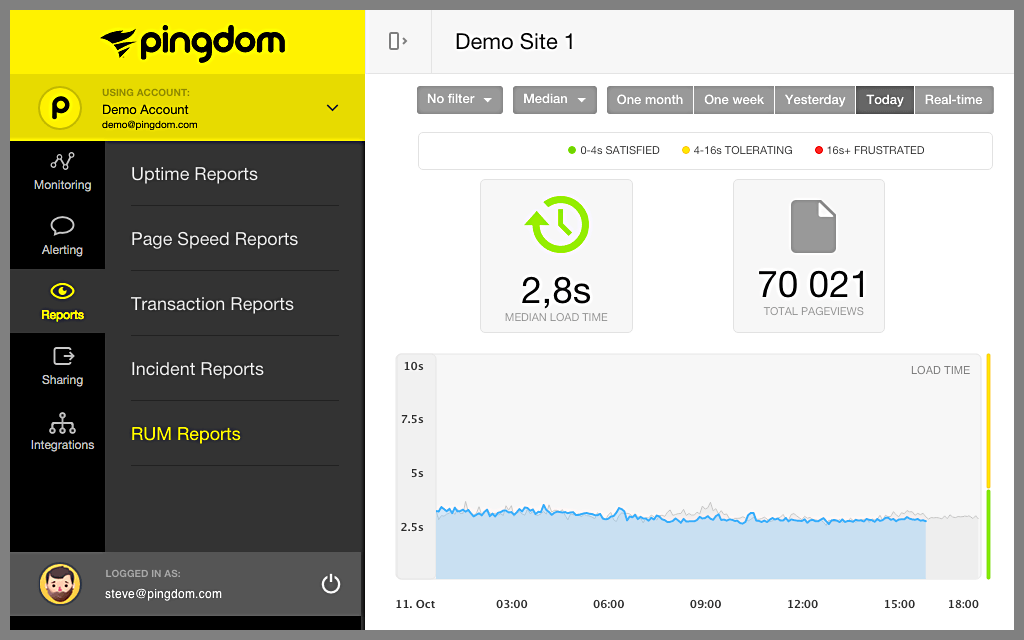
Testing webpage speed
There are so many tools which can help you to respond to your problem well. Use of Pingdom or Google PageSpeed Insights can assist you to check the reasons and root causes of loading webpage speed. These tools will help you to realize specific fixes that may help you to optimize web page speed.
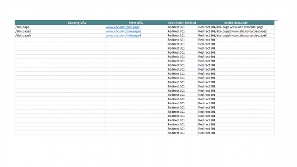
Optimize Redirect Process Where Possible
You should use 301 redirects IS in a user-friendly manner. Try to download Screaming Frog application to dump it in your URL. it will help you to highlight redirects and optimize redirect pointing which occasionally occurs as the sites evolve while redesigning.
You can minimize, resize and compress the images to reduce the substantial impacts having on loading times of webpages.
2. Cluttered Design
Cluttering design of landing pages is another mistake usually done by entrepreneurs. There are around 48% landing pages that contain multiple offers for users, even approximately 16% of landing pages are optimized without navigation bars. According to Tim Ash, author of the best and amazing selling books - landing pages optimization and CEO of SiteTuners, if there is any company focused on managing landing pages, they remove navigation bars and see 100% notice improvement.
For instance, one of the effective and best books known as “Don’t Make Me Think”, with the name it is already clear what it is all about. In this book, the author has mentioned that the landing pages should be clear, well-organized and optimized. Users should focus on “only one” action and make sure your visitors know exactly what you want to make them know.
In the above images, you can see and observe that the primary headline is big and bold, there is only one click button which helps your users to know what you actually want them to know and there is no more navigation for distraction away from the website. It helps you to scan the reliability of your landing page, measure the traffic flow logically and make you the best landing page agency.
3. Limp Headlines
Great headlines might make your content look attractive which could help you to retain existing customers plus attract more traffic on your website.
Bit, what if there is no option when you realize you are giving limp headlines and content to your target audience?
According to Tim Ash, Limp Headline may reduce the possibility and high traffic by 14% per cent, it creates difficulties for you to retain more visitors more than 5-10 seconds. But if you have an implementation of good practises of ideal headlines, these kinds of landing pages which contain good and appropriate contents expectedly summarize the critical value proportion of customer turnover. Limp headlines may reduce the percentage of visitors to scrolling up through their news feed and declines popping up in the email boxes.
So, what can be done in this case?
Understanding the expectation and choices of your target audience is more important, first thing, your title should be matched to the entire content you have written under it.
For example, when you go to the website of BuzzFeed, you will check into the landing page how much easy and generic headline content they frame to take its advantages in getting their clients and visitors retained.
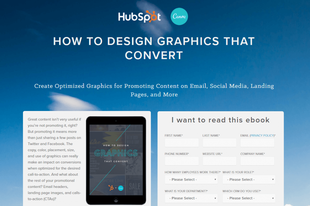
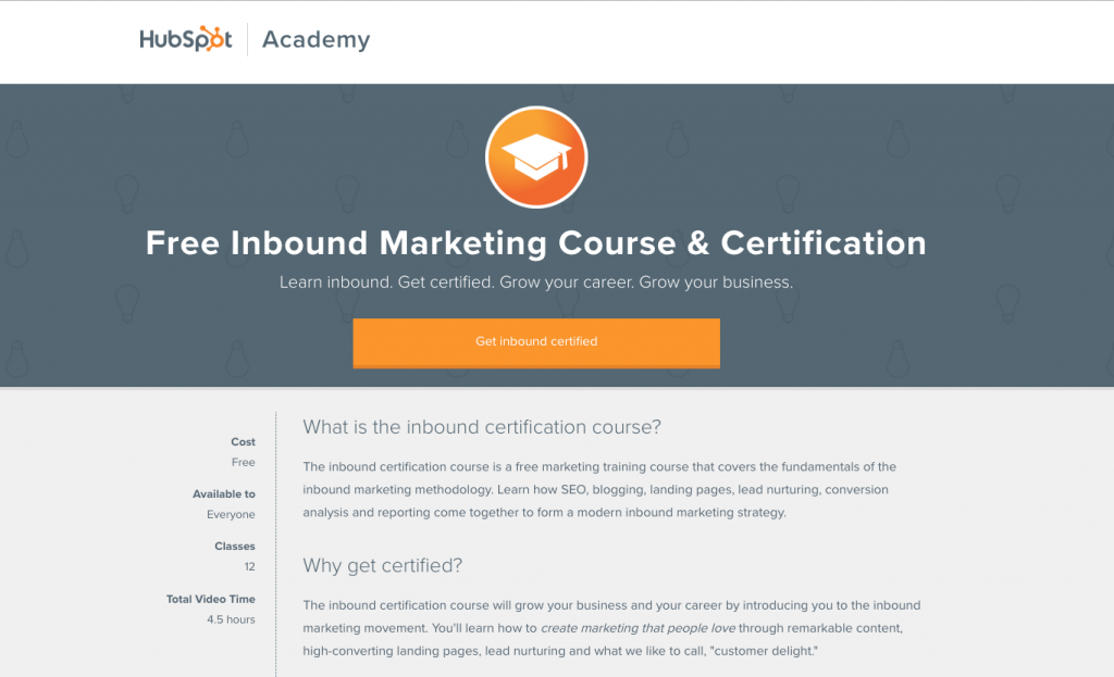
For more respective knowledge, you can see how the similar and easier headline templates pop up on the landing pages of HubSpot.
4. Irrelevant Visuals
Stock Photos from different sources are very bad. Images and infographics pasted in your landing pages should be relevant and matched to your content, not just because they are ridiculously overrated or overpriced, but also they won’t work.
If you haven’t used any real photographs or images instead of an unnecessary dummy collection, the traffic of your website or landing page could be dropped.
For the best results, the visualised images can be helpful for your landing pages in the following ways:
- Show off your product and services in use or in context.
- You should try to show real visual examples related to the product and services of what they are going to get.
- Show the before and after Transformation
- While mentioning services try to show before and after results of your service.
If your photographs and images are not real and original, you will not be able to give powerful statements to your visitors and target audience through landing pages.
One of the top authentic brands Lululemon will be a good example of this:
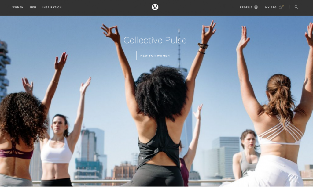
There is a small quote to show the product details, and they are showing the product in the context of use, which shows excellent things about the product. These landing pages design shows originality, high quality and high visual photography that helps users to find their own product to purchase very easily.
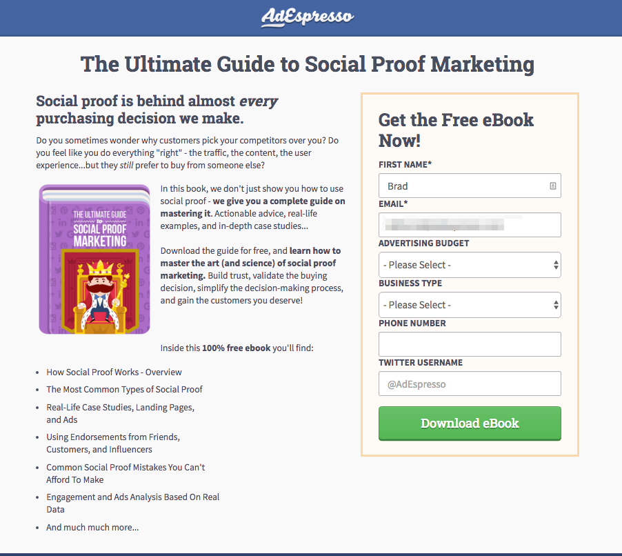
The ebook landing page from AdEspresso always uses simple and easy illustrations to show their target audience what they are actually looking for, they enter all required information in the context use, it increases perceived values by boosting credibility.
5. Generic Calls to Action
Another problem with a landing page is envy call to action. Lack of proper CTA may reduce the traffic on your landing page.
Let’s suppose, your competitor has just received an eBook request twice as many downloads as many eBooks they have published. As you are also desperate for the leads and counteract by launching a campaign with CTAs with groundbreaking eBook. When your hopeful visitors click on the landing page and then instead of seeing filling out the form to request CTA, not only you will lose your credibility but also your money if they come to your site through a PPC click ad. The major reason behind this is lack of consistency. If your landing page doesn’t offer consistency, your visitors will fail to track landing page performance which can reduce traffic and online business reach.
6. Multiple Offers on the Page
Giving multiple offers to your customers and target audience may keep them confused or distracted. Lust is one of another sin of intense desire. If your landing page shows multiple offers then could be a big distraction for your visitors. If you think like a customer, then you will realize that your visitor will be interested only in one thing. If you present multiple things before them, it can be difficult for them to opt one thing out of them which can reduce the visitors’ traffic because in that case, they will find other options for them. Offering a maximum of more than two pieces of content and offers may reduce the risk of confusing the customers.
7. Too Many forms to fill
Customers always want original, genuine and authenticated content, so you need to take care of numbers and length of your landing page forms. It should be qualified and easy to fill. If you forget such things then customers can lose their patience and interest.
If you want to get any piece of information about your visitors to convert your leads, you need to figure out the golden rules of the successful landing page forms: less field = more downloads = more leads. Always try to ask for necessary information only whenever it is required.
What to do in the end?
A landing page cannot be judged as a good and perfect landing page if you are not able to present something good before your target audience. Even a good landing page cannot get a response without visitors would not stick around long enough to check it out. So, it is better to focus on presenting a high convertible landing page before your customers. Review and follow the aforementioned points to make your landing page effective and attractive enough to retain potential customers.