
Logo Design According to Zeitgeist: Not Only the Times are Changing
Logos, be it wordmarks or symbols, are rarely „timeless“. Instead, they are regularly adapted over time – sometimes tentatively, sometimes more radical. Apart from taking on style details such as gloss, 3D, and shadow effects which disappear with the fading of those design trends, there seems to be an underlying general direction in logo design: shapes get more simple, proportions more harmonious, and details disappear. When a company is founded, logos are often not created by professional designers, but rather quickly jotted down. Frequently, those logos do not correspond with the core principles needed for creating a distinct logo. Simplicity always plays an important part here. Wordmarks and symbols need to be quickly recognized and embraced.
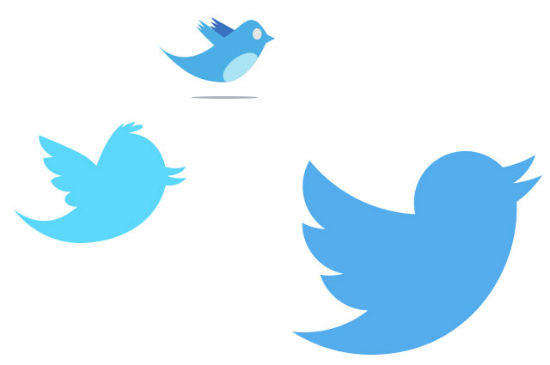 Twitter Logo Versions dating from 2009, 2010, 2012
Later on, the bird changed to monochrome and lost details like its head feathers. And the current logo version is even more minimalist in design. Dispensable details are gone, just three feathers instead of four. The shapes of head, wings and body also have been unified. In fact, all curves are derived from just two differently sized circles.
Coffeehouse chain Starbucks went through a similar evolution of its trademark. Whereas the first logo showed a Siren drawn in high detail circled by the Starbucks logotype, the current version consists of just the Siren – with fewer detailed features, resulting in a clearer and more distinct design.
Twitter Logo Versions dating from 2009, 2010, 2012
Later on, the bird changed to monochrome and lost details like its head feathers. And the current logo version is even more minimalist in design. Dispensable details are gone, just three feathers instead of four. The shapes of head, wings and body also have been unified. In fact, all curves are derived from just two differently sized circles.
Coffeehouse chain Starbucks went through a similar evolution of its trademark. Whereas the first logo showed a Siren drawn in high detail circled by the Starbucks logotype, the current version consists of just the Siren – with fewer detailed features, resulting in a clearer and more distinct design.
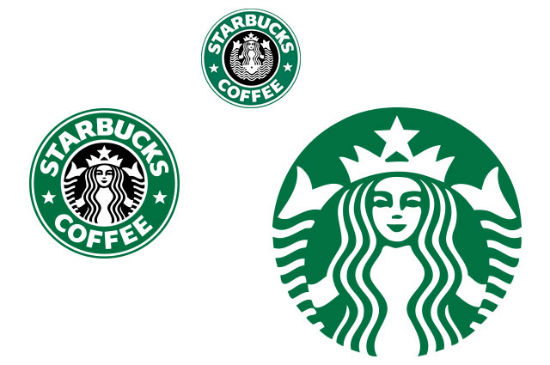 Starbucks Logo Versions from 1987, 1992, 2011
It´s interesting, though, how rigorous Twitter has altered its logo compared to Starbucks. The former´s blue „Larry“ did get a nearly complete makeover within just three years, whereas Starbuck has modified their logo more cautiously within 20 years.
Starbucks Logo Versions from 1987, 1992, 2011
It´s interesting, though, how rigorous Twitter has altered its logo compared to Starbucks. The former´s blue „Larry“ did get a nearly complete makeover within just three years, whereas Starbuck has modified their logo more cautiously within 20 years.
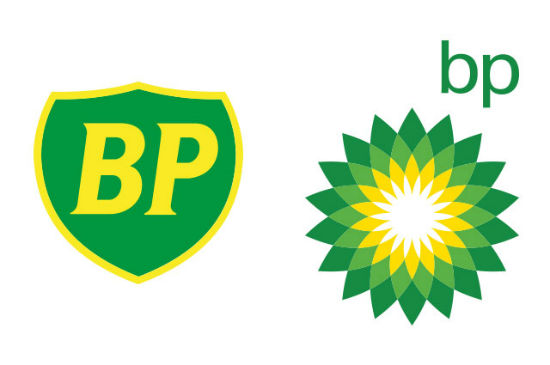 BP´s Logo as of 1982 and 2000
On the occasion of rolling out Windows 8, Microsoft replaced its well established, distinctive logotype with a less striking but contemporary font. Furthermore, they took the operating system´s ubiquitous Windows icon and adopted it, although modified, as an additional part of the logo. Sure enough, such radical changes are always risky and often draw criticism. Too much change may well hurt a brand.
In any case, it is advisable to come up with good reasons for logo design changes. Whether this is done carefully, as with Twitter and Starbucks, or more explicitly, as with BP and Microsoft, depends more often than not on how much the revised logo aims to represent a change in a company´s business policy.
BP´s Logo as of 1982 and 2000
On the occasion of rolling out Windows 8, Microsoft replaced its well established, distinctive logotype with a less striking but contemporary font. Furthermore, they took the operating system´s ubiquitous Windows icon and adopted it, although modified, as an additional part of the logo. Sure enough, such radical changes are always risky and often draw criticism. Too much change may well hurt a brand.
In any case, it is advisable to come up with good reasons for logo design changes. Whether this is done carefully, as with Twitter and Starbucks, or more explicitly, as with BP and Microsoft, depends more often than not on how much the revised logo aims to represent a change in a company´s business policy.
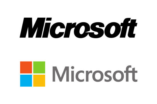 Microsoft´s Logo as of 1987 and 2012
Microsoft being an excellent case in point: When introducing its new logo and Windows 8, the company also set out to focus its business on the internet, mobile devices, and cloud services. Over at BP, the occasion was a merger of several companies, turning BP into a huge international oil and gas company – with the need to also position itself in the growing renewables sector, against the backdrop of growing scrutiny regarding fossil fuels.
At times, a redesign that is perceived as too radical can even backfire. As happened to SAP recently when they were forced to backpedal and return to their old logo after harsh criticism from employees and customers. Californian company and lodging marketplace Airbnb also had to endure a wave of malicious comments after introducing their new logo.
(dpe)
Microsoft´s Logo as of 1987 and 2012
Microsoft being an excellent case in point: When introducing its new logo and Windows 8, the company also set out to focus its business on the internet, mobile devices, and cloud services. Over at BP, the occasion was a merger of several companies, turning BP into a huge international oil and gas company – with the need to also position itself in the growing renewables sector, against the backdrop of growing scrutiny regarding fossil fuels.
At times, a redesign that is perceived as too radical can even backfire. As happened to SAP recently when they were forced to backpedal and return to their old logo after harsh criticism from employees and customers. Californian company and lodging marketplace Airbnb also had to endure a wave of malicious comments after introducing their new logo.
(dpe)
Of Twitter´s Bird and Starbuck´s Siren
The better a trademark is known, the more careful it is usually dealt with. Changes may not be too radical. However, they are often necessary to create a more distinctive logo. When Twitter started more than ten years ago, the blue bird already appeared as the company´s logo. But the original drawing had lots of details, like eyes and shadowed feathers – pretty awkward for a modern logo. Fun fact: Twitter bought this one at stock site iStockphoto, paying just between $10 and $15.
Twitter Logo Versions dating from 2009, 2010, 2012
Later on, the bird changed to monochrome and lost details like its head feathers. And the current logo version is even more minimalist in design. Dispensable details are gone, just three feathers instead of four. The shapes of head, wings and body also have been unified. In fact, all curves are derived from just two differently sized circles.
Coffeehouse chain Starbucks went through a similar evolution of its trademark. Whereas the first logo showed a Siren drawn in high detail circled by the Starbucks logotype, the current version consists of just the Siren – with fewer detailed features, resulting in a clearer and more distinct design.
Starbucks Logo Versions from 1987, 1992, 2011
It´s interesting, though, how rigorous Twitter has altered its logo compared to Starbucks. The former´s blue „Larry“ did get a nearly complete makeover within just three years, whereas Starbuck has modified their logo more cautiously within 20 years.
Microsoft´s Windows and BP´s Shield
Sometimes companies spring a surprise on the public by changing their decades-old logos or logotypes fundamentally. Like BP, which replaced its classic green shield with a green-yellow sun, called „Helios,“ after 50 years.
BP´s Logo as of 1982 and 2000
On the occasion of rolling out Windows 8, Microsoft replaced its well established, distinctive logotype with a less striking but contemporary font. Furthermore, they took the operating system´s ubiquitous Windows icon and adopted it, although modified, as an additional part of the logo. Sure enough, such radical changes are always risky and often draw criticism. Too much change may well hurt a brand.
In any case, it is advisable to come up with good reasons for logo design changes. Whether this is done carefully, as with Twitter and Starbucks, or more explicitly, as with BP and Microsoft, depends more often than not on how much the revised logo aims to represent a change in a company´s business policy.
Microsoft´s Logo as of 1987 and 2012
Microsoft being an excellent case in point: When introducing its new logo and Windows 8, the company also set out to focus its business on the internet, mobile devices, and cloud services. Over at BP, the occasion was a merger of several companies, turning BP into a huge international oil and gas company – with the need to also position itself in the growing renewables sector, against the backdrop of growing scrutiny regarding fossil fuels.
At times, a redesign that is perceived as too radical can even backfire. As happened to SAP recently when they were forced to backpedal and return to their old logo after harsh criticism from employees and customers. Californian company and lodging marketplace Airbnb also had to endure a wave of malicious comments after introducing their new logo.
(dpe)
Comments weren’t intentionally off. Sorry for the inconvenience…
Very interesting how much quicker the Twitter logo evolved when compared to other companies, I wonder if that’s indicative of how fast-paced the social industry is? The original logo looks ridiculous now!
The Microsoft logo evolved a lot from the last 3 decades. They also changed their tag line in recent years.
There is a lot of innovation that have took place in the recent times in the logos of various companies. Now nobody is going to like the order logos.
I think minimalistic logos are becoming a trend nowadays. Especially, with a simple touch of typography like Facebook, Google, etc. What do you think?
I agree, they are becoming a lot more minimalist and flat. Its great! Gradients kill my eye, it never made sense to me why everyone wanted things beveled. We are looking at a flat surface! Thanks for the share, I’ll be sharing with my team.