Today, a large portion of site traffic comes from mobile devices — namely smart phones and tablets — in addition to traditional PCs. Across the globe, mobile devices now account for
12 percent of Internet traffic, and it’s scaling up faster than desktop Internet traffic. The fraction of mobile Web traffic is sufficiently higher in nations with high smartphone penetration (for example,
20 percent of US-based Web traffic is via mobile browsing). What’s more, this figure is expected to grow significantly over the next 10 years, as smartphones evolve and mature in terms of hardware and software and adoption picks up in South America, Asia and Africa.

The Mobile Playing Field
Site owners have begun to take advantage of this trend over the past several years and have primarily relied on native mobile apps for top sites such as
Facebook, Hulu and t
he New York Times. Moreover, up-and-coming Web services such as
Pulse, Flipboard and others have even taken to a mobile-first approach, by building apps for iOS and other ecosystems before building a Web site experience. Native apps allow developers to create unique phone-first, touch-optimized experiences for users to interact with their content to take advantage of features like camera integration, geo-location and offline data storage.
Targeting users on mobile natively makes good sense, especially within the US, where more than
50 percent of mobile users own a smartphone. While mobile apps offer site owners a way to connect with users on new form factors, new ways to monetize across platforms and new mobile-scenario-centric experiences to empower and delight their users, they offer an incomplete opportunity for developers compared to the ubiquity and reach of the Web. There are a couple of problems that affect a native mobile-only approach.
Problem 1: Cost of Supporting Multiple Platforms
Creating similar content and experiences across multiple platforms is costly and requires site owners to choose platforms for which to optimize. Additionally, this translates to a limited Web site experience for users who seek out your content from other platforms, especially when you need to prioritize your development investments.
Adopting a
responsively designed Web site can help address the investment costs and ensure that your users across all the latest mobile operating systems are enjoying a consistent experience.
Scott Scazafavo, former vice president of product management at
Allrecipes.com, whose responsibilities included mobile product development, puts it this way:
To do a decent job developing a native mobile application that can compete with “best in class” offerings that are powered by live data or content (like we have at MSN and also at my previous employer, Allrecipes.com), it typically takes a minimum initial investment of about $250k to define, design and engineer that native application, and then an annual maintenance investment for that native app of $75K to $100K per platform to keep it evolving, feature wise, to keep consumers interested and adoption numbers healthy. That is over and above any internal work needed for design or engineering to create and maintain the services (APIs) that power those products.
The approach we have taken here at MSN for our TMX product with HTML5 browse-based products, with thin-shell apps to help deliver that product into app marketplaces, in addition to mobile browsers, comes only with a small incremental initial investment to what we do with internal resources to create that app product. [That figure is] probably a $25K to $50K initial investment per platform for each app, and a negligible maintenance cost thereafter to maintain those apps.
Similarly, by using responsive Web design techniques,
Clipboard.com was able to target many mobile, small device browsers like Internet Explorer 10 on Windows 8 and Safari on iPhone/iPad at
half its expected costs to develop when they began the project.
Problem 2: Fragmented Ecosystems
Even within a given platform, a plethora of device geometries and sizes—as well as platforms—exist. This requires site owners to not only design for near-similar display sizes and resolutions, but also to submit to multiple app stores (Kindle store, Google Play and Nook store, all on the Android platform). Managing multiple assets within the same platform adds complexity to the support matrix. Fix a layout bug in your native app for the Nexus 7, and you might have to fix it again for the Kindle Fire app. This means all your users are not on the same app version, with the same feature set and the same bug fixes.
Similarly (even within the iOS app ecosystem), top apps like ESPN, Spotify, Angry Birds Space and the App Store itself
did not correctly occupy the full screen, instead just showing users a black bar at the top and bottom of the app. The addition of iPhone 5 required developers to ship app updates to address this simple layout bug.
We’re also still at a stage where vendors are
experimenting with new form factors, such as the big screen. For example, more than 25 million Xbox Live users now have access to Internet Explorer 10 on their living room TV screens and are interacting with it not just through a pointer but also through more human-centric mechanisms such as Kinect and Xbox SmartGlass. Today’s technical decision makers are facing a fragmented and very volatile landscape of devices that their users have integrated into their daily routines.
A Unifying Approach: Responsive Web Design
Responsive Web design aims to provide an optimal viewing/consumption experience—
easy reading and navigation with minimum resizing, panning, and scrolling —across the gamut of devices that exist in the market,
as well as future-proof your site for those that are yet to come. There already exist different Web tutorials regarding individual techniques that help a site become more responsive. This series aims not only to provide a unified approach to responsive Web design, it aims to impress upon decision makers and developers the immediate need for adopting responsiveness as part of their reach strategy. According to a crawl of the top 5,000 Web sites by
modern.IE, only about 14 percent of sites have some form of responsive design. It’s not difficult to see why developers think it’s a daunting task to consider.
Take a look at
Figure 1. You can see the relative screen resolutions for the Web browsers on popular smartphones and tablets (the devices are identified in
Table 1). The device resolutions, as well as ratio of CSS pixels to hardware pixels (a concept we’ll explain in part 3), are taken from
Wikipedia. (Each square corresponds to 100 x 100 px of Web content, laid out at 1x optical zoom.)
 Figure 1. Sampling of Resolutions for Several Current Devices
Table 1. Key to Figure 1
|
A |
iPhone 4 |
| B |
iPhone 5 |
| C |
Samsung Galaxy S3 |
| D |
Nokia Lumia 920 |
| E |
HTC 8X |
| 1 |
Kindle Fire, Nook Color |
| 2 |
Kindle Fire HD |
| 3 |
LG Nexus 7 |
| 4 |
Kindle Fire HD 8.9 |
| 5 |
iPad and iPad Mini (different hardware resolutions but same number of CSS pixels, more on this in Part 2) |
| 6 |
Microsoft Surface |
So is cross-browser, cross-device code the solution?
Traditionally, OS-specific apps have been able to provide more sophisticated user engagement because they have access to valuable user information, such as geo-location, offline storage and even custom font support for customized interfaces.
However, modern browsers such as Internet Explorer 10, Google Chrome (version 22), Safari 6 and Firefox (version 17) now offer the lion’s share of these experiences as part of their support for HTML5 and CSS3. HTML5 is not your grandpa’s HTML, which was originally designed to let people encode and deliver pieces of textual information across the Internet. HTML5 is intended for developers to write rich Web-based apps for the twenty-first century. Between HTML5 and CSS3, you get access to once-native features such as
media queries,
geo-location,
custom font support,
offline storage and even
touch events! This way, your sites can have a different look and layout on hardware of different dimensions, provide users with location-aware services and even provide a valuable experience when the user is disconnected from the Internet.
HTML5 Myths
There are some common HTML5 myths out there. These include:
 I can’t monetize HTML5.
HTML5 sites have arguably more monetization opportunities than their app equivalents. App monetization today includes app purchases (although most apps in the iOS apps store are in the free to $0.99 range). This is probably the only way in which HTML5 site experiences can’t be directly monetized. Otherwise, developers have a lot of control over advertising and in-app or in-site purchases. More importantly, a lot of apps tend to limit the amount of navigation a user can do. For example, most reader and newspaper/magazine apps offer textual content and don’t provide the “linky-ness” of the Web, which allows users to navigate to related content while consuming the current Web page.
The Web site experience, when responsively implemented, retains the “linky” nature of the Web and can lead to a higher number of user impressions.
HTML5 cannot be offline.
HTML5 has a couple of different solutions for ensuring that users have a great offline experience. First and foremost, Web pages can specify which of their assets should be made available to users when they are disconnected (using
App Cache). This way, the user can still interact with the page even while offline. Additionally, HTML5 can locally store user information and input using Local Storage, as well as Indexed DB. This data persists even if the user closes the browser and can be synced back to the server at a later point in time when the user relaunches the Web page.
Check out the demo for this
offline calculator. A user needs to be connected to the Web only the first time he visits it. Subsequently, he can access it offline. Moreover, the user’s calculation and results are stored via Local Storage so he can come back at a later time and continue a calculation.
The
Mozilla hacks blog is a great start at busting some common myths about HTML5. It’s important to note here that native apps use APIs that are optimized for device-specific performance. However, HTML5 and CSS3 provide developers with tools to build engaging experiences across a variety of form factors and ensure that you are not missing out on users visiting from other platforms.
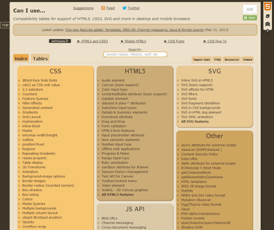
CanIUse.com is a great resource for understanding the available browser support for specific HTML5 and CSS features.
Media Queries and Responsive Design
One of the new tools in CSS3 to aid in responsive Web design is called
media queries. Media queries allow you to offer your users the same HTML content but enable the browser to detect the size constraints of the device (in pixels) and layout the same content in a different, relevant manner. You can grow or shrink the width of your text and image content, increase or decrease the number of columns in your newspaper-style layout or even hide pieces of information entirely, depending on what you think the right consumption experience is for your user on a given device.
With a combination of media queries to dictate the layout of your content, as well as browser detection to identify additional constraints of the user experience (for example, if the user is interacting with a site via Xbox 360 on a large TV screen), you can identify your users’ needs and deliver the right experience for the current context in which a user has accessed your content—whether it be to consume it richly on a desktop, interact with it via touch on a slate or quickly skim through it on the go on a phone—and do so gracefully with Web technologies.
What’s best, most modern mobile devices support HTML5 and CSS3! This way, you can create near-native experiences directly within the browser. Short of DRM support or access to certain device-unique hardware, there’s no limit to the kinds of experiences you can offer through HTML5, CSS3 and JavaScript. Check out
retro Atari video games to get an idea of the kind of cool experiences you can build purely with standards-compliant Web technologies.
It should be noted that using media queries alone to build three different fixed-width layouts for your Web site can definitely help you target common screen dimensions today (for example, desktop, tablet and phone). However,
this is not truly responsive Web design. It does not provide an optimal experience for users visiting your site with a device that has an intermediate width, nor does it prepare you for the next wave of “it” devices with new geometries and dimensions.
Build Once! Deploy Once!
If you choose to invest in your site experience, you can design a single HTML5, CSS3 and JavaScript experience that can scale across form factors, from a small smartphone touchscreen to a large cinema display or TV set. We’ll go into the implementation details later in the series, but what’s great to note here is that you never have to choose which of your users you want to delight with that cool new feature, or protect with that high-security patch.
In addition to simplifying your code base and support matrix, this has the following advantages.
Benefit 1: Leave No Users Behind
Betting on powerful native apps for the top one or two mobile platforms can mean that some of your users migrate to competitors if they offer a useful Web experience, with more reach, on all platforms.
Benefit 2: Unified Ad Story
Often, when sites rely on advertising for revenue, they engage with their business partners and sell them advertising piecemeal, based on whether the users are experiencing the full-blown Web version or a limited app version. Also, click-through rates for ads on mobile devices are less than those on desktop PCs, in which case the extra cost of engaging with partners, creating advertising assets for native apps and selling app-specific ad real estate does not justify the additional gains. For example, MSN.com (which has now begun to roll out a unified, media-query-based HTML5 Web site across its international markets) can now unify its ad partnership story across all device types.
With a single HTML5 experience that responsively scales to different form factors, you can cater to a single ad customer with the same set of ad assets across a variety of devices—in the living room, on the work desk and on the go.
Benefit 3: Upgrade Your Site Experience Directly into Your App Experience
Occasionally, you might still hit a roadblock where you want to deliver a great mobile experience to your users that takes advantage of their unique hardware—for example, you want users to get new content from your site by shaking their phone. In this case, you need to access the device accelerometer.
Well, the great news is that you can create a native app by applying a wrapper around your site content and only write the necessary native app code to interact with the additional hardware on the phone. For example, you can host (the responsively scaled down view of) your site content within a Web view controller on an iPhone and just listen for the accelerometer event in your objective-C native code.
This means that for any fixes/features that you build within the Web layer, you don’t need to go through the trouble of shipping app upgrades!
“So, how do I start?”
At this point, we have yet to talk about the “how-tos” of responsive Web design. I’ll get to that in the next part of the series, but I hope you’ve had a chance to consider the long-term benefits of a solution for delivering your content to your users that consists of a single code base, written in familiar Web technologies, with ever-growing support of open JavaScript libraries, rich HTML5 device integration and high-quality CSS3 layout and graphic support. If not, you can always look back at the quickly increasing list of devices in
Figure 1.
About the Author
 Rahul Lalmalani is a former Microsoft engineer who currently freelances in app and Web development. You can follow him online at RahulJL.com and reach him @quasirahul.
(dpe) 
 Figure 1. Sampling of Resolutions for Several Current Devices
Table 1. Key to Figure 1
 I can’t monetize HTML5.
HTML5 sites have arguably more monetization opportunities than their app equivalents. App monetization today includes app purchases (although most apps in the iOS apps store are in the free to $0.99 range). This is probably the only way in which HTML5 site experiences can’t be directly monetized. Otherwise, developers have a lot of control over advertising and in-app or in-site purchases. More importantly, a lot of apps tend to limit the amount of navigation a user can do. For example, most reader and newspaper/magazine apps offer textual content and don’t provide the “linky-ness” of the Web, which allows users to navigate to related content while consuming the current Web page.
The Web site experience, when responsively implemented, retains the “linky” nature of the Web and can lead to a higher number of user impressions.
HTML5 cannot be offline.
HTML5 has a couple of different solutions for ensuring that users have a great offline experience. First and foremost, Web pages can specify which of their assets should be made available to users when they are disconnected (using App Cache). This way, the user can still interact with the page even while offline. Additionally, HTML5 can locally store user information and input using Local Storage, as well as Indexed DB. This data persists even if the user closes the browser and can be synced back to the server at a later point in time when the user relaunches the Web page.
Check out the demo for this offline calculator. A user needs to be connected to the Web only the first time he visits it. Subsequently, he can access it offline. Moreover, the user’s calculation and results are stored via Local Storage so he can come back at a later time and continue a calculation.
The Mozilla hacks blog is a great start at busting some common myths about HTML5. It’s important to note here that native apps use APIs that are optimized for device-specific performance. However, HTML5 and CSS3 provide developers with tools to build engaging experiences across a variety of form factors and ensure that you are not missing out on users visiting from other platforms.
CanIUse.com is a great resource for understanding the available browser support for specific HTML5 and CSS features.


 Figure 1. Sampling of Resolutions for Several Current Devices
Table 1. Key to Figure 1
 I can’t monetize HTML5.
HTML5 sites have arguably more monetization opportunities than their app equivalents. App monetization today includes app purchases (although most apps in the iOS apps store are in the free to $0.99 range). This is probably the only way in which HTML5 site experiences can’t be directly monetized. Otherwise, developers have a lot of control over advertising and in-app or in-site purchases. More importantly, a lot of apps tend to limit the amount of navigation a user can do. For example, most reader and newspaper/magazine apps offer textual content and don’t provide the “linky-ness” of the Web, which allows users to navigate to related content while consuming the current Web page.
The Web site experience, when responsively implemented, retains the “linky” nature of the Web and can lead to a higher number of user impressions.
HTML5 cannot be offline.
HTML5 has a couple of different solutions for ensuring that users have a great offline experience. First and foremost, Web pages can specify which of their assets should be made available to users when they are disconnected (using App Cache). This way, the user can still interact with the page even while offline. Additionally, HTML5 can locally store user information and input using Local Storage, as well as Indexed DB. This data persists even if the user closes the browser and can be synced back to the server at a later point in time when the user relaunches the Web page.
Check out the demo for this offline calculator. A user needs to be connected to the Web only the first time he visits it. Subsequently, he can access it offline. Moreover, the user’s calculation and results are stored via Local Storage so he can come back at a later time and continue a calculation.
The Mozilla hacks blog is a great start at busting some common myths about HTML5. It’s important to note here that native apps use APIs that are optimized for device-specific performance. However, HTML5 and CSS3 provide developers with tools to build engaging experiences across a variety of form factors and ensure that you are not missing out on users visiting from other platforms.
CanIUse.com is a great resource for understanding the available browser support for specific HTML5 and CSS features.

Rahul Lalmalani is a former Microsoft engineer who currently freelances in app and Web development. You can follow him online at RahulJL.com and reach him @quasirahul.

I love responsive web design, and I really prefer to create responsive sites, even if I have to spend more time coding than web apps to several platforms.
However, nothing is so good to be called perfect. I mean, we have one problem to face: the size of the multiple files and the time to load them all.
What I see is that people are getting “minimal” when the subject is responsive web design, creating super simple (lazy?) sites to avoid losing too much time making a decent version for most screen sizes (I guess).
It’s literaly loading four or more pages in one time, plus a big .css. If we chose to create one image size to every breakpoint instead of just resizing the images, the server load will be very hard.
Everyone will need a dedicated server, even small sites.
So, the question is: Is responsive web design making minimal (clean, light, solid colors) designs the standard of the today’s web?
That’s a question to think about.
Maybe that’s why some people still prefer to create a mobile version of their websites under a subdomain so they can develop thinking about small screen sizes only.
I think that more and more responsive web site will start to appear. They are very cool and if done correctly work well with mobile. The only downfall is that no one wants to pay that much more for a responsive site. No matter what happens I think that responsive will start to pick up.