
School Website Best Practices: Designing for Success

As students head into the fall semester, every school needs to have a solid tech strategy in place, and this all starts with a well-designed website.
This rings especially true since many schools are trying to connect with large volumes of students and keep them updated throughout COVID-19 challenges.
Having a well-designed education website is an ideal way to establish your digital presence, regardless if you work at a school with an existing web presence or are building your brand from the ground up. Whether you’re aiming to impart knowledge or simply inform students about upcoming events, your website should provide your community with any information they’re seeking.
The best education websites support your goals by incorporating solid design principles. To help, we’ll walk through these three design elements that can make your school stand out to students and families:
- Develop engaging learning opportunities.
- Create a well-organized navigation bar.
- Offer straightforward forms.
To easily incorporate these strategies, you’ll first need an intuitive content management system (CMS) built specifically for the education sector. These will offer education-based functionality that more generic ones won’t include. To kick off your search, take a look at Morweb’s list of top school website builders. This will help you choose one that supports your goals, which is vital to school web design success.
Ready to create a beautiful school website that fully engages your students, prospects, parents, and faculty? Let’s jump in.

1. Develop engaging learning opportunities.
For the past several years, the growing prevalence of technology in the classroom has been a major consideration for schools. Now, due to the pandemic, schools and educators are having to reevaluate how they communicate with students, hold classes remotely, and keep students engaged while at home. With many schools making the shift to remote learning, educators are scrambling to figure out how to provide an engaging learning experience online.
Through your school’s website, you can provide valuable learning opportunities and stay connected with students at a safe social distance. Let’s explore three primary learning opportunities you can offer through your school website:
- Offer eCourses. With the shift to virtual learning, eCourses allow teachers to continue sharing knowledge with students from a safe distance. Upload these lessons directly to your school’s website. With a website builder that offers a student portal, you can ensure only designated individuals access these courses.
- Create online assignments. Quizzes and assignments are an essential part of the learning process. Especially as schools shift away from paper assessments, it’s important to incorporate e-learning tools into your curriculum. Using an online form builder with templates, your teachers will be able to quickly create these quizzes, which will then be automatically graded as students complete them.
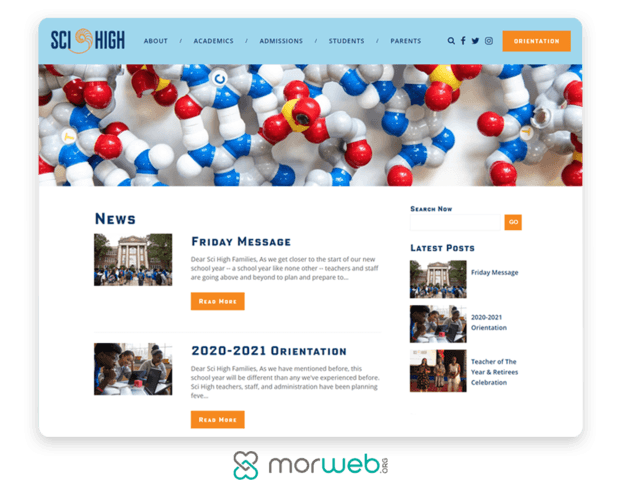
- Run a blog. Blogging enables you to share news and updates with your website visitors. While your marketing team will primarily run the blog, you may also consider allowing your students and faculty members to take charge and craft some of the posts themselves. Work with your team to determine which approach your school will take in advance.
Going virtual doesn’t mean you have to sacrifice quality. In fact, it gives your educators the opportunity to completely rethink the learning experience for students. Encourage your faculty to keep the above in mind when developing assignments and other educational content. Explore the concept of shifting to online learning further with this educational technology guide to make the most of virtual classrooms and consider lending out devices tracked by school asset management software.

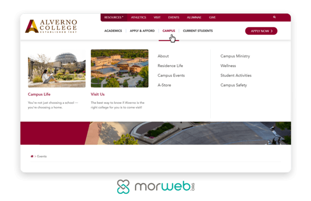
2. Create a well-organized navigation bar.
When you’ve taken the time to develop engaging content, you’ll want to ensure that your website visitors can find it. By developing a clear navigation bar, your audience will be able to locate whatever information is most relevant to their immediate needs. On the other hand, if they can’t find the desired information within a reasonable amount of time, they may become frustrated and leave your school’s website altogether.
Consider your target audience. This likely includes your prospective students, your current students and staff members, and your alumni. When visiting your school’s website, these three groups have different intentions behind why they’re there. Because of this, it’s important to create the correct framework to help them find what they’re looking for. Let’s take a look at these three perspectives:
- Prospective students: These individuals want to start with an overview of your school. This includes information such as its location and offered courses. From here, they may dive deeper to learn more about available programs and extracurricular activities. Otherwise, they may continue their search for education elsewhere.
- Current students and staff members: This group is already familiar with your school, so you’ll need to take a slightly different approach for their experience with your navigation. These visitors will likely want to learn more about ongoing events (whether in-person or virtual), access a community program, or log into your student and faculty portal. This way, they can maximize their learning experience.
- Alumni: For high schools and higher education institutions, individuals who have already graduated have a different set of needs altogether. They return to your school’s website looking to stay updated on any progress, engage in career networking opportunities, and possibly donate to their alma mater. Help them accomplish these goals by creating dedicated alumni pages, clear fundraising appeals, and accessible donation forms.
From here, you’ll want to determine which information is most pertinent to each of these audiences, which will be used to form the information architecture within your navigation bar. Don’t include everything in your navigation bar, though. Instead, only feature your high-value pages, such as those discussed above.
Often, you’ll see schools include button CTAs such as ‘Donate’ and ‘Enroll’ in the navigation bar as well. According to Soapbox Engage’s donate button guide, each button’s design can play an important role in generating conversions, so take the necessary time to create a straightforward design that stands out. If your CMS offers it, you can include a search bar to help visitors navigate to your other content.
Overall, remember that your navigation bar will be visible across your entire website. Whether a visitor lands on your homepage or a blog post, they should be able to quickly locate whatever they need using your navigation bar, whether it’s your donation form or information about upcoming events.

3. Offer straightforward forms.
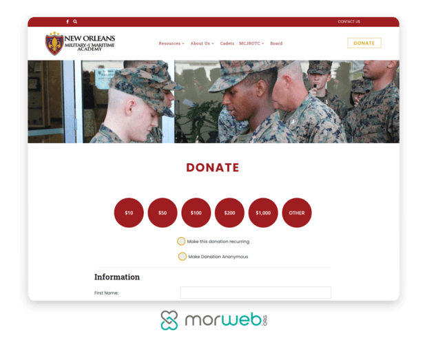
Chances are, your school employs various types of forms, such as those for donations, health information, and applications. Thanks to online form builders, you can now make yours available online. By placing these valuable resources directly on your school’s website, visitors will find them much easier to locate and will be able to fill them out without making an extra trip to your school. Not to mention, you won’t have to worry about organizing this data on your own later on.
Forms that are difficult to locate and navigate will turn users away. Instead, make sure they’re user-friendly, so you can effectively drive people through the process. Keep these best practices in mind to improve the user experience and boost form conversions:
- Determine what information you’d like to collect. When someone clicks through to one of your forms (whether they’re looking to enroll, register for an event, or donate), dozens of fields will seem overwhelming. Then, they may choose to leave before ever starting. Instead, limit the number of fields to the basics. For your donation page design, this means name, contact details, and payment information. Each additional field will give the visitor another chance to leave the process.
- Make sure it’s mobile-responsive. In 2019, 80% of online users used a mobile device to search the internet, making it an important consideration in your school’s web design strategy. When it comes to your forms, each element (e.g. fields, images, text) should automatically resize itself based on the user’s screen size. This will make it easier for users to fill out the fields and complete the form on mobile devices, which is important since your students are primarily younger and rely heavily on mobile devices.
- Brand it to your school. Sticking to the same font as well as two or three colors will make sure your forms are consistent with the rest of your website. You’ll want to include your school’s logo as well. These subtle elements can make a big difference in reminding users of why they’re there. If your forms look drastically different from the rest of your website, visitors may think they’ve somehow ended up on an untrustworthy third-party site.
Once you’ve created well-designed forms, you’ll want to ensure they’re visible across your school’s website. As we mentioned earlier, your high-value forms should be featured in your navigation bar for quick access. From health forms to event registrations, ensure your communications team spends sufficient time designing these to drive conversions.
The Gist
Making smart design choices can boost your brand and elevate your appeal to students, families, and faculty. A well-designed school website is a vital component of any education venture, regardless of your goals.
While there’s much more that goes into effective school web design, these three design elements will serve as a great starting point. Regardless of the criteria you set in place for what an “award-winning” school web design looks like, it’s important that it be clear, navigable, and accessible. How does your school’s current website stack up?
To position your school for success, check out this list of best school website designs. It provides examples of exceptional school websites so you can draw inspiration. Best of luck!
Featured Image by Andrea Piacquadio