
Simple Logos – Why They are More Attractive?

A fantastic logo is created from a variety of distinct components. But you must watch out that you don't overdo it with the colors, fonts, shapes, etc. The end result is a logo that appears to have not been created by a little child or an inexperienced designer.
The reality is that a simple logo may cut through the clutter and showcase your brand's actual core, which is crucial for the expansion of your company.
Even if they are not aware of it, individuals are interacting with companies more often than ever before nowadays. Brands are present everywhere, whether it is on social media platforms, television, radio, or email inboxes. Because of this, maintaining a strong brand is essential if you want to succeed. You can stand out from the competition by having a beautiful, simple logo design that connects with your audience.
Because they can convey clear ideas more rapidly than more complicated ones, simple logos frequently have a greater effect. There are several methods to make a simple logo, despite how simple it may seem in its design. For your inspiration, we've gathered some very outstanding examples from the internet.
Science tells us why we love simple logos
Recent research support what several businesses have previously found. People are naturally drawn to simplicity. It is derived from the idea of cognitive fluency. According to the hypothesis, our brains are programmed to look for information that is simple to digest. Our brains don't appear to want to work very hard. Clean and straightforward logos appeal to our minds like sweets.
How It Works
Our eyes process visual data from an image into an electrical signal that is then sent to our brain. The brain receives the color and light information from this signal.
Our brains have to work harder to comprehend and recall information when processing complex logos with more colors and light changes. It takes longer and is more difficult for us to remember the image as a result. On the other hand, When you see a straightforward logo, you might assume that it was simple to make; however, there is a lengthy process of brainstorming, trial and error, revision, and sometimes even starting over to find the ideal logo for your brand. You may seek assistance from a skilled designer that specializes in basic design to make a distinctive, eye-catching logo that will help you connect with your target market.
Here there are some examples of simple logos
Typography Logos
Businesses whose brands lend themselves to form, shapes, or art may find simple typography advantageous. Its minimalism makes other design elements stand out.
It's crucial to maintain your brand values and the message you want to convey to your audience in mind while designing your own typographic logo. Your logo should be concentrated on telling your story and invoking the feelings you want to convey the key message of your business.
Then, make sure your logo is simple and straightforward to understand. You won't have much success making an impact if your logo is difficult for your audience to understand at a glance.
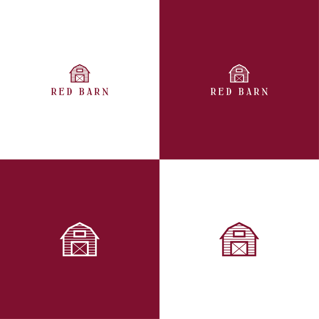
Geometric Logos
Simple geometry has been used in many different types of logos over many years. The main reason why geometry can be used in simple logo designs is that it contains mathematical resolutions. Although simple geometric shapes such as triangles and rectangles are generally used, asymmetrical geometric shapes are also commonly used in simple logo design.
If you think you need a stronger logo design with more catchy, sharp lines, you can turn to geometric logos by using the power of mathematics.
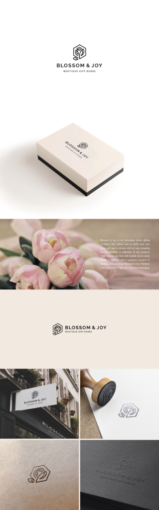
Symbols or Icons
When used well, such logos can represent the company in a simple and bold way. In many cases, the design is abstract and aims to arouse interest. Although such logos are basically simple, they can be used as a product in many different designs, so they should be preferred primarily by large companies or companies that plan to grow.

Wordmarks
Wordmark logos are uniquely styled text that spells out the brand's name, as opposed to symbols and icons. In order for such logos to be unique, a logo-specific font design is required. Since using the Wordmark logo makes the company's name stand out much more, it contributes greatly to increasing the company's name awareness. Since it is a type that provides simplicity, elegance, and usefulness at the same time, it is a type that is widely used by many companies.
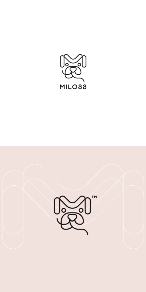
Line Drawing Logos
Another way to simplify logo design is to use line drawings. Line drawings form the basis of typographic and geometric logos.
By integrating line drawing into their other designs, designers can obtain more elegant products while maintaining simplicity. Another advantage of line drawing is that it adds a more fluid and luxurious air to the design it is used in.
Looking more accessible
In the business world where everything is complicated, you can change your perception in people's eyes by simplifying your logo, that is, your first impression in people's eyes. Being simple and appearing that way will also help you become a more successful company in the long run, as it will make you look more accessible outside of people.
Featured Image by Mehdi MeSSrro on Unsplash
Thank you for providing such an insightful post. It’s a really helpful and well-written blog.