
Single-Page Websites: Examples and Good Practices
Single-page websites are becoming more popular among web designers, both for their own projects and for client sites. There are a lot of cases out there in which a single-page site makes a lot of sense: if there isn't a ton of content; if the content is all closely related; or in cases where a particular stylistic element works best on a single page.
In any case, single-page sites are cropping up all over the place. But figure out when to use a one-page design and the best way to go about creating one is still a challenge for many. While a lot of general web design best practices apply to single-page sites just as they apply to more complex sites, there are some special considerations, which we've included below.
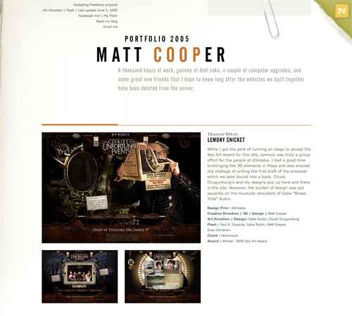 A single-page portfolio site that showcases a dozen movie websites. Minimal information is provided in the header, including a contact link.
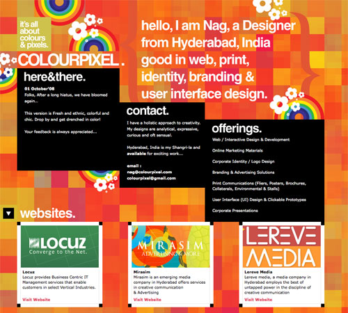 Colourpixel has a lot of varying information on their site, but for the most part everything is kept short and to the point. There's contact information, a portfolio and about information, all on a single page.
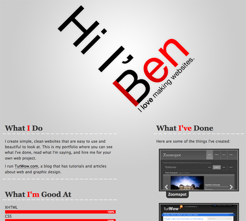 Ben Lind's website includes only the minimum amount of content to get his message across.
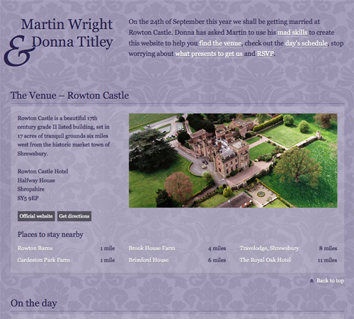 Single-page sites are perfect for things like events (a wedding in this case). There's not too much content to include and the single page makes it easy to find whatever you're looking for.
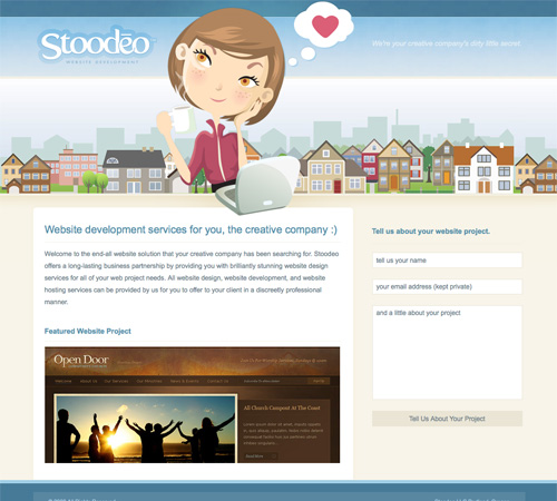 Stoodeo's site only contain's a single page worth of content. By placing the contact form to the side, they've really minimized the length of the page.
 This site incorporates both horizontal and vertical scrolling to get six pages worth of information on a single page.
 F Claire Baxter's site is a fantastic example of using JavaScript to create a site that smoothly scrolls horizontally.
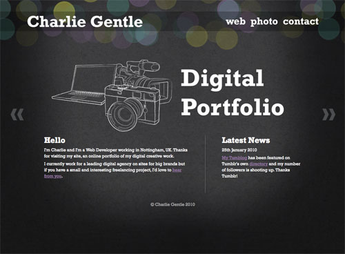 Charlie Gentle's website uses a horizontal-scrolling slideshow effect to display content.
A huge horizontally-scrolling single page site. They include the contact form right at the beginning, setting it apart from a lot of other horizontal sites that include it on the last screen.
Charlie Gentle's website uses a horizontal-scrolling slideshow effect to display content.
A huge horizontally-scrolling single page site. They include the contact form right at the beginning, setting it apart from a lot of other horizontal sites that include it on the last screen.
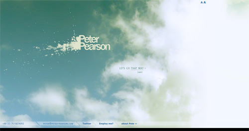 Peter Pearson's site uses a mix of animation and horizontal scrolling on his site. Multiple pages worth of content are broken up across multiple horizontal screens.
 This is a very simple, three-screen single page site. Each section of the site easily fits within a single screen and requires no scrolling. The use of bi-directional scrolling to navigate is also a unique touch.
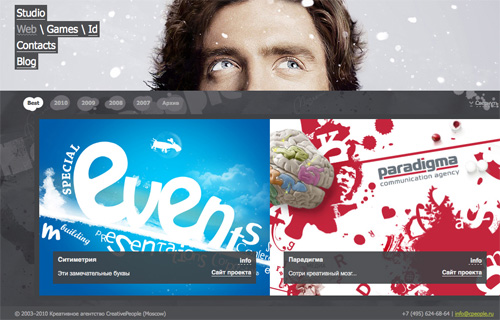 The CreativePeople website uses accordian sliders that come up from the bottom of the screen to display content. No scrolling is required.
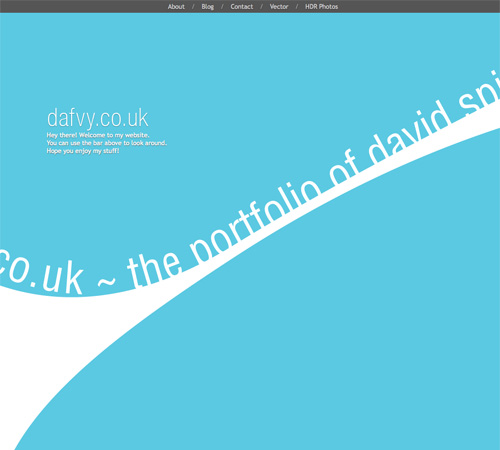 Each content area on the Dafvy.co.uk site fits easily within a single screen with no scrolling required. The background color transitions that occur when you click to navigate to each individual section is a very nice touch.
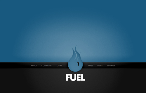 Fuel Brand uses a single-page that fits within your browser window and uses Ajax to show more content.
 A simple site with a slideshow and minimal information. The content adjusts to your screen size.
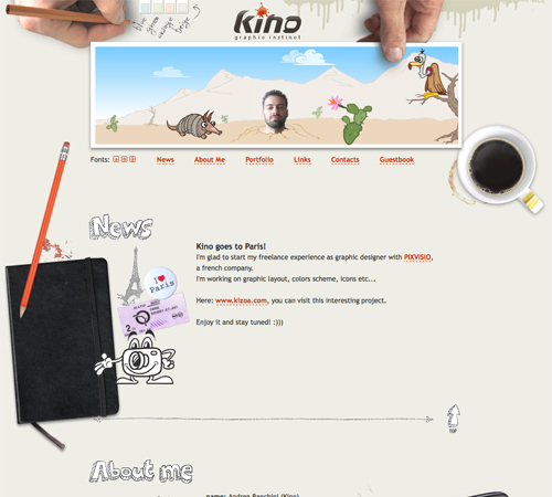 KINO uses consistent hand-drawn headers for each section of the site, along with a thin, hand-drawn border separating each one.
 Simple banners between each section keep a consistent look throughout the page while setting apart each content area.
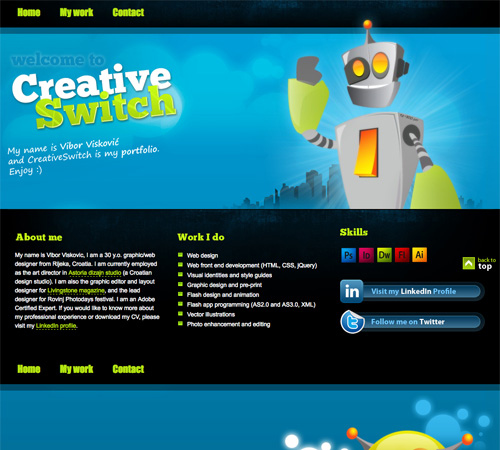 CreativeSwitch uses images similar to distinct headers for each section of the site, clearly marking transitions between different types of content.
 Even something as simple as a thick black bar can be enough to set your content areas apart from each other, as is done here.
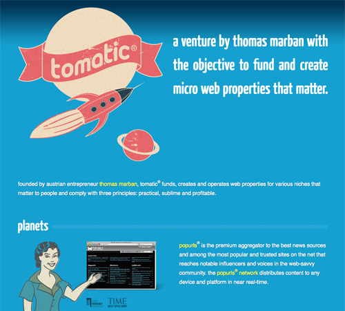 The Tomatic website uses a retro rocket and space exploration theme. The header includes a rocket with planets. Various other sections on the site continue the retro theme, and then the footer includes a robot and UFO on a planet's surface. Each section is set off with a unified header.
 This coming soon page is another great example of using a unified theme throughout the site.
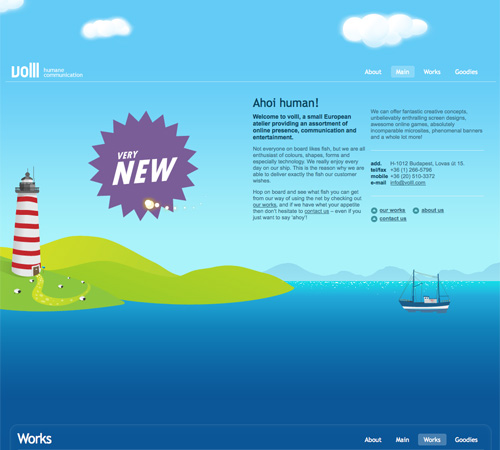 The Volll site uses a seascape/landscape image for the background, with the main content at sea level. Additional information shows up above the main content in the sky and below in the water, right down to the ocean floor.
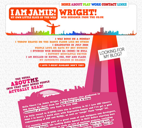 Jamie Wright's site uses a more abstract, colorful theme throughout. It really sets the site apart and draws your attention exactly where it should be.
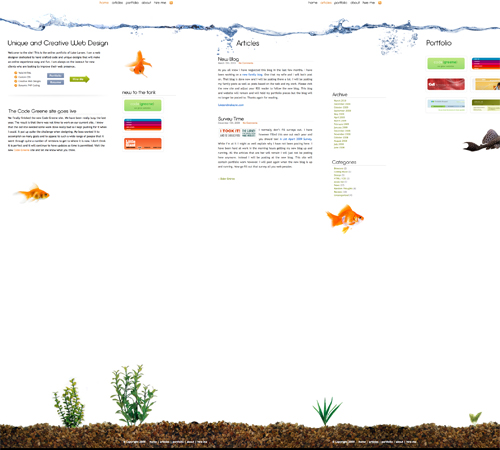 Luke Larsen's site uses a background that resembles a goldfish bowl.
 This is one of the most innovative background designs I've seen. As you scroll down the page, colored bars in the background interact with other background elements to produce a one-of-a-kind effect that's hard to even explain (so go check it out!).
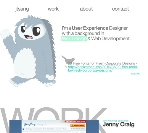
 Justin Tsang
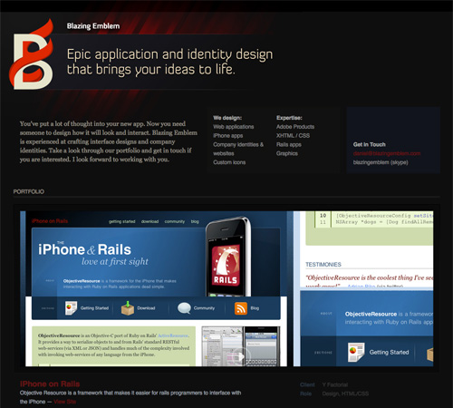
 Blazing Emblem, LLC
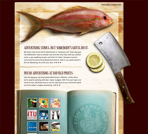
 Fish Marketing
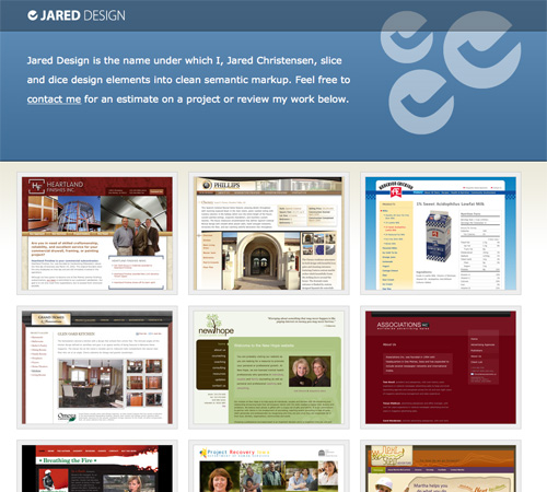
 Jared Design
 Koffie Verkeerd
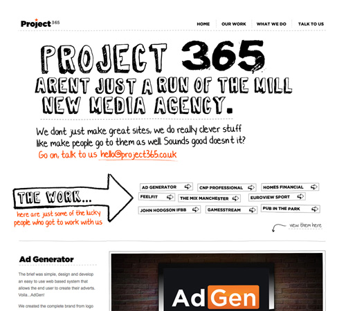
 Project 365
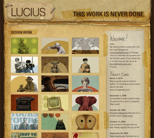
 Kevin Lucius
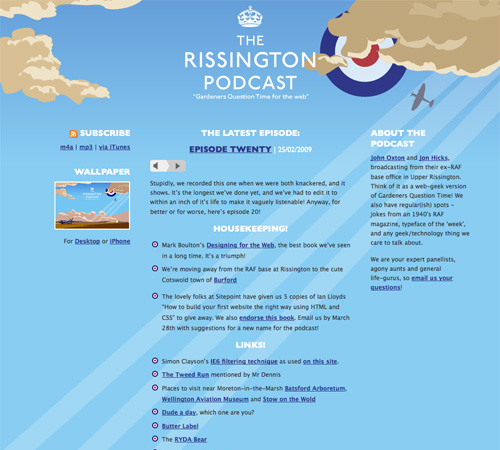
 The Rissington Podcast
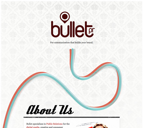
 Bullet PR
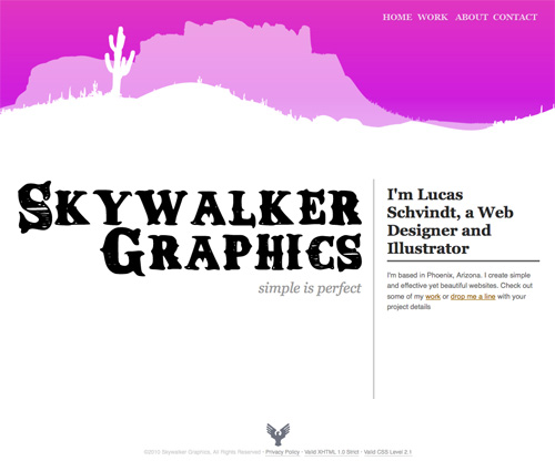
 Skywalker Graphics
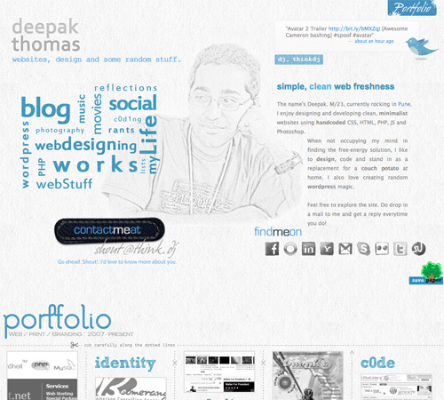
 thinkdj
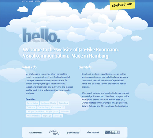
 Jan-Eike Koormann
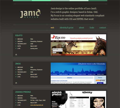
 Janic Design
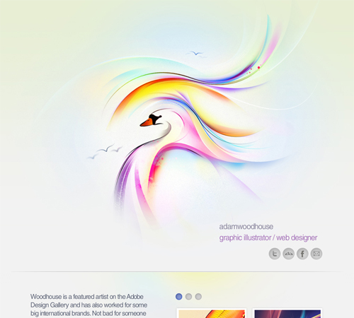
 Adam Woodhouse
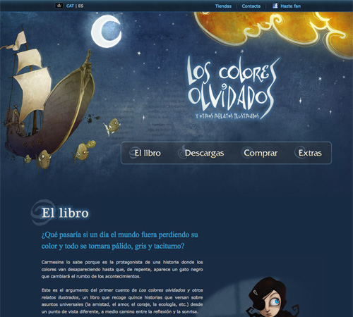
 Los Colores Olvidados
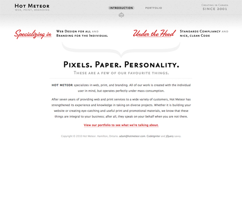
 Hot Meteor
 IndoFolio

Is a One-Page Site Right for Your Project?
Single page websites seem to be particularly popular among designers. But that doesn't mean those are the only sites they're appropriate for. Other places we've seen them include app websites and websites for particular products (like books). So how do you decide if a one-page site will meet your needs? Try asking yourself these questions:- Do I have a lot of content? Content-rich sites are probably not the best fit for a single-page site. If you have more than a dozen pages worth of information, you're probably better off with a more traditional, multi-page structure.
- Am I trying to sell a specific product? A single page website can be a great solution for selling one product, like a book, website theme, or similar.
- Are you comfortable with Ajax and JavaScript? A very large number of single-page sites use Ajax and JS for navigation and other elements. It's a very valuable way of creating an uncluttered site that still contains a fair amount of content.
- Is my content all related? Trying to put a bunch of unrelated content on a single page is likely just going to confuse your visitor. If you have a bunch of unrelated pages, they're probably best left as separate pages.
1. Minimal Content
When designing a single-page website, limiting the amount of content is important. First of all, rememeber that all your content needs to load at one time (unless you're using Ajax, but even then there's sometimes a fair amount of content to load at once). Also, if you want to use transitions between your content areas, they often work better when there isn't a huge amount of content to cover between sections that aren't bordering each other. Five or six separate content areas seem to be about the norm on many single-page sites. Some sites limit it to only two or three, even. It's rare to see a site with more than ten different content areas on a single page.Examples
A single-page portfolio site that showcases a dozen movie websites. Minimal information is provided in the header, including a contact link.
Ben Lind's website includes only the minimum amount of content to get his message across.
Single-page sites are perfect for things like events (a wedding in this case). There's not too much content to include and the single page makes it easy to find whatever you're looking for.
Stoodeo's site only contain's a single page worth of content. By placing the contact form to the side, they've really minimized the length of the page.
2. Consider Horizontal Scrolling
Not all horizontally-scrolling websites are single page sites. But a fair number of them are, and it's an interesting way to break out of the standard single-page box. Horizontal scrolling can also work better if you have more content. Combining a horizontal layout with JavaScript can also facilitate larger amounts of content without overwhelming the visitor.Examples
This site incorporates both horizontal and vertical scrolling to get six pages worth of information on a single page.
F Claire Baxter's site is a fantastic example of using JavaScript to create a site that smoothly scrolls horizontally.
Charlie Gentle's website uses a horizontal-scrolling slideshow effect to display content.
A huge horizontally-scrolling single page site. They include the contact form right at the beginning, setting it apart from a lot of other horizontal sites that include it on the last screen.
Peter Pearson's site uses a mix of animation and horizontal scrolling on his site. Multiple pages worth of content are broken up across multiple horizontal screens.
3. Consider Screen Size
With a single-page site, you may want to consider the visible area your visitors likely see within their browser. Crafting your pages to fit comfortably within that space can minimize scrolling while viewing individual sections. This can be particularly important if the transitions between areas are important to you. Once a visitor starts scrolling, they may just keep scrolling rather than using your navigation links.Examples
This is a very simple, three-screen single page site. Each section of the site easily fits within a single screen and requires no scrolling. The use of bi-directional scrolling to navigate is also a unique touch.
The CreativePeople website uses accordian sliders that come up from the bottom of the screen to display content. No scrolling is required.
Each content area on the Dafvy.co.uk site fits easily within a single screen with no scrolling required. The background color transitions that occur when you click to navigate to each individual section is a very nice touch.
Fuel Brand uses a single-page that fits within your browser window and uses Ajax to show more content.
A simple site with a slideshow and minimal information. The content adjusts to your screen size.
4. Clearly Set Apart Each Section
Most visitors to your site are going to be used to loading a new page for new content. If you squish all the content on your single-page site too close together, they may not see the transitions from one section the next. There are a variety of ways to differentiate between sections. Using a header for each content area is one way. Some sites use an actual line to separate different areas. And still other sites use ample amounts of white space to set areas apart from one another.Examples
KINO uses consistent hand-drawn headers for each section of the site, along with a thin, hand-drawn border separating each one.
Simple banners between each section keep a consistent look throughout the page while setting apart each content area.
CreativeSwitch uses images similar to distinct headers for each section of the site, clearly marking transitions between different types of content.
Even something as simple as a thick black bar can be enough to set your content areas apart from each other, as is done here.
The Tomatic website uses a retro rocket and space exploration theme. The header includes a rocket with planets. Various other sections on the site continue the retro theme, and then the footer includes a robot and UFO on a planet's surface. Each section is set off with a unified header.
5. Take Advantage of a Bigger Background
Big backgrounds are popular in all kinds of website design, but single page designs open up new possibilities for large backgrounds. Many designers take advantage of large background images as a way to set apart their content areas while maintaining a unified look to the entire site. For example, some sites might have a scene in the background that starts with a sky at the top with one content area, then further down they have a ground-level scene with another content area, and at the bottom they have an underwater scene with yet another content area. The possibilities with this kind of site are almost endless.Examples
This coming soon page is another great example of using a unified theme throughout the site.
The Volll site uses a seascape/landscape image for the background, with the main content at sea level. Additional information shows up above the main content in the sky and below in the water, right down to the ocean floor.
Jamie Wright's site uses a more abstract, colorful theme throughout. It really sets the site apart and draws your attention exactly where it should be.
Luke Larsen's site uses a background that resembles a goldfish bowl.
This is one of the most innovative background designs I've seen. As you scroll down the page, colored bars in the background interact with other background elements to produce a one-of-a-kind effect that's hard to even explain (so go check it out!).
6. Use JavaScript and Ajax to Organize and Display Content
If you have a bit more content to display but still want to stick to a single page design, consider using JS and Ajax to hide some content while others is displayed. Slideshows are the most popular techniques for incorporating JS, but modal windows and other methods are also used.Examples
Jon Brousseau's site uses JS for subtle enhancements like modal windows and tooltips.More Examples
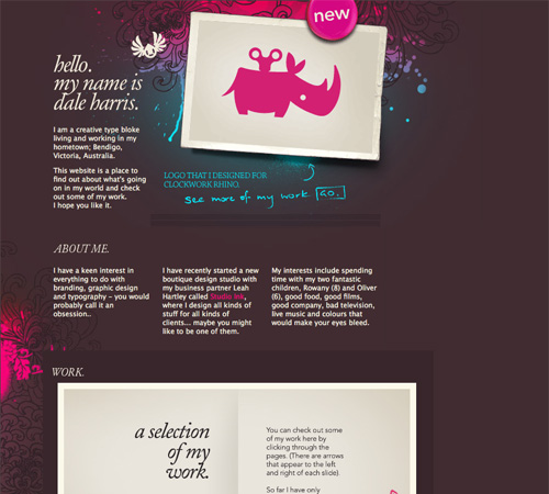
Below are a bunch of other great single-page website designs. Dale Harris
Justin Tsang
Blazing Emblem, LLC
Fish Marketing
Jared Design
Koffie Verkeerd
Project 365
Kevin Lucius
The Rissington Podcast
Bullet PR
Skywalker Graphics
thinkdj
Jan-Eike Koormann
Janic Design
Adam Woodhouse
Los Colores Olvidados
Hot Meteor
IndoFolio
In Review...
One-page websites can be a fun and different way to design a site, whether it's your own personal site or for a client. Consider ways to differentiate your one-page site that might not work as well on a multi-page site. Things like big background images or certain Ajax techniques work really well on one-page sites and have a bigger impact than they do on more complex sites. Here's a quick run-down of the best-practices mentioned above:- Minimal content. There's only room for so much content on a single page.
- Consider horizontal scrolling. While not all horizontal-scrolling websites are single pages, it's a format that lends itself well to the one-page format.
- Consider screen size. Creating content areas that fit within a visitor's screen without requiring scrolling is common in single-page sites.
- Clearly set apart each section. You don't have the convention of separate pages for different content, so you need to figure out another way to delineate content areas.
- Take advantage of bigger backgrounds. Single page sites are often longer or larger than other pages, giving more opportunities for creative use of big backgrounds.
- Use JavaScript and Ajax. Organizing a lot of content on a single page can be enhanced if you use Ajax or JS techniques like modal windows, tooltips and sliders.
Showcases
- One Page Love A gallery of single-page website designs.
- 30 One Page Websites A showcase from Tutorial Blog.
- 40+ Impressive Single Page Websites A showcase of single page sites from Dzine Blog.
- Single-Page Portfolio Sites An excellent showcase of designs from Web Designer Wall.
- 88 Single Page Website Designs for Design Inspiration A large showcase from InstantShift.
- How to Build Your Own Single Page Portfolio Website A rundown of the pros and cons of single page sites from a business perspective.
I like it. I want to do something like that but I don’t know how. Is there any tutorials or finished sites that can be downloaded and just change pictures?
I think that is actually a very useful one-page web sites. but it is still widely used in the classical system
Very nice compilation. Thanks for sharing.
I used these as a guide to design my one page portfolio!
Hello! Thank you for the tips. I have a question: How good are “onepagers” with SEO and the new Google algorithm?
Guillermo, as per my experience One Page sites are tough to have SEO done. A good website consit of quality contents that are branched out on various pages.
Single page sites were best used for landing pages when there was only HTML. Now the trend is changing and you see many single page site with quality effects on it.
As per new Google algorithms, i am not sure about it yet. But i am working on a single page site and doing seo on it, lets see how it goes. i will surely share it here.
Regards
It’s nearly impossible to find experienced people in this particular
topic, however, you seem like you know what you’re talking about!
Thanks