
SVG in Responsive Webdesign: Pros and Cons

The SVG format has plenty of advantages over other image formats for the web. It's vector-based, compact, and even editable via plain text editors thanks to the XML syntax. There's a reason why it's becoming increasingly more popular, especially with the steadily growing mobile web. Responsive webdesign is where it has a lot of strengths. However, it does have some problems here as well. So let's take a look at the pros and cons of SVG in responsive webdesign.

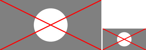
 SVG Without Media Queries: Thin Lines Because of Small Scaling
Here, a stronger line can be chosen using CSS.
SVG Without Media Queries: Thin Lines Because of Small Scaling
Here, a stronger line can be chosen using CSS.
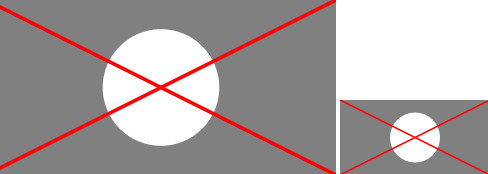
 SVG With Media Queries: Line Width is Enhanced For Small Scaling
Overall, plenty of optimizations can be made this way. By now, Media Queries and CSS within an SVG graphic are supported by all modern browsers. Internet Explorer starting from version 10 also supports it.
It doesn't matter whether you implement the SVG file via "<iframe>", "<object>" or "<img>" elements. In any case, the Media Queries are executed.
SVG With Media Queries: Line Width is Enhanced For Small Scaling
Overall, plenty of optimizations can be made this way. By now, Media Queries and CSS within an SVG graphic are supported by all modern browsers. Internet Explorer starting from version 10 also supports it.
It doesn't matter whether you implement the SVG file via "<iframe>", "<object>" or "<img>" elements. In any case, the Media Queries are executed.
 Background Graphic with „viewBox“ Property but without „background-size.“
This can be helped by defining a fixed size for the "<svg>" element instead of using the "viewBox" attribute. Alternatively, it is possible to define the background size via CSS, using the "background-size" attribute.
Background Graphic with „viewBox“ Property but without „background-size.“
This can be helped by defining a fixed size for the "<svg>" element instead of using the "viewBox" attribute. Alternatively, it is possible to define the background size via CSS, using the "background-size" attribute.
 Background Graphic With "viewBox" property and "background-size"
From time to time, you might want to equip HTML elements with a background graphic that has the exact same measurements. For fixed sizes, that's not a problem, as all you need to do is enter absolute values. However, when trying to equip the element with a relative size instead, which is often the case when it comes to responsive webdesign, a few tricks are necessary.
Here is where the so-called "padding-bottom" hack comes into play. Let's assume an element is supposed to always take up 50 percent of the window width. With CSS, an SVG background graphic can always be defined to assume the HTML element's width. The problem starts when it comes to the height. When assigning a relative height to the HTML element, it will always be displayed in relation to the window, but not in relation to the element's width.
However, it is possible to enter a value that is interpreted in relation to the element width, using "padding-bottom", and the "calc()" rule. For instance, when my SVG graphic has an aspect ratio of 2:1, I can enter this aspect ratio with "padding-bottom". For that, the width of the element is divided by the aspect ratio.
Background Graphic With "viewBox" property and "background-size"
From time to time, you might want to equip HTML elements with a background graphic that has the exact same measurements. For fixed sizes, that's not a problem, as all you need to do is enter absolute values. However, when trying to equip the element with a relative size instead, which is often the case when it comes to responsive webdesign, a few tricks are necessary.
Here is where the so-called "padding-bottom" hack comes into play. Let's assume an element is supposed to always take up 50 percent of the window width. With CSS, an SVG background graphic can always be defined to assume the HTML element's width. The problem starts when it comes to the height. When assigning a relative height to the HTML element, it will always be displayed in relation to the window, but not in relation to the element's width.
However, it is possible to enter a value that is interpreted in relation to the element width, using "padding-bottom", and the "calc()" rule. For instance, when my SVG graphic has an aspect ratio of 2:1, I can enter this aspect ratio with "padding-bottom". For that, the width of the element is divided by the aspect ratio.
Scalable at Will
As a vector format, SVG is scalable at will. Especially in responsive and fluid layouts, graphics are often scaled to the maximum width available depending on the browser and display size. With standard JPEG and PNG, you often risk images becoming pixelated. SVG graphics, on the other hand, are always displayed razor-sharp. While photos can deal with a scaling of over 100 percent, logos and other, less filigree drawings, however, will look blurry at such a scaling. To allow SVG graphics to be scaled at will, you need to enter the "viewBox" attribute into the "<svg>" element, and to forgo absolute width and height values. Applications like Illustrator automatically place this attribute when exporting to SVG format. When SVG graphics have set width and height values, they are always displayed in these dimensions. Then, scaling isn't possible. When using the "viewBox" attribute, an SVG graphic is always displayed in the maximum width of the element that ties in the graphic.<img src="demo.svg" width="640" height="320" />
When an SVG file is implemented via an "<img>" element, like in this example, you should enter a width and height there. Otherwise, the graphic is scaled as if the "width" value was set to 100 percent.
Another positive aspect of the scalability is the use on high-resolution displays. Without using the "srcset" attribute, which allows for the integration of high-resolution image files, pixel-based graphics are always scaled up. However, when using SVG graphics, you save the work of having to provide multiple versions of a graphic for different pixel densities. An SVG graphic is always displayed at its best resolution.
Adjustable Via Media Queries
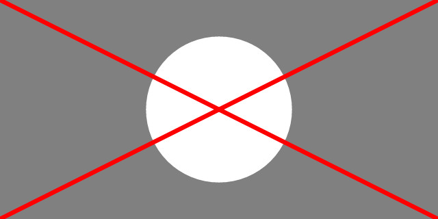
Another significant advantage of the SVG format is the application of Media Queries and CSS. Similar to an HTML document, the appearance can be adjusted to the respective width. In contrast to HTML documents, the width of the browser window or display, respectively, is not the decisive factor, but the width of the element that integrates an SVG graphic into a document. Especially detailed graphics often fail to shine on small displays. For that, there's the option to simply hide expendable details using a "display" attribute. As a graphic's line width is always scaled with the rest, the lines can sometimes become too slim to be clearly visible.
SVG Without Media Queries: Thin Lines Because of Small Scaling
Here, a stronger line can be chosen using CSS.
line {
  stroke-width: 6px;
}

@media all and (max-width: 320px) {
  line {
    stroke-width: 12px;
  }
}
In our example, the line width is set to six pixels. It is buffed to twelve pixels on depictions of less than 320 pixels in width.
SVG With Media Queries: Line Width is Enhanced For Small Scaling
Overall, plenty of optimizations can be made this way. By now, Media Queries and CSS within an SVG graphic are supported by all modern browsers. Internet Explorer starting from version 10 also supports it.
It doesn't matter whether you implement the SVG file via "<iframe>", "<object>" or "<img>" elements. In any case, the Media Queries are executed.
Integrating SVG Via CSS
Integration via CSS works the same way as the integration with an "<img>" element. However, there are a few things to keep in mind here. For example, if you want to use an SVG graphic as a background image, it will always be scaled to the element's full width when using the "viewBox" method described above.
Background Graphic with „viewBox“ Property but without „background-size.“
This can be helped by defining a fixed size for the "<svg>" element instead of using the "viewBox" attribute. Alternatively, it is possible to define the background size via CSS, using the "background-size" attribute.
div {
  background-image: url("demo.svg");
  background-size: 50px 25px;
}
Background Graphic With "viewBox" property and "background-size"
From time to time, you might want to equip HTML elements with a background graphic that has the exact same measurements. For fixed sizes, that's not a problem, as all you need to do is enter absolute values. However, when trying to equip the element with a relative size instead, which is often the case when it comes to responsive webdesign, a few tricks are necessary.
Here is where the so-called "padding-bottom" hack comes into play. Let's assume an element is supposed to always take up 50 percent of the window width. With CSS, an SVG background graphic can always be defined to assume the HTML element's width. The problem starts when it comes to the height. When assigning a relative height to the HTML element, it will always be displayed in relation to the window, but not in relation to the element's width.
However, it is possible to enter a value that is interpreted in relation to the element width, using "padding-bottom", and the "calc()" rule. For instance, when my SVG graphic has an aspect ratio of 2:1, I can enter this aspect ratio with "padding-bottom". For that, the width of the element is divided by the aspect ratio.
div {
  background-image: url("demo.svg");
  width: 50%;
  padding-bottom: calc(50% / (2 / 1));
}
As seen above, the width of 50 percent is divided by the aspect ratio of 2:1. Instead of "calc()", you could also directly enter the calculated value, 25 percent in this case. Thus, the HTML element always has a width of 50 percent as well as a height that matches the SVG graphic's aspect ratio.
Insightful and well thought out article. Thanks for sharing.
SVG in Responsive Webdesign: Pros and Cons? Wrong title, there are no cons :-)
I really simple to work with SVG in XML format and it has many advantages. Was very interesting to read about integration with CSS, thank you.
Thanks for writing this about SVG RWD. Doesn’t seem like there isn’t a reason to not use it.
Great article! I learned here: http://www.coreldraw.com/en/pages/svg-file/ about .svg files and how to edit them but I wanted to learn more and I just came to the right place. Thank you for sharing :)