
Tips for Coding and Designing Usable Web Forms
By Louis Lazaris
The web form has been one of the most discussed elements in web design for more than ten years now. We can't help it. Call-to-action functionality often leads users to a form; purchases are made using forms; users register via a registration form or subscribe using forms — the uses for forms are endless.
While it is fairly easy to slap together a form in HTML, it's not as easy to code, style, and design your form in a manner that makes it usable and accessible to the majority of users. Since forms play such a large role in website conversions and success rates, the tips below, as well as the resources provided at the end of this article, should prove valuable for developers creating and coding web forms.
 What are the benefits to this type of form layout, as opposed to a two-column form? First, the form labels have plenty of space to allow for future changes to the text inside them. A two-column form could be limited in this regard, and might require the entire form to be restructured if changes are made. Another benefit is that the form is not as cluttered looking, having plenty of whitespace in the label areas, so it's easy to read and easy to associate the labels with the fields. Additionally, the background color given to each label/field pairing makes the form more visually inviting.
By contrast, look at the two-column form below:
What are the benefits to this type of form layout, as opposed to a two-column form? First, the form labels have plenty of space to allow for future changes to the text inside them. A two-column form could be limited in this regard, and might require the entire form to be restructured if changes are made. Another benefit is that the form is not as cluttered looking, having plenty of whitespace in the label areas, so it's easy to read and easy to associate the labels with the fields. Additionally, the background color given to each label/field pairing makes the form more visually inviting.
By contrast, look at the two-column form below:
 Especially because of the left-aligned text and lack of color, this form doesn't have the same clean, visual effect as the previous example. In fact, the vertical space between the labels and the fields is somewhat distracting, giving the sense of multiple entities, when in fact a simple form like this should visually be presented as one grouped entity.
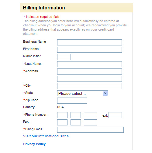
It's not impossible, however to achieve a clean, organized look with a two-column layout, as shown by the example below from Chapters Indigo Books:
Especially because of the left-aligned text and lack of color, this form doesn't have the same clean, visual effect as the previous example. In fact, the vertical space between the labels and the fields is somewhat distracting, giving the sense of multiple entities, when in fact a simple form like this should visually be presented as one grouped entity.
It's not impossible, however to achieve a clean, organized look with a two-column layout, as shown by the example below from Chapters Indigo Books:
 So, although there are no definite rules for the general layout of your form, effective guidelines include avoiding a two-column layout for simple forms, and aligning the text labels right if a two-column layout is used.
 Really Easy Field Validation
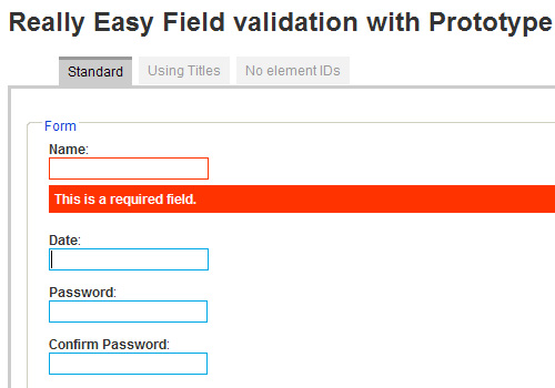 Dexagogo provides a simple script that can be used to add inline validation to your forms. The demo example is not the prettiest, but of course it can be customized to suit your needs. The script uses Scriptaculous for the fade-in effect.
 Unfortunately, the display of the border on the
 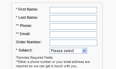 The example above has two problems: the asterisks are the same color as the rest of the text, and the explanation of the asterisk is near the bottom of the form. In many instances, asterisks alone would be enough, without any explanation, but if your target audience is not as computer-savvy, you will likely want to include at the top of the form a brief description of what the asterisk means.
The example below from Office Depot's registration page demonstrates a properly-placed asterisk description:
Office Depot Registration Form
The example above has two problems: the asterisks are the same color as the rest of the text, and the explanation of the asterisk is near the bottom of the form. In many instances, asterisks alone would be enough, without any explanation, but if your target audience is not as computer-savvy, you will likely want to include at the top of the form a brief description of what the asterisk means.
The example below from Office Depot's registration page demonstrates a properly-placed asterisk description:
Office Depot Registration Form
 Although the example form above does have problems (left aligned text, small type, little use of whitespace), it clearly indicates required fields and explains the meaning of the asterisk before the user begins filling it out. This is especially important in this example, since the first three fields are not required, thus the user can safely skip them.
 jQuery Image Combobox is a fully skinnable image-based replacement for the browser's usually-ugly
  Giva Labs mcDropdown jQuery Plug-in is an intuitive, keyboard-accessible, easy-to-implement replacement for a typical
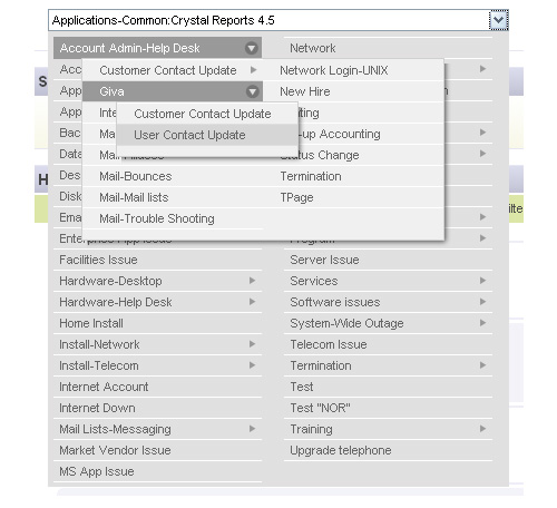
 DHTML Goodies Form Field Tooltip is another variation of the form field helper text that displays the helper text based on what is entered in the form field's
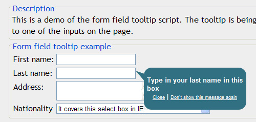
Two-Column vs. One
This decision will generally depend on the content of the form, but it's often preferable to avoid a two-column layout if the form is fairly simple. Below is a good example of a simple contact form that places each label above its related form element.
What are the benefits to this type of form layout, as opposed to a two-column form? First, the form labels have plenty of space to allow for future changes to the text inside them. A two-column form could be limited in this regard, and might require the entire form to be restructured if changes are made. Another benefit is that the form is not as cluttered looking, having plenty of whitespace in the label areas, so it's easy to read and easy to associate the labels with the fields. Additionally, the background color given to each label/field pairing makes the form more visually inviting.
By contrast, look at the two-column form below:
Especially because of the left-aligned text and lack of color, this form doesn't have the same clean, visual effect as the previous example. In fact, the vertical space between the labels and the fields is somewhat distracting, giving the sense of multiple entities, when in fact a simple form like this should visually be presented as one grouped entity.
It's not impossible, however to achieve a clean, organized look with a two-column layout, as shown by the example below from Chapters Indigo Books:
So, although there are no definite rules for the general layout of your form, effective guidelines include avoiding a two-column layout for simple forms, and aligning the text labels right if a two-column layout is used.
Use Inline Form Validation
Recently Luke Wroblewski wrote about the effectiveness of inline form validation on A List Apart. To quote directly from that article:Our participants were faster, more successful, less error-prone, and more satisfied when they used the forms with inline validation.jQuery Inline Form Validation, Because Validation is a Mess is a step-by-step tutorial describing how to use jQuery to add inline validation to a lengthy form.
Really Easy Field Validation
Dexagogo provides a simple script that can be used to add inline validation to your forms. The demo example is not the prettiest, but of course it can be customized to suit your needs. The script uses Scriptaculous for the fade-in effect.
Group Related Fields
With a lengthy form, you'll be limited as to what you can do to improve its usability, but grouping related fields together to divide the form into manageable visual components will make the form a little less intimidating. Thus, the form will be perceived to be easier to fill out, even though it will probably take about the same amount of time as a form that has no grouping of fields. To group related fields, use<fieldset> and the optional <legend> element, as shown in the code below:
<form id="form" action="register.php" method="post">

	<fieldset>
		<legend>Basic Info</legend>
		<div>
		<label for="name">Name:</label>
		<input type="text" name="name" id="name" />
		</div>
		<label for="password">Password:</label>
		<input type="text" name="password" id="password" />
		<div>
		<label for="password-confirm">Confirm Password:</label>
		<input type="text" name="password-confirm" id="password-confirm" />
		</div>
	</fieldset>

	<fieldset>
		<legend>Address</legend>
		<label for="address">Address:</label>
		<input type="text" name="address" id="address" />

		<label for="address2">Address (cont'd):</label>
		<input type="text" name="address2" id="address2" />

		<label for="zip">Zip/Postal:</label>
		<input type="text" name="zip" id="zip" />

		<label for="city">City:</label>
		<input type="text" name="city" id="city" />

		<label for="country">Country:</label>
		<input type="text" name="country" id="country" />

	</fieldset>

</form>
The
<fieldset> element by default has a border, which can be changed, and is often removed in a CSS reset. Below is an example of a single form that is divided into two sections using <fieldset> and <legend> elements:
Cosmicsoda Registration Form
Unfortunately, the display of the border on the <fieldset> is not the same across all browsers, so it is usually best to disable the border in your stylesheet and create a custom border by some other means. This will also affect the look of the <legend> element, so it's rare to see the use of these two elements nowadays. But the <fieldset> can still be used to group elements, and custom borders and headings can be included to provide the same basic effect. The <fieldset> and <legend> elements also have the added benefit of contributing to a form's accessibility.
Clearly Indicate Required Fields
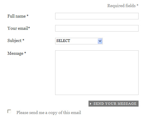
It's common to indicate required fields by means of the asterisk symbol (*) in a different color than the rest of the text, so the required indicator stands out. Although most sites nowadays include this indicator, some still fail to use it properly. The explanatory text that describes the purpose of the asterisk should be placed immediately above the form that is to be filled out, so the users see it before they begin filling it out. Some sites have used the asterisk character somewhat like a footnote indicator, placing the description of the asterisk below the form. The example below from the Elderluxe contact page demonstrates this poor placement of the the text that explains the meaning of the asterisk: Elderluxe Contact Form
The example above has two problems: the asterisks are the same color as the rest of the text, and the explanation of the asterisk is near the bottom of the form. In many instances, asterisks alone would be enough, without any explanation, but if your target audience is not as computer-savvy, you will likely want to include at the top of the form a brief description of what the asterisk means.
The example below from Office Depot's registration page demonstrates a properly-placed asterisk description:
Office Depot Registration Form
Although the example form above does have problems (left aligned text, small type, little use of whitespace), it clearly indicates required fields and explains the meaning of the asterisk before the user begins filling it out. This is especially important in this example, since the first three fields are not required, thus the user can safely skip them.
Fancier Checkboxes, Radio Buttons, and Select Elements
Forms can look awfully dull, especially since the styling of<select> elements, checkboxes, and radio buttons is limited in most browsers, and it is impossible to use CSS alone to style those elements to look exactly the same in every browser. Fortunately, there are a number of JavaScript library plugins and code that allow developers to include fancier, cross-browser form elements that degrade gracefully.
jQuery Checkbox allows you to insert custom checkboxes and radio buttons into your forms. I don't particularly care for the look of the radio buttons in this case (they look nothing like radio buttons), but it's one option to consider.
jQuery Image Combobox is a fully skinnable image-based replacement for the browser's usually-ugly <select> element.
Giva Labs mcDropdown jQuery Plug-in is an intuitive, keyboard-accessible, easy-to-implement replacement for a typical <select> element that allows for nested data.
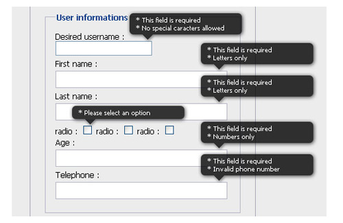
Display a Hint When a Field Gets Focus
Complex forms with many different fields can be easier for the user to fill out if some help text is given. Of course, you don't want to overwhelm the user with one or more paragraphs of text above the form explaining what the fields are for. As a simple alternative, you can write some JavaScript (or use a customizable plugin) that will display a custom tooltip-style message to explain form elements that might be confusing, or that require a certain type of input (for example, a username that only allows letters or numbers and must have at least 6 characters). jQuery Input Floating Hint Box is a simple plugin that displays a fully-customizable floating hint when a field gets focus.
DHTML Goodies Form Field Tooltip is another variation of the form field helper text that displays the helper text based on what is entered in the form field's title attribute.
Be Generous with Whitespace
As mentioned earlier, forms can look ugly and cluttered if the elements in the form are not displayed in a clean, usable manner. We generally think of the use of whitespace in our overall site design, but the same principle can be applied within a form, even down to the smallest details. You can improve a form's design by adding appropriate amounts of space around field elements, giving the elements themselves a larger and more usable size, and also allowing plenty of space inside text fields by using padding in your CSS. For example, try typing some text into the two fields below. With just a small difference in size and padding, the second input field has a more usable feel. When multiple text fields appear in the same form, this can make quite a difference in how the overall experience is perceived, even though technically it might not make a whole lot of difference as far as how long it takes the user to fill it out. It also helps to allow text fields to have plenty of visible characters. A name field especially should have plenty of space to allow for longer names. Overflow of characters will start pushing the text out of view, so it's best to have enough space to accommodate longer names so that the user can more easily spot mistakes. The example field below demonstrates how a longer name would be cut off. A text field that is similar in size to the ones in the previous example would be more appropriate and would allow for longer input to be entered without the risk of cutting anything off. The same principle would apply to a search box that may potentially receive long queries as input.Make Your Forms Accessible
The topic of accessible forms could easily encompass an entire article and much more, but here are just a few tips to ensure your forms are more accessible and usable to a diverse audience.- Use the
titleattribute for inputs, to assist those using screen readers - If a label doesn't wrap around the field it is associated with, use a
forattribute that matches the accompanying field'sid - Set a tab order using the
tabindexattribute on each element - For the tab order, increment the tab numbers by large amounts (e.g. "10, 20, 30..." instead of "1, 2, 3..."), to allow for later additions that don't require rewriting all the tab indexes
- For radio buttons and checkboxes, put the label after the associated element so screen readers read the item first and the word "checkbox" or "radio button" second
- Use the
<optgroup>tag to group<select>items - Use the
accesskeyattribute on form elements, to allow keyboard access
Nice tips. Mostly are well known but there are still some unusable forms out there.
Thanks for making the time to write this.
One thing that would have been nice to read is how the forms’ feedback is markedup, i.e when a user forgets to complete a field.
You mention semantic when creating the actual form: fieldset, label, title, using the right tags, etc.
You could talk about about the markup used to display an error…such as using tags to alert the user of incorrect field or password mismatch.
Thanks
Darren
i used html characters that didn’t display. Last paragrpah should read.
You could talk about about the markup used to display an error…such as using the strong tags to alert the user of incorrect field or password mismatch.
Thanks
nicely done!
Wonderful stuff
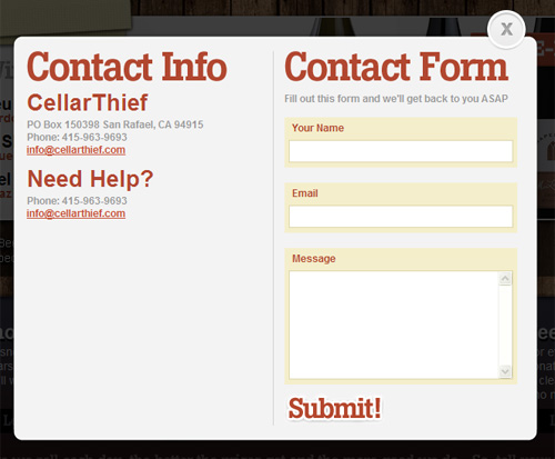
The contact page of #1 cellarthief . com looks awesome.I love the pop-up style and the way they arranged the fields.
Thanks for the great Post.
Perfect timing…I’m going to be working on a form today :)
Thanks much!
“Fancier Checkboxes, Radio Buttons, and Select Elements…”
Too fancy elements can often confuse the user too. Our usability tests suggest keeping the familiar ‘standard’ look.
Except, when the fancy item adds some value/clarity (example: the lists with the icon)
You’re probably right, those were not exactly the safest recommendation in an article about “usable” web forms, so I should have pointed out the potential drawbacks. Thanks.
Thanks for sharing!
In AdmixWeb We cover this topic too in our entry “15+ Best Practices Designing Web Forms” http://bit.ly/8tAPiU.
Nice Job!!!!!
Nice article. Great resources as well. Keeping forms simple and painless is an art in it self.
Nice tip about explaining the asterisk on top. However, I think using two columns has its place. Not for labels, but for really long forms. For example, let’s say a form has 40 inputs and most of them are text. Normally, text boxes are about 40 characters long, but a normal browser window size is 5-10 times that, meaning lots of unnecessary scrolling when filling out the form. Adding a column or two to split up the input elements will make it more readable and easier to navigate as its filled out.
There are so many little things that add up to a good user experience…Good Information!
I was just looking for a form tuts when I StumbleUpon this. Nice job.
Yeah! Good work, I like it! :-)
nice post. i would add use a label for every form control and use the for attribute with said label matching its conrols id.
very informative, especially image combo box .. great!
Great post, bookmarked
Nice Post, thanks for making out time to write this, very insightful!
good works an pratice for webforms
fab post, forms can be a pain and the code can sometimes look so messy but you’ve managed to confirm and wrap thing up very well with this – thanks for sharing
Nice idea’s. I like them. Thanks for show it.
good works for collect webforms
Great tips, although sometimes people try too hard to make their forms look “pretty” and actually hurt the user experience. Just as everything else online, forms should be clear, easy to understand and FAST to load and fill out.
Also, sometimes people (not so much myself) actually prefer the familiar (read: ugly) interfaces they are used to, so be careful how much you actually beautify your forms.
Nice and usefull information to share.
Thanks!
Great article – some good tips there!
Thanks for share
a good shell javascript editor http://www.bestofactuality.com/2010/01/jsfiddle-un-editeur-shell-javascript.html
That is an extremely helpful article.
Thanks for the article, it is always important to review usability and style in something as common as a web form.
Nice roundup of tips – it’s great to see people being really interested in forms design.
One point: on two-column forms design. In the past, I’ve usually seen this refer to having two columns of fields so that the user has to either switch from working down all the left column, and then working on the right column, or keep going across/down/across/down. You can see that even from this description, it’s quite confusing for users. I’ve written about this some more in my article “Two column forms are best avoided”.
You’ve used the term two-column forms design to refer to the practice of having the labels to the left of the fields, rather than on top. And although you’re not keen on that style of layout for simple forms, in fact you’ve given us some examples (lower down your article) that do exactly that, and are neatly designed and look easy enough.
If the labels are to the left of the fields, the next question is: should they be right-aligned or left aligned? Another topic that gets people discussing a lot! And the answer is: either can work very nicely. It depends on what the questions are asking, and how long the text is that you’re working with.
So the crucial points are:
– don’t have _two columns of fields_. Please.
– choose an arrangement of labels and field that looks harmonious to you. Then test it with typical users. Be objective about your design. Listen carefully to what your users tell you, watch them carefully as they fill in the form, and you’ll learn really quickly if you made good choices.
Best
Caroline Jarrett
Author: “Forms that work: Designing web forms for usability”
Caroline,
Thanks for the info, I’ll have to check out your articles. My problem with having the labels on the left was only with simple forms, as I mentioned. But even a simple form can be made to look inviting with the labels aligned left, as shown by the example from chapters/indigo.
I tend to prefer labels above fields, which is why I leaned towards that. Being a developer, I find it’s much easier to maintain that way too, so maybe I’m being biased.
Thanks again for your thoughts.
Hey Louis, nice article. I’d just disagree with two things.
The first one is usage of asterisk. Since the form should contain less optional fields (or none if possible), in most cases I’d go with marking them instead of required fields. There is an excellent study about this: http://www.cxpartners.co.uk/thoughts/web_forms_design_guidelines_an_eyetracking_study.htm Check out Guidelines 5.
The other thing is usage of fancy stuff. I’d be careful with it since it easily becomes too fancy and unusable.
nice tips tahk you.
Thanks for this useful article. Best regards.
You should totally check out this article about web forms good practices and options at http://www.webia.info/articles/usability/forms-cant-live-with-them-cant-live-without-them/
It’s a really good in depth article.
Excellent article and visuals thanks!
I always find it helpful when form fields provide a hint, although most forms are straight forward, don’t assume that every user will fully understand what your looking for.
Great post. In my experience inline validation & specifying required fields have been key to successful conversion rates.
Forms are usually a pain, especially the forms in two column layouts with dynamic form validations.
I really liked your collection. Easy to use and well-covered
Nice article! Thanks very much for keeping post such good articles!
Interesting blog, not like the load of rubbish on the internet
really Interesting article keep on the good work
Your joking, right?
Thank You so much for the real ..
It’s Looking Fantastic..