
Ultimate Guide To Grid-Based Web Design: Techniques and Tools
Grid-based layouts are generally more aesthetically pleasing and balanced than those not based on grids. While there are definitely great designs out there that don't use a grid-based layout, they are more difficult to create and often end up falling into some sort of loose grid structure anyway. So why not just design based on a grid in the first place?
This post offers up a complete guide to designing with grids. There's plenty of basic information here, as well as tons of links to more in-depth information on specific aspects of grid-based design from other sites. And to top it all off, we've compiled a showcase of excellent grid-based designs for inspiration.
 This tutorial series on designing with grids comes in five parts. It covers all aspects of grid-based design and walks your through designing a grid from scratch. Here are parts 2, 3, 4, and 5, and the preface to the series.
O Rule + Golden Proportion for Calculating the Gutter in a Grid
As the title suggests, this article explains how to use the Golden Proportion (also called the Golden Mean or the Golden Rectangle) and the "O Rule" to establish the gutter widths in your grid design.
Gridlasticness
A short post on elastic grid design based on em sizes. Includes some helpful tips based on a real-world site redesign.
Fluid Grids
This tutorial series on designing with grids comes in five parts. It covers all aspects of grid-based design and walks your through designing a grid from scratch. Here are parts 2, 3, 4, and 5, and the preface to the series.
O Rule + Golden Proportion for Calculating the Gutter in a Grid
As the title suggests, this article explains how to use the Golden Proportion (also called the Golden Mean or the Golden Rectangle) and the "O Rule" to establish the gutter widths in your grid design.
Gridlasticness
A short post on elastic grid design based on em sizes. Includes some helpful tips based on a real-world site redesign.
Fluid Grids
 This post from A List Apart offers a comprehensive tutorial on creating fluid grids. It covers everything from font sizing to the markup used for the example site.
Prototype a Magazine-Style Home Page Template with the Blueprint CSS Framework
This tutorial from Nettuts+ goes through the entire process of creating a magazine-style grid-based website design using the Blueprint framework (more information on that below). This is a very thorough tutorial with a demo and downloadable source materials.
960 CSS Framework—Learn the Basics
This article offers a great introduction to work with the 960.gs system. If you're new to working with 960.gs or grids in general, this is a great place to start.
This post from A List Apart offers a comprehensive tutorial on creating fluid grids. It covers everything from font sizing to the markup used for the example site.
Prototype a Magazine-Style Home Page Template with the Blueprint CSS Framework
This tutorial from Nettuts+ goes through the entire process of creating a magazine-style grid-based website design using the Blueprint framework (more information on that below). This is a very thorough tutorial with a demo and downloadable source materials.
960 CSS Framework—Learn the Basics
This article offers a great introduction to work with the 960.gs system. If you're new to working with 960.gs or grids in general, this is a great place to start.
 This is an excellent introductory article for grid-based design that provides a good overview of what grids are and how they're used.
Web Design Trend Hunting—Fluid Grid Layout: 10+ Outstanding Examples and 1 Tutorial
This post from Inspired Magazine offers up ten great examples of fluid grid designs, as well as a tutorial for creating your own fluid grid-based designs.
Setting Web Type to a Baseline Grid
This is a great post from Dev Opera about baseline grids and vertical flow in grid-based designs. It covers not only why you should use a baseline grid, but also how to go about it.
Thinking Outside the Grid
An early article on grid-based design from A List Apart. It covers how to break out of the traditional table-based grid, while still showing designs in the context of their looser grid-based structure.
Grid Style in Modern Web Design: Showcase and Resources
This article gives a great overview of grid-based design, and includes an introduction to what it is and how it works. It also has a great showcase of grid-based designs.
Oh Yeeaahh!
This is an excellent introductory article for grid-based design that provides a good overview of what grids are and how they're used.
Web Design Trend Hunting—Fluid Grid Layout: 10+ Outstanding Examples and 1 Tutorial
This post from Inspired Magazine offers up ten great examples of fluid grid designs, as well as a tutorial for creating your own fluid grid-based designs.
Setting Web Type to a Baseline Grid
This is a great post from Dev Opera about baseline grids and vertical flow in grid-based designs. It covers not only why you should use a baseline grid, but also how to go about it.
Thinking Outside the Grid
An early article on grid-based design from A List Apart. It covers how to break out of the traditional table-based grid, while still showing designs in the context of their looser grid-based structure.
Grid Style in Modern Web Design: Showcase and Resources
This article gives a great overview of grid-based design, and includes an introduction to what it is and how it works. It also has a great showcase of grid-based designs.
Oh Yeeaahh!
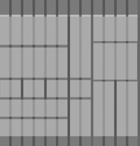
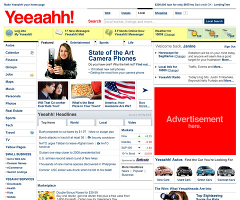 This is a now somewhat famous article on redesigning a well-known website to conform to a grid layout. It details the entire process (in the article and in a downloadable presentation), including the challenges the redesign presented.
The Grid System
This site offers up tons of categorized resources on grid design, compiling articles from all over the web. It also includes tools, books, templates, a blog, and inspiration — all in one place.
Adobe Web Tech Curriculum: Page Layout Grids
This lesson from Adobe gives a great introduction to grid design and includes guidelines for creating and using your own grids. The factors and guidelines are provided in an easy-to-reference bulleted list.
The Complex Grid
This post is typography-specific, though many of the principles it discusses in relation to grid-based design could be applied to other design elements.
Developing the Grid that Supports Your Design
A great overview of creating a grid to fit your proposed design, with some great grid examples based on common layouts.
Designing with Grids
This is a very thorough article from .net magazine about designing grid-based layouts. It covers why grids work along with grid-based design theory and includes some practical suggestions for working with grids.
Design By Grid
Design By Grid offers up tons of grid design resources, including a showcase, articles, and tutorials. They also have a resources section with even more information from around the web.
65 Resources for Grid-Based Design
This is an excellent roundup of resources compiled by Vandelay Design. The listings are categorized by articles, galleries, tools, framework resources, and WordPress themes.
Grid Based Design Toolbox
This is a now somewhat famous article on redesigning a well-known website to conform to a grid layout. It details the entire process (in the article and in a downloadable presentation), including the challenges the redesign presented.
The Grid System
This site offers up tons of categorized resources on grid design, compiling articles from all over the web. It also includes tools, books, templates, a blog, and inspiration — all in one place.
Adobe Web Tech Curriculum: Page Layout Grids
This lesson from Adobe gives a great introduction to grid design and includes guidelines for creating and using your own grids. The factors and guidelines are provided in an easy-to-reference bulleted list.
The Complex Grid
This post is typography-specific, though many of the principles it discusses in relation to grid-based design could be applied to other design elements.
Developing the Grid that Supports Your Design
A great overview of creating a grid to fit your proposed design, with some great grid examples based on common layouts.
Designing with Grids
This is a very thorough article from .net magazine about designing grid-based layouts. It covers why grids work along with grid-based design theory and includes some practical suggestions for working with grids.
Design By Grid
Design By Grid offers up tons of grid design resources, including a showcase, articles, and tutorials. They also have a resources section with even more information from around the web.
65 Resources for Grid-Based Design
This is an excellent roundup of resources compiled by Vandelay Design. The listings are categorized by articles, galleries, tools, framework resources, and WordPress themes.
Grid Based Design Toolbox
 Fuel Your Creativity has compiled a huge list of grid-based design resources, broken down by category. There are tools, galleries, tutorials, WordPress themes, and articles to get you going with grid-based design.
The Funniest Grid You Ever Saw
This article from Subtraction talks about the redesign of The Onion and how it now fits into a grid-based framework. It's a very thorough article that offers great insights into how to design a complex grid-based theme so common on news and magazine websites.
45+ CSS Grid Systems, Layout Generators and Tutorials that Every Designer Should Know
Tripwire Magazine has compiled this excellent resource list for grid design. Some basic information is provided for each link, as well as some general grid-design info.
Grid (page layout)
This is Wikipedia's page explaining grid-based design. It offers some great explanations of why grids work and includes a bit of history and further resources.
Fuel Your Creativity has compiled a huge list of grid-based design resources, broken down by category. There are tools, galleries, tutorials, WordPress themes, and articles to get you going with grid-based design.
The Funniest Grid You Ever Saw
This article from Subtraction talks about the redesign of The Onion and how it now fits into a grid-based framework. It's a very thorough article that offers great insights into how to design a complex grid-based theme so common on news and magazine websites.
45+ CSS Grid Systems, Layout Generators and Tutorials that Every Designer Should Know
Tripwire Magazine has compiled this excellent resource list for grid design. Some basic information is provided for each link, as well as some general grid-design info.
Grid (page layout)
This is Wikipedia's page explaining grid-based design. It offers some great explanations of why grids work and includes a bit of history and further resources.
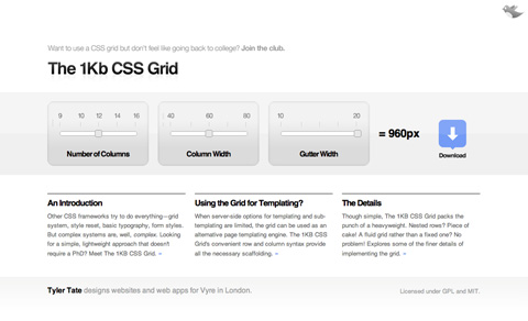 Just as the name suggests, the 1KB Grid System is a grid system based on a CSS file that is under 1 kilobyte. You can customize the grid before downloading, with the number of columns (9, 10, 12, 14, or 16), their width (40, 60, or 80 pixels), and how wide you want the gutters to be (10 or 20 pixels) to create grids from 450px wide up to 1600px (not recommended, obviously). The resulting file is not only super-tiny, but also super-easy to understand and work with. If you're new to grid-based design, this might be one of the best framework options available.
 960.gs is a grid system based on a 960-pixel-wide page layout. It supports designs based on 12 or 16 columns. The download includes a printable sketch sheet for hand-drawing mockups.
 Baseline is a framework built with both grid-based design and good typography in mind. It works with HTML 5 and CSS 3 (requiring a modern browser for all of their functionality to display properly). Baseline serves as a great framework for creating grid-based sites that feature visually pleasing typography (beyond just nice fonts and styles).
 Blueprint is one of the better-known grid frameworks out there. In addition to the grid-design tools, Blueprint also includes support for typography, print styles, sprites, and more.
 Boks is a cross-platform-compatible Adobe AIR application for working with the Blueprint CSS framework. It lets you configure your grid, baseline rhythm, CSS, and exports a .png file to use in your design mockups.
 The Fluid 960 Grid System is based on the 960.gs framework but with a fluid width and incorporates MooTools and jQuery effects. The demo page itself is impressive, and the fluid nature makes it a preferrable choice for many designers.
 The Grid Calculator is a simple tool that uses sliders to adjust the base font size, number of columns and their width, and the gutter width of your grid. It automatically calculates the total grid width and shows the grid layout below the calculator.
 Grid Designer is a simple grid layout tool for creating grids with any number of columns, of any width, with any size gutters and margins. It's simple to use and even includes tools for developing your site's typography at the same time.
 GridFox is a Firefox plugin that lets you overlay a grid on any website design. You can change the width, the number of columns, and the alignment of the grid, though the gutter width seems to be fixed. It's a great tool if you're trying to figure out how an existing grid-based website was set up, or even for double-checking your own work.
 The Gridinator is an online tool for creating custom grids that match your needs. You can specify how many columns you want, how wide they should be, the margins, and the body font size, and then download the CSS, HTML, and the image file for creating mockups.
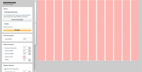 Gridmaker is a fairly robust online grid creator that includes tools for formatting your vertical columns and baseline properties. You can then export a .png file for creating your design mockups. Gridmaker is also available as a Photohsop CS4 plugin.
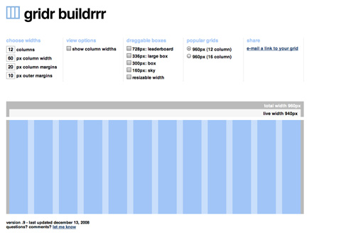 Gridr Buildrrr is another online grid design tool that lets you create custom grids to meet your design needs. You can specify the number of columns, their width and margins, and the container margin. It also allows you to add draggable boxes to your grid (including leaderboards and resizable width boxes).
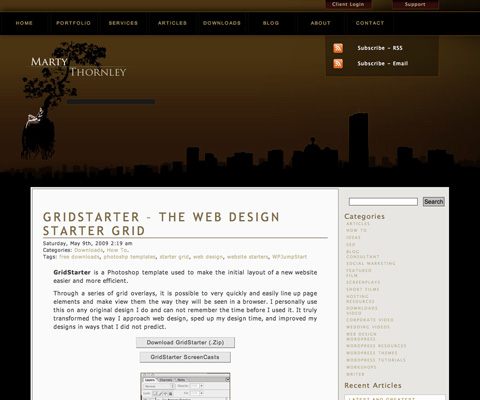 Gridstarter is a free grid template for Photoshop that's based on a 960px layout. It's based on a 60x60 grid for 16 columns (which also means you can easily do 2, 4, 6, 8, or 12 columns by combining grid columns). The site also includes screencasts for getting started with Gridstarter.
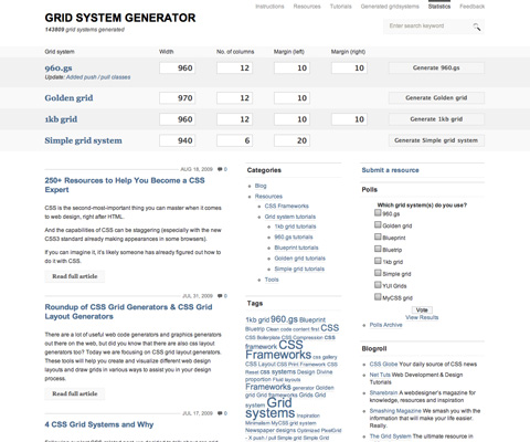 The Grid System Generator makes it easy to set up grid templates for 960.gs, The Golden Grid, the 1KB Grid, and Simple Grid. You can choose the width, number of columns, and margins to create a customized template file for your own needs. The site also offers articles on CSS and grid-based design, plus additional resources from around the web.
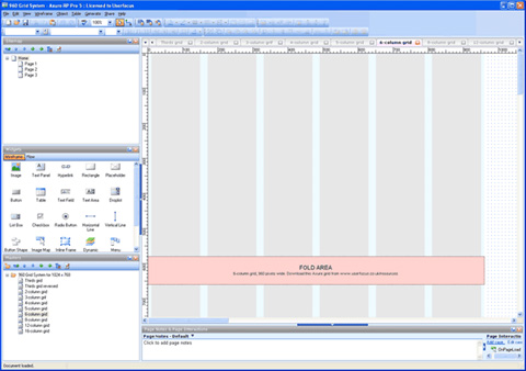 If you use Axure for prototyping and wireframing or the Pencil extension for Firefox, then these Layout Grids are for you. The files included here overlay a grid to your workspace (either in Axure RP Pro 5 or Pencil), making the creation of grid-based wireframes and prototypes much easier.
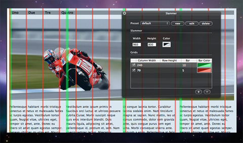 Slammer is a program for Mac OS X Leopard that lets you overlay a grid on any window. It includes rulers to help you position elements precisely and also allows you to save your customized overlays for future use.
 The Golden Grid is a slightly different grid system based on the number 3. It uses a 6/12 grid system instead of the more common 14 or 16 column format. The grid takes into account the Rule of Thirds (Golden Rule, hence the name) to create more aesthetically pleasing designs.
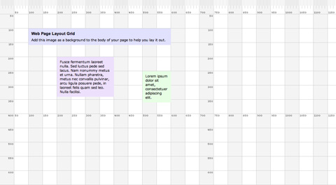 The Web Page Layout Grid is a simple, downloadable (just right click and then click on "view background image") image for laying out your designs on a grid. Just put the image behind your design work and you have a ready-made grid with pixel markings on both vertical and horizontal axes.
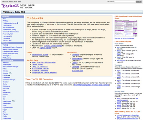 YUI Grids CSS is a grid framework that supports both fixed- and fluid-width grids. It's a 4kb file that claims to support over 1000 page layouts. Examples and tools are included, too.


The Basics of Grid Design
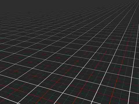
Virtually any website you design should be based on a grid. Grids lend a sense of structure to your site and improved usability for your visitors. And designing to a grid can simplify your design process and make you a more efficient designer. In a grid-based design, since the guides are already in place for you, your options are reduced, making it easier to decide on the width and height of different elements on your pages.
Basic Principles and Ideas
Most grid systems are split up into either 9, 12, 16, or 20 columns. Custom grids might use more or fewer columns than this. Some grids also break up the design into horizontal rows, which are generally the same width in pixels as the columns. Many designers feel that grids are only appropriate for fixed-width layouts, but grids are versatile enough to be used in fluid layouts, too. There are already some grid frameworks that make provisions for fluid layouts.Best Practices in Grid Design
There are a number of things to keep in mind when designing with a grid. While many of the tips below are flexible, it's helpful to know what they are before you embark on a grid-based design project. There's nothing wrong with breaking the rules as long as it's a conscious decision and not an accident. Use only enough columns as you need for your design. What's the point of using a grid with 20 columns if you're only going to use four of those? While combining columns is expected for individual elements, if you only need 12 columns, then pick a grid system (or design your own) that only uses 12 columns. Anything beyond that only creates visual clutter in your design workspace. Pay attention to both horizontal and vertical spacing. While some grid frameworks don't have provisions for designing along a horizontal baseline, others do. If you work with one that doesn't, consider creating your own horizontal rows to help with the spacing of elements vertically. Generally, rows should be the same number of pixels high as columns are wide. Don't be afraid to step outside the grid. Sometimes you need to break free of your grid for certain elements. This is fine, as long as it's a conscious decision and you know why it's necessary. This is especially prevalent in header and footer design with complex backgrounds (like with an illustrated header). It's okay to get away from the grid if you feel it's integral to the design. Use a pre-designed grid if possible. You don't have to reinvent the wheel. There are more than a dozen good, grid-based layouts available. One of them will most likely fit your needs, even if you have to tweak it a bit.Additional Resources
Grid-Based Design 101 Grid-Based Design: Six Creative Column Techniques which covers six techniques for working within grid columns.Grid Design Tutorials and Resources
There are numerous tutorials and resources available for grid-based design. While many rehash what's been said over and over again, there are some real gems out there that provide valuable insights into grid-based design. And while tutorials are more sparse than articles, there are some great ones available, some of which are included below.Tips and Tutorials
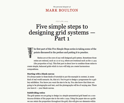
Five Simple Steps to Designing Grid Systems—Part 1
This tutorial series on designing with grids comes in five parts. It covers all aspects of grid-based design and walks your through designing a grid from scratch. Here are parts 2, 3, 4, and 5, and the preface to the series.
O Rule + Golden Proportion for Calculating the Gutter in a Grid
As the title suggests, this article explains how to use the Golden Proportion (also called the Golden Mean or the Golden Rectangle) and the "O Rule" to establish the gutter widths in your grid design.
Gridlasticness
A short post on elastic grid design based on em sizes. Includes some helpful tips based on a real-world site redesign.
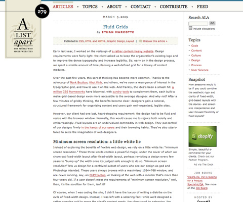
Fluid Grids
This post from A List Apart offers a comprehensive tutorial on creating fluid grids. It covers everything from font sizing to the markup used for the example site.
Prototype a Magazine-Style Home Page Template with the Blueprint CSS Framework
This tutorial from Nettuts+ goes through the entire process of creating a magazine-style grid-based website design using the Blueprint framework (more information on that below). This is a very thorough tutorial with a demo and downloadable source materials.
960 CSS Framework—Learn the Basics
This article offers a great introduction to work with the 960.gs system. If you're new to working with 960.gs or grids in general, this is a great place to start.
General Resources
Grid-Based Layout
This is an excellent introductory article for grid-based design that provides a good overview of what grids are and how they're used.
Web Design Trend Hunting—Fluid Grid Layout: 10+ Outstanding Examples and 1 Tutorial
This post from Inspired Magazine offers up ten great examples of fluid grid designs, as well as a tutorial for creating your own fluid grid-based designs.
Setting Web Type to a Baseline Grid
This is a great post from Dev Opera about baseline grids and vertical flow in grid-based designs. It covers not only why you should use a baseline grid, but also how to go about it.
Thinking Outside the Grid
An early article on grid-based design from A List Apart. It covers how to break out of the traditional table-based grid, while still showing designs in the context of their looser grid-based structure.
Grid Style in Modern Web Design: Showcase and Resources
This article gives a great overview of grid-based design, and includes an introduction to what it is and how it works. It also has a great showcase of grid-based designs.
Oh Yeeaahh!
This is a now somewhat famous article on redesigning a well-known website to conform to a grid layout. It details the entire process (in the article and in a downloadable presentation), including the challenges the redesign presented.
The Grid System
This site offers up tons of categorized resources on grid design, compiling articles from all over the web. It also includes tools, books, templates, a blog, and inspiration — all in one place.
Adobe Web Tech Curriculum: Page Layout Grids
This lesson from Adobe gives a great introduction to grid design and includes guidelines for creating and using your own grids. The factors and guidelines are provided in an easy-to-reference bulleted list.
The Complex Grid
This post is typography-specific, though many of the principles it discusses in relation to grid-based design could be applied to other design elements.
Developing the Grid that Supports Your Design
A great overview of creating a grid to fit your proposed design, with some great grid examples based on common layouts.
Designing with Grids
This is a very thorough article from .net magazine about designing grid-based layouts. It covers why grids work along with grid-based design theory and includes some practical suggestions for working with grids.
Design By Grid
Design By Grid offers up tons of grid design resources, including a showcase, articles, and tutorials. They also have a resources section with even more information from around the web.
65 Resources for Grid-Based Design
This is an excellent roundup of resources compiled by Vandelay Design. The listings are categorized by articles, galleries, tools, framework resources, and WordPress themes.
Grid Based Design Toolbox
Fuel Your Creativity has compiled a huge list of grid-based design resources, broken down by category. There are tools, galleries, tutorials, WordPress themes, and articles to get you going with grid-based design.
The Funniest Grid You Ever Saw
This article from Subtraction talks about the redesign of The Onion and how it now fits into a grid-based framework. It's a very thorough article that offers great insights into how to design a complex grid-based theme so common on news and magazine websites.
45+ CSS Grid Systems, Layout Generators and Tutorials that Every Designer Should Know
Tripwire Magazine has compiled this excellent resource list for grid design. Some basic information is provided for each link, as well as some general grid-design info.
Grid (page layout)
This is Wikipedia's page explaining grid-based design. It offers some great explanations of why grids work and includes a bit of history and further resources.
Grid Tools, Frameworks and Templates
While sometimes a particular design project calls for a custom grid solution, there are plenty of frameworks that can be customized to work for just about any design. And even if you opt for a custom solution, there are tools available that can help you decide on the basics of your grid's layout.1KB CSS Grid
Just as the name suggests, the 1KB Grid System is a grid system based on a CSS file that is under 1 kilobyte. You can customize the grid before downloading, with the number of columns (9, 10, 12, 14, or 16), their width (40, 60, or 80 pixels), and how wide you want the gutters to be (10 or 20 pixels) to create grids from 450px wide up to 1600px (not recommended, obviously). The resulting file is not only super-tiny, but also super-easy to understand and work with. If you're new to grid-based design, this might be one of the best framework options available.
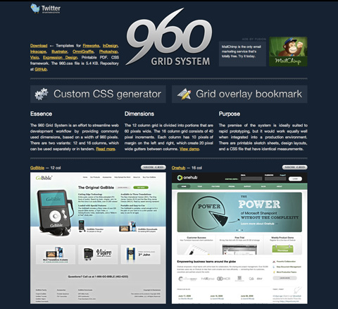
960 Grid System
960.gs is a grid system based on a 960-pixel-wide page layout. It supports designs based on 12 or 16 columns. The download includes a printable sketch sheet for hand-drawing mockups.
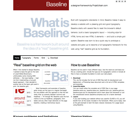
Baseline
Baseline is a framework built with both grid-based design and good typography in mind. It works with HTML 5 and CSS 3 (requiring a modern browser for all of their functionality to display properly). Baseline serves as a great framework for creating grid-based sites that feature visually pleasing typography (beyond just nice fonts and styles).
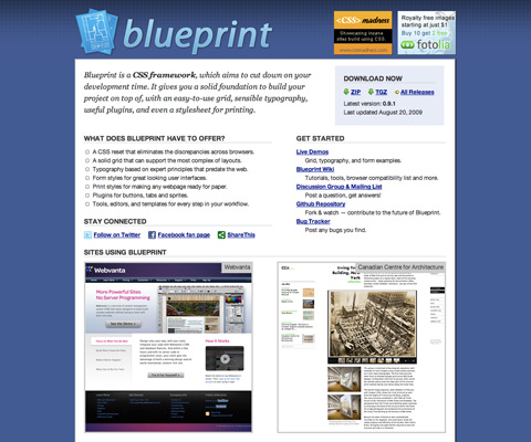
Blueprint CSS
Blueprint is one of the better-known grid frameworks out there. In addition to the grid-design tools, Blueprint also includes support for typography, print styles, sprites, and more.
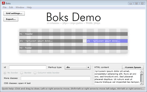
Boks
Boks is a cross-platform-compatible Adobe AIR application for working with the Blueprint CSS framework. It lets you configure your grid, baseline rhythm, CSS, and exports a .png file to use in your design mockups.
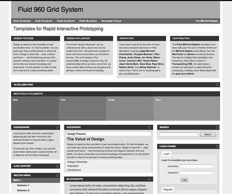
Fluid 960 Grid System
The Fluid 960 Grid System is based on the 960.gs framework but with a fluid width and incorporates MooTools and jQuery effects. The demo page itself is impressive, and the fluid nature makes it a preferrable choice for many designers.
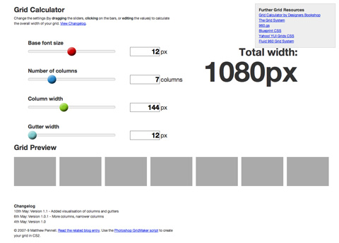
Grid Calculator
The Grid Calculator is a simple tool that uses sliders to adjust the base font size, number of columns and their width, and the gutter width of your grid. It automatically calculates the total grid width and shows the grid layout below the calculator.
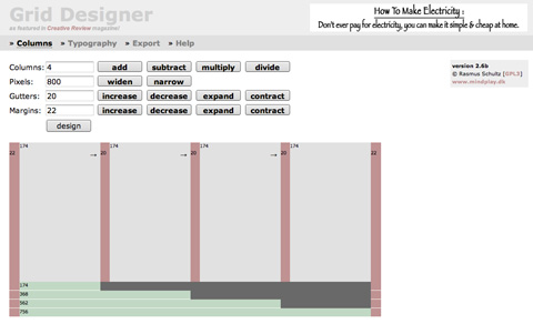
Grid Designer
Grid Designer is a simple grid layout tool for creating grids with any number of columns, of any width, with any size gutters and margins. It's simple to use and even includes tools for developing your site's typography at the same time.
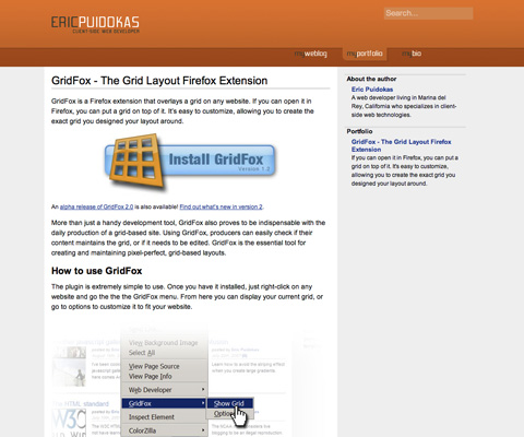
GridFox
GridFox is a Firefox plugin that lets you overlay a grid on any website design. You can change the width, the number of columns, and the alignment of the grid, though the gutter width seems to be fixed. It's a great tool if you're trying to figure out how an existing grid-based website was set up, or even for double-checking your own work.
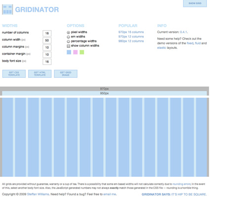
Gridinator
The Gridinator is an online tool for creating custom grids that match your needs. You can specify how many columns you want, how wide they should be, the margins, and the body font size, and then download the CSS, HTML, and the image file for creating mockups.
Gridmaker
Gridmaker is a fairly robust online grid creator that includes tools for formatting your vertical columns and baseline properties. You can then export a .png file for creating your design mockups. Gridmaker is also available as a Photohsop CS4 plugin.
Gridr Buildrrr
Gridr Buildrrr is another online grid design tool that lets you create custom grids to meet your design needs. You can specify the number of columns, their width and margins, and the container margin. It also allows you to add draggable boxes to your grid (including leaderboards and resizable width boxes).
Gridstarter—The Web Design Starter Grid
Gridstarter is a free grid template for Photoshop that's based on a 960px layout. It's based on a 60x60 grid for 16 columns (which also means you can easily do 2, 4, 6, 8, or 12 columns by combining grid columns). The site also includes screencasts for getting started with Gridstarter.
Grid System Generator
The Grid System Generator makes it easy to set up grid templates for 960.gs, The Golden Grid, the 1KB Grid, and Simple Grid. You can choose the width, number of columns, and margins to create a customized template file for your own needs. The site also offers articles on CSS and grid-based design, plus additional resources from around the web.
Layout Grids for Axure and Pencil
If you use Axure for prototyping and wireframing or the Pencil extension for Firefox, then these Layout Grids are for you. The files included here overlay a grid to your workspace (either in Axure RP Pro 5 or Pencil), making the creation of grid-based wireframes and prototypes much easier.
Slammer
Slammer is a program for Mac OS X Leopard that lets you overlay a grid on any window. It includes rulers to help you position elements precisely and also allows you to save your customized overlays for future use.
The Golden Grid
The Golden Grid is a slightly different grid system based on the number 3. It uses a 6/12 grid system instead of the more common 14 or 16 column format. The grid takes into account the Rule of Thirds (Golden Rule, hence the name) to create more aesthetically pleasing designs.
Web Page Layout Grid
The Web Page Layout Grid is a simple, downloadable (just right click and then click on "view background image") image for laying out your designs on a grid. Just put the image behind your design work and you have a ready-made grid with pixel markings on both vertical and horizontal axes.
YUI Grids CSS
YUI Grids CSS is a grid framework that supports both fixed- and fluid-width grids. It's a 4kb file that claims to support over 1000 page layouts. Examples and tools are included, too.
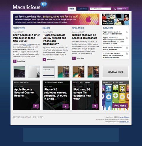
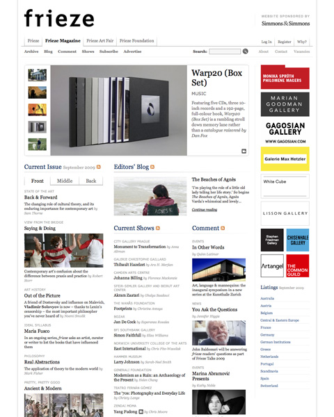
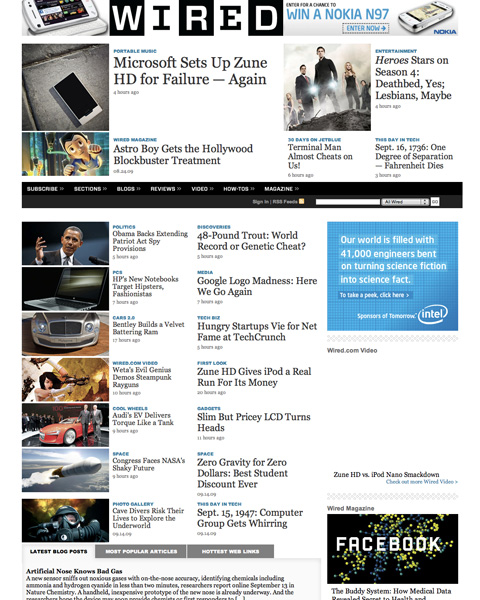
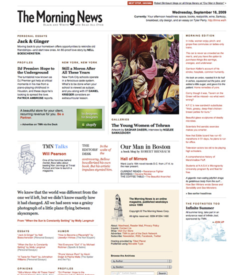
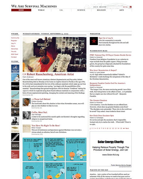
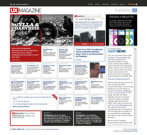
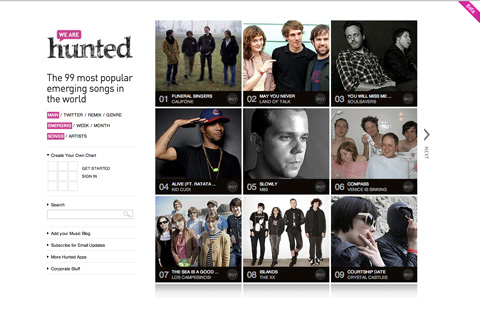
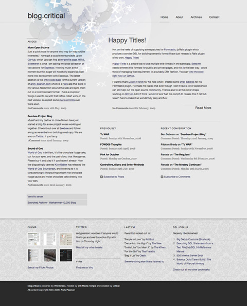
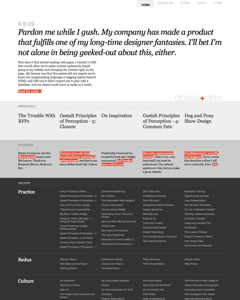
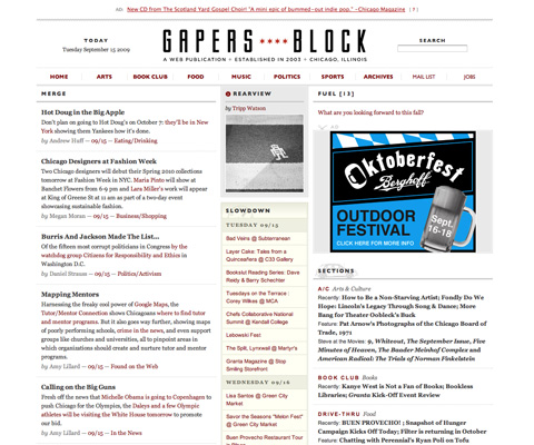
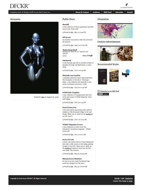
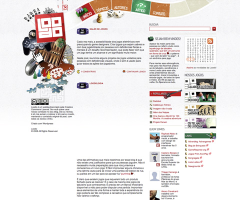
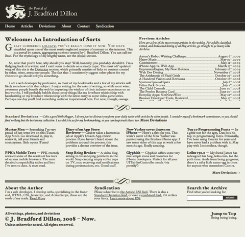
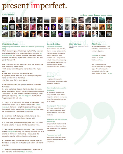
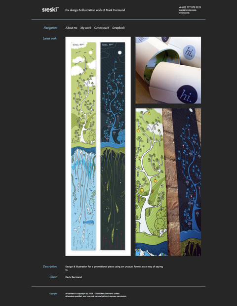
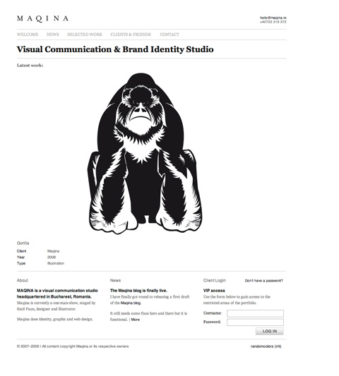
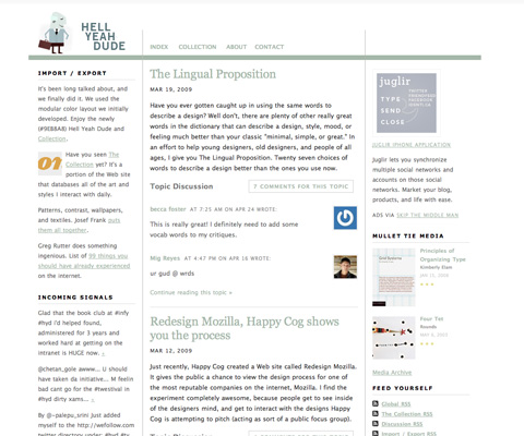
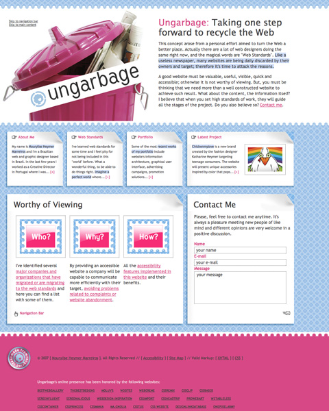
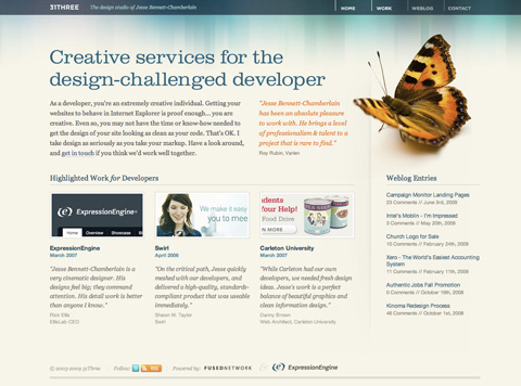
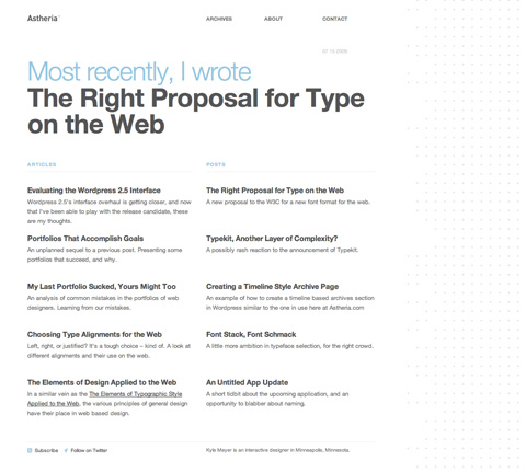
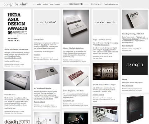
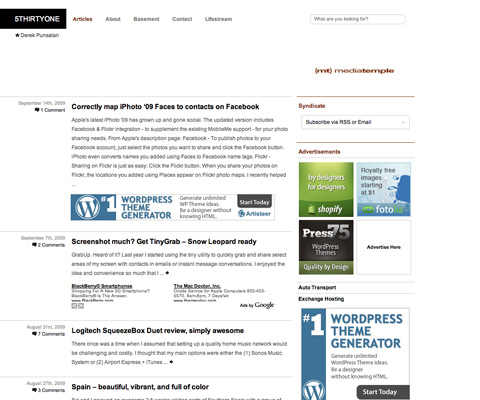
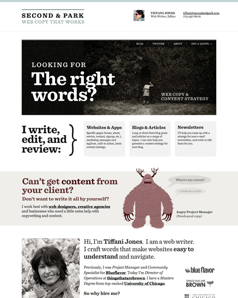
Gallery of Excellent Grid Designs
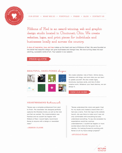
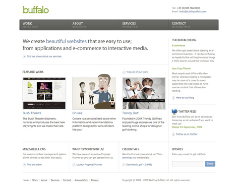
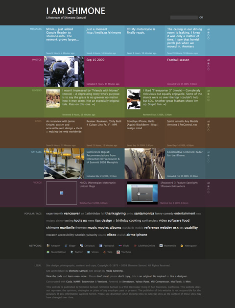
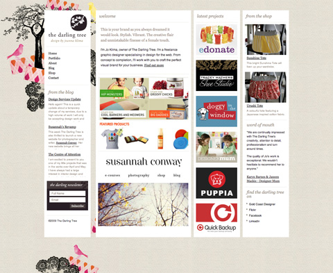
What would a post on grid design be without a selection of awesome grid-based designs to inspire you? Below are 30 excellent designs based on grids. Some have more complex grids than others, and some do an excellent job of breaking outside of the grid when necessary.
yeeahh! very nice post
Are noupe and smasingnmagazine belongs to same person?
Great information. I have stopped going down the grid route but may find myself back on it!
Wow Cameron – once again you have provided us web designers with a valuable resource. I appreciate the flexibility of the grid system. It is a fundamental design need.
This is an excellent article !!!
And to answer the one who asked that question. Noupe was recently bought by Smashing Magazine !
thanks for this great info
Thank you for mention my articles “O rule + golden proportion” and The Golden Grid. I really enjoyed the Gallery of Grid Designs Sites. Excellent choose!
– WoW big post, very nice !!
Congratulations……….
Ive been looking for a good article on grid based web design. Gladly I found one. Thanks. This is so helpful.
Great resource article. I’ve had Mark Boultan’s article bookmarked for years, but theres loads of stuff I haven’t seen yet up here. Thanks for putting the time into sharing this.
Here’s a shout out for the BlueTrip CSS Grid Framework, a nice mishmash of Blueprint, Tripoli, etc., along with some great icons.
maybe one day i will figure in such list :)
Good Article, nice examples. I prefer the 960.gs
Nice.
Btw, that Grid System Generator uses the Grid Focus WordPress theme by 5thirtyone http://5thirtyone.com/grid-focus
W O W………no comment awesome
Good stuff – can’t enough of the grid :)
I’m very fond of grid based websites. Thanks for sharing!
Thanks for this informative post! Especially like all the resources listed and the fact that you explained WHY use grid based systems. Thanks again
Great to find all these resources pulled together. Great reference article.
DW
I’m interested with the tutorial part in which you provide….I’ll be making a theme which uses grid system, the only problem is how I’ll make it beautifully
A great round up. I’m currently working on my portfolio site and this guide will be very helpful understanding the basics of grid based web design thanks
This page is a huge help in us because of its unique and interesting designs.Web Designer Perthincludes it as a good source of information.
Great article is the least i can say
Wow! Props on the article. This is a such a great amount of useful information.
Looking forward to using this on my next project. Great job on the research. Thanks,
DG.
I really learned some good web designing facts from this useful post. Thanks for writing this post to guide us. Thanks.
Great idea for grid based web design