
What is visual hierarchy, and why do you need it?

Crowded and hard-to-navigate designs are two of the biggest reasons users leave a website. When users quickly leave, engaging them and boosting conversions is impossible. One way you can help keep users on your site engaged is by implementing a visual hierarchy.
What is visual hierarchy?
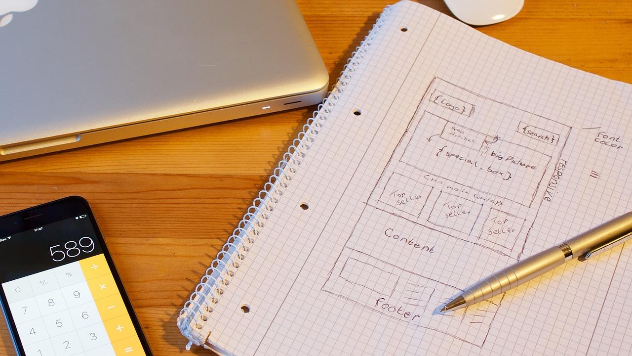
Visual hierarchy is one web design principle that involves arranging elements on a page or site in order of importance. This helps to avoid pages becoming overcrowded with design elements that detract from the user experience.
One of the most prominent problems users experience online is overcrowded websites, so visual hierarchy is crucial. Data from HubSpot estimates that around 84.6% of users find overcrowded web designs a mistake for small businesses.
Typically, the most important design elements are situated at the top of the page or in a prominent position so users can easily see them. Otherwise, every design element would have equal importance and provide no guide for overcoming customer needs.
A strong visual hierarchy will seek to place logos, whitespace, typography, visual storytelling, and more in a way that predicts the user's flow. As such, you have a much greater influence over how users interact with your site.
A good visual hierarchy captures the user's attention and guides them through the content using an intuitive flow and priority levels. Understanding visual processing can help create effective visual hierarchies in web design.
Why is visual hierarchy important?

Visual hierarchy in web design is essential for creating a positive user experience. User experience refers to how the different elements on a page or website make users feel and whether they help them achieve their goals.
A positive user experience is vital as it affects the likelihood of users staying on your site and whether they convert. There is a strong correlation between a strong visual hierarchy and positive user experience.
Aside from impacting a positive user experience, visual hierarchy is one of visual design’s four pillars (the other three are space, contrast, and scale). The four pillars work together to ensure a strategically organized website design.
It also helps guide users to take a specific action or highlight a certain message. This is crucial for creating strong first impressions and experiences that will bring users back.
Whether users are clicking a call-to-action (CTA), submitting a form, or registering for a newsletter, visual hierarchy ensures the important elements stand out so users can act when ready. Otherwise, there may be uncertainty about how to act and take the steps.
A good visual hierarchy grabs users' attention when they first land on your site or webpage. Ensuring you capture their attention is vital, and it is the first important step to engaging users and keeping them on your site.
It also gives users a scannable layout. When important elements and items stand out on a page, users can scan the page to find what most appeals to them, allowing them to find solutions to their pain points quickly.
Understanding visual processing
Before creating a visual hierarchy, it’s important to understand how the brain processes visuals and eye movement. Eye tracking research has revealed two major methods humans use to process information: F-shape and Z-shape patterns.
F-shape pattern
The F-shape pattern is one method humans use to process information. Typically, users process and scan information from left to right, top to bottom. Placing elements in users' gaze or eyeline makes a big difference.
The F-shape pattern involves organizing content into an F shape. It is the most common method for visual processing and is most widely used for text-heavy content without subheadings or visuals to guide users.
As a result, users will read the first few words or sentences at the top of the page and then scan the first words of each line or sentence to find certain words or phrases. In terms of visual web designs, this layout indicates poor formatting and visual hierarchy.
Z-shape pattern
This is where the Z-shape pattern comes in. Similar to the F-shape pattern, the Z-shape pattern follows a scanning or reading pattern of the letter Z. This layout pattern is much more effective for minimalist web designs that want to emphasize CTAs and forms more.
Unlike the F-shape pattern, the Z-shape pattern provides an excellent basis for a strong visual hierarchy that seeks to attract and engage the user. Using a landing page as an example, users will typically scan the page as follows:

When creating web designs with the Z-shape pattern in mind, there are some key considerations. First, you must prioritize what information or visuals you want the user to see. This will typically be something that captures the attention.
You must then consider what order or structure you want the user to follow. This includes content structure, visual layout, CTAs, etc. Finally, you need to decide on the action or outcome you expect a user to take from the page, e.g., submitting a form.
How can you implement visual hierarchy?

Now that we’ve covered what visual hierarchy is and why you need it, it’s time to explore some tips for implementing an impactful visual hierarchy.
Utilise size
Sizing and scaling are two methods for prioritizing content or visuals in web design. The content or visuals you want to emphasize should be much more prominent on the page.
Items with a larger size or scale will typically attract more attention. When using size and scale in the visual hierarchy, it’s important to use no more than three sizes and that the most important elements are the biggest.
Colour and contrast
Color and contrast can play a significant impact in creating an appealing visual hierarchy. The strategic use of color helps elements stand out and draws the eye to the areas or content you want users to see first.
For example, a CTA with a strong contrasting color will stand out more prominently to users. Understanding the psychology of color and its impact on users can help ensure you create a visual hierarchy with compelling visual components.
Whitespace
Whitespace is a crucial element of successful web design. The blank space or area within a page design, whitespace helps the different content on a page breathe and declutter the layout. It also adds legibility and a visual balance.
Using whitespace effectively between and around different elements on a page makes it much easier for users to absorb the information and removes potential distractions. While there is no set standard for how much whitespace you should use, aiming for at least 30% helps create a good visual hierarchy.
Repetition
The human brain is naturally wired to seek out patterns. Using repetition in a visual hierarchy can help the human brain better understand how content or elements on a page are related.
Repetition also creates a sense of unity within your web design. Repetition can apply to typography, shapes, image layout, or use of color. As a result, users' understanding and recognition of your content are much stronger.
Alignment and composition
Another way to implement visual hierarchy in your web design is through alignment and composition. Good alignment and composition of elements in a visual hierarchy create a structure for design elements and a focal point for users.
Two methods can be used to implement alignment and composition in the visual hierarchy: the rule of thirds and the rule of odds. The rule of thirds refers to dividing the sections of a page into a horizontal grid of nine equally sized squares.
The intersection lines are focal points where you should consider placing important design elements on your page. Then, additional design elements are placed around these focal points. Consider placing hero images, CTAs, and headlines along the focal lines of the horizontal grid.
The rule of odds is another method of alignment and composition. It refers to creating pleasing and appealing visual hierarchies using an odd number of elements (most commonly 3) rather than an even number.
This creates a stronger dynamic and balance between the elements around a focal point. Using an even number of elements can create a symmetry that seems unnaturally static and less visually appealing to users.
Visual hierarchy keeps users engaged and more likely to visit your site. Implementing an effective visual hierarchy that emphasizes the most important elements ensures your web design has the desired impact on boosting conversions and driving success.
Featured image by Victor Freitas on Unsplash