
5 CSS3 Techniques For Major Browsers using the Power of jQuery
Many exciting new functions and features are being thought up for CSS3: text-shadow, box-sizing, opacity, multiple backgrounds, border-radius, border-image, etc…
CSS3 leads to greater flexibility and makes it much easier to recreate previously complex effects. Not all current browsers support CSS3, but it is however possible to create equivalent effects and serve it with the power of jQuery.
This article presents 5 CSS3 techniques which can dramatically get you a stunning user interfaces and how to achieve almost the same effects using jQuery for browsers that are not compatible yet with CSS3 new features.
1. Border Radius: Create rounded corners
W3C has offered a very interesting option for borders in CSS3, of which one is border-radius. This CSS3 styling rule allows rounded corners to be set. Both Mozila/Firefox and Safari 3 have implemented this function, which allows you to create round corners on box-items.
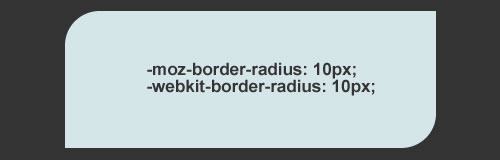
Use the followig css code to replicate the above example.
#rounded-box {
-moz-border-radius-topleft: 15px;
-moz-border-radius-topright: 0px;
-moz-border-radius-bottomright: 15px;
-moz-border-radius-bottomleft: 0px;
-webkit-border-top-left-radius: 15px;
-webkit-border-top-right-radius: 0px;
-webkit-border-bottom-left-radius: 0px;
-webkit-border-bottom-right-radius: 15px;
}
Below you will find jQuery solutions and plugins that will allow you to create rounded corners without using images.
How To » jQuery Canvas Rounded Corners
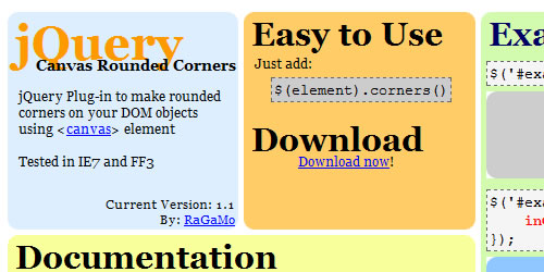
jQuery Plug-in to make rounded corners on your DOM objects using
You can change the following Options:
- radio - (int) radius size of corners
- inColor - (color) inside color of element
- outColor - (color) outside color of corners
- borderSize - (int) border width
- borderColor - (color) color of borders
How To » jQuery Corners
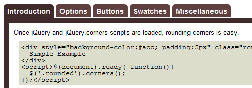
This jQuery plugin will easily create beautifully rounded corners. No images or obtrusive markup necessary.
2. Border Image
Another exciting new border feature of CSS3 is the property border-image. Border-image, allows an image to be used as the border of an element. Each side of the image corresponds to a side of the HTML object.
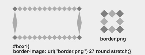
Currently “Border Image” is only implemented in the upcoming Firefox3.1 and recent releases of Safari and Chrome. Below you will find a tricky jQuery solution that will allow you to have this feature work in: Firefox 2.*, Firefox 3, Firefox 3.1, Safari 3.*, Chrome 1.0, Opera 9.*, Opera 10
and IE7.
How To » jquery.borderImage.js
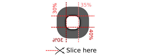
jquery.borderImage is a cross-browser, partial implementation of CSS3’s border-image property. This plugin can create the same effect as border-image by creating nine slices from the image one by one, and then tile them in the background of our element.
3. Multiple Backgrounds
CSS3 allows for multiple background images on one element, this is a real time saver. To do this, you can separate backgrounds by commas, like this
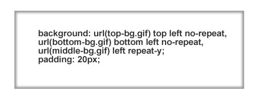
#multiple-background-box {
background: url(top-bg.gif) top left no-repeat,
url(bottom-bg.gif) bottom left no-repeat,
url(middle-bg.gif) left repeat-y;
padding: 20px;
}
Since this features is not supported by most browsers yet, and you want multiple/layered backgrounds for a div tag, you would nest div tags inside of each other with the CSS to give it the background you wanted. That’s a lot of code, and doesn’t seem too effecient. The solution is to use jQuery with the Background Layers plugin.
How To » CSS Multiple Backgrounds / Background Layering with jQuery
The Background Layers plugin reduces the amount XHTML you need to write simply by adding a few lines of JavaScript, making your code much less cumbersome. The concept is similar to the use of layers in Photoshop, one background image on top of another.

The code above demonstrate laying backgrounds than to use a few sprites from the classic video game, Super Mario Bros 3.
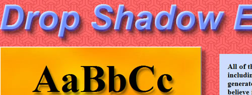
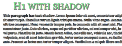
4. Box Shadow and Text Shadow
The main goal of this property is to give designers and css coders a nice way to display a shadow behind your text. The property syntax should look like this:
h3 { text-shadow: 2px 2px 2px #333; }
A very useful article i found at Kretschmann’s website, explaing different usage of this property and including different example for using it in a nice way.
Again, this property is not supported by Firefox and IE, so we have to find ourself another way of doing it using jQuery.
How To » Drop Shadow
This plugin creates soft drop shadows behind page elements, including text and transparent images. It accepts options for the horizontal and vertical offsets, amount of blur, opacity, and color. Please look at the demo page for examples.
How To » Text-shadow in Internet Explorer
Text-shadow in Internet Explorer adds text-shadow effects to Internet Explorer. You can easily turn it on by calling textShadow();.
5.Transparency & Opacity
The most widely implemented feature of CSS3 up till now is opacity. ‘opacity’ sets the value to how opaque an elements. An element with opacity value 1.0 will be fully opaque (visible) while an element with opacity value 0.0 will be the complete opposite, invisible. Any value inbetween will determine how opaque (or transparent) the element is. Check out this interesting post by Zen Elements explaining how to use it.

The above opacity example is set in another layer containing a completely random, never seen before background and each layer uses the following CSS:
div.L1 { background:#036; opacity:0.2; width:575px; height:20px; }
div.L2 { background:#036; opacity:0.4; width:575px; height:20px; }
div.L3 { background:#036; opacity:0.6; width:575px; height:20px; }
div.L4 { background:#036; opacity:0.8; width:575px; height:20px; }
div.L5 { background:#036; opacity:1.0; width:575px; height:20px; }
How To » Element gradient
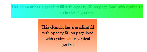
It allows you to define a gradient fill and have an element filled with a gradient. You can set the direction of the gradient (right-left or up-down) and the opacity of the gradient easily.
Pretty awesome – I’ve been waiting to adopt css3 simply because of browser compatibility issues, but this motivates me to dive in and see what is there, that we can apply now.
Thanks for the great article, I have already put a couple of these techniques to good use. It’s a shame that CSS3 isn’t supported by all of the browsers but at least it gives us something to look forward to. I have been recommending Firefox to all of my clients. It’s up to us (Designers/Developers) to help people make the change!
Wow! This is exciting! I can not wait to use the new CSS3 with Javascript!! THANK YOU!!
That’s awesome! The problem is that I use mootools and there is a conflict between mootools and jQuery. I know there are solutions but I never found a GOOD solution for this conflict.
CSS 3 very powerful. Very good that jQuery can solve some CSS 3 styles for all browsers, but want really CSS 100% code without any javascript hacks…
yea ,, :( ..
Call Bill Gates and have him turn ALL versions of IE into REAL browsers (including the infamous IE6!). That should do the trick!
If only life was that simple…
Try jQuery.noConflict() Pluggin. can be found here:
http://api.jquery.com/jQuery.noConflict/
Good Luck
thank you! these basic jquery solutions in one place is real helpful!
Just wanted to let you know that the multiple-background example you used in this article can be done even more simply using CSS3. You used multiple-background images as a way to create an inset drop shadow, but this is possible using the box-shadow command as well.
Like so:
box-shadow: inset 0px 0px 3px #000;
-moz-box-shadow: inset 0px 0px 3px #000;
-webkit-box-shadow: inset 0px 0px 3px #000;
Inset applies the shadow to the interior of the box, first number is the horizontal offset, 2nd is the vertical offset, 3rd is the blur amount and finally the color.
Thanx for the Share :) ..
Awesome grate Tips.But it will not working in IE Browsers.If u have any alternative options for IE Browsers.Please suggest me.
Excellent article, thanks a lot!
Been using a couple of these jQuery alternatives for a while, but learned of a couple more here too :)
Great tips here – thanks a lot. Can’t wait for the day when we can stop using javascript and concentrate on pure CSS
Hey everyone good read. I’m trying to get the image to overlay the edge of the div (green box) so it has a rough look to it. Any ideas?
What’s the border-image-outset all about? Can’t get that to work…
Thanks in advance.
Thanks for a very great reading!I’ve learn much, and all becaus of you!
graxx
very informative article thank you very much
For the Multiple CSS Backgrounds, the link doesn’t work and I am not able to get it working. Does anyone know an alternate link I can go to? :(
I was researching on CSS3 Multiple Background when I found this article. It is definitely eliminating the old way of having multiple tags.
I am looking forward to the day when all browsers (including the old ones) support HTML5 and CSS3.
Thank you for sharing.
This is exactly what I am looking for to use in my new redesign. Thank you to bring my search to an end :)
Regards from Bonn, Germany
– Daniel
Nice list! HTML5 + CSS3 + Jquery = Powerful Website