
A Look into a Web Designer’s Toolbox – Today: John Siebert
As a web designer, you must be well aware of how even a minuscule designing mistake can result in the failure of your website. One of the ways of avoiding the various pitfalls related to website design is using the right set of tools. The idea is to use such tools to simplify some of the more time consuming tasks related to web design and ensuring that you get them absolutely right. There are plenty of web design tools available on the market and you will be hard-pressed to choose the right one for your needs. This article aims to make your job a bit simpler. It’s a curated list of 8 tools that can help you get the most out of your web design process.
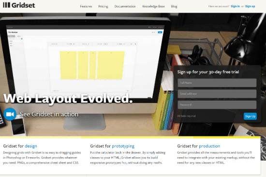 You know how important responsive web design has become when you see people relying more and more on their mobile phones for their business and daily activities. It’s imperative, therefore, that you build a website that renders effectively across diverse devices. Gridset helps you do just that. It is a full-fledged designing tool that allows you to build bespoke, responsive grid-based layouts. Create any type of grid – columnar, asymmetrical, compound, fixed, fluid and responsive grids, with an option to choose from the available presets. You have a library of grids out there!! One of the great features of this tool is the ease with which you can create responsive prototypes without doing calculations. You just speed up your grid design and tailor it to perfection just as you imagined.
Gridset is a paid service, setting you back 9 USD monthly or 90 USD annually.
You know how important responsive web design has become when you see people relying more and more on their mobile phones for their business and daily activities. It’s imperative, therefore, that you build a website that renders effectively across diverse devices. Gridset helps you do just that. It is a full-fledged designing tool that allows you to build bespoke, responsive grid-based layouts. Create any type of grid – columnar, asymmetrical, compound, fixed, fluid and responsive grids, with an option to choose from the available presets. You have a library of grids out there!! One of the great features of this tool is the ease with which you can create responsive prototypes without doing calculations. You just speed up your grid design and tailor it to perfection just as you imagined.
Gridset is a paid service, setting you back 9 USD monthly or 90 USD annually.
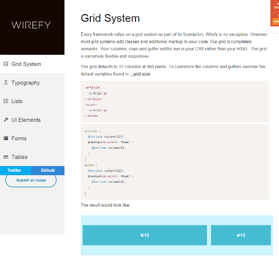 If you are looking for a tool that helps you create fast, manageable wireframes that are web responsive, Wirefy is a good option. It speeds the design process from the initial sketch phase to the final deliverables. No fancy components, but great user friendly features allow you to quickly experiment with responsive wireframes and lay a foundation for your design without losing track of content. Packed with styles like typography, tables, buttons, paginator, menu, slideshow, images, forms and many more, Wirefy provides the flexibility and comprehensive features you need to create a visually appealing website on the fly.
Wirefy is free under the terms of the MIT license and available from Github.
If you are looking for a tool that helps you create fast, manageable wireframes that are web responsive, Wirefy is a good option. It speeds the design process from the initial sketch phase to the final deliverables. No fancy components, but great user friendly features allow you to quickly experiment with responsive wireframes and lay a foundation for your design without losing track of content. Packed with styles like typography, tables, buttons, paginator, menu, slideshow, images, forms and many more, Wirefy provides the flexibility and comprehensive features you need to create a visually appealing website on the fly.
Wirefy is free under the terms of the MIT license and available from Github.
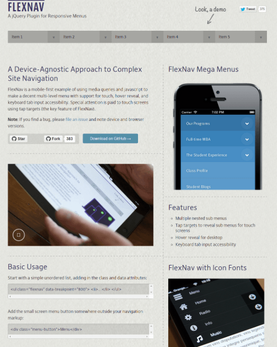 Another great web responsive design tool, FlexNav is a JQuery plugin that uses JavaScript to create drop down menus with multiple nested sub-menus. It is simple to set up and the default speed can be changed. This plugin is supported by most modern browsers.
FLEXNAV has been released into the public domain and is available from Github.
Another great web responsive design tool, FlexNav is a JQuery plugin that uses JavaScript to create drop down menus with multiple nested sub-menus. It is simple to set up and the default speed can be changed. This plugin is supported by most modern browsers.
FLEXNAV has been released into the public domain and is available from Github.
 Use this tool to instantly record a video on your screen or capture an image by quickly traversing the option menu. You can also take advantage of the editing program within Snagit to make changes to the screenshot; add an arrow, blur it or crop it as you need. Introduce images called “stamps” onto the screenshots; include annotations and improve the overall look of the screenshot. The tool automatically moves screenshots to the edit section where they can be changed exactly as you want. Make use of different selection formats including All-in-One, Full Screen, Copy to clipboard, Web Page as a PDF with links, Copy text to clipboard, Free hand, and Menu with time delay to customize a great screenshot that simply captivates your audience.
Snagit isn't free, but available for Windows and Mac alike. Prices vary.
Use this tool to instantly record a video on your screen or capture an image by quickly traversing the option menu. You can also take advantage of the editing program within Snagit to make changes to the screenshot; add an arrow, blur it or crop it as you need. Introduce images called “stamps” onto the screenshots; include annotations and improve the overall look of the screenshot. The tool automatically moves screenshots to the edit section where they can be changed exactly as you want. Make use of different selection formats including All-in-One, Full Screen, Copy to clipboard, Web Page as a PDF with links, Copy text to clipboard, Free hand, and Menu with time delay to customize a great screenshot that simply captivates your audience.
Snagit isn't free, but available for Windows and Mac alike. Prices vary.
 A great designer aid tool centered on responsive web design, Edge Inspect, as the name suggests, gives you the resources to quickly preview web design on mobile platforms without publishing the associated files on the server. Belonging to the Adobe family, Edge Inspect allows iOS and Android mobile devices to be paired to the computer. Each device displays the same site using its native render and presentation modes. So, instead of previewing a site optimized for mobile, the file is sent to paired devices for display. The codes can be edited live and the changes instantaneously displayed and rechecked on the spot to confirm the response of the website design to various hand-held devices. No time wasting.
Edge Inspect is freely available outside a subscription to the Creative Cloud. You'll need an Adobe iD, however.
A great designer aid tool centered on responsive web design, Edge Inspect, as the name suggests, gives you the resources to quickly preview web design on mobile platforms without publishing the associated files on the server. Belonging to the Adobe family, Edge Inspect allows iOS and Android mobile devices to be paired to the computer. Each device displays the same site using its native render and presentation modes. So, instead of previewing a site optimized for mobile, the file is sent to paired devices for display. The codes can be edited live and the changes instantaneously displayed and rechecked on the spot to confirm the response of the website design to various hand-held devices. No time wasting.
Edge Inspect is freely available outside a subscription to the Creative Cloud. You'll need an Adobe iD, however.
 FitText is a great tool to customize your headlines. You can’t ignore them; they are the first words that meet the eyes of your readers. If the content scales up or down as per user viewport (I am talking about responsive web design) your headlines may look ugly and turn off your readers. FitText is what you need. It is a great jQuery plugin that pumps life into your text and auto updates the font size to give you a scalable headline. It offers a level of fine tuning that makes your text look lively rather than a string of lifeless words that might strain your audience’s eyes.
FitText is released under the WTFPL license, which essentially translates to what you think it does. You can use the script freely. The license is kind of public domain on steroids (if that were possible).
We have reviewed the alternative slabText here at Noupe already.
What are your favorite tools? Tell us in the comments below.
(dpe)
Image by ErikaWittlieb from Pixabay
FitText is a great tool to customize your headlines. You can’t ignore them; they are the first words that meet the eyes of your readers. If the content scales up or down as per user viewport (I am talking about responsive web design) your headlines may look ugly and turn off your readers. FitText is what you need. It is a great jQuery plugin that pumps life into your text and auto updates the font size to give you a scalable headline. It offers a level of fine tuning that makes your text look lively rather than a string of lifeless words that might strain your audience’s eyes.
FitText is released under the WTFPL license, which essentially translates to what you think it does. You can use the script freely. The license is kind of public domain on steroids (if that were possible).
We have reviewed the alternative slabText here at Noupe already.
What are your favorite tools? Tell us in the comments below.
(dpe)
Image by ErikaWittlieb from Pixabay
Gridset
You know how important responsive web design has become when you see people relying more and more on their mobile phones for their business and daily activities. It’s imperative, therefore, that you build a website that renders effectively across diverse devices. Gridset helps you do just that. It is a full-fledged designing tool that allows you to build bespoke, responsive grid-based layouts. Create any type of grid – columnar, asymmetrical, compound, fixed, fluid and responsive grids, with an option to choose from the available presets. You have a library of grids out there!! One of the great features of this tool is the ease with which you can create responsive prototypes without doing calculations. You just speed up your grid design and tailor it to perfection just as you imagined.
Gridset is a paid service, setting you back 9 USD monthly or 90 USD annually.
Wirefy
If you are looking for a tool that helps you create fast, manageable wireframes that are web responsive, Wirefy is a good option. It speeds the design process from the initial sketch phase to the final deliverables. No fancy components, but great user friendly features allow you to quickly experiment with responsive wireframes and lay a foundation for your design without losing track of content. Packed with styles like typography, tables, buttons, paginator, menu, slideshow, images, forms and many more, Wirefy provides the flexibility and comprehensive features you need to create a visually appealing website on the fly.
Wirefy is free under the terms of the MIT license and available from Github.
FLEXNAV
Another great web responsive design tool, FlexNav is a JQuery plugin that uses JavaScript to create drop down menus with multiple nested sub-menus. It is simple to set up and the default speed can be changed. This plugin is supported by most modern browsers.
FLEXNAV has been released into the public domain and is available from Github.
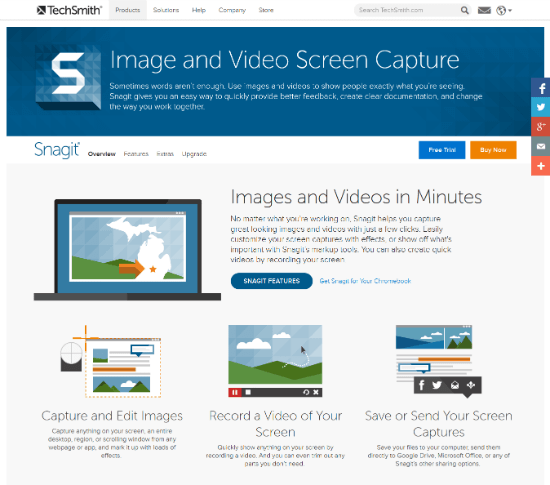
Snagit
Use this tool to instantly record a video on your screen or capture an image by quickly traversing the option menu. You can also take advantage of the editing program within Snagit to make changes to the screenshot; add an arrow, blur it or crop it as you need. Introduce images called “stamps” onto the screenshots; include annotations and improve the overall look of the screenshot. The tool automatically moves screenshots to the edit section where they can be changed exactly as you want. Make use of different selection formats including All-in-One, Full Screen, Copy to clipboard, Web Page as a PDF with links, Copy text to clipboard, Free hand, and Menu with time delay to customize a great screenshot that simply captivates your audience.
Snagit isn't free, but available for Windows and Mac alike. Prices vary.
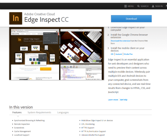
Edge Inspect
A great designer aid tool centered on responsive web design, Edge Inspect, as the name suggests, gives you the resources to quickly preview web design on mobile platforms without publishing the associated files on the server. Belonging to the Adobe family, Edge Inspect allows iOS and Android mobile devices to be paired to the computer. Each device displays the same site using its native render and presentation modes. So, instead of previewing a site optimized for mobile, the file is sent to paired devices for display. The codes can be edited live and the changes instantaneously displayed and rechecked on the spot to confirm the response of the website design to various hand-held devices. No time wasting.
Edge Inspect is freely available outside a subscription to the Creative Cloud. You'll need an Adobe iD, however.
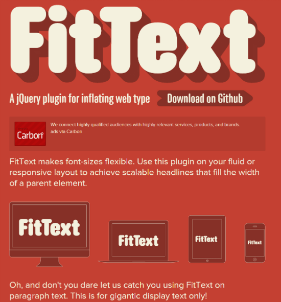
FitText
FitText is a great tool to customize your headlines. You can’t ignore them; they are the first words that meet the eyes of your readers. If the content scales up or down as per user viewport (I am talking about responsive web design) your headlines may look ugly and turn off your readers. FitText is what you need. It is a great jQuery plugin that pumps life into your text and auto updates the font size to give you a scalable headline. It offers a level of fine tuning that makes your text look lively rather than a string of lifeless words that might strain your audience’s eyes.
FitText is released under the WTFPL license, which essentially translates to what you think it does. You can use the script freely. The license is kind of public domain on steroids (if that were possible).
We have reviewed the alternative slabText here at Noupe already.
What are your favorite tools? Tell us in the comments below.
(dpe)
Image by ErikaWittlieb from Pixabay
Thank you for sharing such tools with us. I will use the FLEXNAV for my future projects for sure.